6,722 search results
(0.017 seconds)
- Eva Antiqua SG by Spiece Graphics,
$39.00 Based on the 1922 Klingspor model by German designer Rudolf Koch, this hand-drawn quill roman has an informal and curiously delicate appearance. The typeface was known in Germany as Koch Antiqua and in the rest of Europe as Locarno. Eve, as it was called in the United States, continues to enjoy great popularity in advertising and book publishing circles. This deluxe version includes display light, display heavy, and display black as well as the hard-to-find display light and heavy (Koch Kursiv) italics. Eva-Paramount, which is based on Morris Benton's 1928 ATF Paramount, has also been included. It contains a set of alternates characters that are in keeping with the light and heavy display letter styles. Eva-Antiqua is also available in the OpenType Std format. Alternates are now merged together into each style as stylistic alternates or as swashes. These advanced features currently work in Adobe Creative Suite InDesign, Creative Suite Illustrator, and Quark XPress 7. Check for OpenType advanced feature support in other applications as it gradually becomes available with upgrades.
 - Palatino Nova Paneuropean by Linotype,
$67.99Palatino® Nova is Prof. Hermann Zapf's redesign of his own masterpiece, Palatino. The original Palatino was cut in metal by August Rosenberger at D. Stempel AG typefoundry in Frankfurt, and released in 1950. Palatino was later adapted for mechanical composition on the Linotype machine, and became one of the most-used typefaces of the 20th Century. Palatino was designed for legibility, and has open counters and carefully weighted strokes. The type was named after Giambattista Palatino, a master of calligraphy from the time of Leonardo da Vinci. Palatino is a typeface based on classical Italian Renaissance forms. A modern classic in its own right, Palatino is popular among professional graphic designers and amateurs alike, working well for both text and display typography. Hermann Zapf and Akira Kobayashi redeveloped Palatino for the 21st Century, creating Palatino Nova. Released by Linotype in 2005, the Palatino Nova family is part of Linotype's Platinum Collection. Palatino Nova includes several weights (Light, Regular, Medium, and Bold), each with companion italics. Four styles (Regular, Italic, Bold, and Bold Italic) have Greek and Cyrillic glyphs built into their character sets. The Palatino Nova family also includes revised versions of Aldus (now called Aldus Nova), as well as two titling weights. The first titling weight, Palatino Nova Titling, is based on Hermann Zapf's metal typeface Michelangelo, including Greek glyphs from Phidias Greek. The heavier titling weight, Palatino Nova Imperial, is based on Sistina. The fonts in the Palatino Nova family support all 48 Western, Central, and Eastern European languages. Additional features: ligatures and historical ligatures, Small Caps, ornaments, and a range of numerals (proportional & tabular width lining and Old style Figures, fractions, inferiors, and superiors)." - Palatino Nova by Linotype,
$50.99 Palatino® Nova is Prof. Hermann Zapf's redesign of his own masterpiece, Palatino. The original Palatino was cut in metal by August Rosenberger at D. Stempel AG typefoundry in Frankfurt, and released in 1950. Palatino was later adapted for mechanical composition on the Linotype machine, and became one of the most-used typefaces of the 20th Century. Palatino was designed for legibility, and has open counters and carefully weighted strokes. The type was named after Giambattista Palatino, a master of calligraphy from the time of Leonardo da Vinci. Palatino is a typeface based on classical Italian Renaissance forms. A modern classic in its own right, Palatino is popular among professional graphic designers and amateurs alike, working well for both text and display typography. Hermann Zapf and Akira Kobayashi redeveloped Palatino for the 21st Century, creating Palatino Nova. Released by Linotype in 2005, the Palatino Nova family is part of Linotype's Platinum Collection. Palatino Nova includes several weights (Light, Regular, Medium, and Bold), each with companion italics. Four styles (Regular, Italic, Bold, and Bold Italic) have Greek and Cyrillic glyphs built into their character sets. The Palatino Nova family also includes revised versions of Aldus (now called Aldus Nova), as well as two titling weights. The first titling weight, Palatino Nova Titling, is based on Hermann Zapf's metal typeface Michelangelo, including Greek glyphs from Phidias Greek. The heavier titling weight, Palatino Nova Imperial, is based on Sistina. The fonts in the Palatino Nova family support all 48 Western, Central, and Eastern European languages. Additional features: ligatures and historical ligatures, Small Caps, ornaments, and a range of numerals (proportional & tabular width lining and Old style Figures, fractions, inferiors, and superiors)."
 - Anahita Extra Bold by Naghi Naghachian,
$95.00 Anahita ExtraBold is designed by Naghi Naghashian. This Headline Font is developed on the basis of specific research and analysis on Arabic characters and definition of their structure. This innovation is a contribution to modernisation of Arabic typography, gives the font design of Arabic letters real typographic arrangement and provides more typographic flexibility. This step was necessary after more than two hundred years of relative stagnation in Arabic font design. Anahita supports Arabic, Persian, and Urdu. It also includes proportional and tabular numerals for the supported languages. Anahita Font is available in ExtraBold. This font is designed to be used as advertising and newspaper headlines. Anahita design fulfills the following needs: A Explicitly crafted for use in electronic media fulfills the demands of electronic communication. Anahita is not based on any pre-digital typefaces. It is not a revival. Rather, its forms were created with today's technology in mind. B Suitability for multiple applications. Gives the widest potential acceptability. C Extreme legibility not only in small sizes, but also when the type is filtered or skewed, e.g., in Photoshop or Illustrator. Anahita's simplified forms may be artificial obliqued in InDesign or Illustrator, without any loss in quality for the effected text. D An attractive typographic image. Anahita was developed for multiple languages and writing conventions. E The highest degree of geometric clarity and the necessary amount of calligraphic references. This typeface offers a fine balance between calligraphic tradition and the contemporary sans serif aesthetic now common in Latin typography.
 - Satero Serif by Linotype,
$29.99 Satero was designed by Prof. Werner Schneider in 2007. Never before have we had so much written material to consume; this is the age of mass-communication. Unfortunately, the decision of which typeface to use is too often made lightly. The typeface is one of the most elementary means of language, and it can play a major role in a text's legibility and the amount of time the reader needs for it. The Satero Type System offers a high degree of legibility due to its dynamic and forms. The individual characters have been based on classical concepts. They are clearly made, and leave all unnecessary elements behind. The type works to create an environment of extreme legibility. Essential parts of the a, c, e, s, and r are to be found at the x-height line, which is the most important area of a line of text in determining legibility. The Satero Type System includes two members whose basic forms are the same. The Sans Serif members are more horizontally differentiated than common grotesques, which aides their legibility. The Serif design employs asymmetrical serifs, avoiding elephant feet" altogether. Their dynamic is progressive. The condensed nature of the seriffed counterparts is optimal for newspaper and magazine applications, where space is at a premium and paper must be saved. All fonts in the Satero Type System include a number of alternate glyphs, as well as ligatures and proportional lining figures; all weights except the Heavy and Heavy Italic fonts are also equipped with small caps, small cap figures, and oldstyle figures as OpenType features. "
 - Bamdad by Naghi Naghachian,
$95.00 Bamdad Extra Bold Condensed is designed by Naghi Naghashian. This Headline Font is developed on the basis of specific research and analysis on Arabic characters and definition of their structure. This innovation is a contribution to modernisation of Arabic typography, gives the font design of Arabic letters real typographic arrangement and provides more typographic flexibility. This step was necessary after more than two hundred years of relative stagnation in Arabic font design. Bamdad supports Arabic, Persian, and Urdu. It also includes proportional and tabular numerals for the supported languages. Bamdad Font is available in Extra Bold Condensed. This font is designed to be used as advertising and newspaper headlines. Bamdad design fulfills the following needs: A Explicitly crafted for use in electronic media fulfills the demands of electronic communication. Bamdad is not based on any pre-digital typefaces. It is not a revival. Rather, its forms were created with today’s technology in mind. B Suitability for multiple applications. Gives the widest potential acceptability. C Extreme legibility not only in small sizes, but also when the type is filtered or skewed, e.g., in Photoshop or Illustrator. Bamdad's simplified forms may be artificial 'obliqued' in InDesign or Illustrator, without any loss in quality for the effected text. D An attractive typographic image. Bamdad was developed for multiple languages and writing conventions. E The highest degree of geometric clarity and the necessary amount of calligraphic references. This typeface offers a fine balance between calligraphic tradition and the contemporary sans serif aesthetic now common in Latin typography.
 - Parto by Naghi Naghachian,
$78.00 Parto Font family is designed by Naghi Naghashian. This Font is developed on the basis of specific research and analysis on Arabic characters and definition of their structure. This innovation is a contribution to modernization of Arabic typography, giving the font design of Arabic letters real typographic arrangement and providing more typographic flexibility. It enables, moreover, the use of this typeface for decorative headlines. This step was necessary after more than two hundred years of relative stagnation in Arabic font design. Parto supports Arabic, Persian, and Urdu. It also includes proportional and tabular numerals for the supported languages. Parto Font is available in Regular and Bold. Parto design fulfills the following needs: A Explicitly crafted for use in electronic media fulfills the demands of electronic communication. Parto is not based on any pre-digital typefaces. It is not a revival. Rather, its forms were created with today’s technology in mind. B Suitability for multiple applications. Gives the widest potential acceptability. C Extreme legibility not only in small sizes, but also when the type is filtered or skewed, e.g., in Photoshop or Illustrator. Parto's simplified forms may be artificial obliqued in InDesign or Illustrator, without any loss in quality for the effected text. D An attractive typographic image. Parto was developed for multiple languages and writing conventions. E The highest degree of geometric clarity and the necessary amount of calligraphic references. This typeface offers a fine balance between calligraphic tradition and the contemporary sans serif aesthetic now common in Latin typography.
 - Aban by Naghi Naghachian,
$95.00 The Aban font family was designed by Naghi Naghashian. It is developed on the basis of specific research and analysis on Arabic characters and definition of their structure. This innovation is a contribution to modernization of Arabic typography, gives the font design of Arabic letters real typographic arrangement and provides more typographic flexibility. This step was necessary after more than two hundred years of relative stagnation in Arabic font design. Aban supports Arabic, Persian, and Urdu. It also includes proportional and tabular numerals for the supported languages. Aban Font Family is available in three weights: Regular, Bold and ExtraBold, a three stings outline font. The Aban design fulfills the following needs: A Explicitly crafted for use in electronic media fulfills the demands of electronic communication. Aban is not based on any pre-digital typefaces. It is not a revival. Rather, its forms were created with today’s technology in mind. B Suitability for multiple applications. Gives the widest potential acceptability. C Extreme legibility not only in small sizes, but also when the type is filtered or skewed, e.g., in Photoshop or Illustrator. Aban’s simplified forms may be artificial obliqued in InDesign or Illustrator, without any loss in quality for the effected text. D An attractive typographic image. Aban was developed for multiple languages and writing conventions. E The highest degree of geometric clarity and the necessary amount of calligraphic references. This typeface offers a fine balance between calligraphic tradition and the contemporary sans serif aesthetic now common in Latin typography.
 - Satero Sans by Linotype,
$29.99 Satero was designed by Prof. Werner Schneider in 2007. Never before have we had so much written material to consume; this is the age of mass-communication. Unfortunately, the decision of which typeface to use is too often made lightly. The typeface is one of the most elementary means of language, and it can play a major role in a text's legibility and the amount of time the reader needs for it. The Satero Type System offers a high degree of legibility due to its dynamic and forms. The individual characters have been based on classical concepts. They are clearly made, and leave all unnecessary elements behind. The type works to create an environment of extreme legibility. Essential parts of the a, c, e, s, and r are to be found at the x-height line, which is the most important area of a line of text in determining legibility. The Satero Type System includes two members whose basic forms are the same. The Sans Serif members are more horizontally differentiated than common grotesques, which aides their legibility. The Serif design employs asymmetrical serifs, avoiding elephant feet" altogether. Their dynamic is progressive. The condensed nature of the seriffed counterparts is optimal for newspaper and magazine applications, where space is at a premium and paper must be saved. All fonts in the Satero Type System include a number of alternate glyphs, as well as ligatures and proportional lining figures; all weights except the Heavy and Heavy Italic fonts are also equipped with small caps, small cap figures, and oldstyle figures as OpenType features. "
 - Avesta Extra Bold by Naghi Naghachian,
$95.00 Avesta ExtraBoldCondensed is designed by Naghi Naghashian. This Headline Font is developed on the basis of specific research and analysis on Arabic characters and definition of their structure. This innovation is a contribution to modernisation of Arabic typography, gives the font design of Arabic letters real typographic arrangement and provides more typographic flexibility. This step was necessary after more than two hundred years of relative stagnation in Arabic font design. Avesta supports Arabic, Persian, and Urdu. It also includes proportional and tabular numerals for the supported languages. Avesta Font is available in ExtraBoldCondensed. This font is designed to be used as advertising and newspaper headlines. Avesta design fulfills the following needs: A Explicitly crafted for use in electronic media fulfills the demands of electronic communication. Avesta is not based on any pre-digital typefaces. It is not a revival. Rather, its forms were created with today’s technology in mind. B Suitability for multiple applications. Gives the widest potential acceptability. C Extreme legibility not only in small sizes, but also when the type is filtered or skewed, e.g., in Photoshop or Illustrator. Avesta's simplified forms may be artificial obliqued in InDesign or Illustrator, without any loss in quality for the effected text. D An attractive typographic image. Avesta was developed for multiple languages and writing conventions. E The highest degree of geometric clarity and the necessary amount of calligraphic references. This typeface offers a fine balance between calligraphic tradition and the contemporary sans serif aesthetic now common in Latin typography.
 - Bi Bi by Naghi Naghachian,
$78.00 BiBi font family is designed by Naghi Naghashian. This font family is developed on the basis of specific research and analysis on Arabic characters and definition of their structure. This innovation is a contribution to modernisation of Arabic typography, gives the font design of Arabic letters real typographic arrangement and provides more typographic flexibility. This step was necessary after more than two hundred years of relative stagnation in Arabic font design. BiBi supports Arabic, Persian, and Urdu. It also includes proportional and tabular numerals for the supported languages. BiBi Font family is available in five weights: Light, Regular, Demi, Bold and Heavy; each of them in two diferent styles including normal and extended. BiBi designs fulfill the following needs: A Explicitly crafted for use in electronic media fulfils the demands of electronic communication. BiBi is not based on any pre-digital typefaces. It is not a revival. Rather, its forms were created with today’s technology in mind. B Suitability for multiple applications. Gives the widest potential acceptability. C Extreme legibility not only in small sizes, but also when the type is filtered or skewed, e.g., in Photoshop or Illustrator. BiBi's simplified forms may be artificial obliqued in InDesign or Illustrator, without any loss in quality for the effected text. D An attractive typographic image. BiBi was developed for multiple languages and writing conventions. E The highest degree of geometric clarity and the necessary amount of calligraphic references. This typeface offers a fine balance between calligraphic tradition and the contemporary sans serif aesthetic now common in Latin typography.
 - ITC Ellipse Neo by Typorium,
$30.00 The Typorium presents a new optimized and enriched version of ITC Ellipse which first appeared in 1996 in the International Typeface Corporation typeface library. ITC Ellipse Neo design has been lightly modified. Three weights have been added (light, Medium, Extra Bold, including Italics) to the original Regular and Bold styles. ITC Ellipse Neo is both modern and classic. Modern in the unusual shape based on the geometric ellipse form. And classic in the structure of some letters like the lower cases c, e, g, o, s. These letters alone could come from a traditional typeface, but they fit perfectly with the atypical rest of the alphabet giving it a present-day and traditional mix. Furthermore, the ellipse shape fits naturally in the italic styles, giving the font an organic and fluid feeling. ITC Ellipse Neo offers OpenType features such as alternate characters for upper and lower case, and an extended accented character set to support many languages. Five weights have been created for each style to offer a wide range of graphic possibilities in a tidy digital footprint. Designer: Jean-Renaud Cuaz Publisher: Typorium MyFonts debut: December 15, 2020 Le Typorium présente une nouvelle version optimisée et enrichie d'ITC Ellipse qui est apparue pour la première fois en 1996 dans la bibliothèque de caractères de l'International Typeface Corporation. Le design de ITC Ellipse Neo a été légèrement modifié. Trois graisses ont été ajoutées (léger, moyen, extra gras, y compris les italiques) aux styles originaux Regular et Bold. ITC Ellipse Neo est à la fois moderne et classique. Moderne dans le dessin inhabituel basé sur la forme géométrique de l’ellipse. Et classique dans la structure de certaines lettres comme les minuscules c, e, g, o, s. Ces lettres pourraient provenir d'une police de caractères traditionnelle, mais elles s'intègrent parfaitement avec le reste de l'alphabet plus insolite en lui donnant un mélange de modernité et de tradition. De plus, la forme de l'ellipse s'intègre naturellement dans les styles italiques, donnant à la police une sensation organique et fluide. ITC Ellipse Neo offre des fonctionnalités OpenType telles que des caractères alternatifs pour les capitales et les bas de casse, et un jeu de caractères accentués étendu pour prendre en charge de nombreuses langues. Cinq graisses ont été créés pour chaque style afin d'offrir un large éventail de possibilités graphiques pour une empreinte numérique rigoureuse.
 - ITC Cerigo by ITC,
$29.99ITC Cerigo is the result of a challenge which designer Jean-Renaud Cuaz set for himself: to create a typeface with the grace of Renaissance calligraphy but different from the numerous Chancery scripts. He calls Cerigo a 'vertical italic' and based it on 15th century calligraphic forms. The weights are carefully designed to complement each other and are made more flexible by a number of italic swash capitals. The flexible ITC Cerigo is suitable for both text and display. - AT Move Powerplay by André Toet Design,
$39.95 POWERPLAY a monospace lowercase alphabet with a 3D twist. Designed by André Toet in 1976 (during his study at Central School of Art & Design, London, UK) and he redesigned this in 2011. The name Powerplay is based on the Battersea Power Station, London. The remarkable architecture of the building is also used as a decor for films and for one of the covers by Pink Floyd (Animals, the flying pig). Concept/Art Direction/ Design: André Toet © 2017
 - Rocking the Kasbah NF by Nick's Fonts,
$10.00This lively script is based on a handlettered offering from The Hunt Brothers, which they called simply "Ornamental Italic". Ornamental, yes, but there’s also a lot of action and attitude in this typeface. Please note that, due to the extreme slant of the characters, spacing in the font has been optimized for upper- and lowercase use. Both versions of this font contain complete Unicode 1252 (Latin) and Unicode 1250 (Central European) character sets, with localization for Romanian and Moldovan. - Grafinc by PosterType,
$18.00 Grafinc is fat, black and robust. It is a geometric-based display typeface that comes in two cuts: ExtraBlack and Rounded. Grafinc can be used for all types of media – print, web, broadcasting or games. Despite its robust appearance and display character, Grafinc is very friendly typeface. It appears to be very legible in smaller sizes, too. The cuts include some very fine ligatures, making its appearance very rhythmic and smooth. Available in OpenType and western languages.
 - Proxemic by Sarid Ezra,
$15.00 Proxemic is a bold sans based font with unique lowercase that will make your logo and design looks advance and modern. With the unique characteristic lowercase, this font can make your logo even more stunning only with simple steps. You can use this font for any purpose, especially to make logotype. You can mix and match the uppercase and lowercase to make your logo more advanced. This font also comes with number, symbol, and multilingual support!
 - Montana by Resistenza,
$39.00 Montana is an elegantly playful handwritten font family with separate fonts for icons and illustrations included. This font is based on tight, condensed Grotesk typefaces, combining geometry and legibility with the originality of handwritten strokes. The result is a fresh font family perfect for headlines, typographic posters, t-shirts, food packaging and other print works. Its optimized legibility, simple structure and low contrast was made to perform excellently with e-books and mobile apps in mind.
 - Ongunkan Bactrian Script by Runic World Tamgacı,
$150.00 Bactrian (Bactrian: Αριαο, ariao, [arjaː], meaning "Iranian") is an extinct Eastern Iranian language formerly spoken in the Central Asian region of Bactria (present day Afghanistan) and used as the official language of the Kushan and the Hephthalite empires.Bactrian, which was written predominantly in an alphabet based on the Greek script, was known natively as αριαο [arjaː] ("Arya"; an endonym common amongst Indo-Iranian peoples). It has also been known by names such as Greco-Bactrian, Kushan or Kushano-Bactrian.
 - Charles Wright by K-Type,
$20.00 Charles Wright is a full typeface in the style used for British vehicle license plates. The standard Bold weight is based on the condensed bold ‘2001’ style with an uppercase which conforms to UK registration plate specifications for character heights of 79mm and widths of 50mm. The 9 font family also includes previously unavailable Medium and Regular weights, Obliques , and a newly designed lowercase. For platemakers, the wider '1935' and lighter 'Motorcycle' fonts are also included.
 - Typewriter Revo by Matthias Luh,
$29.99 Typewriter Revo is based on Typewriter BasiX but it is completely redesigned: While Typewriter BasiX has dapples and grunge (which looks more realistic), the contours of Typewriter Revo crisp and clear. Typewriter Revo is more suitable for continuous text while Typewriter BasiX and Typewriter DirtY are suitable for large Pictures, logos or headings. In contrast to Typewriter BasiX, Typewriter Revo includes 11 more characters and is also available in a bold, italic and bold + italic version.
 - Osnova Pro by AndrijType,
$55.00 The common Slavic word Osnova means basis in English and βάση in Greek. This universal but still distinctive typeface can make a good ground for any design project. Osnova has six weights from Thin to Heavy with Italic, Small Caps, Old Style & Tabular Figures, some ligatures, alternatives and letter variations. It supports Central European, Greek and Cyrillic codepages, and will be suited for both display and text use. Look how people use it: http://use.type.org.ua/tagged/osnova
 - Grassroots Typewriter by BeckMcCormick,
$16.00This font was inspired by a 1950’s Royal Quiet De Luxe Typewriter, and features textured letters & symbols, creating a realistic look & feel without needing to source your own antique machine! Each keystroke on an old typewriter shows variations based on the ink ribbon & how hard or soft the typebars strike the ribbon & paper. This font was designed to provide multiple options for each letter so that you can further customize the look & feel of your text. - Merry Brook by Letterhend,
$19.00 Merry Brook is a beautiful signature script based on manual hand writing. The stylistic alternate, ligatures and the tick and thin stroke kk make this font looks a real hand writing instead of typing a font. This type of font perfectly made to be applied especially in logo, and the other various formal forms such as invitations, labels, logos, magazines, books, greeting / wedding cards, packaging, fashion, make up, stationery, novels, labels or any type of advertising purpose.
 - Getman by Dima Pole,
$25.00 Getman is a light Gothic typeface. It made all the rules and traditions of classic Gothic typeface, but it has lightweight shapes, making it easy to read and understood. Getman is based on the works of type masters 1910s. This font has all 104 European alphabets, all Slavic alphabets, OpenType features (ligatures, oldstyle numerals, fistorical forms, localized forms, fractions, ordinals and others). Getman has an historic beauty of the medieval Germanic national script. Glory to the Germans!
 - WrenchedLetters by Ingrimayne Type,
$14.95 WrenchedLetters is a novelty font in which characters are composed of wrenches and bolts. It is caps only, but the characters on the lower-case keys differ from those on the upper-case keys. It has a large set of accented characters. It is not often that one needs a typeface made of wrenches and bolts, but if one does, there is a font for that. For related, tool-based typefaces, see Screwged, NailsNStaples, and Hammered.
 - Screwged by Ingrimayne Type,
$14.95 Screwged is a letterbat font in which letters are made of screwdrivers and screws. It is caps only, but the characters on the lower-case keys differ from those on the upper-case keys. It contains a large set of accented characters. It is not often that one needs a typeface made of screws and screwdrivers, but if one does, there is a font for that. For related, tool-based typefaces, see WrenchedLetters, NailsNStaples, and Hammered.
 - Tabac Sans by Suitcase Type Foundry,
$75.00 Tabac Sans is a linear, dynamic sans serif type that blurs the lines between text and title typefaces. Drawing on the rich tradition of European lettering, the humanist basis supports excellent readability even at the smallest letter sizes, while unique details and a wide array of alternative glyphs prove highly effectual in titles and headlines. The broad variety of types and weights make this font family a versatile aid when composing complex magazine and newspaper layouts.
 - Graphic Stylin NF by Nick's Fonts,
$10.00The letterforms are based on Inserat Cursive, a bold script popular in the late nineteenth century; the treatment was suggested by cover artwork for Graphic Styles from Victorian to Post-Modern, written by Stephen Heller and designed by Seymour Chwast. Included in the font are several handy ink blots (section mark and superior numbers positions), a stylish tailpiece (florin position), and a couple of ink bottles patterned after those on the bookcover (bar and broken bar). - Gloss Drop by phospho,
$20.00 Gloss Drop is a wild hand lettered typeface, that passed the process of digitization without losing the spontaneous vibrancy of brush lettering. With the power of OpenType it gets real close to what you normally do with ink, brush and paper. Like in real handwriting, some, but not all, letters connect within a word. Automatic OpenType features handle the choice of inital and final forms neighbouring a gap and choose the adequate medial or isolated forms.
 - MC Haltto by Maulana Creative,
$17.00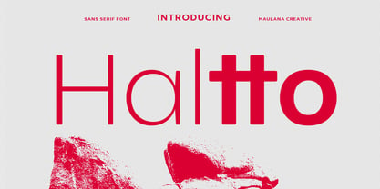 Haltto is a geometric based sans serif font. 2 weights stroke, fun character with a bit of ligatures and alternates. To give you an extra creative work. Haltto font support multilingual more than 100+ language. This font is good for logo design, Social media, Movie Titles, Books Titles, a short text even a long text letter and good for your secondary text font with script or serif. Make a stunning work with Haltto font. Cheers, Maulana Creative
 - Tomate by Re-Type,
$45.00 Tomate started in 2006 as a brush lettering exercise for a poster and was later used for the ReType identity. In 2008 its author decided to turn it into a super fat typeface suitable for packaging and mass consumption products. The possibilities of ultra heavy forms are explored in this alphabet; trying to solve the design problems that these sort of forms present. Tomate shows influences from the beautiful Goudy Heavyface Italic which is a design the author admires.
 - Quta by Fo Da,
$15.00 Quta is a sans serif typeface produced by FoDa foundry, that meets all the needs of professionals who search a family of clean geometric font, very well suited for headlines, newspaper and many purposes. With a basic character set in Five weights with their italics. Quta covers many features like: -Five main weights (Light, Regular, Medium, Bold and Extra Bold) -Matching italics for all weights. -language support for many Latin-based scripts -Ligatures and many other OpenType features.
 - Zholud's Modern Ghotic by Vladzh,
$30.00The first ideas about creation this font appeared in spring 2005. I took gothic fonts and a technique of feather as the base and create something unusual. Zholud's Modern Ghotic font has only A-Z, a-z, 0-9 and . , : ; ' " ! ? - characters. I recommed you to use this font in headers. It looks better if you'll start each word with Caps. Please use an application that supports kerning in order to display the spaces between characters correctly. - Jugenstil Kunsthand by Scriptorium,
$12.00Jugendstil Kunsthand is based on a sample of late 19th century lettering in a style often associated with artists of the Jugendstil Art Nouveau movement in Germany. The characters are done in heavy outline with a rough-hand drawn look. The style is interesting because it shows the influence of the Arts and Crafts movement on Art Nouveau with many of the characters featuring alternate versions that nest together in a manner typical of Arts & Crafts lettering. - Eckhardt Titling JNL by Jeff Levine,
$29.00Eckhardt Titling JNL is another treatment of a popular typeface that lends itself well to the hand-lettered sign and display work of days past. A clean sans serif with a slight touch of Art Deco, this font renders well from small point sizes to large posters. As with other fonts in this series, it is named in honor of Jeff Levine’s good friend Albert Eckhardt, Jr. who owned Allied Signs in Miami, Florida from 1959 until his passing. - Textbook New by ParaType,
$30.00 Designed for ParaType in 2007 by Isabella Chaeva. The type is based on Bukvarnaya (TextBook) photocomposing version designed in 1987 by Emma Zakharova. The initial Bukvarnaya for metal composition was created at Polygraphmash in 1958 by Elena Tsaregorodtseva. It was developed for primers and the first level school textbooks. An early sans serif ('Grotesque') with half-closed static letterforms. For use in book and magazine typography, advertising and headlines. Also may be useful as screen font.
 - Refugio NF by Nick's Fonts,
$10.00This family is based on an offering in Barnhart Brothers & Spindler’s Type Specimen Catalog No. 9, issued around 1910, originally named "Grant". It makes a handsome addition to the Whiz-Bang Woodtype series, and is available in both a Rustic and Refined version. Named for a town in Texas, which the locals pronounce "Reh-FURRY-o". Both versions of this font contain complete Unicode 1252 (Latin) and Unicode 1250 (Central European) character sets, with localization for Romanian and Moldovan. - Disco Inferno NF by Nick's Fonts,
$10.00Set the mirrored ball spinning, and get down to Funky Town. Based on a period piece appropriately named Disco 79, this version shifts the concentric elements so that they appear to be lit from below, adding impact and, perhaps, even a sinister touch. You'll also find special treats at the dagger, double dagger and section mark positions. This font contains the complete Latin language character set (Unicode 1252) plus support for Central European (Unicode 1250) languages as well. - E-Lie by Shaun C. Kennedy,
$99.99E-Lie is based on the logo for the Portland band E-Lie. Jon Lincicum designed the logo, and then the basic shapes of the principal letters and numbers. He then gave these designs to Shaun Kennedy, who expanded the design, adding punctuation, accented letters, and math symbols. Shaun then compiled the designs into an OpenType font, adding kerning and ligature information. The design is a distinctive, stylistic font excellent for use when you need to grab someone's attention.