10,000 search results
(0.072 seconds)
- Sibre by 38-lineart,
$80.00 We present "Sibre," a flexible and dependable serif family font that is ideal for any design project. This font family offers a wide range of possibilities for headers, subheaders, body text, captions, and displays. A total of 16 fonts are available, including 7 regular weights, 7 italics. 1 regular varible and 1 italic variable The font "Sibre" has a flexible appearance and a distinctive, quirky, and memorable name. It can be either feminine or masculine, glamorous or elegant, or anything in between, depending on your design. A variety of uses are considered in the design of Soulkind. It works perfectly for both contemporary digital designs and classic print media like books and newspapers. Furthermore, this font family is multilingual and supports a variety of languages in Latin. All in all, the Sibre font family is adaptable, authoritative, and created to make your content stand out. It doesn't matter if you're designing a website, a brand identity, or anything else—Soulkind is the best option.
 - Big River by Ana's Fonts,
$15.00 Big River is an elegant sans serif and handwritten font duo with lots of extras. It includes: - A wide sans serif font in three weights (with caps and small caps); - A handwritten font with a regular and slant version, and bonus swashes to give your designs a more natural look. Each font includes: - A-Z, a-z, 0-9, accents, punctuation and symbols - Contextual alternates (script) - Ligatures (script) This font duo makes it so easy to achieve beautiful and eye-catching designs, and is perfect for both short and longer texts. It can be used for making postcards and notes, creating logotypes, social media posts, branding and packaging, etc. Please note: No special software is needed in order to access the extras, as they are in a different font file. You can simply access them directly in your font bar (a-z for terminals in regular, A-Z for terminals in italic, and 0-1 for squiggles).
 - Gladolia by Ahmad Jamaludin,
$17.00 Get ready to rock your designs with the brand new Chunky Groovy Font, GLADOLIA! 🎉 Gladolia is a chunky typeface with a unique retro style that is sure to make your designs stand out. With 2 different style fonts, regular and oblique, plus an extra Extruded Font version for each style, you can easily create eye-catching designs without any extra effort. This font is perfect for a retro 80s theme and can be used for cover magazines, brochures, logos, headlines or quotes, stand-alone displays, and short paragraphs or content. Each font in the family is dynamic and authoritative on its own, making it perfect for any display project. So what are you waiting for? Elevate your designs with the cool and groovy vibes of Gladolia! 🤘 Similar Item: Sugar Peachy : LINK HERE Gyoza : LINK HERE Gunydrops : LINK HERE Swipe: LINK HERE Replay : LINK HERE Bright : LINK HERE Margin : LINK HERE Nighty : LINK HERE What you get? Gladolia Regular Gladolia Italic Gladolia Shadow Regular Gladolia Shadow Italic Features : Alternates and Ligatures Instructions ( Access special characters, even in circuit design ) Letters, numbers, symbols, and punctuation No special software is required to use this typeface even work in Canva Multilingual Support Give your design projects that fun, playful edge with GLADOLIA! Thank you, Dharmas Studio
 - Kickbox by Ahmad Jamaludin,
$19.00 Introducing KICKBOX Fonts - Unleash the Power of Nostalgia and Captivate Pop Culture, Lifestyle, and Music and Film Branding Looking to infuse your brand with a burst of retro charm and a dash of pop culture? Say hello to our KICKBOX Fonts! Designed with 3 styles: Narrow, Regular, Wide to make your brand stand out in the realms of pop culture, lifestyle, music, and film branding. These fonts are an absolute game-changer. KICKBOX transports you to the golden era of the past, evoking a sense of nostalgia that resonates with pop culture enthusiasts. Seamlessly blending boldness and authenticity, they captivate the hearts of your audience, adding a unique and irresistible touch to your brand identity. KICKBOX has 3 widths on each type: Narrow - Regular - Wide so can be perfect for any retro project like logotype, branding, title, packaging, and many more Features: Kickbox Main File Has 3 Variable: Narrow - Regular - Wide Instructions (Access special characters, even in Cricut Design) Unique Letterforms Works on PC & Mac Simple Installations Accessible in Adobe Illustrator, Adobe Photoshop, Microsoft Word even work on Canva! PUA Encoded Characters Fully accessible without additional design software. Embrace the captivating allure of our KICKBOX today and unleash a world of endless possibilities! Enjoy Designing! Dharmas Studio
 - Koo Koo Puff by astroluxtype,
$20.00 Does the world really need one more vernacular pop culture typeface? We here, at astroluxtype shout a resounding yes! Sure, at myfonts.com, you can find the apex of fine font design that will have your mind and eyes burst with joy at the level of sophistication and craftsmanship they exhibit- Koo Koo Puff Light Condensed and Regular Condensed are not one of those fonts. But if kooky goofy is your thing, we're selling it at the astroluxtype booth. Koo Koo Puff Regular Condensed is the companion font to Koo Koo Puff Light Condensed. Both fonts includes an upper and lowercase glyph set. Regular Condensed has a different upper and lowercase “O” from the original Koo Koo Puff Light Condensed. Spacing metrics are looser, as well. The font is not a match for Light Condensed, it is a separate font. Both are headline display faces, for optimum usage it is recommended to be set at 48 points or larger in size. Look to astroluxtype’s Sugarbang ! as the first in a series of fonts inspired by vintage product packaging, Koo Koo Puff is the second release in the Cerealboxx series. The third font is in the fridge getting cool now, watch for it in the future. Rave on you design genius.
 - Elektrakution by Comicraft,
$19.00 SHE'S DEAD, FRANK It's the year 1991, BC (Before Comicraft) when REM were still making records and Frank Miller’s memorable run on Marvel Comics’ DAREDEVIL was just over ten years old. Comicraft’s Richard Starkings found himself working in Anaheim, California for Graphitti Designs. Graphitti had produced the first hardcover edition of Miller’s Batman tale, DARK KNIGHT RETURNS and was now putting together the sequel to Miller’s DAREDEVIL — ELEKTRA LIVES AGAIN! Richard was not engaged to letter this book, the pages of Frank’s incredible original art that came through Graphitti’s studio were already lettered by Marvel Stalwart, Jim Novak. However, there were some cover elements that needed to be added, based on the logo originally rendered by Frank’s brother, Steve. Starkings set about the task of creating an alphabet that could be used to develop Steve’s idea for the trade dress -- the cover elements, the back cover copy and credits on the interior pages. This was long before Macintosh computers and font programs made this work considerably easier, so Rich sat down with a pencil and a sheet of vellum and rendered an alphabet that could be used as the basis for the text that was needed... Those sketches have languished in a drawer for nearly thirty years, but now, finally, Comicraft’s John Roshell has dusted off those old letterforms and Elektrakuted a font based on those designs, a font we HAD to call ELEKTRAKUTION! As for Elektra; she’s dead, Frank. Features: Ten weights (Light, Regular, Bold; Rough Light, Regular & Bold; Inline, Inline Rough, Outline & Outline Rough) with upper & lowercase characters, Western & Central European accents and Greek characters.
 - VLNL Melk by VetteLetters,
$29.99 At VetteLetters we like food but we also appreciate our drinks. Yes, of the non-alcoholic kind as well. Like milk. Contrary to what Arnold Schwartzenegger once said, Milk is not just for babies. It contains a whole lot of stuff that is genuinely good for you. Like proteins, carbohydrates, minerals (calcium a.o.) and many vitamins. One time visiting The Hague, Donald DBXL spotted a tile tableau on a brick wall, advertising a dairy factory called ‘De Sierkan’. Yellow sans serif letters on a bright blue background, dating back to the late 19th century, immediately grabbed DBXL’s attention. Especially because the tableau showed both regular and bold letters with some lovely peculiarities here and there. De Sierkan appeared to have been a milk factory solely operating in The Hague from 1879 until 1961. A number of these wall adverts are still to be seen in The Hague streets today. Photos were taken for later reference. Later is now, the lettering has been digitized, missing characters added, and VLNL Melk sees the light of day. VLNL Melk is an all-caps geometric display sans serif family of three weights, Regular, Bold and Black. The basic shape of the letters is a rectangle with rounded corners, leaving a sturdy no-nonsense look and feel. It has a distinct historic aura, but with both feet in this digital day and age. It can equally well be used for the logo of a hipster coffee place, as the cover of a historic novel. Actually, VLNL Melk kan be applied in a wide range of designs like logos, posters, flyers, book covers and magazine headlines.
 - Fangs ALot by Ingrimayne Type,
$9.00 FangsALot is a bizarre typeface family that was designed to alternate two character sets. These sets are alternated automatically in applications that support the OpenType feature Contextual Alternatives (calt). The template used to design characters is a distorted triangle that resembles a curved tooth or a fang. This shape can be flipped horizontally, vertically, and both horizontally and vertically to give four orientations. Two of these orientations are used in the regular style and two in what is called the italic style. I thought the fang motif did not come through clearly in the regular and italic styles. Rather the impression they give is more like graffiti lettering. To emphasize the fang motif I added two more members to the family by filling fang outlines with unadorned sans-serif characters. Then to allow more color in lettering, I added two more styles with letters on black. I then had six styles based on triangles skewed left and right. Why not fill the family out with three more styles based on an isosceles triangle? The end result is a family of nine. All members of the family are monospaced and are hard to read. The three graffiti-like styles have some alternative letters that can be accessed with the OpenType feature Stylistic Sets. Also, for each style it is possible to use only one set of characters by adding a space after each letter and then adjusting the character spacing. The graffiti-like styles can be useful in situations where the hard-to-read property is not important but where a menacing and vicious touch is needed, such as topics of sharks, teeth, biting, and vampires.
 - Oliandre Demo - Personal use only

- Declaration - 100% free

- Core Gothic E by S-Core,
$72.00 Core Gothic E is a simple and modern sans-serif Korean font consists of 9 weights (Thin, ExtraLight, Light, Regular, Medium, Bold, ExtraBold, Heavy & Black). Character set is consist of Korean 11,172 characters, Hirakana & Katakana, Latin and Korean symbols. It is well balenced between Korean and Latin characters. Latin typeface (Core Sans E) was adjusted to be matched with korean typeface. Spaces between individual letter forms are adjusted in detail so that it makes perfect typesetting. Supported codepages are MS Windows 1252 Latin1 and MS Windows 949 Korean. We recommend to use for books, web, screen displays and so on.
 - Almost Perfect by Sensatype Studio,
$15.00 A Nostalgic Elegant Serif font that we created special for elegant branding needs, with unique shape will be ready to add value of your brand. It so nice to leverage designer or product owner that need solutions to make their design look more stylish and modern. And specially for Almost font, We prepared any characters to help you create unlimited variations for your creative needs. Almost Nostalgic Serif font ready with: Ready with Regular and Italic version Preview as a inspirations that you can do with Almost font Ready with Lowercase and Uppercase characters Wish you enjoy our font. :)
 - Litho Display by Arkitype,
$9.00 Litho Display is a bold display typeface, it has 8 fonts in the family with four different styles. Litho Display has been created with bold headline and poster typography in mind. It is perfect for use on typography heavy posters, packaging or on screen idents. The four different styles Litho Display comes in is Regular, Rounded, Rough and Press each with an italic pairing. With these styles Litho Display is versatile for various different uses whether it needs to be clean type for a poster or on screen or a more rough and rustic style for some packaging.
 - Wildcat by K-Type,
$20.00 The starting point for Wildcat was the 3×5 squared grid popular for tiled lettering and American sportswear typefaces. However, Wildcat breaks free of the net whenever necessary. This typeface comes across as tough, it has no soft curves, and evokes strength and confidence. Unlike other collegiate-style fonts, Wildcat includes a real lowercase which makes the face particularly usable and adaptable. Wildcat also contains a full complement of Latin Extended-A characters. Three fonts are included in the download; Regular, College and Outline. The College and Outline fonts share identical spacing and kerning, so can be overlapped to create bicolor artwork.
 - New Millennium Linear by Three Islands Press,
$24.00New Millennium Linear is one of three font families that share a common name, a common design philosophy, a common x-height, and basic character shapes. (The others are New Millennium and New Millennium Sans; all three work well together.) New Millennium Linear is a "monotone" newer version of the Sans face whose smooth, geometric, "Gothic" look gives it a completely different personality. The typeface comes with regular, bold, italic, and bold italic styles, each with a complete character set. New Millennium Linear might best be used in captions, callouts, labels, titles, and similar display situations. - Filarion by Locomotype,
$15.00 Filarion is inspired by a bit of 60s typography. At first glance it looks contrasting but is executed in a different way. The lines are drawn irregularly so that it looks casual and not stiff. From a clean basic form (Regular), Filarion was developed into three different variants, namely Bulbous, Noetic and Print. Each of them has an oblique style. So you will get 8 fonts from Filarion family. This font is suitable for use as a title in broadcast videos, movies or poster designs. It can also be used on quotes and other promotional materials that require extra attention.
 - Kevlar by Letterbox,
$50.00 Kevlar was initially inspired by an obscure logo discovered in a 1960s radio-fan magazine. Of immediate interest was that the upper half of the typeface appeared to be a sans while the lower half appeared as a curious blend of a slab serif imbued with a script-like quality. First came Kevlar Bold in 2003, closely followed by its text weight companion Kevlar Regular. The original source of the inspiration as then revisited to develop the third in the set, Kevlar Slab, a truly individual mix of script-like fluency with the heavy weight base of a slab serif.
 - HiTone by Scholtz Fonts,
$19.00 HiTone emulates a natural hand-lettered typeface that provides exceptional legibility with a quirky style. It comes in three widths, the narrowest of which enables text to be placed compactly within a limited space. The widest, on the other hand, increases readability while maintaining the same stroke weight. In addition, each width comes in two weights, regular and black, enabling the user to provide emphasis or headline display without changing the essential style of writing. The font is most useful as a stylish text font. The font has all the features of a fully professional typeface. Language support includes all European character sets.
 - Karolinus Fraktur by Cercurius,
$19.95 A slightly regularized digital version of a late Baroque Fraktur type, probably from the beginning of the 18th century, issued by the Norstedts type foundry in Stockholm in 56 point size as "Sju petit fraktur nr 2". This digital font is designed for rather large sizes, at least 30 points. The font includes accented letters for all Western languages, as well as a long s and the usual Fraktur ligatures, e.g. ch, ck, st, tz. The font can be used for logos, packaging, posters, restaurant menus, beer and wine labels etc. associated with traditional German and Scandinavian culture.
 - Kidyzen by Niznaztype,
$10.00 Kidyzen is a sans handwritten typeface. Inspired from the character of kids writing in their book. Kidyzen have unique style because it like same with typing of children. Kidyzen is perfect for comic, illustration, cartoon, kids design and very suitable for speech bubble text. It have very fun, cute, easy communication, easy reading and unique styles. You can use it for kids t-shirt, cover book, tagline, poster, branding, advertising, wall painting letter and graphic designs that use kids character . Kidyzen have 6 styles, there are regular, italic, bold, bold italic, thin and thin italic. Be enjoy it with my fonts.
 - Gene Condensed JNL by Jeff Levine,
$29.00 Gene Gable is known to many graphic artists from his on-line column 'Scanning Around with Gene', which was on the Creative Pro website for a number of years, covering a variety of topics ranging from printing techniques to paper ephemera; water applied decals to lettering stencils. Gene has also been a great help in providing vintage source material to Jeff Levine, which resulted in many additional font designs. It seems only fitting that he should be bestowed with his own-named font as well. Gene Condensed JNL is offered in both regular and oblique versions.
 - Rumley Moon by Letterhend,
$17.00 Rumley Moon is a versatile bold font with unique letterform. This font will bring you back to retro feel.This font perfectly made to be applied especially in logo, and the other various formal forms such as invitations, labels, logos, magazines, books, greeting / wedding cards, packaging, fashion, make up, stationery, novels, labels or any type of advertising purpose. Features : Regular & outline version Uppercase & lowercase Numbers and punctuation Multilingual PUA encoded We highly recommend using a program that supports OpenType features and Glyphs panels like many of Adobe apps and Corel Draw, so you can see and access all Glyph variations.
 - Gatsby Modern by Nicky Laatz,
$15.00 Gatsby Modern Serif takes its cues from the "Roaring Twenties" , an era when breaking from the norm was the order of the day, when femininity took on a charming 'boyishness', and a time when anyone who’s anyone, needed to be bold and ever so slightly, or even not so slightly, eccentric. Perfect at any size - Gatsby Modern does well from large eye-catching headlines , to large paragraphs of small text. Great for modern branding, posters, logos, social media projects, headers, advertising and so much more. Gatsby Modern is available in two weights, regular and a heavier set bold to suit your project needs.
 - Love The Journey by Letterhend,
$14.00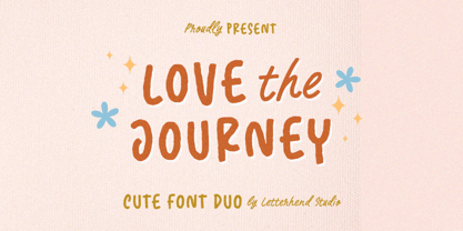 Love The Journey is a cute handwritten font. It comes with 2 looks, regular and slant version. This font perfectly made to be applied especially in logo, and the other various formal forms such as invitations, labels, logos, magazines, books, greeting / wedding cards, packaging, fashion, make up, stationery, novels, labels or any type of advertising purpose. Features : Uppercase & lowercase Numbers and punctuation Alternates & Ligatures Multilingual PUA encoded We highly recommend using a program that supports OpenType features and Glyphs panels like many of Adobe apps and Corel Draw, so you can see and access all Glyph variations.
 - PiS Malefiz by PiS,
$24.00 PiS Malefiz is inspired by the hand-drawn type on the package of the german 60's version boardgame „Malefiz“, also known as Barricade or Barricata. Extended to five hand-drawn weights PiS Malefiz turned out to be the weird lovechild of Saul Bass and Ralph Steadman, fun and childish plus angry and strange. Just as playing the boardgame, PiS Malefiz is a wild and superfast rollercoaster ride of emotions! Combine the five interchangeable weights for total whackyness or use the clean and legible thin and regular versions for sleek and slender slanting. Have fun! Keep the dice rolling!
 - Helenium by Greater Albion Typefounders,
$14.95 Informal does not have to mean aggressively modern or casual. Helenium is inspired by some hand drawn capitals that I found added to a 19th century map. It's a great font for informal titles and headings that still keep an air or regularity and ever so slightly period elegance. It manages to be formal and casual all at once, as well as classical and modern. Helenium's range of different weights and drop shadow effects make it useful for hierarchical titles and headings. Helenium miniscule adds greater flexibility by extending the family with a fun range of rounded lower case forms.
 - Frequent by PizzaDude.dk,
$19.00 This font was originally meant to be my last creation of 2022, but as it turned out, it was the first font of 2023 instead! Why? Well, because it took me a lot of time to complete the 150 different swahes letter combinations, the 182 different letters (not counting numbers, accented characters etc) the small caps, the subscript and the multilingual support! Anyway, it was worth the work - the Frequent font works great as a display font, or whatever you have in mind. Play around with the different versions (Regular, Solid and Inside) for great results.
 - Letro by Thinkdust,
$10.00 Letro’s sturdy, slab serif form and sleek alternates make it perfect for any sort of display, whether it’s professional or personal, casual or serious, big, small, on a computer screen or on paper. Letro does everything: elegant while slightly blocky, stylised while legible, solid but full of finesse, this font isn’t the jack of all trades, it comes close to being the master. Letro comes in two weights, light and regular, with support for a multitude of languages. When you need a font with serifs to get the job done, Letro is your go to type.
 - Hostile Portia by Letterhend,
$19.00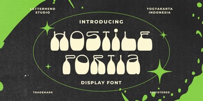 Hostile Portiais a reverse display font with fun and playful looks. This type of font perfectly made to be applied especially in storybook children or child theme which is need a standout font, and the other various formal forms such as invitations, labels, logos, magazines, books, greeting / wedding cards, packaging, fashion, make up, stationery, novels, labels or any type of advertising purpose. Features : regular & hand drawn numbers and punctuation multilingual PUA encoded We highly recommend using a program that supports OpenType features and Glyphs panels like many of Adobe apps and Corel Draw, so you can see and access all Glyph variations.
 - RM True To Type by Ray Meadows,
$19.00 Throw away the carbon paper, ribbons and Tippex ... now you can get that typewritten look with RM True to Type. Legible at all sizes, it is available in regular and bold. That faithful old typewriter has given many years of valiant service, but now the keys are worn and blocked with ink. The Old styles replicate the wear and tear of years of use. Includes: Western European, Central European, Baltic & Turkish sets Due to the modular nature of this design there may be a slight lack of smoothness to the curves at very large point sizes (around 100 pt and above).
 - Core Gothic M by S-Core,
$72.00 Core Gothic M is a simple and modern sans-serif Korean font consists of 7 weights (Light, Regular, Medium, Bold, ExtraBold, Heavy & Black). Character set is consist of Korean 11,172 characters, Hirakana & Katakana, Latin and Korean symbols. It is well balenced between Korean and Latin characters. Latin typeface (Core Sans M) was adjusted to be matched with korean typeface. Spaces between individual letter forms are adjusted in detail so that it makes perfect typesetting. Supported codepages are MS Windows 1252 Latin1 and MS Windows 949 Korean. We recommend to use for books, web, screen displays and so on.
 - UT Laurelle by Uniontype,
$20.00 Laurelle is a polished and smooth script family. The family consists of light, regular, bold and press styles. Laurelle provides advanced typographical support with contextual alternates, final forms, ligatures and swashes. This font also includes Cyrillic, with all OpenType features. It is most suitable for the headlines of all sizes, as well as for the text blocks. Laurelle is versatile and can be used on cards, posters, merchandise, book covers, websites, packaging, and basically anywhere you like. The overall feel of the font is warm, elegant and informal and it is perfect if you want to convey a sense of friendliness and style.
 - Brother Tom by Letterara,
$10.00 Brother Tom is a textured brush font. It has a natural handmade look with a less regular baseline. Give your designs an elegant yet completely modern look with Brother Tom. It's a great font font for any branding, posters designs, and for your upcoming winter stuff. Features : - Upper Case & Lowercase - Numerals - Punctuations (OpenType Standard) - Accents (Multilingual characters) - underline in swash - Works on PC & Mac - Simple installations - Accessible in Adobe Illustrator, Adobe Photoshop, Adobe InDesign, even works on Microsoft Word. Don't wait anymore, put it in your shopping basket and follow me, because there will be many promos!
 - Youngblood Antique by insigne,
$21.99 Youngblood Antique is a distressed non-connected formal script with tall, sweeping ascenders. Three variants are available, including an inked regular font, a font drawn with a dry brush and a distressed, grungy version. Sixty-four OpenType ligatures add a realistic, natural effect and ensure that no two letters in a word repeat. Youngblood Antique also includes OpenType ending swashes, and old style figures and 30 alternate characters that allow designers to customize the ascender and descender swashes. Be sure to check out the non-distressed original Youngblood. Youngblood Antique works great in conjunction with insigne Splats!.
 - Naomi Style by Sensatype Studio,
$15.00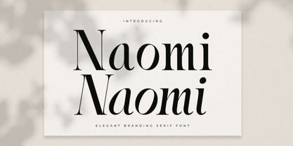 A Serif font that we created special for elegant branding needs, with extra ligature and alternates in unique shape will be ready to add value of your brand. It so nice to leverage designer or product owner that need solutions to make their design look more stylish and modern. And specially for Naomi font, We prepared any ligatures characters to help you create unlimited variations for your creative needs. Naomi Serif font ready with: Ready with Regular and Italic version Preview as a inspirations that you can do with Naomi font Ready with Lowercase and Uppercase characters Wish you enjoy our font. :)
 - Broken Glade by Letterhend,
$17.00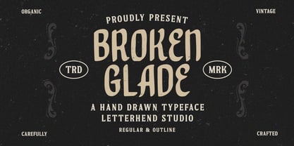 Broken Glade is a classic hand drawn with vintage looks!. This unique font has 2 styles : regular and outline. This font perfectly made to be applied especially in logo, and the other various formal forms such as invitations, labels, logos, magazines, books, greeting / wedding cards, packaging, fashion, make up, stationery, novels, labels or any type of advertising purpose. Features : Uppercase & lowercase Numbers and punctuation Multilingual PUA encoded We highly recommend using a program that supports OpenType features and Glyphs panels like many of Adobe apps and Corel Draw, so you can see and access all Glyph variations.
 - Safrina by Cocodesign,
$12.00 Safrina Script is a modern calligraphy design, including Regular. This font is casual and beautiful with swash. Can be used for various purposes. such as logos, product packaging, wedding invitations, branding, headlines, signage, labels, signatures, book covers, posters, quotes, and more. Safrinal Script includes a change of the OpenType language style, binding and international support for most Western languages. To activate the OpenType Stylistic alternative, you need a program that supports OpenType features such as Adobe Illustrator CS, Adobe Indesign & CorelDraw X6-X7, Microsoft Word 2010 or newer versions. How to access all alternative characters using Adobe Illustrator:
 - Origen by Alex Camacho Studio,
$35.00 Origen is a typeface inspired by the illuminated manuscripts whereby the text is accompanied by a decorative capital letter at the start of the text. The family is formed by three different weights (light, regular, bold) and an additional decorative set of capital letters. Each of the four styles has characters to write in all Latin-based languages. It is an Open Type font. The Origen family is a hybrid between Textura and Rotunda fonts, characterized by a dynamic calligraphic flow. Origen is also playful as it can be use in editorial, advertising and packaging designs to capture viewers' attention through refined details.
 - Neiva Flowers by Niznaztype,
$15.00 Thanks for checking my font’s work, Neiva Flowers typeface. It’s postmodern script font. Neiva Flowers have a feminism styles and ethnic curves. Very perfect for adding unique and slegant character to your branding project. Also, Neiva Flowers font is suitable for wedding lettering, beautiful touch in your all graphic design. This font have two styles, regular and italic. It contains a full set of lowercase, uppercase, punctuation, numeral and multilingual support. Neiva Flowers typeface also can support your design to be more better. You can use it in lettering, wall painting, cover, advertising, invitation, card, feminism design, script lettering design and more.
 - Gageac by Eurotypo,
$29.00 Gageac is a classic "Didona" font, characterized by an extreme contrast in the thick and thin strokes, by the use of short serifs, and by the vertical stress of the letters. This typeface is slightly condensed, the ascenders were lowered, the thick strokes were exaggerated and enriched with a full set of OpenType features of tails, ligatures, alternates and swashes, giving them an excellent legibility and a very clear and elegant appearance. The italic version is a true "italic" so some glyphs were adjusted. Gageac Italic was carefully designed and drawn to be combined with Gageac Regular.

