10,000 search results
(0.098 seconds)
- Teorema Sans by FSdesign-Salmina,
$39.00 Teorema. Well balanced Reading. Looking for a geometric yet flexible character? Teorema typeface combines different geometric shapes, according to a pragmatic approach that favors flexibility and ease of use. The font is distinguished by the contrast between perfectly circular shapes, and other, more angular ones in search of a formal balance aimed at optimizing the recognizability of the characters and finally the legibility of the text. Worthy of a geometric “theorem”? Try Teorema for free. Download a free version of Teorema Regular and Bold with a reduced character set. Check it out!
 - Stacylia by Letterhend,
$19.00 Introducing, Stacylia - a bold handwritten script typeface. This type of font perfectly made to be applied especially in logo, and the other various formal forms such as invitations, labels, logos, magazines, books, greeting / wedding cards, packaging, fashion, make up, stationery, novels, labels or any type of advertising purpose. Features : uppercase & lowercase numbers and punctuation multilingual alternates and ligatures PUA encoded We highly recommend using a program that supports OpenType features and Glyphs panels like many of Adobe apps and Corel Draw, so you can see and access all Glyph variations.
 - Breakshot by Letterhend,
$14.00 Break Shot is a bold display sans font. This type of font perfectly made which is need a standout font, and the other various formal forms such as invitations, labels, logos, magazines, books, greeting / wedding cards, packaging, fashion, make up, stationery, novels, labels or any type of advertising purpose. Features : regular & stamp numbers and punctuation multilingual ligatures PUA encoded We highly recommend using a program that supports OpenType features and Glyphs panels like many of Adobe apps and Corel Draw, so you can see and access all Glyph variations.
 - Blantika by Letterhend,
$19.00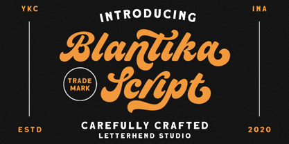 Introducing, Blantika Script - a bold script which is purposely made for logotype. This type of font perfectly made to be applied especially in logo, and the other various formal forms such as invitations, labels, logos, magazines, books, greeting / wedding cards, packaging, fashion, make up, stationery, novels, labels or any type of advertising purpose. Features : uppercase & lowercase numbers and punctuation multilingual alternates and ligatures PUA encoded We highly recommend using a program that supports OpenType features and Glyphs panels like many of Adobe apps and Corel Draw, so you can see and access all Glyph variations.
 - Sanitation JNL by Jeff Levine,
$29.00 Sanitation JNL is a bold Art Deco sans design inspired by some stylized hand lettering on a 1930s-era WPA (Works Progress Administration) poster and is available in both regular and oblique versions. The topic of the poster was "Your home is not complete without a sanitary unit" and that was recommended by the State Department of Public Health. A "sanitary unit" is the formal name for what rural folks called an "outhouse", and it's presumed the target group were homeowners not hooked up to major sewer lines such as in those rural areas.
 - New Cuisine by Stephen Rapp,
$59.00 New Cuisine is a departure from formal, handwriting, and retro scripts. Influenced by the DIY lettering generation New Cuisine is a joyful looking script with all the right moves. Its bold graphic presence makes it ideal for packaging, online journals and blogs, signage, logos, and menus. Under the hood of New Cuisine lie precise connections, unique ligatures and alternates, and OpenType programming to orchestrate it all. Because of this, typesetting turns into a simple and playful experience. Also included are a simple fraction feature as well as Central European language support.
 - Gamila Arabic by Zaza type,
$24.00 Gamila is a new Arabic font that is inspired by the traditional Naskh style. It is elegant and versatile, with five different weights ranging from light to bold. This font is perfect for a wide range of design projects, including book covers, brochures, posters, and more. The Naskh style is known for its legibility and readability, making Gamila a great choice for long-form text. Whether you are working on a formal document or a creative project, Gamila is sure to impress with its refined and sophisticated appearance.
 - Mayburn by Letterhend,
$19.00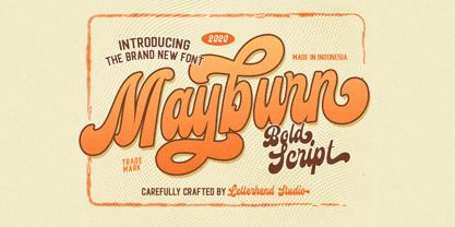 Introducing, Mayburn Script - a bold script with a touch of retro feel. This type of font perfectly made to be applied especially in logo, and the other various formal forms such as invitations, labels, logos, magazines, books, greeting / wedding cards, packaging, fashion, make up, stationery, novels, labels or any type of advertising purpose. Features : uppercase & lowercase numbers and punctuation multilingual alternates and ligatures PUA encoded We highly recommend using a program that supports OpenType features and Glyphs panels like many of Adobe apps and Corel Draw, so you can see and access all Glyph variations.
 - Sogate by Letterhend,
$19.00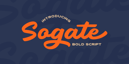 Introducing, Sogate - a bold script which is purposely made for logotype. This type of font perfectly made to be applied especially in logo, and the other various formal forms such as invitations, labels, logos, magazines, books, greeting / wedding cards, packaging, fashion, make up, stationery, novels, labels or any type of advertising purpose. Features : uppercase & lowercase numbers and punctuation multilingual alternates and ligatures PUA encoded We highly recommend using a program that supports OpenType features and Glyphs panels like many of Adobe apps and Corel Draw, so you can see and access all Glyph variations.
 - Bellasmith by Abbasy Studio,
$15.00 Bellasmith, is a pair of bold sans and monoline script with a touch of vintage look. This script font comes with multiple alternates that will make your words look like a custom lettering. With additional sans font you will be able to create the beautiful combination. This type of font perfectly suitable for made to be applied especially in logo, and the other various formal forms such as invitations, labels, logos, magazines, books, greeting / wedding cards, packaging, fashion, make up, stationery, novels, labels or any type of advertising purpose.
 - Thirtylane Script by Letterhend,
$19.00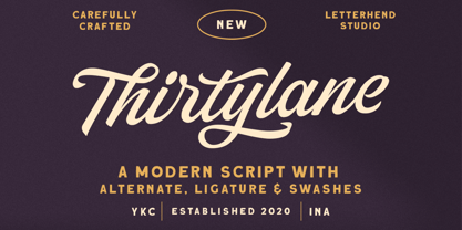 Introducing, Thirtylane - a bold script which is purposely made for logotype. This type of font perfectly made to be applied especially in logo, and the other various formal forms such as invitations, labels, logos, magazines, books, greeting / wedding cards, packaging, fashion, make up, stationery, novels, labels or any type of advertising purpose. Features : uppercase & lowercase numbers and punctuation multilingual alternates and ligatures PUA encoded We highly recommend using a program that supports OpenType features and Glyphs panels like many of Adobe apps and Corel Draw, so you can see and access all Glyph variations.
 - Raksana by Letterhend,
$19.00 Introducing, Raksana. A retro bold script which will bring you back to 60s feel. This font perfectly made to be applied especially in logo, and the other various formal forms such as invitations, labels, logos, magazines, books, greeting / wedding cards, packaging, fashion, make up, stationery, novels, labels or any type of advertising purpose. Features : uppercase & lowercase numbers and punctuation multilingual ligatures alternates swashes PUA encoded We highly recommend using a program that supports OpenType features and Glyphs panels like many of Adobe apps and Corel Draw, so you can see and access all Glyph variations.
 - Bunken Tech Sans Wide by Buntype,
$49.00 The Bunken Tech Sans superfamily: A reminiscence of constructed fonts of the modern age designed with considerably cleaner forms. •See other members of the Superfamily: Bunken Tech Sans •For further details, view the Specimen PDF. Bunken Tech Sans Wide follows in the best tradition of the straight-lined and somewhat angular structures of its predecessors while offering a much more open and mild design. The shapes of the letters are therefore reduced to the most essential elements: The spurs on a, b, n and other lower case letters occur just as little as decorative or style details, the lightly rounded inside edges are more pleasing to the eye than certain historic role models and make for a harmonic, flowing style. Use In particular Bunken Tech Sans Wide stands out as an easy, distinctive headline font with its straight-lined, technical design. Open counters and large x-height make it equally suited for use in shorter texts. It is also perfectly complemented by Bunken Sans or Bunken Slab in longer texts (available soon). Features Available in 16 styles with widths ranging from Light to Heavy with associated Italics. All of the styles are very extensive: Support for at least 58 languages, Small Capitals, 9 number sets (e.g. Lining, Oldstyle, Tabular and Small Cap Figures), ligatures, alternate characters, numerous Opentype functions, and lots of other small features that make it more pleasant to work with the font on a daily basis as well as fulfilling typographic desires. Each style contains more than 870 characters! Each style is available in a professional (Pro) standard (Std) and Small Caps (SC) edition with a different range of functions. (Language support, OpenType features and number of glyphs). Details can be found on the respective pages. Bunken Tech Sans Wide is part of the Bunken Tech superfamily and is available in Condensed, Normal and Wide. Also of interest: The slab serif variation Bunken Tech Slab Features in Detail: 16 Weights: -Light -Book -Medium -SemiBold -Bold -ExtraBold -UltraBold -Heavy and corresponding Italics 3 Widths: -Condensed -Normal -Wide Alternate Characters: A, E, F, L, S, e, f, t, s, y, etc. Small Capitals 5 Sets of Figures: -Lining Figures -Old Style Figures -Tabfigures -Old Style Tabfigures -Small Cap Figures Automatic Ordinals Automatic Fractions Extended Language Support and more...
 - Bellas Artes by Sudtipos,
$59.00 Bellas Artes is what happens when the brush of Angel Koziupa and the technical expertise of Alejandro Paul go face to face with the Art Deco aesthetic. The recognizable Koziupa curves become players of a game of halves, where there is no such thing as a better half, but both sides complete each other like in that perfect romance you will never forget. Bellas Artes is an excellent choice not only for packaging design, but also for book and music covers meant for the feminine demographic, collateral of classical taste, and of course pre-WWII visuals.
 - Goudy Stout CT by CastleType,
$49.00 This face was recommended to me by Mark Solsburg, president of FontHaus. At first I was a bit reluctant to revive it, if for no other reason than Frederic Goudy’s admission that he created this design “in a moment of typographic weakness.” However, I put the sample that Mark sent me up on my bulletin board, and over a period of time, it grew on me. It finally got to the point that I had to recreate the face, and from the response that I’ve gotten, I’m glad I did! Uppercase only with numerals and punctuation.
 - Glitzy by Ingrimayne Type,
$9.95 Glitzy is a caps-only font with extreme contrast. It was inspired by Art Deco typefaces, especially Broadway by Morris Fuller Benton, but Glitzy is not an attempt to reproduce that typeface. The letters on the lower-case keys differ slightly from the letters on the upper-case keys. The large black interiors invite decoration and the family includes four faces with interior decoration. These four faces with interior decoration can be used in layers with the base font to add color to lettering. (OakPark is a another attempt to do high-contrast lettering with an Art Deco feel.)
 - Mynaruse by insigne,
$22.00 Mynaruse is an elegant and regal roman inscriptional titling family. It has sharp and elongated serifs that give the face extra punch. The face shines in settings that call for elegance and splendor. Mynaruse’s six weights range from a fine, delicate thin to a powerful and solid heavy weight. Mynaruse includes many useful OpenType features, including a set of swash alternates, alternate titling forms, ligatures and miscellaneous alternates. OpenType-capable applications such as Quark or the Adobe suite can take full advantage of the automatically replacing ligatures and alternates. This family also includes the glyphs to support a wide range of languages.
 - Azuza by Parkinson,
$20.00 In the 1990s I drew a text face for the San Francisco Chronicle. It was based on W. A. Dwiggins’ Electra and incorporated many features of the Linotype Legibility Series: More compact, with a taller lowercase X-height, etc. That type was called Electric and it was the Chronicle’s text face for nearly a decade, surviving several redesigns. From that, I made Azuza, a more detailed and sensitive style. Azuza was recognized in the TDC2 type competition in 2001. Then it went into hibernation as a Type 1 font family. Today it is back. Six fonts. Open Type.
 - Chipperly by Greater Albion Typefounders,
$16.95 Chipperly is a brand new face inspired by the art of the Edwardian poster, especially travel posters. It’s good for clear ad legible headings which need a gentle and unobtrusive period touch, and is the latest is Greater Albion’s line of faces to explore the ‘small capitals’ idea. In its regular weight, Chipperly’s glyphs are semi-shaded within an outer outline giving a distinctive look, while the Heavy weight maintains the separate outline but is completely filled. The Light form is an outline alone. All forms unite period elegance with the modern need for clear readiility.
 - Kuenstler 165 by ParaType,
$30.00 Bitstream typeface based on Koch Antiqua by Rudolph Koch (Klingspor, 1922). Koch Antiqua, also known as Locarno and Eve, is the most popular face of one of the great lettering artists of the 20th century. This delicate display face has a small x-height, very tall ascenders, and main strokes that taper gracefully downward. Koch-Antiqua appeared extensively in advertising between the wars. A refined letterform, it is best used sparingly for a distinctive look in advertising, book, and job work. Two weights of Cyrillic version including alternative lc characters were developed by Isabella Chaeva and released in 2008 by ParaType.
 - Mexborough by Greater Albion Typefounders,
$11.50 Tradition meets tomorrow in Mexborough. Mexborough owes its origins to a challenge from a client of ours- they wanted a clear and easily readable typeface to use for signage in public spaces, but with enough flair and style to be suitable for use in heritage precincts. The result is a family of six Roman faces in a single weight, encompassing Regular, Text, Flamboyant, Small Capitals, Capitals and Title forms. These faces combine legibilty with traditional character, ideal for signage and poster work, where dignity and character are required. Mexborough's simple clean lines also lend themselves readily to web and online use.
 - Arial Windows compatible by Monotype,A contemporary sans serif design, Arial contains more humanist characteristics than many of its predecessors and as such is more in tune with the mood of the last decades of the twentieth century. The overall treatment of curves is softer and fuller than in most industrial-style sans serif faces. Terminal strokes are cut on the diagonal which helps to give the face a less mechanical appearance. Arial is an extremely versatile family of typefaces which can be used with equal success for text setting in reports, presentations, magazines etc, and for display use in newspapers, advertising and promotions.
- Portello by Greater Albion Typefounders,
$14.50 Portello is a display family in the tradition of Tuscan advertising and display faces. It's a family of three 'all capital' faces. A perpendicular regular form is offered, along with an italic form (a true italic - with purpose designed glyphs-NOT merely an oblique) and a basic form for small text - which dispenses with the family's characteristic outlined look. It offers the spirit of the Victorian era with ready and distinctive legibility. It's ideal for poster work, especially at large sizes, and for signage with a period flair. Why not give your work the flair of colorful 19th century commercial design today?
 - Generic by More Etc,
$15.00 The Generic Typeface Collection is a series of sans-serif typefaces inspired by the craftsmanship of graphic design, typesetting, and printing in the analogue era – before Adobe, Macintosh computers and desktop publishing – when dinosaurs ruled the earth. With the use of various typesetting apparatuses or dry transfer type, photo copiers, and shooting layouts and paste-ups to film, the printed results was not as exact, precise and predictable as it is today. When examining old prints, it is difficult not to like the way that characters in over- or underexposed film have a special type of vibe to them that is often sadly lost in today’s pursuit of total perfection. Encouraged by this, I saw a need for a collection of typefaces that are non-clinical and non-conformist, and some that are coarse, rough and distorted – errors that might come from poor exposure when put on film, enlargements from small point texts, or maybe quality loss from successive generations of photocopies. Or all of the above. This is an attempt to incorporate spirit and personality into a set of typefaces without losing distinction. You might call it a homage to non-perfection. I call it human. The Generic Typeface Collection consists of 11 fonts divided into four series. The three standard series – the Formal Release series, the Coarse Copy series, and the Rough Display series – all contain three fonts each. The Extra Splendor series contains a couple of shadow fonts for that little extra sparkle. Formal Release – Handcrafted & Clean The Formal Release series features sans-serif typefaces for everyday use. They are handcrafted and clean, human and uncomplicated. The Formal Release series contains three typefaces that add tons of personality to any text. G10 FR ‘Slim’ – a slightly under-exposed and clean typeface in a regular weight (228 glyphs - 1 alternate) G20 FR ‘Classic’ – a properly exposed clean typeface in a bold weight (228 glyphs - 1 alternate) G30 FR ‘Bulky’ – a heavily over-exposed clean typeface in an ultra weight (228 glyphs - 1 alternate) Coarse Copy – Dirty & Rough The Coarse Copy series features non-conformist typefaces that are worn and rough, maybe after going through that bad copier a few times too much. The Coarse Copy series contains three sans-serif typefaces that add tons of spirit to any text without compromising too much on legibility. Try them on in poster-sizes and everyone will know that you mean business. G40 CC ‘Slender’ – an under-exposed coarse typeface in a regular weight (228 glyphs - 1 alternate) G50 CC ‘Typic’ – a properly exposed coarse typeface in a bold weight (228 glyphs - 1 alternate) G60 CC ‘Huge’ – a heavily over-exposed coarse typeface in an ultra weight (228 glyphs - 1 alternate) Rough Display – Faded & Decorative The Rough Display series features attention-seeking decorative typefaces in three feature-packed fonts. Faded and gritty like the image distortion and degradation from successive generations of photocopies, they are eye-catching typefaces intended to stand out in bigger point sizes. Use these typefaces for signage, headlines and similar situations were a strong typographic statement is desired. We have packed no less than 1,334 alternate characters and 212 discretionary ligatures into this series for a greater chance of not having characters that look exactly the same more than once. G70 RD ‘Slinky’ – an under-exposed rough and decorative typeface in a regular weight (741 glyphs – 448 alternates – 66 discretionary ligatures) G80 RD ‘Standard’ – a properly-exposed rough and decorative typeface in a bold weight (748 glyphs – 448 alternates – 73 discretionary ligatures) G90 RD ‘Swollen’ – a heavily over-exposed rough and decorative typeface in an ultra weight (748 glyphs – 448 alternates – 73 discretionary ligatures) Extra Splendor – Sparkling & Extraordinary The Extra Splendor series features two shadow typefaces for that little extra sparkle. One clean shadow to be used with G20 FR ‘Classic’, and one rough shadow to be used with G80 RD ‘Standard’. Having the shadows separate from the main typeface adds another layer of expressiveness in that you can try out color combinations for that extra splendor. Tips for matching (applies to both the base font and the shadow font): Set the kerning to Metric, not optical. Increase tracking to accommodate for the shadows extra width. G25 ES ‘Classic Shadow’ – a clean shadow to be used with G20 FR ‘Classic’ (228 glyphs – 1 alternate) G85 ES ‘Standard Shadow’ – a rough shadow to be used with 80 RD ‘Standard’ (227 glyphs) OpenType features – alternate characters and discretionary ligatures – can be accessed by using OpenType friendly professional design applications, such as Adobe Illustrator, Adobe InDesign, and Adobe Photoshop.
 - Supra Demiserif by Wiescher Design,
$29.00 »Supra Demiserif« is the demi serif addition to the Supra family. I am no fan of slab serif fonts, so I designed this one with half serifs, that makes the serifs less important. Then I found, that the italic does not look nice with slab serifs, so I did only one italic cut for the normal weight. The light and normal weights and the dominant x-height with its high ascenders make for easy reading of long copy. The heavy and x-light weights are great for elegant headlines. Supra is an OpenType family for professional typography with an extended character set of over 700 glyphs. It supports more than 40 Central- and Eastern-European as well as many Western languages. Ligatures, different figures, fractions, currency symbols and smallcaps can be found in all cuts. with each other.
 - Brilliant Fighter by Letterara,
$21.00 Brilliant Fighter is a gorgeous and unique sans serif font. With its neat and beautiful arrangement of letters, this typeface will look outstanding in both formal and non-formal designs. This font was created with care and given a lot of features to make it look very attractive. Its features will look particularly adept when used in logos, branding, packaging design, and much more. This masterfully designed font is a true must-have. This font is PUA encoded which means you can access all of the glyphs.
 - MKorsair - 100% free

- Aramus by Hackberry Font Foundry,
$24.95 Aramus is a new serif font in my continuing objective of designing book fonts that I can really use. In many ways, Aramus is a very different direction for me. It comes from a scan of an old display face that has been radically modified to a much smaller x-height than I have been using lately, plus taller ascenders. Many of the characters needed a lot of correction to bring them into my taste. In general, I have decided that many of my fonts create a type color that is too dense. Aramus is an attempt to get away from that look. Although Amitale has been a very successful book family and excellent to work with, I find I still need something more open with a lighter color. Aramus is the first look at the new direction. The original hand-cut serifs vary a lot, different for almost every character. This gives a little looseness and helps the lightness I am looking for. It will be interesting to see where this all goes. This is a normal serif for me in that it has caps, lowercase, small caps with the appropriate figures for each case. This font has all the OpenType features in the set for 2009. I didn't bother with the CE accents (though I can add them upon request. They will be in the final new book family). There are several ligatures for your fun and enjoyment: bb gg ff fi fl ffi ffl ffy fj ft tt ty Wh Th and more. Like all of my fonts, there are: caps, lowercase, small caps, proportional lining figures, proportional oldstyle figures, & small cap figures, plus numerators, denominators, superiors, inferiors, and a complete set of ordinals 1st through infinity. Enjoy!
 - Redwater Banker by Mans Greback,
$59.00 Redwater Banker is a Western slab-serif typeface. A historical frontier lettering, this font is rough and eroded, with a tough and confident attitude. Redwater Banker is a serif font with a strong cowboy personality, reminiscent of a bank or saloon in the Old West. Use the parenthesis characters ( ) [ ] { } to make patriotic symbols like eagles and crowns. Redwater Banker comes in three styles: The normal Regular, the slanted Italic, plus the bonus Corner font for a decorative edge. The font is built with advanced OpenType functionality and has a guaranteed top-notch quality, containing stylistic and contextual alternates, ligatures and more features; all to give you full control and customizability. It has extensive lingual support, covering all Latin-based languages, from North Europe to South Africa, from America to South-East Asia. It contains all characters and symbols you'll ever need, including all punctuation and numbers.
 - Antoinette Monogrammes by Dharma Type,
$19.99 Antoinette Monogrammes is a monogram font based on old embroideries in the early 20th century by Janon Co. This font includes Upright script capitals and Normal slanted script capitals and 24 fancy frames. By combining each letters and frames, you can make your own monogram. And Every letters and frames were added handwritten effect to make warm and handcrafted impression. How about making monogram for wedding card, scrap book, stamp, logo? Upright script capitals can be accessed by typing Uppercase keys(A, B, C ....) and Slanted script capitals by lowercase key(a, b, c ...). Frames are 0-9 and exclamation mark(!), at mark(@), number sign(#), dollar($), percent(%), ascii circumflex(^), ampersand(&), asterisk(*), left and right brackets(()), period(.), comma(,), less and greater(). You need to arrange and set the position manually to finish making monograms. Please use graphic applications such as adobe illustrator or photoshop but not microsoft word.
 - Costanera by W Type Foundry,
$29.00 Costanera is a neohumanist typeface with both soft strokes and endings, which is inspired by 90s typefaces. It has an organic aspect and curved finials associated to the early calligraphy, while its straight angles give Costanera a technological and futuristic impression. Costanera weights go from thin to black, thus it can be used in short-impact phrases ideally using Black or Thin weight and extensive texts selecting the Book version. On the other hand, due to its calligraphic-futuristic features Costanera is perfectly suitable for different fields, such as vanguard technology, architecture, and signage topics. This typeface is composed of a Normal and Alternative version, adding 32 weights in total. Stylistic sets, small caps, ligatures, lining and old style numbers, fractions, circle numbers and arrows are part of the Opentype features. Moreover, this project comes with 790 glyphs that allows to write in 219 languages.
 - Chorine by The Flying Type,
$24.00 Chorine is a retro face, impacting and comfy, available in two cuts. It's great for vintage, nostalgic and psychedelic pieces yet also for creative contemporary designs. Chorine sounds sixties, sounds seventies and sounds perfectly now. Play it!
 - Sharquefin by Linotype,
$29.99Sharquefin is a round, constructed display face, which contains shark fin-like elements that rise out from part of its letterforms. Gary Tennant, a designer from the UK, designed Sharquefin especially for fun uses, like party flyers. - Zombie by FontHaus,
$15.00 Zombie™ is a cute and playful whimsical font unlike a real Zombie. This monoline display face does not take itself too seriously and is at home in children's books, invitations, headlines or other decorative design projects.
 - Vauxhall NF by Nick's Fonts,
$10.00 Get your groove on with this trippy little gem, based on a Fotostar face called Angelica. Not for the faint of heart. Both versions support the Latin 1252, Central European 1250, Turkish 1254 and Baltic 1257 codepages
 - Lowndes by Greater Albion Typefounders,
$8.50 Lowndes is designed as a Blackletter display face with a spirit of fun rather than historical accuracy, and with an emphasis on legibility and clarity. It's ideal for festive design such as cards, posters etc... Have fun!
 - Dangerfield by Solotype,
$19.95The Barnhart Bros. & Spindler foundry put out a caps-only face called Dante. We liked it, but felt it needed a lowercase. The result here is a rather nice square design, which has become a personal favorite. - Venus by Linotype,
$29.00The Venus type family is a historic hot metal face with left slanted weights that is used for the german cartographic map production. There are also special typefaces required like the Roemisch and Topografische Zahlentafel type family." - XAabced by Ingrimayne Type,
$6.00 XAabced evolved gradually as I reworked earlier attempts to do a text face. It is quite condensed, but with fairly long ascenders and descenders. Blending it with JasperSqueeze resulted in JabcdHy, which I prefer to either parent.
 - Kairengu by insigne,
$15.95Kairengu is a casual and lively rounded sans serif. The characters are "gloopy" as if ink was poured onto page surface. Kairengu is a great choice whenever you need an amusing face with a lot of character.
