213 search results
(0.037 seconds)
- Baker Script by T-26,
$29.00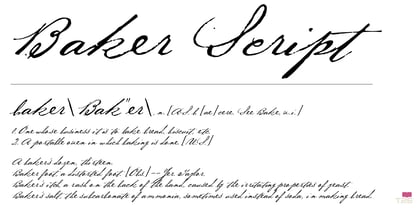
- Baker Street by Kimmy Design,
$20.00 Baker Street was inspired by a recent trip to London, England where I happened upon a bustling pub with beautiful typographic signage. Early sketches created an array of specialized ligatures from which the font really took shape. The family is comprised of regular, italic, inline and a rustic textured style. Baker Street delivers a multitude of Opentype features, primarily including hundreds of discretionary ligatures that connect letter pairs through varying flourishes. These distinct ligatures are used in combinations between two capital letters, two lowercase letters, uppercase to lowercase pairs and specific number combinations. For a number of capital and lowercase letters, large swashes expand above and below the characters. Contextual swashes are also applied to some characters when placed at the beginning or end of a word. Stylistic Alternatives and Titling Alternatives offer distinct style variations to capital letters. Tabular Lining and Oldstyle Figures provide several numerical alternatives. Lastly, the family also includes two sets of ornaments created specially to work with Baker Street’s style. With all that, Baker Street provides each and every user the tools to solve their own case. The game is on!
 - Monotype Baskerville eText by Monotype,
$103.99The eText fonts from the Monotype Baskerville have been specially tuned by our type design experts for a better on screen readability for instance in PDFs. - Baskerville No. 2 by Bitstream,
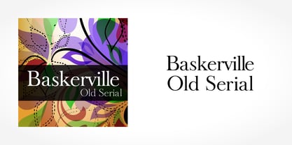
$29.99This redesign is made from proofs, rather than the metal, and so is heavier, with particular attention to the Harris and the Monotype revision, which was made from proofs of Baskerville’s Great Primer (16pt). - Baskerville Old Serial by SoftMaker,
$-
- TS Old Baskerville by TypeShop Collection,
$24.80 - 1785 GLC Baskerville by GLC,
$42.00 This family was created/inspired from the well-known Baskerville Roman and Italic typefaces created by John Baskerville, the English font designer. We were inspired by the original family sent by Baskerville’s wife after his death. The full Baskerville collection was bought by the French editor and author Pierre-Augustin Caron de Beaumarchais who used it to print - in Switzerland - for the first time the complete works of Voltaire (known as the “Kehl edition” from the "Imprimerie de la société littéraire typographique"). We have used this edition, with copies from 1785, to reconstruct these two genuine historical styles. The font faces, kerning, and spacing are scrupulously identical to the original. This Pro font includes characters for Western, Eastern and Central European languages (including Celtic) and Turkish, with a complete set of small caps, standard and “long s” ligatures in each of the two styles.
 - Baskerville Display PT by ParaType,
$30.00 Baskerville Display PT is a type family intended for large and extra large point sizes. It was inspired by the faces of John Baskerville and designed for expressive display typography. Two weights of Baskerville Display with matching italics are much lighter than the existing text versions of Baskerville. Each of them is an ideal partner for ITC New Baskerville. A good addition to the family is Baskerville Poster which will look great in very large sizes. The font was designed by Arina Alaferdova under the supervision of Dmitry Kirsanov and released by ParaType in 2016.
 - Baskerville No. 2 by URW Type Foundry,
$35.00
- Baskerville Old Face by URW Type Foundry,
$35.99
- Baskerville LT Cyrilic by Linotype,
$29.99John Baskerville (1706-1775) was an accomplished writing master and printer from Birmingham, England. He was the designer of several types, punchcut by John Handy, which are the basis for the fonts that bear the name Baskerville today. The excellent quality of his printing influenced such famous printers as Didot in France and Bodoni in Italy. Though he was known internationally as an innovator of technique and style, his high standards for paper and ink quality made it difficult for him to compete with local commercial printers. However, his fellow Englishmen imitated his types, and in 1768, Isaac Moore punchcut a version of Baskerville's letterforms for the Fry Foundry. Baskerville produced a masterpiece folio Bible for Cambridge University, and today, his types are considered to be fine representations of eighteenth century rationalism and neoclassicism. Legible and eminently dignified, Baskerville makes an excellent text typeface; and its sharp, high-contrast forms make it suitable for elegant advertising pieces as well. The Linotype portfolio offers many versions of this design: ITC New Baskerville® was designed by John Quaranda in 1978. Baskerville Cyrillic was designed by the Linotype Design Studio. Baskerville Greek was designed by Matthew Carter in 1978. Baskerville™ Classico was designed by Franko Luin in 1995." - ITC New Baskerville by ITC,
$34.99 ITC New Baskerville is one of many contemporary type families based on the work of John Baskerville (1706-1775), a writing master and printer from Birmingham, England, whose types were cut by the punchcutter John Handy. Baskerville produced a masterpiece folio Bible for Cambridge University, and today, his types are considered to be fine representations of eighteenth-century rationalism and neoclassicism. ITC New Baskerville is a late 20th-century interpretation of Baskerville’s style, designed by John Quaranda. It makes an excellent and very readable text face; its sharp, high-contrast forms make it suitable for elegant advertising settings as well. ITC New Baskerville® font field guide including best practices, font pairings and alternatives.
 - !Basket of Hammers - Unknown license

- KR Easter Baskets - Unknown license

- LHF Centennial Banker by Letterhead Fonts,
$42.00 A bold currency typeface that's perfect for replicating the style of money and old stock certificates. Includes drop caps on lowercase characters.
 - Al Mother Bakery by Aluyeah Studio,
$125.00 Hello Aluyeaholics! Mother Bakery, a handwriting inspired by the warm and fussy nature of a mother baking cakes for her children and grandchildren. Coming with 100+ stunning and super easy to use alternates and ligatures. Super Easy to Use alternates - You can easily call alternates using special combination like a.2 k.3 b.4 th cc etc. To get results like the preview just type Mother.2 Bak.7ery.2
 - Shopping Basket JNL by Jeff Levine,
$29.00 The cover of the vintage sheet music for "This Little Piggie Went to Market" (from the 1934 film "Eight Girls in a Boat") features a hand-lettered sans serif with intermittent chamfered angles. This became the model for Shopping Basket JNL.
 - Baskerville Old Face SH by Scangraphic Digital Type Collection,
$26.00Since the release of these fonts most typefaces in the Scangraphic Type Collection appear in two versions. One is designed specifically for headline typesetting (SH: Scangraphic Headline Types) and one specifically for text typesetting (SB Scangraphic Bodytypes). The most obvious differentiation can be found in the spacing. That of the Bodytypes is adjusted for readability. That of the Headline Types is decidedly more narrow in order to do justice to the requirements of headline typesetting. The kerning tables, as well, have been individualized for each of these type varieties. In addition to the adjustment of spacing, there are also adjustments in the design. For the Bodytypes, fine spaces were created which prevented the smear effect on acute angles in small typesizes. For a number of Bodytypes, hairlines and serifs were thickened or the whole typeface was adjusted to meet the optical requirements for setting type in small sizes. For the German lower-case diacritical marks, all Headline Types complements contain alternative integrated accents which allow the compact setting of lower-case headlines. - Baskerville Old Face KTKM by KTKM,
$55.00 “So-called Baskerville Old Face of the type foundry Stephenson Blake & Co. of Sheffield. The Script is probably not immediately linked to Baskerville, but it is very much influenced by it. It is one of the most beautiful types of which the mats still exist; it has an incomparably different spirit than the ‘streamlined’ re-cuts of today’s Baskerville. Even keeping the general restraint extremely expressive. According to Berthold Wolpe (‘Signatures’ No. 18), the punches were cut and shown in samples in 1776 by Isaac Moore, who came from Birmingham to Bristol.” – Jan Tschichold, “Meisterbuch der Schrift”, Notes On The Plates, Page 231 Publisher note: I wanted to improve the contrast between thick and thin, reduce some ink-traps and give stems, serifs and links a smoother overall feel. I have also added some alternative letters and old style numerals.
 - Baskerville Old Face SB by Scangraphic Digital Type Collection,
$26.00Since the release of these fonts most typefaces in the Scangraphic Type Collection appear in two versions. One is designed specifically for headline typesetting (SH: Scangraphic Headline Types) and one specifically for text typesetting (SB Scangraphic Bodytypes). The most obvious differentiation can be found in the spacing. That of the Bodytypes is adjusted for readability. That of the Headline Types is decidedly more narrow in order to do justice to the requirements of headline typesetting. The kerning tables, as well, have been individualized for each of these type varieties. In addition to the adjustment of spacing, there are also adjustments in the design. For the Bodytypes, fine spaces were created which prevented the smear effect on acute angles in small typesizes. For a number of Bodytypes, hairlines and serifs were thickened or the whole typeface was adjusted to meet the optical requirements for setting type in small sizes. For the German lower-case diacritical marks, all Headline Types complements contain alternative integrated accents which allow the compact setting of lower-case headlines. - Baskerville Old Face EF by Elsner+Flake,
$35.00 - Baskerville No. 1 SB by Scangraphic Digital Type Collection,
$26.00Since the release of these fonts most typefaces in the Scangraphic Type Collection appear in two versions. One is designed specifically for headline typesetting (SH: Scangraphic Headline Types) and one specifically for text typesetting (SB Scangraphic Bodytypes). The most obvious differentiation can be found in the spacing. That of the Bodytypes is adjusted for readability. That of the Headline Types is decidedly more narrow in order to do justice to the requirements of headline typesetting. The kerning tables, as well, have been individualized for each of these type varieties. In addition to the adjustment of spacing, there are also adjustments in the design. For the Bodytypes, fine spaces were created which prevented the smear effect on acute angles in small typesizes. For a number of Bodytypes, hairlines and serifs were thickened or the whole typeface was adjusted to meet the optical requirements for setting type in small sizes. For the German lower-case diacritical marks, all Headline Types complements contain alternative integrated accents which allow the compact setting of lower-case headlines. - Baskerville No. 1 SH by Scangraphic Digital Type Collection,
$26.00Since the release of these fonts most typefaces in the Scangraphic Type Collection appear in two versions. One is designed specifically for headline typesetting (SH: Scangraphic Headline Types) and one specifically for text typesetting (SB Scangraphic Bodytypes). The most obvious differentiation can be found in the spacing. That of the Bodytypes is adjusted for readability. That of the Headline Types is decidedly more narrow in order to do justice to the requirements of headline typesetting. The kerning tables, as well, have been individualized for each of these type varieties. In addition to the adjustment of spacing, there are also adjustments in the design. For the Bodytypes, fine spaces were created which prevented the smear effect on acute angles in small typesizes. For a number of Bodytypes, hairlines and serifs were thickened or the whole typeface was adjusted to meet the optical requirements for setting type in small sizes. For the German lower-case diacritical marks, all Headline Types complements contain alternative integrated accents which allow the compact setting of lower-case headlines. - MTF Bakers Dozen by Miss Tiina Fonts,
$12.00 Baker’s Dozen is a lovely display font that’s sure to put a smile on your face. It is a delightful handwritten font that complements anything nicely. Slightly minimalistic and very tidy, this typeface is sure to please! Its charming, playful design features soft curves and whimsical details that evoke a sense of innocence and sweetness.
 - Dirty Bakers Dozen by Typodermic,
$- Dirty Baker’s Dozen, was released in 1998 and has since become the gold standard in raunchy stencil fonts. This version of Dirty Baker’s Dozen is pants-full of handy symbols, fractions, accents and what not. Need numeric ordinals? Probably not, but if you do, Dirty Baker’s Dozen will be there with boots on and numeric ordinals a-blazing. Two new styles were introduced in 2009: Scorch & Spraypaint. When you're using Scorch or Spraypaint styles in an OpenType savvy application, common letter pairs will be automatically replaced by custom pairs for a more realistic, filthy effect.
 - HAPPY DONUTS - Personal use only

- Argus by Red Rooster Collection,
$45.00 Designed by Les Usherwood. Argus is a flared serif font family. Its analog form was designed by Les Usherwood (Typsettra) in the 1980’s, and Paul Hickson (P&P Hickson) and Steve Jackaman (ITF) designed the digital version exclusively for the Red Rooster Collection in 1992. Argus is an expressive, graceful typeface that was inspired by Baroque typography. Its diamond-shaped punctuation shares similarities with other glyphic typefaces, such as Arthur Baker’s ‘Baker Signet.’ The font family gives a beautiful gravitas to any project, whether it be packaging, motion picture, or magazines.
 - Omnibus by Linotype,
$29.99Omnibus is one of my absolute favourites. My intention was to design a typeface as easy to read as Baskerville, without being a copy of it. It is easy to see that I was influenced by Baskerville, e.g. in the open lowercase g. I had in mind to design a Baskerville with the looks of the Baskervilles used in earlier typesetting. I put aside those plans for a while (but fulfilled them later on) and dedicated myself to Omnibus. In both cases my aim was to achieve a typeface with darker looks than the most used Baskerville. The name has nothing to do with buses, it is Latin with the meaning of for all". It is also in the name of Omnibus Typografi. Omnibus was released in 1993. - Geriatric - Unknown license

- Fiesta Win95 - Unknown license

- Mrs Eaves by Emigre,
$125.00 This typeface is named after Sarah Eaves, the woman who became John Baskerville’s wife. As Baskerville was setting up his printing and type business, Mrs. Eaves moved in with him as a live-in housekeeper, eventually becoming his wife after the death of her first husband, Mr. Eaves. Like the widows of Caslon, Bodoni, and the daughters of Fournier, Sarah similarly completed the printing of the unfinished volumes that John Baskerville left upon his death.
 - Brownies by DawnCreative.Id,
$9.99 Brownies script will be a good thing for your design and matches well for uses ranging from wedding invitation, bakeries, and much more.
 - Greyfriars by Hanoded,
$15.00 Greyfriars Kirkyard is the graveyard surrounding Greyfriars Kirk in Edinburgh, Scotland. I needed a rather ‘English’ name for this hand drawn Baskerville, but I ended up with a Scottish one. Greyfriars font was hand drawn with a Japanese brush pen. It is based on Baskerville, a font I really like. The glyphs are a bit rough and jumpy, which adds to Greyfriars’ unique look. Use it for your titling, book covers and product packaging, or stick it in a website and see what happens! Comes with a jolly bundle of diacritics.
 - Arthur - Unknown license

- AZ Cupcakes by Otto Maurer,
$23.00 AZ Cupcakes is a special Font for Cupcakes bakery Designs and for all Fans of Cupcakes. It comes in Creamy Design an with many sweet and sugar Graphics.
 - MonogramsToolbox - 100% free

- Wilko by Device,
$39.00 Wilko is the carnival barker of typefaces. Bold, impactful yet friendly, with two decorative variants. No frills, no corners, no messing. When you want to say it loud and clear.
 - Epicgant by Viaction Type.Co,
$25.00 Epicgant is a sans serif font with elegant characters. Epicgant is perfect for your elegant-themed work, suitable also for elegant vintage. This font is available in two font style variants, making it easy to do work on various design themes. Epicgant is equipped with multilingual accents. Check out the latest Viaction Type.Co font products : Matrole : https://www.myfonts.com/fonts/viaction-type/matrole/ Baskar : https://www.myfonts.com/fonts/viaction-type/baskar-stc/ Get it now Epicgant Family fonts, to add to your collection and work solutions. Thanks.
 - Farmhouse by Victory Type,
$20.00Farmhouse is a rustic serif typeface that was inspired by the woodcarved store signs on Main Street in a quaint little village nearby. Farmhouse is based upon the shapes of Baskerville but has a unique rustic character all its own. - Neona by Wundes,
$18.00Neona is a font in the spirit of the standard 'no frills' sans-serif 4-inch-high neon sign text used in cheap bars, coffee shops, bakeries and tattoo parlors around the world.


