10,000 search results
(0.045 seconds)
- Foro Sans by Hoftype,
$49.00 Foro Sans is the matching friend of the popular Foro family (Foro and Foro Rounded). It comes with the same number of styles and the form displays the same characteristic features. Foro Sans consists of 16 styles and is well suited for ambitious typography. It comes in OpenType format with extended language support. All weights contain ligatures, superior characters, proportional lining figures, tabular lining figures, proportional old style figures, lining old style figures, matching currency symbols, fraction- and scientific numerals and matching arrows.
 - Mangan Nova by Hoftype,
$49.00 Mangan Nova is the semi-condensed version of Mangan. Designed for strong headlines but with slender and economical proportions, it fosters space saving text applications while permitting very pleasant reading. Mangan Nova, as does also Mangan, comprises 14 styles and is well suited for ambitious typography. It comes in OpenType format with extended language support. All weights contain small caps, ordinals, ligatures, proportional lining figures, tabular lining figures, proportional old style figures, lining old style figures, matching currency symbols, fraction- and scientific numerals.
 - Rodley by Fettle Foundry,
$10.00 Rodley is a geometric sans-serif typeface and a ground-up redrawing of Bairne – the first ever typeface from Fettle Foundry – with a completely new character set that closer resembles the original vision for the typeface. The changes are so substantial that Rodley has taken on a life of its own, becoming a brand new typeface. Inspired by low-contrast Swiss and Modernist grotesque typefaces, with the addition of characterful geometric shapes, Rodley aims to be a more disruptive choice for brands, while retaining the appeal of those popular styles. Based upon a Latin S character set with additional glyphs, Rodley supports many latin-based languages, with a focus on pan-European and South American languages. Thorough kerning has been applied to uppercase/lowercase, uppercase/uppercase, lowercase/lowercase and CamelCase character combinations, with thorough attention paid to an incredibly large number of diacritical combinations. Available in 5 weights, from thin to bold, with matching italics, Rodley has been designed with a wide range of uses and sizes in mind.
 - PF Centro Slab Press by Parachute,
$75.00 Centro Slab Press: Specimen Manual PDF Ever since its first release, Centro Slab has been particularly popular with corporate applications, branding and print media. The new Centro Slab Press version was redesigned with narrower proportions which are better suited for publications such as magazines and newspapers as well as web applications. Centro Slab Press is a very clean and legible typeface even at heavier weights, a characteristic which is not often seen among slab typefaces. This is part due to the fact that Centro Slab Press is not overpowered by clumsy serifs. Instead it incorporates semi-slabs which provide comfortable reading without compromising its modern profile. The italics are narrower than the romans and incorporate beautiful cursive characteristics. Each style consists of 659 glyphs with several opentype features and an extended set of characters which support more that 100 languages such as those based on the Latin, Greek and Cyrillic alphabet. The family is composed of 16 styles from ExtraThin to UltraBlack along with their italics. All weights were meticulously hinted for excellent display performance on the web.
 - Quarantype by Zetafonts,
$- Trapped home during the Coronavirus outburst of March 2020 the Zetafonts team found some solace from the world-wide anxiety by designing letters for the #36daysoftype challenge. To fight dark thoughts and spread some good karma we decided to add a free font twist, selecting the best glyphs drawn to develop a collection of ten free typefaces for download. We did our best to make this little gift to the community valuable, though developed in record time: although playful and excessive, these typefaces all stem from our current research in contemporary trends and historical design solutions, bridging calligraphy and design. The typefaces have been published daily starting Monday, March 30. You can download and use the typefaces in any way you desire, as they are totally free for commercial and non-commercial use. We are not asking anything back, but feel free to share the good karma and, if you want, please consider a donation for hospitals.
 - Arturo by Hackberry Font Foundry,
$24.95 Arturo is a brand new font family drawn from the original inspiration of an old alphabet in one of Dan Solo 's Dover Clip Art books. It has moved far away from those raw roots, however. Every character has been redrawn. For example, I had a light version that I never could get working. Arturo is based on that light style and called Arturo Book. The name comes from a good friend of mine in El Paso. He was the guinea pig upon whom I foisted off the beginnings of this style so many years ago. I did several marketing pieces for him using the raw drawings. I figured that he deserved to have the family named after him, at the very least. This is a normal font family for me in that it has caps, lowercase, small caps with the appropriate figures for each case. This font has all the OpenType features in the set for 2009. There are several ligatures for your fun and enjoyment: bb gg ff fi fl ffi ffl ffy fj ft tt ty Wh Th and more. Like all of my fonts, there are: caps, lowercase, small caps, proportional lining figures, proportional oldstyle figures, & small cap figures, plus numerators, denominators, superiors, inferiors, and a complete set of ordinals 1st through infinity. Enjoy!
 - Jon - Unknown license

- sfd004 - Unknown license

- Summer Love by Komet & Flicker,
$15.00 Good Vibes Only! This hand drawn brush font gives a loose and laid-back feeling to any project. Included with are 10 common connector words like "the" "and" and "with" which can easily be accessed through Illustrator's glyphs panel. Also included are 24 hand drawn sun & surf themed icons.
 - RoyHand RP by BluHead Studio,
$25.00RoyHand RP is a new OpenType font family release by BluHead Studio, LLC from the wonderfully talented English designer and illustrator Roy Preston. RoyHand, as the name would suggest, is based upon the handwriting of Roy himself. The family has three weights and is suitable for many everyday uses. - MD Pen by Margarita Dyakovich,
$12.00 MD pen is a unique handwritten sans serif font family ( based on MD Grotesque) with a feel of elegance and with high readability. It’s versatile and can be used for a big variety of design projects. Perfect for any simple text. Each style includes Latin and Cyrillic character set.
 - Deco Revival JNL by Jeff Levine,
$29.00 Some time back, a few basic characters were drawn out (possibly inspired by some vintage sheet music) and set aside for a future font project. Despite being incomplete for a few years, this once-forgotten design is now available as Deco Revival JNL, in both regular and oblique versions.
 - Apura by Adelina Apostolova,
$12.00 Apura stands for a clear geometric language based on two main shapes: a circle and a square, complemented by organic elements. It‘s perfect for headlines, posters, experimental designs as well as branding. The font includes uppercase and lowercase characters, both latin and cyrillic, alternates, numbers, punctuation marks and symbols.
 - Hello Bellandia by IM Studio,
$13.00 Hello Bellandia is a new modern script font with an irregular base line. Hello Bellandia looks beautiful on wedding invitations, thank you cards, quotes, greeting cards, logos, business cards and more. Perfect for use in ink or watercolors. Includes initial and final letters, alternatives and multi-language support.
 - Hubbard by Scriptorium,
$12.00Hubbard is based on hand lettering from the Roycroft Arts and Crafts movement of turn-of-the-century New York. The Roycrofters were heavily influenced by the design concepts of William Morris and Charles Rennie MacKintosh. The font takes its name from Elbert Hubbard, leader of the Roycroft movement. - Leah by Scholtz Fonts,
$4.95Leah is an easy-going, informal handwritten font based on the handwriting of a friend. It was digitally refined after scanning. It has been refined to ensure legibility. Leah is fully professional, carefully letterspaced and kerned. All upper and lower case characters, punctuation, numerals and accented characters are present. - Geometa Rounded Deco by Wiescher Design,
$39.50 Geometa is based on Paul Renners Futura Classic, the one that he designed before he had to soften it to make it more appealing to the broad public. I thought the normal rounded fonts needed a decorative sister. Here they are! Your type-designer for decorative solutions, Gert Wiescher
 - Shadowland JNL by Jeff Levine,
$29.00 Shadowland JNL is a simple titling font with a limited character set. Comprised of just A-Z with basic punctuation, the design is based on a set of wood type of a more modern era. The outer lines are crisp and sharp, while the interior letters have rounded ends.
 - Vtg Stencil US No. 51 by astype,
$28.00 The Vtg Stencil series of fonts from astype are based on real world stencils. These stencils were used in the 50's and 60's by the US Army. If you are interested in the current stencil design, please have a look at Vtg Stencil US No.72 .
 - Copperlove by Resistenza,
$49.00 Copperlove was born during a very long and hard wintertime in Berlin. This font is based on Giuseppe Salerno’s Copperplate calligraphy. Oblique nib and sepia ink were the tools used to create this sublime english typeface. There are also many opentype features like alternates and beautiful swashes. Turquoise Nautica
 - Lorida by Graptail,
$19.00 Lorida - Condensed Display is an Elegant Condensed serif with eye-catching ligatures for each letter combination. it is based on a compact solid font, by combining various styles. Perfect for Logos, greeting cards, quotes, posters, branding, business cards, postcards, movie titles, blog headers, art quotes, typography, magazines and more.
 - Morphadore by Invasi Studio,
$17.00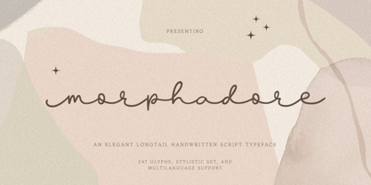 The Morphadore font brings elegance and luxury by offering a longtail monoline handwritten style. With Morphadore you can create elegant luxury logos, greeting cards, illustrations, quotes, charming branding, book covers, packaging, and much more. Features: Total 247 Glyph Uppercase & Lowercase Numerals & Punctuation Alternates Multilanguage Supports 60+ Latin based languages
 - Pleasantville JNL by Jeff Levine,
$29.00 Pleasantville JNL is a condensed slab serif font with angled corners emulating a popular style of lettering most prevalent in the 1920s. Modeled from Cornfield JNL (which in turn was based on a vintage popcorn box's logo), the letters were given a more standardized treatment in form and balance.
 - Ecstasy by Talavera,
$60.00 This calligraphic type is based on a free-styled blackletter with an ink-stained spirit. By having several stylistic alternates (on both U&lc.) plus some non standard ligatures, your text may look like it’s written or handmade! You should combine this font with Agony, also available on MyFonts.
 - Eulalie NF by Nick's Fonts,
$10.00Here’s another happy camper based on the work of master penman Walter Heberling. Its quirky character and offset baseline make for interesting and enticing heads and subheads. All versions of this font include the Unicode 1250 Central European character set in addition to the standard Unicode 1252 Latin set. - Snooty Fox NF by Nick's Fonts,
$10.00This casually elegant typeface is based on an unnamed offering from Pen & Brush Lettering and Practical Alphabets, published by Blandford Press, Ltd., London, in 1929. Good taste dictates that, because of the ornate and unusual letterforms of the uppercase letters, the font never be used as all caps. - Churchward Supascript by BluHead Studio,
$25.00Churchward Supascript Unplugged is a new OpenType font release by BluHead Studio, LLC from the exciting and unique type design library of Joseph Churchward. The design is based upon Churchward's original Supascript drawings but with a little added edginess in the form of some scanner-induced rough outlines. - TagBoyHardcore by PizzaDude.dk,
$15.00TagBoyHardcore is based on my own tagging style when I did graffiti in the mid-eighties. The font is roughly scanned and spaced narrowly in order to keep the original bad boy style. Pump up your text by starting and ending sentences with parentheses, brackets or the curly brackets. - Canterbury Sans by Red Rooster Collection,
$45.00 Based on the Morris F. Benton for ATF in 1920, it was not completed for production until 1926. The serif version we released a few years ago was so popular, that we decided to design a complementary sans serif version in three weights, along with three corresponding Swash fonts.
 - Memphis by Linotype,
$40.99 Because of the geometric basis of its forms, Memphis is often thought of as a font for technical fields, making a rational, purposeful impression. This emphasis on objectivity is well-suited to technical texts, but Memphis is appropriate for any text which should exhibit a clear, neutral character.
 - Oxford Street by K-Type,
$20.00 Oxford Street is a signage font that began as a redrawing of the capital letters used for street nameplates in the borough of Westminster in Central London. The nameplates were designed in 1967 by the Design Research Unit using custom lettering based on Adrian Frutiger’s Univers typeface, a curious combination of Univers 69 Bold Ultra Condensed, a weight that doesn’t seem to exist but which would flatten the long curves of glyphs such as O, C and D, and Universe 67 Bold Condensed with its more rounded lobes on glyphs like B, P and R. Letters were then remodelled to improve their use on street signs. Thin strokes like the inner diagonals of M and N were thickened to create a more monolinear alphabet; the high interior apexes were lowered and the wide joins thinned. The crossbar of the A was lowered, the K was made double junction, and the tail of the Q was given a baseline curve. K-Type Oxford Street continues the process of impertinent improvement and includes myriad minor adjustments and several more conspicuous amendments. The stroke junctions of M and N are further narrowed and their interior apexes modified. The middle apex of the W is narrowed and the glyph is a little more condensed. The C and S are drawn more open, terminals slightly shortened. The K-Type font adds a new lowercase which is also made more monolinear so better suited to signage, loosely based on Univers but also taking inspiration from the Transport typeface both in a taller x-height and character formation. The lowercase L has a curled foot, the k is double junctioned to match the uppercase, and terminals of a, c, e, g and s are drawn shorter for openness and clarity. A full repertoire of Latin Extended-A characters features low-rise diacritics that keep congestion to a minimum in multiple lines of text. The font tips the hat to signage history by including stylistic alternates for M, W and w that have the pointed middles of the earlier MOT street sign typeface. Incidentally, Alistair Hall (‘London Street Signs’, Batsford, 2020) notes that when the manufacturer of signs was changed in 2007, Helvetica Bold Condensed was substituted in place of the custom design, “an unfortunate case of an off-the-peg suit replacing a tailored one” and a blunder that has happily since been rectified, though offending nameplates can still be spotted by discerning font fans.
 - Ameliana by HandletterYean,
$4.00 Ameliana is an amazing handwritten font, it created by the inspiration of women’s smile. the simplicity of this font tries to resemble that smile which is simple yet beautiful and amazing. Ameliana has a great readability and is perfect for adding a natural look to your designs. This font comes in regular, bold, italic, bold italic style and can be use for multi language.
 - NorB Marker by NorFonts,
$28.00 NorB Marker is a handwritten text font emulating a marker pen. The fonts set can be used with any word processing program for text and display use, print and web projects, apps and ePub, comic books, graphic identities, branding, editorial, advertising, scrapbooking, cards and invitations and any casual lettering purpose… or even just for fun! The fonts set features 4 weights: Regular Italic Bold Bold Italic
 - Engage by Sohel Studio,
$14.00 "The 'Emerge Font' is a captivating typeface with a unique and bold serif display style. Featuring distinctive thick lines, each letter exudes strength and firmness. This font combines classic serif elements with modern touches, creating a visually striking and bold appearance. Emerge Font evokes elegance while maintaining a modern edge, making it ideal for graphic design projects, posters, and layouts that require unforgettable visual appeal."
 - Kithan by Ixipcalli,
$26.00 Kithan is a font that provides three weights and three compressed from semi-fine to bold, while the compressed have a reduced contrast creating a tall and soft look. Bold font sizes allow letterforms to be appreciated, with the same restraint and focus. Creates a smooth texture for small font sizes and long reads. Kithan's theme is inspired by the Mexican currency of the year 2000.
 - Tallings by Grontype,
$14.00 TALLINGS is a bold modern, urban-condensed font, inspired by street urban poster that combines the classic and modern style. TALLINGS will be best suited for creating logotypes, branding, headlines, corporate identities, Invitation card, and other graphic design elements. TALLINGS Features: Bold condensed font Punctuation & Characters Ligatures and alternates Glyphs included superscript & Symbol Currencies Multilingual Thankyou for picking up this font. Happy creating! Regard, Grontype
 - Teimer Std by Suitcase Type Foundry,
$75.00Typographer and graphic designer Pavel Teimer (1935-1970) designed a modern serif roman with italics in 1967. For the drawing of Teimer he found inspiration in the types of Walbaum and Didot, rather than Bodoni. He re-evaluated these archetypes in an individual way, adjusting both height and width proportions and modifying details in the strokes, thus effectively breaking away from the historical models he used as a starting point. Teimer's antiqua has less contrast; the overall construction of the characters is softer and more lively. The proportions of the italics are rather wide, making them stand out by their calm and measured rhythm. This was defined by the purpose of the typeface, as it was to be utilised for two-character matrices. The long serifs are a typical feature noticeable throughout the complete family of fonts. In 1967, a full set of basic glyphs, numerals and diacritics of Teimer's antiqua was submitted to the Czechoslovak Grafotechna type foundry. However, the face was never cast. At the beginning of 2005 we decided to rehabilitate this hidden gem of Czech typography. We used the booklet "Teimer's antiqua - a design of modern type roman and italics", written by Jan Solpera and Kl‡ra Kv’zov‡ in 1992, as a template for digitisation. The specimen contains an elementary set of roman and italics, including numerals and ampersands. After studying the specimen, we decided to make certain adjustments to the construction of the character shapes. We slightly corrected the proportions of the typeface, cut and broadened the serifs, and slightly strengthened the hair strokes. In the upper case we made some significant changes in the end serifs of round strokes in C, G and S, and the J was redrawn from the scratch. The top diagonal arm of the K was made to connect with the vertical stem, while the tail of Q has received a more expressive tail. The stronger hairlines are yet more apparent in the lower case, which is why we needed to further intervene in the construction of the actual character shapes. The drawing of the f is new, with more tension at the top of the character, and the overall shape of the g is better balanced. We also added an ear to the j, and curves in the r have become more fluent. To emphasise the compact character of the family, the lining numerals were thoroughly redrawn, with the finials being replaced by vertical serifs. The original character of the numerals was preserved in the new set of old-style figures. To make the uppercase italics as compact as possible, they were based on the roman cut rather than on the original design. The slope of lowercase italics needed to be harmonised. The actual letter forms are still broader than the characters in the original design, and the changes in construction are more noticeable. The lower case b gained a bottom serif, the f has a more traditional shape as it is no longer constricted by the demands of two-matrice casting, the g was redrawn and is a single storey design now. The serifs on one side of the descenders of the p and q were removed, the r is broader and more open. The construction of s, v, w, x, y, and z is now more compact and better balanced. Because Teimer was designed to make optimal use of the OpenType format, it was deemed necessary to add a significant amount of new glyphs. The present character set of one font comprisess over 780 glyphs, including accented characters for typesetting of common Latin script languages, small caps and a set of ligatures, tabular, proportional, old style and lining, superscript and fraction numerals. It also contains a number of special characters, such as arrows, circles, squares, boxed numerals, and ornaments. Because of its fine and light construction, the original digitised design remained the lightest of the family. Several heavier weights were added, with the family now comprising Light, Light Italic, Medium, Medium Italic, Semibold, Semibold Italic, Bold, and Bold Italic. - TBS Gartek by TypoBureau Studio,
$19.00 Meet the new Strong and Bold typeface from TBS. TBS GARTEK is a Display typeface It has a single weight ultra bold It come with multilingual glyphs. Good amount at Large Point sizes with combine with any suit typefaces, Headline, Logo font.
 - Yenda by Deniart Systems,
$20.00 Yenda is a bold angular font with just a bit of swoosh. Great for short text and headlines! Don't leave this one out of your next sci-fi or bold designs! This typeface includes all the special diacritics required for European languages.
 - Dava by Tiposureño,
$20.00 The Dava typeface is the result of almost two years of self-study. Dava is a screen sans serif font that is small but fun. His family is small and has fine, regular, bold, fine slant, regular slant, and slanted bold weights.

