10,000 search results
(0.034 seconds)
- BLT Heirloom by Black Lab Type,
$19.00 Heirloom grew from an interest of soft and friendly forms from the 1970s, with respect to the time's chill vibes and natural earthy roots. Its refined approachable characteristics allow it to be very readable carry a modern relaxed attitude. Available in 3 weights: Light, Regular and Bold. Any weight can be used as a display type, logotype and/or headlines, and lighter weights would work in bodies of text. The font pairs well with natural, historical or vintage graphic elements.
 - Nastyflashy by Maulana Creative,
$11.00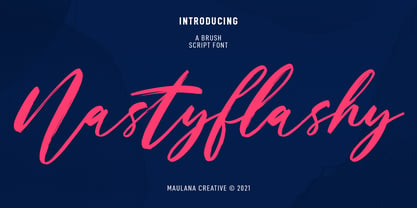 "Nastyflashy" is an expressive brush script font. With regular brush stroke, fun character with a bit of ligatures and has a two files lowercase alternates and swashes. To give you an extra creative work. "Nastyflashy "font support multilingual more than 100+ language. This font is good for logo design, Social media, Movie Titles, Books Titles, a short text even a long text letter and good for your secondary text font with sans or serif. Make a stunning work with "Nastyflashy" font. Cheers, MaulanaCreative
 - Sacremende by Lauren Ashpole,
$15.00 Welcome to Sacremende, a chunky, slightly messy display font. As the name implies, this font was inspired by the retro California aesthetic and, in particular, old surf rock posters. To highlight the vintage feel, the font package comes with a distressed option for a well-worn effect. This font is all caps but includes unique styles for upper and lowercase letters. Both versions are available as webfonts but for better performance, I would recommend using the regular option for the web.
 - Kalela Slab by Afkari Studio,
$10.00 Kalela Slab is Condensed Slab Serif Font a Modern Condensed Slab serif with solid font files. Suitable for branding, name card, stationary, design title, blog header, Logo, greeting cards, quotes, posters, art quote, typography. Kalela Slab Condensed Slab Serif Font also suitable for your any projects. Iclude: Kalela Slab With 4 Weight; Thin, Light, Regular and Bold Features : – Upper Case & Lowercase (All Caps) – Numerals & Punctuations (OpenType Standard) – Accents (Multilingual characters) No special software is required to use Kalela Slab Condensed Slab Serif Font
 - Colfige by Alcode,
$20.00 Collge is a serif typeface with ligatures also complete multilingual glyphs. Collge come with Regular style, it will make this typeface can be used in all design projects and works perfectly for pairing with script typeface or handmade fonts, Headlines, Posters, Packaging, T-shirts, Postcards, Invitation, Wedding Sign, Sign Painting, Signboard, and much more. Try Collge, enjoy the richness of OpenType features and let her fun and elegant excitement make you happy and enhance your creativity! You can use this font very easily.
 - The Impostor by Maulana Creative,
$15.00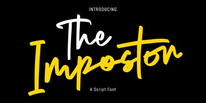 The Impostor is a regular casual script font. With sharp felt-tip stroke, slant and fun character with a bit of ligatures. To give you an extra creative work. The Impostor font support multilingual more than 100+ language. This font is good for logo design, Social media, Movie Titles, Books Titles, a short text even a long text letter and good for your secondary text font with sans or serif. Make a stunning work with The Impostor font. Cheers, MaulanaCreative
 - Pontiac Inline by S&C Type,
$15.00 Pontiac Inline is a layered Art Deco font designed by Fanny Coulez and Julien Saurin in Paris. This finely balanced inline font can be enhanced to improve your designs and bring an unusual and modern feeling. You could change the inside color, then add a 3D or shadow effect. To do so, you can simply superimpose the elements in compatible softwares (Photoshop, Illustrator...) ; The Regular above, the Inside line below, for example. We hope you will enjoy our work. Merci beaucoup!
 - Honey Rain by Maulana Creative,
$14.00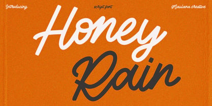 Honey Rain is a fancy handwritten script font. With regular mono-line stroke, fun character with a bit of ligatures and alternates. To give you an extra creative work. Honey Rain font support multilingual more than 100+ language. This font is good for logo design, Social media, Movie Titles, Books Titles, a short text even a long text letter and good for your secondary text font with sans or serif. Make a stunning work with Honey Rain font. Cheers, Maulana Creative
 - GHEA Samo by Edik Ghabuzyan,
$30.00 GHEA News is a super family font. It has 8 upright weights and their Italics and supports Latin, Armenian and Cyrillic alphabet systems. The weights from Regular to Bold and their Italics can be used as text fonts. The weights thicker than Bold can be used as Display fonts. It is an easily readable two side serif font and the eyes don't get tired while reading. GHEA News has a contrast style and at the same time is quite bright and clear.
 - Handu by Alex Jacque,
$20.00 Handu, designed by Alex Jacque in 2012, is an affable hand-drawn sans-serif inspired by the hand-painted type and signage on the streets of Kolkata, India. Fitting then that it come to life with brush and paint. When used for display purposes the organic, painted texture of Handu's glyphs really shines. At smaller point-sizes the hand-drawn aesthetic still translates. Handu comes in two styles, regular and shadow. Use each independently or overlay them for a little youthful emphasis.
 - GHEA News by Edik Ghabuzyan,
$40.00 GHEA News is a super family font. It has 8 upright weights and their Italics and supports Latin, Armenian and Cyrillic alphabet systems. The weights from Regular to Bold and their Italics can be used as text fonts. The weights thicker than Bold can be used as Display fonts. It is an easily readable two side serif font and the eyes don't get tired while reading. GHEA News has a contrast style and at the same time is quite bright and clear.
 - Astonice by Asritype,
$26.00 Astonice is a beautiful calligraphy font family with 3 weight variants: Regular, Semibold and Bold. Astonice has more than 1100 glyphs each, has opentype feature such as stylistic sets, stylistic alternatives, and old number form. Astonice supports a wide range language: Latin plus Greek and Cyrillic. Astonice is suitable for most typing and design such as cards, logos, banner, posters and others as you intended. Beautiful glyphs, OpenType features and 3 weight, Astonice provide you the right choice for your best design.
 - Warrior by CastleType,
$59.00 Warrior is a chunky typeface design inspired by a Russian Egyptian-style block alphabet (original designer unknown). Now available in seven weights (Hairline, Extra Light, Light, Medium, Regular, Bold, Black) in addition to three decorative styles: Shaded (3-dimensional), Inline, and Open. With its blocky letters and stable slab serifs, Warrior will add a bold, masculine look to your design. All members of the Warrior family support most European languages including modern Greek, and, of course, languages that use the Cyrillic alphabet.
 - Rust Crowth by Maulana Creative,
$15.00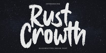 Rust Crowth is a handwritten brush font. With regular rough brush stroke, fun character with a bit of ligatures and alternates. To give you an extra creative work. Rust Crowth font support multilingual more than 100+ language. This font is good for logo design, Social media, Movie Titles, Books Titles, a short text even a long text letter and good for your secondary text font with sans or serif. Make a stunning work with Rust Crowth font. Cheers, Maulana Creative
 - Cafgone by Wildan Type,
$14.00 Cafgone is a modern display sans serif with modern and elegant style. This fonts is designed to pair harmoniously, and lend themselves to high end branding, logo designs, product packaging & invitation designs. With two fonts style (Regular and Oblique), Cafgone clean lines and subtle contrast give any project a touch of luxury and class. There are also decorative alternates and ligature available for uppercase letters and lowercase, so you can mix and match to add extra character and interest to logos and wordmarks.
 - Skratchbook by CozyFonts,
$30.00 Skratchbook is a new handwritten font from the sketch pad of designer Tom Nikosey of CozyFonts. The family exists in 3 versions, Regular, Italic, & Back Italic. This font is a casual, coarse style meant to be used for personality and spontaneity. It's style conjurs anything from quick grocery lists to Halloween Party invites. It maintains amazing legibility in small sizes and it's true personality is revealed the larger it is set! Hoping this font finds your voice! Skratchbook, New from CozyFonts Foundry.
 - Road Picture JNL by Jeff Levine,
$29.00 Road Picture JNL was modeled after the hand lettered title and credits for the 1940 Bob Hope-Bing Crosby semi-musical comedy “Road to Singapore”, and is available in both regular and oblique versions. Although the lettering design doesn’t resemble anything that was probably used in Singapore at the time, its faux “exotic” look still makes for an interesting revival. Bob Hope and Bing Crosby made a total of seven “road” pictures, hence the homage in the name of this type font.
 - Ruber by Artisticandunique,
$20.00 Ruber - Sans serif font family - Multilingual - 12 Styles You can easily use the sans serif font feature in many areas. You can compose your text with regular characters, highlight heavy characters and titles. Functional in many sizes and environments. If you are looking for a modern - geometric and sans serif style that can be effective in branding, you can easily use this font. It is also assertive about being a highly readable font with different weights. Have a good time.
 - Nachel Victoria by HandletterYean,
$10.00 Nachel Victoria is a simple, yet aesthetically beautiful typeface. It has a modern script look which can be used for business cards, logos, packaging, branding, magazines, quotes, and much more! What's included: 1. Nachel Victoria (OTF) 2. Style in this font include: Regular, Bold, Italic, and Bold italic 3. Works on Mac & PC 4. Simple installations 5. Accessible in the Adobe Illustrator, Adobe Photoshop, Adobe InDesign, CorelDraw, even work on Microsoft Word. 6. Support multilingual; ä ö ü Ä Ö Ü ß ¿ ¡
 - Hyperon by ParaType,
$30.00 Hyperon is a text typeface, which is especially useful for math and physics literature. Its nature is defined by austere and humanist features that show the most in italic. The typeface includes weights from Regular to Black and widths from Condensed to Semi Expanded. What stands out for Hyperon is the extended character set, with added Greek and lots of mathematical signs. Some styles have small caps. The typeface was designed by Natalia Vasilyeva and released by Paratype in 2020.
 - Mishega by Mega Type,
$12.00 Mishega Script is modern calligraphy font, including Regular. This font is casual and pretty with swashes. Can used for various purposes. such as logo, product packaging, wedding invitations, branding, headlines, signage, labels, signature, book covers, posters, quotes and more. Feature: · All Uppercase and Lowercase · Alternates and Ligatures · Numbers & Symbols · Supported Languages · Substitutes and Binders · PUA Encoded Have fun using Mishega!!! I really hope you enjoy it! Feel free to follow, like and share. Thank you so much for checking out my shop!
 - Ciribiribin JNL by Jeff Levine,
$29.00 Ciribiribin is an Italian ballad composed by Alberto Pestalozza in 1898. Many versions with different sets of lyrics have been recorded over the years. The hand lettering on the sheet music for one such popular version of the song was comprised of bold characters with a "semi-serif" treatment; that is, characters with partial or no serifs on certain strokes of the letters. Ciribiribin JNL extends this unique design into a complete digital typeface. Available in both regular and oblique versions.
 - Legal Eagle JNL by Jeff Levine,
$29.00 The lettering on the cover of the sheet music for 1919's "The World is Waiting for the Sunrise" was set in a decorative sans serif with an engraved line adorning each character. Reminiscent of the headlines of legal documents, way bills, stock certificates and the like, the digital version of the design was given the name Legal Eagle JNL and is available in both regular and oblique versions. A companion font without the engraved lines is also available as Junior Clerk JNL.
 - Summit by Jonahfonts,
$35.00 Summit rehashes both Circuitry Fonts, combining them into one font. To further modernize Summit, I have included all the characters required for full character set. Regular with Small Caps. Summit includes all punctuations, numerals, diacritics and special characters. The oringinal Circuitry Font was inspired by the printing on electronic circuit boards, it was interesting that most all printed font-strokes were either 90 or 45 degrees. I have kept most if not all of these angles while simultaneously giving it a contemporary feel.
 - Heroliga by Yahya Type,
$18.00 Heroliga is an elegant & modern sans serif font with special alternative letters and with multilingual support. Heroliga is perfect for logo design, magazine headers, product packaging, branding projects, clothing or simply as a stylish text overlay to any images or websites. WHAT’S INCLUDED? • Comes with regular, italic, bold and bold italic font styles. • Uppercase & lowercase letters. • Numbers, punctuation. • Ligature & Huge Stylistic alternate. • Multilingual support. Still got a question? Send me a message and I’ll be happy to answer! qura.yahya@gmail.com
 - Heidth Variable by Arkitype,
$40.00 Heidth Variable has 2 styles, regular and slanted with varying extremes in width and height. It is designed as a display font for fun typographic use. Heidth is perfect for use in branding, posters, print campaigns packaging or what ever you need to have fun expressive typography. Wide or high, Heidth Variable is extremely versatile and works for any artwork layout and orientation. Please note: Being a Variable font, you will need software that supports variable fonts.i.e Adobe Illustrator, Photoshop etc.
 - Matricule 57 by designdefontes,
$24.00 Matricule 57 is a typeface whose design is inspired by license plates and by the deformations due to the stamping in the metal plates. These deformations give a very specific style, especially concerning the hairlines. It is the Condensed version of Matricule, a Typeface designed by Loïc Choquet. It consists of 4 fonts : Light, regular, bold and black. For Mac or PC. Well-suited for edition, logotypes, posters, etc. Each font contains 359 glyphs and supports up to 89 different languages.
 - Legere by B2302,
$35.00 Legere is a slim, light and decorative font, based on the idea to work as close as possible on the geometric forms of the circle, the triangle and the square. As a natural conclusion the number of angles is limited. Legere comes in these weights: THIN, LIGHT, REGULAR and a very special DECO version. Legere might be used as a headline font, for posters or cover layout, it might also be transformed into that fashion label logotype you are working on. Have fun!
 - Rigor Mortis by Comicraft,
$19.00 Here's a Collector's Item Classic for all our fiends! Sit up in your Caskets and we'll help you spin a Shocking, Suspense-filled Tale of Terror with a font Bad Bad Leroy "JG" Brown found in the Vault! Give us your grimy little dimes and come down into the Crypt with us. We call this rotten little font... RIGORMORTIS! AHAHAHHAHHHAHHHHAHA-HAH-haa... Features: Four weights (Regular, Italic, Bold & Bold Italic) with alternate uppercase characters. Includes Western and Central European international characters.
 - Makata by Cuda Wianki,
$29.00 MAKATA is highly modern and trendy. Use it in decorative headlines, logos, posters, covers and wherever you want use a stylish yet geometric letters. As a regular text font we strongly recommend to you our TOTEM. Thanks to alternate characters (each letter has 3 various versions) typing MAKATA is like painting. Words are very decorative and look like fashionable pattern. Of course there is a nice set of ornaments too to meet the needs of even the most demanding design.
 - Morgalina Vintage by Agny Hasya Studio,
$12.00 Morgalina Vintage Is a Serif Display Font With a Retro Vintage Style Bold Typeface, Modern Classic Yet Decorative. It Comes in 2 (Two) Styles (Regular and Italic) Including Slants, and Is Created With Stylistic Alternatives and Ligatures. Featured With Uppercase and Lowercase, Numeral and Punctuation, Multilingual Support, and Opentype Features. Perfect for Your Design Projects Like Logos, Branding, Advertising, Product Designs, Stationery, Magazine Designs, Book/Cover Title Designs, Photography, Art Quotes, Wedding Designs, Fashion Designs, Special Events, Labels, Product Packaging, and More.
 - Toggle by Thinkdust,
$10.00 Toggle is a welcoming font with a charming and friendly demeanour. An all-caps display set with built-in layers of customisability in the form of two different cuts, regular and stencil, Toggle is happy to go along with whatever suits you best. The quirky corners and upbeat details flirt with tradition without conforming to what has been before, giving you confidence in Toggle’s quality type credentials while simultaneously freeing you to use it in a huge variety of situations.
 - Only One by Letterara,
$10.00 Only One is a stylish, unique, handwritten family that is easy to remember. It’s great for unique branding, photo overlays, watermarks, business cards, invitations, wedding, photography, fashion, etc. This font is available in 10 styles: Thin, Light, Regular, Semi Bold, Bold, Thin Italic, Light Italic, Italic, Semi Bold Italic, Bold Italic. And most importantly: Only one is perfect for you. Thanks for checking out my store, and feel free to get in touch if you have any questions! thomasaradea@gmail.com
 - Beauty Balichot by Agny Hasya Studio,
$12.00 Beauty Balichot is a Modern Serif Display Font combined with decorative ornaments that make it unique, luxurious, elegant, and versatile. Come in 2 (two) styles (regular & italic) and is created with glyph variations like alternates and ligatures. Featured with Uppercase and Lowercase, Numeral and Punctuation, Multilingual Support, and Opentype Features. Perfect for your design projects like logos, branding, advertising, product designs, stationery, magazine designs, book/cover title designs, photography, art quotes, wedding designs, fashion designs, special events, labels, product packaging, and more.
 - Areplos by Storm Type Foundry,
$53.00To design a text typeface "at the top with, at the bottom without" serifs was an idea which crossed my mind at the end of the sixties. I started from the fact that what one reads in the Latin alphabet is mainly the upper half of the letters, where good distinguishableness of the individual signs, and therefore, also good legibility, is aided by serifs. The first tests of the design, by which I checked up whether the basic principle could be used also for the then current technology of setting - for double-sign matrices -, were carried out in 1970. During the first half of the seventies I created first the basic design, then also the slanted Roman and the medium types. These drawings were not very successful. My greatest concern during this initial phase was the upper case A. I had to design it in such a way that the basic principle should be adhered to and the new alphabet, at the same time, should not look too complicated. The necessary prerequisite for a design of a new alphabet for double-sign matrices, i.e. to draw each letter of all the three fonts to the same width, did not agree with this typeface. What came to the greatest harm were the two styles used for emphasis: the italics even more than the medium type. That is why I fundamentally remodelled the basic design in 1980. In the course of this work I tried to forget about the previous technological limitations and to respect only the requirements then placed on typefaces intended for photosetting. As a matter of fact, this was not very difficult; this typeface was from the very beginning conceived in such a way as to have a large x-height of lower-case letters and upper serifs that could be joined without any problems in condensed setting. I gave much more thought to the proportional relations of the individual letters, the continuity of their outer and inner silhouettes, than to the requirements of their production. The greatest number of problems arose in the colour balancing of the individual signs, as it was necessary to achieve that the upper half of each letter should have a visual counterbalance in its lower, simpler half. Specifically, this meant to find the correct shape and degree of thickening of the lower parts of the letters. These had to counterbalance the upper parts of the letters emphasized by serifs, yet they should not look too romantic or decorative, for otherwise the typeface might lose its sober character. Also the shape, length and thickness of the upper serifs had to be resolved differently than in the previous design. In the seventies and at the beginning of the eighties a typeface conceived in this way, let alone one intended for setting of common texts in magazines and books, was to all intents and purposes an experiment with an uncertain end. At this time, before typographic postmodernism, it was not the custom to abandon in such typefaces the clear-cut formal categories, let alone to attempt to combine the serif and sans serif principles in a single design. I had already designed the basic, starting, alphabets of lower case and upper case letters with the intention to derive further styles from them, differing in colour and proportions. These fonts were not to serve merely for emphasis in the context of the basic design, but were to function, especially the bold versions, also as independent display alphabets. At this stage of my work it was, for a change, the upper case L that presented the greatest problem. Its lower left part had to counterbalance the symmetrical two-sided serif in the upper half of the letter. The ITC Company submitted this design to text tests, which, in their view, were successful. The director of this company Aaron Burns then invited me to add further styles, in order to create an entire, extensive typeface family. At that time, without the possibility to use a computer and given my other considerable workload, this was a task I could not manage. I tried to come back to this, by then already very large project, several times, but every time some other, at the moment very urgent, work diverted me from it. At the beginning of the nineties several alphabets appeared which were based on the same principle. It seemed to me that to continue working on my semi-finished designs was pointless. They were, therefore, abandoned until the spring of 2005, when František Štorm digitalized the basic design. František gave the typeface the working title Areplos and this name stuck. Then he made me add small capitals and the entire bold type, inducing me at the same time to consider what to do with the italics in order that they might be at least a little italic in character, and not merely slanted Roman alphabets, as was my original intention. In the course of the subsequent summer holidays, when the weather was bad, we met in his little cottage in South Bohemia, between two ponds, and resuscitated this more than twenty-five-years-old typeface. It was like this: We were drinking good tea, František worked on the computer, added accents and some remaining signs, inclined and interpolated, while I was looking over his shoulder. There is hardly any typeface that originated in a more harmonious setting. Solpera, summer 2005 I first encountered this typeface at the exhibition of Contemporary Czech Type Design in 1982. It was there, in the Portheim Summer Palace in Prague, that I, at the age of sixteen, decided to become a typographer. Having no knowledge about the technologies, the rules of construction of an alphabet or about cultural connections, I perceived Jan Solpera's typeface as the acme of excellence. Now, many years after, replete with experience of revitalization of typefaces of both living and deceased Czech type designers, I am able to compare their differing approaches. Jan Solpera put up a fight against the digital technology and exerted creative pressure to counteract my rather loose approach. Jan prepared dozens of fresh pencil drawings on thin sketching paper in which he elaborated in detail all the style-creating elements of the alphabet. I can say with full responsibility that I have never worked on anything as meticulous as the design of the Areplos typeface. I did not invent this name; it is the name of Jan Solpera's miniature publishing house, in which he issued for example an enchanting series of memoirs of a certain shopkeeper of Jindrichuv Hradec. The idea that the publishing house and the typeface might have the same name crossed my mind instinctively as a symbol of the original designation of Areplos - to serve for text setting. What you can see here originated in Trebon and in a cottage outside the village of Domanín - I even wanted to rename my firm to The Trebon Type Foundry. When mists enfold the pond and gloom pervades one's soul, the so-called typographic weather sets in - the time to sit, peer at the monitor and click the mouse, as also our students who were present would attest. Areplos is reminiscent of the essential inspirational period of a whole generation of Czech type designers - of the seventies and eighties, which were, however, at the same time the incubation period of my generation. I believe that this typeface will be received favourably, for it represents the better aspect of the eighties. Today, at the time when the infection by ITC typefaces has not been quite cured yet, it does absolutely no harm to remind ourselves of the high quality and timeless typefaces designed then in this country.In technical terms, this family consists of two times four OpenType designs, with five types of figures, ligatures and small capitals as well as an extensive assortment of both eastern and western diacritics. I can see as a basic text typeface of smaller periodicals and informative job-prints, a typeface usable for posters and programmes of various events, but also for corporate identity. Štorm, summer 2005 - Shutdown Brush by Rockboys Studio,
$23.00 Shutdown Brush is textured brush font using a contemporary approach to design. Handmade naturally with an irregular baseline, Amithen is suitable for a number of display or decorative designs.
 - Capstone by Rivet Designworks,
$10.00 Capstone is a display typeface influenced by the bold angular features of stone architecture, especially that of cathedrals and archways. It works well for short bold titles or brands.
 - Stylish Marker by Pedro Teixeira,
$14.00 Stylish Marker is a font based on a casual and worn marker, just before it's unusable, thus giving rise to an irregular texture, typical of a widely used marker
 - WalcomeOne by Ingrimayne Type,
$7.95 WalcomeOne simulates sloppy, messy hand printing. Despite being irregular and childlike, it is quite legible even at small sizes. It comes in four weights, each with an oblique style.
 - Solida by Graviton,
$4.00 Solida font family has been designed for Graviton Font Foundry by Pablo Balcells in 2012. It is display typeface with a geometric angular look. Solida consists of 10 styles.