10,000 search results
(0.048 seconds)
- BD Aubergin by Typedifferent,
$15.00 The typeface with a slice: BD Aubergin is somehow reminiscent of the bauhaus era but with a modern twist, great for the use in titling and giving character to your print and screen work. The variable version morphs from filled (flat) to sliced.
 - Krom Mono by ATK Studio,
$15.00 Krom Mono is a modular monospaced font built with pixel shapes. Designed for headlines, posters, and small size body text. This family consist of 9 weights from thin to black plus variable font with a character set that covers over 90 languages.
 - Lambada by ITC,
$29.99Lambada font is the work of British designer David Quay, a font with a Latin American look. It should be used with closer letter and word spacing. Lambada will create eye-catching headlines and is perfect for wherever a festive appearance is desired. - FF Tokyo by FontFont,
$30.99 British type designer Neville Brody created this display FontFont in 1993. The family contains 4 weights and is ideally suited for poster and billboards and sports. FF Tokyo provides advanced typographical support with features such as ligatures. It comes with proportional lining figures.
 - Brandegoris by Scriptorium,
$12.00Brandegoris is a set of traditional split-pen capitals with two forms for most of the letters. It is excellent for headers and titles, especially on web pages and also works well as initial characters in combination with a serif text face. - Roble by Latinotype,
$26.00 Roble is a Slab Serif Font, from a mix between Andes and Sanchez, following a harmony with both fonts one sans and one serif with a fresh and dynamic result. Roble is a family of 16 display fonts 8 weights plus italics.
 - Monk by 4RM Font,
$27.00 Monk font is made with an extra expanded style and combined with the value of beauty and authenticity so that it looks like it has a solid impression. suitable for use in graphic design such as logos, billboards, posters, and large graphic designs.
 - Explora by TypeSETit,
$24.95 This formal calligraphic face is light, and delicate with beautiful lines and curves. The Pro version adds extra elegance with alternate caps and beginning and ending swashes. Explora has over 600 glyphs and features international languages including the entire Cherokee Nation character set.
 - Spooky Vibes by Ake,
$18.00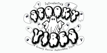 Spooky Vibes is a charming and groovy Halloween display font. Infuse your designs with playful retro spirit and delightful spookiness. Perfect for invitations, posters, and more, this font adds a captivating twist to your Halloween creations. Unleash your creativity with Spooky Vibes today!
 - Blancmange by District,
$35.00 Humanist meets handwriting. Blancmange is a fun and informal face with brushy alternates for the flair when you need it. Swash mannerisms blend with structured letter shapes to give a range of personality. Includes all the requisite OpenType goodies in two weights.
 - Truncheon by Cool Fonts,
$24.00 Truncheon is a grunge font with hair on its chest. Like its namesake it beats you over the head with enough attitude to leaves you confused and spinning. Upper and Lower case characters have variations like filled counters to keep things random.
 - Morse Code by Deniart Systems,
$10.00This font can be used as a play'n learn tool to teach the meaning of these modern day communication symbols. Each alphabetical character can be printed with or without the corresponding roman symbols. NOTE: comes with an interpretation guide in pdf format. - Losta Nova by Creativemedialab,
$20.00 Minimal and modern sans serif consists of 10 weights from hairline to black as well as variable versions. Works great for branding, fashion, modern, and casual valentine design theme. Designing a logo is made easy with lots of alternates to play with.
 - Frykas by Edyta Demurat,
$24.00 Frykas is warm and friendly, hand-drawn font. It has a simple form with subtle irregularities, but no swashes or ornaments. This condensed font family with five styles will be a great solution for posters, titles, short sentences or whenever you need impact.
 - Kotes by Gassstype,
$22.00 Kotes - Natural Handwritten Allcaps Font with a natural style and dramatic movement. Crafted manually with love and passion, This font is great for your next creative project such as logos, printed quotes, invitations, cards, product packaging, headers, Logotype, Letterhead, Poster, Label, and etc.
 - Fleischer Display by Lewis McGuffie Type,
$30.00 Fleischer is a rough and playful display typeface good for headlines and posters. The face is based on historical letterforms combined with energetic 20th century pulp-style lettering. Fleischer comes with caps and small caps plus West, Central and East European language support.
 - Monster Blood by Yoga Letter,
$16.00 "Monster Blood" is a unique horror font with a blood-like melt in every letter. This font is perfect for Halloween moments, movie titles, logos, book covers, horror stories and more. "Monster Blood" comes with lowercase, uppercase, multilingual support, numerals, and punctuations.
 - Firewerk by PizzaDude.dk,
$20.00 A squarish font with rounded edges with an amazing number of ligatures—298 to be more precise. That should be enough to make your text look like hours of fun! You will need to use OpenType supporting applications to use the autoligatures.
 - Spellbound by Stefani Letter,
$12.00 Spellbound is a beautiful light handwritten font with a unique feel and looks stunning. It will add a luxury spark to any design project! This font is PUA encoded which means you can access all of the amazing glyphs and ligatures with ease!
 - Pejuang Cinta by Stringlabs Creative Studio,
$25.00 Pejuang Cinta is a Script Font with Handwritten Style. The Pejuang Cinta font made with digital brush pen strokes that making this font look authentic. This font is perfect for fashion brand, wedding invitation, business card, logo brand, signature, and then calligraphy.
 - Golden Signer by Letrasupply Typefoundry,
$20.00 Golden Signer was inspired by vintage and tattoo letters. The font family comes with Regular and Serif type, completed with alternates characters, deboss style, shapes and also free ornaments. Golden Signer is a perfect package for any project that needs display lettering.
 - Fokers by Letterhend,
$14.00 Fokers, a new display typeface with classy and luxury look! Fokers' different styles works perfectly for headline, logotype, apparel, invitation, branding, packaging, advertising, and more. Fokers comes in uppercase, lowercase, with punctuation, symbols, numerals, stylistic set alternate, ligatures and also multi-lingual support.
 - Koska Esko by Jehansyah,
$9.00 Koska Esko This is a font with a very bold and elegant look, perfect for designs with a modern look it's time for you to try a new style for a new design include : numeric latin ligatures alternate And Thank you very Much
 - Vallisa by Letterara,
$12.00 Vallisa is a cute and sweet handwritten font with an incredibly friendly feel. This font will turn any creative idea into a true piece of art! This font is PUA encoded which means you can access all of the cute glyphs with ease!
 - Spartacus by Alan Meeks,
$45.00 A further development of the Colosseum range but this with a slab serif. Visually monoline and modern in appearence it still retains its Trajan characteristics. The addition of Spartacus black with its unusual Italic gives a the face a strong original headline font.
 - Vox Round by Canada Type,
$39.95 Vox Round is the softer version of the Vox family. The original brief for Vox was a extensive monoline typeface that can be both precise and friendly, yet contain enough choice of seamlessly interchangeable variants for the user to be able to completely transform the personality of the typeface depending on the application. Basically, a sans serif with applications that range from clean and transparent information relay to sleek and angular branding. When the first version of Vox was released in 2007, it became an instant hit with interface designers, product packagers, sports channels, transport engineers and electronics manufacturers. This new version (2013) is the expanded treatment, which is even more dedicated to the original idea of abundant application flexibility. The family was expanded to five weights and two widths, with corresponding italics, for a total of 20 fonts. Each font contains 1240 glyphs. Localization includes Cyrillic and Greek, as well as extended Latin language support. Built-in OpenType features include small caps, caps to small caps, four completely interchangeable sytlistic alternates sets, automatic fractions, six types of figures, ordinals, and meticulous class-based kerning. This kind of typeface malleability is not an easy thing to come by these days.
 - LiebeDoni by LiebeFonts,
$29.90 LiebeDoni is pure Italian art. A contemporary nod to Italian typographic heritage, LiebeDoni’s warm and friendly style is perfect for—literally—bold headlines and impressive invitations. Take a seat on LiebeDoni’s Vespa and enjoy the sweet curves of dolce far niente. But don’t let the relaxed hand-crafted appearance fool you: You’re dealing with a solid quality typeface that has received painstaking attention to detail. Round like the Colosseum, some lines are as colloquial as the Tower of Pisa—but all this with almost Teutonic obsession for technical perfection. Feature-wise, we went the full quattro stagioni: Variations and alternatives for many letters, swashy initials and swirly ligatures—plus language support that goes way beyond English and Italiano. Double-o ligature, anyone? Two different www ligatures? Check. (Please make sure your software supports OpenType if you wish to use the advanced features.) Get both the outline and the filled version and go crazy on creative layering and endless possibilities. Each font contains over 600 glyphs and both contain the full character set. Make a bold move to italy—treat yourself with this font. If you like LiebeDoni, you may also like its perfectly matching sisters LiebeErika and LiebeOrnaments—or any of our other 100% compatible LiebeFonts.
 - Jazm by Arabetics,
$34.00 Jazm is an Arabetic typeface design with connected glyphs. Jazm was the earliest, pre-Islamic, script style of the modern Arabic script, before branching into Kufi and Naskh styles. The initial script had a lot less, position-dependent shapes and ligatures, and was not strictly connected. It occasionally included minuscule dots to distinguish identical shapes. This font family design is a modern visualization by the designer of the historical Jazm letter shapes following the guidelines of the Mutamathil Taqlidi type style with one glyph for every basic Arabic Unicode character or letter, as defined in Unicode Standards, and one additional final form glyph for each Arabic letter that can connect with other letters from both sides in traditional cursive Arabic strings. Jazm employs variable x-height values. It includes all required Lam-Alif ligatures and selected marks. Tatweel (or Kashida) glyph is a zero width space. Keying it before any glyph will display that glyph isolated form, if desired. Keying Tatweel before Alif Lam Lam Ha will display the Allah ligature. Jazm typeface family includes both Arabic and Arabic-Indic numerals; all required diacritic marks, in addition to Standard English keyboard punctuations and major currency symbols. Jazm is available in regular, bold, black, and corresponding italic (slated to the left) styles.
 - Aeroko Variable by Monotype,
$279.99 Meet Aeroko, a slick variable typeface that evokes grit and speed, a dynamic play, a future–present competitive edge that evokes motorsport and all progressive brand design. This is a robust type system that creates memorable brand headlines. Powered by four display weights and three widths. Turbo-charged by a two-axes variable font. High performance brands can expect Aeroko to out-pace in every graphic condition. Aeroko is bold and assertive, it moves fast in headlines, it flexes when and where you need it. The forms are boxed and solid from Condensed to Wide, and they provide a distinct contrast when paired with rounder text fonts. Aeroko’s secondary power unit is harnessed from the ever adaptable variable font format. Variable font technology enables vast levels of typographic scale and expression, furthermore it allows Aeroko to react instantly in any digital space to maximize results. Aeroko evokes confidence, this is a typeface that actively encourages you to be courageous and daring with type in your own way. Brands demand distinct and robust typography, much in the same way that drivers demand pace. Aeroko meets these demands with ease, delivering assurance and weight across a valiant aesthetic. Aeroko is designed by Krista Radoeva and the Monotype Studio.
 - Bill Corporate Medium by OGJ Type Design,
$35.00 Bill Corporate is a geometric typeface with generous capitals. A modern classic, based on Max Bill’s lettering work, its straightforward and uncompromising construction can be both edgy and sublime. With minimalist letterforms, pointy apexes instead of flat ones, and archetypal proportions, this font family doesn’t follow any trends but strives to achieve a timeless formal vocabulary. The skeleton of its letters is based heavily on the famous primary shapes of the Bauhaus: square, circle, and triangle. This makes for quite wide uppercase and much narrower lowercase letters. The contrast between uppercase and lowercase benefits inexperienced users, who will be able to get appealing results quickly. At the same time, it’s a powerful tool for seasoned designers, who can employ either case selectively to set the desired typographic course. Bill Corporate Medium’s 16 styles (including a set of eight lighter-than-light fonts from “Two” to “ExtraLight”) are an excellent choice for editorial design, branding, headlines, and even short to mid-length copy in a wide range of applications and industries. The uppercase letters in particular—with their varied widths and lavish dimensions—are suitable for cosmopolitan and stylish logotypes and wordmarks. Whenever a timeless, staid, and classy look is demanded, choose Bill Corporate.
 - Malden Sans by Monotype,
$49.00 Malden Sans is a mischievous grotesque sans serif with charming details that gives designers a solid typographic voice. It was created by Michele Patanè with regular and condensed widths, as a utilitarian typeface family for print and digital environments. It was originally designed as part of a type system for cinema magazines, and embodies the devil-may care attitude of the silver screen. Designer Michele Patanè looked back to an earlier era of typography to create the typeface, embracing unusual details, rather than ironing them out. “There is a very naive way of using typography in the 30s and 40s, something not as clean as how it’s used in the late 50s and 60s when everything passed through a rationalisation of the typographic palette,” he explains. “In film magazines you can still see a bit of roughness, and I like that.” This is a design that’s desperate to be used in editorial environments, and has been created to stand up to lower quality paper. It would be equally at home on posters, packaging, and even in digital environments where designers are looking for something more expressive than another geometric sans serif. Malden Sans includes a Normal and Condensed range, with 7 weights in the normal and 6 in the Condensed, both including italics.
 - Pata Slab by In-House International,
$10.00 Pata Slab: the ultra-heavy optimism we all need in 2020 Pata Slab is the type equivalent of a catwalk stomp down a city sidewalk, a font that’s assertive, funky and more than a little sexy. Named after a colloquialism for ‘feet’, Pata features ultra-heavy slabs and contrasting hairline centers that rise from its chunky footprint. The resulting, retro-inspired vertiginous curves add instant attitude to any design. Developed in 2020, Pata is a type of its time.Pata is all upside, as it is a typeface with no descenders — one that elevates all characters to grow upward from the baseline (because, c’mon, we could all use something uplifting right now!) All uppercase characters were built to fit precisely inside a square, so they’re all the same width and height. The lowercase alphabet, eñes, cedillas, punctuation, numbers and symbols all follow the same height restrictions. Despite all that confinement, Pata sports standard-height terminals that connect seamlessly so there’s nearly endless options for modular ligatures. The upshot of all this meticulous awesomeness is that laying out, customizing and stacking text super simple. Pata Slab was created by In-House International, designed Alexander Wright in collaboration with Rodrigo Fuenzalida. It's available for Opentype format (.otf) compatible with Mac and PC.
 - Anuschka by Anomali Creative,
$10.00 Introducing **ANUSCHKA** - Faux Cyrillic Display Font Faux Cyrillic, pseudo-Cyrillic, pseudo-Russian or faux Russian typography is the use of Cyrillic letters in Latin text, usually to evoke the Soviet Union or Russia, though it may be used in other contexts as well. It is a common Western trope used in book covers, film titles, comic book lettering, artwork for computer games, or product packaging which are set in or wish to evoke Eastern Europe, the Soviet Union, or Russia. A typeface designed to emulate Cyrillic is classed as an ethnic typeface. **ANUSCHKA** came with that protest and propaganda vibe. It's contain a complete Simple Latin Glyphs, with extra ligatures, D-Ligature, Stylistic set for the main character to make it stencil look and distressed look. --- This font can be used with all software that can read standard fonts. Check out my instagram: https://www.instagram.com/anomalicreatype/ Thanks so much for checking out my shop! All the best, **Krisna Teja** Anomali Creatype #typeface #Stencil #FauxCyrillic #Cyrillic #Military #Protest #Poster #vintage #Extreme #design #Vintage #graphic #calligraphy #Retro #typography #propaganda #Poster #blackletter #retrostyle #illustration #Russian #socialist #character #set #uppercase #decorative #black #classic #Uppercase #handmade #capital #bold #number #modern #tattoo #english #art #label #logo #middle #typographic #antique #sign #letterhead #fashion #filmtitles #russia #comicbooklettering #videogames #computergames
 - Handasi by Arabetics,
$39.00 The Handasi type family follows the guidelines of the Mutamathil Taqlidi type style. It has one glyph for every basic Arabic Unicode character or letter and one additional, final-position, glyph for each Arabic letter that is normally connected with other letters from both sides in traditional cursive Arabic strings. Handasi employs variable x-height values. Its design uses straight lines only but with variable distributed weight. Handasi fonts include all required Lam-Alif ligatures and use ligature substitutions and selected marks positioning but they do not use any other glyph substitutions or forming. Text strings composed using types of this family are non-cursive with stand-alone isolated glyphs. It employs our "natural Arabic input" method where first glyph is displayed in its non-isolated form. Tatweel (or Kashida) glyph is a zero width space. Keying it before any glyph will display that glyph isolated form. Keying it before Alif Lam Lam Ha will display the Allah ligature. Handasi family includes both Arabic and Arabic-Indic numerals, all required diacritic marks, Allah ligature, in addition to all standard English keyboard punctuations and major currency symbols. The fonts in this family support the following scripts: Arabic, Persian, Urdu, Pashtu, Kurdish, Baluchi, Kashmiri, Kazakh, Sindhi, Uyghur, Turkic, and all extended Arabic scripts.
 - Mehdi by Arabetics,
$39.00 The Mehdi type family follows the guidelines of the Mutamathil Taqlidi type style. It has one glyph for every basic Arabic Unicode character or letter and one additional, final-position, glyph for each Arabic letter that is normally connected with other letters from both sides in traditional cursive Arabic strings. Mehdi employs variable x-height values. Its design uses full curves with variable distributed weights. Mehdi family includes all required Lam-Alif ligatures and uses ligature substitutions and selected marks positioning but it does not use any other glyph substitutions or forming. Text strings composed using types of this family are non-cursive with stand-alone isolated glyphs. The family employs our "natural Arabic input" method where first glyph is displayed in its non-isolated form. Tatweel (or Kashida) glyph is a zero width space. Keying it before any glyph will display that glyph isolated form. Keying it before Alif Lam Lam Ha will display the Allah ligature. Mehdi family includes both Arabic and Arabic-Indic numerals, all required diacritic marks, Allah ligature, in addition to all standard English keyboard punctuations and major currency symbols. The fonts in this family support the following scripts: Arabic, Persian, Urdu, Pashtu, Kurdish, Baluchi, Kashmiri, Kazakh, Sindhi, Uyghur, Turkic, and all extended Arabic scripts.
 - Kickbox by Ahmad Jamaludin,
$19.00 Introducing KICKBOX Fonts - Unleash the Power of Nostalgia and Captivate Pop Culture, Lifestyle, and Music and Film Branding Looking to infuse your brand with a burst of retro charm and a dash of pop culture? Say hello to our KICKBOX Fonts! Designed with 3 styles: Narrow, Regular, Wide to make your brand stand out in the realms of pop culture, lifestyle, music, and film branding. These fonts are an absolute game-changer. KICKBOX transports you to the golden era of the past, evoking a sense of nostalgia that resonates with pop culture enthusiasts. Seamlessly blending boldness and authenticity, they captivate the hearts of your audience, adding a unique and irresistible touch to your brand identity. KICKBOX has 3 widths on each type: Narrow - Regular - Wide so can be perfect for any retro project like logotype, branding, title, packaging, and many more Features: Kickbox Main File Has 3 Variable: Narrow - Regular - Wide Instructions (Access special characters, even in Cricut Design) Unique Letterforms Works on PC & Mac Simple Installations Accessible in Adobe Illustrator, Adobe Photoshop, Microsoft Word even work on Canva! PUA Encoded Characters Fully accessible without additional design software. Embrace the captivating allure of our KICKBOX today and unleash a world of endless possibilities! Enjoy Designing! Dharmas Studio
 - Camille by Arabetics,
$45.00 Camille was designed with exaggerated emphasis on letter vertical characteristic, by virtually eliminating the typical Arabic horizontal line look. This font glyph weights and look and feel are heavily influenced by early Kufic Quranic calligraphy style. Camille supports all Arabetic scripts covered by Unicode 6.1, and the latest Arabic Supplement and Extended-A Unicode blocks, including support for Quranic texts. This font family includes two letter spacing flavors: isolated for small text and overlapped for large or display text. The two spacing flavors have one weight each with a normal and a left-slanted Italic version. The script design of this font family follows the Arabetics Mutamathil Taqlidi style utilizing varying x-heights. The Mutamathil Taqlidi type style uses one glyph per every basic Arabic Unicode character or letter, as defined by the Unicode Standards, and one additional final form glyph, for each freely-connecting letter of the Arabic cursive text. Camille includes the required Lam-Alif ligatures in addition to all vowel diacritic ligatures. Soft-vowel diacritic marks (harakat) are selectively positioned with most of them appearing on similar high and low levels—top left corner—, to clearly distinguish them from the letters. Tatweel is a zero-width glyph.
 - Aeroko by Monotype,
$49.99 Meet Aeroko, a slick variable typeface that evokes grit and speed, a dynamic play, a future–present competitive edge that evokes motorsport and all progressive brand design. This is a robust type system that creates memorable brand headlines. Powered by four display weights and three widths. Turbo-charged by a two-axes variable font. High performance brands can expect Aeroko to out-pace in every graphic condition. Aeroko is bold and assertive, it moves fast in headlines, it flexes when and where you need it. The forms are boxed and solid from Condensed to Wide, and they provide a distinct contrast when paired with rounder text fonts. Aeroko’s secondary power unit is harnessed from the ever adaptable variable font format. Variable font technology enables vast levels of typographic scale and expression, furthermore it allows Aeroko to react instantly in any digital space to maximize results. Aeroko evokes confidence, this is a typeface that actively encourages you to be courageous and daring with type in your own way. Brands demand distinct and robust typography, much in the same way that drivers demand pace. Aeroko meets these demands with ease, delivering assurance and weight across a valiant aesthetic. Aeroko is designed by Krista Radoeva and the Monotype Studio.
 - Vox by Canada Type,
$39.95 The original brief for Vox was a extensive monoline typeface that can be both precise and friendly, yet contain enough choice of seamlessly interchangeable variants for the user to be able to completely transform the personality of the typeface depending on the application. Basically, a sans serif with applications that range from clean and transparent information relay to sleek and angular branding. When the first version of Vox was released in 2007, it became an instant hit with interface designers, product packagers, sports channels, transport engineers and electronics manufacturers. This new version (2013) is the expanded treatment, which is even more dedicated to the original idea of abundant application flexibility. The family was expanded to five weights and two widths, with corresponding italics, for a total of 20 fonts. Each font contains 1240 glyphs. Localization includes Cyrillic and Greek, as well as extended Latin language support. Built-in OpenType features include small caps, caps to small caps, four completely interchangeable sytlistic alternates sets, automatic fractions, six types of figures, ordinals, and meticulous class-based kerning. This kind of typeface malleability is not an easy thing to come by these days. For additional versatility, take a look at Vox Round, the softer, but just as extensive, counterpart to this family.
 - Otostrada MF by Masterfont,
$59.00 Legible yet elegant font family with a variety of weights.