10,000 search results
(0.043 seconds)
- Fd Hallway by Fortunes Co,
$15.00
- Billetha by Yoga Letter,
$18.00
- Confas by Krntype Studio,
$16.00
- Innuendo by Hanoded,
$15.00
- Magules by HansCo,
$15.00
- Irish Stout BB by Blambot,
$20.00
- Ballerose by Nissa Nana,
$27.00
- Military Agent by Yoga Letter,
$17.00
- Midnight Sun by Hanoded,
$15.00
- Bradlay by Sabrcreative,
$25.00
- PIXymbols Signet Modern by Page Studio Graphics,
$29.00 - Jelly Bean by Typadelic,
$19.00 - Winter Claus by Yoga Letter,
$14.00
- Realstin by Ajibatype,
$19.00
- Oksana Std by AndrijType,
$25.00
- Gothic Love by Struvictory.art,
$18.00
- Leky Calgria by Hishand Studio,
$15.00
- Old Fat Boy by Gleb Guralnyk,
$14.00
- Venti CF by Connary Fagen,
$35.00
- Dragon Spell by Hanoded,
$10.00
- "Med Splode" sounds like a font that escaped from a comic book artist's fever dream, where letters aren't just typeset; they detonate with style. Picture this: each character crafted not with the mer...
- The VTC-NueTattooScript font is an enthralling typeface that hails from the creative studio of Vigilante Typeface Corporation (VTC). Emulating the intricate art of tattoo lettering, this font wears i...
- Action Jackson - Unknown license

- Hydrogen - Unknown license

- Zinc Boomerang - Unknown license

- EDB Indians - Unknown license

- I suck at golf - Unknown license

- May Queen - Unknown license

- The "NeverSayDie" font, designed by the talented and distinctively named PizzaDude, offers a bold and unyielding statement in the world of typography. This font embodies a sense of rebellion and resi...
- "Frank Knows" is a captivating and versatile font designed by Chris Hansen, which exudes both personality and practicality. At first glance, it is the kind of typeface that greets you like an old fri...
- Speech Bubbles by Harald Geisler,
$68.00
- Boule Plus by Ingo,
$33.00
- Classica Pro by URW Type Foundry,
$35.99
- Serling Galleria by Mans Greback,
$39.00
- Sure! The Carousel font by Bright Ideas is a whimsical, playful typeface that captures the nostalgia and enchantment of vintage carousels. Its design is characterized by a unique blend of classic ele...
- Covington Condensed, crafted by the talented team at Apostrophic Labs, is a distinctive font that possesses an elegant and refined aesthetic. It’s a variation of the larger Covington family, which is...
- Poxy by Something and Nothing,
$10.00
- Nafise by Sulthan Studio,
$10.00
- Shpinoza MF by Masterfont,
$59.00
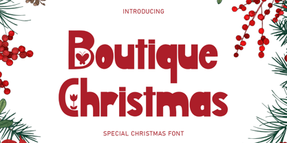
- Boutique Christmas by Selvia Design,
$14.00