10,000 search results
(0.035 seconds)
- African Gold by Scholtz Fonts,
$19.00 The name African Gold is associated with Johannesburg, the "City of Gold"; (the Zulu name for Johannesburg is eGoli). The font was so named for two reasons: the intricate African patterns within the characters of the font suggest the shafts and tunnels of a gold mine, and, as with a gold mine, the richness lies within. African Gold is a display font that is best used at larger sizes, however, it contains a full character set with all accents, special characters, diacritical marks and all the characters are carefully spaced and kerned. The numerals are mono-spaced so that they will line up correctly in columns of figures. The letters of the alphabet are spaced according to their width and are carefully kerned to create an attractive appearance.
 - Pepi/Rudi by Suitcase Type Foundry,
$39.00 The superfamily Pepi and Rudi is based on playful experimentation with basic geometric shapes - the circle, rectangle and triangle - elements that laid the foundations for typographic Modernism. The Pepi and Rudi introduces a number of current elements into a time-proven concept of primitively constructed typefaces. The typeface's somewhat uniform character width establishes a more regular rhythm; the character set is expanded, and legibility is improved thanks to taller lowercase. A wide range of ten styles, from hairline-thin to extra-thick with adequate Italics allow for universal use across the whole scope of graphic design. Carefully designed diacritics, clear punctuation marks, table number characters, ligatures, arrows or alternative lowercase characters are standard; this is sure to please everyone needing to work effectively with a neutral, geometric headline typeface.
 - Suffix by Obelisk Gestalt,
$34.00 Suffix Mono is a monospaced sans-serif family that offers an extensive range of weights and styles. Additionally, it provides numerous OpenType features, including 16 distinct stylistic sets for users to experiment with. The core concept behind Suffix Mono is to explore the distinctive textures often associated with monospace fonts, which are primarily characterized by their "fixed width" nature. Suffix Mono enhances these textures by introducing various stylistic features that enable users to replace closed glyph contours, such as those found in characters like 'f,' 'r,' 'i,' and 'j,' with more open and airy alternatives. Enabling these alternates results in an overall transformation of the textural appearance of Suffix Mono. Furthermore, Suffix Mono boasts one of the hallmark features of modern typefaces: extensive language support, encompassing nearly the entire Latin script.
 - Beachwood by Swell Type,
$25.00 Los Angeles’ distinctive “shotgun” style street signs were last produced over sixty years ago, but these durable porcelain and steel signs are still in use all over the city, by both humans and birds, who like to build their nests between the panels. The street names were drawn at wildly different widths to fit on panels which were manufactured in only one size. Beachwood faithfully re-creates the extreme range of widths & weights on these vintage signs, and adds a new matching lowercase. Use the Beachwood Variable font file to access any width, weight or italic angle between the presets — a technology 20th Century sign painters could only dream of! Each weight of Beachwood includes numbers based on the street signs, plus four alternate number sets based on the jerseys of Los Angeles' pro football teams. Beachwood is named for Beachwood Drive, the street which leads to the famous HOLLYWOOD sign, so we just had to include a bouncy HOLLYWOOD mode! FAMILY FEATURES: Five widths (from XTall to XWide), with eight Weights (from ExtraLight to UltraBold), each with matching italics Variable font to access any width, weight or italic slant EACH WEIGHT INCLUDES: 584 glyphs to support 223 languages in Western Europe, Central Europe, Vietnam and Oceania, plus Cyrillics Five styles of numbers, plus Tabular Lining for screen display Ordinals, Fractions and Arrows Hollywood mode!
 - Green Peas by Four Lines Std,
$15.00 Crafted with meticulous attention to detail, Green Peas Font offers a harmonious balance between beauty and elegance of nature. Green Peas Font combines legibility adnd Readibility with a touch of whimsy, making it perfect for both digital and print mediums. Its versatility allows you to seamlessly incorporate it into various projects, from website headers, quotes, inspirational messages, posters, stickers, social media graphics, or personal journals, to book covers, ensuring a consistent and visually striking presence. Unlock the extraordinary power of Green Peas Font and witness the transformative effect it has on your designs.
 - Kostic Serif by Kostic,
$50.00 Kostic Serif is a classic transitional typeface (like Baskerville, Bookman, Caslon, Times) with tall, clean characters and a large glyph set to support all European languages - Greek and Cyrillic script included. Excellent for setting multiple pages of text and packed with OpenType features (proportional lining and oldstyle numbers, tabular figures, superscript and subscript, numerator and denominator figures, fractions and 31 ligature in 659 characters), it should meet the demands of even the most demanding typographic works. Kostic Serif is made with fairly large x-height, so the text is legible in very small sizes. Zoran began the work on Kostic Serif around 2002 and after completing Regular, Bold and matching italics, he wasn’t too pleased with the design, so he dropped further work on it to make other fonts. In 2010 Nikola came upon unfinished files for Kostic Serif, and decided to redesign the letters, while retaining basic proportions and widths that Zoran established earlier. When they were both pleased with the new look of the font, they made Medium and decided to add CE and Greek script to the glyph set, to make it pan-european.
 - Dragonflight Pro by Fontforecast,
$29.00 Dragonflight Pro is a script collection of four modern calligraphy fonts. Each glyph was hand-drawn with a brass folded pen dipped in ink. The tip of the folded pen resembles the shape of a dragonfly’s wing, hence the name. By tilting the pen variations in line width are made. This produces fun, expressive letters with a spontaneous personality. The regular and rough version of Dragonflight Pro have alternate glyphs that can either be accessed by the swashes feature, stylistic set 1, or the glyphs panel, depending on the application you are using. There are lots of discretionary ligatures that offer even more variation. By typing _1 to _10 you can access bonus swashes that are part of Dragonflight Pro Regular and Rough. Both fonts have 567 glyphs. Dragonflight Pro Sans is an all caps font with 402 glyphs, also hand-drawn with the folded pen, that compliments the other styles perfectly. Dragonflight Pro Extra offers an additional 117 swashes, doodles and ink splatters. With Discretionary Ligatures activated you can type an underscore in front of a letter and (when available) this gives you the rough version of the glyph.
 - Electrone by Alit Design,
$21.00 💥Introducing "Electrone" – Unleash the Power of Typography with a Superhero Flair! Unleash the electrifying energy of "Electrone," a dynamic font that embodies the essence of superheroes with lightning speed, unmatched strength, and a dash of style. This font is not just a typeface; it's a superpower for your design projects! Key Features: Electrifying Glyphs: With 890 meticulously crafted glyphs, "Electrone" offers a vast array of characters that will add a powerful punch to your designs. Every glyph is a superhero in its own right. Sided Ligature: Seamlessly blend characters with our specially designed sided ligatures, creating a visual impact that resonates with strength and unity. Alternate Characters: Customize your text with alternate characters to give your designs a unique and personalized touch. The alternates are carefully curated to ensure versatility without compromising the superhero aesthetic. Lightning Swash: Add a bolt of energy to your typography with lightning swashes that strike through your text. Watch your words come to life with the electrifying force of "Electrone." Wings of Typography: Elevate your designs to new heights with the winged elements included in "Electrone." These wings symbolize the freedom and power associated with superheroes, making your text soar above the ordinary. Suit Up Your Designs: "Electrone" is not just a font; it's a complete superhero costume for your words. Whether you're working on comic book titles, posters, logos, or any design that demands a bold statement, "Electrone" is here to save the day. Perfect for: Comic Books and Graphic Novels Superhero Movie Posters Action-packed Logos Gaming Graphics Apparel Design and more! Embrace the electrifying power of "Electrone" and turn your designs into epic adventures. Download now and witness the transformation of ordinary into extraordinary!
 - Morgan Sans by Feliciano,
$50.00The Morgan Project can be considered a big type family with ‘many styles’ or a set of different types that match with each other. For me it’s one typeface with different versions with deliberate and visible differences according to the propose to which each version was created. The design started in 2000 as a display type with the design of the Morgan Tower, to which more two display versions were added; Morgan Poster and Morgan Big — all together the make our: FTF Morgan Display Kit 1. All three versions consist only in uppercase with alternate letters in the lowercase and a set of special ligatures. Morgan Tower has four variants that differ in width/weight, Morgan Poster has six variants (often called styles), three weights in upright and oblique and Morgan Big has twelve, six weights in upright and oblique. Lately, the FTF Morgan Tex Kit 1 was added. Apropriate versions to use in text setting. Both versions, FTF Morgan Sans and FTF Morgan Sans Condensed share the same structure and character mapping. Four variants each; regular, bold, oblique and bold oblique with a large character set including: small caps, lining and old style figures (here called Office figures) — both tabular —, small caps lining figures, mathematical symbols and fraction figures, and, a set of foreign characters expanding the possibilities of use for a wider range of languages. Characters are distributed in six different font layouts: Lining, Office, Expert, Caps, Figures & Pi. - Caltic by Ingrimayne Type,
$12.95 Caltic-Holiday, Caltic-Festival, and Caltic-Straight are three eye-catching, very bold typefaces that are suitable for posters and signage. Caltic-Holiday and Caltic-Festival base letter shapes on trapezoids with curved sides but with curves that are reversed going from one to the other. Caltic-Straight has letters based on trapezoids with straight sides. None are suited for text and with their built-in spacing will not work as all upper-case or all lower-case. All three come in two widths, regular and wide, giving the Caltic family six members. Caltic has nothing to do with Celts. The Calt refers to the calt or contextual alternative OpenType feature that makes this typeface work. When the letters on the upper-case keys alternate with the letters on the lower-case keys, they fit snuggly together. As long as the user has a word processor that supports the contextual alternatives feature, there is no need for the user to alternate letters; the calt feature does it automatically. Although the fonts seem similar to hand-drawn lettering that was done on posters and signs during the hippie era of the 1960s and 1970s, I can find nothing quite like them. My inspiration for them is older, in a newspaper from 1932 that led to the typeface family PoultySign. Caltic (and Lentzers) are the result of seeing what else I could do with the inspiration that sprang from that 1932 newspaper.
 - Conthey Inline by ROHH,
$29.00 Conthey Inline™ is your new retro-display best friend! The one and only, unique IN-AND-OUT typeface with strong personality and outstanding flexibility. This display sans features amazing variable fonts letting you adjust not only width of the letters, but also let you fluently transition from thin inline styles to thin outline ones. This mechanics opens a world full of layering possibilities as well as a great fine-tuning ability. The family consists of 39 OpenType fonts - 18 pure inline/outline styles in 3 widths (Narrow, Condensed, Normal) and 21 styles carefully prepared and tuned for layering. For even greater flexibility 3 variable fonts are included in the set. In addition to flexible width and inline-outline transitioning, this playful typeface features 4 different inline styles to spice up things even more! All styles were meticulously crafted with the highest attention to detail in the letterforms as well as spacing. Conthey Inline is a sibling of Conthey, a display unicase family as well as Lutschine, a versatile modern narrow display typeface. Conthey Inline composes perfectly with its family members, covering a very broad range of design scenarios. All these typefaces are a part of big type system containing also a workhorse sans serifs such as Rothorn and Montreux Grotesk. You will have a lot of success using Conthey Inline for any kind of playful, vintage/retro, organic, friendly and stylized designs. Especially, industries such as food & beverage, travel, hospitality, fashion, healthcare, sports, lifestyle, music, art, entertainment and products for youth are perfect areas to make Conthey Inline shine with all its charm.
 - Azzury Script by Akifatype,
$14.00 Azzury Script is highly legible Script typeface wit a touch of abold, classic and fun Vintage Script fonts. With glyphs and opentype features with stylistic alternates. Can be used for various purposes. such as posters, t-shirts, signage, logos, news, badges etc. To enable the OpenType Stylistic alternates, you need a program that supports OpenType features such as Adobe Illustrator CS, Adobe Indesign & CorelDraw X6-X7, Microsoft Word 2010 or later versions. Azzury Script is coded with PUA Unicode, which allows full access to all the extra characters without having special designing software. Mac users can use Font Book , and Windows users can use Character Map to view and copy any of the extra characters to paste into your favorite text editor/app.
 - Flaminia by Andinistas,
$39.95 Flaminia is a typeface family of 4 members designed by Carlos Fabián Camargo G. The central idea started as Dingbats and titles labeled with fine-tipped brushes and flat tip for graphic design related restaurant menus, instructions, packaging, food containers and labels. Thus began the process of drawings and letters integrated by shapes and counterblocks that seem inaccurate yet but at the same time clean and attractive. For this reason each variable suggests fresh brushstrokes that combine ideas from Roman and italic calligraphy. Flaminia members work separately or together by solving needs in different scenarios. This will enhance its properties in order to control and diagram titles, subtitles and short paragraphs with an effusive and manuscript character. Flaminia is useful for generating a flavor of "hand lettered by skilled artists lettering." In conclusion, Flaminia Regular and Italic are used to write short paragraphs. His ascending and downs are lower that the X height. Its width is imperceptibly condensed to save horizontal space. Its smooth lines and finishes simulating a crescent moon have been made with fine-tipped brush. The contrast between thick and thin has medium intensity. Its complement is an ideal italic to emphasize words and phrases. Its conceptual characteristics are similar with foundation's handwriting, except for his companion who takes ideas from the ornamental italic calligraphy. Flaminia Black is compact and ideal for ranking information such as words and titles. Its personality is based on ornamental penmanship italics mixed with humanistic ideas outlined with contrast-type, flat-tipped brush thickness. Its overall width is slightly condensed, rising and falling are short compared to an exaggerated X height. Its smooth lines and terminations as in a crescent moon simulate the path of a broad brush. Its amount of contrast between strokes have average intensity. In brief, push to the limit parameters such as the type and amount of contrast, size, backward, forward, overall width, etc. And finally, Flaminia Dingbats offers three sets of different illustrations, a total of almost 90 drawings useful in communications related to: Food, Clothes and Sketchy. Each carefully wrought through research, testing, analytical design, visual strategy and high-definition of Bezier paths, optimizing time and work to their users. And in conclusion, I have plans to continue expanding the family with more complete versions in the future.
 - Leroy by Andinistas,
$39.95 Leroy is a font family of 5 members designed from geometrizing Roman and Gothic skeletons. Its purpose is to provide optimal reading of titles and paragraphs with strong mechanical flavor. Because of this, its variables are designed to sort information in media such as labels, signs and industrial atmosphere packaging related with the Soviet Union’s fonts in 1920. This idea matured white horizontal lines superimposed on alphabets drawn with an ancient architectural team known as “Leroy K & E Controlled Lettering System”. Then that evolved into a family concept unifying its proportion to the same X height for its members, resulting in a versatile type system. Therefore, Regular and Bold variables have low contrast between thick and thin strokes. Its upstream and downstream are extremely short, generating a suitable interline that clogs the vertical area. Its overall width equal to its X height, supports its tight spacing that compacts the horizontal area. Therefore, the variant with black caliber has plenty of contrast between thick and thin strokes. The light variable has a “blind” effect radiating light halos, ideal to propose hierarchies and combinations with orthogonal projection. In that sense, Leroy’s modular character reminds constructivist ideology merged with typographical variants suitable for graphic design with geometric look. To achieve this, I studied the softening of forms and counter blocks into a typographical system specially designed for composing useful information to attract attention. In that sense, the dingbats were obtained through a careful process of research and testings done with drawings that provided full and empty visual strategies that with the passage of time helped to forge the major decisions of a metamorphosis from industrial tools, birds and humans from pictogram mixing various genres.
 - Alaturka by Bülent Yüksel,
$19.00 ABOUT FAMILY: What makes "Alaturka" elegant, friendly and contemporary is its very rounded curves with very open terminals. "Alaturka" has been designed with a higher "x-height" than other fonts in its class to make tiny readability more obvious in any use situation. It will be ideal for use in small sizes such as business cards or mobile applications. This typeface is also equipped with powerful OpenType features to satisfy the most demanding professionals. It has solid features like case sensitivity, small, true capitals, full ligatures, tabular figures for tables, old-style figures to elegantly insert numbers into your sentences, and more alternative characters to give personality to your projects. FEATURE SUMMARY: - 2 style: 1From 1923 To 2023 - 8 weights: Thin, Extra Light, Light, Regular, Medium, Bold, Extra Bold, and Black. - 3widths: Normal, Narrow, and Condensed. - Matching italics (12º) for all weights and widths. - Matching small caps for all weights and widths. - Lining and old-style figures (proportional and tabular). - Some alternate characters - Unlimited fractions. - Automatic ordinals (1st, 2nd, 3rd, etc.). - Extended language support: Most Latin-based scripts - Extended currency support. You can enjoy using it.
 - Extenda by Zetafonts,
$39.00 Extenda is a variable width sans serif type family designed by Francesco Canovaro with Andrea Tartarelli and Cosimo Lorenzo Pancini.It been created to provide designers with a powerful but flexible tool to create strong headlines, logos, and display text with tight spacing and maximum space coverage. Rather than providing a family of weights, it gives you a fine-grained range of widths to choose from, allowing maximum control in display editorial uses, and proportional size variation in logo design, keeping consistent appearance and readability. From the vertical, ultra-condensed and thin Pica, Nano and Micro weights to the wide and ultra-bold Peta, Exa and Yotta weights, all Extenda fonts include an extended character set covering Latin languages as well as ones using Cyrillic and Greek for a coverage of 200+ languages. Full Open Type features are included, from small caps to stylistic alternates, positional number forms and discretionary & standard ligatures. The 11-weights family is complemented by the Extendable special weight, that uses Open Type scripts to create a dynamically scaling typeface where each letter becomes automatically tighter or wider than the previous one.
 - Etnier by Ahmad Jamaludin,
$17.00 Introducing Etnier – A brand-new modern family with a unique! Etnier is a modern variable font. Essentially, it's a sans-serif font with a sturdy and squared appearance, ensuring excellent legibility. It offers various widths and italics that provide versatility for your designs. The bolder, the stronger – this defines Etnier. Its bold and robust qualities, especially in the italic version, make it ideal for UI/UX-related designs. In total, there are 14 font styles available, or even more if you use the single files variable. You have the flexibility to slide through the weight and width options to find the sweet spot for Etnier. shape! What's Included? Etnier Main File 14 fonts family with Weight and Oblique options Instructions (Access special characters in all apps, even in Cricut Design) Accessible in Adobe Illustrator, Adobe Photoshop, Microsoft Word even Canva! PUA Encoded Characters. Fully accessible without additional design software Language Support: Danish, English, Estonian, Filipino, Finnish, French, Friulian, Galician, German, Gusii, Indonesian, Irish, Italian, Luxembourgish, Norwegian Bokmål, Norwegian Nynorsk, Nyankole, Oromo, Portuguese, Romansh, Rombo, Spanish, Swedish, Swiss-German, Uzbek (Latin) Come and say hello over on Instagram! https://www.instagram.com/dharmas.studio/ Have a great day! Dharmas Studio
 - Hellschreiber by Jörg Schmitt,
$35.00 The birth of the monospaced types dates back to the past. There was a need for the creation of typesets for typewriters. The difficulty was to align the different glyphs in the same width. This led to particular problems with letters like “M” and “l”; the former seemed to be squeezed into the same width of all letters and the second one appeared way too streched. Despite – or perhaps because of – the impression of the typewriter is still popular with Graphic Designers. Nowadays there are even monospaced versions of primarily proportional types; for example the the Sans Mono designed by Lucas de Groot or the DIN Mono. Then again, why not the other way round?! In the first half of the Nineties, Erik Spiekermann developed a proportional type named ITC Officina based on the Letter Gothic. According to a survey on the 100 best fonts of all time conducted by FontShop, ITC Officina is in an eighth place, far ahead of its forerunner. This was the reason for me to create a wider design with a Serif and a Sans Serif based on the queen of all monospaced types – the Courier.
 - Terfens Contrast by insigne,
$35.00 Terfens draws influence from chancery scripts, updating it for the twenty-first century. Terfens Contrast is derived from Terfens' DNA and retains its humanist tone. It’s tall x-height gives it a friendly but not informal feel. With Terfen Contrast, calligraphy-inspired letterforms are rendered with a high contrast nib, lending raw vitality and expressivity. This juxtaposition gives the letters a sense of firmness and energy, but also of heavenly, delicate beauty. Terfens is a full-service branding and packaging solution, containing a lot of personality, combining the passion of a broad nib pen with the beauty of a brush. Terfens is a "workhorse typeface" comprising 48 typefaces in three widths and eight weights. There are ligatures and swashes in all weights, as well as support for more than 72 languages. Another powerful typeface to add to your collection of eye-catching fonts. Terfens draws influence from chancery scripts, updating it for the twenty-first century. Terfens Contrast is derived from Terfens' DNA and retains its humanist tone. It’s tall x-height gives it a friendly but not informal feel. With Terfen Contrast, calligraphy-inspired letterforms are rendered with a high contrast nib, lending raw vitality and expressivity. This juxtaposition gives the letters a sense of firmness and energy, but also of heavenly, delicate beauty. Terfens is a full-service branding and packaging solution, containing a lot of personality, combining the passion of a broad nib pen with the beauty of a brush. Terfens is a "workhorse typeface" comprising 48 typefaces in three widths and eight weights. There are ligatures and swashes in all weights, as well as support for more than 72 languages. Another powerful typeface to add to your collection of eye-catching fonts. • Recommended uses: modern branding and logo design, powerful editorial design, exciting packaging, and a wide range of additional jobs. • 54 font styles, including eight weights, eight italics, and three widths. • Each weight has 500+ glyphs. Useful Opentype features include: Access All Alternates, Discretionary Ligatures, Denominators, Fractions, Kerning, Standard Ligatures, Lining Figures, Numerators, Oldstyle Figures, Ordinals, Scientific Inferiors, Subscript and Superscript.
 - Andovine by Stringlabs Creative Studio,
$25.00 Andovine is a strong and powerful display font with a vintage feel. Fall in love with its raw authenticity. Andovine is a handbrush font with authentic style. This font is made with a brush pen with very careful techniques, so the results are charismatic and have enchanting characteristics.
 - Tinta Arabic by NamelaType,
$29.00 Tinta Arabic is the sibling of Tinta, with with additional Arabic glyphs for more international fun with the addition of Arabic glyphs; Arabic, Urdu, Kurdish Farsi and Jawi. Basic form for arabic font is refers to the arabic Naskhi style, with a cute shape to harmony with Latin.
 - Belle Sans by Park Street Studio,
$25.00 Belle Sans is a clean, straightforward sans serif typeface family, and a very large family at that! It has seven widths, from Ultra Condensed to Extra Wide, and seven weights, ranging from Light to Black, all with Oblique companions. Belle Sans offers up great legibility for on-screen usage, and the breadth of width and weight make it very usable for text applications as well. The heavier weights, especially the Black, are exceptional for creating visual impact! Each font supports Western and Central European languages, ligatures, tabular figures, unlimited fractions, superiors & inferiors, and ordinals.
 - Manual by TypeUnion,
$39.00 Manual is an 80 font super family formed of 10 weights in 4 different widths. The font is styled with a slight retro feel to give it a unique appearance. Manual is a blue-collar font that works hard for you and your design ideas. The higher x-height enhances the readability for smaller, more informative text sizes whereas the black weights create beautiful, impactful headlines to fit a variety of spaces. The support of the expansive weights and widths will give your design a truly unique feel.
 - Fictional Powers by PizzaDude.dk,
$15.00 As a kid, I often fantasied about which superpowers would be the coolest. That was a time before the internet and social media, so my references were limited. But I guess that being invisible or fast speed was the top wishes. Not much, but still great powers - today, I think I’d wish for “world peace” or “with a blink of my eyes, sushi appears” as superpowers. Anyway, say hello to my multilingual graffiti-inspired comic font, Fictional Powers, that even comes in a super-duper-sonic-speed version!
 - Nuber Next by The Northern Block,
$39.95 Nuber Next is a modern geometric sans influenced by the popular neo-grotesques of the 1950s including Helvetica and Univers. Carefully remastered from the original Nuber type family to improve letter shape, overall uniformity and introduce a flexible width system capable of handling a wider variety of typographic applications. Details include 750 characters per font, nine weights and five widths with matching italics. Opentype features include seven variations of numerals, fractions, case-sensitive forms, stylistic alternates, ligatures, extended monetary symbols and language support covering Cyrillic, Western, South and Central Europe.
 - Pageu by Realtype,
$14.00 Pageu is a handmade font written with a real brush pen. Written with quick movements using a brush pen. It's Handwritten with quick dry strokes. Suitable for those who need a font with real textures
 - Chilloxine by Owl king project,
$29.00 Chilloxine is a clean font with detailed edges combined with sharp corners and one side with rounded corners. font with 18 families that bring more varied thickness and slope, with many style choices in one family, the font is very good to use for logos, titles headlines, & can even work well for text. Chilloxine is very minimalist with a clean form and is more professional.
 - Moku Brush by Deltatype,
$49.00 Moku Brush is a structural brush script inspired from handwriting with brush, with straight letterform you will get less formal but more sweet! Moku Brush come with nine weights, so you can use as body text or even better with headline. With nine variations, you can use this font in different sizes with different weights, you will get better balance when do type setup.
 - Klainy by Identity Letters,
$29.00 An unadorned Grotesque with a refreshingly personal touch. If “Grotesque” mainly means “industrial, mechanical, anonymous typeface” to you, Klainy might redefine your image of the genre. Yes, it’s a Grotesque—but with a contemporary look and a lot of personality. Klainy’s apertures are more closed at the top and more open at the bottom, creating an informal rhythm that sets Klainy apart: a confident, optimistic voice with a clean appearance. Terminals are subtly back-bent: these quaint “hooks” make Klainy a bit more personal, a bit friendlier. (You can find them in the a, c, f, and r.) Just like its old-style Grotesque ancestors, Klainy is optimized for display sizes and short texts. There, its unobtrusive quirks can be wholly appreciated. However, the familiar Grotesque appearance makes sure that the typeface is comfortable to read in smaller sizes, as well. Use Klainy whenever a basically classic sans-serif typeface with a modern and individual twist is called for. This font family comes in eight weights ranging from Thin to Black, each with a matching italic style. More than 500 glyphs and a bunch of Open Type Features make it a reliable companion for all of your projects. You can fine-tune the flavor of Klainy with Stylistic Alternates such as a one-story a and a two-story g. Their simple construction blends perfectly with the design concept of this typeface. Klainy is a seasoned blue-collar worker that surprises you with wit and team spirit. It’ll be a great addition to your font library.
 - Ghastly Panic - Unknown license

- Samsheriff by Ingrimayne Type,
$5.00 Samsheriff is a large sans-serif family with a touch of quirkiness. It contains an eclectic mix of letter styles but is very legible. The origin of this typeface was in the caps-only letters used for the novelty font Coffinated. Adding lower-case letters, additional widths, additional weights, and italics resulted in the 30 styles that make up the Samsheriff family.
 - Syntho by Gspr one,
$5.00 Syntho is a modular typeface with 18 variants and a Variable Font. Its structure is geometric and modular, but its proportions resemble those of classic grotesque typefaces, giving it a familiar feel to the designer. It also includes two subfamilies, 200 and 300, which are expansions of the typeface in width, providing greater possibilities for the designer in any project.
 - Oceanfront Property JNL by Jeff Levine,
$29.00 Oceanfront Property JNL was modeled from the hand lettered title on the cover of the 1932 sheet music for "There's Oceans of Love by the Beautiful Sea". A simple sans, it still reflects the beginnings of the Art Deco Era with its approach to letter forms and varying widths. This type design is available in both regular and oblique versions.
 - Belgiano Serif by Skypia,
$15.00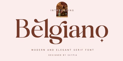 introducing our new "Belgiano" Modern Ligature with Elegant Style this is perfect for branding, logos, invitation, masterheads and more. Belgiano is also included full set of: uppercase and lowercase letters multilingual symbols numerals punctuation Alternates PUA Encoded Ligatures Wish you enjoy our font and if you have a question, don't hesitate to drop message & I'm happy to help :) Thank you, Skypia
 - MardiKrewe PB by Pink Broccoli,
$14.00 Wild and carefree, the MardiKrewe Family is filled with spunk and personality. MardiKrewe started as a digitization of a film typeface called MardiGras by Lettergraphics. From there, this lively typeface was fleshed out to a full character set and expanded to a family of 5 widths: Extra Narrow, Narrow, Regular, Wide, and Extra Wide to fit a variety of funktastic needs.
 - Huggy by Typogama,
$19.00 Huggy is a display typeface designed by Michael Parson and inspired by the work of Heinrich Heinz. Full of Art Nouveau flair, this two weight typeface is bold forceful but full of subtle features that give the design a unique personality. With a narrow width and tall aspect, it is perfect for setting text in tight spaces like posters or other titling situations.
 - Gio by Fenotype,
$20.00 Gio is a wedge serif with robust geometric features and subtle details. Available in two widths and seven styles each, Gio boasts a generous x-height and straight endings, maintaining generally consistent proportions. This creates an elegant ensemble, ideal for captivating display purposes. Gio excels in magazine layouts, headlines, as a logotype, or in any display use, imparting a sophisticated modern feel.
 - TS Kirt by Vitaliy Tsygankov,
$19.00 TS Kirt - variable sans-serif typeface with narrowed proportions. The font is suitable for titles, packaging, printing, websites, infographics, and advertising. The TS Kirt font family consists of 6 faces and as well as a variable version. The advantage of the font - the same width character in any style. When switching the face, the length of the line will not change.
 - Ganery by Sensatype Studio,
$15.00 Madani is a sans serif font family with modern, corporate, elegant, unique and classy-look. This font crafted specials for logo design projects, ready to use on Logo, Branding, Magazine, Social Media, and Many more that needs modern touches. Madani is also included full set of: uppercase and lowercase letters 18 weights multilingual characters numerals punctuation Wish you enjoy our font. :)
 - Toddler JNL by Jeff Levine,
$29.00The fun, lighthearted appeal of Toddler JNL will bring out the inner child in you. Perfect for any layout or project that has to do with newborns, toddlers, preschool, playtime or anything related to little ones. There's a fairly complete character set - and two different width blank boxes on the brace keys - which can be used as spaces between words.
