10,000 search results
(0.028 seconds)
- Highboy by Elemeno,
$25.00In the world of interior design, a Highboy is a tall chest of drawers with legs. Although this font is wide and bold, it seems ideal for storage. Highboy is best at large sizes, but can easily overwhelm other fonts of lighter weight. - Coleface by Roy Cole,
$34.00 Coleface was created by the British typographer Roy Cole, completed shortly before his death in 2012. It comprises six fonts: Coleface 30, 60, 90 and the italics 33, 66, 99. As with his earlier typeface families - Lina, Zeta and Colophon - Coleface is a highly-readable sans serif typeface that offers significant flexibility in terms of its potential uses. Roy Cole studied typographic design under the tutelage of Emil Ruder at the Gewerbeschule in Basel, at a time when typographic history was being made through the creation of a style that epitomized modernity. Consequently the principles of order, simplicity and legibility, fused with experimentation, became a hallmark of his practice, as exemplified in his last font Coleface.
 - Double Aunofa by Konstantine Studio,
$13.00 Double Aunofa, a couple of beautiful fonts with the approach to luxury branding and classy feels. Comes in clean tall serif and handwritten script style. Perfectly fit for your simple branding, logo, classy visual identity, you name it.
 - Joost by Type-Ø-Tones,
$60.00 This is a relaunch version of Joost, a milestone of the Type-Ø-Tones catalogue. This revival of Joost Schmidt’s typeface now has a capital set, a new weight and some OpenType features. Not to mention alternate glyphs for M, N, Ñ, and W characters. The inspiration came from the 'bauhaus dessau im gewerbemuseum' basel exhibition poster, designed in 1929 by Franz Ehrlich after a sketch by Joost Schmidt.
 - Gageac by Eurotypo,
$29.00 Gageac is a classic "Didona" font, characterized by an extreme contrast in the thick and thin strokes, by the use of short serifs, and by the vertical stress of the letters. This typeface is slightly condensed, the ascenders were lowered, the thick strokes were exaggerated and enriched with a full set of OpenType features of tails, ligatures, alternates and swashes, giving them an excellent legibility and a very clear and elegant appearance. The italic version is a true "italic" so some glyphs were adjusted. Gageac Italic was carefully designed and drawn to be combined with Gageac Regular.
 - Boscha by Maulana Creative,
$17.00 Boscha is a condensed sans serif font. With medium tall stroke, fun character with a bit of ligatures. To give you an extra creative work. Boscha font support multilingual more than 100+ language. This font is good for logo design, Social media, Movie Titles, Books Titles, a short text even a long text letter and good for your secondary text font with sans or serif. Make a stunning work with Boscha font. Cheers, Maulana Creative
 - Coopslight by Maulana Creative,
$15.00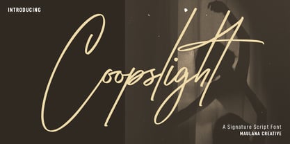 Coopslight is a tall expressive signature font. With medium stroke, fun character with a bit of ligatures and alternates. To give you an extra creative work. Coopslight font support multilingual more than 100+ language. This font is good for logo design, Social media, Movie Titles, Books Titles, a short text even a long text letter and good for your secondary text font with sans or serif. Make a stunning work with Coopslight font. Cheers, MaulanaCreative
 - Best Choice by Dharma Type,
$9.99 Best Choice is a family of next-generation monospaced fonts for developing, programming, coding, and table layout. Some desirable features in monospaced fonts are listed below. 1.Easy to distinguish 2.Easy to identify 3.Easy to read Best Choice has very distinguishing letterforms for confusable letters such as Zero&Oh, One&I, and Two&Z. A lot of ingenuity makes this family very distinguishable. Italics have a very large inclination angle to be distinguished from their Roman. For the same reason, Italics are slightly lighter than Romans. Italic is not cursive Italic. It is near the slanted Roman. This is an intentional design to identify Italic letters. Cursive is not suitable for programming font. Very clean and natural letterform is good for reading. Common curvature for tails and hooks makes harmony and a sense of unity. Best Choice supports almost all Latin including Vietnamese and Cyrillic. Try this all-new experiment.
 - Ranch Hand JNL by Jeff Levine,
$29.00 Ranch Hand JNL is a tall, condensed wood type with slab serifs. The font is somewhat bolder in weight than Nostrand JNL, but like its counterpart, fully captures the spirit and flavor of Nineteenth Century advertising, fliers and notices.
 - Cozee by Parker Creative,
$18.00 Introducing Cozee, a quirky tall and narrow handwritten font with stylistic alternates! This modern condensed sans serif is fun and skinny - ideal for creating minimalist illustrations, cricut projects, kids books, branding projects, custom home decor, and so much more.
 - YT Steel Latin by Yangtype,
$9.00 The concept of this letter is a tall, well-dressed man with moderate muscles, decent appearance, and manners. We are always impatient. I miss someone who can give me some space. This letter gives you some leeway that you can rely on for a moment.
 - Stencil Octoid JNL by Jeff Levine,
$29.00 Stencil Octoid JNL was inspired by a set of twelve inch tall stencil letters and numbers made by Duro Art Industries in Chicago. The bold type style with angled rather than rounded corners gives the font a strong feel of industry or military usage.
 - Estandar Rounded by Latinotype,
$- Estandar Rounded is a retro and vintage wayfinding sans serif font, inspired by old signals in central park and Europe. It is a Condensed sans with their tall x-height. The family has 6 Weights, italics and dingbats. It is an extension of Estandar font.
 - Paralucent by Device,
$39.00 Paralucent is versatile all-purpose modern sans. Available in seven weights, from Thin to Heavy, and in two widths each with corresponding italics, it avoids some of the more eccentric calligraphic quirks of Akzidenz or Helvetica or the cool precision of Univers for an elegant, functional, yet warm design. There are two additions to the core 28-weight family: a three-weight stencil set, and a four weight text family. The text weights have been adjusted for use at small point sizes, and feature more open character shapes, looser inter-letter spacing for improved readability, and lining numerals for use in listings and tables. Several core ideas inform Paralucent’s design. Prime attention has given to the negative space between characters, giving a more even “colour”, especially in text. For example, the J, L and T have shorter arms than comparable sans typefaces, while the M and W are wider. The A has a lower bar, opening up the interior counter. An unusually high lower-case x-height again helps to give a more even colour and improve legibility. Care has been taken to rationalise repeated elements like the tails on lower-case letters, or the Q and the “ear” of the g. Typographic design solutions that are consistent across all these features add more stylistic cohesion. ‘Ink traps’ are exaggerated incisions used to open up a letter's narrower internal angles, which can become clogged with ink, especially in small point sizes. Now largely redundant due to the high quality of modern print, they are still sometimes used as a stylistic quirk or design feature. Now that digital fonts are often reversed or outlined, or enlarged to enormous sizes, these can also lead to unexpected or obtrusive results. Paralucent takes these inevitable digital manipulations into account, and adds optical corrections without resort to ink traps. The family has been picked up by many UK and US publishers, featuring heavily in magazines like Loaded, Heat and TV Quick, as well as high-end coffee-table photography books and gallery websites. A perennial Device bestseller.
 - Balgin by Studio Sun,
$12.00 Balgin brings back the nostalgic era of 90's. The 90’s were a magical time – a time of the Docs, Game Boys, and Cartoon. As everything that was once old is new again, the 90’s are making a come back. The basic of typeface are from geometric/basic shapes (Triangle, Square, Circle) form. Some character in Display font are modified, like 'R'K' stroke are more dynamic. and the tail of 'g' are more generic. Balgin are available in 3 Flavour Typefaces (Display - Normal - Text) and have 6 different weights (For Normal are available on 5 Widths). Available with Variable Fonts on Balgin Display & Balgin Normal
 - Bolognia by Craft Supply Co,
$15.00 Bolognia is a classic serif typeface with high-contrast leaning to the concept of contemporary typefaces. Bolognia has a tall x-height value, modern proportion, transitional serif and extreme stroke contrast with vertical stress. Available in 6 weights, this typeface is a good choice to provide clear solutions for a variety of situations and settings such as editorials and headlines.
 - Ontario Script by Factory738,
$15.00 Call me Ontario - A fashionable handwritten font with a personal touch. Ontario script is ideal for a variety of projects such as branding, logo design, wedding designs, social media posts, advertisements, product packaging, product designs, label, photography, watermark, invitation, stationery, and any other project that requires a handwritten touch. Ontario Script (Regular, Caps, and Tails) Basic Latin A-Z and a-z Numerals & Punctuation Stylistic Alternates Multilingual Support for ä ö ü Ä Ö Ü … Free updates and feature additions Thanks for looking, and I hope you enjoy it.
 - Nova Scotia by Factory738,
$15.00 Introducing Nova-Scotia - A charming handwritten font with a personalized touch. Nova-Scotia script is ideal for a variety of projects such as branding, logo design, wedding designs, social media posts, advertisements, product packaging, product designs, label, photography, watermark, invitation, stationery, and any other project that requires a handwritten touch. Nova-Scotia Script (Regular, Caps, and Tails) Basic Latin A-Z and a-z Numerals & Punctuation Stylistic Alternates Multilingual Support for ä ö ü Ä Ö Ü … Free updates and feature additions Thanks for looking, and I hope you enjoy it.
 - Mummbler by PizzaDude.dk,
$20.00 Mummbler is your tiny, crunchy and lovely serif font with tall ascenders and deep descenders. Romantic, perhaps - but definately worth your next print project!
 - Mandatory by K-Type,
$20.00 Mandatory is a full small caps font developed from the typeface used for UK vehicle registration plates. There is improved stroke separation on the M and W which are pointed at the centre, and the tail of the Q is thinner and clearer.
 - Marsden by J Foundry,
$25.00 Marsden is a bold, no-nonsense Grotesque. It was designed for display, branding, advertising, packaging or anywhere a strong voice is needed. Marsden is built on a geometric foundation, with just enough warmth to keep the style confident and lively. The family features 8 widths in 12 weights; from a Slim Hairline to an extremely bold Wide Super. The fonts flow from condensed to wide with design intent. The condensed forms feature flat sides and subtle curves, while the wider forms feature rounded sides and open curves. The character set is robust, covering extended latin. The default forms are contemporary with alternates including: single-story a, two-story g, curved terminal l, raised vertex M, rounded top A, fully rounded G, rounded leg R, straight tail Q and straight descender y, all separated into individual style sets for control and customization. Completing the family are the Text fonts where the weights, widths and spacing are adjusted for smaller use.
 - Cutout by Adobe,
$29.00Matisse's paper cutouts inspired Gail Blumberg, Adobe art director, to create a typeface of figures. Her biggest challenge: keeping each Cutout design in scale. It's not easy to make a standing figure, like 'Y,' to be the same size as a curled up figure, like 'G,'" Gail says." - Express by ParaType,
$30.00 Express® is based on the lettershapes of Express typeface designed for Ludwig & Mayer in 1957 by Walter Hoehnisch. A tall, bold script with even inclination. Cyrillic version developed in 2001 by Natalia Vasilyeva. For use in advertising and display typography.
 - Wingate JNL by Jeff Levine,
$29.00The elegance of the 1940s and the Art Deco Era is evident in Wingate JNL from Jeff Levine. Its tall, graceful styling is perfect for invitations, letterheads, announcements or anything that needs the look of yesterday with a sophisticated understatement. - Shinn by Red Rooster Collection,
$45.00 Designed by Nick Shinn. Digitally engineered by Steve Jackaman. Humanist sans serif with a calligraphic cut and tall ascenders. Light, Medium and Extra Bold designed by Nick in 1985 for Typsettra; Steve added the Book and Bold weights, and the Italics.
 - P22 Akebono by IHOF,
$24.95 Akebono means dawn in Japanese. It expresses the pleasure of imbalance. Stems and strokes are mixed--straight and round with slender terminals and arches. Akebono is available in three styles; Regular, Alternate, Italic. Akebono Alternate resembles the Regular but features some of the hooked tails found on the Italic. P22 Akebono is licensed exclusively to P22/IHOF
 - ITC Cali by ITC,
$29.99 There are a few professions in which being left-handed confers an advantage-think of the great southpaw pitchers in major league baseball, like Sandy Koufax. Now, think of all the great left-handed calligraphers. Not so easy, right? Here's a hint: Luis Siquot. Far from being an advantage, Siquot's lefty orientation proved a hurdle to overcome. When I was young, I had serious problems writing," he recalls. "If there was a lot of text, I almost always soiled the paper with wet ink as my hand followed the pen." Then, a friend told Siquot about a special store in London that catered to left-handed people. It was there that he found an Osmiroid pen specially designed for left-handed calligraphers. ITC Cali is based on Siquot's use of this pen. "Electronic scans of my calligraphy were the foundation of the design," he says. "I was careful to leave in some imperfections to avoid an excessively mechanical look, and added the little notches in the strokes to imitate the texture of writing on a rough cotton paper." ITC Cali works equally well in text and display sizes, but it is a calligraphic script, Siquot warns, "and shouldn't be set in all capitals." That said, ITC Cali is a remarkably versatile design, well-suited to a variety of communication projects."
 - Ann’s Valentines by Dingbatcave,
$15.00Ann's Valentines are heart-shaped dingbats that are perfect for web design as well as print that you'll use 'til your heart's content. A dingbat to fall in love with. - Daisy Lovers by Sarid Ezra,
$15.00 Introducing, Daisy Lovers, a tall handwritten sans! Daisy Lovers is a sans font with handwritten touch. This font will make your project or your design more human. You can use this font for your brands, quotes, book covers, etc. With unique lowercase, Daisy Lovers can make your project more stand out! This font also support multi language. Happy Creating!
 - Amy by AVP,
$19.00 Developed from the simplest possible curves, Amy is a wide hand lettered style with tall straight ascenders and generously looped descenders. The capitals are centred horizontally with the lower case. A handful of ligatures helps copy to flow for easy reading and optional proportionally spaced numerals make the font suitable for quite lengthy chunks of copy.
 - Dorris by Creativemedialab,
$20.00 Dorris - Swirly font family Unique, cute and versatile serif family with alternates and ornaments to create a more stunning display. Try capital letters for groovy vintage style look or Capitalize for a happy, cute and beauty. This Family has 9 weights from thin to black with a soft and curly tail that makes this font look funky and fresh. Suitable for use in many design forms, for example, magazines, DIY projects, quotes, ice cream, postcards, logos, vintage look badges, old classic music, the 60s, 70s, 80s era, stickers, label, kids, baby, wedding projects and many more. We recommend using Adobe Programs.
 - Mandarin Duck by Yasemin Varlik,
$10.00 Mandarin Duck is a very playful typeface where its design was inspired by the rare duck seen in New York once every year. The delicate tail of this duck creates the edges of the characters. It is bold and fun, a perfect typeface for children books and larger texts.
 - PRONK Clean by wearecolt,
$9.00 Introducing PRONK. By Wearecolt. This is a tall, bold and round display font designed for retro-modern designs. This font is perfect for your next logo design or magazine titles. Taking inspiration from many tall fonts and American number plates i created a display font that would be my 'go to' for a neat tall, bold font. I also wanted something which would be able to take a good amount of treatment like stamp effects and grunge. The PRONK pack includes: .otf and standard webfont file types
 - Edigna by Johannes Hoffmann,
$25.00 Edigna is a clean, rounded sans-serif with a tall x-height. It contains five different weights and a matching inline style. The font family supports a variety of languages, including Western, Southern, Northern and Central European as well as Eastern European. It's good for headlines, posters, brands, and magazines.
 - Carbonium by Paweł Burgiel,
$38.00 Carbonium (with lining figures) and Carbonium OSF (with Old Style figures) is a cursive (upright and oblique) typeface. Its character set support Latin, Cyrillic and Greek scripts. Contain fraction- and scientific numerals, standard ligatures, currency symbols and popular recycling symbols used for packaging. Kerning is prepared as single ('flat') table for maximum possible compatibility with older software.
 - Leaves and Twigs by Ana's Fonts,
$15.00 Leaves and Twigs is a quirky handwritten font trio and floral illustrations collection with fun variations, that is perfect for logotype design, branding and packaging, and social media posts. Just in time for the holidays, Leaves and Twigs is also perfect for homemade seasonal designs (such as postcards, prints, and present tags). Included in this collection: a tall, all-caps sans serif font - with a slant alternative a small, spaced sans serif font - with a jumpy alternative a spaced script font - with a slant alternative a floral illustrations dingbat font - with a blackout alternative All written with the same pen, at the same size, so that the line width is consistent throughout the collection, for easy pairing (floral illustrations are sized down by 4x).
 - Mister Twiggs by Type Innovations,
$39.00 Mister Twiggs is a comtemporary modern sans created by the American type designer Alex Kaczun. There are absolutely no curves in this elegant typeface. It has sharp corners with extra tall capitals and a narrow waistline. Mister Twiggs comes in 3 flavors: regular, thin and heavy.
 - Tablica by RMU,
$30.00 Inspired by Typoart’s Minima, Tablica which comes in three styles - Regular, Italic, Bold - fills ideally narrow columns, charts and tables. Since all numerals are monospaced, you can sum up all numbers of a table. Though this is a condensed sans serif family, it offers a high legibility even in small degrees.
 - Longhorn by Belldorado,
$20.00 I saw a cool UT-Ligature on an old (maybe 70's or 80's) Texas Longhorns fan-shirt - it was in 3D and I wanted something like that with my own initials A and B to print it on a baseball hat. I started drawing it and when I was finished, I thought it might be nice to do the same for my officemates. I needed another G, T and K. After finishing that I thought it might be cool to do this for other people as well. Since the source of all the 3D glyphs is found in the regular ones which get moved by a 45 degree angle and then connected with lines , I first draw all the uppercase regular glyphs. The thing that followed was kind of an addiction: after finishing the uppercase letters, I wanted to add lowercase letters, after finishing the 3D letters, I thought it would be nice to have a fill version to layer with the 3D letters. Having a rough, woodcut version of the regular style would be cool, too. And the font is also pretty much suited to make a stencil version. When all this was done, I was interested on how the font would look like without the serifs and curves instead of the 45 degree angles, so I did the Longhorn Sans. Good to use for all sports-related designs, especially retro-style soccer/football shirts. Uppercase characters can be combined to form ligatures or logotypes.
 - Canoe Handwriting by Angie Makes,
$10.00 Canoe is a fun, all-caps font with a delightfully hand-written feel. It comes “water ready” to be used in the wild on the web, save the dates, and other design projects that need a homemade touch. Its characters are wiry and tall with crossbars that hit at varying heights. Canoe also includes 1st, 2nd, 3rd ordinal capabilities as well as fractions.