10,000 search results
(0.033 seconds)
- Zenga by The Northern Block,
$29.99 Zenga is a contemporary typeface that fuses precise geometry with subtle hints of blackletter forms. The concept was to adapt core values from the gothic style and develop a design suitable for grid and pixel based platforms. Details include five distinctive weights with italics, over 500 characters, five variations of numerals with stylistic zero's, ten alternative characters, extended symbols including chess pieces and OpenType features.
 - Blinks High by Reyrey Blue Std,
$12.00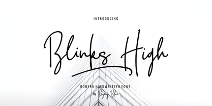 Blink High Signature Script is a beautiful handwriting font based on authentic hand writing with natural signature style. Blink High Signature Script is perfect for branding projects, logo, wedding designs, social media posts, advertisements, product packaging, product designs, label, photography, watermark, invitation, stationery and any projects that need handwriting taste. Features : · All Uppercase and Lowercase · Number & Symbol · Supported Languages · Alternates and Ligatures · PUA Encoded
 - Cinta Adhesiva by Wordshape,
$20.00 Cinta Adhesiva began as a typeface designed for the masthead of a graffiti fanzine called Free Copy. The monumental letters painted by L.A.-based graffiti writers Crae and Hael greatly influenced the feel of the typeface. The availability and ease-of-use of tape as a medium to write with is apparent on a multitude of surfaces, and this approach led to the creation of Cinta Adhesiva.
 - Blackpast by Sarid Ezra,
$15.00 Introducing, Blackpast, a futuristic logo font with alternates! Blackpast is a sans based font with unique lowercase that will make your design looks futuristic and modern. You can use this font for any purpose, especially to make logotype. You can mix and match the uppercase and lowercase to make your logo more readable. This font also have special alternates that will make your design more stand-out!
 - Blomfer by Creative Juncture,
$15.00 Blomfer is a simple, yet dynamic Graphic Typeface based on the chamfering of a simple block font. The design element of the chamfered corners also expresses as the opposite, protruding seraph like corners and angled terminations to ascenders and descenders. It is available in four weights all of which contain many glyphs that includes accents, ligatures, and mathematic symbols to meet the needs of most latin languages.
 - Brandon Grotesque Condensed by HVD Fonts,
$40.00 Eight years after the initial release of Brandon Grotesque , the typeface has grown into a font family of 48 styles, including a version for small sizes and a space saving condensed version. This type family was completely drawn from scratch with the look and feel of the original normal-width version. Today, Brandon supports at least 116 languages, from Latin based languages to Greek and Cyrillic.
 - Augustea Open by ITC,
$29.00Augustea was designed by Alessandro Butti and Aldo Novarese and is one of the most popular classical, monumental letterforms featureing a stone cut effect. This font is based on the classic proportions of Capitalis, which dates back to the first century AD during the reign of Augustus. It should be set with a widely spaced bias. Augustea is distinguished by its balanced, classic and majestic image. - Butterfield by Scriptorium,
$18.00Butterfield is based on poster lettering from posters for rock shows at the Fillmore in the 1960s. It is particularly influenced by the lettering of Wes Wilson, but has added features and improvements to make it more generally useful. It is one of the most effective examples of the psychedelic style. Combining the basic font with Photoshop's wave pattern produces the unique look seen above. - Siwa Arabic by Protype,
$45.00 Siwa is a Multilingue typeface that created for the screens and the daily uses, with a simple timeless geometric design to merge the modern requirements with the traditional rules of calligraphy, comes with 9 weights, and support an OpenType feature for more than 90 languages, includes all the languages that based on Latin and Arabic letters, also support the Indian, Latin, Persian and Urdu numbers.
 - Bigestar by Mevstory Studio,
$25.00 Bigestar is a sans based font with unique lowercase & uppercase that will make your design looks futuristic and modern. You can use this font for any purpose, especially to make hi-tech logotype. This font is also suitable for science-fiction movie poster. You can mix and match the uppercase and lowercase to make your logo more unique and stand-out. This font also support multi language.
 - Pixwar by FSdesign-Salmina,
$39.00 An epochal battle in form of font. Calligraphic characters and pixel fight against each other in this experimental font. Two historical epochs collude. You decide the destiny of the battle using the shift button. The font is based on OpenType technology. Ligatures are required for its correct functionality and must be switched on (both on professional and office applications). May the best win, with Pixwar.
 - Ghaith Sans by GHEEN Studio,
$25.00 Ghaith Font is Arabic and Latin and the sub-languages from them are inspired by the Naskh script with a semi-rigid base characterized by many variable and compound characters, as well as high flexibility. Ghaith Font is considered a typographical font for the clarity of its typefaces in all types and sizes of printing. It is also used for broad headings, logos, and various fields.
 - Broken Drive by Sarid Ezra,
$15.00 Introducing, Broken Drive, a grunge display font! Broken Drive is a grunge sans based font that have natural textures. This textured font will make your poster and presentations looks more bold and stand out! You can use this font for any purpose, especially for movie poster. You can combine the uppercase and lowercase to make your design more natural and handmade. This font also support multilingual.
 - Pisang Manis by Hanoded,
$16.00 Pisang Manis means ‘sweet banana’ in Bahasa Indonesia. I don’t think this particular combination is used in everyday life, but it sounds nice. Pisang Manis is based on an older font of mine, called Pisang, which I created in 2013. It looks similar, but it is a different font altogether. Pisang Manis is a ‘Tall & Thin’ display font, ideally used for product packaging, websites and book covers.
 - Cranach by profonts,
$41.99 This picturesque, beautiful German Blackletter typeface was originally released by Benjamin Becker Succ, Frankfurt am Main, then named ?K�nstlergotisch?. Ralph M. Unger redesigned, digitally remastered and completed the font based on old catalogues/specimen. In honor of the famous Cranach family, German artists in medieval times, we renamed the font after them. The shadowed version was added for even more eye-catching purposes, e.g. in headlines.
 - Divert by Little Fonts,
$15.00 Based on the outline of each character, Divert works by re-directing each outline as a single meandering stroke that moves back and forth to create a quirky yet clean typeface. The typeface contains an uppercase character set plus two lowercase character sets (one standard and one alternate) and two sets of numerals. Plus all punctuation and basic latin European accents. See glyphs for full character set.
 - Afeesh by Abjad,
$45.00 The Afeesh typeface is an attempt to create a solid and robust type family, that is based on the Ruq'a calligraphy style. Following the Egyptian style of drawing Ruq'a, which was very popular on movie posters during the 50s-70s. The typeface comes with an extensive set of ligatures, and opentype features such as swash and stylistic alternates. Arabic, Farsi, Urdu, in addition to Kurdish are supported.
 - Starella Tattoo by Mans Greback,
$59.00 Starella Tattoo is a professional typeface with flowing letter forms representing the merge between beauty and attitude. The font is provided as a regular version, as well as a version decorated with diamonds in each letter. Use symbols _ [ ] at any place in a word to create swashes. Example: S[tarellaTatt]oo It supports all Latin-based European languages, contains numbers and all symbols you'll ever need.
 - FF Flightcase by FontFont,
$59.99 Dutch type designer Just van Rossum created this display FontFont in 1992. The font is ideally suited for advertising and packaging, festive occasions, editorial and publishing as well as poster and billboards. FF Flightcase provides advanced typographical support with features such as ligatures. It comes with proportional lining figures. As well as Latin-based languages, the typeface family also supports the Greek writing system.
 - Recepts NF by Nick's Fonts,
$10.00Here’s a futuristic face with a neo-retro twist, based on the logotype for the 1990s tank-warfare videogame for the Mac, Spectre. Whether you're going back to the future or resurrecting a blast from the past, this face will get you there in style. Both versions of this font include the complete Unicode Latin 1252, Central European 1250 and Turkish 1254 character sets. - Cartage Stencil JNL by Jeff Levine,
$29.00 The sheet music for the title song of the 1960 movie "Exodus" had the name hand lettered in a block stencil style with rounded corners and narrow "rails" [the breaks between the stencil parts]. Loosely based on this design and working from just the six letters of the title, Cartage Stencil JNL is available as a digital font in both regular and oblique versions.
 - Marquee by Design is Culture,
$39.00 In 1994 I took a picture of an old movie marquee in Times Square, New York City. 7 years later, I decided to design a typeface based on the big plastic letters found in those old marquees. I scanned in the picture I took and began to draw the letterforms. Like most of my font designs, the initial inspiration came from an urban environment.
 - Kiddie Show JNL by Jeff Levine,
$29.00 The design for Kiddie Show JNL is based on the hand lettering for a piece of sheet music from 1946 entitled "Wee Marionettes". While basically an Art Deco-flavored monoline typeface, it contains characters with intersecting lines and assembled parts that give it an eccentric, playful look. Available in both regular and oblique versions to add a bit of playfulness to your next project.
 - Putney Junction NF by Nick's Fonts,
$10.00This elegant offering is based on a typeface originally called "Design", from Barnhart Brothers & Spindler’s Specimen Catalog Number 9, published in the first decade of the twentieth century. This version has been fine-tuned to set tight, and is suitable for headlines, subheads, and limited amounts of body copy. Both versions of this font include the complete Unicode Latin 1252 and Central European 1250 character sets. - Duffy’s Tavern NF by Nick's Fonts,
$10.00Originally presented as an alphabet suitable for movie title cards, this font is based on a 1920 work by showcard artist E. C. Matthews, and named after the eponymous 1940s radio show about a local saloon and its never-present owner. Both versions of this font contain the Unicode 1252 (Latin) and Unicode 1250 (Central European) character sets, with localization for Romanian and Moldovan. - Heberling Casual NF by Nick's Fonts,
$10.00This delightfully playful font is based on a single-stroke pen font from the 1922 tome Heberling’s Basic Lettering, and elements of composition, color harmony, gilding, embossing-processes, etc. by Walter A. Heberling. Swoopy, loopy, but never poopy, this font delivers on the fun. This font contains the complete Latin language character set (Unicode 1252) plus support for Central European (Unicode 1250) languages as well. - Sign Template JNL by Jeff Levine,
$29.00 Sign Template JNL is based on one of the many plastic lettering guides manufactured by the now-defunct Wright-Regan Instrument Company (also known as WRICO). Aside from their engineering and drafting templates and tools, WRICO had a line of "Sign-Maker" sets which featured various styles of lettering, special ink pens and metal alignment guides to assure clean, crisp lettering with little effort.
 - SK Brushwood by Shriftovik,
$10.00 SK Brushwood is an experimental geometric font based on chaotic lines. It is inspired by the Greek stone script, but nevertheless it is modern. The main component of the letter shape is straight and sloping lines ending in straight corners, which makes it look like brushwood. This is why the font gets its name. SK Brushwood is perfect for headlines, posters, print work, and the Internet.
 - Qoronfull Arabic by Boharat Cairo,
$20.00 Qoronfull is an exuberant industrial display typeface, full of curves that create neat alignments. and it's our second collaboration with Hey Porter! Qoronfull means clove, (a dried flower buds spice tree native to Indonesia), Qoronfull's esthetics, curves, and lines are representing the flowers, leaves, and stems of clove, applied on a strong base of Arabic Kufi calligraphy style, with a big group of type compositions and ligatures.
 - Tme by bb-bureau,
$65.00 Tme, new lineal — Tme is an update of Sl (T = S + 1, m = l + 1 and e for natural logarithm), drawn in 2006 for the University of Arts Saint-Luc de Tournai. Its geometrical drawing is based on the directions of the hexagon, a scrupulously followed constraint which confers on some glyphs a very particular drawing. in light, regular and bold language: all latin glyphs
 - Nabataean 50 by Archaica,
$30.00This font provides a typical set of characters for the ancient Nabataean language, used in what is now Jordan and adjoining regions during the period of the Roman Empire, based on lapidary letter-forms of the first century of the present era. It includes a full set of alphabetic characters as well as the ancient numeral forms, with ligatures and variant shapes for some numerals. - Farson Family by Garisman Studio,
$20.00 Proudly Present Farson - Vintage Typeface Farson born from an inspiring vintage display. This font gives a feel of a vintage, classic, old, and based on handmade. Already PUA Encoded and I think this font is perfect for people looking for vintage aesthetic or logo-type. Suitable for any graphic designs such as branding materials, t-shirt, print, business cards, logo, poster, t-shirt, photography, quotes .etc.
 - Yukas by Alex Camacho Studio,
$25.00 Yukas is a funky and sexy typeface where the proportions are based on the optical balance between black strokes and white shapes. Ideal to enjoy on a large scale. It takes its references from the psychedelic movement, old-school western movie posters, and mid-19th century American wood type with those big, heavy capital letters. Includes several Open Type alternatives to customize your design however you want.
 - Rabbet by Atlantic Fonts,
$26.00 Rabbet is based on the handwriting of Maine furniture designer and maker, Aaron Fedarko. It's friendly, bold, condensed, and slants left. Rabbet's special feature, besides loads of boyish charm, is a load of handwritten fractions as discretionary ligatures. Whether you're curious about woodworking (a rabbet is a type of joint), or you just want a cool, maybe slightly rebellious font, Rabbet is ready to do the work.
 - Folio by Linotype,
$29.99Folio was designed by Konrad F. Bauer and Walter Baum and appeared with the Bauer font foundry (Bauersche Gießerei) in 1957. The designers based their ideas on Helvetica but Folio did not turn out to pose the competition they had hoped. The font has the same applications as Helvetica and is an extremely legible font. Folio is particularly good for text and has an objective, neutral character. - FF Confidential by FontFont,
$59.99 Dutch type designer Just van Rossum created this display FontFont in 1992. The font is ideally suited for advertising and packaging, film and tv, editorial and publishing as well as music and nightlife. FF Confidential provides advanced typographical support with features such as ligatures. It comes with tabular lining figures. As well as Latin-based languages, the typeface family also supports the Greek writing system.
 - Quartell Round by NREY,
$19.00 Hello! Introducing Quartell - modern display typeface family. Font looks amazing as alone words and as full text blocks. Also it good for bright captions and unforgettable logos It have supporting for many languages as: Czech, Danish and Norwegian, Deutsch, English, Espanol, French, Italiano, Magyar, Nederlands, Polish, Portuguese, Finnish, Swedish, Turkish, Russian and other based on extended latin. Thank you for purchasing and happy designing :)
 - Jazzfest NF by Nick's Fonts,
$10.00Based on the 1932 typeface Newport, designed by Willard T. Sniffin for ATF, this Art Deco standard packs a lot into multi-line heads and subheads due to its very short descenders, cleverly accomplished by “fudging the baseline” on the g, p, q, and y. All versions of this font include the Unicode 1250 Central European character set in addition to the standard Unicode 1252 Latin set. - FS Untitled Variable by Fontsmith,
$319.99Developer-friendly The studio has developed a wide array of weights for FS Untitled – 12 in all, in roman and italic – with the intention of meeting every on-screen need. All recognisably part of a family, each weight brings a different edge or personality to headline or body copy. There’s more. Type on screen has a tendency to fill in or blow so for each weight, there’s the choice of two marginally different versions, allowing designers and developers to go up or down a touch in weight. They’re free to use the font at any size on any background colour without fear of causing optical obstacles. And to make life even easier for developers, the 12 weight pairs have each been designated with a number from 100 (Thin) to 750 (Bold), corresponding to the system used to denote font weight in CSS code. Selecting a weight is always light work. Easy on the pixels ‘It’s a digital-first world,’ says Jason Smith, ‘and I wanted to make something that was really functional for digital brands’. FS Untitled was made for modern screens. Its shapes and proportions, x-height and cap height were modelled around the pixel grids of even low-resolution displays. So there are no angles in the A, V and W, just gently curving strokes that fit, not fight, with the pixels, and reduce the dependency on font hinting. Forms are simplified and modular – there are no spurs on the r or d, for example – and the space between the dot of the i and its stem is larger than usual. The result is a clearer, more legible typeface – functional but with bags of character. Screen beginnings FS Untitled got its start on the box. Its roots lie in Fontsmith’s creation of the typeface for Channel 4’s rebrand in 2005: the classic, quirky, edgy C4 headline font, with its rounded square shapes (inspired by the classic cartoon TV shape of a squidgy rectangle), and a toned-down version for use in text, captions and content graphics. The studio has built on the characteristics that made the original face so pixel-friendly: its blend of almost-flat horizontals and verticals with just enough openness and curve at the corners to keep the font looking friendly. The curves of the o, c and e are classic Fontsmith – typical of the dedication its designers puts into sculpting letterforms. Look out for… FS Untitled wouldn’t be a Fontsmith typeface if it didn’t have its quirks, some warranted, some wanton. There’s the rounded junction at the base of the E, for example, and the strong, solid contours of the punctuation marks and numerals. Notice, too, the distinctive, open shape of the A, V, W, X and Y, created by strokes that start off straight before curving into their diagonal path. Some would call the look bow-legged; we’d call it big-hearted. - FS Untitled by Fontsmith,
$80.00 Developer-friendly The studio has developed a wide array of weights for FS Untitled – 12 in all, in roman and italic – with the intention of meeting every on-screen need. All recognisably part of a family, each weight brings a different edge or personality to headline or body copy. There’s more. Type on screen has a tendency to fill in or blow so for each weight, there’s the choice of two marginally different versions, allowing designers and developers to go up or down a touch in weight. They’re free to use the font at any size on any background colour without fear of causing optical obstacles. And to make life even easier for developers, the 12 weight pairs have each been designated with a number from 100 (Thin) to 750 (Bold), corresponding to the system used to denote font weight in CSS code. Selecting a weight is always light work. Easy on the pixels ‘It’s a digital-first world,’ says Jason Smith, ‘and I wanted to make something that was really functional for digital brands’. FS Untitled was made for modern screens. Its shapes and proportions, x-height and cap height were modelled around the pixel grids of even low-resolution displays. So there are no angles in the A, V and W, just gently curving strokes that fit, not fight, with the pixels, and reduce the dependency on font hinting. Forms are simplified and modular – there are no spurs on the r or d, for example – and the space between the dot of the i and its stem is larger than usual. The result is a clearer, more legible typeface – functional but with bags of character. Screen beginnings FS Untitled got its start on the box. Its roots lie in Fontsmith’s creation of the typeface for Channel 4’s rebrand in 2005: the classic, quirky, edgy C4 headline font, with its rounded square shapes (inspired by the classic cartoon TV shape of a squidgy rectangle), and a toned-down version for use in text, captions and content graphics. The studio has built on the characteristics that made the original face so pixel-friendly: its blend of almost-flat horizontals and verticals with just enough openness and curve at the corners to keep the font looking friendly. The curves of the o, c and e are classic Fontsmith – typical of the dedication its designers puts into sculpting letterforms. Look out for… FS Untitled wouldn’t be a Fontsmith typeface if it didn’t have its quirks, some warranted, some wanton. There’s the rounded junction at the base of the E, for example, and the strong, solid contours of the punctuation marks and numerals. Notice, too, the distinctive, open shape of the A, V, W, X and Y, created by strokes that start off straight before curving into their diagonal path. Some would call the look bow-legged; we’d call it big-hearted.