9,309 search results
(0.016 seconds)
- Airco Std by Typofonderie,
$59.00 Designed between italic and script styles Airco is a typeface designed between italic and script styles. The letterform finish is rounded. Designed ultra slanted (27°), the shapes evoke a fast and assertive movement. The result is a human typeface, dynamic, that will visually work well in technology and sport, without ever being dry, rigid or dehumanized. The structure of the letters is influenced by Renaissance italics, at the difference that in the case of Airco, the lowercases and capitals are visually homogeneous thanks to the giants lowercases. In fact, the default numerals can be used in capital as well lowercases settings.
 - Jazz Guitar JNL by Jeff Levine,
$29.00 Latin music was all the rage in the United States from the 1930s through the 1950s and songs with a “South of the Border” or “Old Mexico” theme were plentiful. The 1940 sheet music for “Make Love with a Guitar” evoked the idea of serenading one’s lovely lady on horseback while strumming the guitar. ..at least if you went by the by the illustration under the song’s name. As the hand lettered title was rendered in an Art Deco design, it became the basis for Jazz Guitar JNL [which seemed a more befitting name], and is available in both regular and oblique versions.
 - Newsprint JNL by Jeff Levine,
$29.00 Newsprint JNL has its origins in an online auction image of wood type. Only the lower case a-z were shown and the type design included an extra-wide 'g' and 's'. Expanding on this idea but narrowing the 's' a bit, Jeff Levine created a capitals set and all of the necessary additional characters - even adding a generous selection of accented characters not usually found in his display fonts. Regular, oblique, narrow, narrow oblique, wide and wide oblique versions are available. All styles offer crisp, clean lettering for headlines, window signage and other display text applications.
 - Uncia Black by Greater Albion Typefounders,
$12.00 Greater Albion Has been toying with thoughts of a “unicase” typeface for a while. On the other hand we’ve always wondered just what practical use they are. It is also a while since we’ve introduced a ‘handwritten’ design. Therefore, It struck us that one answer was something ‘hand-lettered’. These days many people do write in a sort of informal unicase don’t they? But, at the same time, we wanted it to have a little character. So here it is, a bit calligraphic, with a touch of black-letter and a cunning mix of upper- and lower-case forms Uncia Black!
 - Metronic Slab Pro by Mostardesign,
$26.00 Metronic Slab Pro is a slab serif typeface with a technological and minimalist look for text and headlines. It has six versatile weights from Air to Black with an alternative glyph set to improve its use in different graphic contexts. Metronic Pro has a wide range of OpenType features such as: old style and proportional figures, ligatures, case sensitive forms, fractions, stylistic alternates, arrows and an icons/ornaments set. This set of 60 icons, directly inspired from the typeface improves the OpenType features and can be quickly and easily use in your web design, GUI design, graphic design or any other graphic work.
 - Blom by The Northern Block,
$29.95 Blom is a humanist sans with subtle squarish character in reverse contrast. The combination of heavy horizontals and modern geometry give the typeface a unique visual aesthetic whilst making small text perfectly readable. Blom bucks the trend of conventional letterforms in favour of a versatile typeface with bags of originality, that is both inventive in style yet completely functional in a wide range of intended uses. Details include 463 characters, six weights with matching italics and five variations of numerals. Opentype features include inferiors, superiors, fractions, slashed zeros, case-sensitive forms, ligatures and language support covering Western, South and Central Europe.
 - Revla Sans by Eclectotype,
$40.00 NEWSFLASH! Revla Sans is now available specially tailored for smaller settings. Take a look at Revla Sans Text ! Meet Revla Serif 's dorky younger brother, or should that be brothers? Revla Sans is a grotesque companion to Revla Serif, in four weights. The weights can be used pretty easily as grades, so that text set at different sizes has similar thickness. The contextual alternates engine from its serifed sibling is used to pseudo randomise the text and avoid the monotony of repeating glyphs. Other features include case sensitive forms, standard and discretionary ligatures, stylistic sets and automagic fractions.
 - Bassanova by Julia Bausenhardt,
$35.00 Bassanova is a dynamic display font inspired by lettering on the "Love in the Afternoon" movie poster by Saul Bass. The font captures the minimalistic, yet very distinct look that is so typical for his designs. Bassanova offers four versions for each letter that change automatically and give the font a handlettered feel. It also contains over 100 discretionary ligatures to add even more dynamic letter combinations to the mix. This cool all-caps typeface fits a wide range of design applications, and it features a full international character set. Please activate Open Type Features to get the most out of this font.
 - Linotype Scott by Linotype,
$29.99Linotype Scott Mars, from German designer Hellmut Bomm, is part of the TakeType Library, chosen from the entries of the Linotype-sponsored International Digital Type Design Contest 1999 for inclusion on the TakeType 3 CD. Bomm constructed this typeface from a consciously limited repertoire of forms, producing a strictly constructed font with a cool, technical look. Worthy of note are also the exalted numeral forms and the unusual size relation of the lower case and capital letters. Scott Mars is best used for headlines and short to middle length texts in point sizes of 10 or larger. - Hub by ParaType,
$25.00Designed by Gennady Fridman and released by ParaType in 2008. Hub represents so called block letter handwriting style, which becomes more and more usual and nowadays replaces traditional cursive handwriting. One of the reasons for these changes is an often requirement in official forms to write in block letters. Some forms contain even stricter rule – to write in capital letters. Hub was designed to meet these requirements and includes small caps instead of lower case letters. It’s recommended for use in advertising and display typography and especially when you need to show a sample of properly filled bureaucratic form. - FF Typestar by FontFont,
$62.99 German type designer Steffen Sauerteig created this slab FontFont in 1999. The family contains 4 weights: Regular, Italic, Black, and Black Italic and is ideally suited for advertising and packaging, editorial and publishing, logo, branding and creative industries, poster and billboards as well as wayfinding and signage. FF Typestar provides advanced typographical support with features such as ligatures, alternate characters, case-sensitive forms, fractions, super- and subscript characters, and stylistic alternates. It comes with tabular lining and proportional lining figures. This FontFont is a member of the FF Typestar super family, which also includes FF Typestar OCR.
 - Belfast Grotesk by TypoBureau Studio,
$17.00 Belfast Grotesk™ 9 weights, 18 uprights and Oblique. Each typeface contains over 700+ glyphs with latin extensive Western, Central and Eastern European language support, Free updates and feature additions. Belfast Grotesk™ influenced by the grotesk typefaces developed in the early 20th century. Attempts to follow the best traditions of Grotesk typefaces. A good amount of contrast between the stroke thickness of each weight. Belfast Grotesk™ was developed with unique glyphs to offer best flexibility. a good legibility in short texts. OPENTYPE FEATURES Including tabular figures, alternate characters, ligatures, fractions, case-sensitive forms, superscripts, subscripts etc.
 - Mato Sans by Picador,
$29.00 Legible and dynamic shape, tons of OpenType options, different scripts – that’s Mato Sans. Difficult small size, long text in Vietnamese, huge heading in Russian or table full of figures to create? It’s not a problem with this family. There are over 2000 glyphs in every weight with such features: superscript and subscript characters, tabular lining and old style figures, small caps, fractions, arrows or even case sensitive parenthesis. Mato Sans was designed for use in Latin as well as in Cyrillic script. Every font contains an extended set of Cyrillic characters including special, local glyphs for Bulgarian, Macedonian and Serbian.
 - Fully Automatic by Hanoded,
$15.00 I raise chickens for eggs and meat. I usually buy fertilised eggs online and place them in my incubator, which says that it is 'fully automatic'. Of course I added that rather random introduction to tell you how I came up with the name for this new font... Fully Automatic is a handmade cartoon font: I used a sharpie pen to draw the glyphs onto rough paper. The result is a wobbly, yet quite clean cartoon font. Fully automatic comes with extensive language support and two sets of alternates for the lower case glyphs that cycle as you type.
 - Obvia Condensed by Typefolio,
$29.00 'Obvia' appeared as a result of direct observation on typefaces classified as geometric and the plan to explore for the first time width axes Expanded, Wide, Normal, Narrow and Condensed The idea behind 'Obvia's design was to create a distancing from geometrically pure shapes, in this case, square shapes. Then some details were added, such as subtle inktraps, concave endings of the stems and carefully drawn alternate characters, giving a 'geohumanist' tone to the font. This first family of 'Obvia' has 9 weights ranging from Thin to Black, delivering a strong typographic identity, from the paper to the pixel.
 - XXII Geom by Doubletwo Studios,
$- XXII Geom and its slab-serific XXII Geom Slab are modern geometric type systems designed with focus on functionality & legibility and with an eye on the old masters. Their well balanced low contrast letter shapes come with a tall x-height. The italics are designed with a little more curvy approach what brings up a different individual character fitting perfect to the straighter forms of the uprights. With its large range of Opentype features it is designed to fulfill the needs your content deserves (Smallcaps, Case Sensitives, Ligatures…) as well as serving your individual taste (Stylistic alternates & Sets). More information on Behance.
 - Kaipara by Gleb Guralnyk,
$14.00 Presenting originally designed decorative font named Kaipara. The main goal of this font is a pattern that flows between the characters. Each letter has six variations that switches automatically to create a solid pattern feeling. Check out that "context alternates" OpenType feature is activated to achieve neccessery result. Also a simple supporting font is available here. Note: Please note that full pattern effect is working only with english alphabet and numbers. All other characters has only one variation. Note: Check out that all of your letters has the same case (lowercase or uppercase) to make the effect work properly.
 - Architype Bill by The Foundry,
$99.00 Architype Universal is a collection of avant-garde typefaces deriving mainly from the work of artists/designers of the inter-war years, whose ideals underpin the design philosophies of the modernist movement in Europe. Their ‘universal’, ‘single alphabet’ theory limits the character sets. Architype Bill was developed from the few letterforms created by Max Bill for a 1949 exhibition poster. All the forms, with the exception of the letter ‘o’, were constructed using only straight lines and triangles on a purely mathematical basis, that showed the continued influence of his earlier Bauhaus training, and the universal alphabet principle.
 - Calypso I by Typolar,
$65.00 Calypso I (Italian) draws its inspiration from type founders' plentiful show-off-letters, which were typical on title pages and lithographs in the early 19th century. It borrows luscious details from these but inherits a stiff modern backbone from its parent, Calypso E (Egyptian). Within the Calypso type family all fonts share the same dimensions and work together consistently. Calypso I supports many languages and includes, for example, four sets of basic numerals, circled numbers, alternative characters, case sensitive forms and dingbats. Give it a go on drop caps and headlines or even set short paragraphs with it. It loves colour and effects.
 - FF Legato by FontFont,
$68.99 Dutch type designer Evert Bloemsma created this sans FontFont in 2004. The family has 8 weights, ranging from Light to Bold (including italics) and is ideally suited for book text, editorial and publishing, logo, branding and creative industries as well as small text. FF Legato provides advanced typographical support with features such as ligatures, small capitals, alternate characters, case-sensitive forms, fractions, and super- and subscript characters. It comes with a complete range of figure set options – oldstyle and lining figures, each in tabular and proportional widths. In 2011, FF Legato received the Letter.2 award.
 - Triplepass by Shapovalov Fonts,
$10.00 Triplepass is a narrow grotesque with 3 styles: normal, with cut corners and a stencil shape. The font has a retro character, contains both humanistic rounded designs and modern smooth alternatives. The font is suitable for logos, large headlines, posters, signs, prints, font compositions, as well as for sports-related layouts where clear numbers and space savings are needed. Triplepass contains extended Latin, Cyrillic, fractions, ligatures and two icons of a basketball. It contains OpenType features: liga, numr, dnom, calt, ss01, ss02. The font is also case sensitive, has fractions, currency signs including the rouble sign.
 - Blingston Brush Font by madjack.font,
$18.00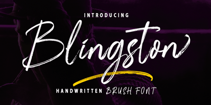 Blingston Brush. is a textured brush font, a contemporary approach to design, with handcrafted and natural underlines and also has alternatives & binders that make your designs more attractive. Suitable for use in title design. Such as clothes, invitations, book titles, stationery designs, quotes, branding, logos, greeting cards, t-shirts, packaging designs, posters, and others. Blingston Brush. equipped with Standard Characters upper and lower case, Punctuation, Numbers. And some glyph variations of OpenType features like Standard Ligatures and Stylistic Sets. Includes multiple multilingual support If you have any questions, feel free to message me :) Thank you so much for watching and enjoying it!
 - FF Prater Sans by FontFont,
$62.99 German type designers Henning Wagenbreth and Steffen Sauerteig created this display and sans FontFont in 2000. The family contains 2 weights: Regular and Bold and is ideally suited for advertising and packaging, festive occasions, film and tv, editorial and publishing as well as poster and billboards. FF Prater Sans provides advanced typographical support with features such as ligatures, alternate characters, and case-sensitive forms. It comes with tabular lining and proportional lining figures. This FontFont is a member of the FF Prater super family, which also includes FF Prater Block, FF Prater Script, and FF Prater Serif.
 - Zim by Scholtz Fonts,
$19.00 Zim is a bold, earthy font, named for the Great Zimbambwe ruins (a World Heritage site). Its solid silhouette represents the timelessness of this ancient structure. The font is very readable, and its bold, rugged shape make it ideal for display purposes, for posters and headlines. Fully professional, it contains a complete set of 255 characters — Upper and Lower case, all numerals, punctuation, symbols and accented characters. It is suitable for layout work in all major European languages — Spanish, Portuguese, German, French, Swedish and Italian (to name a few). The characters are spaced for readability and have been carefully kerned.
 - DXAngelus Mediaval by DXTypefoundry,
$45.00 The font DXAngelusMediaval was developed on the basis of the Angelus Mediaval font, which was issued by Russian type foundry from the beginning of the 20th century (type foundry of G. Bertgold, St. Petersburg and Moscow, before 1904). Probably, the font is a reworking of the DeVinne font (1892 (?), Designer Nicholas J. Werner) of the American Central Type Foundry. For the reconstruction, we used examples of font prints: Cyrillic from the catalog "Art Fonts", 1929, Latin part - Chicago font, from the catalog "La Fonderie Typographique Francaise" (FTF) 1924. In addition, in the font are available Digits of the old style and ligature.
 - Leenyx by ActiveSphere,
$30.00 Leenyx is a geometric display font family and works best in display applications, such as posters, signage, logos and label. The Leenyx family comes in 2 versions: Leenyx AX and Leenyx BX. Leenyx AX has lines of even width and no serifs. Leenyx BX has lines of even width with slight curve on the ends of the strokes. Each Leenyx font version has two weights: regular and bold, each available in italic, making a total of eight styles for. Each style has a full upper and lower-case, accents, punctuation and a selection of monetary symbols.
 - Disposition by PizzaDude.dk,
$15.00 You may not know it, but you've been looking for a font like DISPOSITION! Yeah, it's a font...but it doesn't act or look like one! Why?! Because there are 6 different versions of each letter! Yes, SIX different versions! Enough to make your design look soooo cool and handmade! The font uses "contextual alternates" which makes the font cycle the different versions as you type! What can you use DISPOSITION for? There are almost no limits, but I would suggest designs such as invitations, headlines, posters, signs and other cases where a dry brush look is required.
 - Aforo Display by DarezD,
$10.99 Aforo Display is a decorative font suitable for logos, headlines, packaging, signs, posters, postcards, labels, publishing, page design... The basis of the construction of the Aforo Display typeface is a slab serif font intertwined in four horizontal bars similar to the marquee letters of the old cinema/theatres. Hence its name: Aforo in Spanish is the capacity of spectators of a theater. The horizontal bars partially penetrate each character giving a sense of depth and the right and lower strokes are widened to simulate volume. It comes with four special characters to add start and end arrows, two versions for each element.
 - FF Suhmo by FontFont,
$68.99 German type designer Alex Rütten created this serif and slab FontFont in 2010. The family has 8 weights, ranging from Light to Black (including italics) and is ideally suited for advertising and packaging, film and tv, editorial and publishing, logo, branding and creative industries as well as web and screen design. FF Suhmo provides advanced typographical support with features such as ligatures, small capitals, alternate characters, case-sensitive forms, fractions, and super- and subscript characters. It comes with a complete range of figure set options – oldstyle and lining figures, each in tabular and proportional widths. In 2011, FF Suhmo received the TDC2 award.
 - BR Shape by Brink,
$30.00 A contemporary geometric type family in 18 styles. Built with precision, simplicity and a subtle warmth. Flexibility is the founding principle around which BR Shape was designed. The family is open, accessible and puts content first. Perfect for displaying text with complete clarity and purity. BR Shape is available in 18 finely crafted styles, with nine weights ranging from Hairline to Super. The fonts also provide advanced typographic support with OpenType features such as case sensitive forms, icons, stylistic alternates and multiple figure sets. Also containing advanced language support as standard. For custom inquiries please contact: mail@brinktype.com
 - FF Absara Sans Headline by FontFont,
$59.99 French type designer Xavier Dupré created this sans FontFont in 2007. The family has 6 weights, ranging from Thin to Black and is ideally suited for editorial and publishing projects. FF Absara Sans Headline provides advanced typographical support with features such as ligatures, alternate characters, case-sensitive forms, fractions, and super- and subscript characters. It comes with a complete range of figure set options – oldstyle and lining figures, each in tabular and proportional widths. This FontFont is a member of the FF Absara super family, which also includes FF Absara, FF Absara Headline, and FF Absara Sans.
 - Ballasticus by Shapovalov Fonts,
$15.00 Ballasticus is a controversial bold grotesque for logos, big headlines, posters, signage, gyms, and bodybuilders. The outer contour of the beech is rounded, while the inner space is square. The font contains two barbell icons that can be immediately inserted into your company logo. The character of Ballasticus is honest, stable, open, grounded like a weight. Ballasticus contains extended Latin, Cyrillic, ligatures, barbell and peace sign, as well as alternatives for some letters, the total number of glyphs is more than 700. It contains OpenType functions: liga, numr, dnom, calt, ss01. The font is also case sensitive, has fractions, currency signs, and arrows.
 - Ritz Slab Serif JNL by Jeff Levine,
$29.00 Ritz Slab Serif JNL is a bold display face which shares a lot of similar design traits to Stymie and other similar metal type of the 1930s and 1940s, but in actuality was modeled from only four letters. On the sheet music for the 1937 song "Sweet Varsity Sue" [from the 20th Century Fox Film "Life Begins in College"], there is a picture of the Ritz Brothers - a popular comedy team from 1925 through the late 1960s. The hand lettered name "Ritz" became the basis for Ritz Slab Serif JNL, which is available in both regular and oblique versions.
 - Mramor Pro by Storm Type Foundry,
$52.00 The Mramor family first appeared in the Stormtype catalogue in 1994. The first sketch arose in 1988 through the narrowing of Roman capitals. It has uniform width proportions and, above all, original lower-case letters, unprecedented with Roman Capitals. The text designs are discontinued since they were replaced by the related Amor Serif family (along with its -sans version). Now, Mramor has “only” 10 designs that each include true small caps, Cyrillics and a rich variety of figures, ligatures and alternates. Mramor excels in corporate identity or bottle-label design, also whenever there is a need for a “classic” looking face.
 - Anavio by Greater Albion Typefounders,
$14.95 Anavio is named in honor of the ancient Roman name of an English Derbyshire town. Anavio is a classically inspired family of Roman faces, emphasizing simplicity of form and elegance. Regular and Bold weights are offered, along with condensed forms. Anavio is offered in both upper and lower case and small capitals faces. Its simple lines are immediately legible, lending it to both text and display uses. A range of ligatures, both standard and discretionary, are included as are stylistic alternates and two styles of numerals. Use Anavio to lend that indefinable air of elegance to your next project.
 - Dramatico Script by Ana's Fonts,
$12.00 Dramatico is a script font family inspired by vintage handwritten postcards and notes. Perfect for any design that needs a vintage calligraphy look, Dramatico was handmade using a real dip pen and ink. Use it in signatures and logos, notes and quotes, social media posts, and branding and packaging. Dramatico includes: Ligatures for a more natural text Swashes for most of the lower-case letters A set of ornaments to decorate your text A set of extras (lines, scribbles, arrows, splatters, etc) to add a grungier look to your vintage designs Bonus! Underlined and Strikethrough versions of the script font
 - Floorwalker JNL by Jeff Levine,
$29.00 On February 15, 1926, the Display Material Company of St. Paul Minnesota patented a sign making outfit consisting of a series of stencils in various sizes and styles, paints, brushes, instructions for use and all stored inside a convenient wooden case. Sold to any business in need of making many signs at low cost, this versatile stencil set enabled many a merchant to produce posters, show cards and price tags for pennies over what a commercial sign shop would charge. Floorwalker JNL is the digital version of one of these stencil fonts, solidified into a pre-Art Deco-era typeface.
 - Pricing Labels JNL by Jeff Levine,
$29.00Pricing Labels JNL gives you a set of digital price gun labels in fifty-one of the most common store departments, plus an untitled title label on the lower case ‘z’ key. Additionally, numbers for creating prices are on the standard keystrokes (for dollar amounts), and smaller numbers/underscores (for cents amounts) are on the shift key groupings for the number keys. The dollar and cents sign are on the left and right brackets, the decimal point is on the period key and the words “each” and “for” [set sideways] are on the greater and lesser keys. - FF Reminga by FontFont,
$51.99 French type designer Xavier Dupré created this serif FontFont in 2001. The family has 6 weights, ranging from Regular to Bold (including italics) and is ideally suited for advertising and packaging, book text as well as festive occasions. FF Reminga provides advanced typographical support with features such as ligatures, small capitals, alternate characters, case-sensitive forms, fractions, and super- and subscript characters. It comes with a complete range of figure set options – oldstyle and lining figures, each in tabular and proportional widths. This FontFont is a member of the FF Reminga super family, which also includes FF Reminga Titling.
 - Gorda by Zeptonn,
$10.00 Oh yeah! Gorda is a huge, bold and all-caps typeface. It's rounded style makes sure it's nice and friendly, even though it can be used in (very) large sizes. With Gorda you can produce a powerful and contemporary style. The smaller stroke width of the symbols and punctuation marks makes sure legibility is not an issue, as is often the case with fat type. Gorda is suitable for all sorts of uses, especially posters, headlines, artwork and logos. Use it to draw attention, in a quirky and distinctive way. Gorda has been designed and developed by Zeptonn.