10,000 search results
(0.265 seconds)
- Casablanca by Red Rooster Collection,
$45.00Casablanca is a decorative sans serif font family. It was designed and produced in 1997 by Steve Jackaman (International TypeFounders). Jackaman loosely based the designs on the Carlos Winkow typeface ‘Electra’ from the Spanish foundry, Nacional, circa early 1940’s. Casablanca has a clean, Art Deco, jazz, and/or noir film feel. It sets nicely at any size, and brings an air of bold mystery to the projects it is applied in. - Linotype Boundaround by Linotype,
$29.99Linotype Boundaround is part of the Take Type Library, selected from the contestants of Linotype’s International Digital Type Design Contests from 1994 and 1997. German artist Christina Sachse gave her font a mystical feel. The vertical strokes meet the base line at a point and the strokes vary in their width. The lively Linotype Boundaround is suitable for shorter texts in point sizes 12 or larger and for headlines in larger point sizes. - Folkner by Garisman Studio,
$18.00 Folkner born from an inspiring vintage display. This font gives a feel of a vintage, classic, old, and based on handmade. With messy line stamp touch in Folkner Stamp give you a vintage taste. Already PUA Encoded and I think this font is perfect for people looking for vintage aesthetic or logo-type. Suitable for any graphic designs such as branding materials, t-shirt, print, business cards, logo, poster, t-shirt, photography, quotes .etc.
 - Aduana by Fabio Ares,
$- Aduana is the first typographic product of argentine-chilean typographic archeology project called "Valpo. Ciudad de Letras" (Fabio Ares & Karin Thiers, since 2016). Based on the letter located on the front of the Customs building (Valparaíso, Chile). The resultant family can be described as display type and modern renaissance style, with geometric shapes and serif and mild line modulation. The proceeds from the sale of the fonts will be used to finance the project.
 - TG Reglic by Tegami Type,
$24.99 TG Reglic is a new contemporary sans serif, influenced by grotesque and geometric typeface letterforms. It comes with four weights, matched with Italic styles. TG Reglic has several OpenType features such as various ligatures, lining figures (proportional, superior, inferior, denominator, numerator & fraction), stylistic features from 01-04 and covered more than 100 languages Latin based. TG Reglic would be the ideal alternative choice typeface for small or large text sizes with unique characteristics.
 - Janson Text by Linotype,
$29.99 The Janson font was based on the matrices made for the typeface in the 17th century. It originated from the Dutch typeface designer Anton Janson and was cut by Nicholas Kis. The strong main strokes and fine hair strokes were influenced by the art of copper engraving. In 1983, Prof. Horst Heiderhoff led the expansion of the Janson into a font family with various stroke contrasts and gave it the name Janson Text.
 - Slipstream by ITC,
$40.99Slipstream font was developed by Letraset Type Studio in response to the growing need to convey competence and speed through typography. It is based on an italic sans serif letterform and its horizontal lines look like streaks left behind letters speeding to the right. Characters can be slightly overlapped for small spaces without losing this feeling of movement. Slipstream font is ideal for service-oriented advertisements, especially where efficiency and quick service should be emphasized. - Cuthick by GuseType,
$12.00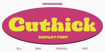 Cuthick is a display font that made based on thick lines, this font has a chubby and cute shape. You can use this font in playful, retro, and vintage style designs. This font can be use for a variety of projects or artwork such as sticker, headline, branding, product label, poster, logotype, magazine, and many more. Feature: - Kerning - Alternative Style and Ligature - Uppercase and Lowercase Letters - Numeral - Punctuation and Symbols - Multilingual Supports
 - Caravan by Linotype,
$29.99Caravan was designed in 1938 by William Addison Dwiggins and consists of a variety of ornaments. He based the forms of the ornaments on the same lines and curves found in his font Electra. He wanted printers and designers to have the chance to combine the two fonts for a more attractive or outstanding overall picture. Caravan is particularly popular for advertisements in newspapers. Caravan can be easily mixed with other fonts designed by Dwiggins. - Colleen Doran by Comicraft,
$29.00 A DISTANT SOIL is a classic bold and beautiful science fiction/fantasy comic book series by creator, writer, artist AND letterer Colleen Doran! A DISTANT SOIL is being remastered and re-released by those awfully nice chaps at Image Comics and Colleen commissioned Comicraft to create the definitive bold and beautiful Colleen Doran font, based on her original pen lettering, so that she might re-letter the series without excessive eye strain or hand cramp.
 - Pixter by Matt Grey Design,
$12.99 Pixter straddles the lines between the extreme forms of grid based pixel fonts, and more conventional grotesque fonts. Its array of styles create a palette of textures to work with multiple scenarios, from large format display to oversized passages of copy. Inspiration for Pixter initially grew from old computer bitmap fonts, but branched out into Swiss and Dutch graphic design, such as the graphic work of Josef Müller-Brockmann and typography of Wim Crouwel.
 - Hanka Rounded Sans by Tom Károly,
$19.99 This font is a very new typeface from 2022. It is based on biro pen writings. The name Hanka is the nick of the designer’s daughter. The family has seven weights (straight and oblique), which are OpenType sets with PostScript curves. Features include ligatures (classical and discretionary), number formats (tabular/proportional, lining/old style), fractions, old-style formats, stylistic alternates, and kerning. May you be happy with this set when creating advertisements or artistic content.
 - Maypole by Scholtz Fonts,
$19.00MayPole is a contemporary, 21st century, sans serif font, that contains an eclectic mix of elements from the 20th century. It combines gentle curves with base and caps-line transgressions but is substantially more rounded than in most commercial-style sans serif faces. Terminal strokes are slightly rounded and occasional elements are strongly rounded. MayPole is readable and can be successfully used for presentations, magazines etc, and for display use in newspapers, advertising and promotions. - Fondamento Pro by Stiggy & Sands,
$29.00 Fondamento and Fondamento Italic are calligraphic lettering styles based on the traditional Foundational Hand, a basic teaching style created by Edward Johnston in the early 20th century. The letterforms are clear and cleanly legible, basic and formal. Opentype features include: - Stylistic Alternates for a collection of alternate Small Caps - Full set of Inferiors and Superiors for limitless fractions - Lining and Proportional figure sets, several discretionary ligatures/alternates as well as a collection of ligatures.
 - ITC Static by ITC,
$29.99Static looks almost like it was stamped on paper: the black color is not evenly distributed and the background comes through the letters and consciously irregular forms reinforce the effect. The characters do not all have the same height, nor do they stand straight and regularly on the base line. Static is a robust font with bold, rounded serifs and is best used for headlines and short texts in point sizes of 12 and larger. - RNS Pictografica Cocina by RNS Fonts,
$9.00 RNS Pictografica Cocina (Kitchen, culinary arts and food related font) it is comprised of 230 glyphs, it's based on a modular structure of a minimal thickness on lines and round corners, making a clean visually drawing, give importance to the surround white for improve contrast. The font is better used on a big white canvas for achieve visual focus. And in great sizes for more impact, however the font is legible even at small sizes.
 - Linotype Down Town by Linotype,
$29.99Linotype Down Town is part of the Take Type Library, chosen from the contestants of Linotype’s International Digital Type Design Contests of 1994 and 1997. The cheerful character of this fun font from German designer Critzler is perfect for comics or posters. The figures dance across the base line, swinging between thick and thin, big and small. Linotype Down Town is intended exclusively for headlines and short texts in at least 18 point. - Octo by Gunjan,
$32.00 Octo is square bold/display font with italics. Letterform is bit quirky and square shaped, it can fill all kind of spaces. Octo has nice form that relate to industrial, machines and italics helps denoting speed. Octo is good for branding in fields of sports, automobile. It has full glyph set of numerals and signs. Octo is an excellent choice for headline-typesetting and logo design. Octo is developed by Gunjan Panchal based in India.
 - Butcher by RodrigoTypo,
$25.00 Butcher is a Rough font with 2 styles, a medium and a black to play with the weights, it contains the Greek and Cyrillic alphabet, special for action titles
 - SpaceMace by Scannerlicker,
$33.00 SpaceMace is a pixel-font designed for print work... or not! It features 950 glyphs, from Basic Latin to Greek and Cyrillic, with ligatures, swashes and much, much more!
 - Amalfi by Irina Vascovet,
$26.00 Amalfi a hand written pointed pen font that is filled with personality. The font comes with upper and lowercase characters in both Roman and Cyrillic, numbers, marks and punctuation.
 - Intro by Fontfabric,
$47.00 Let us introduce you the official big update of Intro type family with essential upgrades to this contemporary sans serif. The weight distributions completely revised has brought 8 new weights and matching italics resulting in 72-fonts family with 22 fonts extra. Intro’s refined playfulness is further emphasized with additions of multiple ingredients, such as carefully adjusted Oblique alternatives next to the existing upright alternatives. All these styles are now available as a Condensed version. On top of that, there are 3 inline fonts. The glyph case was expanded to cover Extended Latin and Cyrillic with adequate language localization. The OpenType features rewritten and improved now allow case-sensitive forms and contextual alternates, and plenty of stylistic alternates. The standard numerals set includes as well tabular figures and symbols, superiors and inferiors, numerators and denominators, plus fractions.
 - Nineteen Ten Vienna - Unknown license

- Mucha - Personal use only

- Basileus - Unknown license

- Synthetic BRK - 100% free

- Resist Mono by Groteskly Yours,
$25.00 Resist Mono is a highly functional monospaced type family designed for optimal performance both in print and on the web. Inspired by the distinctive features of the original Resist Sans family, it showcases deep inktraps, angled terminals, and exceptional legibility. With its bold personality and style, Resist Mono remains highly readable even at small sizes. Suitable for coding, UX, web, and graphic design, Resist Mono offers versatility and visual impact for a wide range of applications. Resist Mono comes in 16 styles (14 static fonts) and two variable fonts. Each font contains over 1300 glyphs, including letters, small capitals, numbers, punctuation, symbols, etc. Resist Mono supports more than 200 Latin-based languages and has extensive Cyrillic support for languages like Russian, Bulgarian, Ukrainian, Serbian, and many more. In addition to this, Resist Mono also includes special Powerline symbols for coding. OpenType features in Resist Mono include Small Capitals, Case Sensitive Punctuation, Stylistic Alternates, Fractions, Subscript, Superscript, Ligatures and many more. Resist Mono Type Family Features: - 1300+ characters per font - 14 static fonts - 2 variable fonts - True Italics - Small Capitals - Extensive OpenType features - Supports 200+ Languages (Latin & Cyrillic) - Special Symbols and Features - Free Trial Fonts Available Resist Mono has been meticulously developed to prioritize functionality and legibility, making it an ideal choice for coding. It offers true italics with a calligraphic influence, adding a unique touch to the font. Additionally, users can access the regular slanted letterforms through OpenType by selecting the corresponding stylistic set. With its versatility, Resist Mono can be applied beyond coding, finding relevance in various contexts like product and graphic design, web design, publishing, and more, thanks to its visually appealing features and bold stylistic choices. Explore Resist Mono Dynamic Specimen for more features, type testers, etc.
 - Ekamai by Eclectotype,
$40.00 This is Ekamai, named after the district of Bangkok I lived in. It is based on Quinella, and was supposed to be a quick and easy reworking of that font into a "tight-not-touching" (rather than overlapping) version. As is often the case with quick and easy things, it turned out to be neither, and the vast majority of glyphs needed to be completely overhauled to fit the new system. This face is deliciously plump face, with lovingly rendered curves and just the right amount of cuteness; perfect for food packaging (of the sweeter variety probably!), logos, magazine headlines and the like. It performs admirably in all caps settings. The numerals are expressive hybrid figures (somewhere between lining and oldstyle). The overall feel is friendly and soft, without being overtly saccharine. Ekamai is equipped with subtle contextual alternates (which I'd recommend leaving on) to help with the tight fit, a handful of discretionary ligatures if that's your thing, and a case feature for all caps settings. The stylistic alternates and stylistic set 1 features simply change the # glyph to an attractive numero. Automatic fractions are included along with wide-ranging language support.
 - Pepper Sans by VIDI Visual Design Studio,
$17.99 The core design of Pepper family, designed by VIDI Visual Design Studio, is the fingertip handwriting style inspired by children’s writings on windows. This distinctive low-contrast typeface combines characteristics from neo-grotesque and organic models. Warmer than most Helvetica inspired typefaces, Pepper has organic shapes, playful strokes, rounded endings, and a generous x-height which makes Pepper easy to read. This family could be used well for food packagings, content aimed for children, book covers, branding, high-impact titles and small body texts, advertising, editorial design and more. What makes Pepper Sans Vol.1 competent and more spicy then some other fonts is that it contains a set of more than 900 characters for each of 5 weights that support many Latin-based languages, Greek and Cyrillic. As the weight decreases, the typeface gains impact with becoming elegant, giving titles in (Hair, Thin or Light) a breath of fresh air. We derived a typeface family consisting of Hair, Thin, Light, Regular, Semi Bold in this Vol.1 edition. Typeface features: • 5 weights: Hair, Thin, Light, Regular, Semi Bold • Latin, Greek & Cyrillic multilingual support • More than 900 characters for each of 5 weights Font Specs: • Created: August 2020 • Files type: .ttf
 - Change Serif by Borutta Group,
$39.00 Change Serif is a typeface family designed as a part of Mateusz Machalski's PhD project, carried out in 2015-2021. The main goal was to create a typeface allowing for the typesetting of complex humanistic texts, containing many historical letterforms. The starting point was the preparation of most of the glyphs provided in unicode for Latin, Cyrillic and Greek. From the formal point of view, the Change family is based on Renaissance proportions with contemporary details. Classic upright version is paired with expressive and calligraphic italics, inspired by the works of Robert Granjon. Each of the styles contains about 4,000 characters, allowing for a broad range of typesetting capabilities – multiscript publications, historical translations, and texts transcription. The crucial aspect was to treat all scripts equally. All OpenType features, such as swashes, final forms, decorative ligatures, can be found in Latin, Cyrillic and also Greek. The name of the typeface refers to the design process in which there are constant changes and corrections. On the other hand, it means to convey how this project influenced my perception of typography and allowed me to embrace it as a medium of artistic expression. Due to its similar proportions, Change works perfectly with the Gaultier typeface.
 - Epoca Classic by Hoftype,
$39.00 Epoca-Classic, designed in 2012, is the contrasted sister of Epoca, also suited for text and display. As is the case with Epoca, Epoca-classic has economical proportions, a neutral appearance and a discreet elegance. It is fresh, crisp and distinguished. Its well-balanced proportions result in an even text flow which allows for pleasant reading even with large amounts of text. Epoca-Classic comes in twelve weights, in OpenType format and with extended language support for more than 40 languages. All weights contain small caps, standard ligatures, proportional lining figures, tabular lining figures, proportional old style figures, lining old style figures, matching currency symbols, fraction- and scientific numerals.
 - Odin by ITC,
$29.00The extravagant Odin was designed by Bob Newman in 1972. Its figures display constructed basic forms and when set into words, the typeface builds closely set lines. The strong serifs catch the reader's eye and draws it horizontally across the page. The forms of the capital letters are particularly distinctive. In the upper third, the stroke beginnings seem to form a roof over the body of the letter, fragmented by a fine white line that lends them independence and dominance. Odin is best used for headlines in display point sizes. - Wandering Pencil by Hanoded,
$15.00 I have a lot of pencils, but when I need one, they seem to have grown legs and have disappeared! When I decided I wanted to create a pencil font, it took me a long time to find the right pencil for the job! Wandering Pencil is a nice, handmade font. It is a bit shaky, a bit rough, but it does have class and will look nice on your designs! Comes with diacritics and double letter ligatures for the lower case.
 - Amico by Hackberry Font Foundry,
$24.95 This is a new barely modulated, slightly narrow, sans serif font family. It has eight styles: thin, thin italic, regular, italic, bold, bold italic, black, & black italic grouped into two 4-font families: Amico Thin with the Bold; and Amico with the Black. Amico has the standard feature set developed at the end of 2007. It has many OpenType features and 654 character/glyphs: Caps, lower case, small caps, ligatures, discretionary ligatures, swashes, small cap figures, old style figures, numerators, denominators, accent characters, ordinal numbers (1st-infinity): lining and oldstyle), and so on. It is designed for text use in body copy. However, Amico really shines as the choice for heads & subheads when using Amitale or Brinar for the text family.
 - Rationell by PeGGO Fonts,
$29.00 Download PDF Instructions from https://peggofonts.com/download/Rationell-Instructions_4.59.pdf Behance presentation https://www.behance.net/gallery/88695175/Rationell Rationell is a functional multipurpose corporate typeface, based on classic 1950's swiss rationalism, subtle tuned on a XIX century didonesque modernist structure, a contemporary interpretation with the eyes of the Latin idiosyncrasy. Designed in 12 upright weight with 12 matching Italic, from Hairline to ExtraBlack, average weights (Light to Bold) are easily read on text sizes, printed and digital media, while Hairline to ExtraLight and ExtraBold to ExtraBlack are especially suitable for big contexts like headlines, poster and higher sizes as big as storefronts, monumental billboards or building size printed mesh covers. 40 OpenType features: Standard and Discretionary Ligatures, Lining, Old Style and tabular numerals, scientific and fractional forms, slashed zero, stylistic and contextual alternates (rounded dots, "Il" readability, auto roman numbers, auto group enclosed numbers, slashed zero on alphanumeric contexts), sensitive case, localized forms, glyphs composition/decomposition, access to all alternates. Rationell has a serious but kind timeless look, an ideal voice for corporate publishing, branding, wayfinding and complex technical information systems. It Supports 222 Latin based languages, with +2200 glyphs Rationell is capable to solve the most advanced nowadays global design needs.
 - LTC Athena by Lanston Type Co.,
$29.95 LTC Athena brings a somewhat “lost” hot-metal typeface back from obscurity into digital Opentype format. In fall 2012, printing historian Rich Hopkins contacted P22 type foundry regarding some inked type drawings he had just uncovered from his acquisition of the Baltimore-based “Baltotype” company some 20 years ago. It is a rare face whose original matrices were destroyed and thought fully lost. The drawings included a full upper and lower case set, numerals, basic punctuation, and alternate forms of some letters. The design is a narrow deco-flavored design from the 1950s with a curious avoidance of straight lines in the stems and main strokes. The face has been expanded to over 340 characters by Miranda Roth and includes ligatures as well as a full Pan-European character set. It is released through the Lanston division of P22 in consideration of its earlier incarnation as a metal typeface.
 - Smart Casual by Scholtz Fonts,
$21.00 The name "Smart Casual" says it all. This is the font to use when you want to create that smart impression without being too formal. It is based on the font "Black Tie" but it is less formal than "Black Tie". It conveys an impression of relaxed elegance without being either sloppy or too intimate. Smart Casual is ideal for invitations to stylish but relaxed events, for advertisements that are intended to create that special ambience, for posters and for announcements. Smart Casual has a full character set and has been carefully letter-spaced and kerned. It comes in two styles: Baseline and Staggered. In "Baseline" all characters refer to the same baseline (the lower part of the characters are in line), while in "Staggered" the capitals are placed lower than the lower case characters, creating a slightly more dramatic, yet formal and retro look.
 - Heimat Display by Atlas Font Foundry,
$50.00 Heimat Display is the high contrast sans serif typeface family within the Heimat Collection, also containing Heimat Didone, Heimat Sans, Heimat Mono and Heimat Stencil. Heimat Display is a typeface family designed for contemporary typography, especially for use in headlines and on posters, but also for reading purposes. It combines an idiosyncratic appearance with the feeling of a grid-based letter construction of the late 20s. Since the design might be too extreme for some applications, Heimat Display’s character set provides different alphabets, the regular one plus alternate designs that comes across as less suspenseful. Heimat Display [873 glyphs] comes in 72 styles and contains extra sets of alternate glyphs, many ligatures, lining figures [proportionally spaced and monospaced], hanging figures [proportionally spaced and monospaced], positive and negative circled figures for upper and lower case, superior and inferior, fractions, extensive language support and many more OpenType features.
 - Stadia by Device,
$29.00 Stadia is designed around a series of modular units: quartercircles, teardrop shapes, squares, circles and variations thereon. The versatility of these basic shapes is such that a teardrop, for example, can represent a looped bowl, as in the lower part of the a, while also representing a curved arc at the top of the same character. The strict grid is broken for the T and the Y, and the placement of accents. The alternative – basing a T, for example, across three units – though rational, is far less aesthetically pleasing. As always with type design, one has to know when the internal structural rules should be bent for a more beautiful result. The horizontal lines appear to travel through the letters, bursting into stars in the counters of lower-case characters such as the o and p. The outline version is weighted to the same width as the gaps between the units.
 - Heimat Didone by Atlas Font Foundry,
$50.00 Heimat Didone is the high contrast serif typeface family within the Heimat Collection, also containing Heimat Display, Heimat Sans, Heimat Mono and Heimat Stencil. Heimat Didone is a neo-classical typeface family designed for contemporary typography, especially for use in headlines and on posters, but also for reading purposes. It combines an idiosyncratic appearance with the feeling of a grid-based letter construction of the late 20s. Since the design might be too extreme for some applications, Heimat Didone’s character set provides two alphabets, the regular one plus an alternate design that comes across as less suspenseful. Heimat Didone [872 glyphs] comes in 72 styles and contains 6 optical weights, extra sets of alternate glyphs, many ligatures, lining figures [proportionally spaced and monospaced], hanging figures [proportionally spaced and monospaced], positive and negative circled figures for upper and lower case, superior and inferior, fractions, extensive language support and many more OpenType features.


