10,000 search results
(0.017 seconds)
- BR Sonoma by Brink,
$30.00 BR Sonoma is a new geometric grotesque built for the 21st century with a finely tuned modern aesthetic. BR Sonoma builds on the foundations laid by the classic Swiss grotesques such as Helvetica and Univers but combines their features with a stronger geometric base usually found in other early classics such as Avant Garde, Futura and Avenir.
 - Wafterby by Paramajan,
$8.00 Wafterby is a handsome sans serif typeface family. It comes in eight weights which have a minimal and clean feel. Its design is based on circle and line geometric shapes. It can be used as a cute minimal-style header display or as a stylish text for magazine, blog, corporate branding, packaging, wedding invitation project, etc.
 - Corradine Handwriting Italic by Corradine Fonts,
$19.95 Few fonts reach the goal of simulate properly the hand writing aspect. Based on the hand writing of Manuel Corradine, Corradine Handwriting fonts have a lot of automatized alternates and ligatures that give them a natural hand writing feeling. Initially we were offering just the upright version of Corradine Handwriting but now here is the nice italic version.
 - Allerton by Jeff Levine,
$29.00 Presenting a condensed Art Deco sans serif font with rounded corners and squared inner lines, based on the hand lettered title on the cover of the sheet music for 1944’s “Just A Little Fond Affection”. Allerton JNL is available in both regular and oblique versions, and was named after a neighborhood in the Bronx, New York.
 - Caesar Pro by RMU,
$35.00 In 1913, Leipzig-based foundry C. F. Ruehl released a hot-metal font called Caesar-Schrift which was cut by the engraver and medalist Georg Schiller (1858-1937). This humanist sans combines successfully traditional classic forms with the flowing lines of the Art Nouveau period. Now revived as Caesar Pro, this font was carefully extended and made multilingual.
 - Cookie Powered by PizzaDude.dk,
$15.00 Tall, thin, grid, legible and handmade! What's not to like?! The font was made using a squared paper as a base for the lines. However, I managed to keep the free spirit of the handmade look, despite the guides. Play around with the 4 different versions of each letter and the swashes to make your text stand out!
 - Mawoot by Brainware Graphic,
$12.00 Mawoot is a geometric display font. This design has a strong technological feel and modern playful shapes, it will suit any project you can think of. Mawoot comes with many OpenType features, and with broad multilingual support covering many Latin-based languages. Mawoot is a nice fit for many design projects, for example logo, branding, posters, etc.
 - Bettiya by Sinfa,
$8.00 Bettiya is a new modern script font with an irregular base line. It's trendy and feminine. Bettiya Script looks clean and beautiful in a variety of designs such as in invitations, thank you cards, quotes, greeting cards, T-shirt designs, product labels, branding, logos, business cards, and more. Bettiya includes several lowercase alternatives and has multi-lingual support.
 - Halliday JNL by Jeff Levine,
$29.00 Halliday JNL was redrawn from impressions made by a rubber stamp sign printing set, thus providing the slight imperfection of line widths that gives a hand-made approach to the typeface. The lettering style is based on Beton Open Condensed, a clean and popular slab serif used for decades in print display titling and rubber stamp manufacture.
 - Hasan Ghada Rectangle by Hiba Studio,
$59.00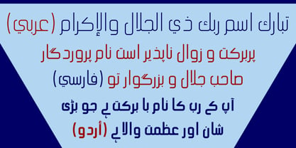 Hasan Ghada Rectangle is a developed version of Hasan Ghada with a rectangle feel. It supports Arabic, Persian and Urdu. Hasan Ghada is an Arabic display typeface. It is useful for titles and graphic projects. The font is based on the simple lines of Modern Kufi calligraphy with new ideas for rectangle shapes and geometric feel.
 - Arya Rounded by Underground,
$19.90 Arya Rounded is a display typeface, based on Roman proportions. It has three versions, differentiated by the amount of the drawn lines. Single is solid. Double is sturdy but light. Triple is versatile and includes alternatives. They can be combined in layers. Capsule versions (White and Black) are designed to do quick, simple and elegant labels.
 - Juneway JNL by Jeff Levine,
$29.00 Jeff Levine acquired a set of original water-applied decals made by the Duro Decal Company of Chicago (now Duro Art Industries) and painstakingly recreated one of the classic hand-drawn typefaces from the Duro line. Named after the street where the company is located, Juneway JNL is an authentic reproduction for the computer-based designer.
 - Occulista by VersusTwin,
$39.00 Occulista began as a modern take on a vintage tri-line style of typeface, but quickly evolved into something quite different. This heavyweight optically-stimulating family features nine weights, with alternate uppercase letters in place of lowercase. This typeface works best in eye-catching headlines or short bursts of text, and the variant styles can applied to accent key wordings in many interesting combinations.
 - Morton by Deltatype,
$59.00 Morton, another modern grotesque typeface which deliver a extraordinary unique within typeface with the style of condensed let you create more impact with your design. Morton Type Family available in nine weights, the Thin weight deliver you a simple hair line stem until you reach the bold weight, you will get more dynamic with three stem weights which give you a modern, old school look and feel.
 - Single Gyrl - Unknown license

- PF Champion Script Pro by Parachute,
$125.00 PF Champion Script Pro is perhaps the most advanced and powerful calligraphic family ever made. It received an award for Excellence in Type Design from the International Type Design Competition ‘Modern Cyrillic 2009’ which was held in Moscow. Most recently, it received another award from the 3rd International Eastern Type Design Competition - Granshan Awards 2010. This typeface was first presented in June 2007 at the 3rd International Conference on Typography and Visual Communication (ICTVC) and was met with rave reviews. It is based mainly on the manuscripts of the 18th century English calligrapher Joseph Champion. Developed over a period of two and a half years, each one of the 2 weights is loaded with 4300 glyphs(!), offering simultaneous support for all European languages based on the Latin, Greek and Cyrillic scripts. Furthermore, a wide selection of alternate forms and ligatures is included for all languages, in order to accommodate diverse design aesthetics. These alternates are either applied automatically through an advanced programming scheme, or manually through several OpenType features. An attempt was made to design a contemporary script typeface with classic roots, by following certain guidelines, i.e. lowercase characters were designed so they are less inclined, have a higher x-height and are less condensed than the original. Several characters were stripped-off their connecting lines in order to enhance legibility. Four sets of alternate swashed capitals as well as a plethora of ornaments and frames (117) was included. Small caps and their alternate forms were designed to replace the capitals which disrupt the flow of text within a sentence with their extravagant swashes. All characters were carefully designed with the proper weight in order to sustain harsh printing conditions (on special papers), a situation which affects mainly the light connecting parts of calligraphic typefaces. Finally, it was programmed in such a way as to preserve handwriting qualities, by designing an extensive array of ligatures and alternate glyphs in all languages, never before released or incorporated within the same font.
 - Basenji by Typodermic,
$11.95 Basenji is a flowing headline typeface influenced by the modular geometric design trend of the 1970s. Herbert Bayer published his highly influential Universal Alphabet in 1924, which was based on circles and straight lines and had a modern, industrial appearance. Jan Tschischold’s typography popularized this simple, unconventional style but by the late 1950s, it had fallen by the wayside. Type designers Joe Taylor and Herb Lubalin inaugurated the 1970s with fresh takes on an old concept. These new typefaces were more practical than the original, and their blend of futuristic curves and funky curls fit the zeitgeist. The popularity of these types spawned a flood of similar designs like Pink Mouse, Bauhaus, Pump, and Harry. These typefaces were popular throughout the decade then fell out of favor by the mid-1980s, making a comeback in the year 2000. Many contemporary font designs have drawn inspiration from the beginnings of the Universal Alphabet, but Basenji is unique. This typeface amplifies of the 1970s elements of Rondo, Pump, Bauhaus and Blippo, and packs them into a practical, versatile design toolset. Basenji comes in nine weights and italics. Most Latin-based European, Vietnamese, Greek, and most Cyrillic-based writing systems are supported, including the following languages. Afaan Oromo, Afar, Afrikaans, Albanian, Alsatian, Aromanian, Aymara, Azerbaijani, Bashkir, Bashkir (Latin), Basque, Belarusian, Belarusian (Latin), Bemba, Bikol, Bosnian, Breton, Bulgarian, Buryat, Cape Verdean, Creole, Catalan, Cebuano, Chamorro, Chavacano, Chichewa, Crimean Tatar (Latin), Croatian, Czech, Danish, Dawan, Dholuo, Dungan, Dutch, English, Estonian, Faroese, Fijian, Filipino, Finnish, French, Frisian, Friulian, Gagauz (Latin), Galician, Ganda, Genoese, German, Gikuyu, Greenlandic, Guadeloupean Creole, Haitian Creole, Hawaiian, Hiligaynon, Hungarian, Icelandic, Igbo, Ilocano, Indonesian, Irish, Italian, Jamaican, Kaingang, Khalkha, Kalmyk, Kanuri, Kaqchikel, Karakalpak (Latin), Kashubian, Kazakh, Kikongo, Kinyarwanda, Kirundi, Komi-Permyak, Kurdish, Kurdish (Latin), Kyrgyz, Latvian, Lithuanian, Lombard, Low Saxon, Luxembourgish, Maasai, Macedonian, Makhuwa, Malay, Maltese, Māori, Moldovan, Montenegrin, Nahuatl, Ndebele, Neapolitan, Norwegian, Novial, Occitan, Ossetian, Ossetian (Latin), Papiamento, Piedmontese, Polish, Portuguese, Quechua, Rarotongan, Romanian, Romansh, Russian, Rusyn, Sami, Sango, Saramaccan, Sardinian, Scottish Gaelic, Serbian, Serbian (Latin), Shona, Sicilian, Silesian, Slovak, Slovenian, Somali, Sorbian, Sotho, Spanish, Swahili, Swazi, Swedish, Tagalog, Tahitian, Tajik, Tatar, Tetum, Tongan, Tshiluba, Tsonga, Tswana, Tumbuka, Turkish, Turkmen (Latin), Tuvaluan, Ukrainian, Uzbek, Uzbek (Latin), Venda, Venetian, Vepsian, Vietnamese, Võro, Walloon, Waray-Waray, Wayuu, Welsh, Wolof, Xavante, Xhosa, Yapese, Zapotec, Zarma, Zazaki, Zulu and Zuni.
 - Campton by René Bieder,
$30.00 Campton is an unconventional typeface based on the first steps of the newly born sans serif genre in the early twentieth century. Its character draws inspiration from Gill Sans and Johnston Sans while combining it with contemporary elements. The result is a modern and unorthodox family that is perfectly suited for graphic design application ranging from editorial and corporate design to web and interaction design. Campton comes in nine weights with matching italics and is equipped with a wide range of opentype features.
 - Cyceon Pro by DBSV,
$90.00 Fluted pillars… As for the name of "Cyceon", it is a "juice-drink" that they made in ancient Greece...! In this font the straight lines are not vertical but inclined like something from the Doric columns!!! There are two versions of letters. In the first version, it is of a normal character, while in the second version I have mixed some capitals with lower case letters. I have given them the acronym Msc "miscellaneous". I tried in this way to give another version of the small capitals and I think they show a different view from the purely small capitals… And in this family, the “Strap”/“Strap Msc”/“StrapIt”/ and “Strap MscIt” with “Solid”/“Solid Msc”/“SolidIt”/ and “Solid MscIt” engage in the same way like… “Layered font families” as the previous series. This series is composed and includes twenty-four fonts with 642-658 glyphs each, with true italics and supports Latin, Greek and Cyrillic.
 - Segment A Type by Kobuzan,
$35.00 Segment A is a powerful display type family with 18 styles inspired by condensed European grotesques of 19th-century, but with clear geometric proportions. In Black weights, the letterforms are inspired by the aggressive industrial graphic design of the 1960s and 70s. Both have 3 axes and are adjustable in weight, width and 10˚ italic. It is a typeface with narrow proportions, distinctive character, high-quality outline and lots of details. Characters have oblique cuts, sharp tails and highly visible ink traps. All this makes the font more aggressive and edgy. The huge x-height with short ascenders and descenders allows this typeface to be used in blocks with minimal line spacing. Features: – Total glyph set: 631 glyphs; – 18 styles (3 weights x 3 widths + italic); – Support 210+ languages; – Latin Extended; – Cyrillic Basic + Bulgarian letters; OpenType features: – Proportional numerals, tabular numerals, superiors, fractions; – Punctuations and symbols; – Arrows; – Stylistic alternates (ss01-ss05); – Ligatures; – Case-sensitive forms.
 - Core Sans ES by S-Core,
$29.00 The Core Sans ES Family is a rounded version of Core Sans E and a part of the Core Sans Series such as Core Sans N, M, A, G, D. This is a modernized grotesque font family with horizontal terminals, low stroke contrast, enclosed apertures and little line width variation. Its tall x-height makes the text legible and the spaces between individual letter forms are precisely adjusted to create the perfect typesetting. The Core Sans ES Family consists of 9 Weights (Thin, ExtraLight, Light, Regular, Medium, Bold, ExtraBold, Heavy, Black) and Italics for each format. It supports WGL4, which provides a wide range of character sets (CE, Greek, Cyrillic and Eastern European characters). Each font includes support for Superiors and Inferiors, Fractions, Tabular numbers, Arrows, Mathematical operators and Opentype Features such as Proportional Figures, Tabular Figures, Numerators, Denominators, Superscript, Scientific Inferiors, Subscript, Fractions, Case Features and Standard Ligatures. We highly recommend it for use in books, web pages, screen displays, and so on.
 - Pusia by ROHH,
$40.00 Pusia is a versatile font family with a lot of character and warmth. It is a professional, contemporary sans serif with original letter forms, friendly and dynamic feel. Its subtle curved shapes and attention to details give Pusia a very distinctive look. Its proportions and optimized kerning make it a very clean and legible in all sizes. Pusia is a great choice for all kinds of design work, both print and on-screen. It is perfect for display use in headlines, advertising, logo design and branding as well as long and short paragraphs of text. Pusia consists of 20 fonts - 10 weights and their corresponding italics. It has extended language support including cyrillic and true italics, as well as broad number of OpenType features, such as small caps, case sensitive forms, ligatures, stylistic alternates, contextual alternates, lining, oldstyle, tabular, small cap and circled figures, slashed zero, fractions, superscript and subscript, ordinals, currencies and symbols.
 - Tosia by ROHH,
$40.00 Tosia is a modern, geometric, clean, elegant and versatile font family designed with neutrality, beautiful proportion and excellent legibility in mind. This professional, contemporary sans serif has slightly condensed dimensions, which make it a great typeface for situations, where space saving is needed. Tosia’s broad variety of weights makes it suitable for headlines of all sizes, as well as for long and short paragraphs of text. It is excellent for on-screen use, for web applications, user interfaces, as well as for all kind of print purposes, like branding, packaging and editorial design. Tosia consists of 20 fonts - 10 weights and their corresponding italics. It has extended language support including cyrillic and true italics, as well as broad number of OpenType features, such as small caps, case sensitive forms, ligatures, stylistic alternates, contextual alternates, lining, oldstyle, tabular, small cap and circled figures, slashed zero, fractions, superscript and subscript, ordinals, currencies and symbols.
 - Elysio by Type Dynamic,
$37.00 Elysio is a condensed and humanist sans. Its open forms are very useful for signage. The constructed aspect is based on Predige. The Elysio family includes 7 weights, from Hairline to Black, with their corresponding italics. Each font includes OpenType Features such as Stylistic Alternates, Proportional Figure, Tabular Figures, Numerator, Superscript, Denominators, Scientific Inferiors, Subscript, Ordinals, Ligatures and Fractions. Elysio family supports Latin and Cyrillic, all these languages are covered: Latin language support: Afar, Afrikaans, Albanian, Asturian, Azeri, Basque, Bosnian, Breton, Bulgarian, Catalan, Cornish, Corsican, Croatian, Czech, Danish, Dutch, English, Esperanto, Estonian, Faroese, Filipino, Finnish, Flemish, French, Frisian, Friulian, Gaelic, Galician, German, Greenlandic, Hungarian, Icelandic, Indonesian, Irish, Italian, Kurdish, Latin, Latvian, Lithuanian, Luxembourgish, Malagasy, Malay, Maltese, Maori, Moldavian, Norwegian, Occitan, Polish, Portuguese, Provençal, Romanian, Romansch, Saami, Samoan, Scots, Scottish, Serbian, Slovak, Slovenian, Spanish, Swahili, Swedish, Tagalog, Turkish, Walloon, Welsh, Wolof Cyrillic language support: Adyghe, Avar, Belarusian, Bulgarian, Buryat, Chechen, Erzya, Ingush, Kabardian, Kalmyk, Karachay-Balkar, Karakalpak, Kazakh, Komi, Kyrgyz, Lak, Macedonian, Moldovan, Mongol, Permyak, Russian, Rusyn, Serbian, Tatar, Tofa, Tuvan, Ukrainian, Uzbek
 - WrenchedLetters by Ingrimayne Type,
$14.95 WrenchedLetters is a novelty font in which characters are composed of wrenches and bolts. It is caps only, but the characters on the lower-case keys differ from those on the upper-case keys. It has a large set of accented characters. It is not often that one needs a typeface made of wrenches and bolts, but if one does, there is a font for that. For related, tool-based typefaces, see Screwged, NailsNStaples, and Hammered.
 - Screwged by Ingrimayne Type,
$14.95 Screwged is a letterbat font in which letters are made of screwdrivers and screws. It is caps only, but the characters on the lower-case keys differ from those on the upper-case keys. It contains a large set of accented characters. It is not often that one needs a typeface made of screws and screwdrivers, but if one does, there is a font for that. For related, tool-based typefaces, see WrenchedLetters, NailsNStaples, and Hammered.
 - LTC Forum Title by Lanston Type Co.,
$24.95 Forum Title was originally designed by Frederic Goudy in 1911. It was intended to be the heading font used for a book set in Kennerley. Based on inscriptional Roman stone cut capitals, this face is true to the early Roman forms which did not have a lower case. Forum exemplifies the classic Roman letterform at its finest. If a lower case were desired, Forum Title can be paired with Goudy Oldstyle for a harmonious hybrid font.
 - Hammered by Ingrimayne Type,
$14.95 In Hammered all the letters are made up of hammers and an occasional nail. It is caps only, but the characters on the lower-case keys differ from those on the upper-case keys. It has a large set of accented characters. It is not often that one needs a typeface made of hammers and nails, but if one does, there is a font for that. For related, tool-based typefaces, see Screwged, NailsNStaples, and WrenchedLetters.
 - FF Sale by FontFont,
$41.99 British type designer Tony Booth created this script FontFont in 1996. The family contains 4 weights: Light Italic, Regular, Medium Italic, and Bold Italic and is ideally suited for advertising and packaging and poster and billboards. FF Sale provides advanced typographical support with features such as ligatures, alternate characters, and case-sensitive forms. It comes with proportional lining and tabular lining figures.
 - Oxford by profonts,
$41.99 profonts Oxford was originally designed by Christine Lord in 1960 and digitally re-mastered by profonts in 2009. The font contains lower case characters only. It is a multi-line display design with a continuous connecting horizontal line that combines all characters. This combination makes it special and very sporty. profonts Oxford is ideal for any design of sporting character.
 - Beaumaris by Roland Hüse Design,
$30.00 Beaumaris is a serif typeface named after a nice bay area in Australia which I would like to visit one day. A modern bold serif with an art deco touch, this font is great choice for fashion brands, jewellery and magazine headlines. It contains stylistic alternates, discretional and standard ligatures, small caps and fractions (see image gallery for details). The character set covers all Latin accented characters (including Schwa) and Russian cyrillic alphabet. For additional customization please message me at: contact@rolandhuse.com Thank you & I hope you like this font!
 - ALS Lamon by Art. Lebedev Studio,
$63.00 Lamon is a soft-natured display typeface. It looks best when used for short words and succinct phrases. Lamon’s outlined glyphs are made of both uppercase and lowercase letters with the smaller letters hiding inside the bigger ones. The face's smooth lines give street signs, packaging and decorative materials a friendly lightness, while the unexpected contrast involves the viewer in an interesting optical game. Lamon is a perfect typeface for neon signs. In addition to Cyrillic and Latin letters, Lamon includes a set of useful characters and currency signs.
 - Swansea by Mysterylab,
$17.00 Swansea font is an ornate and elegant serif typeface providing both roman and italic variants. The old world strokes and flourish embellishments are fused with a modern uniformity that makes this type versatile and useful in many contexts. A collection of two character ligatures bring out additional possibilities (It's easy to override these ligatures in the Glyphs menu of most design software packages.) It's excellent for posh specialty branding applications, antique themes, fine art publications, fashion, and much more. This font also includes the complete Cyrillic character set for Russian, Belarusian, and Ukrainian.
 - Jasan by Storm Type Foundry,
$49.00 Jasan is the Czech expression for ash tree (Fraxinus Excelsior) which provides great wood for tools and furniture. In a landscape it’s a rather inconspicuous tree which forms beautiful alleys. Jasan typeface represents a synthesis of many famous sans-serifs: despite the concept being strictly rational, it’s not at all cold. Simple shapes & human expression will make your projects nicely colored. It brings excellent clarity for printed and web publishing, visual identity & information systems. The 36-font family contains multi-lingual support including Cyrillics, Small Caps & rich palette of OpenType Features.
 - Varp by Kobuzan,
$25.00 Varp is a rather narrow 2-axis variable geometric typeface with slight reverse contrast inspired by utilitarian and technical design. In Slim and Tight styles, the reverse contrast is enhanced. Typeface is adjustable in width, as if by mechanical deformation of proportions, which is often found in technical and transport markings. The letterforms are based in part on the shapes of DIN fonts, with the deliberate addition of contrasting connections, sharp spurs and massive ink traps for sharpness. With the help of special spacing, selective kerning and adjusted letter width, the effect of a monospaced font is created with no obvious "holes" in the text set, while maintaining a special rhythm. In addition to the width, Varp is adjustable in tilt angle to an extreme 30 degrees and an intermediate 15 degrees in both directions. Features: – Total glyph set: 795 glyphs; – 15 styles (3 widths x 5 italics) + variable; – Support 210+ languages; – Latin Extended; – Cyrillic Basic + Bulgarian letters; – Greek. OpenType features: – Uppercase, lowercase; – Proportional, circled, tabular numerals, superiors, inferiors, fractions; – Punctuations and symbols; – Arrows; – Stylistic sets (ss01-ss04); – Ligatures; – Case-sensitive forms.
 - Core Sans CR by S-Core,
$20.00 Core Sans CR family is a rounded version of Core Sans C; a part of the Core Sans Series, such as Core Sans N, Core Sans M, Core Sans E, Core Sans A, Core Sans D, Core Sans G, Core Sans R and Core Sans B. Core Sans CR is inspired by classic geometric sans (Futura, Avenir, Avant Garde etc.). It is based on geometric shapes, like near-perfect circle and square. It has a much higher x-height (height of lowercase letters), an effect which promotes readability especially at small print sizes. The Core Sans C Family consists of 9 weights (Thin, Extra Light, Light, Regular, Medium, Bold, Extra Bold, Heavy, Black) and Italics for each format. Core Sans C supports complete Basic Latin, Cyrillic, Central European, Turkish, Baltic character sets. Each font includes proportional figures, tabular figures, oldstyle figures, numerators, denominators, superscript, scientific inferiors, subscript, fractions and case features. Core Sans C is an ideal font family for use in magazines, web pages, screens, displays, and so on.
 - Alianza by Corradine Fonts,
$24.95 This is a complex typographic system which includes three different but complementary styles so far: Slab, italic and script, with nine weights each one; plus three sets of ornamental fonts: labels, negative labels and ornaments. The soul of the family is a slab feeling applied judiciously to the italic and script styles to make it coherent with the whole system. Each style has three sets of figures: Proportional lining, tabular lining and old style. You can mix the three styles in a single piece to obtain more expressive results without worring about the uniformity and complementing the design by using the ornamental sets.
 - Homenko by Apostrof,
$35.00 Homenko was the only Ukrainian typeface for metal type casting developed in the last century. It has already become a 'classic'. Vasyl Homenko worked on it from 1964 to 1967. The typeface successfully combines the qualities of lineal humanist typefaces with the Ukrainian tradition of asymmetrical slab serif. The works on its digitization and further development has been in progress since 2000. The present version contains Latin Extended characters, Cyrillic with stressed alternates and several ornaments based on Vasyl Homenko's works. It works perfectly for books for children and is ideal for publications related to culture, history, literature and traditional art of Ukraine and other nations of Eastern Europe.
 - Teaspoon by Canada Type,
$29.95 Teaspoon was originally designed by Haley Fiege as a project-specific font in 2007, then completed and produced by Canada Type for commercial viability in 2008. With a personality that can only be described as “ironic cute”, it serves as a much needed alternative for the old overused poster faces, such as Cooper Black and Gill Sans Extra Bold. Words that look good set in Teaspoon include puppies, rainbows, salmonella poisoning and Tom Cruise. Teaspoon is available in all popular formats, comes with plenty of alternate characters, and supports a wider than normal range of Latin-based languages, as well as Cyrillic and Greek.
 - Osbourne by Latinotype,
$39.00 Osbourne is a display typeface with titles based on a refresh, a revival of Salem, originally designed by Keystone Type Foundry. A font with elevated x-height and condense proportions. Visibly “sharp.” In addition to the default version, it has two other versions: one that is sharper and another with wide alternatives to the circular characters. Between these and its five weights, Osbourne has a range of personalities to fit a designer’s needs. Think titles, branding, short texts, whatever you want to make look good. Yet another font in the Latinotype arsenal that covers more than 200 languages within the Latin alphabet and basic Cyrillic.
