10,000 search results
(0.05 seconds)
- Cave Pilot by Baqoos,
$15.00 Cave Pilot is an au fait piquant handwritten mix cased typeface apt for headline, editorial, branding, packaging, printed materials and typographic applications. 200+ glyphs including punctuation and numerical.
 - Macro by Gustav & Brun,
$10.00 Macro is a hand-drawn display font available in a regular and a bold version. Both versions come with double upper cases. Prepare to make a monstrous statement!
 - Pleinair by Gaslight,
$15.00 Pleinair - all caps serif font with alternatives on lower case. Besides Pleinair have two Stylistic sets for two-tier typesetting. Also Pleinair have some decoratives and swashes characters.
 - Schnorr by HiH,
$10.00 Schnorr is a family of three fonts drawn by a German designer, Peter Schnorr. Schnorr Dekorativ is one of the less frequently seen of the alphabets he designed and one of the few for which he designed as lower case. Like many of the alphabets of the period, Schnorr Dekorativ is a delicate design. To provide a little more presence, we have added a DEMIBOLD version. Included in both Schnorr Dekorativ and Schnorr Demibold are an ornament of Schnorr’s design, seven T-ligatures and an alternate lower case t. 123=Ta, 125=Te, 135=Th, 137=Ornament, 167=Ti, 172=To, 188=Tr, 190=Tu and 177=alternate t. Schnorr’s design for the lower case t is unusual and not readily recognized. The alternate may be used to improve readability. Schnorr Initialen was designed as an upper case only design and as such is quite popular. It is often seen under the name of Odessa. Our font is a fresh scan and is paired with our Schnorr Demibold to provide a compatible lower case, along with all the rest of the auxiliary characters. Schnorr Initialen includes all the extras supplied with Schnorr Dekorativ and Schnorr Demibold: 123=Ta, 125=Te, 135=Th, 137=Ornament, 167=Ti, 172=To, 188=Tr, 190=Tu and 177=alternate t. In addition, Schnorr Initialen also includes an alternate uppercase I (172) and five lotus ornaments (123, 125, 167, 188 and 190).
 - SwissCheese - Unknown license

- Nafise by Sulthan Studio,
$10.00 A modern font with a Typeface display style, very attractive, coupled with several lowercase ligatures. This font is available in 3 thickness styles such as regular, Bold, and Out line . This font has uppercase, lowercase, numbers, punctuation, and language support.
 - Fidelma by Patricia Lillie,
$29.00Can't decide whether you're feeling archaic or modern today? Try Fidelma. Fidelma is drawn entirely with straight lines, no curves, giving it a rough but still readable look.Includes four fonts: Regular, Bold, ExtraBold, and a nifty set of Drop Caps. - Puffball by Open Window,
$- Puffball is a fat face with cartoonish features. It also wouldn't look out of place in an ancient Celtic engraving. What makes Puffball so intriguing to look at is that it seems to walk a thin line of buffoonery and ornamentation.
 - PR Swirlies 08 by PR Fonts,
$10.80 This font is a collection of simple calligraphic ornaments suitable for invitations, gift tags, and anything that can benifit from a "spoonful of sugar" visually. This font includes fewer line fillers, and more "ferns and fans" than our previous swirlies.
 - Shabby Brush by Pavel Boog,
$14.00 Shabby brush - creating this font Pavel was inspired by the past and visualized a good future. Erasing lines of letters, like memories that have passed through years. The long-lasting brush continues to create and inspire with all its strength
 - FF TradeOne by FontFont,
$30.99 Italian type designer Fabrizio Schiavi created this display FontFont in 1994. The font is ideally suited for music and nightlife and poster and billboards. FF TradeOne provides advanced typographical support with features such as ligatures. It comes with proportional lining figures.
 - Juicy Toon Font by Josie Makes Stuff,
$10.00 Juicy toon is the perfect font to add a sense of fun and happiness to your project! Round, bouncy characters are with varying line weight are designed to find the perfect balance between hand-drawn charm and a polished, professional finish.
 - Hurley 1967 by Tyfomono,
$16.00 Hurley 1967 is a bold script, with clean lines and smooth curve combined with beautiful features! Simply amazing fonts, comes with 7 styles. Hurley 1967 has a bunch of styles as a families to designed lettering style logotype using the fonts.
 - Matrole by Viaction Type.Co,
$15.00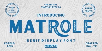 Matrole is a Display Serif with 3 styles: clean, rough and stamp, nice applied in various products. Complete with multilingual characters and stylistic alternates. It is suitable for quote, clothing design, vintage logo, label, poster, packaging design and other designs.
 - Thievery by Hanoded,
$15.00 The idea behind Thievery… is that there is no idea behind it. Thievery is just a nice, legible, happy typeface. It is hand made, has lots of curly swirly bits and looks good as well. So… grab it and run!
 - Skelett Antiken NF by Nick's Fonts,
$10.00 You can pack a lot of letters into a single line with this face, originally released as Clarendon XX Condensed in 1859. Both versions of this font support the Latin 1262, Central European 1250, Turkish 1254 and Baltic 1257 codepages.
 - Katydid JNL by Jeff Levine,
$29.00 Vintage sheet music for a song from the Broadway Musical “Kiss Me Kate” is the inspiration for Katydid JNL. The play’s name was written in a ball-and-line type of lettering which somewhat resembles either 'Tinker Toys' or celestial mapping.
 - 21 Emmerson by Deniart Systems,
$20.00 A bit grungy, a bit stern, 21 Emmerson is a tribute to my birthplace and was designed with punky headline posters in mind. The simple lines of this font are angular and sharp - great for party posters, invitations, labels, etc.
 - Genevieve by Scholtz Fonts,
$19.00 Genevieve combines the elegance of classical calligraphy with a feminine, yet contemporary, economy of line. It will enhance the appearance of advertisements, wedding invitations, headlines and posters. It contains a full character set and is professionally letter-spaced and kerned.
 - Hefeweizen by David Thometz Design,
$24.95 As seen on Typophile.com, DTD Hefeweizen is a contemporary take on the textura blackletter style. Comprised of straight lines and angles sloped at ratios of 1/2 or 2/1, Hefeweizen is a highly geometric design with extensive alternates and ligatures.
 - Syndebuk by Bogstav,
$17.00 Syndebuk is designed with comics and print in mind. I’ve added 5 slightly different versions of each letter, which really comes in hand when you need a natural and organic handmade look. Play around with the different layers for nice effects!
 - Inked Classic by Adam Ladd,
$25.00 Inked Classic is hand-inked with a mix of strong lines and a classic feel. While it has a personal touch, it also conveys a sense of modernism with the didone influence. Great for display and works in smaller text settings.
 - Florry by Gleb Guralnyk,
$14.00 Florry is a modern, trendy, display typeface with a lot of ligatures that helps to make each word unique. It has a multilingual support. All available characters you can see on the 5th screenshot. Thank you & have a nice day!
 - Corazon by HandletterYean,
$10.00 Corazon is a simple, yet cute font. This mono-line serif font shows simplicity, and has happy and fun vibe which can be used for quotations, logos, titles, advertising, business cards, signs, greeting cards, flyers, magazines, t-shirts, and much more!
 - Hobo by Linotype,
$29.99Hobo font was designed in 1910 by Morris Fuller Benton for American Type Founders. This unusual Art Nouveau-inspired design contains no straight lines and no descenders. It imparts a friendliness to display work such as invitations, menus, signage, and packaging. - Shenandoah Clarendon by Megami Studios,
$7.50 With a hint of flair and some nice update touches, Shenandoah Clarendon is a beautiful and modernized revival of the traditional Clarendon font. Adding new glyphs and measurements into the mix, it's sure to add a distinctive touch to your works!
 - Sweety Pie by LePine Studios,
$10.00 Originally designed as a companion font to a series of illustrations by Phillip LePine, this font stands beautifully on its own. Featuring letterforms with curls and varied line weight, it captures a feeling of the carefree days of our youth.
 - P22 Art Nouveau by P22 Type Foundry,
$24.95 The Art Nouveau styles of the late 19th century exhibited a bold approach to organic lines and lavish decoration. This new style was spread throughout the world and helped usher in a new era that led to modern art and design.
 - Flomic by Sergey Melnikov,
$24.00 Ukrainian type designer Melnikov Sergey created Flomic font between 2015 and 2016. Flomic is a geometric sans built from a folded lines. Most effective when used in short words or phrases at larger sizes, where the details can be appreciated.
 - Antically by Ali Hamidi,
$10.00 Antically is a superb handwritten font that will make your work stand out through its elegant and curvy lines. It is perfect for product packaging, branding project, magazine covers, social media, wedding, or just used to express words above the background.
 - Propeller by Gleb Guralnyk,
$15.00 Introducing a script font named "Propeller". This font has a trendy look inspired by vintage aircraft ads. It has connected letters with smooth shape and round endings. Intersecting lines are made with a small overlay that gives a tiny volume effect.
 - Bumper Sticker by Hanoded,
$10.00 Bumper Sticker is a nice, uncomplicated display font. It is quite loud, a little heavy boned and very in-your-face. You could use it to design more bumper stickers, but I am sure you will come up with something better.
 - Fairway by Alan Meeks,
$45.00 The thinking behind Fairway was to create a relatively conventional soft sans with a certain amount of movement at the top of the x-height line. The face is casual and quirky but can still be used as a text face.
 - P22 Basala by IHOF,
$24.95 P22 Basala was created using straight horizontal and vertical lines, but with large rounded corners to create an unconventional softness for a bold face. The naming of the font reflects this juxtaposition: Basara= Basala= (in Japanese) free and unrestrained, unconventional.
 - Gavuel by Amera Type,
$15.00 Introducing Gavuel font with a unique, bold and wide sans serif look. The carefully crafted nodes and each line can create a luxurious look for high-level graphic branding Gavuel will be a perfect choice for labels, packages, covers, headlines, etc
 - Snappy Patter NF by Nick's Fonts,
$10.00The pattern for this delightful gem was found in Dan X. Solo's "Rustic and Rough-Hewn Alphabets" book under the name "Antique No 14." For this font, the rough-hewn lines have been cleaned up, but the underlying fun remains. - TC Broadway by Monotype,
$29.99 Modeled after a 1928-1928 design by M.F. Benton -- Broadway --, TC Broadway is ideal for show posters and signs for restaurants and boutiques. The TC Broadway font has strong contrasting strokes, and as such is only suitable for short lines.
 - Veronia by Cultivated Mind,
$15.00 Meet Veronia! An elegant, handwritten mono-line font family designed by Cindy Kinash and Callie Hegstrom. Available in four weights, with floral elements and decorative alternate letters. Veronia is perfect for stationery, greeting cards, invitations, magazines and websites and more.
 - Dime by Produce,
$29.00 Intended to create a typeface that contain both two dimensional and three dimensional elements, Dime gives a very bold optical illusion effect. It is so intense and masculine that it is still macho in pink. Available in both Solid and Lined.
 - Okra Cubo by Cool Fonts,
$24.00 OkraCubo in a distressed font with a cubist bent. This font work nicely for both grunge and modern styles. Used at large point sizes the cubist look really comes out. This font is as strange as Okra is a vegetable????
