10,000 search results
(0.107 seconds)
- Tunga by Microsoft Corporation,
$49.00Tunga™ is an OpenType font for the Indic script Kannada. It is based on Unicode, contains TrueType outlines and was designed by Raghunath Joshi (Type Director) and Vinay Saynekar for use as a UI font. Copyright ™ 2001 Microsoft Corporation. All rights reserved. Character Set: Latin-1, Kannada - Oceanwaves by me55enjah,
$12.00 Oceanwaves Typeface. Base on brush hand lettering character, this playful script can make your text so much fun. Inspired by curly waves at the ocean that we like to play with. Including this uppercase, lowercase, punctuation, numbers, alternate characters or ligatures into your design make it more unique & catchy.
 - Blob by Superfried,
$32.50 Blob, designed by Superfried, is available in two formats Round and Square. It is an experimental, sans-serif display typeface based on simple geometric shapes. Although unorthodox, care has been taken to ensure that it is completely legible. Blob has been featured on the Behance curated typographic gallery TypographyServed.com.
 - Lorida by Graptail,
$19.00 Lorida - Condensed Display is an Elegant Condensed serif with eye-catching ligatures for each letter combination. it is based on a compact solid font, by combining various styles. Perfect for Logos, greeting cards, quotes, posters, branding, business cards, postcards, movie titles, blog headers, art quotes, typography, magazines and more.
 - Dalliance by Emigre,
$125.00 Dalliance Script is based on the elegant handwriting found on a map of a horrific battle between the Habsburg Coalition and France which took place at Ostrach, in southwest Germany, in 1799. A roman style, and flourishes, were added to turn Dalliance into a fully functional typeface family.
 - Fathoms PB by Pink Broccoli,
$14.00 A totally off-the-wall sans serif font based on the titling from one of ABC's Movie of the Week series from 1969 called Daughter of the Mind. Turn on Contextual Alternates to automatically alternate between Capitals and Lowercase as you type to really make the font dance!
 - Viareggio by Hanoded,
$15.00 Viareggio is a city in Northern Tuscany, Italy. Viareggio is famous for its carnival and its mascot, the clown Burlamacco (designed by Uberto Bonetti in 1930). Viareggio font was based on the hand lettering found on a 1931 poster, advertising the carnival. Viareggio font comes with extensive language support.
 - Chamber Of Commerce JNL by Jeff Levine,
$29.00Chamber of Commerce JNL is loosely based on a type style used for some rubber stamp letters and numbers from a vintage child's printing set. Originally a cast shadow design, Jeff Levine felt the lettering merited a direct treatment in both regular and oblique styles without the shadow effect. - Morphadore by Invasi Studio,
$17.00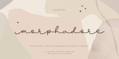 The Morphadore font brings elegance and luxury by offering a longtail monoline handwritten style. With Morphadore you can create elegant luxury logos, greeting cards, illustrations, quotes, charming branding, book covers, packaging, and much more. Features: Total 247 Glyph Uppercase & Lowercase Numerals & Punctuation Alternates Multilanguage Supports 60+ Latin based languages
 - Pleasantville JNL by Jeff Levine,
$29.00 Pleasantville JNL is a condensed slab serif font with angled corners emulating a popular style of lettering most prevalent in the 1920s. Modeled from Cornfield JNL (which in turn was based on a vintage popcorn box's logo), the letters were given a more standardized treatment in form and balance.
 - Creighton by Red Rooster Collection,
$60.00 It was our initial intention to develop a suitable lowercase for Les Usherwood's Elston typeface, based on a few characters from an old German typeface called Hermes Grotesque (Woellmer, Berlin). However, the new design quickly took on a life of its own, and we decided to call it ‘Creighton’.
 - Joanne Script BH by BluHead Studio,
$25.00 Joanne Script BH is based on the handwriting of a BluHead friend. This fun design has a sharp, angular feel which lends itself to casual messages, greeting cards, post its, journals, you name it! Plus, a large complement of characters allows you to send your thoughts in multiple languages.
 - Ecstasy by Talavera,
$60.00 This calligraphic type is based on a free-styled blackletter with an ink-stained spirit. By having several stylistic alternates (on both U&lc.) plus some non standard ligatures, your text may look like it’s written or handmade! You should combine this font with Agony, also available on MyFonts.
 - Modern Art NF by Nick's Fonts,
$10.00A font with a strong graphical appeal, based on the logotype lettering for the comic magazine of the same name, designed by Dutch illustrator Joost Swarte. Both versions of this font contain the Unicode 1252 Latin and Unicode 1250 Central European character sets, with localization for Romanian and Moldovan. - Phaistos Disk Glyphs by Deniart Systems,
$25.00 The Phaistos series contains 47 unique characters based on the cryptichieroglyphic symbols depicted on the infamous Phaistos Disk. Measuring approximately 16cm in diameter, the Phaistos Disk was excavated in 1908 at the Minoan palace at Hagia Triada in Crete. The glyphs have not been conclusively deciphered to this day.
 - Eulalie NF by Nick's Fonts,
$10.00Here’s another happy camper based on the work of master penman Walter Heberling. Its quirky character and offset baseline make for interesting and enticing heads and subheads. All versions of this font include the Unicode 1250 Central European character set in addition to the standard Unicode 1252 Latin set. - Shruti by Microsoft Corporation,
$49.00Shruti™ is an OpenType font for the Indic script Gujarati. It is based on Unicode, contains TrueType outlines and was designed by Raghunath Joshi (Type Director) Santosh Kshirsagar for use as a UI font. Copyright ™ 2001 Microsoft Corporation. All rights reserved. Character Set: Latin-1, Gujarati - Potpourri by Linotype,
$29.99 Potpourri was based on an energetic alphabet written by expert calligrapher Gottfried Pott. To create the elegant yet rugged strokes, Pott cut a pen with a unique fringed tip — from a drinking straw! He then produced an huge series of drafts before deciding on the final alphabet for digitization.
 - Summer Program JNL by Jeff Levine,
$29.00 The WPA (Works Progress Administration) posters on file at the Library of Congress have been a treasure trove of classic hand-lettered type designs. Summer Program JNL is based on one such poster offering free arts and crafts classes in New York City sponsored by the Federal Art Project.
 - Mozaic by TipoType,
$24.00 The value and individual beauty contribute to the group. Each with their own, but all together with a new identity enriched by exchange, perfected by diversity. Mozaic is sum. Mozaic is strength. It includes a very thorough coverage for a wide variety of Latin alphabet-based language families.
 - Snooty Fox NF by Nick's Fonts,
$10.00This casually elegant typeface is based on an unnamed offering from Pen & Brush Lettering and Practical Alphabets, published by Blandford Press, Ltd., London, in 1929. Good taste dictates that, because of the ornate and unusual letterforms of the uppercase letters, the font never be used as all caps. - Raleigh by Linotype,
$29.99The Raleigh typestyle is based on Carl Dair's original 1967, Cartier typeface. which was designed for the Canadian Centennial and the 1967 Montreal World's Fair. It was renamed Raleigh after Dair's death. Adrian Williams added three weights for a display series, and Robert Norton designed the text version. - Chauncy Pro by Chank,
$99.00 Chauncy Pro is a bouncy, artistic, childish handwriting font that comes in four practical weights: Regular, Italic, Bold and Bold Italic. The jaunty little font is based on the left-handed penmanship of an artist and it's ready to go play with some of your fanciful, light-hearted designs.
 - Churchward Supascript by BluHead Studio,
$25.00Churchward Supascript Unplugged is a new OpenType font release by BluHead Studio, LLC from the exciting and unique type design library of Joseph Churchward. The design is based upon Churchward's original Supascript drawings but with a little added edginess in the form of some scanner-induced rough outlines. - LU LU by Design by Pascal,
$20.00 A mono-weight, bifurcated serif typeface in all caps. Based off of an old classic French biscuit logo. This distinctive vintage display typeface can also evoke edgier sentiments when set in a moodier context, as well as making for a playful option when set in a soft colour palette.
 - TagBoyHardcore by PizzaDude.dk,
$15.00TagBoyHardcore is based on my own tagging style when I did graffiti in the mid-eighties. The font is roughly scanned and spaced narrowly in order to keep the original bad boy style. Pump up your text by starting and ending sentences with parentheses, brackets or the curly brackets. - Tomboy LP by LetterPerfect,
$39.00 Tomboy is a type design based on informal handwriting. Its presence on the page is friendly and easy to read, suitable for correspondence, brief text, and for display use in titles and headlines. Three weights -- Light, Medium & Bold -- allow Tomboy to speak in a wide range of voices.
 - Wataha by Soar Studio,
$22.00 Wataha (in polish - wolf pack) is a sharp, robust uppercase family of 3 fonts: Bold, Heavy and Black. Perfect for posters, headlines and logotypes. With a range of OpenType features you have access to alternative letter shapes, fractions, arrows etc. Wataha supports most Latin-based languages and few others.
 - Pinsher by Abbasy Studio,
$15.00Pinsher, is a font inspired by Signs Painting, This font is based on retro hand-painted paper signs primarily seen in grocery stores from the 1940s through today. With additional shadow font you will be able to create the beautiful combination and bring retro touch to your artworks! - Signboard JNL by Jeff Levine,
$29.00Signboard JNL is based on die-cut cardboard display lettering once made by the Duro Decal Company (now Duro Art Industries) of Chicago, Illinois. Available in various sizes, these letters and numbers could be affixed to a number of different surfaces to make affordable signs, displays and show cards. - Canterbury Sans by Red Rooster Collection,
$45.00 Based on the Morris F. Benton for ATF in 1920, it was not completed for production until 1926. The serif version we released a few years ago was so popular, that we decided to design a complementary sans serif version in three weights, along with three corresponding Swash fonts.
 - Kryptic LP by LetterPerfect,
$39.00 Kryptic is based on a design for computer optical character recognition (OCR) from the 1960s developed by Epps & Evans at the National Physical Laboratory. Its pure geometric and elemental shapes create graphic patterns and visual puzzles that only secondarily communicate meaning. Not recommended for extended text, unless intentionally encrypting!
 - Jantar Flow by CAST,
$45.00 Jantar Flow is a humanist sanserif type family tailored for continuous reading for both printing and screen. With its large x-height and low contrast it also performs very well in captions, side notes, and short paragraphs set in small sizes. Jantar Flow Italic is distinct and readable. Following a proper italic construction, it shows the fun side of the family yet keeps the features of the upright. Jantar Flow – as well as its teammate Jantar Sharp – comes in seven weights from ExtraLight to Heavy, each with accompanying italics. It has a tabular and proportional set of figures in both old style and lining options, and also a special set of hybrid figures sitting between x-height and capitals. Superscripts and subscripts are provided together with a vast collection of diacritics covering all European languages as well as a set of case-sensitive characters. Jantar, the pairing superfamily. ‘Jantar’ is an old Polish name for ‘amber’, a fossilised resin – a substance that is robust and organic at the same time. These qualities somehow reflect the feeling behind the Jantar families, ‘Flow’ and ‘Sharp’. Jantar Flow was designed along with Jantar Sharp. As part of the Jantar superfamily these two faces are perfectly paired: though not based on the same skeleton, they share the same design parameters and the same character set, but each one works independently with its peculiar features. Designed for publishing for print and web, as well as for branding, the Jantar superfamily was inspired by common font pairings of the digital age like Helvetica/Times or Verdana/Georgia. Jantar Flow and Jantar Sharp communicate with individual yet complementing voices, just like two trained acrobats can perform alone but also know well how to perform together.
 - Mantika Book Paneuropean by Linotype,
$67.99Mantika Book expands the Mantika super family: a contemporary serif font with a soft, yet robust character and a classic lookMantika Book, an Antiqua, is the third member of the Mantika super family, which consists of the Mantika Sans and Mantika Informal. Designer Jürgen Weltin has gone back to the roots of his font, which he had originally derived from a Renaissance Antiqua. These origins are recognizable in the first member of the Mantika family, Mantika Sans, in the form of carefully suggested line use and a contrast in the weights that recalls the Antiqua. This solid sans serif, optimized for use in text, also has a particularly energetic and dynamically designed italic. Mantika Informal also brings to mind a cursive font at first glance; ultimately, however, it is not easily categorized. Its light, organic shapes combine the informally flowing style of cursive handwriting with the open and airy form and contrast of a humanist sans serif. The shapes in the serif Mantika Book are also based on the Renaissance Antiqua, just like the other members of the Mantika super family. However, the contrast in the weights is somewhat stronger than is conventional for this genre, and the serifs are characteristically asymmetrical, with slanted ends. Lightly grooved stems with an implied curvature in the lower-case letters as well as dots whose shape flirts with a fountain pen lend the Mantika Book a dynamic and particularly friendly character. Details like the open "g" or the contoured foot of the "k" emphasize this dynamism. The letters of Mantika Book have the same large x-height as the other members of the super family, but are equipped with somewhat longer ascenders and descenders. - FF Sizmo by FontFont,
$50.99 FF Sizmo™ is available in two flavors. One is an honest, industrial strength, somewhat condensed, sans serif family. The other builds on the first, and is a display design with horizontally connecting baseline strokes. The five weights of basic the FF Sizmo typefaces are ideal for print and digital projects. Character spacing is generous, counters are open and apertures are wide and clear. Banners, navigational links, sub heads, and short blocks of contextual copy are natural on-screen uses for the design. Print projects from branding to way-finding also fall easily into FF Sizmo’s range of applications. The “line” versions of FF Sizmo can be arresting stand-alone typefaces – or distinctive complements to the basic roman and italic designs. In either instance, the line designs make powerful statements in headlines, subheads, posters and cover art. OpenType® fonts automatically insert beginning, middle or ending line element characters into the copy. Drawn by Verena Gerlach, both designs were inspired by the same source, a commercial signage system that enabled quick and easy copy changes. “The idea for the typeface,” explains Gerlach, “is a housing complex index board, on which movable white plastic capital letters were fixed by a thick line to the wooden board. This line is an important part of the font’s appearance.”
 - JAF Lapture by Just Another Foundry,
$59.00 Lapture is based on the Leipziger Antiqua by Albert Kapr, released in 1971 by the East German foundry Typoart. It has been extended and carefully redesigned by Tim Ahrens in 2002-05. The strong calligraphic characteristics are a result of the design process: "The size of the counters and the width of individual characters at small optical sizes were analysed with a steel pen while the letter shapes were designed in larger size with a specially trimmed reed pen. Sometimes the hand is more innovative than the head alone," says Kapr. A unique feature of this font is the introduction of gothic shapes into a latin typeface. "The basic concept is to string together narrow white hexagons as counters and inter-letter spaces, defined by vertical stems and triangular serifs. The interior spaces are at least as important as the strokes that make up the characters." Lapture is an ideal choice if a reference to gothic style is desired, as true black letter types are often too eye-catching and not as legible as latin fonts for unfamiliar readers. "The last few years have seen a number of very elegant typefaces based on the mellow and feminine renaissance model. However, sometimes we require a font that is strong and robust, harmonic yet rigid," says designer Tim Ahrens. JAF Lapture is provided in OpenType format. Each font contains more than 600 glyphs, including true small caps, nine sorts of figures, contextual and stylistic alternates and accented characters. This means that you only need to purchase one font whereas in other families you would have to buy two or three fonts in order to get the same. Technically, they follow the Adobe Pro fonts and provide the same glyph set and OpenType functionality. JAF Lapture Basic is provided in OpenType format. Each font contains the standard sets of both MacOS and Windows. In contrast to JAF Lapture they do not provide any advanced OpenType features and no extended glyph set.
 - Winsel by insigne,
$29.00 You stand, poised at the brink. If you do not choose the right, the best typeface, this may be one of the greatest disasters in your history. The whole root and core and brain on which and around which your project is built seems about to perish into an ignominious end. But I do not for a moment fail to believe that Winsel shall prevail for you. This bold new face, founded from the tested mind of insigne design, will in the moment of need wield for you the full might of its ancestors. The entire strength of the British Empire’s vernacular poster lettering spanning the 1920’s to the 1950’s drives the very heart of every feature and weight this font has to offer. Winsel’s expanded design is sharp and angular, based on pointed brush strokes. Its thick, sturdy appearance will draw and direct your reader’s mind to the weight and importance of your messages and titling. Within the font’s full forces work a range of styles to achieve victory in the contest ahead: thick weights that are compact and muscular for carrying a heavier load and lighter, finer weights to lead you through your more sensitive operations. It stands equipped with OpenType features, ready to support most European Latin-based languages and providing features such as Small Caps and Titling Caps in all nine of its weights. Well-honed for the task ahead, Winsel has been crafted to ride out the storm of mediocrity and to outlive the merits of inconsequence, if necessary for years, if necessary alone. There has never been in all the world such an opportunity for you. With Winsel, you shall go on till the end. You shall write on the beaches. You shall write on the landing grounds. You shall write with growing confidence and growing strength in print or on the air. Every morn has brought forth a noble chance. Your chance this day is Winsel.
 - FF Good by FontFont,
$72.99 FF Good is a straight-sided sans serif in the American Gothic tradition, designed by Warsaw-based Łukasz Dziedzic. Despite having something of an “old-fashioned” heritage, FF Good feels new. Many customers agree: the sturdy, legible forms of FF Good have been put to good use in the Polish-language magazine ‘Komputer Swiat,’ the German and Russian edition of the celebrity tabloid OK!, and the new corporate design for the Associated Press. Although initially released as a family of modest size, the typeface was fully overhauled in 2010, increasing it from nine styles to 30 styles, with an additional 30-style sibling for larger sizes, FF Good Headline. In 2014, the type system underwent additional expansion to become FontFont’s largest family ever with an incredible 196 total styles. This includes seven weights ranging from Light to Ultra, and an astonishing seven widths from Compressed to Extended for both FF Good and FF Good Headline, all with companion italics and small caps in both roman and italic. With its subtle weight and width graduation, it is the perfect companion for interface, editorial, and web designers. This allows the typographer to pick the style best suited to their layout. As a contemporary competitor to classic American Gothic style typefaces—like Franklin Gothic, News Gothic, or Trade Gothic—it was necessary that an expanded FF Good also offers customers both Text and Display versions. The base FF Good fonts are mastered for text use, while FF Good Headline aims for maximum compactness. Its low cap height together with trimmed ascenders and descenders give punch to headlines and larger-sized copy in publications such as newspapers, magazines, and blogs. There is even more good news about FF Good: it has something of a serif companion. Łukasz Dziedzic built FF Good to work together with FF More, creating in a powerhouse superfamily that is versatile in both its function and aesthetic.
 - SPIDER-MAN:ECLIPSE - Personal use only

- Decora Two by Naghi Naghachian,
$82.00 “Innovation” best describes Naghi Naghashian’s new Decora Two font. It is a “Liaison amoureuse” between the Sans Serif typeface and English manuscript style. Decora Two is the second of a series of typeface that enables graphic arts professionals the flexibility to use modern initials. It enables, moreover, the use of this typeface for decorative headlines and is a boon for manipulations of both vector-based and pixel-based graphic programs. Typographers worldwide, whose alphabets derive from the Roman one, depend on such innovations in order to meet increased demands of modern communication. This typeface enriches the possibilities for typographical design, which in turn increases the delight in such design. It gives me great pleasure to present this series of new typefaces to my creative colleagues worldwide!
