9,801 search results
(0.02 seconds)
- Drug by Fatchair,
$9.95Drug is based on the distressed type found on a till receipt. - Fundstueck by Ingo,
$12.00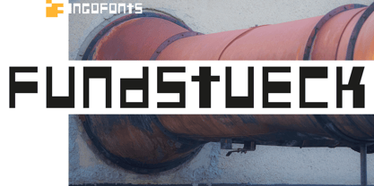 Inspired by a find a coarse but decorative font was created. "Fundstueck" ist the German term for it. Fonts can be so simple. That is what I was thinking as my attention was turned to this rusty piece of metal. Only a few centimeters in size, I couldn’t imagine which purpose it might truly serve. But my eyes also saw an E, even a well-proportioned E: a width to height ratio of approximately 2/3, black and fine strokes with a 1/2 proportion — could I create more characters on this basis? Thought it, did it. The form is based on a 5mm unit. The strikingly thick middle stroke of E suggests that the emphasis is not necessarily placed on the typical stroke, and likewise with the other characters. But if the font is going to be somewhat legible, then you cannot leave out slanted strokes completely. Eventually I found enough varying solutions for all letters of the alphabet and figures. A font designed in this way doesn’t really have to be extremely legible, which is why I forwent creating lower case letters. Nevertheless, Fundstueck still contains some diverse forms in the layout of upper and lower case letters. Thus, the typeface is a bit richer in variety. By the way — the “lower” letters with accents and umlauts stay between the baseline and cap height. And with that, you get wonderful ribbon-type lines.
 - Porker by Ingrimayne Type,
$6.95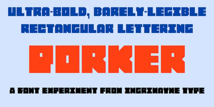 Porker was an experiment in making a barely readable but very simple and very bold typeface with no curves. It is caps only with some of the letters on the lower-case keys giving alternate versions. Include are three variants, a tall version, a striped version, and a randomized version. The striped version can be placed in a layer above the regular version to give two-colored letters.
 - Argent by Device,
$39.00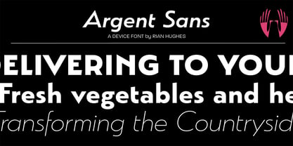 An elegant sans with a low lower-case x-height, diamond-shaped dots and a reweighed complimentary italic with subtle calligraphic touches. With its generous spacing and leading, Argent is very readable in extended text settings, appearing warm and open. The wide range of weights, from thin to heavy, provide all the necessary options for headline and text, the basis of any comprehensive design system. Perfect for brochures and magazines.
 - Linefeed by Typodermic,
$11.95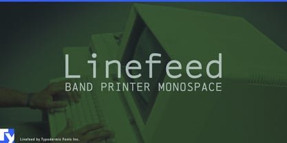 Introducing Linefeed, the retro-inspired monospaced typeface that transports you back to the 1960s and 1970s era of computer band printers. Drawing inspiration from the revolutionary technology of the time, Linefeed captures the essence of the clunky yet iconic machines that were responsible for producing some of the most important documents of the time. Imagine a row of hammers, one for each column, smacking the paper against the ribbon and raised characters embossed on a constantly revolving steel band. This is the heart of the Linefeed font, paying homage to the technology that paved the way for the digital age. Most band printers of the time were restricted to uppercase, digits, and a little punctuation to ensure maximum efficiency, but Linefeed brings this beloved typeface to life with added lowercase letters, extra punctuation, and accents. Linefeed was once one of the most widely used computer fonts during the 1960s and 1970s. It could be found on a plethora of documents, including driver’s licenses, magazine subscription labels, report cards, invoices, and auto dealership window stickers, among other things. In a world where sleek and modern designs dominate, Linefeed offers a refreshing throwback to the golden age of computing. Its technical design, inspired by the machines of yesteryear, is a testament to the ingenuity and creativity of early computer designers. With its monospaced layout and vintage charm, Linefeed is sure to bring a touch of nostalgia to any design project. Most Latin-based European writing systems are supported, including the following languages. Afaan Oromo, Afar, Afrikaans, Albanian, Alsatian, Aromanian, Aymara, Bashkir (Latin), Basque, Belarusian (Latin), Bemba, Bikol, Bosnian, Breton, Cape Verdean, Creole, Catalan, Cebuano, Chamorro, Chavacano, Chichewa, Crimean Tatar (Latin), Croatian, Czech, Danish, Dawan, Dholuo, Dutch, English, Estonian, Faroese, Fijian, Filipino, Finnish, French, Frisian, Friulian, Gagauz (Latin), Galician, Ganda, Genoese, German, Greenlandic, Guadeloupean Creole, Haitian Creole, Hawaiian, Hiligaynon, Hungarian, Icelandic, Ilocano, Indonesian, Irish, Italian, Jamaican, Kaqchikel, Karakalpak (Latin), Kashubian, Kikongo, Kinyarwanda, Kirundi, Kurdish (Latin), Latvian, Lithuanian, Lombard, Low Saxon, Luxembourgish, Maasai, Makhuwa, Malay, Maltese, Māori, Moldovan, Montenegrin, Ndebele, Neapolitan, Norwegian, Novial, Occitan, Ossetian (Latin), Papiamento, Piedmontese, Polish, Portuguese, Quechua, Rarotongan, Romanian, Romansh, Sami, Sango, Saramaccan, Sardinian, Scottish Gaelic, Serbian (Latin), Shona, Sicilian, Silesian, Slovak, Slovenian, Somali, Sorbian, Sotho, Spanish, Swahili, Swazi, Swedish, Tagalog, Tahitian, Tetum, Tongan, Tshiluba, Tsonga, Tswana, Tumbuka, Turkish, Turkmen (Latin), Tuvaluan, Uzbek (Latin), Venetian, Vepsian, Võro, Walloon, Waray-Waray, Wayuu, Welsh, Wolof, Xhosa, Yapese, Zapotec Zulu and Zuni.
 - ITC Kulukundis by ITC,
$29.99ITC Kulukundis is the work of designer Daniel Pelavin, a square, connecting script which looks as though it could have been cast in shiny chrome for the side of a 1950s American roadster. Pelavin based his design very loosely on a vertical French script but the overall look is all his own. Unlike calligraphic scripts, the lower case letters all connect in exactly the same way and the straight diagonal junctures give the typeface its broad, spacious character and keep it locked into a continuous line. ITC Kulukundis could also be used to create a decorative border for special occasions. - Banco by Linotype,
$40.99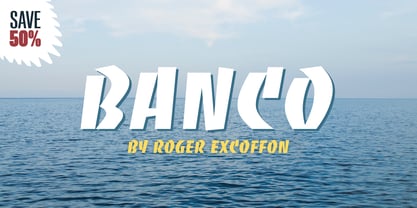 Designed for Linotype Library GMBH and the International Typeface Corporation in 1997 by Phil Grimshaw. Based on bold script Banco designed by French graphic and poster designer Roger Excoffon and released in 1952 by the Fonderie Olive. Originally Banco was an all-caps bold typeface, and the lower case and the corresponding light weight were created for ITC. The tapering slightly slanted strokes of Banco made by sharp-edged flat brush. The face has the effect of being quickly sketched by a powerful hand. For use in advertising and display typography. Cyrillic version developed for ParaType in 2000 by Tagir Safayev.
 - FF Providence by FontFont,
$72.99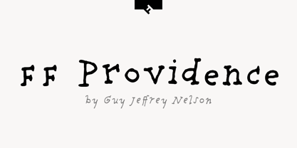 American type designer Guy Jeffrey Nelson created this script FontFont in 1994. The family contains 4 weights: Regular, Italic, Bold, and Bold Italic and is ideally suited for advertising and packaging, festive occasions, poster and billboards as well as web and screen design. FF Providence provides advanced typographical support with features such as ligatures, small capitals, alternate characters, case-sensitive forms, and stylistic alternates. It comes with proportional oldstyle figures. As well as Latin-based languages, the typeface family also supports the Greek writing system. This FontFont is a member of the FF Providence super family, which also includes FF Providence Sans.
 - Dropsomaniacal by Proportional Lime,
$9.99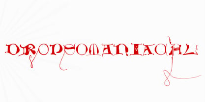 Drop Caps happen. They started off life as decorated initials way back when in the days of illuminated manuscripts. Then printing came and they became the work of the rubricators and then somewhere soon after printing began, at least by the 1490’s, they were printed directly into the text. This then is a collection of over a hundred glyphs from that closing decade of the Incunabula period. All of them are based on examples found in the works printed by Michael Wenssler in Basel. This font also contains a few useful pointing hands and a set of spacing characters.
 - Dimensions by Dharma Type,
$19.99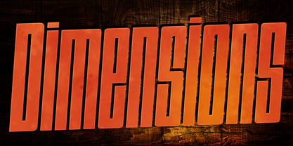 Dimensions is redesigned font family based on Blackout font released as free font in 2005. The original blackout has been used especially for company or brand logo of fashion and music label in the world. In 2011, Blackout had evolved into this Dimensions font family of seven weights with roman and italics. They are one of the most condensed, black and skinny font in the world. All weights and italics have upper and lower cases, accented characters and small capital glyphs that can be used with OpenType smcp feature. There is high contrast version called Speedometer.
 - Rapier by ITC,
$40.99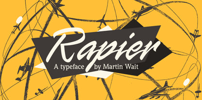 Rapier, designed by Martin Wait for ITC in 1989, is an impulsive, energetic script font with strong ties to the brush and advertisement typefaces of hte 1940s. The zestful capitals contrast with small, narrow lower case letters, lending the font its dynamism and liveliness. Desinger Wait reached the energetic, almost aggressive feel of Rapier with snappy base forms and especially with ascending strokes. For an optimal look it is advisable to set Rapier's forms near to one another, so that the ends of the strokes of one figure touch the beginning of the next. Rapier is best used for headlines and short texts.
 - Swing Vote JNL by Jeff Levine,
$29.00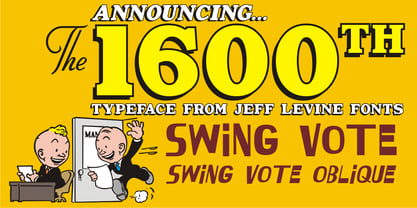 A 1964 piece of sheet music entitled “Old Soldiers Never Die (They Just Fade Away)” was based on the farewell speech General Douglas MacArthur gave to Congress on April 19, 1951. This particular edition of the song sheet had part of his speech (as well as its title) hand lettered in a free-form sans serif reminiscent of the lettering done by such noted lettering artists as Paul Coker and Saul Bass. The casual and playful style of this type design became the inspiration for Swing Vote JNL, which is available in both regular and oblique versions.
 - FF Mach by FontFont,
$58.99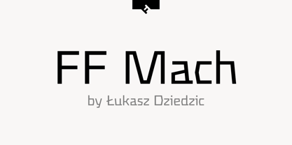 Polish type designer Lukasz Dziedzic created this display and sans FontFont in 2009. The family has 18 weights, ranging from Thin to Black in Condensed, Normal, and Wide and is ideally suited for editorial and publishing, music and nightlife as well as poster and billboards. FF Mach provides advanced typographical support with features such as ligatures, case-sensitive forms, fractions, super- and subscript characters, and stylistic alternates. It comes with a complete range of figure set options – oldstyle and lining figures, each in tabular and proportional widths. As well as Latin-based languages, the typeface family also supports the Cyrillic writing system.
 - P22 Pooper Black Pro by IHOF,
$39.95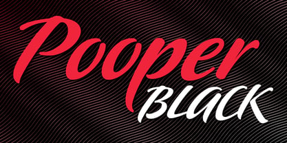 Pooper Black Pro is based on a brush ethic and has an extreme axis that lends a certain amount of speed to the font while the lack of connectors slows it down. The pro version expands on the original and popular Pooper Black with the addition of full Central and Eastern European character sets and plenty of alternate characters for those who have applications that support Opentype features. Almost all of the lower case characters now include an in stroke and out stroke version for greater design flexibility. A wonderful face for packaging, titling, and short bursts of text.
 - FF OCR-F by FontFont,
$68.99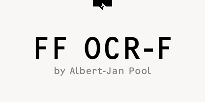 German type designer Albert-Jan Pool created this sans FontFont in 1995. The family contains 3 weights: Light, Regular, and Bold and is ideally suited for film and tv, small text as well as software and gaming. FF OCR-F provides advanced typographical support with features such as ligatures, alternate characters, case-sensitive forms, fractions, super- and subscript characters, and stylistic alternates. It comes with a complete range of figure set options – oldstyle and lining figures, each in tabular and proportional widths. As well as Latin-based languages, the typeface family also supports the Cyrillic writing system.
 - Advertiser JNL by Jeff Levine,
$29.00Advertiser JNL is a simple A-Z only font used to make retro-styled titles and names. Based on a popular style of retail signage from the 1950s and 1960s, alternating keystrokes will create a contrast of positive and negative letters. The capital letters have the alphabet in white on black boxes, the lower case have the black letters alone—with the white space conforming to the width of the black boxes. In a pinch, the boxed characters can also be used as initial caps. For a more complete character set with the same style of lettering, use DuBois Block JNL. - Exec by Wiescher Design,
$35.00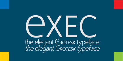 I created my new »EXEC« sans font during the years 2018 to mid 2020. The Normal »EXEC«-family has 7 weights, ranging from Thin to Bold (plus 7 italics). This elegant Sans is suited for editorial, book text, advertising and packaging, logo, branding, small text as well as web and screen design. »EXEC« has advanced typographical support including ligatures, small caps, alternate characters, case-sensitive forms, fractions, super- and subscript characters. »EXEC« comes with a range of figures—oldstyle and lining figures, each in tabular and proportional widths. »EXEC« supports Basic-, Western-, and Central-European Latin-based languages.
 - FF Tartine Script by FontFont,
$51.99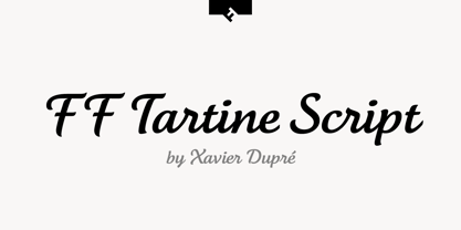 French type designer Xavier Dupré created this script FontFont between 2002 and 2007. The family contains 3 weights: Regular, Bold, and Black and is ideally suited for advertising and packaging, logo, branding and creative industries as well as sports. FF Tartine Script provides advanced typographical support with features such as ligatures, alternate characters, case-sensitive forms, fractions, super- and subscript characters, and stylistic alternates. It comes with a complete range of figure set options – oldstyle and lining figures, each in tabular and proportional widths. As well as Latin-based languages, the typeface family also supports the Greek writing system.
 - Manly Beard by Mightyfire,
$15.00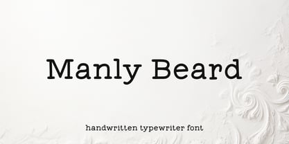 Introducing Manly Beard , the typewriter font. Typewriter font is a timeless and iconic typeface, seamlessly bridges the realms of nostalgia and functionality. Inspired by the mechanical simplicity of traditional typewriters, this font exudes a distinct charm that harks back to an era when the written word was synonymous with the rhythmic clatter of keys striking paper. Characterized by monospacing, each letter and symbol occupies the same amount of horizontal space, mirroring the uniformity of characters produced by the typewriter's fixed-width mechanical arms. The result is a text that maintains a deliberate and organized appearance, evoking a sense of order and precision. We're honored and proud if Manly Beard can be the part of your special masterpiece. Thankyou! :)
 - VLNL Neue Sardines by VetteLetters,
$35.00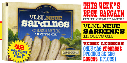 Sardines is a project by Jacques Le Bailly aka Baron von Fonthausen. It first saw the light as a student project for a monospaced font and eventually grew into Vette Letters’ largest font family. We saw its potential and expect it to be a million seller, just like our other typefaces. VLNL Sardines comes in 42 different variations, like rough and clean cuts, regular and condensed widths (condensed is the exactly half of the regular width). Sardines is an eclectic mash of classic curves and mathematical measurements, leaving a very distinct typographic flavor. While most of our type is market-fresh, this one comes out of the can, but it’s delicious nonetheless. And it’s great for adventurous BBQ-ing!
 - Neuro X by Sawdust,
$35.00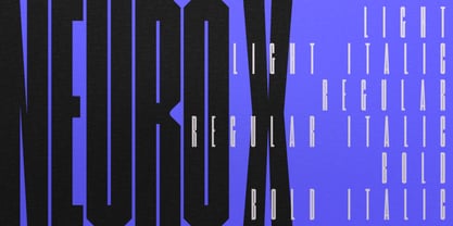 Neuro X is a narrow sans serif typeface consisting of three weights with additional rounded versions and matching italics. It was first drawn as an exploration for a headline font and later expanded on to become a full typeface family. Neuro X explores the extremities of narrow proportions whilst also allowing for eccentric cuts. The typeface has been tightly monospaced and intended for use at larger sizes as a display but can also work at smaller scales for the more courageous among us. This 339 glyph font has language support for 26 languages: Afrikaans, Albanian, Catalan, Croatian, Czech, Danish, Dutch, English, Estonian, Finnish, French, German, Hungarian, Icelandic, Italian, Lithuanian, Maltese, Norwegian, Polish, Portuguese, Slovak, Slovenian, Spanish, Swedish, Turkish, Zulu.
 - CamingoMono by Jan Fromm,
$45.00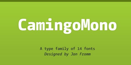 CamingoMono is a modern monospaced typeface family of seven weights with matching italics, from ExtraLight to Black. Predominantly humanist in character, the typeface also has a technical feel thanks to the fixed proportions, while its semi-condensed width means CamingoMono is a great space saver in long passages of text. The default figures are noticeably lower than the uppercase letters, making them clearly distinguishable from one another. The typeface’s additional features include three different figure sets, slashed zeros and currency symbols, arrows and a handful of stylistic alternates. It is ideal for any technically-flavored text where an individual touch is desired, from advertising to corporate design. With CamingoMono, private and commercial correspondence alike will look neat and credible.
 - Vershen by Page Studio Graphics,
$25.00A calligraphic roman sans-serif, with large x-height, the Vershen font is available in four weights, plus a series with small capitals and old-style figures, also in four weights, and finally, a four-weight set of universal fraction generators. The fonts are thoroughly pair-kerned, including all accented characters and letter pairs not commonly found in English, but frequent in other western European languages. Each font package includes both TrueType and PostScript versions, and is avialable in either PC/Win or Macintosh format. Numerals and currency symbols in the standard font set are monospaced for orderly columns; but a narrower numeral '1' is also provided, along with an alternate lowercase 'g' and ampersand. - Realtime Stencil Rounded by Juri Zaech,
$30.00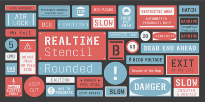 Realtime Stencil Rounded is part of the Realtime type family which draws inspiration from information displays. The result is a technical yet friendly design with details that serve function and visual impact alike. As a monospaced typeface it lends itself to tabular designs, sturdy columns and tidy layouts. Nevertheless Realtime Stencil Rounded comes with a feature for setting continuous text — a proportional design employable through OpenType — it further comes in five weights, from light to black, and with a character set that covers over 200 latin languages. Please see the Realtime Stencil Rounded Type Specimen PDF in the gallery. Realtime Stencil Rounded is the soft companion to the standard Realtime Stencil typeface which is available separately.
 - Birdcage by FontMesa,
$30.00Birdcage was designed from a very short lettering sample in Rob Roy Kelly's American Wood Type book, from the image I created a complete font plus a regular version with lowercase. In the past banner style fonts would limit you to a monospaced look, so how do you kern a banner font? Well, with today's OpenType font format the solution is simple, draw the kerning pairs together as one character glyph and place them inside the font then use auto substitution to access those characters when needed. Birdcage (OpenType version) includes 249 auto ligature kerning pairs, to use this feature you will need an application that takes advantage of OpenType features such as Adobe CS products. - Realtime Stencil by Juri Zaech,
$30.00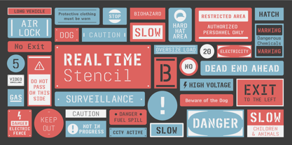 Realtime Stencil is part of the Realtime type family which draws inspiration from information displays. The result is a technical yet friendly design with details that serve function and visual impact alike. As a monospaced typeface it lends itself to tabular designs, sturdy columns and tidy layouts. Nevertheless Realtime Stencil comes with a feature for setting continuous text — a proportional design employable through OpenType — it further comes in five weights, from light to black, and with a character set that covers over 200 latin languages. Please see the Realtime Stencil Type Specimen PDF in the gallery. A soft version of Realtime Stencil is available separately: Realtime Stencil Rounded. Its soft edges apply warmth to the otherwise rather technical appearance.
 - TG Frekuent Mono by Tegami Type,
$30.00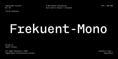 TG Frekuent Mono a new modern geometric sans serif with monospaced style. This typeface is made with precise calculations so that it displays a beautiful and modern appearance. Besides this new typeface is also equipped with six different styles, ranging from ultra light to extra bold plus variable font. This typeface also has various alternative characters that can be used according to the needs in the design. Alternative characters that exist in this type of font have a touch of script typeface so that it makes the alternative character of this type of letter a little quirky and different but still fits well with the combination of modern main characters. And supports approximately 100 languages.
 - Bodrum Sweet by Bülent Yüksel,
$19.00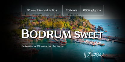 Bodrum Collection: 1- Bodrum Sans 2- Bodrum Sweet 3- Bodrum Stencil 4- Bodrum Slab 5- Bodrum Styte 6- Bodrum Soft "Bodrum Sweet" is a sans serif type family. Designed by Bülent Yüksel in 2018/19. The font, influenced by style serifs, popular in the 1920s and 30s, is based on optically corrected geometric forms for better readability. "Bodrum Sweet" is not purely geometric; it has vertical strokes that are thicker than the horizontals, an “o” that is not a perfect circle, and shortened ascenders. "Bodrum Sweet" some corner is rounded. These nuances aid in legibility and give "Bodrum Sweet" a harmonious and sensible appearance for both texts and headlines. Bodrum Sweet provides advanced typographical support for Latin-based languages. An extended character set, supporting Central, Western and Eastern European languages, rounds up the family. The designation “Bodrum Sweet 14 Regular” forms the central point. "Bodrum Sweet" is available in 10 weights (Hair, Thin, Extra-Light, Light, Regular, Meduim, Bold, Extra-Bold, Heavy and Black) and 10 matching italics. The family contains a set of 650+ characters. Case-Sensitive Forms, Classes and Features, Small Caps from Letter Cases, Fractions, Superior, Inferior, Denominator, Numerator, Old Style Figures just one touch easy In all graphic programs. Bodrum Sweet is the perfect font for web use. You can enjoy using it.
 - Colwell - Unknown license

- Cyntho Next by Mint Type,
$35.00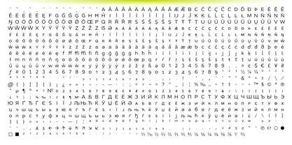 Cyntho Next is a totally reworked typeface based on our previous bestseller Cyntho Pro. It also has a slab-serif counterpart - Cyntho Next Slab. Cyntho Next is a modern geometric sans based on a hybrid waterdrop-like shape with eight weights varying from Thin to Black and featuring Cyrillic.
 - Xaver Grotesk by Xaver Design Studio,
$25.00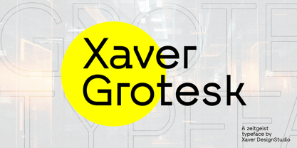 Xaver Grotesk Variable, a font that emerged in the creative landscape of 2023, stands as a testament to contemporary typographic innovation. This font is not just a mere collection of characters but a meticulously crafted expression of modernity and sophistication. Its genesis was driven by a desire to infuse the typographic realm with a fresh take on the classic grotesque style while embodying a technical allure that whispers of a slightly futuristic essence. At its core, Xaver Grotesk is a testament to the marriage of form and function. The deliberate choice of monospacing adds a unique rhythm and structure to the font, instilling it with a sense of order and balance. The low capital height introduces a distinctive visual characteristic, creating an unconventional yet captivating silhouette that stands out in various design contexts. One of the font's most striking features lies in its letter design. Each character is meticulously sculpted, bearing angular and horizontal traits that not only convey a sense of modernity but also evoke a hint of technological precision. These angular and horizontal elements work in tandem, shaping the font's overall personality and lending it a forward-thinking edge. The fusion of these elements—monospacing, low capital height, and angular/horizontal letter design—creates a harmonious interplay that sets Xaver Grotesk apart. It's not merely a collection of letters; it's an experience, a visual journey that captivates and engages the viewer. Whether used in digital interfaces, printed materials, or other design mediums, this font transcends its utilitarian purpose to become an artistic statement in itself.
 - Penic Masturbata - Unknown license

- Krystal - Unknown license

- Bardour - Unknown license

- Grand Canyon by Red Rooster Collection,
$45.00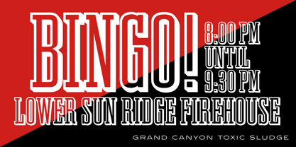 Based on an early wood type design. An original creation, that kept growing...!
 - Maestra by dooType,
$30.00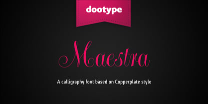 Maestra is a new dooType calligraphy font based on calligraphic style called Copperplate.
 - Trsc by Konrad Trzeszczkowski,
$5.00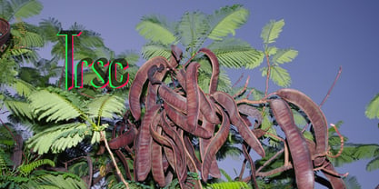 This font was based on calligraphic letters I made with pen size 2B.
 - Toxic Marker by Pedro Teixeira,
$14.00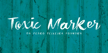 A font based on extreme texture marker. Dry brush script, modern calligraphy font.
 - Kulli by Volcano Type,
$19.00This font is based on a simple sketch made during a phone call. - Juline by URW Type Foundry,
$35.99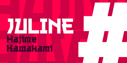 Juline has the character like a straight-based robot, mixed with curved letters.


