9,801 search results
(0.021 seconds)
- Egypt Rose by Octopi,
$8.00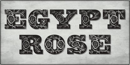 Slab Serif fonts are also sometimes referred to as ‘Egyptian’, hence the Egypt in the name. This lovely and complex font is based on old woodcut fonts. The upper case only font is brilliant for striking headlines. This OpenType font has support for CE languages and I hope you like it.
 - Source Code Pro - 100% free

- !Futurelic - Unknown license

- WrenchedLetters by Ingrimayne Type,
$14.95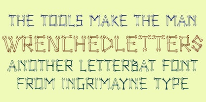 WrenchedLetters is a novelty font in which characters are composed of wrenches and bolts. It is caps only, but the characters on the lower-case keys differ from those on the upper-case keys. It has a large set of accented characters. It is not often that one needs a typeface made of wrenches and bolts, but if one does, there is a font for that. For related, tool-based typefaces, see Screwged, NailsNStaples, and Hammered.
 - Screwged by Ingrimayne Type,
$14.95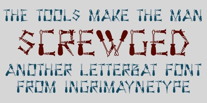 Screwged is a letterbat font in which letters are made of screwdrivers and screws. It is caps only, but the characters on the lower-case keys differ from those on the upper-case keys. It contains a large set of accented characters. It is not often that one needs a typeface made of screws and screwdrivers, but if one does, there is a font for that. For related, tool-based typefaces, see WrenchedLetters, NailsNStaples, and Hammered.
 - LTC Forum Title by Lanston Type Co.,
$24.95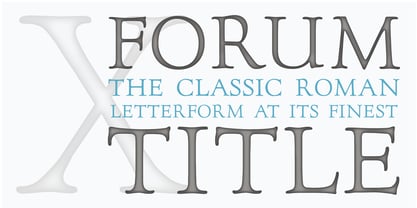 Forum Title was originally designed by Frederic Goudy in 1911. It was intended to be the heading font used for a book set in Kennerley. Based on inscriptional Roman stone cut capitals, this face is true to the early Roman forms which did not have a lower case. Forum exemplifies the classic Roman letterform at its finest. If a lower case were desired, Forum Title can be paired with Goudy Oldstyle for a harmonious hybrid font.
 - Hammered by Ingrimayne Type,
$14.95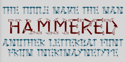 In Hammered all the letters are made up of hammers and an occasional nail. It is caps only, but the characters on the lower-case keys differ from those on the upper-case keys. It has a large set of accented characters. It is not often that one needs a typeface made of hammers and nails, but if one does, there is a font for that. For related, tool-based typefaces, see Screwged, NailsNStaples, and WrenchedLetters.
 - OBO Classic by Juri Zaech,
$19.00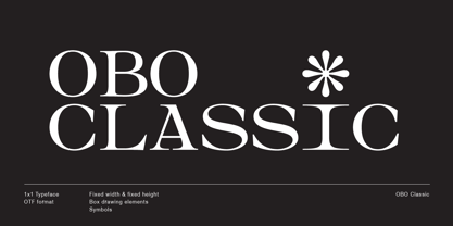 OBO Classic is the second installment of the OBO series, a type collection based on a square. Every character is mapped on a 1x1 ratio which allows for horizontal and vertical settings alike. Or mixed, like crosswords. OBO Classic is a display interpretation of a traditional Old-style Serif. The “distortion” which maps each character to a square creates unusual proportions to what we are used to from classic serif typefaces. The result is a monospaced font. While each individual letter feels conventional on its own, when brought together in words the result feels contemporary. Thanks to the square base vertical and horizontal – and mixed – settings are possible and easy to apply. There are a few exceptions for certain punctuation and special characters that are half the width for better spacing; and the word space’s width can easily be adjusted through OpenType stylistic sets. Talking about spacing, for strictly horizontal typesetting there is the option to turn on kerning for a number of characters to create a cleaner texture across words and phrases. OBO Classic is best set in large sizes and is most comfortable in editorial and display settings. A series of icons complete the character set. A selection comes as pixel graphics which adds further contrast to the traditional legacy of the typeface.
 - Decima Mono by TipografiaRamis,
$39.00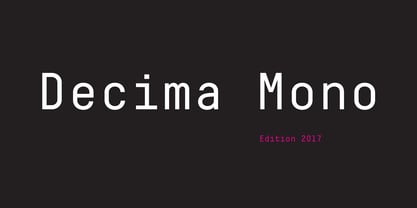 Decima Mono – condensed geometric monospaced Sans Serif typeface, released back in 2009 and quite successful ever since (MyFonts Rising Star, February 2009). This new edition is an upgraded version of Decima Mono and Decima Mono X, combining both into one edition. New version supports more Latin languages with an extension to glyph amounts. Also, six more alternate styles have been added to the original six styles.
 - WBP Red Tape by Studio Jasper Nijssen,
$20.00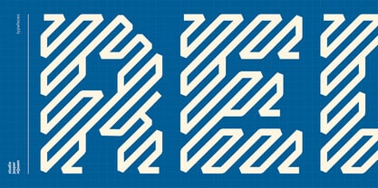 A wise orange cat said once: There are three things certain in life. Death, taxes and teddy bears. The closest thing to a fourth is red tape. Restricting you, bounding you to the rules of a bureaucratic organisation. My advise, carry a scissor with you all the time to cut through it. WBP Red Tape is a great monospace font specifically designed for headings and logo design.
 - Airo by LetterMaker,
$28.90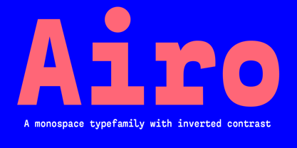 Airo is a monospace type family with inverted contrast. The distinct shapes and detailing give Airo a strong typographic voice. The family comes in six carefully selected weights, from Light to Extra Bold, making it a versatile typographic tool. The family works best as a display typeface for creating a strong visual impact, but you can use the lighter weights for medium length text as well.
 - DF Staple TXT by Dutchfonts,
$33.00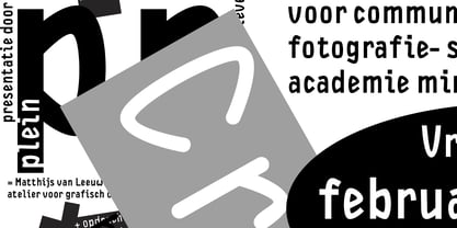 StapleTXT is a transformation from the monospaced typewriter font Staple mono into a text type. The 'mono' skeleton was used as much as possible but some characters were slightly altered in order to obtain more regularity without losing its specific typewriter atmosphere: little variation in character widths. The font has lining figures and works very well as text system in combination with the Staple mono.
 - Futureboy by PizzaDude.dk,
$17.00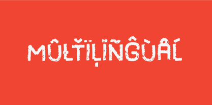 Futureboy is my ALL-CAPS worn comic font. At first glance it may look monospaced, but it's not! Despite its worn look and jumpy baseline/x-height, it is surprisingly legible. Use it for your comics, invitations, posters or perhaps flyers! The font uses contextual alternates - each letter has 4 different versions which automatically cycles as you type. Of course there is multilingual support! :)
 - Proto Mono by ATK Studio,
$15.00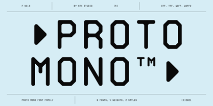 Proto Mono™ is a modular monospaced font built with rounded shapes, designed with tech industrial taste by Radinal Riki. Created for electronic displays found in our modern techie world such as postal packing slips, airline tickets, informational video displays, ads, and more. Come with 2 styles with 4 weights each. This entire font is capitalized and with a character set that covers over 100 languages.
 - One More Typewriter by Ana's Fonts,
$15.00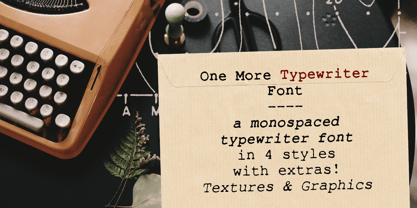 One More Typewriter font is a monospaced typewriter font in two styles: Regular and Italic, and two weights: Regular and Bold. This makes it versatile and ready to use in modern and vintage designs alike. This font is also very legible at a wide range of sizes and looks great in both long or short texts, in digital collages, branding and packaging, social media posts, logotypes, etc.
 - BMF Brohan Black by BuyMyFonts,
$25.00Brohan Black is a monospaced font: each character has the width of the piece of paper from which it was cut with a pair of scissors. The loss is minimal, as the counters are as small as possible while still retaining maximum legibilty. To save ink, print negative. Recommended for cement companies, post-industrial record sleeves and heavy poetry. Also great for temporary signage. - JetJaneButton by Ingrimayne Type,
$15.00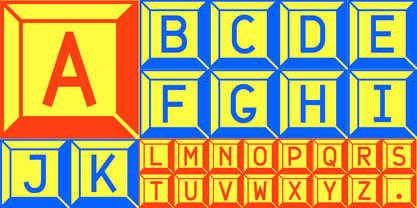 JetJaneButton has letters on a design that looks like a computer button. Its letters are from JetJane Mono, a sans-serif monospaced font. The typeface contains characters that can add color to letters. There are two ways to do this. One uses layers and the other a combination of characters, some with zero width. This pdf file explains the how this can be done.
 - Caldicote by Aah Yes,
$12.00Caldicote is a formal and conventional serif typeface, with slightly broadened verticals. The Tab version is the same as the ordinary version, EXCEPT the Tab version has monospaced numerals and zero kerning between numbers - useful where you might like columns of numbers all vertically aligned in a Tabular display. The zip files contain both OTF and TTF versions of the font - install one version only. - Centima Mono by TipografiaRamis,
$29.00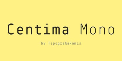 Centima Mono is a subfamily addition to Centima type family. Centima Mono is a condensed geometric monospaced san serif, built in six styles. The typeface is intended for use in display sizes, but also is quite legible in text and is well suited for editorial and brand design. Centima Mono is released in OpenType format with support for most European languages and includes some opentype features.
 - TG Praktikal by Tegami Type,
$30.00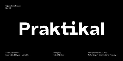 TG Praktikal is new modern geometrics sans with 8 styles & 1 variable font. Inspired by geometrics and gothic typefaces like Bell Centinel, Whitney and Metric, with an additional touch of monospace characters. That makes that TG Praktikal has a unique character set and fit perfectly for body text. Coupled with 3 flavors that can provide different impressions, including approximately 90 multilingual with various OpenType features.
 - FeggoliteMono by Ingrimayne Type,
$6.95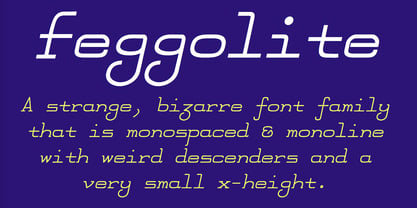 FeggoliteMono is a decorative, monospaced typeface family with a small x-height and long descenders. Two styles (plain and bold but renamed in 2020 as light and regular) were created in 1994 and revised in 2010. In 2020 a bolder bold was added along with italics versions for each of the three weights. The design was an attempt to create a decorative typewriter font.
 - Delko by Minor Praxis,
$20.00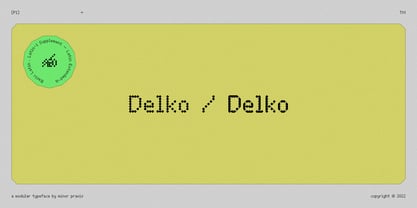 Inspired by a scrolling banner led lamp display and monospace fonts like OCR-A/B. A modular typeface that come from an arranged octagonal shape module, with 45 degrees sides slope which can gives it a casual digital-look font. Designed for headlines, posters, and medium size body copy. Delko come with 2 styles, regular and lined. Languages support, ligatures, stylistic alternates, and symbols are available.
 - Monoplan by Plantype,
$30.00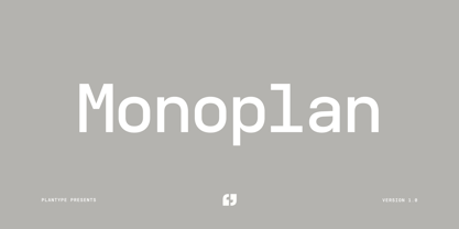 Monoplan is a versatile monospaced sans serif typeface. Minimal shapes and straight sides are definitive features of the typeface. Tables, headers, code blocks, signages or other small informative texts are the standard places where Monoplan shines. Different alternatives such as square dots, alternate /a /y /6 /9, coverage of 94 Latin languages, various Opentype features, and 5 styles expand the usage area of Monoplan.
 - Disclosure by Device,
$39.00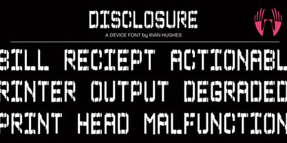 Disclosure is suggestive of low-grade digital output, screen displays, fax machines, or high-speed data transfer. It is missing vertical sections, perhaps due to a faulty print head or signal degradation. It is intentionally monospaced — each letter has the same width, like a typewriter — and unkerned. Suitable for uses where an unfussy urgency and drama is required. Developed from the 112 Hours numbers-only font, Throughput.
 - Crasher Gear by Mofr24,
$10.00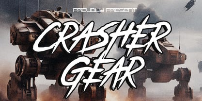 Introducing "Crasher Gear," a captivating handwritten font with a monospaced, grunge-inspired design. Its multilingual support ensures global communication. With Regular, Italic, Oblique Italic, Bold, Bold Italic, and Bold Oblique Italic styles, it's ideal for posters, marketing, T-shirts, YouTube, games, and more. Embodying a bold, dystopian spirit, this versatile font leaves a lasting impression. Pair it seamlessly with various typefaces. Unleash creativity with "Crasher Gear" today.
 - ASM by Extratype,
$40.00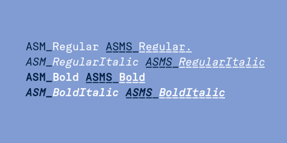 The initials ASM represent the acronym of the Santa Monica Arts cultural center located in Barcelona, Spain, where this typeface, with the same name, has served as the custom corporate typeface since 2008 till today (2013). ASM is an energetic monospaced with extreme legibility consisting of two original weights, with an underlined version – used on some of corporate applications – all with their corresponding italics.
 - Cutting Corners by Just My Type,
$20.00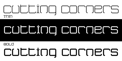 Cutting Corners is all about letters made of squares that also suggest circles. That’s it. This is one of several fonts I’ve created based upon a strictly geometric form; in this case, a round-cornered square. The width is equal to height (except for i, I and most punctuation). Usage recommendations: logos, samplers.
 - Atenta by Glen Jan,
$25.00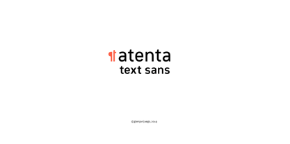 Atenta is a neutral sans-serif family based on techno-geometric forms in 8 styles. It supports Western, CE, Baltic, Turkish and Cyrillic encoding languages. All styles of Atenta contain small capital forms, case sensitive punctuations, lining, Oldstyle and smallcaps figures (including currency and math operators), superscripts and subscripts, numerators and denominators.
 - Cubio Mono by R9 Type+Design,
$38.00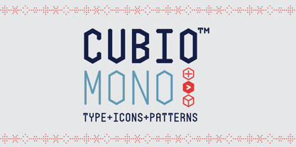 Cubio™ Mono is a new monospaced geometric sans serif inspired by the hexagonal silhouette of isometric cubes. We applied this angular form through all aspects of Cubio™ type design from the overall look of letters and icons down to the small details such as the end of each letter stem and hexagonal dotted lines. This font family comes in 3 weights/styles: 300 (Regular), 500 (Medium), and 700 (Bold). With over 1,500 glyphs, Cubio™ Mono not only supports most Latin-based languages, but also features an extensive set of UX/UI icons, and patterns. Cubio™ Mono is a versatile typeface for both digital and traditional designs. Perfect for packaging design, logo design, print design, store signages, UX/UI web & apps designs. Cubio™ Mono packed with features such as case-sensitive marks, punctuations and math symbols. It also comes with an extensive set of box/compartment drawing glyphs to help you create a unique modern design without even using the line tools. We designed the Cubio™ Mono font system with your convenience in mind. It comes with two sets of hexagonal dotted line and icon positions (Mid Cap Height and Mid X-Height ), so you don’t have to use the baseline shift command to set them to the perfect spots. To find out more about Cubio™ Mono Opentype features and type specimen, please visit www.r9typedesign.com
 - Cooper Goodtime by Breauhare,
$35.00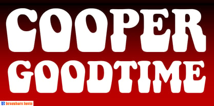 Cooper Goodtime is a font based on the lettering used on the CBS-TV variety series The Glen Campbell Goodtime Hour (1969-1972). The name pays tribute to its two origins, the other being Cooper Black. It was never an actual complete font set on the TV show, only a limited number of handmade letters, all upper case. It has lain dormant since the show went off the air in 1972. With this incarnation, a set of lower case letters has been created to complement the upper case letters. These lower case letters never existed before now. Cooper Goodtime is a funky, nostalgic, cool way to create a display, and it works surprisingly well in text sizes, too.
 - Best Choice by Dharma Type,
$9.99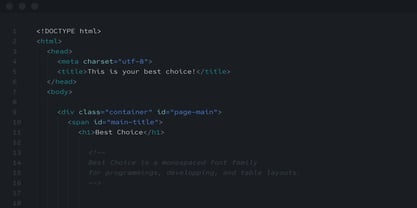 Best Choice is a family of next-generation monospaced fonts for developing, programming, coding, and table layout. Some desirable features in monospaced fonts are listed below. 1.Easy to distinguish 2.Easy to identify 3.Easy to read Best Choice has very distinguishing letterforms for confusable letters such as Zero&Oh, One&I, and Two&Z. A lot of ingenuity makes this family very distinguishable. Italics have a very large inclination angle to be distinguished from their Roman. For the same reason, Italics are slightly lighter than Romans. Italic is not cursive Italic. It is near the slanted Roman. This is an intentional design to identify Italic letters. Cursive is not suitable for programming font. Very clean and natural letterform is good for reading. Common curvature for tails and hooks makes harmony and a sense of unity. Best Choice supports almost all Latin including Vietnamese and Cyrillic. Try this all-new experiment.
 - Dossier by Tabular Type Foundry,
$29.99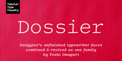 Dossier is a monospaced serif face that originates in Dwiggins's designs for typewriter. It has a soft and casual personality and comes in 8 weights and matching italics, making it ideal for text typography, package and advertisement design. Dossier is an adaptation of William Addison Dwiggins's unfinished typewriter faces. He worked with multiple typewriter manufactures including Underwood, Remington Rand, and IBM, but none of them were finished. He left a number of intriguing drawings which are now kept at the Boston Public Library. You could see in the drawings that Dwiggins was also interested in exploring designs of varied width. Toshi Omagari decided to combine these materials to make a cohesive family: the upright was taken from a drawing of monospaced lowercase for an unknown client, and the italic was from the work he did for Underwood which he called "Aldine". Toshi added narrower and wider alternates in the same way Dwiggins devised.
 - Binomic by DearType,
$19.00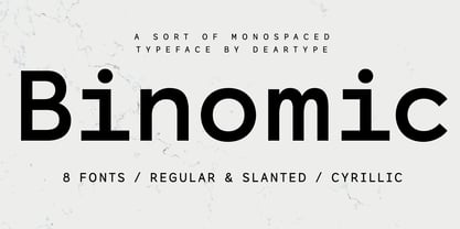 Binomic is a sort of monospaced font family. "Sort of" because it was not designed with the sole purpose of being used as a coding font, but rather as a nice alternative to monospaced fonts in graphic design projects. It's a friendly mix between your average fixed-width font and a more geometric, wider sans, thus more of a display font than a text one. The Binomic family has both upright and slanted versions, each in four convenient weights. The family is equipped with 480+ glyphs, has Latin Extended and Cyrillic support (both Russian and Bulgarian), oldstyle figures, as well as a set of cute technical characters, alternates and symbols. The Binomic family is clean, amiable and really versatile, so it will fit most design applications - from greeting cards, menus, merchandise, book covers and packaging materials to websites and apps. It is legible and modern, kind of sleek but without any pretensions.
 - OCR A Tribute by Linotype,
$57.99OCR-A was originally designed in 1968 as a machine-readable alphabet. Its functionality was its most important element, instead of its design. Over the following decades, the typeface has become popular in the design world nevertheless. But typographically pleasing results are often hard to come by, due to the original design’s “non-design design”, as well as its undeveloped character set. In 2006, Miriam Röttgers revised and extended OCR-A, creating OCR A Tribute. OCR A Tribute is a typeface family comprising of two versions: one in which the glyphs have been proportionally-spaced, and another that is monospaced. In the monospaced version, all glyphs have the same width, like the letters in the original OCR-A font do. Both versions of OCR A Tribute contain complete character sets and expert glyphs, as well as lining and old style figures. Now you can rest easy, and finally use this classic design for display purposes and headlines! - Selectric Melt by Indian Summer Studio,
$45.00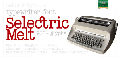 A classical 20-th century's (1900s to 1980s) typewriter font for both text and large display usage, titles, signage... A new thicker version of Selectric (2016), as if typed using not a thin carbon ribbon but a coarse fabric one. Both are available on a different models of Selectrics. Made after rare enough samples of the same style used during 1980s in the USSR. Based on the actual letter proportions of the original typewriter Selectric (2016) (Cyrillic ball). This time not monospaced as before, but proportional. The single known so far previous typewriter vector typeface with this 'ink blotting' effect (similarly expanded serifs) as in Dodo (2008) is ITC American Typewriter (1974; by Joel Kaden and Tony Stan) and all its hand drawn analogs from 1980s (and perhaps before). Which, in turn, is resembling ATF Bulletin Typewriter's (1925, 1933; by Morris Fuller Benton) overall proportions, geometry, and even had some natural ink expands in its paper sample (but not by design, as I see it).
 - Eggad by Ingrimayne Type,
$9.00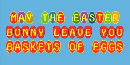 Eggad features letters on eggs. It can be a fun font to use at Easter or for any egg-related message. Some of the eggs - those on the upper-case keys - have their large end on the bottom and others - those on the lower-case keys - have their large end on the top. The font uses the contextual alternatives feature of OpenType to alternate the big-bottom and big-top eggs. If you only want eggs with big tops or with big bottoms, turn this feature off. Eggad comes in two styles, a regular style in which the eggs are outlined and a bold style in which the eggs are solid. Both are monospaced. The two styles can be layered to color the eggs. Alternatively, background color can be added (dot accent and ring characters) or the outline color can be changed (sterling and yen characters) using layers in the regular style. If you are typing numbers and you want the start to be big-bottom number, switch on OpenType style set 1.
 - P22 Woodtype by P22 Type Foundry,
$24.95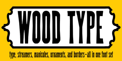 P22 Wood Type is a set of four fonts based on 19th Century American wooden printing types. Wood Type Regular is a condensed Tuscan styled font with a lower case and international character set. Wood Type Small Caps is a variation of the regular with small caps in place of the lower case. Wood Type Extras One & Two feature over 150 borders, stars, pointers, combination dashes, manicules & other decorative embellishments. Perfect for evoking 19th Century printing & Americana at its most genuine.
 - Farming Stencil JNL by Jeff Levine,
$29.00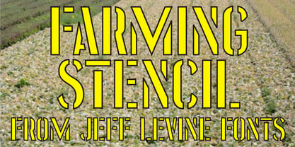 Examples of Australian brass stencils used for baling form the basis of Farming Stencil JNL. The hand-cut look of this typeface gives a more casual approach to a standard stencil design.
 - Refresh by Scholtz Fonts,
$12.00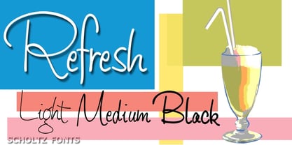 Refresh was inspired and partly based on handwritten text from advertisements for a popular cola-based soft drink from the 1950s. I designed the missing characters in the handwriting style of the original. The Refresh family comes in three styles: - Lite- possibly the most elegant of the three styles -- use at larger sizes for greater legibility; - Med -of intermediate weight - more legible than Lite; - Blak - for bolder statements and best readabilty. Refresh, with its three styles, is ideal for any display work needing a feminine, handwritten effect. Use it for product branding, book covers, invitations, greeting cards where you're looking for charm and movement. Refresh has not been designed to be used with capital letters placed next to one another: it is not advisable to use text in "ALL CAPS". The best effects for headings and subheads are obtained with an initial upper case letter followed by lower case characters. If you are using upper and lower case then it is not necessary to use kerning. Refresh contains over 250 characters - (upper and lower case characters, punctuation, numerals, symbols and accented characters are present). It has all the accented characters used in the major European languages.
 - Highbrow Cafetorium JNL by Jeff Levine,
$29.00Highbrow Cafetorium JNL is a very "minimalist" font in the sense that there's only the basic lower case characters and essential punctuation. The lettering is based on a neon-and-bulb wall sign for a long-closed cafeteria on Lincoln Road in Miami Beach, Florida. The 'b', 'd', 'k' and 'l' have unusually high verticals.

