10,000 search results
(0.054 seconds)
- MVB Verdigris Pro by MVB,
$79.00 Garalde: the word itself sounds antique and arcane to anyone who isn’t fresh out of design school, but the sort of typeface it describes is actually quite familiar to all of us. Despite its age—born fairly early in printing’s history—the style has fared well; Garaldes are still the typefaces of choice for books and other long reading. And so we continue to see text set in old favorites—Garamond, Sabon®, and their Venetian predecessor, Bembo®. Yet many new books don’t feel as handsome and readable as older books printed in the original, metal type. The problem is that digital type revivals are typically facsimiles of their metal predecessors, merely duplicating the letterforms rather than capturing the impression—both physical and emotional—that the typefaces once left on the page. MVB Verdigris is a Garalde text face for the digital age. Inspired by the work of 16th-century punchcutters Robert Granjon (roman) and Pierre Haultin (italic), Verdigris celebrates tradition but is not beholden to it. Created specifically to deliver good typographic color as text, Mark van Bronkhorst’s design meets the needs of today’s designer using today’s paper and press. And now, as a full-featured OpenType release, it’s optimized for the latest typesetting technologies too. With MVB Verdigris Pro Text, Van Bronkhorst has revisited the family, adding small caps to all weights and styles, extensive language support, and other typographic refinements. Among the features: • Support for most Latin-based languages, including those of Central and Eastern Europe. • Precision spacing and kerning by type editor Linnea Lundquist. The fonts practically set beautiful text by themselves. • Proportional and tabular figure sets, each with oldstyle and lining forms with currency symbols to match. • Ligatures to maintain even spacing while accommodating Verdigris’ elegant, sweeping glyphs. • Numerators and denominators for automatic fractions of any denomination. • Useful, straightforward dingbats including arrows, checkboxes, and square and round bullets in three sizes. • Alternative ‘zero’ and ‘one’ oldstyle figures for those who prefer more contemporary versions over the traditional forms. • An alternative uppercase Q with a more reserved tail. • An optional, roman “Caps” font providing mid-caps, useful for titling settings, and for those situations when caps seem too big and small caps seem too small. __________ Sabon is a trademark of Linotype Corp. Bembo is a trademark of the Monotype Corporation.
 - Kisba Nova by Identity Letters,
$29.00 Kisba Nova – A character actor that turns heads. Spiky serifs, soft ball terminals. All eyes on Kisba Nova: enter a typeface designed to arouse attention. Kisba Nova is that one guest who joins a party, and a murmur goes through the crowd. Kisba Nova is pure charisma. Opposites attract: Kisba Nova combines sharp wedge serifs and spiky spurs with round and soft ball terminals. Infuse this with a neoclassical stroke contrast and you get a thrilling typeface driven by visual extremes. Sure: Kisba Nova is a diva. But it’s a pro, after all. That’s why it comes in two optical sizes: Headline and Text. This makes sure it looks gorgeous in any situation. The Kisba Nova Headline subfamily is flaunts the trademark flamboyant looks and extravagant letters like f and k. They bring you all of the excitement of the showbiz in large applications—use it for sizes of 24 Pt. and more. The extraordinarily designed, thin and monolinear diacritics, punctuation marks, and symbols of Kisba Nova Headline add to this modern and elegant character. Kisba Nova Headline consists of seven weights from Thin to Black, offering plenty of possibilities to set headlines and titles. With about 600 characters per weight, it contains enough functionality for the demands of a skilled typographer. OpenType features, such as a large set of ligatures, extended language support, case-sensitive forms, different sets of figures, and arrows, enable sensational designs both in web & print layouts. The Kisba Nova Text subfamily comes with decreased contrast, more generous letter proportions, and wider spacing. Instead of employing flashy thin and monolinear diacritics, punctuation marks, and symbols, Kisba Nova Text aims for a more even texture on the page. It retains the true, elegant Kisba DNA while allowing you to set legible copy in sizes between 9 and 18 Pt. Nothing will distract your reader–Kisba Nova Text aims to please. Kisba Nova Text consists of seven weights from Thin to Black, offering plenty of possibilities to set body copy and subheadlines. With about 600 characters per weight, it contains enough functionality for the demands of a skilled typographer. OpenType features, such as a large set of ligatures, extended language support, case-sensitive forms, different sets of figures, and arrows, enable sensational designs both in web & print layouts. Kisba Nova celebrates the dual nature of softness and sharpness in a single typeface. It’s a character actor that turns heads.
 - Comenia Sans by Suitcase Type Foundry,
$75.00Comenia Sans was designed in the framework of a unique typographic project for all types of schools. It is a complementary face for Comenia Serif, released by our friends at Storm Type Foundry. Comenia Sans has a lot in common with its serif sister: the height of both upper and lower case, the length of ascenders and descenders, and the general weight. This makes the two perfect partners which work well even when set side by side in a single line of text. Comenia Sans does, however, lack all serifs, ornamental elements and stroke stress variation. All these elements freshen up the feel of long texts, but for shorter texts use, they are not necessary. Despite that, Comenia Sans retains the soft, friendly character of its big sister, as well as a few tiny details which lend it its unique character without compromising legibility or utility. Open counters give all letters an airy feel and permit enough variation in construction. This is why the face works well even in multiple-page texts. All its letters are easily distinguished from each other, so the reader's eyes are not strained. Diacritics and punctuation harmonize with both upper and lower case. As usually, all diacritical marks fully respect conventional shapes of accents and they are perfectly suitable for Czech, Slovak, Polish and other Central European languages, where a lot of diacritics abounds. Similarly to the renaissance italics which refers to the cursive forms, Comenia Sans introduces novel shapes of some characters drawing from the hand-written heritage. This is most apparent in the single-bellied a, the simplified g, and the stem of f which crosses the baseline and ends with a distinct terminal. In the text, emphasized words are thus distinguished not only by the slant of letters, but also by the shapes of the letters themselves. All twelve styles contain set of small caps, suitable for the names, in the indexes or the headlines in longer texts. Legibility in small sizes under 10 points was at the center of designers' attention, too. This is why the counters of a, e and g are large enough to prevent ink spread in small sizes, both on-screen and in print. After all, the font was specifically optimized for screen use: its sober, simple forms are perfectly fit to be displayed on the computer screen and in other low-resolution devices. When used in the context of architecture, the smoothness of all contours stands out, permitting to enlarge the letters almost without limit. A standard at the Suitcase Type Foundry, each style of Comenia Sans boasts a number of ligatures, an automatic replacement of small caps and caps punctuation, a collection of mathematical symbols, and several types of numerals which make it easy to set academic and other texts in an organised, well-arranged way. For the same purpose, fractions may come in handy, too. Apart from the standard emphasis styles, the family also contains six condensed cuts (each set has the same number of characters), designated for situations where space is limited or the need for striking, poster-like effect arises. Comenia Sans is the ideal choice for the setting of magazines, picture books, and navigation systems alike. Its excellent legibility and soft, fine details will be appreciated both in micro-typography and in poster sizes. Although it was designed as a member of a compact system, it will work equally well on its own or in combination with other high-quality typefaces. - Fifty Five MF by Masterfont,
$59.00 This high contrast nib strokes and angle make this delicate handwriting stand out on your next greeting card.
 - Sazone by Product Type,
$15.00 Welcome to Sazone, a font that represents the essence of the future with a stunning modern and futuristic twist. Are you looking for the perfect solution for modern, futuristic, sci-fi, and future-themed projects? Sazone is the answer. Sazone is a font specially designed to bring an extraordinary and stunning visual experience. Each letter is unique and conveys a sense of the future, showing astonishing sophistication and innovation. The main benefit of Sazone is its ability to deliver unrivaled style. With a unique and exclusive character, this font will give a modern, classy, and futuristic look to every text you use. Every detail is carefully thought out to create a standout and stunning impression. Also, multilingual support, allows you to display text in multiple languages without restrictions. This gives you the flexibility to reach a global audience and convey messages effectively in the most relevant contexts. Take your projects to the next level with Sazone. Let this font be the catalyst for your visual success in creating eye-catching future looks. It doesn’t matter whether you are designing logos, posters, or websites, Sazone will give off a distinctive feel, exude sophistication, and deliver an unforgettable experience. Explore endless possibilities and make your vision come true with Sazone. It’s time to enter a spectacular and amazing future. Choose Sazone and let this font become an indispensable part of your vibrant, modern, futuristic, sci-fi, and future projects. What’s Included : - File font - All glyphs Iso Latin 1 - We highly recommend using a program that supports OpenType features and Glyphs panels like many Adobe apps and Corel Draw, so you can see and access all Glyph variations. - PUA Encoded Characters – Fully accessible without additional design software. - Fonts include Multilingual support
 - Givens Antiqua by Monotype,
$29.99Drawn by George Ryan and named after Robert Givens, the co-founder and first president of Monotype Imaging, the Givens Antiqua™ typeface speaks with elegance and subtle authority. The design's open proportions, generous x-height and soft serifs lend Givens Antiqua a gracious quality that invites reading. I didn't work from any single design model," Ryan recalls. "The face grew out of my experimenting with several characters from a hand-lettered headline in a magazine. I worked on the shapes and forms for some time before I put the drawings in a drawer." At that point Ryan had finished the basic alphabet in two weights, but had not yet tackled the italics. A new project came along that demanded his full attention, and it was two years before he revisited the drawings. He liked what he saw and decided to finish the job. "The italics were the most problematic designs in the family," says Ryan, "but once I had their basic shapes and proportions, the rest was basically a production project." Another year of sketching, testing, editing and reworking characters ensued before Givens Antiqua was ready for release. The result is a four-weight family of roman designs and small caps, with complementary italics for the lightest three weights and a suite of swash caps for the italic designs. Givens Antiqua and Givens Antiqua Light show a modest stroke weight stress and a light, even text color. Givens Antiqua Bold is an effective emphasizer for text copy and an authoritative communicator at display sizes. The Black weight performs best at large sizes and makes a powerful statement without shouting, while the italic swash capitals possess enough vitality to serve as standalone initial letters." - Sunset Imaginary by Din Studio,
$29.00 Sunset Imaginary is a captivating duo of fonts that brings together the charm of a handwritten style and the timeless elegance of a serif typeface. This combination creates a harmonious and versatile typographic pairing, perfect for a wide range of design projects. The first font in the Sunset Imaginary duo is a beautiful handwritten font. Its letterforms are intricately crafted, with each letter seamlessly connected to the next, creating a flowing and cohesive script. This handwritten style exudes a sense of warmth and authenticity, as if each word was lovingly penned by hand. The connected letters add a touch of fluidity and rhythm to the text, enhancing its visual appeal. Complementing the handwritten font is a refined serif typeface. With its classic and elegant characteristics, the serif font provides a sense of stability and sophistication to the overall design. The carefully designed serifs and balanced proportions give the text a timeless and polished look. The combination of the handwritten font and serif font in Sunset Imaginary offers a versatile typographic palette. It allows you to create striking contrasts and establish hierarchy within your designs. Enjoy the various features available in this font. Features: Stylistic Sets Ligatures Multilingual Supports PUA Encoded Numerals and Punctuations Sunset Imaginary fits in invitation posters, branding materials, packaging, editorial layouts, or any project that demands a balance of personal touch and timeless elegance Find out more ways to use this font by taking a look at the font preview. Thanks for purchasing our fonts. Hopefully, you have a great time using our font. Feel free to contact us anytime for further information or when you have trouble with the font. Thanks a lot and happy designing
 - Lapis Pro by Canada Type,
$29.95 Lapis was Jim Rimmer's venture into a territory he'd earlier explored with his Lancelot and Fellowship faces. This time he stayed much longer, dug pretty deep, and had plenty of fun in there. The end result is the kind of mosaic of influences only a guy like Jim could consider, gather, manage and apply in a way that ultimately makes sense and works as a type family. On the surface Lapis seems like something that can be billed as what Jim would have called an "advertising text face". But under the hood, it's a whole other story. On top of the calligraphic, nib-driven base Jim usually employed in his faces, Lapis shows plenty of typographic traits from a variety of genres, from Egyptian to Latin, from blackletter angularity to Dutch-like curvature, with an overall tension even reminiscent of wood type. There are some Goudy-informed shapes that somehow fit comfortably within all this. Then it's all strung together with a mix of wedged, tapered and leaning serifs, placed with precision to reveal expert spontaneity and a great command of guiding the forms through counterspace. In the fall of 2013, the Lapis fonts were scrutinized and remastered into versatile performers for sizes large and small. The three weights and their italic counterparts have been refined and expanded across the board to include small caps, alternates, ligatures, ordinals, case-sensitive forms, six kinds of figures, automatic fractions, and a character set that covers an extended range of Latin languages. Each of the Lapis Pro fonts contains over 760 glyphs. For more details on the fonts' features, text and display specimens and print tests, consult the Lapis Pro PDF availabe in the Gallery section of this page. 20% of Lapis Pro's revenues will be donated to the Canada Type Scholarship Fund, supporting higher typography education in Canada.
 - Bunyan Pro by Canada Type,
$39.95 Bunyan Pro is the synthesis of Bunyan, the last face Eric Gill designed for hand setting in 1934 and Pilgrim, the machine face based on it, issued by British Linotype in the early 1950s — the most popular Gill text face in Britain from its release until well into the 1980s. Gill’s last face doesn't date itself anywhere near as obviously as Gill’s other serif faces, which were all really products of their time, heavily influenced by the richly ornamental and constantly changing aesthetic trends of the interwar period. When compared to Gill’s previous work, Bunyan seems like a revolution in the way he thought and drew. It’s as if he was shrugging off all heavy burden of what was popular, and going back to the basics of older standards. Bunyan had no bells and whistles, doesn't risk functionality with contrasts that are too high or too low, and didn't venture far outside the comfortable oldstyle rhythm Gill grew up with. By interbellum standards, this was utter austerity, a veritable denial of deco excess. Surprisingly, even without all the cloying trivialities, Bunyan still stood indisputably as an aesthetically pleasing, space saving design that could have been made only by Eric Gill. Bunyan Pro comes in three weights and their italics. The main font is intended for use between 8 and 14 points. The medium and the bold are great for emphasis but also have good merit in larger sizes, so can make effective display types as well. All six fonts include small caps, ligatures, alternates, six sets of figures, and three original Gill manicules. We tried to keep the best features of the handset (Bunyan) and machine (Pilgrim) versions while building a text face that can function in today’s immersive reading media. Deciding on which useful letterpress features to preserve for aesthetic importance was hell on our eyeballs — which lead to complex and painstaking ways of ironing out irregularities and inconsistencies related to metal technologies, in order to provide something with authenticity. The result is a unique typeface based on a Gill design that, to a much greater extent than any of his other faces, works well as a text face that can be used for entire books and magazines. For more information on Bunyan Pro’s character set, features, development process and some print tests, please consult the PDF in the gallery section of this page.
 - Postea by TypeTogether,
$47.00 The Postea font family is Veronika Burian and José Scaglione’s take on German geometric typefaces, reshaped with the right attributes for setting paragraphs and headings, and perfect for branding and text use. Some typefaces are a rough tool, like a pumice rock: abrasive to the senses, unforgiving, and unhelpful for most reading situations. Postea is an obsidian: smooth and classy, with attractive nuances in any light. The classic curves and purposeful details keep its individuality intact while allowing it to fit an incredible range of geometric font needs. Because of these qualities, Postea makes normal reading in paragraphs a cinch and your branding memorable. Compared to midcentury attributes of restraint and a sparse appearance, Postea’s deliberate play between character widths injects life and distinctiveness into its personality. The default ‘t, f’ have lyrical doses akin to a robust evening drink and are rounded out with a serpentine ‘s’ and rotund ‘o, g, b’. Another nice surprise awaits: spacing for the Hairline weight is tighter for optimal use in large headings and titles, while the regular weights have the expected, slightly looser spacing for text. Setting the test word ‘bogarts’ brings all this together nicely, invoking a balance between a constructed and human feel while brushing away the dust from a century of derivatives. Postea is opinionated and its modern stylistic sets allow it to be accommodating with softer, specially-designed alternative characters. SS01 replaces ‘b, f, M, m, t’, while SS02 changes only the lowercase ‘a’ to the round style, and SS03 swaps out the angled ‘y’ for a straight version. The fourth and sixth stylistic sets are packed with wallpaper-worthy geometric patterns, ornaments, arrows, and symbols aplenty. Postea’s 14 styles (seven upright and italic) and two variable fonts are accompanied by an all-new family of icons in three weights, which we developed a new, easy way to activate. Simply bookend the desired icon name with colons (:arrowUp: :chargingStation: :aid: :firstAid:), making sure to capitalise each word after the first word, then highlight and activate SS05. Icons include wayfinding, social interface, sanitary precautions like face masks, thermometers, and hand washing, and much more. Postea is resilient in the number of ways the family can be used, and its recognisable characters make it a prime selection for branding, signage, corporate typefaces, and magazines. Beginning with midcentury virtues, Postea is the rational response for text — a lyrical take on geometric sans serifs.
 - TT Jenevers by TypeType,
$35.00 TT Jenevers useful links: Specimen | Graphic presentation | Customization options Please note! If you need OTF versions of the fonts, just email us at commercial@typetype.org About TT Jenevers: TT Jenevers is a modern serif with Dutch flavor. The font family features the characteristic details peculiar to Dutch serifs—these are the asymmetrical shape of serifs and an irregular slant of ovals. For example, in the letter “o” there is no slant, but it is present in p-q. In TT Jenevers, both lowercase and uppercase characters are of a large size, which makes it a rather display typeface. At the same time, the big half-ellipse of the lowercase characters does not allow the letters to stick, which allows the implementation of TT Jenevers in text arrays. The italics of the TT Jenevers are slightly narrower as compared to upright faces—this is done to ensure a greater density of the text array. The italics of the TT Jenevers are slightly narrower as compared to upright faces—this is done to ensure a greater density of the text array. TT Jenevers font family consists of 12 fonts (6 upright and 6 true Italics), each of which has more than 830 characters. The typefaces include small capitals for Cyrillic and Latin alphabets, 33 ligatures, standard and old-style figures, stylistic alternates, arrows, hands, and card suits. We have prepared two dissimilar stylistic sets, which allow changing the nature of TT Jenevers to a more hand-written one, or adding a futuristic touch to the typeface. FOLLOW US: Instagram | Facebook | Website TT Jenevers OpenType features: ordn, case, c2sc, smcp, frac, sups, sinf, numr, dnom, onum, tnum, pnum, lnum, liga, dlig, salt, ss01, ss02, zero. TT Jenevers language support: Acehnese, Afar, Albanian, Alsatian, Aragonese, Arumanian, Asu, Aymara, Azerbaijani, Banjar, Basque, Belarusian (cyr), Belarusian (lat), Bemba, Bena, Betawi, Bislama, Boholano, Bosnian (cyr), Bosnian (lat), Breton, Bulgarian (cyr), Cebuano, Chamorro, Chichewa, Chiga, Colognian, Cornish, Corsican, Cree, Croatian, Czech, Danish, Dutch, Embu, English, Erzya, Esperanto, Estonian, Faroese, Fijian, Filipino, Finnish, French, Frisian, Friulian, Gaelic, Gagauz (lat), Galician, Ganda, German, Gusii, Haitian Creole, Hawaiian, Hiri Motu, Hungarian, Icelandic, Ilocano, Indonesian, Innu-aimun, Interlingua, Irish, Italian, Javanese, Jola-Fonyi, Judaeo-Spanish, Judaeo-Spanish, Kalenjin, Karachay-Balkar (lat), Karaim (lat), Karakalpak (lat), Kashubian, Kazakh (lat), Khasi, Khvarshi, Kinyarwanda, Kirundi, Komi-Permyak, Komi-Zyrian, Kongo, Kumyk, Kurdish (lat), Ladin, Latvian, Laz, Leonese, Lithuanian, Luba-Kasai, Luganda, Luo, Luxembourgish, Luyia, Macedonian, Machame, Makhuwa-Meetto, Makonde, Malay, Maltese, Manx, Maori, Mauritian Creole, Minangkabau, Moldavian (lat), Montenegrin (lat), Mordvin-moksha, Morisyen, Nahuatl, Nauruan, Ndebele, Nias, Nogai, Norwegian, Nyankole, Occitan, Oromo, Palauan, Polish, Portuguese, Quechua, Rheto-Romance, Rohingya, Romanian, Romansh, Rombo, Rundi, Russian, Rusyn, Rwa, Salar, Samburu, Samoan, Sango, Sangu, Sasak, Scots, Sena, Serbian (cyr), Serbian (lat), Seychellois Creole, Shambala, Shona, Silesian, Slovak, Slovenian, Soga, Somali, Sorbian, Sotho, Spanish, Sundanese, Swahili, Swazi, Swedish, Swiss German, Tagalog, Tahitian, Taita, Talysh (lat), Tatar, Teso, Tetum, Tok Pisin, Tongan, Tsakhur (Azerbaijan), Tsonga, Tswana, Turkish, Turkmen (lat), Udmurt, Ukrainian, Uyghur, Vastese, Vepsian, Volapük, Võro, Vunjo, Welsh, Wolof, Xhosa, Zaza, Zulu.
 - Keraton by Letterara,
$8.00 Keraton is a monoline script with a signature look. It will take any design project to the next level.
 - Georgeanna MF by Masterfont,
$59.00 Renamed font (was Georgia) and refined outlines to make it stand out on your next book jacket or tatoo.
 - Phoenix - Unknown license

- Blikfang by Bogstav,
$17.00 All caps font that just want to be your friend, and maybe the font you use for your next project! :)
 - Sui Generis Free - Unknown license

- Parte Handwritten by Papermode Co,
$18.00 Parte is a organic handwritted font inspired by natural brush typography. Written in rapid motion using a slightly dry brush pen. This will give you a fresh and elegant design. Parte comes with uppercase and lowercase sets, numbers, alternative styles for some lowercase characters are also available which make your text and designs more attractive. Included multilingual support and special ligatures
 - SF Yazan by Sultan Fonts,
$19.99Yazan is a New Arabic display typeface for desktop applications, inspired by oriental kufi and Qairawani kufi . Designed and developed by Sultan M. Saeed, Yazan has updated proportions and details, and is distinguished by its traditional serenity, modern aesthetics, This makes it suitable for large display sizes, especially in the area of advertising, while still functioning well as a text face. - Lougra by Creativemedialab,
$22.00 Monograms or connected letters are very popular; apart from looking elegant, the monogram will also present an impression that sticks in the eyes of the audience. Lougra has more than 100 monograms or ligatures, making designing an initial or logo easier. Lougra is elegant and minimal modern sans serif. It has three contrast options which are display, regular and text.
 - Maxwell Sans by Kimmy Design,
$12.00 Maxwell is a clean condensed san serif typeface inspired by similar retro fonts from the 1950's. It comes in regular and small caps versions, includes stylistic alternatives and via the glyph panel you can access scientific inferiors, fractions, oldstyle numerals, Cyrillic, Greek, Latin and other Western and Central European languages. It can be used as a headline font or paragraph text.
 - Sonopa by Kenneth Woodruff,
$20.00Sonopa is a classically unclassifiable face, with an array of standard and extended ligatures and alternates, tabular and lining oldstyle figures. In essence, it is a playful, hand-penned script, with elements of rigidity taken from more structured styles. Sonopa contains enough detail to fare well at poster sizes, with an evenness of color that is also suitable for text runs. - Valute by Authentype,
$12.00 Valute is a custom font with variable typeface, but at first glance it looks very mischievous. Very thincontrasting lines are very legible with heavy use of paragraph text. We made Valute with 9 weights that include ligatures and are multilingual. We will make language and feature updates in the future as this is a long-term project that we will be building on.
 - Delvon Family by madeDeduk,
$15.00 Delvon is a modern sans serif font family. It is suitable to create text for branding, product packaging, invitations, quotes, t-shirts, labels, poster, logos and more. Features: Uppercase Lowercase Numbers & Symbols International Glyphs Ligatures If you need anything else just shoot me on email at: dedukvic@gmail.com or find more previews on my Instagram here : https://www.instagram.com/acekelgondolayu/ Hope you enjoy it.
 - Balian by Alit Design,
$24.00 The BALIAN font is inspired by Balinese style carvings, because it is made in Bali and the Balinese also make it. The unique and beautiful engraving forms create a display font with character. The Balian font is perfect for classic and unique themed designs, besides that this font is perfect for t-shirt designs, poster titles, text headers or logotype designs.
 - Blue On Blue by Gerald Gallo,
$20.00 Blue On Blue is a display font not intended for text use. It was designed specifically for display, headline, logotype, branding, and similar applications. Blue On Blue has an uppercase alphabet, numbers, and punctuation. For convenience, the uppercase alphabet is repeated under the lowercase keys. Only the portions of the characters that are outlined by the 3D-simulated depth are visible.
 - Hello Hollis by Zane Studio,
$15.00 Introducing the Halo Hollis Font Duo.. hello nice people this is my new font, the Hello Hollis Font Duo sits somewhere between a modern serif and signature, Hello Hollis is great for logo branding, wedding invitations, typography, text quotes, magazines, or anything else you want. Hello Hollis Serif includes, numbers, punctuation, alternatives, ligatures and also supports other languages :) Thank You :)
 - Lolapeluza by RodrigoTypo,
$45.00 Inspired by the logo from “Lollapalooza”. The intention was to design a cheerful, entertaining typeface. Lolapeluza works perfectly for designs for children and youth. 4 variants are also included: -Regular: Basic set -Black: Heavy -line. Lolapeluza can run over or behind a text -Shadow. A Cyrillic alphabet is also included to enhance but the typography is more a set of alternatives.
 - Bastion by Scriptorium,
$12.00Bastion is an ultra-bold text-style font derived from some turn of the century hand lettered signage. It is characteristic of the very bold lettering used in a lot of advertising and product packaging in the early 1900s, a style of lettering which was also the inspiration for the Cooper font, though we think Bastion has a much more attractive overall look. - Black Gold VP by VP Creative Shop,
$15.00 Black Gold is sophisticated typeface with tons of alternate glyphs, ornaments and multilingual support. It's a very versatile font that works great in large and small sizes. Black Gold is perfect for branding projects, home-ware designs, product packaging, magazine headers - or simply as a stylish text overlay to any background image. Feel free to contact me if you have any questions!
 - Puipui by Jipatype,
$25.00 Puipui is a sans serif typeface with a rounded, contrast stroke and minimal look. Comes with 9 weights and italics of each weight total 18 styles. Support multi-languages and Thai language. Suitable for Headline or text body. Puipui can help you to create a mood and tone of cuteness suitable for kid, pet, food product or anything about cuteness content.
 - Centima by TipografiaRamis,
$29.00 Centima – a geometric sans serif typeface family, built in six styles. The typeface is intended for use in display sizes, but also is quite legible in text and is well suited for editorial and brand design. Centima is released in OpenType format with support for most European languages and includes some OpenType features – proportional/tabular, lining/oldstyle figures, slashed zero, ligatures, fractions.
 - Flanker Garaldus by Flanker,
$25.00 The typeface Garaldus was presented in 1956 by Italian designer Aldo Novarese, inspired by Venetian tradition of the sixteenth century: the font name derives from Claude Garamond and Aldus Manutius. A peculiarity of this font is to change appearance, acquiring a form a more or less angular, depending on the size of the text and the way in which it is printed.
 - Helsing by Great Lakes Lettering,
$30.00 Helsing is a serif style font inspired by Bram Stoker’s 1897 Dracula as well as Edward Gorey’s rendition of the story. Helsing is characterized by his slighting skewed baseline, subtle texture, thick and thin contrasts, and decorative legs. Made as a graphic style font, Helsing is perfect for illustrative titles, small bodies of text, and pairing with contrasting lettering style fonts like Asterism.
 - Shelline by Almarkha Type,
$29.00 Welcome to the new Romantic script font, Shelline. This is a modern script with a delicious flow, snap-perfect characters and start & end swash. With its alternative character, you will immediately get an original handmade look. Become the perfect professional in a minute and start creating modern designs such as advertising, sales, logos, branding, posters, social media text overlays today!
 - Okelani Script by Fontop,
$14.00 Tropical temptation with Okelani script. Cute hand lettered font inspired by Hawaii islands’ natural beauty and zest. Stylistic alternates gives an additional handmade mood. Your quotes, wedding items would look sooo cute with this font. Also is perfect for social media texts, blogs and much more. Font is Latin multilingual and have uppercase letters, lowercase letters, numbers and basic punctuations.
 - Aligant by Malgorzata Bartosik,
$29.00 Aligant is very fancy and rich sans serif typeface. It's perfect for graphic design of luxury products - fashion, jewelry, cars, cosmetics, entertainment, food, furniture. It contains diacritics from Western, Central and South Eastern Europe. It can be used especially as a display, but also as a body text. Aligant is both classic and modern, so it can be widely used.
 - Alight Slab by Eclectotype,
$40.00 Alight Slab is, wait for it... A light slab! Designed to be set large, in headlines or subheads and (very) short paragraphs of running text. It has slightly super-eliptical forms and crisp details, giving it a contemporary look. Alight Slab features automatic fractions, a discretionary ct ligature, and a capital sharp s. Anultra Slab is an ultra bold accompanying typeface.
 - Danni Hand by danni.creative,
$29.00 Thx for checking out DANNI HAND! This hand written font gives a personal feeling to any project. Perfect for logos, initial logos, posters, text copy, printed quotes, t-shirt design and whatever your imagination holds. DANNI HAND comes in 3 font stylesnwith a complete set of uppercase and lowercase alternates, which can easily be accessed through the glyphs panel. Enjoy!
 - Epical Comeback by Zeenesia Studio,
$15.00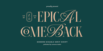 Introducing Epical Comeback Epical Comeback is a modern display font with serif with script style. It's modern and classic font with a unique and deference look . Perfect if you need a dose of fun in your project. Perfect for editorial projects, Logo design, web font, clothing branding, product packaging, magazine headers, or simply as a stylish text overlay to any background image.
 - Miragem by Vanarchiv,
$55.00 This serif typeface was designed to be simple and neutral on text sizes, there descender proportions are short and the x-height is large. The lowercase italics contain different structure from roman characters, but the most differentiation detail is the fact the ascender and descender strokes don’t contain serifs. Italics characters are slightly more narrow and condensed than roman letterforms.

