9,557 search results
(0.032 seconds)
- Mellow Serif by ParaType,
$30.00 Mellow Serif is a soft and friendly typeface. It looks compelling in large point sizes due to the rounded terminals and calligraphic details. Mellow Serif also works well in body text with a small leading size as it has even proportions and a large x-height. Mellow Serif includes ten styles—five upright and five italic, ranging from Light to Extra Bold. The typeface supports extended Latin, extended Cyrillic, and Greek. The character set also includes old style figures, small caps in the Light, Regular, and Medium upright styles as well as stylistic alternate sets that slightly change the way Mellow Serif looks in large point sizes. The Regular style also has alternative letterforms with swashes. Mellow Serif is great for book printing (from fiction and children’s books to science literature), headings, and large texts on the web as well as for toys and confectionary packaging. It also works perfectly with a rounded sans serif Mellow Sans. Mellow Serif was created by Natalya Vasilyeva, an expert in designing text and calligraphic typefaces, and released by Paratype in 2023.
 - Boge LP by LetterPerfect,
$39.00 Boge LP is a new font family designed to communicate lucidly in text as well as in headlines and titles. The family consists of Regular, Italic, Bold, Bold Italic & Black. Character sets include a full compliment of multi-language support and fine-tuned kerning to make Boge™ a smart choice for professional quality typography from text to billboard-sized advertising. Regular and Bold styles include designed small caps and old-style numerals accessed as OpenType features. An original serif design, Boge blends traditional aesthetic with contemporary refinement. Its hallmarks are: clarity, readability, geniality, competence. The five related styles provide a strong palette for coloring words, text and ideas with quiet authority. Garrett Boge has been designing type for over 30 years, working with Apple, Microsoft, Adobe, Disney and numerous corporate clients. His background in calligraphy, commercial lettering, graphic design, and typography has been channeled into creating this namesake design. Boge Text joins his other popular faces — Spring, Florens, Bermuda, Spumoni, Longhand, Tomboy, Wendy — under the LetterPerfect Fonts brand, marketed through Monotype and its partners.
 - Master Rumble by Alit Design,
$24.00 Introducing "Master Rumble" - an exquisite font that embodies the timeless elegance of the Victorian era. With its ornate details and refined aesthetics, this font exudes a sense of grandeur and sophistication. "Master Rumble" offers two distinct versions: the regular and expanded. The regular version maintains the classic proportions and delicate details, perfect for creating elegant headlines and body text. The expanded version, on the other hand, provides a more dramatic and impactful look, making it ideal for titles and display purposes. These two variants offer versatility and flexibility to suit different design needs. With an impressive collection of 646 glyphs, "Master Rumble" empowers you to craft captivating typographic compositions. The font boasts an extensive range of alternative characters, allowing you to experiment with different letterforms and create unique combinations. This abundance of options gives you the freedom to customize and tailor the font to perfectly match your creative vision. Enhancing the font's allure, "Master Rumble" comes with an additional 146 ornamental elements. These ornaments beautifully complement the Victorian style, enabling you to adorn your designs with decorative flourishes, frames, and borders. These intricate details add a touch of opulence and bring a sense of refinement to your typographic creations. In conclusion, "Master Rumble" is a font that epitomizes the Victorian elegance, offering a perfect balance between classic charm and contemporary design. With its regular and expanded versions, extensive glyph set, alternative characters, ornamental elements, and multilingual support, this font empowers designers to create captivating and sophisticated typographic designs that leave a lasting impression. Elevate your creative projects and embrace the timeless beauty of "Master Rumble".
 - Gyoza by Ahmad Jamaludin,
$15.00 Introducing Gyoza - Font Family (4 Fonts) Gyoza - was designed in late 2022 and published on January 2023. The Typeface was inspired by the 90’s playful cartoons and comic books. This font comes with 4 weights; Regular, Semibold, Bold, and Black. Gyoza - available with the variable fonts in weights and the Ink Trap. With the regular style, you'll have the correct anatomy of the fonts. with the Ink Trap style, it added more extreme space on the Ink Trap. Gyoza - contains everything you need to create stunning typography – from headline fonts to body text fonts - all in one place. Whether you're starting out or you've been designing for years, Gyoza has everything you need. Can be used for modern and vintage designs, and also can be easily paired with some graphic elements (Illustration, Photography) this font is perfect for, Logotype, Branding, Title, and Packaging. So take your design skills up a notch and get started on some fresh new projects with Gyoza today! Similar Item: Gunydrops : LINK HERE Kelpo : LINK HERE Swipe : LINK HERE Replay : LINK HERE What you get : Gyoza Regular Gyoza Semibold Gyoza Bold Gyoza Black Features : Ligatures Instructions ( Access special characters, even in circuit design ) Letters, numbers, symbols, and punctuation No special software is required to use this typeface even work in Canva Multilingual Support Language Support: Danish, English, Estonian, Filipino, Finnish, French, Friulian, Galician, German, Gusii, Indonesian, Irish, Italian, Luxembourgish, Norwegian Bokmål, Norwegian Nynorsk, Nyankole, Oromo, Portuguese, Romansh, Rombo, Spanish, Swedish, Swiss-German, Uzbek (Latin) Please contact us if you have any questions. Enjoy crafting and thanks for supporting us! Come and say hello over on Instagram! https://www.instagram.com/dharmas.studio/ Regards, Dharmas Studio
 - Plz Print Brush by Outside the Line,
$19.00 Plz Print Brush is a good solid font for posters, headlines and accent words like - SALE! It gives the slightly irregular look of handlettering.
 - BobTag by JOEBOB graphics,
$- BobTag was written on paper taped to a wall for extra grungyness. Looks like it was actually written on an irregular surface. Caps only.
 - Fractus by Eurotypo,
$36.00 The requirements of Middle Ages scribes who copied and produced books in monasteries were fundamentally to preserve space, due to the high cost of the writing surface. During this long period of the development of Gothic forms, many other variations of the style of black letters appear: Textur or “Gothic-antique”, another group called Rotunda preferred by Italian and Spanish scribes. In 1490, the style "Bâtarde" (according to the the French classification) began to be widely used in Germany with more rounded shapes and named Scwabacher (probably derived from the city of Schwabach, but not certified) Fractur is a more condensed and narrower form than Schwabacher. This style is attributed to Johann Neudörfer of Nuremberg, cut in 1513; it was quickly imitated, therefore a few years later became to be a German national identity that extended over the next four centuries. The shape of its characters can be considered as a fusion of Texture and Schwabacher: the lowercase actually has medium strictly vertical and half curved strokes. The first expressions of the baroque influence this writing whose appearance of movement is due to the ornaments applied to the uppercase letters and the ascending and descending features of the lowercase. Despite having spent so many years and being a typeface not suitable for extensive reading texts, the Gothic Fractur has endured over time for possessing a strong and solid characteristic, as well as being closely linked to the spirit of gothic cathedrals of countries in northen Europe. In fact, it is probably that this expressive feature leads them to be chosen in the most varied graphic communication needs, which run from from banks and financial companies, insurers, law offices, publishers, newspapers and TV networks, till alcoholic drinks, funeral tombstones, packaging and even tattoos.
 - Origami by Monotype,
$29.99In spite of its angular appearance, Origami is composed almost exclusively of curves. Designer Carl Crossgrove derived the typeface from experiments in designing a low resolution type. The resulting face is reminiscent of Eastern European expressionist designers such as Oldrich Menhart and Vojtech Preissig. It is paired with an equally angular chancery italic. Origami works effectively for short blocks of text or at display sizes, while the capitals are especially suitable for titles. - Fractul by Adam Ladd,
$25.00 Fractul is a geometric sans with architectural qualities. Built from the Konnect family, this typeface introduces even more unique and display oriented design details, which you'll see in characters like a, f, g, t, y, etc. where certain strokes have been straightened for an angular and modern appearance. Also included is Fractul that takes the angular design further by styling characters like m, n, u, etc. to be rectangular and avant garde.
 - Stoan by Scholtz Fonts,
$7.00Stoan is a rough, textured grunge font, based on the popular Spaza. Its characters are irregular and funky, with edges that disappear into the distance. - That by Suomi,
$30.00 This is That: a family of four weights with roman and true italics, and also with chiselled medium weight, and Irregular variant for, well, variety.
 - Drakoni Sans by Mans Greback,
$59.00 Drakoni Sans is a bold and rounded font that exudes a strict and angular aesthetic. Its clean lines and subtle curves give it a humanist touch, making it perfect for a wide range of designs. Designed with a vision of comic book headlines, Drakoni Sans is both playful and professional. Its bold and powerful presence commands attention, while its rounded edges and angled cuts add a touch of personality and charm. Available in four styles - Regular, Italic, Bold, and Bold Italic - Drakoni Sans offers versatility and flexibility for any project. Its clean and clear letterforms make it ideal for logos, headlines, and other display purposes. Whether you're looking to add a touch of softness to your designs or to create a bold and commanding presence, Drakoni Sans is the font for you. The font is built with advanced OpenType functionality and has a guaranteed top-notch quality, containing stylistic and contextual alternates, ligatures and more features; all to give you full control and customizability. It has extensive lingual support, covering all Latin-based languages, from Northern Europe to South Africa, from America to South-East Asia. It contains all characters and symbols you'll ever need, including all punctuation and numbers.
 - Nuit by Eurotypo,
$28.00 Nuit, a delightfully handwritten family font with strong character designed by Carine de Wandeleer. Its slight bounce and intentional irregularity, gives your words a wonderful flow. The fatness and thinness of their strokes give an impressive harmony. This new font family includes Regular, Italic, Bold and Bold Italic. It has OpenType features such as Stylistics alternates, Swashes, Ligatures, up to four Stylistic sets by letter, initial and terminal forms in upper and lower, ornaments that allow you to mix and match pairs of letters and a Central European language support to fit your design. This OpenType features may only be accessible via OpenType-aware applications, or the Character Map to view and copy any of the extra characters to paste into your favorite text editor/app. This will help your creativity and make it easier to make expressive and elegant your typographic work. Also with Nuit it is possible to write all in capitals. Nuit looks lovely on wedding invitations, greeting cards, logos, posters, labels, t-shirt design, logos, business-cards and is perfect for using in ink or watercolor based designs, fashion, magazines, food packaging and menus, book covers and whatever your imagination holds! Nuit was made to make your project more beautiful and attractive.
 - Hex Braille by Echopraxium,
$5.62 The purpose of this monospace font is to display braille in an original although rather steganographic way. Its glyphs are built from a flat hexagon which can be read as 3 rows of 2 vertices (i.e. regular braille glyph grid). The initial design is illustrated by glyphs 'ç' (no dot) and 'û' (6 dots) as shown by poster 5. Glyphs are connected to each other, thus 6 connections for each hexagon (2 on left/right and 4 on top/bottom). In the final design many diagonal segments of the hexagon were removed for esthetical reason. Text is displayed not as a honeycomb but as a lattice instead which mixes hexagons, squares and "irregular convex octagons" (mostly unclosed), the design favored squares over octagons. The whole slightly resembling a PCB. Text can be framed with 3 sets of Frame glyphs (as shown in Poster 4): Octagonal: { €, °, £, µ, §, ¥, ~, ¢ } which can be mixed with Rectangular High Rectangular Low: { è, é, ê, ï, î, à, â, ä } Rectangular High: { Â, ù, Ä, Ê, Ë, ô, õ, ë } which can be mixed with Octagonal NB: When using Frame glyphs, it is advised to show Pilcrow (¶) and Non Breaking Space, which are replaced by empty shapes (e.g. in Microsoft Word, use CTRL+8 or use [¶] button in the ribbon).
 - Austral Slab by Antipixel,
$15.00 Austral Slab is a hand-drawn layered font designed by Antipixel, with unique textures & styles that combine giving your work a distinctive impression. This font comes in three weights, Regular, Light & Thin, with irregular outlines and uneven/crooked strokes, giving your work more personality and making it exclusive and powerful. For this same reason it can be used in a vast variety of projects, such as logos & branding, stationery, book covers, magazine design, clothing prints & tags, packaging, animated videos, and many more! Austral Slab has three sets of alphabets in uppercase and lowercase to avoid repeating the same character pattern, and giving the font a more natural handwritten feel. This is included in the Open-Type Contextual Alternates, which applies an automatic substitution of glyphs as long as the Open-Type features are activated. Also, Austral Slab offers other Open-Type features such as Stylistic Alternates, Ligatures, Discretionary Ligatures, Fractions, Superscript, Subscript, Denominator, Numerator, Scientific Inferiors & Kerning. This font has a very large glyph coverage and can be used in a wide range of languages, including English, Spanish, Italian, French, German, Polish, Czech, Vietnamese, Finnish, Icelandic, among many others. The style Maplines Thin is offered Free for commercial & personal use!
 - 360 by Wilton Foundry,
$29.00Distorted fonts are great but are mostly not very practical - 360 is an attempt to create a simple distorted font that can be used far beyond a few logos or headlines. Each 360 character averages roughly half the number of sharp angles of a regular sans serif. This gives it an unusually fresh and timeless appeal and creates a dynamic presence across body text that is very legible and compact without looking overly condensed. 360 was chosen as a name because it can be used as an everyday font, all year round, and because 360 has so many unusual angles that don't conform to normal font conventions. 360 also happens to be a cool number: 360 makes a highly composite number. 360 is also a superior highly composite number and a colossally abundant number. A circle is divided into 360 degrees for the purpose of angular measurement. 360° is also called round angle. 360 is a convenient standard since, 360 being highly composite, it allows a circle to be divided into equal segments with each segment measured in integer degrees rather than fractional degrees. 360 is the sum of a twin prime (179 + 181). A year is roughly calculated as 360 days. - Groovy 3D Caps JNL by Jeff Levine,
$29.00 It all started with a simple idea back in 1998: do a digital version of a "lost" 70's typeface, and make up the missing letters that were not present in the only available example Jeff Levine had to work with. Jeff wasn't yet doing his own digital font creation, so he hooked up with Brad Nelson who owns a small foundry called Brain Eaters Fonts. Together, they collaborated on "Action Is"- a freeware font named after the source of the type example. This was a title page for a commemorative photo album of images from the 60's TV music show "Where the Action Is", formerly hosted by Jeff's employer at the time, singer-writer-producer Steve Alaimo. The free font took off like a rocket, being released just at the peak of the 60’s/70’s retro craze in the late 1990’s, and it was EVERYWHERE! It showed up on TV shows, packaging and web design -- and was even spotted on signage used on the side of a major amusement resort’s retro-themed hotel. From that point on, Jeff kept getting requests for a version with a lower case. Although they shared the copyright in the freeware version, Brad Nelson gave Jeff his blessing to re-work and take Action Is into the realm of commercial type. Newly improved and re-released as Groovy Happening JNL, it became one of Jeff's better selling type designs. A simplified, yet similar font was issued called Groovy Summer JNL. Now, after about a decade, Jeff had decided to clean up the 3-D (drop shadow) version that was originally freeware with many minute design flaws and re-release it commercially. Groovy 3D Caps JNL is an all-caps, limited character set font which ties in well with the previous releases, yet retains itís 1960s-1970s era charm. The font flag art is courtesy of Barbara D. Berney and is used by permission.
 - Caslon Graphique by ITC,
$29.99 The Englishman William Caslon punchcut many roman, italic, and non-Latin typefaces from 1720 until his death in 1766. At that time most types were being imported to England from Dutch sources, so Caslon was influenced by the characteristics of Dutch types. He did, however, achieve a level of craft that enabled his recognition as the first great English punchcutter. Caslon's roman became so popular that it was known as the script of kings, although on the other side of the political spectrum (and the ocean), the Americans used it for their Declaration of Independence in 1776. The original Caslon specimen sheets and punches have long provided a fertile source for the range of types bearing his name. Identifying characteristics of most Caslons include a cap A with a scooped-out apex; a cap C with two full serifs; and in the italic, a swashed lowercase v and w. Caslon's types have achieved legendary status among printers and typographers, and are considered safe, solid, and dependable. Caslon Antique was designed by Berne Nadall and brought out by the American type foundry Barnhart Bros & Spindler in 1896 to 1898. It doesn't bear any resemblance to Caslon, but has the quaint crudeness of what people imagine type looked like in the eighteenth century. Use Caslon Antique for that old-timey" effect in graphic designs. It looks best in large sizes for titles or initials. Caslon Black was designed by David Farey in the 1990s, and consists of one relatively narrow and very black weight. It is intended exclusively for titles or headlines. Caslon Black has a hint of the original Caslon lurking in the shadows of its shapes, but has taken on its own robust expression. Caslon Graphique was designed by Leslie Usherwood in the 1980s. The basic forms are close to the original Caslon, but this version has wide heavy forms with very high contrast between the hairline thin strokes and the fat main strokes. This precisely drawn and stylized Caslon has verve; it's ideal for headlines or initials in large sizes."
 - Digital tech - Personal use only

- Zentenar Fraktur - Unknown license

- Nouveau Showcard JNL by Jeff Levine,
$29.00 The 1920 song “Noah’s Wife Lived a Wonderful Life (‘Cause Noah Had to Stay Home)” is another example of one of those overly-worded song titles from early 20th Century composers. What’s more important for type enthusiasts is that the title was hand lettered with a round nib pen in a slightly ragged Art Nouveau style. Cleaning up the ragged design, the end result became Nouveau Showcard JNL, which is available in both regular and oblique versions.
 - San Jose by Graffiti Fonts,
$19.99 The San Jose type family provides an array of variants representing a simplified, bay area slant on traditional Chicano American street scripts. The styles in this set can be used in all caps for the most authentic appearance or in a more typographically traditional small caps format. This set also includes latin supplement support and a robust character set in six styles. 3 Stroke variants: Regular, Rough & Bold each have a leaned back, traditional slant variant.
 - MC Rilego by Maulana Creative,
$17.00 Rilego is a semi monospaced with serif font. Regular stroke, fun character with a bit of ligatures and alternates. To give you an extra creative work. Rilego font support multilingual more than 100+ language. This font is good for logo design, Social media, Movie Titles, Books Titles, a short text even a long text letter and good for your secondary text font with script or serif. Make a stunning work with Rilego font. Cheers, Maulana Creative
 - Silta The Farming by Alcode,
$15.00 Silta The Farming come with Regular style, it will make this typeface can be used in all design projects and works perfectly for pairing with Display typeface or script fonts, Headlines, Posters, Packaging, T-shirts, Postcards, Invitation, Wedding Sign, Sign Painting, Signboard, and much more. Try Silta The Farming, enjoy the richness of OpenType features and let her fun and elegant excitement make you happy and enhance your creativity! You can use this font very easily.
 - Lemon Press by Attype Studio,
$7.00 Lemon Press is display font of fresh lemon, come up with two font regular and display. It is suitable for any summer event! Lemon Press is perfect for branding, logo, invitation, stationery, social media post, product packaging, merchandise, blog design, game titles, cute style designs, Book/Cover Titles and more. Multilingual Support included for Afrikaans, Albanian, Catalan, Danish, Dutch, English, Estonian, Finnish, French, German, Icelandic, Italian, Norwegian, Portuguese, Spanish, Swedish, Zulu. Hope you enjoy with our font! Attype Studio
 - Scansky by Satori TF,
$20.80 Scansky is a carefully crafted contemporary modern sans serif typeface. It comes with 28 fonts, regular and condensed sub-families, and matching italics. Scansky was designed to give a distinct, corporative look to your artwork, suited for signage, web, and corporate print material. It is equipped with an extended character set to support Central, Eastern and Western European languages. And the good news is that the SemiBold weights are free of charge so you can try it. :)
 - Jekatep by ActiveSphere,
$30.00 Jekatep is a sans-serif display font and works best in text and display applications, such as posters, headline, magazine, logos, titles, product branding, corporate branding and publishing. Jekatep font has three weights; light, regular, and bold, each available in italic, making a total of six styles. Each style has a full upper and lower-case, accents, punctuation and a selection of monetary symbols. Currently Available for Mac and PC, in Open Type, PostScript or TrueType.
 - Testimoney by Maulana Creative,
$11.00 Testimoney is a Fancy Signature script font. With Regular Contrast stroke, slanted and fun character with a bit of ligatures. To give you an extra creative work. Testimoney font support multilingual more than 100+ language. This font is good for logo design, Social media, Movie Titles, Books Titles, a short text even a long text letter and good for your secondary text font with sans or serif. Make a stunning work with Testimoney font. Cheers, MaulanaCreative
 - FF Ropsen Script by FontFont,
$47.99 German type designer Jürgen Brinckmann created this script FontFont in 2001. The family contains 2 weights: Regular and Bold and is ideally suited for advertising and packaging, festive occasions, editorial and publishing as well as poster and billboards. FF Ropsen Script provides advanced typographical support with features such as ligatures, small capitals, alternate characters, and case-sensitive forms. It comes with a complete range of figure set options – oldstyle and lining figures, each in tabular and proportional widths.
 - Metch Bright by Zeenesia Studio,
$16.00 Bright Diamond - Handwritten Font Bright Diamond is a script and regular handwritten font with a simple and classy style, this font is great for your next creative projects such as watermark on photography, logo design, wedding, invitation, quotes, book cover, business card, and many other design project. From business cards to photo watermarks. We hope you enjoy the font, please feel free to comment if you have any thoughts or feedback. Thanks for purchasing and glad to help you!
 - Tape Up by Ingrimayne Type,
$9.00 The letters in TapedUp are constructed from straight pieces of what could be masking tape. The letters have a unsophisticated or unpolished quality to them. The typeface is caps-only but many of the shapes on the lower-case keys differ from those on the upper-case keys. It was formed with a template used for several letterbat fonts and also typefaces Rumpled and Tinkerer. The family has six styles: regular, bold, shadowed, oblique. bold oblique, and shadowed oblique.
 - Sweet Peanuts by Maulana Creative,
$16.00 Sweet Peanuts is a cute sweety handwritten script font. With regular clean stroke, fun character with some of ligatures. To give you an extra creative work. Sweet Peanuts font support multilingual more than 100+ language. This font is good for logo design, Social media, Movie Titles, Books Titles, a short text even a long text letter and good for your secondary text font with sans or serif. Make a stunning work with Sweet Peanuts font. Cheers, MaulanaCreative
 - Another Passion by Sarid Ezra,
$19.00 Introducing, Another Passion Script Family, make your own handwritten! Another Passion Script Family contain 4 FONTS including ligatures and underline. Also comes with italic, bold, and bold italic. Another Passion Script is a handwritten font that you can use to make a logo for branding, beautiful fashion design, or handwritten quote. Also already PUA Encoded. Foreign Languages Support: ÀÁÂÃÄÅÇÈÉÊËÌÍÎÏÐÑÒÓÔÕÖØÙÚÛÜÝßàáâãäåæçèéêëìíîïðñòóôõöøùúûüýÿ What Will You Get: Another Passion Regular Another Passion Italic Another Passion Bold Another Passion Bold Italic
 - Charles Wright by K-Type,
$20.00 Charles Wright is a full typeface in the style used for British vehicle license plates. The standard Bold weight is based on the condensed bold ‘2001’ style with an uppercase which conforms to UK registration plate specifications for character heights of 79mm and widths of 50mm. The 9 font family also includes previously unavailable Medium and Regular weights, Obliques , and a newly designed lowercase. For platemakers, the wider '1935' and lighter 'Motorcycle' fonts are also included.
 - Automatic Typewriter by Ana's Fonts,
$16.00 Automatic Typewriter is a monospaced typewriter font in two styles: Upright and Oblique, and two weights: Regular and Bold, plus an Automatic Underline version of each font, for a total of 8 fonts. This makes it versatile and ready to use in modern and vintage designs alike. This font is also very legible at a wide range of sizes and looks great in both long or short texts, in digital collages, branding and packaging, social media posts, logotypes, etc.
 - Plastikcycle by Maulana Creative,
$12.00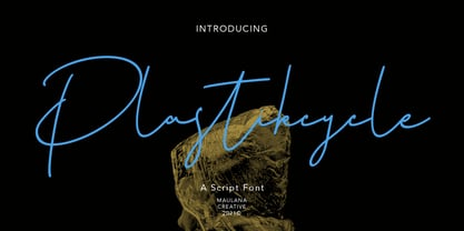 Plastikcycle is casual script font, with clean regular contrast stroke, slanted and fun character. It has Opentype features ligatures of character and alternates lowercases, To give you an extra creative work. Plastikcycle font support multilingual more than 100+ language. This font is good for logo design, Social media, Movie Titles, Books Titles, a short text even a long text letter and good for your secondary text font with sans or serif. Make a stunning work with Plastikcycle font.
 - Southavely Signature by Maulana Creative,
$14.00 Southavely is a casual signature font. With regular mono-line stroke, slanted and fun character with a bit of ligatures. To give you an extra creative work. Southavely font support multilingual more than 100+ language. This font is good for logo design, Social media, Movie Titles, Books Titles, a short text even a long text letter and good for your secondary text font with sans or serif. Make a stunning work with Southavely font. Cheers, MaulanaCreative
 - Contender by Viaction Type.Co,
$17.00 Font Contender with a stamp effect gives a vintage feel and is suitable for adding a vintage feel to your design. There are 2 regular and oblique styles, complete with multilingual characters and stalistic alternatives. It is suitable for quotes, clothing designs, vintage logos, labels, posters, packaging designs and other designs. File Include (Font Family) : - Contender - Contender Slant Features : - Uppercase. - Lowercase. - Multilingual. - Punctuation & Symbol. - Stylistic Set. Thank you for buying. I hope you enjoy and thank you.
 - Logisco by Ideabuk,
$16.00 Introducing Logisco - a sleek and versatile display font family that combines modern geometry with a retro-cool vibe. This six-font collection boasts soft, rounded corners that add a dash of playfulness to any project. Logisco Light, Regular, and Bold offer a range of weights to fit any typographic need, while the Stencil variations add a unique edge to your designs. Whether you're creating sleek logos or funky posters, Logisco has you covered with its stylish and versatile letterforms.
 - Hellowanias by Maulana Creative,
$14.00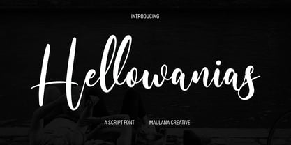 Hellowanias is a fancy handwritten script font. With regular contrast stroke, fun character with a bit of ligatures and alternates. To give you an extra creative work. Hellowanias font support multilingual more than 100+ language. This font is good for logo design, Social media, Movie Titles, Books Titles, a short text even a long text letter and good for your secondary text font with sans or serif. Make a stunning work with Hellowanias font. Cheers, Maulana Creative

