10,000 search results
(0.042 seconds)
- Jules by DSType,
$45.00 At first glance, Jules, appears to be just one more Didonic variation, but a closer look starts revealing all the extraordinary features of this type family, specially designed for use in extremely big sizes. Jules reflect the last of the late 18th century and was inspired by several plates from a portuguese calligrapher named Antonio Jacintho de Araujo. Available in three different optical sizes: Big, Colossal and Epic, Jules has a plethora of ligatures and stylistic alternates, plus refined Italics and a super elegant Swashes version.
 - Mina by Resistenza,
$39.00 Go back to a time when the Mediterranean coastline was truly glamorous, when stylish women and men in wire-framed glasses listened to Domenico Modugno songs on the radio while sipping wine in sidewalk cafes. A relaxing summer’s day, a gentle sea breeze, taking the time to write a postcard to your loved ones in your best handwriting. The 1950’s may have come and gone, but the elegance and simplicity of that classic style has not, Mina keeps the feel of calligraphy, the long connections between letters is elastic, the clean, thin lines, it is a relaxed cursive ideal for logotypes, titles, and lettering. There are eleven Mina font styles and many loops to choose from to customize any letter. Bring the seaside glamour of a bygone era to your projects of today with Mina. Ranging from light to heavy, Mina Calligraphic, and Mina Shadow, this family of fonts work perfectly separately but you can also achieve beautiful results when combining them. Check out also Mina Chic We recommend to combine Mina with: PestoFresco Turquoise
 - Caslon #3 by Linotype,
$29.99The Englishman William Caslon (1672–1766) first cut his typeface Caslon in 1725. His major influences were the Dutch designers Christoffel van Dijcks and Dirck Voskens. The Caslon font was long known as the script of kings, although on the other side of the political spectrum, the Americans used it as well for their Declaration of Independence. The characteristics of the earlier Renaissance typefaces are only barely detectable. The serifs are finer and the axis of the curvature is almost or completely vertical. The overall impression which Caslon makes is serious, elegant and linear. Next to Baskerville, Caslon is known as the embodiment of the English Baroque-Antiqua and has gone through numerous new interpretations, meaning that every Caslon is slightly different. American Type Founders presented a Caslon in 1905 which is true to the forms of the original. This font is relatively wide and comes complete with small caps and old style figures. - Grand Hotel - 100% free

- Adelica Brush by Java Pep,
$11.00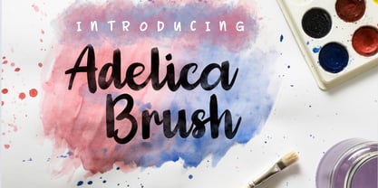 Adelica Brush is made with a handwritten brush. This font is perfect to give your project a fun, feminine, childish, and watercolor effect. Adelica Brush is a solid font. To raise the watercolor effect you must mask it with a watercolor brush or other. Adelica Brush contains: -Uppercase & lowercase -Numeral & punctuation -PUA encoded -Multi-lingual support Thank for using this font, if you have any question don't hesitate to message me at java.indonesian@yahoo.com.
 - Ragged Write NF by Nick's Fonts,
$10.00This rugged rascal is based on at old ATF “original” design called “Hearst” (although Frederic Goudy claimed it was a pirated version of one of his designs). Its commanding, rough-hewn character makes it suitable for headlines, but its large x-height makes it practical for subheads as well. Available in roman and italic versions. Both versions of this font include the complete Unicode 1252 Latin and Unicode 1250 Central European character sets. - Casler by Letrasupply Typefoundry,
$20.00 Casler Font is a display font designed for any creative project that needs to be stand out. While get inspired by some vintage aphotecary labels, Casler Font wrapped as firm yet unique font display that consists over 1000 glyphs and 26 icon as extras. A terrific combo that gives experimentally mood in classic and modern style. Casler Font is a best thought for any advertisements usage, logos, headlines or headings, book covers and many more. A must have display font collection!
 - Thillends by Wacaksara co,
$16.00 Thillends is a fancy handlettering typeface with a clear style, good mood, and dramatic movement. It allows you to create beautiful hand-made typography in an instant. It’s suitable for headlines, logotype, editorial design, branding, letterhead, poster, apparel design, product packaging, label or anything that need handlettering style. Thillends comes with many variations on each character, including uppercase, lowercase, numerals & punctuation, stylistic styles, ligatures, discretionary ligatures, and titling. You will also discover extras swash added to give that finishing touch to your texts.
 - Aderyn by Hanoded,
$15.00 Aderyn is a hand drawn, elegant font with a light touch to it. Aderyn is soft and sleek, but also comes in bolder styles to give a little extra oomph to your designs. Aderyn is Welsh for 'bird', a language I meant to master, but never took beyond 'good morning', 'bird' and 'cat'. I know, it's pathetic… Aderyn comes in 12 styles, all of which have kerning, stylistic and contextual alternates for both lower and upper case letters. It even has a smiley!
 - Utsahakam by Jipatype,
$26.00 ฟอนต์อุตสาหกรรม เป็นอักษรแบบสลับเซอริฟ ที่มีแข็งแกร่ง หนักแน่น มั่นคง มีทั้งหมด 9 น้ำหนักและตัวเอียงของแต่ละน้ำหนักรวมทั้งหมดมี 18 สไตล์ รองรับหลากหลายภาษา เหมาะสำหรับการใช้ผาดหัว ป้าย ข้อความโปรยสั่นๆ ฟอนต์อุตสาหกรรมสามารถช่วยส่งเสริมมูทแอนโทนให้ดูหนักแน่น มั่นคง น่าเชื่อถือ เหมาะกับสินค้าและบริการที่เกี่ยวข้องกับ เครื่องจักร, โรงงานการผลิต, เครื่องมือช่าง หรืออุตสาหกรรมหนัก Utsahakam is a slab serif typeface look strong, solid, stable. Comes with 9 weights and italics of each weight total 18 styles. Support multi-languages. Suitable for headline or sub-headline. Utsahakam can help you to create a mood and tone of strong, solid, stable and reliable. For a product and service about machine, manufacturing factory, mechanic tools or heavy industry.
 - Qurve Hollow Wide - Unknown license

- 4 Star Face Font - Unknown license

- Qurve Hollow - Unknown license

- Qurve Wide - Unknown license

- Qurve Hollow Thin - Unknown license

- Qurve Thin - Unknown license

- Edgar No 9 by Type Innovations,
$39.00 Edgar No. 9 is an original design by Alex Kaczun. Edgar No. 9 is a derivative work based on his Big Boy typeface series. It was designed specifically for display headlines, logotype, branding and similar applications. Primarily a display, this extremely versatile font has generous proportions, large counters and loose fitting which also allow the font to work well across a wide range of text sizes. Edgar No. 9 is a heavy baroque slab serif and although it shares the underling skeleton of 'Big Boy', it is a much more compact in overall proportions and spacing. A handsome bold headline font that works well in text as well as display sizes—ideally suited for publications and advertising. Alex plans to expand the font series to include a large range of weights along with corresponding italics numbering 1 thru 9, as well as, true small capitals and old style figures. Distressed version(s) will also be available in upcoming releases. Stay tuned, more to come soon. The large Pro font character set supports most Central European and many Eastern European languages.variations to expand this 'hip' new font series. Groovin' baby.
 - Parma by Monotype,
$29.99Giambattista Bodoni (1740-1813) was called the King of Printers; he was a prolific type designer, a masterful engraver of punches and the most widely admired printer of his time. His books and typefaces were created during the 45 years he was the director of the fine press and publishing house of the Duke of Parma in Italy. He produced the best of what are known as modern" style types, basing them on the finest writing of his time. Modern types represented the ultimate typographic development of the late eighteenth and early nineteenth centuries. They have characteristics quite different from the types that preceded them; such as extreme vertical stress, fine hairlines contrasted by bold main strokes, and very subtle, almost non-existent bracketing of sharply defined hairline serifs. Bodoni saw this style as beautiful and harmonious-the natural result of writing done with a well-cut pen, and the look was fashionable and admired. Other punchcutters, such as the Didot family (1689-1853) in France, and J. E. Walbaum (1768-1839) in Germany made their own versions of the modern faces. Even though some nineteenth century critics turned up their noses and called such types shattering and chilly, today the Bodoni moderns are seen in much the same light as they were in his own time. When used with care, the Bodoni types are both romantic and elegant, with a presence that adds tasteful sparkle to headlines and advertising. Parma was designed by the monotype Design Team after studying Bodoni's steel punches at the Museo Bodoniana in Parma, Italy. They also referred to specimens from the "Manuale Tipografico," a monumental collection of Bodoni's work published by his widow in 1818. - Summer Desire by Olivetype,
$18.00 Summer Desire is an original typeface that's perfect for all of your summertime and happy designs! Use Summer Desire in your designs to create a lively, optimistic mood. Its playful, and lighthearted vibe is perfect for any design that needs that extra umph. Make your next blog post, social media update, or poster the most memorable thing your customers have ever seen! And you can also use it for logos, business cards, posters, headlines, T-shirts, product packaging, and more. So what’s included : Basic Latin Uppercase and Lowercase Numbers, symbols, and punctuations Multilingual Support. Accented Characters : ÀÁÂÃÄÅÆÇÈÉÊËÌÍÎÏÑÒÓÔÕÖØŒŠÙÚÛÜŸÝŽàáâãäåæçèéêëìíîïñòóôõöøœšùúûüýÿžß PUA Encoded and fully accessible without additional design software Simple Installations works on PC & Mac Thank You!
 - Bisco Condensed by Galapagos,
$39.00Bisco Condensed is a small capital design inspired by hand lettered memorial wall art from the Harlem section of New York City. As a memorial, this design is dedicated to a type design colleague who lost his long battle with cancer. This font is a tribute to his strength and his liveliness. The original idea for Bisco Condensed was to capture the energy of those unique "streetforms" in a text/display design and encapsulate them into a lively & fluid type design with a high level of readability at all point sizes. Bisco Condensed is an excellent type for expressive display layouts. It works well as an independent design or a long with contemporary sans serifs that complement Bisco's irregular contours, weighting and bounce. - MS Mincho by Microsoft,
$39.00MS Mincho™ Japanese font features serifs at the end of its strokes, and can be used for a variety of uses from screen display to publications. This font file is 5.3 MB in size. MS Mincho Japanese font is a trademark of Microsoft Corporation. MS Mincho font Character Set: Latin-1, Japanese (code page 932). MS Mincho is available in both TrueType and OpenType font formats. - Micro Manager NF by Nick's Fonts,
$10.00This font features a complete uppercase alphabet, including accented characters, as well as numbers and standard punctation. Lowercase characters are an assortment of useful dings and things. To create very low-load GIFs, compose your type in Photoshop (or equivalent) at 8 point (or multiples thereof), with anti-aliasing turned off. Both versions of the font include 1252 Latin, 1250 CE (with localization for Romanian and Moldovan). - Hybrid by ParaType,
$30.00 Designed for ParaType in 1999-2003 by Manvel Shmavonyan. This is a low-contrast serif typeface with large x-height and small square cove serifs. For use for text and display typography. Due to its open letterforms and big number of styles the face is a good companion to open humanist Sans. Hybrid design was awarded special prize at Kyrillitsa'99 international type design competition.
 - Widdershins by Hanoded,
$15.00 I like strange words. Widdershins is one of them: it means ‘to go counter clockwise’ and I picked it up from a book I am reading at the moment. Widdershins font was created using a broken bamboo satay skewer and Chinese ink. It is a little messy, uneven and maybe even unnerving, but I am sure you’ll find a way to put it to good use.
 - Thinset by Josh Grzybowski,
$19.99 The original intent for Thinset was to be used strictly as a display font only, but this single weight typeface can at times work great as a body of text as well. It's a clean, legible, and light font which is ideal for publications like fashion and editorial magazines. In addition to ligatures and fractions, Thinset’s other OpenType features include old style numbers and small caps.
 - Cortair by Letterhend,
$15.00 Cortair is an organic font duo with natural vibes! Contain two fonts, Sans and Serif with Rough and Stamp Style. You can use this font for every project. Suitable for branding logo, hand lettering, or apparel design. We hope you enjoy the font, please feel free to comment if you have any thoughts or feedback. Or simply send me a PM or email me at letterhend@gmail.com
 - Lovely Madness by Mirco Zett,
$18.00 Lovely Madness“ is a modern calligraphy font, which is a hybrid out of various types of calligraphy - based fonts. Lovely Madness“ is elegant and at the same time playful, as well as rough and maybe a little bit creepy. That is why there is a wide application possibility for this font and "Lovely Madness“ allows you to give your calligraphy – based creations a new touch.
 - Senhan by Studio Principle Type,
$17.00 A timeless serif with a distinctly contemporary attitude. The Senhan font family makes a statement with confidence. Defined by sexy, sharp, angular contours when used in headline and display scenarios, this family of 5 weights and italics is a real eye-catcher. But with a tall’ish x-height for legibility, and a medium contrast, Senhan is a workhorse at small sizes and in lengthy blocks of copy.
 - Mongondow by Letterena Studios,
$10.00 Mongondow is a unique, modern, and classic display font perfect for elegant and luxury logos, book or movie title designs, fashion brands, magazines, clothes, lettering, quotes, and so much more. . Add it to your fonts library, and it will become your favorite in no time at all! This font is PUA encoded, which means you can access all of the glyphs and swashes with ease!
 - Squadzone by DePlictis Types,
$29.00 SQUADZONE it’s a young & sportive unicase style font, having both uppercase and a few smallcase alternating letters that gives it a unique look. It’s geometric anathomy of the letters may have two different types of endings or detail: straight and sharp cut out angles at 45 degrees. This offers a few alternatives in headlines or even logotype purposes that are realy encouraged to use for.
 - Khamai Pro by DBSV,
$30.00 Khamai Pro is a first attempt at writing a monoline main feature of the curves. Completed after 17 months with many design twists,and also an attempt to provide a different visual design and style as Staccato: (dashed line) Rail: (double line) and Tribe: (triple line). This series of 16 fonts with 625 glyphs each includes true italics and supports Latin, Greek and Cyrillic.
 - Tenby Stencil by Paragraph,
$21.00 Tenby Stencil is a geometric display typeface with broken contours. Unlike real stencil fonts, the gaps are not functional but decorative. They have a consistent size and angular similarity, giving headlines or logos a unique dramatic effect. Designed for use at larger sizes for logotypes, short titles or headings, it contains common ligatures and old-style numerals, and supports Western plus Nordic, Eastern European and Turkish languages.
 - Rosalina by Supfonts,
$15.00 Hello, friends. Here's my new experiment. This font breaks the boundaries even more. Rosalina combines all these qualities: simple and clear, looks at ease. It is perfect for signatures or design, wedding invites and cards, where you do not need a strict style :) Test it out below to see how it could look for your next project! Check out my blog: https://www.instagram.com/zloillev pinterest.com/dmitriychirkov7 Enjoy
 - FS Split Sans by Fontsmith,
$80.00 Quirky and irregular FS Split is no ordinary typeface. Its irregular proportions make it unique, with round letters appearing wide, and straight letters narrow. Other quirks include its eclectic crossbars – the uppercase ‘A’ has an unusually low bar, while the bar on ‘G’ is particularly long. The uppercase has many interesting features in fact, including large counters, closed terminals on certain letters like ‘J’, and a cap-height that lines up with ascenders. The lowercase also holds surprises – the dots on ‘i’ and ‘j’ are unusually large, and some characters, such as ‘g’, feature double-storey counters. An extreme but stylish italic The italic versions of FS Split Sans and Serif are particularly striking. While similar in style to their upright, Roman versions, they take on a larger-than-usual 18-degree angle, making the forward-slant more dramatic. Although the main purpose of any italic is to help words and phrases stand out, this unique execution helps to make the italic variants of FS Split stylish fonts in their own right – they would work brilliantly on magazine covers, in titles and headlines, pull quotes, and even used commercially in logos and corporate branding. Serif and sans: a split personality FS Split Sans and Serif have their differences but also their similarities, contrasting and complementing each other perfectly. This ‘love hate’ relationship inspired the name of the typeface family, and means the two variants provide a versatile, typographic palette for use in graphics and branding. While its proportions are similar to the sans, the serif has a bigger contrast between its weights of bold, regular and light, bracketed serifs, and different styles of terminals, some being straight and others ball-shaped. FS Split Sans has more subtlety and simplicity, with a smaller weight contrast, less flamboyant terminals, and more consistent counter sizes. The two variants are distinct yet alike, so can be used successfully either in isolation or together.
 - FS Split Serif by Fontsmith,
$80.00 Quirky and irregular FS Split is no ordinary typeface. Its irregular proportions make it unique, with round letters appearing wide, and straight letters narrow. Other quirks include its eclectic crossbars – the uppercase ‘A’ has an unusually low bar, while the bar on ‘G’ is particularly long. The uppercase has many interesting features in fact, including large counters, closed terminals on certain letters like ‘J’, and a cap-height that lines up with ascenders. The lowercase also holds surprises – the dots on ‘i’ and ‘j’ are unusually large, and some characters, such as ‘g’, feature double-storey counters. An extreme but stylish italic The italic versions of FS Split Sans and Serif are particularly striking. While similar in style to their upright, Roman versions, they take on a larger-than-usual 18-degree angle, making the forward-slant more dramatic. Although the main purpose of any italic is to help words and phrases stand out, this unique execution helps to make the italic variants of FS Split stylish fonts in their own right – they would work brilliantly on magazine covers, in titles and headlines, pull quotes, and even used commercially in logos and corporate branding. Serif and sans: a split personality FS Split Sans and Serif have their differences but also their similarities, contrasting and complementing each other perfectly. This ‘love hate’ relationship inspired the name of the typeface family, and means the two variants provide a versatile, typographic palette for use in graphics and branding. While its proportions are similar to the sans, the serif has a bigger contrast between its weights of bold, regular and light, bracketed serifs, and different styles of terminals, some being straight and others ball-shaped. FS Split Sans has more subtlety and simplicity, with a smaller weight contrast, less flamboyant terminals, and more consistent counter sizes. The two variants are distinct yet alike, so can be used successfully either in isolation or together.
 - Jubileum by Hanoded,
$15.00 Some time ago, I found myself in a clinic with my wife: at the time she was 20 weeks pregnant and had to do an ultrasound. To pass the time, I leafed through some (ladies') magazines which were lying around. Most of them tackled big issues like which shoes to wear and what type of foundation to plaster on, but one glossy featured a photo shoot. The photographer had found an old building with a beautiful art deco tile mural and had placed his skinny model in front of it. Fortunately for me, the mural featured a lot of text in a beautiful frilly style. I re-created the font I saw and it became "Jubileum" - which just means Jubilee in Dutch.
 - Blazing Furnace by Kitchen Table Type Foundry,
$16.00 At home we have a wood stove. Last year, I bought a whole bunch of tree trunks, which I cut up with a chainsaw and then chopped with my Swedish axe. In Holland we have a saying that firewood keeps you warm three times: when you cut the tree, when you chop the wood and when you burn it in the stove. Our stove is rather small, so it is not exactly a blazing furnace, but I liked the name because it seems to fit this font. Blazing Furnace was made with ink and a brush. It is a bit messy and rough, but it comes with multilingual support and a nice set of alternates for the lower case letters.
 - NorB Architect CF by NorFonts,
$32.00 NorB Architect Condensed fonts are the condensed and the extra-condensed version of my NorB Architect font. It comes with 12 weights from Light to Condensed to Extra Condensed along with their Bold and Felt version. These Architectural fonts will add a beautiful architectural hand-lettering style to all your CAD project drawings. Architects have always wanted their CAD drawings to look more like they were drawn by hand, rather than by a CAD program. These AutoCAD fonts are the first step in bringing back that “artistic hand-drawn” feel to your CAD drawings or any graphic design project that can use true type fonts. They also can be used with any word processing program for text and display use, print and web projects, apps and ePub, Comics, graphic identities, branding, editorial, advertising, scrapbooking, cards and invitations … or even just for fun! NOTE: For more variations of 'NorB Architect CF' font please visit click on this link.
 - Loving Ambros by Say Studio,
$15.00 Introducing Loving Ambros - Luxury Typeface Loving Ambros typeface is a Luxury beautiful typeface and inspiring mix of classic calligraphy with 50 unique alternates and 69 unique ligatures. come with 2 versions regular & italic. Loving Ambros is made mainly for headlines, titles, and other short texts and is well-suited for advertising, vintage mood board, branding, logotypes, packaging, titles, editorial design, modern logos, websites, social media quotes, wedding branding, modern and vintage design. These a fonts are perfect for designs with the concept of elegant, luxury, romance, fashion and so on. What you get: Accessible in the Adobe Illustrator, Adobe Photoshop, Coreldraw, even work on Microsoft Word. PUA Encoded Characters – Fully accessible Fonts include multilingual support. If you need a custom license or have questions, please email to: romandpio3793@gmail.com
 - Ramadan Greeting by Nathatype,
$29.00 Ramadan Greeting is a captivating display font that pays homage to the graceful aesthetics of Arabic calligraphy. Ramadan Greeting is more than just a font; it's a bridge between heritage and modern design. It's a versatile tool that allows you to infuse your projects with the timeless beauty and cultural richness of Arabic calligraphy. The characters in Ramadan Greeting are thoughtfully designed with rounded, soft shapes that exude a sense of warmth and approachability. The high contrast between the strokes adds a traditional and authentic flair while maintaining legibility and clarity, even at display sizes. In addition, you can also enjoy the features here. Features: Stylistic Sets Alternates -Multilingual Supports PUA Encoded Numerals and Punctuations Ramadan Greeting fits in headlines, logos, posters, flyers, branding materials, greeting cards, print media, editorial layouts, and many more designs. Find out more ways to use this font by taking a look at the font preview. Thanks for purchasing our fonts. Hopefully, you have a great time using our font. Feel free to contact us anytime for further information or when you have trouble with the font. Thanks a lot and happy designing.


