10,000 search results
(0.204 seconds)
- Hefeweizen by David Thometz Design,
$24.95 As seen on Typophile.com, DTD Hefeweizen is a contemporary take on the textura blackletter style. Comprised of straight lines and angles sloped at ratios of 1/2 or 2/1, Hefeweizen is a highly geometric design with extensive alternates and ligatures.
 - Mooshine by Jelloween,
$3.95Mooshine is a crisp clear pixelfont, ideal for smallprint, banners, website buttons, navbars, mobile devices and the like. Mooshine contains a wide range of accented characters and is optimized for use at (any multiple of) size 10pt without anti-aliasing. - Coffee by Abedavera,
$20.00 From love into a fontface. Font with the taste of coffee. Made from coffee plant anatomy at local farmer. Hope you enjoy to purchase with price of our "200gr premium green bean" :) Arabica Variety. Dokan, Region Karo - North Sumatra. Indonesia.
 - Flomic by Sergey Melnikov,
$24.00 Ukrainian type designer Melnikov Sergey created Flomic font between 2015 and 2016. Flomic is a geometric sans built from a folded lines. Most effective when used in short words or phrases at larger sizes, where the details can be appreciated.
 - Whipsnapper by Pink Broccoli,
$14.00 A wild at heart offbeat sansserif family inspired not by any single pulp or vintage source but a varied collection of influences. Just an all-around fun typeface with the widths and weights to offer a wide variety of uses.
 - Metal Core by Vozzy,
$10.00 Metal Core is a set of strong and nervous fonts and perfect for lettering on vintage music (and not only for these) style labels, posters, t-shirts, logo etc. All available characters with sample designs you can see at the preview.
 - Spring LP by LetterPerfect,
$39.00 Spring is a lively contemporary script that designer Garrett Boge modeled after his own brush lettering. It was released in 1988 at the launch of LetterPerfect's font collection, and has seen increasing use in advertising, packaging, and point-of-display promotions.
 - Kitra 77 by LightHouse,
$49.00Kitra 77 was one of the studies to Hamuel Nine Five. Though at first glance we can find several similarities, a closer look will reveal a completely different font in color and proportion. Kitra 77 is an OpenType/TTF Unicode font. - Tournedos by Hanoded,
$10.00 The other day, I was cooking a curry and I suddenly realised that we, as a family, eat a lot of meat. At home we do like meat, but given the state our world is in right now, we cannot continue eating meat like there is no tomorrow. As a result, I am hunting the internet right now for good vegetarian recipes (if you have one you’d like to share, then please contact me!). Tournedos is a beefy font family: a chunky all caps set of fonts - and a leaner set to counter and complement this rather heavy dish. And do eat your greens!
 - Mr Foodie by Hipopotam Studio,
$30.00 Mr Foodie is a set of 825 icons divided into 7 groups – 109 fruit icons, 157 kitchen icons, 120 animal products icons, 100 veggie icons, 107 desserts icons, 127 beverages icons, and 105 other food related icons. You can find a full, multi-color list of every icon with its name and corresponding character on a dedicated website or in a pdf manual. It’s a multilayer font so every group consists of 4 fonts – Regular, Back, Front, and 3rd Color. The Regular style is for single color use only and the Back, Front, and 3rd Color styles are necessary if you want to achieve a multicolor effect. Position three identical text boxes exactly on top of each other, apply layer font styles, and choose whatever colors you like. You’ll quickly discover that some icons don’t have 3rd Color style. This is not a mistake – a lot of things look good with just two colors. Use it to make logos, illustrations, games, app icons, t-shirts, mugs, cooking books, restaurant menus, interior decorations, invitations, balloons, and any other project where fine crafted food drawing is needed.
 - Bewitched by Twinletter,
$12.00 BEWITCHED is a handwriting font that has a distinctive feel in its writing, use this font for your designs and make it easy for people to remember at first glance. so that they always remember the message in each of your designs This font is designed with a natural touch of handwriting which is refined to create a portion and composition that suits your needs. So this font is suitable for craft, children's writing, adventure posters, food banner titles, wedding invitations, product packaging logos, quotes, social media page covers, furniture banner headlines, book covers, and much more.
 - Kally Dreams by Hishand Studio,
$14.00 Kally dreams is a beautiful monoline font with signature style that really good for water mark, logotype, advertisement, social media posts, product packaging, clothing design and more. complete with uppercase lowercase ligatures swashes alternates multilingual support
 - Absinette by Greater Albion Typefounders,
$8.95 Absinette takes us straight back to 19th century France. Its a decorative family of Roman faces in three widths as well as a more elaborate inline style, ideal for posters with an Edwardian or Victorian theme.
 - Elastik by bb-bureau,
$65.00 Grotesk typeface with elastic punctuation & diacritical mark. in 4 weights: Light, regular, Medium and Bold by 4 styles: A (small diacritical), B (normal diacritical), C (hight diacritical) and D (very hight diacritical) language: all latin glyphs
 - Deskmark Pro Slab by Alexey Makarov,
$14.00 Hi! Introducing Deskmark Slab Pro Typefamily. Original and soft version. 3 weight for each version, bold, regular and light. Language support: Contains full set of Latin alphabet, including diacritical marks for European languages and Cyrillic alphabets.
 - Monster DD by Doffdog,
$14.00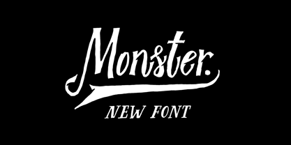 Monster DD is a decorative vintage font in modern performance. It is perfect for: Logos Posters Labels Headlines Apparel Tattoo & more Monster DD comes with upper and lowercase characters, numbers, marks and punctuation. Multilingual support Enjoy!
 - Decora One by Naghi Naghachian,
$82.00 Decora one is a typographic innovation. It is the first of a series of typeface that gives the typographer and other graphic artists the possibility to use modern initials. It enables, moreover, the use of this typeface for decorative headlines and is suitable for manipulations in both vector-based and pixel-based graphic programs. Typographies in countries worldwide, whose alphabets derive from the Roman one, are dependent on such innovations in order to meet the increasing demands of modern communication. This typeface implies at the same time an enrichment of the possibilities for typographical design, which in turn increases the delight in such design. It gives me great pleasure to present this series of new typefaces to my creative colleagues worldwide.
 - Geometry pair by Etewut,
$20.00 Welcome to my Geometry Pair. Introducing two fonts Forma & Structure that will make you happy. One of them is a compilation of shadow-based symbols like silhouettes. Another one has a rock of glyphs that don't repeat each other, but looks in the same style. Surprisingly they fit to each other and you can mix them in your works, be it print or web design. Make your graphic works more stylish that highlight your uniqueness from other. Just wonder people who loves funky design and who respect tiny details. Now you have opportunity to grab them both at the same time! There are all caps fonts kerned with microscope with multi language support.
 - Marseillette NB by No Bodoni,
$39.00 These four typefaces, Berlinette NB, Lyonette NB, Marseillette NB and Parisette NB, were designed from the same basic shape, a fanciful geometric form that avoids strict horizontals and uses more offbeat triangular shapes. Marseillette is the nasty one, with sharp hook terminations that require careful use. Don�t slip and accidentally stick one in your hand � it will hurt pretty bad and make you blubber like a baby. It�s good for surreal warning signs on dark, forbidding docks where gooey monsters live.
 - Palm Club by Set Sail Studios,
$17.00 Leisure awaits you at the Palm Club 🏖. The weather is warm, the drinks are cold, and the font choices are excellent. This high energy, retro-fuelled script font is ideal for signature style logos, product packaging, display text and 80s/90s inspired graphics. Palm Club includes 2 font files with added features; 1. Palm Club Script • A handwritten script font containing upper & lowercase characters, numerals and a large range of punctuation. 2. Palm Club Swash • Type any a-z character in this font to generate one of 21 swashes. These fast strokes are great for underlining your Beach Club Script text and adding some extra finesse to your lettering. Alts & End Characters • End characters are available for 24 lowercase letters when using the Palm Club Script font. Use these characters at the end of your word to add a stylistic ‘end-swash’. Alternate characters are also available for 11 uppercase letters. These are accessible via software with opentype capability, by turning on ‘Stylistic Alternates’, or via a Glyphs panel. Language Support • English, French, Italian, Spanish, Portuguese, German, Swedish, Norwegian, Danish, Dutch, Finnish, Indonesian, Malay, Hungarian, Polish, Croatian, Turkish, Romanian, Czech, Latvian, Lithuanian, Slovak, Slovenian.
 - Koren Siddur by Masterfont,
$59.00 This is a unique design by Elyahu Koren. He wanted to design another version of his Koren Tanakh sacred font that was for Biblical use only. So he designed Koren Siddur to be used for page numbers etc. OpenType Pro Excellent support for Niqqud (Vowels). All marks are programmed to fit each glyph's shape and width. OpenType Pro includes new advanced features like Dagesh Hazak, ShevaNa, Qamatz Katan, Holam Haser and wide letters. Best used with Adobe InDesign CC that support complex Hebrew text. Please check these advanced features in this link: tinyurl.com/2fbkuy95
 - Extrakt by Hof3,
$25.00 The font EXTRAKT references the grotesque fonts and elementary typography as developed at the Bauhaus (ITC Bauhaus, Futura). Extract originated from a child's game: How many matches are needed to write the word EXTRAKT? (https://hof3.com/arbeitsweise/extrahieren) In the development of the typeface "EXTRAKT", the design principle of reducing the letters to the most necessary strokes was central. In addition to the reference to Bauhaus, EXTRAKT also has a futuristic feel. ("The Expanse")
 - Surf Bum by Jeff Levine,
$29.00 The term “Surf Bum” was a slang phrase used to casually describe anyone who spent as much of their time as possible at the beach catching waves in the 1960s. The Revell Company was a well-established maker of plastic model kits such as military airplanes, monsters from Universal horror films and other such items when it hooked up with custom car designer Ed “Big Daddy” Roth to develop a model kit line capitalizing on the surfing fad that was sweeping the West Coast at the time. A number of crazy-looking hot rods, dune buggies and what-have-you were turned out, and one such kit (“Surfite”, with Figure) featured a futuristic one-person dune buggy. It was on the box for the model that the words “with Figure” appear in a casual, brush design type face. Those few letters were the inspiration for creating a new retro type face entitled Surf Bum JNL, which is available in both regular and oblique versions.
 - Jenson Old Style by ITC,
$29.00In 1458, Charles VII sent the Frenchman Nicolas Jenson to learn the craft of movable type in Mainz, the city where Gutenberg was working. Jenson was supposed to return to France with his newly learned skills, but instead he traveled to Italy, as did other itinerant printers of the time. From 1468 on, he was in Venice, where he flourished as a punchcutter, printer and publisher. He was probably the first non-German printer of movable type, and he produced about 150 editions. Though his punches have vanished, his books have not, and those produced from about 1470 until his death in 1480 have served as a source of inspiration for type designers over centuries. His Roman type is often called the first true Roman." Notable in almost all Jensonian Romans is the angled crossbar on the lowercase e, which is known as the "Venetian Oldstyle e." Jenson Old Style™ was designed by Freda Sack and Colin Brignall for Letraset in 1982. Because of its darkness, this version is best used for display designs that call for a sense of old-world elegance and solidity." - Toby Font by Ingo,
$19.00 A playful handwriting of a child Twelve-year old Tobias Düsel designed the characters of this font in 2002 during his family’s furlough in the USA. He drew the alphabet freehand in pencil on a piece of stationery, and clearly had examples of the well-known college and military fonts in mind. The characters in their basic form are geometrically thought out, as well as the construction of the shadows. But remarkably, while drawing, Tobias Düsel did not reach for the obvious aid of a ruler. In fact, the strokes of the letters are not linear, rather are recognizably well-balanced with declining and increasing straights as can be seen in polished classical fonts. Originally this font consists only of upper case letters — all other characters (punctuation marks, figures and similar) have been modified from the components of the capital letters. Complementary to the original Outline-Shadow-Version TobyFont Empty, the variations TobyFont Inside and TobyFont Full are also available. ”Empty“ is, so to speak, the frame of the typeface as “Inside” is the filling, and “Full” is the sum of both. All three versions have the exact same body size so that they can be placed over one another congruently. In this way the effect of a font in two or three colors can be attained. TobyFont is excellently suitable for designing “picturesque” or “hand-carved” contents; large weights are especially charming and striking.
 - Komunikat FA by Fontarte,
$39.00 FA Komunikat is an experimental and geometrical typeface based on simple elements: a circle, it's parts and straight lines. The typeface communicate the spirit of future, dynamism and modernity. FA Komunikat design was based on the sketch of unique lettering from 1932 made by Władysław Strzemiński, Polish vanguard abstract painter, an artist and a typographer. Strzemiński claimed that modern economic letter forms should be standardized and based on lines and arches. He wrote that readability is a matter of habit and after a practice the new letter forms would be very well readable for everyone. In 2004 Artur Frankowski revived original design creating set of characters, widen up with numerals, punctuation marks and diactrics.
 - Outbacker by Rook Supply,
$14.00 With Outbacker you're not just getting a typical a-z font. You're getting a font that has over 100 alternate glyphs, so that you can use the font to write phrases a ton of different ways. So, if you're looking for the perfect 'R', you have 6 additional options to choose from in addition to what's programmed for the default uppercase and lowercase characters. Choose more sharp characters if you're going for something more aggressive, or more rounded characters if you want something with more of a laid back flow.
 - Klagia by Konstantine Studio,
$17.00 Klagia is a font inspired by the advertising media back in 1970. The glory of printing and handpainted signs and visuals. Emphasizing the bold, loud, yet poppin' and modern retro vibes that will be stylish in any era. It makes Klagia a font that you need to have in your design arsenal. Contains a bunch of Ligatures and Stylistic Alternates to give a distinctive vibe in every message conveyed using Klagia font. Perfectly fit for logo, branding, advertising, poster, food and beverages, restaurant, book cover, album artwork, decoration, sign painting, and many more.
 - BachelorScript by Fontforecast,
$39.00 BachelorScript is the preliminary design for GraduateScript, released in june 2013. You can clearly see the resemblance between the two, but while Bachelor is frisky and authentic, Graduate is more polished and staged. GraduateOrnaments was originally designed to complement GraduateScript, but it can be used just as well in combination with BachelorScript. BachelorScript has a casual look and feel and comes in two weights: regular and bold. It offers multiple language support, five numeral styles, real fractions and ligatures for double letters. Various glyphs to mark, underline, circle or cross-out words are also included.
 - RM Whiteletter by Ray Meadows,
$19.00 It is reasonable to assume that a majority of people interested in typography will attempt some variation on the blackletter theme at some time or another. However, there seems to be a paucity of open-faced designs in this style and, having played around with a few thoughts, eventually I came up with RM Whiteletter. Light in appearance but classical in design, this clean looking open-face font provides a good counterpoint to more traditional blackletter designs. This font includes both the full Latin-1 Supplement & Latin Extended-A sets.
 - Gazeta by Vanarchiv,
$21.00 This typeface was designed for editorial purposes (text sizes), where the letterforms contain short serifs (more economical). This font family contains different weights (from Extra Light until to Extra Bold) to create an simple and sequential typographic hierarchy scale. There are two different weights and options designed specifically for text sizes (Regular and Text). The design is classical but contain some contemporary details, which are not distractive for reading, it's simple and clean at small sizes. This font family include italics, small caps, ligatures, old style and tabular figures.
 - Peanut Donuts by IKIIKOWRK,
$17.00 Proudly Present Peanut Donuts - Retro Bubble Type, created by ikiiko. Peanut Donuts is a font that perfectly encapsulates nostalgia, you can travel back in time to a time of delectable delicacies and mouthwatering delights. This retro bubble font, which was meticulously crafted, is the ideal option for your vintage products. The Peanut Donut blends your packaging, labeling, and advertising with delectably nostalgic appeal to bring the happiness and enjoyment of the past to the present. It instantly conjures up images of vintage cafes, soda fountains, and recognizable food trucks with its rounded corners and bubbly shapes. This typeface is perfect for an vintage stuff, retro poster layout, children book, comic, packaging, food & beverages and also good for quotes, or simply as a stylish text overlay to any background image. What's included? Uppercase & Lowercase Number & Punctuation Multilingual Support Works on PC & Mac
 - Patent Reclame by HiH,
$10.00 Patent Reclame manages to be light-hearted, while clearly showing its blackletter roots both in the shape of the individual letters and the rhythm of text on a page. The designer is unknown. Schriftgeisserei Flinsch of Frankfurt a.M. cast the face around 1895. Nicolete Gray shows a quite similar face called “Graphic,” from Stephenson Blake in 1896. Personally, I don't think that Patent Reclame looks like an English design, but I do not have any proof one way or the other. The numbers are proportional, intended for posters, not spreadsheets. Two ornaments are included, an art nouveau rose at #172 and a lilypad with long tendril at #177. Great for invitations, posters and flyers announcing fun events. Do not use for obituaries. Quite readable in smaller sizes for short blocks of text. I really like the buoyant quality -- a nice combination of discipline and enthusiasm.
 - Juan Carlos by Homelessfonts,
$49.00 Homelessfonts is an initiative by the Arrels foundation to support, raise awareness and bring some dignity to the life of homeless people in Barcelona Spain. Each of the fonts was carefully digitized from the handwriting of different homeless people who agreed to participate in this initiative. A biography/story of each homeless person captures their story, to help raise awareness and bring some dignity to the life of homeless people. Monotype is pleased to donate all revenue from the sales of Homelessfonts to the Arrels foundation in support of their mission to provide the homeless people in Barcelona with a path to independence with accommodations, food, social and health care. Juan Carlos was born in Barcelona, Spain 46 years ago. Since the age of 17 – and during eleven years – he worked double shifts of eight hours every day in a factory. Excessive work and family problems debilitated his health and he lost his job. He then faced a dilemma: to spend unemployment benefits to pay for rent or for food. For a few years, he worked helping in the kitchens of different restaurants while he lived on a pension, until he was definitively left without work and ended up living in the street for 10 years. “In the street I tried to find rest in the ATMs of banks. I preferred to be alone, and if I ran into conflictive people, I looked for somewhere else” he explains. Living in the street he was the victim of an aggression. Since then, with the help of Arrels he moved into a pension. Today, Juan Carlos is a volunteer in the shower service of Arrels, the same showers he used during years. He also collaborates with the maintenance team, helps prepare hygienic and cleaning material, and participates in activities such as the theatre group and the football team.
 - Monafont - Unknown license

- Nuptial by Bitstream,
$29.99An informal script designed at Intertype for wedding invitations. - Xmas by Linotype,
$29.99Christmas cookies have already slowly crept onto your local supermarket's shelves -- the Linotype Xmas Fonts just can't wait any longer! Ravishingly friendly and universally applicable: Fuenfwerken -- a design studio from Wiesbaden, Germany -- is proud to present its latest Fun Font Family. Bringing variety to the dry Christmas card genre, these fonts can also be used on posters to spread holiday cheer at home. No limits are placed on your creativity here! The family has three different fonts, each with more than 60 symbols inside: Xmas Story includes the whole figure palette necessary for a classical Christmas story. From a cute little Baby Jesus to the Three Wise Men and woolly Aramaic sheep and everything that one needs to add special flair to a letter to grandma, or to set up a Nativity Scene at home for the kids is included. Customers who aren't searching for a biblical font should check out Xmas Essentials. This font contains typical non-denominational end-of-the-year holiday ornaments, such as snowflakes, decorated Christmas trees, nutcrackers, and stars. Last but not least is the Xmas Modern font. Just as global warming poses severe risks to snowmen, this font will make recipients of your holiday and New Year's cards melt. Glyphs such as Santa Claus riding on a Vespa -- complete with iPod -- speed away from normal, stuffy holiday seriousness, and signal that the Fun Generation has arrived! The best choice, of course, is to treat yourself to all three fonts this Christmas. Then you'll be prepared for every situation. Happy Holidays! - FS Neruda by Fontsmith,
$80.00 A literary font FS Neruda takes its name from Chilean poet Pablo Neruda, described as “the greatest poet of the 20th century in any language”. As such, it’s a font that references the very best literary typeface traditions. Smart, sharp and classical, FS Neruda bridges the gap between the classical and the offbeat. This font started life in the world of newspapers and books and is the perfect storytelling typeface for savvy, inquiring readers whether in printed journals, hard news, short online missives or poetry. Idiosyncratic precision FS Neruda is clear and legible in body text, while also being a space-saver fitting in more characters on each line than the typefaces that inspired it. In larger sizes it becomes a different beast – livelier, quirkier, but no less sharp. This is a truly classic typeface designed with long text setting in mind, thanks to its large x-heights, and short ascenders and descenders. FS Neruda mixes suave, sharp confidence with a sense of fragility and quirkiness. It’s knowledgeable, informative and idiosyncratic; one for readers and enquiring minds. Subtle weight modifications The construction and details of the letterforms differ across each of the five weights, with each cut separately to evoke different flavours: Thin is typewriter-like, Light is classy, Regular is canonical, Bold is robust, Black is magazine-esque. FS Neruda also boasts a radiant italic companion, a wide set of small caps, lower and uppercase ligatures, case punctuation and spacing, four sets of figures, and some ageless typographic symbols such as manicules, fleurons and teardrop crosses. Suggestive simplicity “The key to success in the current type design landscape is to design a typeface which looks conventional at text sizes but has a few small, suggestive touches visible at bigger sizes that make it distinct,” says designer Pedro Arilla. “Another thing we wanted to achieve with this typeface is simplicity.” FS Neruda is available in ten carefully crafted styles: it’s designed to work perfectly at text sizes, but still glows as a display typeface.
 - Harfang Pro by PSY/OPS,
$45.00 My goal for Harfang was to create a serif typeface that would be easy to read at text sizes, while having a strong personality at larger sizes. The initial design had a purely rounded style, but with each development pass I introduced some angularity. The final result is a typeface that is easy to read in long texts, advertising copy, annual reports and the like; but one that also provides a crisp and stylish appeal in more prominent display settings. I choose the name Harfang (Harfang des neiges — Snowy Owl or Great White Owl) because after my first typeface, Migration, I wanted something with a thematic relation. On a more personal level, Harfang is the official bird of Québec, a province with a long winter and a wonderful, white landscape, and the place I call home. —André Simard
 - X Ruffian by ThoroughBR&,
$9.00 X RUFFIAN Ruffian was a champion thoroughbred horse who won 10 consecutive races. A feat worth mentioning & repeating. Her tenacity & steadfast approach established the basis for this variable based font. The X represents both the Roman numeral 10, but also the X-factor for creating bespoke works of art. It is quite befitting that this font be named after a legendary champion. Which begs the question...Do you champion variety? X Ruffian's design motif uses a broad tipped chiseled marker that was set at an angle for that extra bit of vigor. Identical letter forms defeat that truly "hand rendered" look that we ultimately strive for. Each uppercase letter offers 10 (X) or more stylistic alternatives, the lowercase and number sets have 3+ options and an over under for those special characters that yield a long bottom or top (see images). Ligatures & bonus characters can add that unique offering to your already individual style & can easily be found via the glyphs panel in any open type program. With a gigantic glyph count of 688, you'll never run out of options. As a right of passage, we felt obliged to include a roman numeral set as the name beckons, which differs from the standard letter form in which you would use to create. This is a variable winner. See you at the races!
