10,000 search results
(0.047 seconds)
- Verdana Ref by Microsoft Corporation,
$29.00The Verdana™ Family of fonts was created specifically to address the challenges of on-screen display. Designed by world renowned type designer Matthew Carter, and hand-hinted by leading hinting expert, Tom Rickner, these sans serif fonts are unique examples of type design for the computer screen. The generous width and spacing of Verdana's characters is key to the legibility of these fonts on the screen. Despite the quality of the Verdana font family at small sizes it is at higher resolutions that the fonts are best appreciated. In the words of Tom Rickner, ‘My hope now is that these faces will be enjoyed beyond just the computer screen. Although the screen size bitmaps were the most crucial in the production of these fonts [their] uses should not be limited to on screen typography. Character Set: Latin-1, WGL Pan-European (Eastern Europe, Cyrillic, Greek and Turkish). - Clarenwood JNL by Jeff Levine,
$29.00 Based on some examples of a Clarendon-inspired wood type design, Clarenwood JNL is a bold and effective titling font which harkens back to old times and advertising on a grander scale.
 - Regulaire by PizzaDude.dk,
$16.00 Regulaire is my laid back comic font, inspired by graffiti and my everyday regular handwriting. Works quite nice for kids products, comics, party posters - or anything that needs a casual comic look!
 - Crayon Works by Hanoded,
$15.00 My kids had been playing with crayons, so I stole a nice dark one to make a fonts with. Meet Crayon Works - a rounded, handmade childlike font made with my kids’ crayons!
 - Advertisers Gothic by HiH,
$12.00 Advertisers Gothic is bold and brash, like the city it comes from, Chicago. It was designed by the accomplished German-American matrix engraver, Robert Wiebking, for the Western Type Foundry in 1917. As its name suggests, it was designed for commercial headliner work, much as Publicity Gothic by Sidney Gaunt for BB&S the year before. See our Publicity Headline. Alternate letters ‘A’ & ‘S’ are provided. The most popular ad words “Free!”, “New!” and “Sale” (with both esses) are provided at an angle for dramatic tension. Advertisers Gothic became quite popular because it was effective. It can work equally well for a flyer advertising a non-profit event as for a magazine product ad. This font refuses to be a wimp. Use it boldly. Advertisers Gothic ML represents a major extension of the original release, with the following changes: 1. A total of 335 glyphs (compare) with added glyphs for the 1250 Central Europe, the 1252 Turkish and the 1257 Baltic Code Pages. 2. Added OpenType GSUB layout features: pnum, ornm, liga, hist & salt ˜ with total 13 lookups. 3. Added 209 kerning pairs. 4. Revised vertical metrics for improved cross-platform line spacing. 5. The most popular ad words “Free!”, “New!” and “Sale” (with both esses) are provided at an angle for dramatic tension The zip package includes two versions of the font at no extra charge. There is an OTF version which is in Open PS (Post Script Type 1) format and a TTF version which is in Open TT (True Type)format. Use whichever works best for your applications.
 - Coffee Chalk by Kaer,
$19.00 Hey Guys! I’m happy to present my new typeface hand-drawn by chalk on a blackboard. This font is perfect for a school signboard, advertising of a coffee shop, retro logos, handwritten posters, bar identity, etc. What's included? * Uppercase and lowercase * Multilingual support * Numbers * Symbols * Punctuation I hope you enjoy this font. Follow my shop to receive updates of products and the very hottest news! If you have any question or issue, please contact me: kaer.pro@gmail.com Thank you!
 - FractalCaps by Haiku Monkey,
$10.00FractalCaps was inspired by the self-similar nature of fractal geometry. It's a strictly decorative font, without accented characters. FractalCaps shines at large point sizes, and would be a good choice for wild and wooly posters. - Elegantly Modest by eyetype,
$20.00 Elegantly&Modest a work that is purely a result of handwriting, has a natural characteristic. this is perfect for invitations, signatures, blogs, social media, business cards, product brands. elegantly has two sets of letters, namely Stylistic standard and Stylistic Alternate. and includes uppercase and lowercase letters, numbers and punctuation marks, also equipped with 42 ligature. OpenType features can be accessed by using OpenType smart programs such as Adobe Photo Shop, Adobe Illustrator, Adobe Indesign, Corel Draw and Microsoft Office. can also be accessed through the character map. special greetings for all, all of us all smoothly in running the routine
 - Sugartina by Jorsecreative,
$20.00 Introducing the Signature Font "Sugartina" is made like a handwriting that makes your script like your own. Opentype features like alternate alternatives, final form and ligatures. we make this font look elegant, classy, easy to read, stylish, easy to remember, and easy to use.Sugartina Font is the perfect choice for watermarks on photography, signature logo design, quotes, album covers, business cards, invitations and many other design projects. From business cards to watermark Photo, Sugartina is present to make your design elegant.Sugartina has standard Stylistic, Stylistic Alternate, Stylistic Sets, and ligatures. and includes uppercase and lowercase letters, numbers, punctuation marks and International Characters.
 - Hallo Berthany by Java Pep,
$15.00 Introducing the pretty amazing script font that will add a bold feel called Hallo Berthany. This font has already OpenType features such as swashes, alternates, stylistic alternates, SS01-SS06 and supports 17 languages. Hallo Berthany is suitable for greeting cards, logotype, wedding, invitation card, signature mark and more. I've made the special font for all OpenType features like alternate, swashes, stylistic alternates etc. Get inspired by its unique style. What's included: - PUA encoded - Multilingual support - Opentype features If you have any questions or need technical support, don't hesitate to drop a message or contact me. Thanks have a nice day!
 - Bergie Seltzer by Hanoded,
$15.00 It could be you’ve never heard of Bergie Seltzer - and neither had I. Basically, Bergie Seltzer is the fizzing sound an iceberg makes when it melts. We are having a bit of a heat wave right now, so I needed to give this font a ‘cool’ name! Bergie Seltzer font is a cool, all caps display font. It has a slightly eroded look (like a melting iceberg if you will) and a laid back attitude. Use it for your summer magazines, your ultra-cool websites and your bottles of fizzy drink! Just don’t melt the polar cap!
 - Aquabay by Scratch Design,
$12.00 Aquabay is a natural handwritten font that has cute spirit. This font comes with upper and lowercase Basic Characters, Numbers, Marks and Punctuation. As a feature you have also the standard Ligatures and Swashes. Aquabay has an authentic shape like typical handwritten so this font is perfect to apply to the casual and cute design. This font will be perfect for posters, branding, name cards, website, books, comics, presentations, or packaging designs. What are you waiting for? Download now Aquabay font and make your design artwork more wonderful! Thank you for checking and visiting our store, and feel free to drop me a message if you had any questions! Visit our Instagram :) www.instagram.com/scratchdesignbali
 - Juicer by Hanoded,
$15.00 We use an old hand juicer at home: a cheap plastic one that we bought a long time ago at a Swedish home appliances and furniture giant. We haven never considered upgrading to an electronic one, as it still works, it doesn’t use electricity and we don’t really use it that often. This font is called Juicer. It was not named after our manual juicer, or any juicer in particular. It was just a word that seemed to fit the font nicely. Juicer font is a handwritten, script-ish kinda font that comes in two great styles and contains a set of double letter ligatures.
 - Dave Gibbons by Comicraft,
$49.00 How can we possibly call our line of celebrity fonts the MASTERS OF COMIC BOOK ART if it doesn't include a font based on the remarkable work of comic’s renaissance gentleman, artist/writer/colorist/letterer, Dave Gibbons?! Based on Dave’s easy-on-the-eye hand lettering, this is the font Dave himself uses to letter projects such as STAR WARS: VADER'S QUEST, MARTHA WASHINGTON & BATMAN: BLACK & WHITE. Other guys may imitate him, but the original is still the greatest! Get in with the In Crowd and check out the font created by Mister Fontastic for Dave Gibbons Original Graphic Novel, The, ah, The Originals. Yes, Dave Gibbons now comes in lower case, it’s not just what he does when he gets back from the off license. Be sure and pick up The Originals from Amazon -- now available in paperback, and probably still available as a hard case, much like Dave. After the crack about the beer above, I'm guessing you'll find me with a broken spine in the remainder pile. See the family related to Dave Gibbons: Dave Gibbons Journal & Dave Gibbons Lower .
 - ITC Portago by ITC,
$29.99 ITC Portago was designed by Luis Siquot, who admits to a tendency toward unusual typefaces that can be read in text yet also work well in display settings. ITC Portago is a robust alphabet of caps and slightly smaller caps. It is a stencil face, based on the lettering on crates and luggage. Siquot says that his intention drawing Portago was to obtain a neutral, classical, very condensed grotesque stencil shape that is readable in text sizes, showing at the same time the 'movement' produced by the nicked edges. And of course the more obvious rough effect in headline sizes." At small sizes, Portago is best set with slightly looser letterspacing, as capital combinations usually do. Portago includes numerals in both full and small caps proportions.
 - Cell by Type Minds,
$7.50 Cell is a sturdy, geometric typeface with many potential applications. Though it is best suited to display sizes, its construction is simple enough for use in smaller settings. Its octagonal, almost mechanical design is softened by rounded corners. The face is characterized by a single thick stroke in each letter, lending it a unique appearance. It also features an oblique counterpart with several italic-style glyphs. Both members of the family also include small capitals mapped to the Private Use Area. Cell was designed to be at once simple and unique. Its grid-based structure is enhanced by slight adjustments for optical consistency. Glyphs which are normally round instead have 45-degree angles at the corners, sticking to the grid system without losing legibility.
 - Brevier by CAST,
$45.00 Compact sans, ideal for setting long texts in small or very small type sizes: for packaging, instruction booklets, drug information leaflets and anything else that has to be legible at very small sizes. Lean and rhythmical, designed ideally to be used at less than 8 points (Brevier was the old typefounders’ name for 8-point type), Brevier holds up well even under adverse printing conditions. The apparently geometric letterforms hide Renaissance characteristics, the x-height and openings are very generous and the strokes slightly modulated. In order to offset ink spread – which is inevitable when printing very small sizes of type – Brevier has large white spaces between the letters. All internal angles have deep ink traps and many connections have been left open.
 - Quodlibet Serif by Signature Type Foundry,
$43.00 The new typeface system is based on legibility of Renaissance and Baroque Antiqua. It maintains the quality of drawings without an overpowering historical legacy. The current concept makes the system a universal whole. Abrading of sharp edges which could catch one’s attention leads to a fine rounding of details. In this way, a sans drawing does not look hard and sterile unlike most of its contemporaries. Special attention was paid to every detail of each letter. The professional question of how to incorporate brightening wedges into the dark places of individual strokes’ onsets was resolved by rounded shapes that have their graphic response in the detail of the serifs. Particularly in larger sizes the typeface offers drawing sophistication and dimensional interconnection. Apart from Cyrillic alphabet, the alphabet design includes Vietnamese accents.
 - Quodlibet Sans by Signature Type Foundry,
$43.00 The new typeface system is based on legibility of Renaissance and Baroque Antiqua. It maintains the quality of drawings without an overpowering historical legacy. The current concept makes the system a universal whole. Abrading of sharp edges which could catch one’s attention leads to a fine rounding of details. In this way, a sans drawing does not look hard and sterile unlike most of its contemporaries. Special attention was paid to every detail of each letter. The professional question of how to incorporate brightening wedges into the dark places of individual strokes’ onsets was resolved by rounded shapes that have their graphic response in the detail of the serifs. Particularly in larger sizes the typeface offers drawing sophistication and dimensional interconnection. Apart from Cyrillic alphabet, the alphabet design includes Vietnamese accents.
 - Gluon by Harvester Type,
$10.00 Gluon is a font that is perfect for headlines, logos, posters, and much more. This font combines the minimalism, the futurism and aesthetics. We wanted you to feel the cosmos and its beauty when you look at the font. Three weights will help you choose the perfect combination with your design. Initially, the font was developed for the company's logo, but later the idea was slightly revised. The idea of the font is to convey the spirit of the future, but leave the beauty that we are used to seeing. The design was developed by Eugene Bunin and Beginskaya Christine.
 - Honest Punch by Sarid Ezra,
$15.00 Honest Punch is a bold and strong quotable font that you can use for any purposes. This font is very suitable for tagline and branding. With readability and clear looks, this font is perfect for quote. Honest Punch contains unique lowercase and uppercase that you can use at the same times in a word that will make your design more attractive. This font also contains ligature, underline, and support multilingual.
 - Fantini by Canada Type,
$29.95 Fantini is the revival and elaborate update of a typeface called Fantan, made in-house and released in 1970 by a minor Chicago film type supplier called Custom Headings International. In the most excellent tradition of seriously-planned American film faces back then, CHI released a full complement of swashes and alternates to the curly art nouveau letters. Fantan didn't fare much among the type scene's big players back then, but it did spread like electricity among the smaller ones, the mom-and-pop type shops. But by the late 1980s, when film type was giving up the ghost, most smaller players in the industry were gone, in some cases along with little original libraries that existed nowhere else and became instant rarities on their way to be forgotten and almost impossible to resurrect for future technologies. Fantini is the fun and curly art nouveau font bridging the softness and psychedelia of the 1960s with the flirtatious flare of the 1970s like no other face does. Elements of psychedelia and funk flare out and intermix crazily to create cool, swirly letters packed with a lot of joy and energy. This is the kind of American art nouveau font that made its comeback in the late 20th century and is now a standard visual in the branding drive of almost every consumer product, from coffee labels to book and music covers to your favorite sugar or thirst-crunching fix. Alongside Fantini's enormous main font come small caps and three extra fonts loaded with swashy alternates and variations on plenty of letters. All available in all popular font formats. Fantini Pro, the OpenType version, packs the whole she-bang in a single font of high versatility for those who have applications that support advanced type technologies. In order to make Fantini a reality, Canada Type received original 2" film specimen from Robert Donona, a Clevelander whose enthusiasm about American film type has never faltered, even decades after the technology itself became obsolete. Keep an eye out for that name. Robert, who was computer-reluctant for the longest time, has now come a long way toward mastering digital type design.
 - Wittenberger Fraktur by Monotype,
$29.99One of the earliest Monotype faces, issued about 1906 in two weights, normal and semibold. Based on Schelter & Giesecke's School Fraktur which was in turn based on type favored by early 16th century printers in Wittenberg. It was the door of the Schlosskirche in Wittenberg on which Luther nailed his 95 theses. For this reason, types similar to Wittenberger Fraktur are particularly associated with Lutheran theology. There are two s versions in the DFR-layout. They enable you to typeset the old way, where the long s with the form like an f is used in the beginning and middle of a syllable or word and the typical round s, also called final s, is used at the end of syllable and end of words. - Wistenia by Ivan Rosenberg,
$14.00 Wistenia is a stylish ligature rich typeface inspired by fashion magazines and fragrance brands. Wistenia contains more than 80 LIGATURES. Wistenia Typeface is made mainly for short headlines and titles, but it looks great in advertising, vintage mood board, branding, logotypes, packaging, titles, editorial design and modern and vintage design. For access to Stylistic Alternates is required software with glyphs panel like Photoshop and lllustrator. No special software is required to use Ligatures.
 - Minora by Alex Meier,
$40.00 Minora is a contemporary sans serif type family of three weights. Glyphs with open, plain and reduced forms are attributes of Minora. Several OpenType features allow different figure sets, fractions and more. Minora had its beginning in 2007 during Alex Meier’s Typedesign study (CAS Typedesign) at the ZHdK in Zurich (Switzerland). After graduation, Alex Meier continued working on this project in a shared studio with his former fellow student Dominique Kerber . He completed this fully developed font in April 2011.
 - Aeolus Pro by DBSV,
$50.00 Aeolus Pro is a second attempt at writing a monoline style. Completed after many design transformations. And here (as in KhamaiPro) attempted to provide a different visual design with style as Staccato: (dashed line) Rail: (double line) Tribe: (triple line) and finally a New style Shadow. Also (Bold, BoldItalic) has the advantage of involving between styles… (Rail, RailItalic, Tribe, TribeItalic, Shadow and ShadowItalic) for example: …you have a text frame with some text or one word or one letter with Bold or BoldItalic style with e.g. (color blue), if you duplicate the text frame or duplicate the Layer (as is, without shifting position - text) and you make changes ONLY (the Style* and color of text) in second text frame, would have the effect of filling the gap at the following styles... *(Rail, RailItalic, Tribe, TribeItalic, Shadow and ShadowItalic) you can see the presentation of the photo “Multiplex”. This series of 20 fonts with 624 glyphs each is composed and includes true italics and supports Latin, Greek and Cyrillic.
 - Rawengulk - 100% free

- Lingkari Heart by Bhadalstudio,
$18.00 Lingkari Heart is a new vintage handwritten font. This font is perfect to be applied especially in logos, packaging, headlines, posters, t-shirt/apparel, greeting cards, wedding invitations, and other project. As you can see at the previews, this font has unique swashes that allows you to create beautiful lettering in a snap. Lingkari Heart has many stylistic set alternates that you can choose from.
 - Birdspring Signature by Rillatype,
$14.00 Birdspring Signature is a font that can meet your needs to make handwriting that has strong characteristics. This font is perfect for use in branding, wedding invitations, packaging, and so on. This font also equipped with up to 14 ligatures that will make every word you write more eye catching. We hope you enjoy the font, for more question feel free to ask us at rillatype@gmail.com.
 - Swash by Paul O'Connell,
$9.95 This innovative styled swash font was created to suit various design applications within the typeface market and is aimed at people looking for a sharp styled brush script typeface that doesn't fit in with the regular trends of hand written fonts. Designed and produced by Paul O'Connell of POCT, it is a strong pointed styled typeface with sharp edges and curves, but still manages to retain a subtle hand drawn feel.
 - Taku by Thinkdust,
$10.00 Taku comes in two styles, Taku regular and Taku Solid. As one of the most creative faces to date, this is a beautiful piece aimed at a whole range of markets for print and digital work. Super creative, extremely eye catching, and almost obsessively accurate. Taku is a typographers dream, over 300 hours of work on aesthetics and technical details, so you can expect the most high quality typeface around.
 - Rodchenko by ParaType,
$30.00 Designed at ParaType in 1996-2002 by Tagir Safayev. Inspired by works of Russian Constructivists of the 1920s and 30s: Alexander Rodchenko, Varvara Stepanova, Vladimir and George Stenberg, Gustav Klutsis and others. A geometrical, caps and small caps only, sans serif design. The glyphs are formed using straight lines only. Totally simplified, this face is perceived as a symbol of Russian Avant Garde. For use in advertising and display typography.
 - Hand Stamped JNL by Jeff Levine,
$29.00Years before the many "modern" ways to creates signs and posters, the popular method was the rubber stamp printing set. Many of these sets used the classic DeVinne typeface, and were manufactured by at least a half dozen different companies. The "sign and chart printers" (as they were known) often consisted of both upper and lower case letters, numbers, punctuation, pointing hands and other symbols. "Hand Stamped JNL" puts all the fun of the rubber stamp printing set into an easy-to-use digital font with no messy ink spills or clean-up. - Encoder by District,
$20.00 This is not a stencil font. At least it isn't intended to be. The foundation for the entire font comes from a progression in experimental rules on stroke intersections (pinching, separating) while maintaining proportions and elements from a more conventional typeface. More latitude was given to the unicase "Fat" face but still retains the overall flavor of the original. The end result is a typeface that's hard to categorize as any one personality. Most likely a good candidate for logo, display, or headline work, the applications for Encoder are yet undeciphered.
 - Mulier Moderne by HiH,
$8.00 Even though the phrase Art Nouveau originated in Paris at the shop of Siegfried Bing, the French preferred to call it Le style moderne. This very sinuous, very Art Nouveau typeface was designed by an E. Mulier around 1894, probably also in Paris. The organic, vine-like curve forms are frequently seen in the art of the period. Examples include the architecture of Victor Horta, the furniture of Henry van de Velde and the jewelry of Max Gradl. Mulier Moderne is an all-cap font with a full Western European character set plus ST and TH ligatures, an alternate ‘E’ and two glyphs of period printer’s cuts. Warning: do not use for extended text. Duh!
 - Brignell Square by IB TYPE Inc.,
$40.00 BRIGNELL SQUARE is a ten font family designed by Ian Brignell. Modern and crisp, this strong-shouldered sans serif offers tonal neutrality. Like Helvetica, Brignell Square is a classic "do anything" font. Spatial balance defines these letter shapes. Creatively, this typeface was born in 1990 out of Ian’s frustration with ubiquitous, barely readable highway signage. Use everywhere. Extended Latin set.
 - Adira smile by Sulthan Studio,
$14.00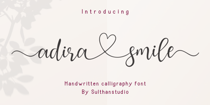 Adira smile is a handmade calligraphic font made with a touch of love in each character with a heart that can be connected to make this font more graceful. This font is perfect for logos, branding, business cards, watermarks, posters and more. Adira smile comes with a full set of uppercase letters, lowercase numbers and punctuation marks, and multilingual support.
 - Wolfgang by Aronetiv,
$9.99 The typeface is influenced by early Italian-French serifs such as Garamond, Jenson, Griffo. The font has clear serifs and slightly sharp shapes. It has a modern character. The font has a uniform texture typical for this type of serif. This font family is well suited for the decoration of solemn and graceful materials. The font has a nice and appropriate italics. Wolfgang is legible and easy to read at small sizes. The font family contains 6 styles The font is equipped with a Variable file. Supports languages ??of central Europe Contains old style figures There are several alternates in the font The font has more than 1000 kerning pairs
 - Railhead by FontMesa,
$25.00Railhead is a revival of an 1870s type style that was originally available from both the Bruce foundry in New York and James Conner's Sons type foundry. The Redux version is the original design but only the uppercase and punctuation were ever created the rest of this font design including numbers, accented characters and lowercase are of my own design. Looking at the original font the inside rails reminded me of a railroad so I created a new version by adding horizontal lines in the lower portion of each letter which resemble railroad ties and Railhead seemed to be the most logical name for this old revival. - Melodia by PintassilgoPrints,
$29.00 This one may look rather strange at a first sight, but it has the true power of coolify written pieces. (Please don’t use it to say “Attorneys’s Conference”, nor “Annual Statement of Accounts”, unless you mean them to be cool, which is very unlikely.) Melodia has 3 glyph drawings for each uppercase letter, 3 more for each lowercase and 2 for the numerals. There are even alternates for punctuation, go figure: there are 3 commas and 3 periods. Surprising. To activate the automatic cycling of all these alternates, simply turn on the Contextual Alternates feature in your application. And it doesn’t hurt to remind: use it only on cool stuff.
