10,000 search results
(0.034 seconds)
- Empirelines by Haksen,
$19.00 Empirelines are the family of blackletter style with Uppercase and Lowercase feel nice balanced. Provide alternates font in lowercase variant style make the design letter looks incredible. Honestly it works perfectly for headlines, logos, posters, packaging, T-shirts and much more. Recommended to use in Adobe Illustrator or Adobe Photoshop with opentype feature. How to access Alternates Character? Open glyphs panel : In Adobe Photoshop choose tool Window >> glyphs In Adobe Illustrator choose toolType >> glyphs If you have questions, just send me a message and I’m glad to help. Have a great day, Haksen
 - New Letter Gothic by ParaType,
$30.00 New Letter Gothic was designed for ParaType by Gayaneh Bagdasaryan based on monospaced Letter Gothic font by Roger Roberson, 1956–62. Due to clear and easy-to-read lettershapes of Letter Gothic the font is rather popular now for display and advertising matters. The idea was to create a font similar to Letter Gothic in lettershapes but with proportional widths of letters. For use in both display and text setting. New Letter Gothic has been adjudged an Award for Excellence in Type Design at Kyrillitsa ’99 International Type Design competition in Moscow, 1999.
 - Savior Sans by Sudtipos,
$39.00 Savior Sans is the third collaboration between Sudtipos and Vástago, this is a 9 weight typeface in 3 different widths, condensed, regular and expanded. Its simple design with open shapes offers a different texture that works in different uses, such as web design, packaging or branding. Savior Sans offers a contemporary look at traditional sans fonts, maintaining the identity in each of its weights. In its variable version, it allows multiple options when designing, adapting to different composition solutions. We hope you enjoy it and get the most out of it.
 - Arquitecta Office by Latinotype,
$16.00 We have adapted the version of our Arquitecta font for use in Microsoft Office™. It only has 4 variants: regular, italic, bold and bold italic. Font weights have been named in a way that can be clearly shown up in the font list in Office™ programs for the sake of a good hierarchy (the bold variant is quite bold and does not look the same as the original font). Arquitecta Office update: Improvements of proportions and drawing. The set was extended to the current one of Latinotype.
 - Crusthy by Scratch Design,
$10.00 Introducing, Crusthy modern handwriting with signature style and brush texture. This font comes with textured handwriting font so natural and this font looks authentic but still readable and incredibly versatile. This font will look outstanding in any occasion design concept, whether it’s being used on colorful backgrounds or as a stand as a headline in a minimalist background! Crushty has multi-language support, swashes, alternate and ligature dan you can apply it in OpenType mode in adobe photoshop or adobe illustrator. Please enjoy the Crushty Font which makes some stunning designs.
 - Academy by ParaType,
$30.00 Academy was designed circa 1910 at the Berthold type foundry (St.-Petersburg). It was based on Sorbonne (H. Berthold, Berlin, 1905), which represented the American Type Founders rework Cheltenham of 1896 (designers Bertram G. Goodhue, Morris F. Benton) and Russian typefaces of the mid-18th century. A low-contrast text typeface with historical flavor. The modern digital version was designed at Poligrafmash type design bureau in 1989 by Lyubov Kuznetsova. Corrections and additions were done later in ParaType in early 2000th. Reworked version with Bold Italic style was released in 2009.
 - Nazhdak by ParaType,
$30.00 Nazhdak is a handwriting sans serif of three styles sketched with a felted pen and digitized afterwards. Designed in 2001 under the impression of Erik van Blockland's FF Kosmik typeface. Nazhdak is searching and investigating boundaries between regular and irregular typefaces. In spite of ragged letterforms and general laxity the face is rather good for small sizes, and in large sizes it completely shows its crude fascination. The main destinations are small informal text compositions and display typography. Nazhdak was designed by Zakhar Yaschin and released by ParaType in 2009.
 - Guminert by Ridtype,
$19.99 The Guminert font is Modern Sans Serif inspired by masculine men, that's why we made this font with all our heart to give a masculine impression in sans serif form. And this font also has Alternate font styles, Ligatures, Multilingual Support and other additional symbols/ characters to use in any of your creative needs in any project. Font Details: Sans Serif Style: 12 Weight (Light - Extra Bold) Release : 03/ March/ 2022 Version: Vol 2.0 Thank you for your support of our products and using them in your creative projects.
 - Monotype Clearface by Monotype,
$29.99A rather narrow and compact design, Monotype Clearface combines both old style and antique characteristics. The lowercase letters are tall, the ascenders and descenders quite short. The intention was to produce a typeface that was easy to read in small sizes, hence the name. Monotype Clearface Bold was first cut for mechanical composition in 1922, and was based on the Clearface Gothic design created by Morris Fuller Benton for ATF in 1910. Although designed as a text face, Monotype Clearface is now more commonly used in advertising and display work. - Skyr Pro by Eurotypo,
$18.00 Skyr is a modern, fun and casual script with a unique and modern look. Skyr family package comes in two styles: regular and italic. Each of these fonts contains 543 glyphs including stylistic and contextual alternatives in uppercase and lowercase, swatches, stylistic sets, standard and discretionary ligatures for a genuine handwriting effect and European central language support. Skyr looks good in children’s books, fashion, magazines, restaurant menus, book covers, wedding invitations, greeting cards, logos, business cards and is perfect for use in designs based on ink or watercolor, and more!
 - Gamundia Pro by RMU,
$50.00 In 2012 the city of Schwäbisch Gmünd will celebrated its 850th anniversary, and in 2014 it was host town to the State Garden Show of Baden-Württemberg. These both celebrations were the background to create a special font for my home town and give it the town’s ancient name. Inspired by Excoffon’s Diane, I drew and digitized a new, multilingual script font which covers the main European languages written in Latin or Cyrillic letters. For users typing in the Serbian language, I recommend to activate the OT feature Stylistic Alternatives.
 - Bannikova by ParaType,
$30.00 Designed at Polygraphmash type design bureau in 1946-51 by Galina Bannikova, inspired by Russian Grazhdansky early- and mid-18th century typefaces as well as Roman Humanist typefaces of the Renaissance. With the archaic features of some characters the face is well recognized because of unique shapes. It is one of the best original typefaces of the Soviet typography. The typeface is useful in text and display composition, in fiction and art books. The revised, improved and completed digital version was designed at ParaType in 2001 by Lyubov Kuznetsova.
 - Broadletter JNL by Jeff Levine,
$29.00Modern digital typography pushes many designers to try and achieve visual perfection with their lettering. In the days of wooden type, the premise was more in creating a font that "sold" the message (possibly, in part due to the lack of advanced tooling to achieve uniformity). In many styles of wood type (such as the one used as a model for Broadletter JNL), there are vast differences within the character design, weight and symmetry from letter to letter. This is now looked upon as "old fashioned" and "charming" - part of the appeal of this typeface. - Silent by Justi,
$20.00 Silent is a semi-serif typeface that combines readability with fluidity in a discreet and clean design. It works great on short texts such as captions, charts and graphs. The soft curves offer a calm rhythm. The design is smooth and bring silence and concentration while reading. Silent Alternates was born from the deconstruction of Silent Light, resulting in a most impressive typeface. Ideal for use in large sizes, such as posters and titles, it is an alternative to italics. It can be used to highlight some words in conjunction with Silent Light.
 - Klagia by Konstantine Studio,
$17.00 Klagia is a font inspired by the advertising media back in 1970. The glory of printing and handpainted signs and visuals. Emphasizing the bold, loud, yet poppin' and modern retro vibes that will be stylish in any era. It makes Klagia a font that you need to have in your design arsenal. Contains a bunch of Ligatures and Stylistic Alternates to give a distinctive vibe in every message conveyed using Klagia font. Perfectly fit for logo, branding, advertising, poster, food and beverages, restaurant, book cover, album artwork, decoration, sign painting, and many more.
 - Sambal Pedas by HansCo,
$12.00 Sambal Pedas is a handwritten font with a dry brush texture. This texture is very detailed. This font looks rough and will be great in any design. It is very recommended to use in crafts, posters, books, branding, quotes, print templates, packaging, invitations, music labels, product label, logo, shirt, magazine or anything else. This typeface comes in uppercase and lowercase, with punctuation, symbols, numerals, swashes and also has multilingual support. Swashes is alternate from numeral 0 - 9, You can access swashes from your OpenType panel in your design software. Enjoy !
 - Sho by Linotype,
$29.99Karl Georg Hoefer’s Sho first appeared in 1992 with Linotype-Hell. The font is a part of the package Calligraphy for Print, which also contains Ruling Script and Wiesbaden Swing. Calligraphy for Print 2 completes the set. These packages offer modern calligraphy fonts particularly well-suited to use in posters, magazines and advertisements. Sho distinguishes itself in the extreme contrast between the strokes. A unique characteristic of the font is the way it uses simple round forms in some of its letters, giving it a peppy and playful feel. - Dungeon by Red Rooster Collection,
$45.00 Dungeon is a glyphic font family that combines elements of both sans serif and spur serif typefaces. It was designed exclusively for the Red Rooster Collection in 1998 by Steve Jackaman (ITF). The family is loosely based on Dick Jensen’s famous design “Serpentine,” which was created for the Visual Graphics Corporation (VGC) in 1972. Dungeon is available in four weights, each of which is optimized for legibility at any size. The family’s masculine feel has helped it to turn up in a variety of projects, ranging from brand identity to advertising.
 - Anything by Supersemarletter,
$10.00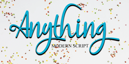 Anything is a handwritten script style in Uppercase and Lowercase feel nice balanced. Provide ligatures with special character make the design letter looks incredible. Honestly it works perfectly for headlines, logos, posters, packaging, T-shirts and much more. Font Features : • Regular version • Character set A-Z in uppercase and lowercase • Ligatures in Lowercase and special • Alternates option • Numerals & Punctuation • Accented Characters • Multiple Languages Supported Recommended to use in Adobe Illustrator or Adobe Photoshop with opentype feature. If you have questions, just send me a message and I'm glad to help.
 - Biscayne by JVB Fonts,
$39.00 Biscayne is inspired by the old and classic Art Deco art and architecture found in some building ads from the 1930's in the Art Deco District of Miami. The name of the font family is one of the most emblematic and representative places in Miami City. Biscayne can be used mainly in titles, display and short texts. This typeface family supports East Europe languages. It also includes standard and discretionary ligatures, alternative style of uppercase, fractions, numerators and denominators, end and/or terminal forms and other OpenType features.
 - Sean Henrich ATF by ActiveSphere,
$30.00 Sean Henrich ATF is a sharp, rounded geometric display font and works best in text and display applications, such as headline, posters, signage, magazine, product branding, corporate branding, logos and titles. Several alternate characters are included in this typeface. Sean Henrich ATF font has six weights; ultra light, extra light, light, regular, bold and extra bold, each available in italic, making a total of twelve styles. Each style has a full upper and lower-case, accents, punctuation and a selection of monetary symbols. Currently Available for PC, in Open Type, PostScript or TrueType.
 - Metalline by Sulthan Studio,
$14.00 Metalline is a modern font typeface that is easy to remember and stylish. A slight wave in uppercase ( alternates ) Ligatures and alternates in lowercase make this font even more unique. It is a mix between classic serif and sans serif. Metalline comes with uppercase, lowercase, numbers, and punctuation marks and language support. This font is perfect for fashion-related branding or editorial design and features both masculine and feminine qualities. HOW TO ACCESS ALTERNATE CHARACTERS Open glyphs panel: In Adobe Photoshop go to Window - glyphs In Adobe Illustrator go to Type - glyphs
 - Dalek by K-Type,
$20.00 DALEK is a distressed, small caps typeface based on the lettering used in the Dalek Book of 1964 and in the Daleks strip in TV21 comic. The fonts have overtones of Greek, Phoenician and Runic alphabets. The updated Dalek fonts contain a full complement of Latin Extended-A characters, and also include Greek capitals and small caps. In addition to the original Regular font, Heavy and Light weights are available, and optically corrected obliques for each weight. Also check out Dalek Pinpoint, a clean and precise version of the Dalek typeface.
 - Congress Sans by Club Type,
$36.99 This sans serif type was completed in 1985, a descendant of the earlier serifed Congress shown for the first time at the Association Typographique International Congress, which proved to be so popular in 1980 at Kiel; designed to present a style equally appealing in European languages. Many characters are more condensed than is usual, while others have been exaggerated. The concept being to bring an equality of importance to the whole, producing a collection of International characters working together in harmony on the page-a common aim that Europeans wish of any Congress.
 - Marazion by Studio K,
$45.00 Marazion takes its name from a Cornish seaside resort in the UK's West Country. It was inspired by some hand lettering I came across at a local inn on the seafront where I was enjoying a lunchtime pint (always a good place to seek inspiration in my experience!) Being based on a hand drawn script Marazion is a smooth, fluid and rounded font that is both fresh and distinctive. Personally, I think it is well suited to applications in food and fashion, but in practice its uses are more or less universal.
 - Dirty Bakers Dozen by Typodermic,
$- Dirty Baker’s Dozen, was released in 1998 and has since become the gold standard in raunchy stencil fonts. This version of Dirty Baker’s Dozen is pants-full of handy symbols, fractions, accents and what not. Need numeric ordinals? Probably not, but if you do, Dirty Baker’s Dozen will be there with boots on and numeric ordinals a-blazing. Two new styles were introduced in 2009: Scorch & Spraypaint. When you're using Scorch or Spraypaint styles in an OpenType savvy application, common letter pairs will be automatically replaced by custom pairs for a more realistic, filthy effect.
 - ASTYPE Ornaments Accolades C by astype,
$40.00 Accolades C and C2 share the same main ornaments but differ in finishing. Accolades C uses pearls and diamonds, C2 does not. Accolades CX is an additional fitting set of borders. All fonts are available in two variations. A clean one and a distressed, grungy version (old). The layout samples from the PDF-specimen are included in the font packages and stored in InDesign CS3 format. Mostly all of the featured fonts of the specimen are available on MyFonts, too. Have a look at Secca Art Std, Secca Saloon Std, Gracia, Battista and Prillwitz.
 - FHA Modernized Ideal Classic by Fontry West,
$25.00 Frank H. Atkinson's book Atkinson Sign Painting was published in 1909. For decades, this book served as the manual for sign painters - a handbook for hand lettering. Atkinson’s book described techniques, layouts and several sample alphabets. Modernized Ideal Classic was inspired by one of these demonstration alphabets. Although Classic has its beginnings in art deco, it is very comfortable in any period or style of design. It is most appropriate in headline and display text, poster copy and signs. We've included some nice stylistic alternates and an interesting array of ligatures.
 - Digideco by astroluxtype,
$20.00 Retro-futuristic robot terminal type. The 1930s Moderne Streamline decade meets the digital domain in this weird font. Use it in an ad for Ford Tri-Motor Airplane or a story about an out of control 1980s computer monster. Which? Help it find its place- as it is lost in time. Digideco is a minimal font set that includes upper and lowercase letterforms which can be used at various sizes but, we consider it a headline/display font, best applied larger than 36 points in size. Shall we play a game?
 - Solidus by Brown Type,
$40.00 Inspired by the heuristic typography of the Concrete Poetry movement, Solidus is a hardworking and unobtrusive sans in the Neo-grotesque style. Its simplified features, generous spacing and squarish curves imbue a sense of sobriety and allow the textual information to take centre stage, whether in body copy or at display sizes. Solidus is available in nine distinctive weights from wafer-thin Hairline to a hefty Black, each with accompanying italics. Typical of the Neo-grotesque style the italics are slanted in construction and have the same advance width as the uprights.
 - Ponzastura by Matyáš Bartoň,
$39.99 Ponzastura typeface was inspired by Aldo Novarese's Eurostile, but in this case, monolinear strokes took on contrast and stress. The classical appearance of Ponzastura, whose name is inspired by the Italian city Pontestura where A. Novarese was born, is more of a reaction and interplay. The character set supports most European languages and contains ligatures as well as symbols, figures and alternative characters. Its strength is in a simplicity and format; recommended for use in headlines or short sentences. Ponzastura typeface can fill in a gap of high-contrasted fonts of nowadays.
 - Mockejoe Font by Tebaltipis Studio,
$13.00 MOCKEJOE FONT was born in the modern era which was inspired by the letters found in various print and digital media. Comes with a modern and futuristic style that will rock your great design! It is suitable for you to use in logotype designs, posters, typography, t-shirts, tickets, and other modern designs. The alternative characters in this font were divided into several OpenType features such as Stylistic Alternates, Stylistic Sets, and Ligature. The OpenType features can be accessed by using the OpenType program such as Adobe Illustrator, Adobe Photoshop, and Adobe InDesign.
 - Vicentina by Eurotypo,
$39.00 Vicentina has been created starting from gothic cursive calligraphy, widely used in Italy during XIV century. The ductus of Vicentina has been derived from the documents redacted by Master Domenico Dominici from Vicenza, while most of the inspiration comes from books preserved in the archives of Orvieto Cathedral (Archivi dell'Opera del Duomo di Orvieto). As a result, Vicentina takes form with an elegant, but fast and simplified ductus respect to gothic graphs, rich in ligatures and with over 400 OpenType glyphs, in perfect harmony with the rules of readability of a modern typeface.
 - Due Credit by Wing's Art Studio,
$6.00 A versatile compressed font for film posters, credit blocks and trailers, Due Credit is a display font specifically designed for the film and television industry. A versatile typeface that’s suitable for bold headline titles and small credit blocks, with an additional horror genre inspired extra style. Watch Due Credit in action in this showreel: https://youtu.be/2XeoqG17wo8 Contents: Due Credit Version One and Two Uppercase Characters Lowercase Capitals Light, Regular, Bold and Extra Bold Weights Additional Cast and Crew Glyphs (simply drop in crew titles in one click) Additional "Horror" genre style with Alternatives
 - Poole Chiselcut by Poole,
$36.00The Poole Chiselcut faces are a useful companion to the regular Poole fonts. In the Standard weight, the diamond shapes inside each character, work toward an elegant, sophisticated look. In the Mid and Heavy weights the chisel cut makes the alphabets look Victorian. In particular, the Heavy weight look is that of a circus letter. Of course the 2 color options for this group are endless. Used in concert with the rest of the Poole Family, or as stand alone fonts, the Poole Chiselcut set is a useful addition to your library. - Tanguera by Sudtipos,
$59.00 While Bellas Artes, Koziupa and Paul's "other" look at intertwined classicism in calligraphy, can be compared to the repeated patterns of standardized dance steps, Tanguera is more like dancers engaged in a free form of the classic Argentine dance. Whether the embrace is open or closed, the walk parallel or crossed, it is still classical tango, with leader and follower blending together, sometimes in relaxed softness, sometimes in alert sharpness, yet never losing the clearest of communication. Tanguera provides essential rhythm to any packaging design that calls for clean and classical personalization.
 - Halis Grotesque by Ahmet Altun,
$19.00 The Halis Grotesque font family comes in eight weights of Normal and Italic. In addition, all weights contain small caps in both italic and normal. The name of the font means “pure, clean.” The Halis Grotesque Font Family has the new Turkish Lira Sign as well as an alternative ampersand created by Prof. Halis Biçer, renowned in Turkey for his expertise in typography, calligraphy, and graphic design. That’s why this font’s name is inscribed with a dedication to the venerable Halis Biçer. The spaces between characters are wide enough to be legible even at very small sizes. With the HALIS GROTESQUE FONT FAMILY, you can create beautiful works for the web, including logos, banners, body copy, and presentations. Halis Grotesque also works nicely in print formats such as posters, T-shirts, magazines, and affiches. Because of its eye-pleasing style, this font is both effective and versatile.
 - Superfont by CozyFonts,
$20.00 Superfont type family, created by Tom Nikosey, California Typographic Designer/Illustrator is based on his design and illustration for the title art for the 1984 movie Supergirl. 'I've always felt someday I would design a complete font with variations, including Euro Glyphs and dingbats and numbers based on that logo and letters'. Cozyfonts Foundry is the manifestation of a career-long desire to create fonts in 2011 with his release of Aladdin Bold font family. Superfont is the 22nd font family release. Superfont has a 1960s superhero feel and movement. The entire font family is italic by style. There's a hint of Retro-Moderne in it's overall look. The 1960s ushered in the supersonic era in travel and technology with the jetset look in fashion, product design, fabric design, and type design. Superfont is Cozyfont's take on that era with the innocent future-forward attitude in it's glyph's personality.
 - ITC Motter Corpus by ITC,
$40.99ITC Motter Corpus was designed by the Austrian type designer Othmar Motter in 1993 to combine the display advantages of a sans serif extra bold design with the legibility of a roman weight. The Motter Corpus is available in the weights regular and condensed regular. The capitals with their strong strokes display slight irregularities and natural looking outlines. When used in very large point sizes the tiny serifs become noticeable. Distinguishing characteristics of this typeface are the unusual design of the g with its upward reaching ear and that of the capital C, whose curve ends in an angular stroke in its upper third. Almost, but not quite, a sans serif, the typeface has diminutive serifs which, along with its modulated weight contrasts, make ITC Motter Corpus remarkable legible in display applications and will give text a nostalgic feel. A similar typeface is Linotype Bariton. - Neuron Angled by Corradine Fonts,
$29.95 Neuron Angled is based in the idea of Neuron, the original font designed in 2012 by Corradine Fonts' team, keeping from its predecessor the proportions and slight narrowness. In this version the rounded edges are replaced by sharp contours and flat endings. A broader typographic system is proposed in Neuron Angled to obtain a versatile and modern typeface without missing its original distinctive style. The neutral aspect of the family allows its application in a wide range of projects specially in those related with branding, signage and editorial design. The Neuron Angled family consists of four styles with eight weights each one, for a total of thirty two fonts. The different fonts of the family are not just complementary to each other, but can be used to complement the original version of Neuron. Its wide character map provides coverage for Western European, Eastern European and Cyrillic scripts.