10,000 search results
(0.019 seconds)
- Infidel by Barnbrook Fonts,
$50.00 Infidel is based upon letterforms from the Lindisfarne Gospels and other manuscripts and bibles from across the Middle Ages. These are wonderfully idiosyncratic forms; some beautiful, others unsightly, but all far away from what we recognise as legible letterforms, today.
 - TT Tsars by TypeType,
$39.00 TT Tsars useful links: Specimen | Graphic presentation | Customization options The TT Tsars font family is a collection of serif display titling fonts that are stylized to resemble the fonts of the beginning, the middle and the end of the XVIII century. The project is based on title fonts, that is, the fonts that were used to design book title pages. The idea for the project TT Tsars was born after a small study of the historical development of the Cyrillic type and is also based on Abram Shchitsgal’s book "Russian Civil Type". At the very beginning of the project, we had developed a basic universal skeleton for the forms of all characters in all subfamilies of the family, and later on, we added styles, visual features, artifacts and other nuances typical of the given period onto the skeleton. Yes, from the historical accuracy point of view it might be that such an approach is not always justified, but we have achieved our goal and as a result, we have created perfectly combinable serifs that can be used to style an inscription for a certain time period. The TT Tsars font family consists of 20 fonts: 5 separate subfamilies, each of which consists of 4 fonts. Each font contains 580 glyphs, except for the TT Tsars E subfamily, in which each font consists of 464 characters. Instead of lowercase characters in the typeface, small capitals are used, which also suggests that the typeface is rather a display than text one. In TT Tsars you can find a large number of ligatures (for Latin and Cyrillic alphabets), arrows and many useful OpenType features, such as: frac, ordn, sinf, sups, numr, dnom, case, onum, tnum, pnum, lnum, salt (ss01), dlig. Time-related characteristics of the subfamilies are distributed as follows: • TT Tsars A—the beginning of the 18th century (Latin and Cyrillic) • TT Tsars B—the beginning of the 18th century (Latin and Cyrillic) • TT Tsars C—the middle of the 18th century (Latin and Cyrillic) • TT Tsars D—the end of the 18th century (Latin and Cyrillic) • TT Tsars E—conditionally the beginning of the 18th century (only Latin) TT Tsars A and TT Tsars B families (both the beginning of the 18th century) have different starting points: for TT Tsars A it is Latin, for TT Tsars B it is Cyrillic. The development of the TT Tsars A family began in Latin, the font is based on the royal serif Romain du Roi. The Cyrillic alphabet is harmoniously matched to the Latin. The development of the TT Tsars B family began in Cyrillic, which is based on a Russian civil type. Characteristic elements are the curved one-sided serifs of triangular characters (A, X, Y), drops appear in the letter ?, the middle strokes ? and P are adjacent to the main stroke. Latin was drawn to pair with Cyrillic. It is still based on the royal serif, but somewhat changed: the letters B and P are closed and the upper bar of the letter A rose. This was done for the visual combination of Cyrillic and Latin and at the same time to make a distinction between TT Tsars A and TT Tsars B. TT Tsars C is now the middle of the 18th century. Cyrillic alphabet itself did not stand still and evolved, and by the middle of the 18th century, its forms have changed and become to look the way they are shown in this font family. Latin forms are following the Cyrillic. The figures are also slightly modified and adapted to the type design. In TT Tsars C, Cyrillic and Latin characters are created in parallel. A distinctive feature of the Cyrillic alphabet in TT Tsars C is the residual influence of the flat pen. This is noticeable in such signs as ?, ?, K. The shape of the letters ?, ?, ?, ? is very characteristic of the period. In the Latin alphabet, a characteristic leg appears at the letter R. For both languages, there is a typical C characterized by an upper serif and the appearance of large, even somewhat bolding serifs on horizontals (T, E, ?, L). TT Tsars D is already the end of the 18th century when with the development of printing, the forms of some Cyrillic characters had changed and turned into new skeletons of letters that we transposed into Latin. The figures were also stylized. In this font, both Cyrillic and Latin are stylistically executed with different serifs and are thus logically separated. The end of the century is characterized by the reduction of decorative elements. Straight, blueprint-like legs of the letters ?, R, K, ?. Serifs are very pronounced and triangular. E and ? are one-sided on the middle horizontal line. A very characteristic C with two serifs appears in the Latin alphabet. TT Tsars E is a steampunk fantasy typeface, its theme is a Latinized Russian ?ivil type (also referred to as Grazhdansky type which emerged after Peter the Great’s language reform), which includes only the Latin alphabet. There is no historical analog to this typeface, it is exclusively our reflections on the topic of what would have happened if the civil font had developed further and received a Latin counterpart. We imagined such a situation in which the civil type was exported to Europe and began to live its own life.
 - Garagin Rock by Rodrigo de Carvalho,
$14.50 Garagin Rock was developed from the studies for the title of a publication called Garagin in 1999. Its use is indicated for the titles on posters and stuff like that, but feel free to dare. Anyway, it really was not made for small sizes and is not a WebFont obviously, but again, feel free to dare. May you notice something odd in the baseline position, this is to keep leading with a defined size. But of course you can change it in any editing program. Being a heavy typeface, use in moderation... or not! Garagin Rock Lite is a version with a limited set of characters.
 - Tin Roof by Jukebox Collection,
$32.99 Tin Roof is a unique and original Jukebox font based on the 1958 hand lettered movie poster from "Cat on a Hot Tin Roof". The slightly modulated baseline and shaky letters give the font both a silly and sinister aspect. Perfect for any dramatic, spooky or sultry subject, Tin Roof has all the allure of a hot southern night! Jukebox fonts are available in OpenType format and downloadable packages contain both .otf and .ttf versions of the font. They are compatible on both Mac and Windows. All fonts contain basic OpenType features as well as support for Latin-based and most Eastern European languages.
 - Plan by Characters Font Foundry,
$17.50 Plan is a corporate typeface made for 'Plan A Ontwerp', a graphic design studio based in Eindhoven, The Netherlands. Based on the rough sketches of the founder of Plan A Ontwerp, Frank Vogt, Characters constructed, mastered and finetuned the complete Plan Family. Plan comes in three versions; Plan A, Plan B and Plan C. All versions can be mixed because they share the same metrics, spacing and kerning. Where Plan A is a strong display type, Plan B has more details and is therefore better suited for longer and smaller texts. Plan C is a decorative stencil version with an own personality and dynamic.
 - Space Time by Lauren Ashpole,
$15.00 What can I say? I like fonts with stars. Space Time is a hand drawn font with a lot of variety. I started designing the regular version with the characters slightly touching but it wasn't quite what I had in my head. I’d imagined tightly spaced letters with overlapping shadows and the only way to get that effect was to create a second version with stackable layers. That means this download includes regular, base, outline, shadow, and stars files. Plus, the base and outline can be used for stacking or work fine as standalone fonts. This font is all caps but the lowercase letters feature alternative styles.
 - Peepz AF by Andrew Foster,
$29.00 Peepz AF features 100 different faces and has been designed to raise much needed money for Keech Hospice Care, a UK charity that runs two hospice services - one for adults and one for children. Their aim is to help patients enjoy the highest quality of life, while providing vital support for their family and friends throughout their loved one's illness and in their bereavement. All of the charity's services are offered free of charge, every single day of the year. This is all made possible because of the generous support of people like you. Profits from the sale of this font will be donated to Keech Hospice Care.
 - Cadmus Pro by Canada Type,
$39.95 Cadmus Pro is the newly remastered and greatly expanded version of a Jim Rimmer design based on a type originally done by hand lettering artist Robert Foster. Foster’s type, named Pericles, was published by ATF in the 1930s, and used in lettering magazines and advertising headings. The design is based closely on early inscriptional Greek. Cadmus Pro comes with over 1130 glyphs, covering pretty much all Latin languages (including Vietnamese) as well as Cyrillic, Greek and Hebrew. OpenType features include stylistic alternates, automatic fractions, ordinals, and small figure ranges for superiors and inferiors. Proceeds from this font will be put towards a variety of Canadian typography education causes.
 - BB Anonym (Pro) by Bold Studio,
$49.00 BB Anonym™ (Std/Pro) is based on the research and realizations of the BB Noname™ Typeface and complements the font family with a rounded version. The idea and design are based on the principle of outsourcing and encryption: an intermediate step in the design process and production is inserted: "Designer, reseller, client". The process is not visible to the end user, but it affects the visual result. Compared to the sharp version, the font looks simpler and the craft and technical requirements are more complex. ● 3 Variants: designer, retailer, client ● 20 Stylistic-sets ● 17 Styles ● 39 OpenType features ● 93 Languages support ● 16,371 Glyphs (963/style)
 - Francker by Linotype,
$29.99 Francker is a sans-serif, based on clean and simple design principles that betray its Danish origin. Its curves are based on the “super ellipse”, a mathematical shape about half-way between an ellipse and a rectangle. Francker’s lowercase lettershapes a, b, n, and u, have no spurs, emphasizing the simplicity of their construction. The Francker family is available in two widths, normal and condensed, each in nine weights, from extra light to extra black. Use Francker for signage, posters, magazines, advertisements, or corporate identity projects—wherever an industrial, contemporary look is needed. The Francker type was developed and designed by Anders Francker, an engineer and designer living in Denmark.
 - Tola by Agnieszka Ewa Olszewska,
$18.00 Tola is a modern, reversed-weight, experimental display font with a spirit of the 70s. Looks better in large sizes but in smaller thanks to the thick bottom makes also interesting effect. It’s based on my letter shape experiment. I was drawing one single letter in the hope to find interesting results. I started Tola font with the letter “G” and based on that shape I created the rest of the alphabet. Tola looks good in modern graphics. It contains uppercase, numbers, and some punctuation signs, and is multilingual. Perfect for logos, posters, and social media graphics that need a super superhero with a sentimental touch.
 - Brownstone Slab by Sudtipos,
$59.00 Alejandro Paul’s Brownstone Slab is based on his own popular, award-winning, Brownstone Sans typeface. Like the original Sans, Brownstone Slab is a 21st-century design, influenced by the Victorian decorative motifs of the ironwork and carved decorations of New York City row houses. Brownstone Slab’s sturdy serifs make it slightly more masculine and solid than its predecessor. As with Brownstone Sans, Brownstone Slab includes character sets for Latin-based languages, including Western and Eastern European, Baltic, Turkish, Maltese, Celtic and Welsh. It includes over 1500 glyphs, including small capitals, swash characters, alternates, and ligatures, in both Light and Thin weights. Ornamental frames are provided in all weights.
 - Monolina by Petra Docekalova,
$29.99 Monolina is a contemporary monolinear script that is based on the contrast between classical (beautiful) calligraphy and quickly jotted manuscript (sketches). As all styles are based on the single stroke of a round nib pen, the letter is rounded. The typeface features two sets of capital and curly uppercase letters, swash characters and alternative lowercase letters, which combine well in three styles. The font also features swash figures and decimal figures for writing years and summer sales. Accent marks for all languages using Latin letters, currency symbols and punctuation marks are included. The typeface comes across as fresh as is particularly effective at headline point sizes.
 - Menhart by Monotype,
$29.99Czech designer Oldrich Menhart (1897-1962) devoted his life to making letters. He was a calligrapher, lettering artist, and typeface designer with over twenty faces to his credit. The Monotype typeface, Menhart, was the second of his designs. Menhart began work on the design in the early 1930s and turned over his final artwork to the Monotype Drawing Office in 1934. The first size cut was 14 Didot (Didot points are the traditional European system of type measure, and are roughly equivalent to the point system commonly used by today's digital fonts). The 14D font was followed by 18D and 24D, indicating that the design was considered most suitable for display work. However, a 10D size was later cut from the same master drawings at the request of a Monotype customer. Menhart's design was light and open, with an even color and a slight squareness" to its round shapes. Because the Czech alphabet has 15 accented letters, Menhart included these diacritics as an integral part of his design, not as an afterthought. As a result, accented copy set in Menhart has a cohesive quality rarely seen in other typefaces. Monotype's new digital release of Menhart is the first revival since the hot metal fonts were cut. Menhart Display is based on the original Monotype drawings, while a slightly heavier, re-spaced version has been created for text sizes. Both versions offer the full capabilities of the OpenType format, such as the automatic insertion of old style figures, ligatures and small caps. In addition to English, the extended character set supports most Central European and many Eastern European languages. One of Menhart's lifelong goals was to share the richness of his Czech culture by drawing typefaces that uniquely served Czechoslovakia literature. In his words: "I believe that a Czech style of type comes above all from the spirit in which it was designed, which gives it its 'signature,' and not so much from decorative composition, and even less from the geographic location of its creation." The typeface Menhart is a tribute to his values. Now, Menhart Pro and Menhart Display Pro capture the unique personality of this timeless design while greatly extending its range of use. " - Walnut by Typodermic,
$11.95 Introducing Walnut—the graffiti typeface that packs a punch! This font was not designed for the faint of heart. It’s tough, rugged and unapologetic. Walnut’s gritty spray-painted look will add a raw edge to your designs that will have people taking notice. With its realistic style, Walnut looks like it just sprang off the wall, ready to wreak havoc on the unsuspecting public. It’s the perfect typeface for any design project that requires a touch of vandalism. From posters to album covers, Walnut will give your work that extra edge that will make it stand out from the crowd. But what really sets Walnut apart are its unique combos. With OpenType ligatures support, Walnut will create custom letter combinations that will appear like they were created on the fly with a can of spray paint. Each character has a distinct personality, making this font perfect for creating custom logos or headlines that demand attention. So why settle for a boring, predictable typeface when you can unleash the power of Walnut? It’s time to take your designs to the next level and make a statement with this tough and gritty typeface. Get ready to make some noise with Walnut! Most Latin-based European writing systems are supported, including the following languages. Afaan Oromo, Afar, Afrikaans, Albanian, Alsatian, Aromanian, Aymara, Bashkir (Latin), Basque, Belarusian (Latin), Bemba, Bikol, Bosnian, Breton, Cape Verdean, Creole, Catalan, Cebuano, Chamorro, Chavacano, Chichewa, Crimean Tatar (Latin), Croatian, Czech, Danish, Dawan, Dholuo, Dutch, English, Estonian, Faroese, Fijian, Filipino, Finnish, French, Frisian, Friulian, Gagauz (Latin), Galician, Ganda, Genoese, German, Greenlandic, Guadeloupean Creole, Haitian Creole, Hawaiian, Hiligaynon, Hungarian, Icelandic, Ilocano, Indonesian, Irish, Italian, Jamaican, Kaqchikel, Karakalpak (Latin), Kashubian, Kikongo, Kinyarwanda, Kirundi, Kurdish (Latin), Latvian, Lithuanian, Lombard, Low Saxon, Luxembourgish, Maasai, Makhuwa, Malay, Maltese, Māori, Moldovan, Montenegrin, Ndebele, Neapolitan, Norwegian, Novial, Occitan, Ossetian (Latin), Papiamento, Piedmontese, Polish, Portuguese, Quechua, Rarotongan, Romanian, Romansh, Sami, Sango, Saramaccan, Sardinian, Scottish Gaelic, Serbian (Latin), Shona, Sicilian, Silesian, Slovak, Slovenian, Somali, Sorbian, Sotho, Spanish, Swahili, Swazi, Swedish, Tagalog, Tahitian, Tetum, Tongan, Tshiluba, Tsonga, Tswana, Tumbuka, Turkish, Turkmen (Latin), Tuvaluan, Uzbek (Latin), Venetian, Vepsian, Võro, Walloon, Waray-Waray, Wayuu, Welsh, Wolof, Xhosa, Yapese, Zapotec Zulu and Zuni.
 - Ministry by Device,
$39.00 A 14-weight sans family based on the original British ‘M.O.T.’ (Ministry of Transport) alphabet. A capitals-only, single-weight design was drawn up around 1933 for use on Britain’s road network, and remained in use until Jock Kinnear and Margaret Calvert’s ‘Transport Alphabet’ was introduced for Britain's first motorway in 1958. The identity of the original designer is not preserved; however, Antony Froshaug in a 1963 ‘Design’ magazine article mentions Edward Johnston as an advisor. Speculation that it was based on Johnston’s London Transport alphabet is discussed in archived government documents from 1957: “So far as I am aware, the Ministry alphabet was not based on Johnston’s design; indeed, it has been suggested that Gill got his idea from Johnston. Our alphabet was based on advice from Hubert Llewellyn-Smith (then chairman of the British Institute of Industrial Art) and Mr. J. G. West, a senior architect of H. M. Office of Works.” A 1955-57 revision of the alphabet which polished the somewhat mechanical aspects of the original may be the work of stone carver and typographer David Kindersley. For the digitisation, Rian Hughes added an entirely new lower case, italics and a range of weights. The lower case mimics the forms of the capitals wherever possible, taking cues form Gill and Johnston for letters such as the a and g, with single-tier versions in the italic. A uniquely British font that is now available in a versatile family for modern use.
 - 1769 by Almarena,
$22.00 1769® Display is an elegant and modern serif typeface inspired by the history of France and more particularly the Romantic movement (1700s and 1800s). The roundness of its characters and its numerous ligatures reflect the grace, refinement and sensitivity that were omnipresent during the 18th century. Its name refers to the birth of Napoleon Bonaparte, the fascinating or revolting emperor, the emblematic figure of this period.
 - Monire by Pandastock,
$12.00 Monire is a modern typeface with visual elegance, smooth curves, and beautiful ligatures clear, making your work look true and attractive. A very versatile font that works in both large and small sizes. This font is suitable for a wide variety of projects such as invitations, logos, branding, magazine, photography, card, product packaging, mugs, quotes, poster, labels, signatures, and more. Font which is perfect for all business
 - Automoto by Device,
$39.00 Automoto is built from a limited number of curved and straight segments that have been flipped and rotated. It has an extensive set of two- and three-letter ligatures that form a triple ribbon resembling a model car racetrack. For clarity, some character combinations were excluded as they proved to be ambiguous in context. The upper- and lowercase characters can be freely intermixed according to taste.
 - WBP Red Tape by Studio Jasper Nijssen,
$20.00 A wise orange cat said once: There are three things certain in life. Death, taxes and teddy bears. The closest thing to a fourth is red tape. Restricting you, bounding you to the rules of a bureaucratic organisation. My advise, carry a scissor with you all the time to cut through it. WBP Red Tape is a great monospace font specifically designed for headings and logo design.
 - Glamorise by UICreative,
$23.00 Introducing our new product the name Glamorise Classic Serif Font Font. Modern Serif font that feels beautiful classy, elegant, and modern. This font is perfectly suited for a wide variety of projects, such as signature, stationery, logo, wedding, typography quotes, magazine or book covers, website headers, clothing, branding, packaging design, and more. Also for fashion-related branding or editorial design and displays both masculine and feminine qualities.
 - Merced by Latinotype,
$49.00 A fresh, curly and delicious sans serif. Designed by Daniel Hernandez, Merced is a sans serif font that can be given different uses due to its wide variety of alternate types. Its main virtue is the endless number of possibilities for you to write words, texts or paragraphs. Languages include: Basic Latin, Western European, Euro, Catalan, Baltic, Turkish, Central European, Romanian and Pan Africa Latin.
 - Torrid Tango JNL by Jeff Levine,
$29.00 1920s-era sheet music for "Tangos Pour Manon" from Brussels, Belgium had the title hand lettered in an unusual style. The alphabet was square, had serifs and the thick-and-thin stroke weights that were more popular in the upcoming Art Deco years of the 1930s and 1940s. This became the working model for Torrid Tango JNL, which is available in both regular and oblique versions.
 - Trocadero Pro by RMU,
$35.00 In 1927 Albert Auspurg cut Trocadero for the Trennert foundry in Hamburg. This new version is not a mere digitalization, but many letterforms were altered and updated, and missing links in the complete alphabet had been drawn afresh. Out came a beautiful cursive font with a certain charm of its own which covers beside the West European languages also those of Central Europe and Turkish.
 - Centrasone by UICreative,
$23.00 Introducing our new product the name CENTRASONE Vintage Ligature Serif Font. Modern Serif font that feels beautiful classy, elegant, and modern. This font is perfectly suited for a wide variety of projects, such as signature, stationery, logo, wedding, typography quotes, magazine or book covers, website headers, clothing, branding, packaging design, and more. Also for fashion-related branding or editorial design and displays both masculine and feminine qualities.
 - Frozenca Script Typeface by UICreative,
$23.00 Introducing our new product the name Frozenca Modern Serif Display Font. Modern Serif font that feels beautiful classy, elegant, and modern. This font is perfectly suited for a wide variety of projects, such as signature, stationery, logo, wedding, typography quotes, magazine or book covers, website headers, clothing, branding, packaging design, and more. Also for fashion-related branding or editorial design and displays both masculine and feminine qualities.
 - Organico by Meat Studio,
$17.50 Organico was created as an organic, hand made font. It is designed to be adaptable and useable across a wide range of markets, brands and disciplines. It has upper and lowercase characters with alternatives for all, as well as all the other glyphs you’d expect. It also utilises a number of opentype features, such as standard and discretionary ligatures, contextual alternates and stylistic sets.
 - Rude ExtraWide by DSType,
$50.00 Rude was designed as a dichotomy between the Grotesque and Humanistic typographic shapes: a no-nonsense Sans and a very muscular Slab Serif companion. Showing the historically demanded consistency for such kind of typefaces, this is one of DSType's most wide-ranging and flexible type systems, introducing seven weights across seven widths, from Thin to Black and ExtraCondensed to ExtraWide, along with a wonderful set of Icons.
 - Nala Junior by Sipanji21,
$16.00 Nala Junior is a chubby, fun and charming display font. Its simple and friendly style makes this design incredibly versatile, fitting a wide variety of creative ideas. If you have any queries, questions, or issues please don't hesitate to contact us direct. Download within a few clicks and use across a huge range of programs including Photoshop, InDesign, Illustrator, and Microsoft Word as well as many more.
 - RMU Koralle by RMU,
$25.00 Koralle was an abundant family of grotesque font styles which had been released by Schelter & Giesecke in the first quarter of the previous century. Out of this family four of the most impressive styles were revived, whereby I stuck as close to the original as possible. All styles contain even the weird-looking capitalized German double-s of which I am a strong opponent.
 - Methadone by UICreative,
$23.00 Introducing our new product the name Methadone Modern Serif Font. Modern Serif font that feels beautiful classy, elegant, and modern. This font is perfectly suited for a wide variety of projects, such as signature, stationery, logo, wedding, typography quotes, magazine or book covers, website headers, clothing, branding, packaging design, and more. Also for fashion-related branding or editorial design and displays both masculine and feminine qualities.
 - Morona by Arterfak Project,
$24.00 Morona is a beautiful, classy, and chic font with an elegant and minimalist design, making it perfect for creating stunning design projects, especially in logos, displays, fashion, wedding, lifestyle, and branding. This font contains numerous special characters, providing satisfying results. Moreover, Morona includes a wide variety of ligatures, allowing you to achieve a magnificent look on your posters, cards, logos, quotes, invitations, books, prints, packaging, and more.
 - Anthelion by UICreative,
$23.00 Introducing our new product the name Anthelion Modern Retro Serif Font. Modern Serif font that feels beautiful classy, elegant, and modern. This font is perfectly suited for a wide variety of projects, such as signature, stationery, logo, wedding, typography quotes, magazine or book covers, website headers, clothing, branding, packaging design, and more. Also for fashion-related branding or editorial design and displays both masculine and feminine qualities.
 - P22 Parrish by P22 Type Foundry,
$24.95 Maxfield Parrish (1870-1966), whose career spanned nearly ninety years, holds a unique place in American art and culture. He was enormously accomplished and successful in both fine art and commercial endeavors. Parrish's hand-drawn letters were a significant part of his works, which bridged the familiar with a startling otherworldliness. P22 has created the Parrish font set in cooperation with the National Museum of American Illustration.
 - Caballero Script by T4 Foundry,
$21.00 Caballero Script is a calligraphic font from from Swedish type designer Bo Berndal and the T4 font foundry. Caballero is inspired by Spanish handwriting from 15th and 16th century, minus the extremely long ascenders. If it would be music or a dance, it would be a Flamenco – there is fire as well as discipline. It is an OpenType creation, for both PC and Mac.
 - Mymoon by Tour De Force,
$25.00 Mymoon is geometric modern sans serif family that comes in 22 weights. Aimed for universal use, in any size and in any media. It has slight retro characteristics and mostly neutral overall impression. With wide range of thickness, from Thin to Heavy, all weights are well synchronized to match ideally. Contains extended Latin character set with OT features such as OldStyle and Tabelar numerals and fractions.
 - Rude Condensed by DSType,
$50.00 Rude was designed as a dichotomy between the Grotesque and Humanistic typographic shapes: a no-nonsense Sans and a very muscular Slab Serif companion. Showing the historically demanded consistency for such kind of typefaces, this is one of DSType's most wide-ranging and flexible type systems, introducing seven weights across seven widths, from Thin to Black and ExtraCondensed to ExtraWide, along with a wonderful set of Icons.
 - Bookbag by Letradora,
$15.00 Bookbag is a font for teaching kids to read and write. It comes in 4 weights, from light to extrabold, and has dotted and lined versions for students to practice. Many glyphs have alternate versions, that can be accessed either through OpenType stylistic alternates, or using the Alt versions of the font. Bookbag has a very wide language support, with most latin languages supported.
 - Displayer by Tour De Force,
$30.00 Displayer font family is modern, wide and sans serif family available in 7 weights and Variable type file. It’s strong, stable, compact, futuristic family with some specific letter design and generous ink-trap. With it’s display charm, Displayer fits perfectly into any branding project – use it in posters, package, website, logo, video games, magazines. Contains fractions and standard ligatures with Extended Latin character map.
 - Pertoneum by UICreative,
$23.00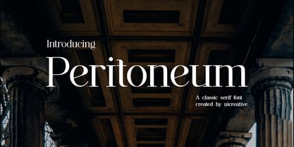 Introducing our new product the name Peritoneum Clasiss Serif Font. Modern Serif font that feels beautiful classy, elegant, and modern. This font is perfectly suited for a wide variety of projects, such as signature, stationery, logo, wedding, typography quotes, magazine or book covers, website headers, clothing, branding, packaging design, and more. Also for fashion-related branding or editorial design and displays both masculine and feminine qualities.