10,000 search results
(0.051 seconds)
- Fence Post JNL by Jeff Levine,
$29.00 The inspiration for Fence Post JNL comes out of an early 1900s manual for sign writing. A number of changes were made to make the design more aesthetically pleasing, but it retains its novelty effect of evoking the look of wooden fence posts or Western-themed typography.
 - Konscript by Michael Browers,
$25.00Konscript is a distressed typewriter face developed from analog samples from papers Mary Browers typed in the 1950s for her high school coursework. The model and age of the typewriter are not known. Additional characters were developed based on the analog samples to complete the character set. - Sign Project JNL by Jeff Levine,
$29.00 Sign Project JNL is based on vintage water-applied decals once made by the Meyercord Decal Company of Chicago (and later Carol Stream), Illinois. These decals were popular during the 1950s and 1960s for window signage, boat identification, mailbox names and numbers and hundreds of other projects.
 - Stencil Sheet JNL by Jeff Levine,
$29.00 Stencil Sheet JNL was modeled from an antique brass stencil sign that was custom hand punched for the customer. Sets of punch dies were available for years that allowed rubber stamp shops and similar trades to make custom stencils out of sheets of zinc or brass.
 - Fallaxe Drip Graffiti by Sipanji21,
$13.00 Fallaxe Graffiti is a spectacular, with bold graffiti display font, there are two style font inside, normal style and dripping style. It will elevate a wide range of design projects to the highest level, be it branding, headings, wall art illustration, apparel, labels, and much more!
 - Jelly Boots by Awan Senja,
$14.00 Jelly Boots is a cute display font, carefully created to become a true favorite. Its casual charm makes it appear wonderfully down-to-earth, readable and, ultimately, incredibly versatile. This versatility will appeal to a wide range of crafty ideas, from letterheads and titles, to stationery.
 - Oyster Lake by Olivetype,
$18.00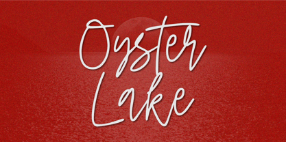 Oyster Lake is an elegant signature script font. This versatile script font has a wide spectrum of applications ranging from greeting cards, product branding to headlines and more. So what’s included : Basic Latin A-Z & a-z Numbers, symbols, and punctuations Ligatures Accented Characters : ÀÁÂÃÄÅÆÇÈÉÊËÌÍÎÏÑÒÓÔÕÖØŒŠÙÚÛÜŸÝŽàáâãäåæçèéêëìíîïñòóôõöøœšùúûüýÿžß Thank you
 - Some Assembly by Open Window,
$14.95 Some Assembly is a sans serif printer font which ran into a few problems when it came time to print. Offered with a wide range of distressed styles. It is a pleasantly styled geometric face which is highly legible and its various styles provide dynamic alternatives.
 - Fashion Statement JNL by Jeff Levine,
$29.00 An example of hand lettering from a vintage instructional book was the basis for Fashion Statement JNL; available in both regular and oblique versions. This extra-wide "thick and thin" design is perfect for replicating the classic signage and print work of the Art Deco era.
 - Kargo Sans by iframe,
$69.00 IF Kargo Sans Clean and Highly Professional. This sans serif typeface includes nine (9) weights and variable format. Aims to serve a wide variety of graphic styles, branding, logotype, packaging, ecommerce in modern way. 9 weights Variable Upper / lower case, numbers, punctuation Language support: Latin and Greek
 - Arco Crayon by Okaycat,
$29.95 Real crayons were used in the making of this font. Yes, design can be fun again! Need to create the textured look of crayon, chalk, conte, or charcoal? Use Arco Crayon. Arco Crayon is extended, containing West European diacritics & ligatures, making it suitable for multilingual environments & publications.
 - Shady Characters JNL by Jeff Levine,
$29.00Shady Characters JNL places type against a simulated halftone background to produce a "ribbon" with black and white visual contrast. By typing the left bracket key, you produce a wide space for between the words. A narrower space is on the right bracket key. Limited character set. - Wolf Paul by Olivetype,
$18.00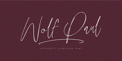 Wolf Paul is an elegant signature script font. This versatile script font has a wide spectrum of applications ranging from greeting cards, product branding to headlines and more. So what’s included : Basic Latin A-Z & a-z Numbers, symbols, and punctuations Ligatures Accented Characters : ÀÁÂÃÄÅÆÇÈÉÊËÌÍÎÏÑÒÓÔÕÖØŒŠÙÚÛÜŸÝŽàáâãäåæçèéêëìíîïñòóôõöøœšùúûüýÿžß Thank you
 - Chunder by Chank,
$49.00Created in Minneapolis in 1996, Chunder is inspired by the hand-painted cursive signage of urban boutiques where a shopkeeper can't afford to hire a very good sign painter. Kinda clunky, kinda flowery. Like beer spilled on a daffodil. "It's not pretty, but it's mine," says Chank. - Summer Story by AEN Creative Studio,
$14.00 Summer Story is a delicate, elegant and flowing handwritten font. It has beautiful and well balanced characters and as a result, it matches a wide pool of designs. Summer Calling is PUA encoded which means you can access all of the glyphs and swashes with ease!
 - Superion by Subectype,
$19.00 Superion is a supercharged, street-wise brush font bursting with energy. Extra attention was given to quick strokes and sharp details. This font is perfect for challenging jobs, titles, t-shirts, websites, hoodies, clothing, headline, logotype, branding, advertising, event and various energetic print and digital media projects.
 - Ela by Wiescher Design,
$39.50 Ela is the typeface I originally designed for the business of my second wife and mother of my two sons, her name is of course Michaela. Ela the typeface is suitable for magazines, newspapers, posters, advertiments, books, text, documentation/business reports, business correspondence, multimedia, and corporate design.
 - Mineola by Haiku Monkey,
$10.00 Mineola got tired of being like all the other serifed fonts, got some hip body art, and moved to the cool part of town. But every so often, when no one's watching, Mineola puts on a light blue oxford shirt and listens to top 40 radio.
 - Linotype Albawing by Linotype,
$29.99Linotype Albawing is the text type that is derived from the original idea for Linotype Albatross. The sketches were done with Fontographer 3.5 using the simplified outlines of Linotype Albatross. Linotype Albawing is an agile, lively and elegant font and well-suited for headlines, posters and advertisements. - Springfield by ITC,
$29.99Springfield is a narrow, western-style display face from Bob McGrath. The design recalls wood types that were popular during the late 19th and early 20th centuries, but which also found resonance during the 1970s. Use Springfield to liven up otherwise dull headline and logo projects. - P22 Ridley by IHOF,
$24.95 Ridley is a calligraphic-influenced, decorative, medieval font combining Roman and Gothic forms. It is named for Nicholas Ridley and similar in style to Staunton’s Latimer font. Ridley and Latimer were protestants burned together at the stake in 1555 during the reign of Queen “Bloody” Mary.
 - Orange Mochi by RA Studio,
$14.00 Flying, elegant, handwritten font Orange Mochi. The font is built on the basis of personal handwriting, has narrow and wide glyphs, brave external elements, alternative letters and funny ligatures. The font works well in an array of text, titles and logos. Display font Extended latin & cyrillic
 - Trailer Park Numerals by Coniglio Type,
$9.95Trailerpark numbers 0-9 were rather old fashioned 1950's cut aluminum numbers, you've seen digitized nowhere else but here! Part of Market LTD, a collection of limited faces, mostly alpha-numeric and some just plain numeric, used primarily in retail and display situations and titling. - Lard Pro by The Type Fetish,
$25.00 Lard Pro Regular is an extreme contrasted extra black typeface designed for usage at larger sizes. Lard Pro Bold is an extra black typeface designed for usage at larger sizes. They contain extended Latin, Cyrillic and Greek alphabets to support a very wide range of languages.
 - Biosphere by Fype Co,
$16.00 Biosphere is inspired by industrial style typeface that's will give look a modern and technical industrial display font. That will take any design idea to the next level, covering a wide range of project types such as poster design, book covers, prints, headlines, id cards, packaging, branding.
 - Overmind Demons by Sipanji21,
$19.00 "Overmind Demond" is a striking display font designed with a futuristic theme in mind. Its sleek and modern letterforms exude a sense of technological advancement and innovation, making it a perfect choice for a wide array of design projects centered around futuristic concepts or space exploration.
 - Bluesman JNL by Jeff Levine,
$29.00 The classic blues album "I'm Jimmy Reed" released on the legendary Vee-Jay label out of Chicago featured title lettering in a bouncy, fun, casual take on the classic Latin Wide style of alphabet. Bluesman JNL offers a full digital typeface based on that album titling.
 - Assay by Solotype,
$19.95This is our name for Antique Tuscan, of which there were many variations. This font came from a large lot purchased around 1970 from an east coast newspaper shop. Subsequently, we acquired several more versions of the face, but this one had lowercase so we used it. - Hiragino Sans TC by SCREEN Graphic Solutions,
$200.00 Hiragino Sans Traditional Chinese is a traditional Chinese font that inherits design characteristics from the Hiragino Sans (Kaku Gothic). The font satisfies the rising demand for a high-quality Big 5 embedded font for multilingual products, allowing it to be utilized in a wide range of applications.
 - Nove by FSD,
$50.00 Designed for "Milano Kalibro Kobe" a Nike advertising campaign. A geometric font inspired by b-movie typography. The glyphs were designed using an unusual method: at a glance it seems a drafted design but if you look closely you will discover how much the geometry is complex.
 - Sleuth JNL by Jeff Levine,
$29.00 The movie trailer for the1936 film "After the Thin Man" is filled with text lettered in this classic Art Deco condensed typeface. Sleuth JNL seems the appropriate name for this digital revival, as the romantic comedy centers around detective Nick Charles' and his wife Nora's adventures.
 - Vivala Old by Johannes Hoffmann,
$11.00 The Vivala old black letter font family is characterized by its hard-cut lines. This gives the typeface a special woodcut-like character. The typeface family offers a wide range of possibilities for design. It works well for posters, packaging, and corporate design for restaurants or breweries.
 - Sodra by Harvester Type,
$20.00 Sodra is a wide-accented antiqua with sharp serifs and hints of futuristic forms. This typeface emerged from a passage in the Manifesto del Futurismo by Filippo Tommaso Marinetti. One short word was the inspiration and the guidance for the creation of this font. An attempt to create something unique and distinctive, an attempt to add a bit of futurism to something historical. The special aesthetics and expressiveness the type conveys will make you look closely at each letter and draw attention to your design. The font has been in development for a long time and painstaking work has been done on it. Large language support, about 470 characters and almost 4,000 kerning pairs. Hinting and testing the font itself in business and in a wide variety of applications. The uses of the type are very wide. Whether it's a branding, logo, identity or merch, a headline or product design. The nature of typeface is not limited to something rough and gloomy, on the contrary, it all depends on how you look at it. I've shown you my point of view, you in turn will see yours!
 - Ciseaux by Wilton Foundry,
$29.00 Ciseaux was inspired and is dedicated to the art of paper cutting. Early paper cutting artists were often royalty, but it soon became a folk art practiced by commoners whose cutouts decorated their homes. By the seventeenth century it had spread throughout the world. The Japanese called it Mon-kiri, the German's Scherenschnitte and Turkey even boasted a guild devoted to the art form. In Poland the designs were traditionally symmetrical and often used layers of colors to form pictorial collages. When Russian invaders confiscated scissors, villagers were found to cut their intricate designs with sheep shears! The art form later developed into cutting out elaborate designs of nature scenes and people, celebrating special occasions and even decorating legal documents. Ciseaux letterforms mimic paper cutting art in its shapes with a rather loose and almost joyous rhythm. The overall effect is somewhat earthy and natural yet it has an element of sophistication that cannot be ignored. Just like paper cutting, Ciseaux can be used for special occasions like invitations, brochures, identities, restaurant menus, and if you dare, some awesome looking paper graffiti. Available in TT, PS and Opentype for Mac and Windows.
 - URW Dock by URW Type Foundry,
$35.99URW Dock is a contemporary geometric type family inspired by the square sans typefaces of the 60s, notably the Eurostile, which is still used in countless applications to the present day. Designed to meet today's requirements for a multifunctional font, this reinterpretation includes numerous enhancements and optimizations to ensure a professional use in today's digital age. Including a wide range of styles, an extended character set and a careful composition, it has the potential to give brands, artworks, and interfaces a modern, professional and unique touch. Its high legibility and clear informative and technological appearance are perfectly suitable for infographics, signage and way-finding systems. And especially when embedded in app, gaming and infotainment software it will display its strength. While the upright styles communicate a clear, professional and informative message, the italics express a technological, dynamic and forward-thinking spirit. An extensive language support, several figure sets and a wide range of OpenType Features will make the URW Dock font family a perfectly suitable partner for a wide range of print, web and app projects. For more information please have look at the URW Dock PDF Type Specimen. - Amitale by Hackberry Font Foundry,
$24.95 Amitale (A-mi-tah'-lay) is the union of Amitale Book and Amitale Wide into a new 8-font book family in my continuing objective of designing a better font family for readability in booklets. My goal here is for a full range of styles from light, regular, bold, and black without the plugged counters and clunky feel of most bold fonts. In my use, personally. I do not use Amitale Book Bold. I use Wide for the bold and Wide-Bold for the black style. In many ways, Amitale is Brinar with bracketed serifs. Many people find Brinar to be an exceptionally readable and beautiful humanist sans. This new serif font family has many of the same characteristics. This is also the debut of my new OpenType features set for 2009. There are more and more ligatures for your fun and enjoyment: bb gg ff fi fl ffi ffl ffy fj ft tt ty Wh Th and more. Like all of my fonts, there are: caps, lowercase, small caps, proportional lining figures, proportional oldstyle figures, & small cap figures, plus numerators, denominators, superiors, inferiors, and a complete set of ordinals 1st through infinity.
 - Ornery Polecat JNL by Jeff Levine,
$29.00 In January of 2006, Jeff Levine fonts debuted with ten releases. Many of those first fonts were based on vintage lettering stencils, which were the "school years" catalyst for Jeff's interest in lettering and type design. Eight years later, his collection of fonts has become a giant catalog of display type ranging from Wood Type revivals to Art Nouveau, Art Deco to stencil, reinterpretations of old favorites, experimental fonts, dingbat fonts and typefaces reflecting a particular decade's styles of cultural popularity. Designs from old lettering books, type catalogs and advertising have also been fodder for many alphabets not previously available in a digital format. Along the way, many unusual lettering sources were also mined for type ideas. Vintage packaging, hand-lettered signage, sign making kits, rubber stamp type, water applied decals and at times just a singular letter example inspired many of the releases within this collection. It was a source of pride for Jeff Levine Fonts to reach 500 releases and a determined goal to grow the type library as far as possible. With this in mind, February 2014 brings forth many new releases. This one in particular, Ornery Polecat JNL, is the 800th typeface release from Jeff.
 - Blanchard by Canada Type,
$39.95 Blanchard is a revival and elaborate extension of Muriel, a 1950 metal face made by Joan Trochut-Blanchard for the Fonderie Typographique Française, that was published simultaneously by the Spanish Gans foundry under the name Juventud. Blanchard is a script that embodies the post-war narrow decorative aesthetic that would become the instantly recognizable feature of that era’s design. Its high ascenders corners make it the tuxedo of fonts, with slight and casual angles gradually revealing a trustworthy confidante, and sharp corners signaling a most expressive ally. Font. James Font. This digital version updates the original metal shapes to work within today’s design tools and designer needs. Some of the questionable metal shapes were optimized, plenty of alternates were added, and as many as five ending forms were built for most lowercase letters. Overall, this is one of the most useful packages for book cover, magazine and packaging design. Blanchard is available in all popular formats. Blanchard Pro combines all five fonts into a single one that makes use of OpenType’s cross-platform compatibility and programs that support OT’s fine typography features, like recent versions of Adobe InDesign and QuarkXpress.
 - Mynaruse Royale by insigne,
$22.00 Mynaruse Royale is an expansion of Mynaruse Titling. It features script capitals and widely tracked and smaller titling capitals. Mynaruse Royale has plenty of character and, with its powerful and sharp serifs it draws in the eye. Mynaruse Royale is useful in settings that call for titling with an extra touch of elegance, such as a storefront, wedding program or formal invitation. Mynaruse Royale contains a number of OpenType alternates, including alternate forms for the capitals that are large, drop cap like capitals instead of the calligraphic script capitals found in the default forms. Additionally, there are non-widely tracked lowercase forms that work well with the included alternate characters and ligatures. The lowercase forms are 80% smaller in height than the Mynaruse lowercase forms, so the families are not interchangeable, but they can be used together. The calligraphic script capitals could also be used separately as drop capitals. OpenType-capable applications such as the Adobe suite or Quark can take full advantage of automatically replacing ligatures and alternates. This family also includes the glyphs to support a wide range of latin based languages.
 - Broadgauge Ornate by FontMesa,
$25.00Broadgauge Ornate originated from MacKellar, Smiths & Jordan in 1869 and was only available as an all caps font with numbers. Today this old beautiful wood type rises again from the archives complete with original numbers and an all new lowercase. An all caps Greek character set has also been added plus accented characters for western, central and Eastern European countries. Included in each font file are two sets of left and right pointing hands located on the Less Than and Greater Than keys and also on the Bracket keys. Because this font works well with a Las Vegas theme I've decided to make the pointing hands gambling related with one set of hands rolling dice and the other holding cards. The condensed versions were created because in today's computer graphics applications people stretch and condense fonts to fit their project but don't notice the change in vertical stroke widths or line thickness. After compressing the letter shapes of each Broadgauge Ornate condensed font the vertical lines were corrected making sure they were the proper width or thickness. The results are balanced condensed versions that weren't simply compressed with out consideration for their appearance.