10,000 search results
(0.021 seconds)
- Copperplate Classic Light by Wiescher Design,
$88.00 Copperplate was the classic nineteenth century engraver's typeface, consisting of capitals and small caps only. Among others (for example Deberny & Peignot) F. W. Goudy's cut for ATF around 1901 is probably the most widely known. Copperplate typefaces are traditionally used for business cards and all that "serious" stuff. My Copperplate Classic is a completely new design, based on some old samples. To make it look more up-to-date and elegant, I gave it some extra swings here and there. The old fonts were all designed with clogging corners or points that can break off in the minds of its designers. Today we do not have those problems any longer, so I could give my Copperplate Classic real sharp pointed serifs. To give you more choice I now added this light cut in three variations, light, sans and rounded! Enjoy! Gert Wiescher
 - Space Traveler JNL by Jeff Levine,
$29.00 The 1990s was a time of creativity, experimentation and exploration into the world of digital typography by amateur and professional alike. Ray Larabie [through his Larabie Fonts] offered dozens upon dozens of wide-ranging (and often most unusual) freeware fonts. Ray was the driving force of encouragement and a behind-the-scenes “mentor” who helped Jeff Levine Fonts get underway in January of 2006. As his focus changed to high-quality commercial type with the launch of Typodermic, Inc., many of Ray’s “less than perfect” font experiments were withdrawn. He eventually turned those typefaces into a bundled zip archive released into the public domain through Creative Commons. “Webster World” resembles a fusion of Techno and Western styles. With Ray's permission, the original characters have been cleaned up and re-made as Space Traveler JNL, which is available in both regular and oblique versions.
 - Diecast by Device,
$39.00 A companion piece to Mulgrave, this font is the intermediary design between the chunky Victorian style that Mulgrave reproduces and the Ministry of Transport sans introduced in 1933 and digitised as Ministry. Although they date from between 1910 and 1933, these signs show the beginnings of several features Ministry later incorporated, notably the thinner strokes and the more modern forms of the G, M, R and S. The letter widths are approaching a monospace - the L, F and E are relatively wide compared to the W and M, a feature that may have something to do to the casting process. These idiosyncracies were all ironed out when the first version of the MOT alphabet was produced. The Device digitization, as with Mulgrave, stays true to the worn and repainted original metal source material and preserves the unusual widths.
 - LFT Etica by TypeTogether,
$35.00 LFT Etica, the-moralist-typefamily-project, was born at the end of 2000, but its development is ongoing, overcoming many hurdles and diversions. The starting point for the designers at Leftloft were the common "cold" grotesk sans serifs, ubiquitous and often badly applied in their everyday visual environment. The challenge was to obtain the same force, versatility and color, but with a much warmer feel. The resulting design has soft strokes, open counters and terminals; aesthetically resting somewhere between a grotesque and humanist sans serif. It successfully combines masculine force with female delicacy. LFT Etica’s wide range of styles, together with a large character set and OpenType features, such as 4 sets of numerals, fractions, several stylistic alternates and a set of arrows and dingbats, allows for a vast variety of applications, be they editorial or corporate.
 - ITC Rastko by ITC,
$29.99ITC Rastko began as a series of initial letters for a book of poetry. Serbian designer Olivera Stojadinovic had been working with a small publishing house creating a special series of books under the Masterpieces" brand. Her goal was to draw a new set of initial letters for each book. ITC Rastko, named after the Serbian poet Rastko Petrovic, was a project that required initial letters for the entire alphabet. Once Stojadinovic had drawn the majority of the capital letters, she realized that a companion lowercase would make a distinctive script typeface. Sketches of the letters were drawn quickly with a pointed pen. Stojadinovic then refined these, keeping the spontaneous, hand-drawn quality. Capitals are wide and flourished, while the lowercase letters are more condensed and subdued. It's no surprise that the capitals also make great initial letters." - Litza by Marianna Orsho,
$35.00 Litza is a layered, condensed, all-caps cross stitch display type family. It is made up of 10 layers that show different stages of stitching and can be stacked, moved around, and coloured separately in order to create interesting effects. The ten layers come in 3 weights; Light, Medium, and Bold. The 3 weights can also be mixed with one another to create a vast range of combinations when stacking the layers. Litza has multilingual support and includes glyphs for a wide range of Latin and Cyrillic languages. The family also contains a set of ornamental borders and over 80 decorative symbols in the shape of various animals and objects. Combining the various Litza layers allows you to create eye-popping, intricate, experimental typographic compositions that are rich in detail - with ease. The condensed, geometrics sans-serif letterforms and playful nature of the Litza layering system give a contemporary feel - while at the same time retaining a nostalgic and tactile quality due to its reference to traditional needlework techniques and patterns. Ideal for use at larger point sizes where the unique, stylish effects can be best expressed - Litza will add a touch of intrigue and work best in headings and emphasised text for poster design, editorial design, packaging design, and motion design.
 - Fireboys Outline by Sipanji21,
$10.00 Introducing, Fire Boys Font, this is a display and decorative with Burning fire looks!! very suitable for logos, clothing, branding and others. very easy to use without the hassle of drawing, Get inspired by its unique feel, and turn to add a lovely charm to any crafts project just by purchasing this font you can immediately use it for all your needs.
 - Arial by Monotype,
$45.99 Arial is one of the most widely used designs of the last 30 years. Drawn in 1982 by Robin Nicholas and Patricia Saunders for use in an early IBM® laser printer, Arial has become a staple for textual content. While it is widely believed that Arial's design was based on Helvetica, it is more accurate to consider Monotype Grotesque as its ancestor.
 - Amateur Printer JNL by Jeff Levine,
$29.00 Amateur Printer JNL is comprised of letters and numbers from one of the rubber stamp sign printing sets that were popular with children up until about the 1960s. The letters were printed out on paper, then scanned and converted into a font... leaving all of the rough edges and defects intact to give the look of authentic rubber stamp impressions.
 - MardiKrewe PB by Pink Broccoli,
$14.00 Wild and carefree, the MardiKrewe Family is filled with spunk and personality. MardiKrewe started as a digitization of a film typeface called MardiGras by Lettergraphics. From there, this lively typeface was fleshed out to a full character set and expanded to a family of 5 widths: Extra Narrow, Narrow, Regular, Wide, and Extra Wide to fit a variety of funktastic needs.
 - Hostil by Intellecta Design,
$34.95Hostil is a modern typeface ready to fight for you. In any territory. Hostil has complete sets in Latin, Hebrew, Cyrillic, and Greek chracters. Plus Central European, Vietnamese, Baltic, Turkish complete sets with all diacritic signs and punctuation marks and extra characters belonging this ranges. Hostil has a wide variety of presentations, like Regular, Bold, Italic, Outline Wide, ExtraWide, Shadow and Compressed. - RM Hunky by Ray Meadows,
$19.00 This distinctive chunky design has a wide range of possibilities as a display face. With a nod towards Deco this strong, bold and well balanced font has a wide range of uses. Due to the nature of this design there may be a very slight lack of smoothness to the curves at extremely large point sizes (around 200 pt and above).
 - Majidah by insigne,
$21.99Majidah is an attempt to replicate the look and feel of an ancient script taken from the pages of an antique document. It has a Middle Eastern feel to it, but could be used for a wide range of applications. Majidah includes a number of OpenType features, including alternatates, ligatures and old style figures, and includes accents for wide range of languages. - Srostky by Nikita Kanarev,
$25.00 The Srostky font is willful and stubborn. It is rude, but it is as natural as a country boy. The characters of this font were inspired by an image of the Russian countryside. The letters look as if they were felled with an ax. It is named after the village in Altai region. This font is suitable for short sayings and titles.
 - La Bodeguita by Resistenza,
$39.00 La Bodeguita is a new calligraphic font carefully designed with walnut ink and a Spencerian feather on an oblique penholder. Bodega means "wine cellar", Bodeguita small "wine cellar"_ This font contains 2 styles, La Bodeguita Regular & La bodeguita Slanted + one Swashes and ornament. More than 400 glyphs We recommend to use La Bodeguita for Labels design, notes, cards, wedding cards etc.
 - Wordwalker by Cititype,
$16.50 Wordwalker is a freehand casual marker script that designed to appear as if it was written by wide marker. This original look will appeal to a wide range of crafty ideas, from letterheads and titles, to stationery. A clean legible style yet friendly & fun. Wordwalker features extended characters, containing West European diacritics & ligatures, making it suitable for international environments & publications.
 - Crem Slab by LomoHiber,
$- Crem is a big Slab Serif font family with gentle minimalistic forms. Variability of styles allows you to experiment very widely with moods Crem reflects. Perfect for use in magazines, posters, logotypes, quotes, invitations, flyers, greeting cards, product packaging, book covers, etc. Crem Slab consists of 14 styles total, has wide language support and dozens of ligatures. Hope you'll enjoy using Crem Slab!
 - Proprietor by Sudtipos,
$59.00 The great value of something crafted thoroughly by hand has been observed for years by Guille Vizzari throughout a wide spectrum of clients and projects developed at «Yani & Guille» —the studio he runs cheek by jowl with Yani Arabena—, and they both noticed that recently it has been taking on a new meaning. From barbers at their shops, to a barista that passionately prepares coffee every morning, or a bartender that deeply enjoys diving towards unknown ingredients, and even Guille’s admiration for sign painters worldwide that keep spreading their passion for the perfectly constructed letter. This wide trades universe, where craftsmanship represents a huge difference, is where «Proprietor» lives, and it’s the reason why it exists. «Proprietor» was born in a Moleskine notebook —just pencil, paper and ink— as a tribute to those crafts, and to regain the art behind Type Design that involves the fusion between tools, materials and the action of the hand. Fed by these principles, every single glyph within the whole «Proprietor» Family has been fully designed and illustrated by hand by its author (including all the ornaments, frames and crafts icons that can be seen along this specimen), showcasing Vizzari’s solid formation in the drawing field. Proprietor can be described as a compact type family system illustrated by hand, intended and designed to be able to create solid —but beautifully ornamented— paragraphs, and elaborate compositions. For this purpose, Proprietor Roman and Open displays a notorious x-height which goes perfectly with plenty of ornaments that unfold along the ascenders and descenders, but always containing its swashes inside the text line. The icing on the cake, Proprietor Script, a copperplate-based font unbelievably flooded with ornamented capitals, flourishes and endings to break through the coarse feeling of the Proprietor non-script sets, with a huge load of delicate and warm letterforms. Proprietor Wide and Wide Open hand a complete font set to complement the family for composing extended words in uppercase, matching in style and adding a striking personality. And as being part of Sudtipos’ catalogue «Proprietor» comes packed with full Open Type support —thanks to Ale Paul, fearless to tame this hand–drawn beast, supported by his vast knowledge in programming and optimization—. 7 imperfectly elegant and completely handmade fonts join the «Proprietor» system, bringing life to designs that are meant to represent the spirit of the genuine and skilled craftsmen, showing respect for their trade, and at the same time being part of it.
 - Saviola by Mazkicibe,
$11.00 Saviola – Modern Display Font with all caps style and bold. You can combine a unique uppercase and lowercase, so it looks like natural. And this font perfect for signature, logo, branding, poster, band, apparel, photography, title, social media post, ad banner, book cover, product packaging, and advertising
 - Spring Easter by Yoga Letter,
$14.00 "Spring Easter" is a very beautiful and elegant handwritten font. This font is very easy to use because it has been specially designed. Equipped with uppercase, lowercase, numerals, punctuation, and multilingual support. It is suitable for birthdays, weddings, engagements, spring, summer, Easter, stickers, banners, posters, and others.
 - Alizarine by Mysterylab,
$18.00 Alizarine is an elegant and luxurious serif font with flowing embellishments. This posh typeface features medium weight with a matching italic, and includes many capital ligature pairs. Excellent for high fashion couture, jewelry, boutique logos, perfume branding, arts organizations, museums, book titles, web banners, and much more.
 - Monogram Lovely by Yoga Letter,
$16.00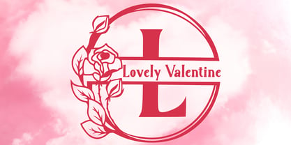 "Lovely Valentine Monogram" is a beautiful and elegant serif monogram font. This font is decorated with monograms combined with beautiful flowers. This font is equipped with uppercase, lowercase, ligatures, numerals, punctuations, and multilingual support. Very suitable for valentine, christmas, wedding, invitations, stickers, banners, posters, logos, and others.
 - Horror Monster by Yoga Letter,
$18.00 "Horror Monster" is a scary horror font. It has a writing texture with small holes in each letter. This font is equipped with uppercase, lowercase, numerals, punctuation, and multilingual support. This font is perfect for posters, banners, stickers, Halloween, horror movie titles, action movies, and more.
 - Kids Touch by Sipanji21,
$15.00 Hello, this is kids touch typeface, it is original and natural kids handwritten font. This article is good for a variety of designs, such as: packaging, advertising, crafting, merchandise, banner posters, titles, book covers, tote bags, and other designs. make your design more natural with Kids Touch.
 - Danzio by Mazkicibe,
$11.00 Introducing Danzio - Modern Font with all caps style and bold. You can combine a unique uppercase and lowercase, so it looks like natural. And this font perfect for signature, logo, branding, poster, band, apparel, photography, title, social media post, ad banner, book cover, product packaging, and advertising
 - Spiderwild by Calligraplay,
$13.00 Spiderwild is a scratchy, splotchy font especially perfect for spooky layouts, but also good for any quirky project that needs a unique and hand-drawn typeface. Use it for Halloween cards, social media tiles, posters or banners. Spiderwild is multilingual with a total of 424 glyphs.
 - Dr. Bones by Sipanji21,
$18.00 Dr Bones is one of those halloween themed fonts, it looks like a series of bones. Dr. Bones is good for some Halloween themed graphic designs, such as logos, banners, t-shirts, posters, products, advertising, or other designs. make your design more attractive with Dr. Bones Font.
 - Rangedit by Muksal Creatives,
$15.00 Rangedit is a Display font created especially for projects that need vintage and Retro typography! Use it for projects like magazines, banners, stationery, branding, name tags, invitations, and more. This font is PUA encoded, which means you can access all of the glyphs and swashes with ease!
 - Annlie by ITC,
$29.99Annlie™ Extra Bold and Annlie Extra Bold Italic are two display faces designed by Fred Lambert in 1966 for the Annlie type family. These two samples from the Annlie family are both fat faces. Fat faces were offshoots of the modern, or Didone, typefaces that were de rigueur during the early 1800s. These fat faces were among the first typefaces to be used solely for advertising purposes. Naturally, they were always used in larger point sizes, in display functions. Annlie could be called an optimization of these old advertising typefaces. With high x-heights, ultra contrast between thick and thin strokes, and perfectly engineered drawing techniques, Annlie is a highly crafted typeface. Give it a spin in your next advertising campaign! Annlie’s fine thin strokes are very graceful in their appearance, and lend a strong, yet soft, feminine feeling to anything they touch. - H74 Le Venom by Hydro74,
$25.00 Hell Fire is a hybrid of traditional early sign painters block and a hint of urban modern day culture.
 - Behetem Lachok MF by Masterfont,
$59.00 This classic title font has a wide proportion and minor contrast to make it the ideal choice for headlines.
 - Maestro by Canada Type,
$24.95 Out of a lifelong inner struggle, Philip Bouwsma unleashes a masterpiece that reconciles classic calligraphy with type in a way never before attempted. Maestro takes its cue from the Italian chancery cursive of the early sixteenth century. By this time type ruled the publishing world, but official court documents were still presented in calligraphy, in a new formal style of the high Renaissance that was integrated with Roman letters and matched the refined order of type. The copybooks of Arrighi and others, printed from engraved wood blocks, spread the Italian cancellaresca across Europe, but the medium was too clumsy and the size too small to show what was really happening in the stroke. Arrighi and others also made metal fonts that pushed type in the direction of calligraphy, but again the medium did not support the superb artistry of these masters or sustain the vitality in their work. As the elegant sensitive moving stroke of the broad pen was reduced to a static outline, the human quality, the variety and the excitement of a living act were lost. Because the high level of skill could not be reproduced, the broad pen was largely replaced by the pointed tool. The modern italic handwriting revival is based on a simplified model and does not approach the level of this formal calligraphy with its relationship to the Roman forms. Maestro is the font that Arrighi and his colleagues would have made if they had had digital technology. Like the calligraphic system of the papal chancery on which it is modelled, it was not drawn as a single finished alphabet, but evolved from a confluence of script and Roman; the script is formalized by the Roman to stand proudly in a world of type. Maestro came together on screen over the course of several years, through many versions ranging widely in style, formality, width, slant, weight and other parameters. On one end of the spectrum, looking back to tradition it embodies the formal harmony of the Roman capitals and the minuscule which became the lower case. On the other it is a flowing script letter drawing on the spirit of later pointed pen and engravers scripts. As its original designers intended, it works with simple Roman capitals and serifs or swash capitals and baroque flourishes. The broad pen supplies weight and substance to the stroke which carries energy through tension in balanced s-curves. Above all it is meant to convey the life and motion of formal calligraphy as a worthy counterbalance to the stolid gravity of metal type. The Maestro family consists of forty fonts distributed over two weights. The OpenType version compresses the family considerably down to two fonts, regular and bold, each containing the entire character set of twenty fonts, for a total of more than 3350 characters per font. These include a wide variety of stylistic alternates, ligatures, beginning and ending letters, flourishes, borders, rules, and other extras. The Pro version also includes extended linguistic support for Latin-based scripts (Western, Central and Eastern European, Baltic, Turkish, Welsh/Celtic, Maltese) as well as Greek. For more thoughts on Maestro, its background and character sets, please read the PDF accompanying the family.
 - Firehell by Zamjump,
$21.00 Introducing Fire Hell – a fiery font inspired by the intensity of death metal. With flames dancing within each letter, this font is tailor-made for death metal, black metal, gothic, horror, and other heavy music genres. The sharp, angular design adds a touch of darkness, making it the perfect visual companion for bands seeking a fierce and impactful typographic identity. Unleash the power of Fire Hell to set your artwork ablaze and embody the relentless spirit of heavy music. Ignite the darkness with this visually striking font! Fire Hell features: Allcaps Beginning Uppercase alternate Ending Uppercase alternate Numbers and punctuation PUA Encoded Characters OpenType Features
 - Cusp by Typeco,
$29.00 Cusp is a display font that was initially inspired by austere Art Deco lettering. After the capitals were refined, then the lowercase was designed with a bit of techno flair. From these basic letterforms a variety of styles were created, ranging from the rigid DeStijl to the whimsical Loose. The result is a versatile display font family that allows the user to mix, match, and overlay the letters for a dynamic effect. In-fact 2 overlay fonts were designed specifically so that one can create graffiti-like multi-layered effects. Cusp is a super-kawaii display family of 16 fonts plus 2 overlay fonts.
 - Punkaholic by Sharkshock,
$115.00 Punkaholic started out as a loopy, all caps display font with a semi condensed feel. Before completion some of the letters such as A and W were given a more traditional look and were penciled in for alternates. In the end, however, they were added as uppercase characters instead. For this reason most words in lowercase vary in appearance from their uppercase counterparts. This dichotomy between straight lined capitals and rounded ones makes for some interesting contrasts. Punkaholic works best in less formal settings such as café menus, t-shirts, or children’s publications. It comes in 3 styles and contains Latin, extended Latin, punctuation, and kerning.
 - Nordeco by Leksen Design,
$29.00 Inspired by her Scandinavian heritage, Andrea Leksen created this modern geometric sans serif reminiscent of Scandinavian design and typography. With its tall x-height and monoweight strokes, Nordeco will be best showcased at large sizes, in headlines and other display uses. It contains 100 alternates with ornamental letters, borders, paragraph separators and seamless wallpapers for your designing pleasure. Designs include stripes, dots, art deco and leopard print. See some of the creative ways Nordeco can be used in this YouTube clip. Check out its cousin, Nordique!
 - JWX Twisted Star by Janworx,
$19.95 Being a Star is one thing, but being a Twisted one is even better! JWX Twisted Star incorporates your deep desire for stardom into each alpha and numeric glyph, in a bold bordered font. The upper case letters sport a trailing accent, making them shooting twisted stars. This is a single bold typeface, and is intended to be used at a large size in graphics work, adding a not-so-subtle statement to everything from screen printed t-shirts to posters or even embroidery (available at www.janworx.com).
 - Notre Dame by Linotype,
$29.99 Notre Dame is a part of the 1990 program Type before Gutenberg, which included the work of twelve contemporary font designers and represented styles from across the ages. Linotype offers a package including all these fonts on its web page, www.fonts.de. Notre Dame was designed by Karlgeorg Hoefer, who was inspired by the structure of forms once used mainly for liturgical purposes. Digital techniques made it possible to add Gothic ornaments and borders to the font, perfect for designing anything which should have a late Gothic feel.
 - ASTYPE Ornaments Accolades B by astype,
$28.00 The astype series Accolades B offers the advanced designer a fine set of calligraphic swashes, swirls and figural ornaments. Accolades B and B2 share most of the base set of ornaments but differ in some of the major shapes. If you're looking for some good companion fonts, give Gracia and Adana a try. Every classic high contrast stroke design like Didot or Bodoni works well. Note: Each package comes with a technical documentation and an InDesign2 sample file with lots of ready made borders.
 - Sablon by Roman Cernohous Typotime,
$29.00 Solid all caps display font with a hint of retro expression. Wide language support including complete set of Cyrillic characters.