10,000 search results
(0.016 seconds)
- Paradise Script by Lián Types,
$12.00Paradise is a script font thought to be used in a wide range of pieces of design. From packaging to invitations, Paradise looks elegant and sometimes very playful. - Nina by ParaType,
$25.00 Based on informal pen handwriting. A set of Western characters and two bold weights were added in 2011 by Gennady Fridman. For use in advertising and display typography.
 - Window Sign JNL by Jeff Levine,
$29.00 Window Sign JNL is a solidified re-working of Sign Stencil JNL; originally modeled from some vintage lettering stencils that were part of a store sign making kit.
 - Antman by Lebbad Design,
$24.95 Antman is a bold serif font consisting of caps and smallcaps. Wide letterforms taper toward the bottom of each character to give this font a retro vintage feel.
 - RMU Gloria by RMU,
$30.00 RMU Gloria is a family of two stylish fin-de-siècle fonts, formerly released by the Gursch Foundry, Berlin, which additionally were spiced with elements for frame making.
 - ITC Garamond Handtooled by ITC,
$34.99Claude Garamond (ca. 1480-1561) cut types for the Parisian scholar-printer Robert Estienne in the first part of the sixteenth century, basing his romans on the types cut by Francesco Griffo for Venetian printer Aldus Manutius in 1495. Garamond refined his romans in later versions, adding his own concepts as he developed his skills as a punchcutter. After his death in 1561, the Garamond punches made their way to the printing office of Christoph Plantin in Antwerp, where they were used by Plantin for many decades, and still exist in the Plantin-Moretus museum. Other Garamond punches went to the Frankfurt foundry of Egenolff-Berner, who issued a specimen in 1592 that became an important source of information about the Garamond types for later scholars and designers. In 1621, sixty years after Garamond's death, the French printer Jean Jannon (1580-1635) issued a specimen of typefaces that had some characteristics similar to the Garamond designs, though his letters were more asymmetrical and irregular in slope and axis. Jannon's types disappeared from use for about two hundred years, but were re-discovered in the French national printing office in 1825, when they were wrongly attributed to Claude Garamond. Their true origin was not to be revealed until the 1927 research of Beatrice Warde. In the early 1900s, Jannon's types were used to print a history of printing in France, which brought new attention to French typography and the Garamond" types. This sparked the beginning of modern revivals; some based on the mistaken model from Jannon's types, and others on the original Garamond types. Italics for Garamond fonts have sometimes been based on those cut by Robert Granjon (1513-1589), who worked for Plantin and whose types are also on the Egenolff-Berner specimen. Linotype has several versions of the Garamond typefaces. Though they vary in design and model of origin, they are all considered to be distinctive representations of French Renaissance style; easily recognizable by their elegance and readability. ITC Garamond? was designed in 1977 by Tony Stan. Loosely based on the forms of the original sixteenth-century Garamond, this version has a taller x-height and tighter letterspacing. These modern characteristics make it very suitable for advertising or packaging, and it also works well for manuals and handbooks. Legible and versatile, ITC Garamond? has eight regular weights from light to ultra, plus eight condensed weights. Ed Benguiat designed the four stylish handtooled weights in 1992." In 1993 Ed Benguiat has designed Handtooled versions. - Adhesive Serif Letters JNL by Jeff Levine,
$29.00 A few scant examples of die cut gummed letters (R, C, Y and &) provided the design inspiration for Adhesive Serif Letters JNL. Influenced by the Caslon style, this typeface offers clean, legible titling. The sample letters were once manufactured by the Tablet and Ticket Company of Chicago and sold under their brand name of Willson's [named for the founder of the company]. Gummed letter sets were available in a variety of styles and sizes for various sign, merchandising and marking needs.
 - Bogesta by Mantype Studio,
$14.00 Bogesta Typeface - Stylish OpenType rich serifs with letters that seem to dance and swirl harmoniously together - to form unique & elegant typographic designs. The wide selection of interwoven binders and Opentype alternatives means lots of choice and variety in your final look. To access these OpenType features, you need Opentype-enabled software such as: Word, Textedit, Photoshop, Sketch, Pages, Keynote, Numbers, iBooks Author, QuarkXPress, Indesign and Illustrator. A wide variety of useful glyphs are included - see preview images of all glyphs.
 - Gentona by René Bieder,
$25.00 Designed for a wide range of applications, Gentona was intended to support the goals of contemporary design paired with a mostly swiss oriented demand on typography – neutrality. The result is a nine-weight neo-grotesque family ranging from sharp and fine thin cuts to muscle-bound and strong heavy weights. Gentona’s confident and open shapes support legibility especially in small sizes while its alternative shapes and letterforms create flexibility. A wide range of typographic features round up the whole family.
 - P22 Typewriter by IHOF,
$24.95 This font is not overly distressed, nor is it overly clean. It is a typewriter font. It is perfect when you want a document to look like it was made on a typewriter. This font is primarily based on the typewriter used for a typographic conference document from 1966 in Mainz Germany. The model and age of the typewriter used is not known. Additional characters were sourced from other vintage typewriters and others were designed to complete the full character set.
 - HGB Memento by HGB fonts,
$32.00 HGB Memento was designed to replace 12 bronze plaques with the names of those who died in World War I. The 12 plaques were stolen in 2016. Stone tablets were made on which the original writing was engraved using sandblasting. Memento is therefore suitable for commemorative plaques and for texts of a sacred nature. Extremely short ascenders and descenders allow very narrow lines. The design language of the Memento comes from the 1920s with echoes of Art Nouveau and Art Deco.
 - HGB Ypsilon by HGB fonts,
$23.00 Playing with old rub-on letters led to this alphabet. On the Letraset sheets (the older ones still remember...) there were always letters left over that were never or rarely used. I sometimes let interns play with it. To explain, I first rubbed an example myself. Two y's from a Helvetica made a pretty shape. Looking closely, you see a contoured, italic N. I developed the HGB Ypsilon font from this N. A purely decorative typeface – it could be interesting for some logo.
 - 1491 Cancellaresca by GLC,
$38.00 This font was inspired by the very well-known humanistic script called "Cancellaresca". This variant was used by a lot of calligraphers in the late 1400s, specially by the Venetian Giovannantonio Tagliente, whose patterns were mainly used for this font. You can compare this with 1610 Cancellaresca. Numerals were inspired by Da Vinci manuscripts, from the same period. We added accented characters and a few others not currently existing at the time. A lot of titling alternates and ligatures are also included.
 - ALS Kraft by Art. Lebedev Studio,
$63.00 A simple rough font. Kraft is a rough techno-style sans serif meant for setting text in all capitals. Instead of lowercase letters there are capitals of smaller height but with the same stroke width. They make tighter type. Characters are pressed really close together which creates the visual rhythm of very narrow and very wide openings. The wide strokes allow free use of graphics. This font is designed for putting on coarse surfaces, for breaking, crumbing, scratching, or making stencils on concrete.
 - Caslon Titling by Monotype,
$29.99Monotype Caslon Titling was made available for hot metal casting in 1932. The capital Monotype Caslon Titling letters were based on types from the Stephenson Blake Foundry, previously the Caslon Foundry. Originally designed by William Caslon in the eighteenth century, Caslon is considered an old face although it has characteristics which were later found in the transitional typefaces. The Monotype Caslon Titling font has a distinctive style, generous width and strong color, ideal for use in advertising, magazines and on book jackets. - Granjon by Linotype,
$29.99 The design for Granjon was produced at the English branch of Linotype under the direction of George William Jones and appeared in 1928. This reproduction of a Garamond typeface was based on the typeface sample of the Frankfurt font foundry Egenolff from the year 1592 . The roman characters of the sample were made by Claude Garamond and the italic forms were designed by Robert Granjon. Jones made sure that the Granjon font remained true to the original characters of Garamond and Granjon.
 - Rostra by Tail Spin Studio,
$20.00It was during a visit to the Roman Forum that we were inspired by a seemingly unique style of lettering on a tablet among the ruins. The Latin message was chiseled in a condensed, free-style manner, almost as if it were intended as a personal note. While the stone showed only the capital letter forms of the period, we felt the creation of a lowercase would help extend the fonts usability and also add a whimsical feel to the design. - Pen Nib Square JNL by Jeff Levine,
$29.00 The idea started with the 1934 sheet music of “Mazurka Amabile”. Its hand drawn title had most of the letters rendered in a rectangular shape [‘square’ in the sign trade] that featured rounded corners and terminals made by the shape of the lettering pen nib. A few letters were rounder in design than others, so those were scrapped in favor of a more consistent character shape throughout the font. Pen Nib Square JNL is available in both regular and oblique versions.
 - Catskin by Hanoded,
$15.00 Catskin is a fairytale by The Brothers Grimm. The story is about a king who has a beautiful wife and daughter - you know, the basic fairytale stuff. Long story short: they all live happily ever after (except for the wife, who dies…). Catskin is also a nice, handmade font. I like making fairytale fonts, especially since I have three kids, who love books. And when I see one of my fonts on the cover, I can tell them: ‘daddy made this’. #prouddaddy ;-)
 - Regular Joe by GroupType,
$21.00 Regular Joe was first delivered to the font world by Ron and Joe. Yes, the same Ron and Joe of the ArtParts fame. A few years of being so regular, Regular Joe became, well, just bored. Regular Joe needed company. He wished for a family. After all, most of his font friends had big families. His wishes were granted by FontHaus. So Skinny and Husky were created to be with Regular and all together, they became Family Joe. All is well.
 - Gv Time by Bejeletter,
$18.00 Inspired from 60's and 70's script lettering, bringing a smile and a dose of nostalgia to the daily lives. Where you get to relive the far out culture of the 60’s and 70’s! The era of groovy was all about music, festivals, where icons were created, epic stories were told, and culture was changed forever. The Gv. time came with opentype features such stylistic alternates and others, its help you to make great lettering, also support multilanguage.
 - WL Rasteroids Monospace by Writ Large,
$5.00 Rasteroids Monospace is a typographic flashback to computing of the mid 1980s, when 9-pin dot-matrix printers were the state of the art, and most home computer displays were TVs hooked up to RF modulators. Rasteroids not only captures the dot-matrix printer look, but recreates the rasterized appearance of text on those lower-resolution monitors. Because of its fixed character width, Rasteroids Monospace is intended for use in accents or small areas of copy rather than long documents.
 - Ezra by Sarid Ezra,
$20.00 A modern and slightly wide sans serif, Ezra Sans Family! Ezra Sans is a casual and modern sans. With slightly wide form and modern details, this font looks more casual for your any project and designs. This font also contain an alternate in selected characters that will make this font even more stunning. You can use it for a tittle, logo, quotes, or become a pairing in any font. This font also support multi language! Support Multilingual up to 14 languages
 - Nest by Khalid Jassim,
$27.00 This font was created for use in a ”bird nest story”. It can be used for any other things but the main idea is that someone looking for a font to use anything related with birds, this can be a perfect match.
 - North Little by Arendxstudio,
$18.00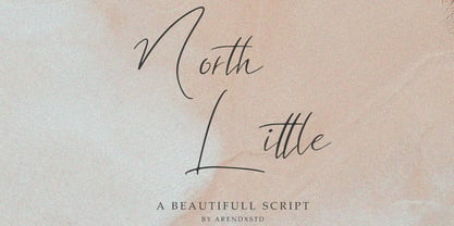 North Little is a handmade font, with an elegant and stylish character. It is perfect for invitations, greeting cards, branding materials, business cards, quotes, posters, and other design concepts. Features : • Character Set A-Z • Numerals & Punctuations (OpenType Standard) • Accents (Multilingual characters) • Ligature • Swash
 - Charmante by Juraj Chrastina,
$39.00 Let's add a little charm between letters with this sweet and straightforward hand-drawn typeface. Charmante is ideal for save-the-dates, wedding announcements, invitation cards, greeting cards, gift tags, cafe or restaurant menus and for any other lovely and charming design.
 - Jositary by HafisHidayat,
$15.00 Jositary is and elegant and fashionable handwriting font, which looks like a signature. This font is intentionally made with unique alternates. Jositary suits perfectly for branding, posters, invitations, greeting cards, news, product packaging, blog posters, logos, business cards, all including personal charms etc.
 - Threefonte by Girinesia,
$13.00 Hello guys... We proud presenting our new font. It's name THREEFONTE. THREEFONTE is cute and unique stacked font. THREEFONTE would perfect for kids poster, t shirt, flyer, cover children book, cartoon, comic , cristmast invitation, greting card, valentine card, new year party and etc.
 - Schmalfette CP by CounterPoint Type Studio,
$29.95 SchmalfetteCP is the result of another collaboration between designers Jason Walcott and Rob King. King suggested that Walcott revive this wonderful and somewhat forgotten sans serif typeface from the mid 1950s. Originally designed by Walter Haettenschweiler in 1954, Schmalfette Grotesk was used for many years in the German magazine "Twen". The typeface was notoriously hard to acquire at the time and graphic designers in the USA often resorted to cutting letters from the Twen magazines and reusing them in their own designs. Later, when digital type came along several typefaces very similar were created that claimed to be digital revivals of Schmalfette Grotesk. However, they are actually only loosely based on the original. The proportions are different and in some cases a lower case was added. The original font was all caps. At Rob King's suggestion, Jason Walcott has strived to recreate the most faithful digital revival possible of the original Schmalfette Grotesk with the new version of SchmalfetteCP. In some cases small changes were made to accommodate today's digital needs (e.g. web fonts), but anyone who has ever searched for this typeface now has a version available that most closely resembles Haettenschweiler's original work. Schmalfette CP comes in OpenType format in both .ttf and .otf files and offers support for all Latin based and Eastern European languages.
 - DM Unarmed by DM Founts,
$12.50 Unarmed began life as a series of rectangles in Fireworks. The task was designing my own business card for the first time in years, and the perfect lettering couldn't be found in either free or commercial fonts. While there were some good choices, none of them really communicated who I was. Initially only the lowercase letters in my name were created, with each being designed around a 7 x 4 grid of squares. I liked the result so much that I wanted to use the same typeface in different projects - and to save time in future, I decided to create this font. In creating DM Unarmed, the intention was to avoid diagonal lines, and to keep all the lines horizontal, vertical and grid-like. This made creating some of the characters - particularly the rounded ones and the letters X and Z - challenging. Coming from both worlds, I wanted to achieve a blend of technicality and creativeness, without trying to pretend one was the other. For best results this font should be used for large and prominent text, although it works at smaller sizes up to 12pt. I've spent a lot of time trying to hint a few characters that wouldn't play ball, such as 2, 7 and 8. In case you're wondering: DM Unarmed got its name from my philosophy of facing challenges without reliance on tools and weapons.
 - Blackduck by Eurotypo,
$60.00 “Blackduck” font is a typical Gothic, usually named “Blackletter” . This typeface was born with the name of “Textur” and developed from Carolingian cursive. It was used in the middle age as sacred script, became increasingly narrower, his vertical lines were emphasized and his strokes very compacted to save space. Along the time the early German print typefaces derived in others styles that were more readable such as Schwabacher and Fraktur, very popular in Germany and sometimes associated to the identity of the country. The font "Blackduck" was inspired mixing carefully the last two “Blackletters”. We try to joine some characteristics of both to reach good legibility without loosing the strong impact and powerfulness of the shapes. Some minuscules like the “o” “c” “e” “d” are rounded on both sides, while both strokes join in an angle at the top and at the bottom. Some other lower cases are formed by an angular and rounded stroke. This font contains a full set of OpenType features; swashes, stylistics alternates, old style figures (Arabic numeral were carefully shape integrated), ligatures and some extras ornaments were added to help in your design. "Blackduck" includes diacritic signs for Central European languages.
 - Bakery Goods by Ali Hamidi,
$10.00 Bakery Goods is a cool, vintage styled and adaptable display font. This original look will appeal to a wide range of crafty ideas, from letterheads and titles, to stationery.
 - Another Shabby by Zetafonts,
$39.00 Another Shabby is a script typeface family. Its shapes are defined by rough, wide brushstrokes, slightly rounded in corners to mimic the feel of a real handwritten casual script.
 - Bordeaux by Solotype,
$19.95This font was inspired by the lettering on a shop sign along a very classy shopping street in Bordeaux, France. There were similar styles among mid-nineteenth century types. - Venzel by Etewut,
$15.00 Introducing new font family Venzel. It's an interesting experimental deco all caps typeface. • 5 fonts with different wide • OTF and TTF version • alternative letters and numbers • multi-language support
 - Stylish Marker by Pedro Teixeira,
$14.00 Stylish Marker is a font based on a casual and worn marker, just before it's unusable, thus giving rise to an irregular texture, typical of a widely used marker
 - Manus Smooth by JOEBOB graphics,
$25.00 The Manus font family is extended with a new relative: Manus Smooth. Some major and minor adjustments were made, but it still has the look & feel of the original.
 - Verdaguera by Type-Ø-Tones,
$40.00 Another rebirth: Verdaguera. The all time Catalan people's choice. Now with a complete set of characters that covers a wide range of latin alphabet languages. Catalan included, of course.
 - Printed Claude by Cuda Wianki,
$20.00This font was inspired by Claude Garamond antique. The original set of letters from 16th century is enlarged by several characters that were not in use in that time. - Lucidity by DogHead Studio,
$20.00 Lucidity is a condensed, handwritten font with emphasis on texture and default wide spacing. This makes it a versatile font for display, medium amounts of text, and T-Shirts.