10,000 search results
(0.037 seconds)
- Atocha by Sudtipos,
$49.00 It was expected that Joluvian’s third type font would be inspired by the city where he currently resides: Madrid, Spain. His previous creations had originated in Venezuela (Zulia) and The Philippines (Salamat), both, places where he had once lived. Joluvian believes “now is the time to pay tribute and show gratitude towards a city that has bestowed me with so many fortunes.” He considers that Madrid’s people, streets, scents, flavor and sounds are gift enough to awaken the creative urgency in any artist. This time around, it is being expressed through the crafts of the Typographic industry. Since his arrival in Spain, Joluvian has been attached to the city’s central area, specifically to the renowned Atocha Street and its railroad station. It was precisely on that street that Joluvian and Mauco Sosa, his friend and partner, decided to establish the Patera Studio: a charming creative space that birthed the concept for this new font which they proudly named Atocha Script. The artists where still in the final phases of their previous script, Salamat, when the idea for Atocha came about. This dynamic is actually very typical of the artistic process, in which every finished product spawns the need to create its next level offspring. “Working on Atocha and Atocha Caps has been a very pleasant journey. We have given our best efforts, for we wanted to offer a typeface that was both versatile and user-friendly on a number of applications, showing a wide scope of alternatives in our glyphs,” says the artist. The illustrations were created by Mauco, to ensure visual integration that would showcase the work of both members of the Patera Studio and their complementing aesthetic voices. Atocha, as Salamat and Zulia before, was digitized by Alejandro Paul.
 - SST by Monotype,
$82.99 Designed for global branding and supporting 93 languages, the SST® typefaces blend the organic readability and controlled structure of modern sans serif designs. In combining these attributes, the SST family is understated, versatile – and sure to be a timeless design. The SST Pan-European family has 17 fonts in total, supporting the W1G character set. It spans six weights from ultra light to heavy, each with an italic complement. In addition, three condensed designs and two monospaced (typewriter) typefaces were drawn to further expand the family’s vast range of uses. SST’s subtle design traits provide a quietly handsome and consistently friendly typographic presence that can be used for just about any typographic application. Broad range branding applicability combined with coverage for almost a hundred languages, makes SST one of the most widely accessible and usable typefaces available. Originally designed in partnership with the global consumer brand, Sony, the SST family is one of the most comprehensive type families available. Since extensive multi-lingual support was a critical design goal from the beginning, Akira Kobayashi, Monotype type director and primary designer on the project, turned to a network of local designers around the world for their individual language expertise. As a result, the details – which could be as subtle as stroke curvature and width – are consistent across Latin, Greek, Cyrillic, Arabic and multiple Asian languages. SST performs equally well in print and on-screen and the designs can be used at very small sizes in packaging and catalogs; while massive print headlines – even complicated wayfinding projects pose no stumbling blocks to the family’s typographic dexterity. While the family is also large enough to manage complicated typographic hierarchy, SST pairs handsomely with typefaces as far reaching as ITC Berkeley Old Style®, Meta®, PMN Caecilia®, Malabar® and Neue Swift®.
 - Navaja by Andinistas,
$39.95 Very few letter types with the context of grunge style fonts offer hierarchies to differentiate words in sentences or paragraphs. With Navaja I developed a font family that meets this need. This family is useful to organize the information into a hierarchy with an eroded look. Its central idea mixes grotesque, geometric and humanistic letter conventions. This way, Navaja is a grunge-sans with dense proportions to make graphic design with eroded character. Its main purpose appeared when one of my customers asked me for a t-shirt design for a fan club of an important football player. For this reason its starting point were stained and muddy letters characterizing the toughness and coldness of the sport. Over time their glyphs began to imitate the robustness of "wood type & Tuscan Type" widely used in posters in the late nineteenth century. Its purpose was strengthened in a family with 6 members that when mixed they produce mind catching contrast levels ideal for designing T-shirts, stickers, flyers, brochures, posters, billboards, cinema or TV. Therefore its variants are short up and down height X combined with different widths that by working together produce information that radiates outstanding apparently destroyed controlled violence. Navaja Dingbats consists of 52 illustrations useful for frames and textures. In that vein, the origin of each member comes from skeletons of Roman and Italic calligraphy. The low amount of contrast between thick and thin lines matching the contours apparently gnawed but strictly regulated by optical adjustments equating the sum between full and empty areas. Factors such as finishes, shapes and counter internal and external forms are meticulously planned although its scruffy look which strategic arrangements are offset to provide color typographical homogeneous. And in conclusion, I have plans to continue expanding the family with more complete versions in the future.
 - Fractus by Eurotypo,
$36.00 The requirements of Middle Ages scribes who copied and produced books in monasteries were fundamentally to preserve space, due to the high cost of the writing surface. During this long period of the development of Gothic forms, many other variations of the style of black letters appear: Textur or “Gothic-antique”, another group called Rotunda preferred by Italian and Spanish scribes. In 1490, the style "Bâtarde" (according to the the French classification) began to be widely used in Germany with more rounded shapes and named Scwabacher (probably derived from the city of Schwabach, but not certified) Fractur is a more condensed and narrower form than Schwabacher. This style is attributed to Johann Neudörfer of Nuremberg, cut in 1513; it was quickly imitated, therefore a few years later became to be a German national identity that extended over the next four centuries. The shape of its characters can be considered as a fusion of Texture and Schwabacher: the lowercase actually has medium strictly vertical and half curved strokes. The first expressions of the baroque influence this writing whose appearance of movement is due to the ornaments applied to the uppercase letters and the ascending and descending features of the lowercase. Despite having spent so many years and being a typeface not suitable for extensive reading texts, the Gothic Fractur has endured over time for possessing a strong and solid characteristic, as well as being closely linked to the spirit of gothic cathedrals of countries in northen Europe. In fact, it is probably that this expressive feature leads them to be chosen in the most varied graphic communication needs, which run from from banks and financial companies, insurers, law offices, publishers, newspapers and TV networks, till alcoholic drinks, funeral tombstones, packaging and even tattoos.
 - Sfilth, a distinctive font crafted by the talented Stephen Bird, stands as a testament to the innovative and adventurous spirit of modern typography. At first glance, Sfilth captivates with its uniqu...
- The KG Dancing on the Rooftop font by Kimberly Geswein is a delightful and whimsical font that embodies a sense of joy and playfulness, perfect for projects that require a touch of lightheartedness a...
- Old Sport JNL by Jeff Levine,
$29.00 The 1930s era French textbook on lettering "100 Alphabets Publicitaires déssinés par M. Moullet" featured a hand lettered chamfered alphabet with slab serifs reminiscent of sports lettering. Although intended for advertising and signage inspiration, only a partial lower case was illustrated along with the capitals and no numbers or other characters existed. These had to be created from scratch. The finished result is not only a bit of classic lettering from the past, but the font also doubles as a typeface with a sports look and feel. A traditional (rather than stylized) M and N are located on the solid bar key and the broken bar key respectively. Old Sport JNL is available in both regular and oblique versions.
 - Bethlehem Ephrath by HiH,
$10.00 One menorah that I have long found particularly appealing was named The Tree of Life Menorah, a replica of which I gave as a gift one holiday to a kindly old couple who were neighbors and became friends. It had a simple, organic elegance that I see in the best of Art Nouveau sculpture. To me personally, Judeism is a celebration of life, like the triumph of the flower that blossoms in the crack of the city sidewalk. Just as Hanukkah celebrates the rededication of the temple and the miracle of the oil, it celebrates the victorious quest for freedom of the Hebrew people led by Judah Maccabee. Hanukkah represents determination and courage and faith — and it represents the presence of God in the lives of His people. It is interesting to note that the founding of the Albanian nation in the early twentieth century grew out of the resistance of the Albanian people to the imposition of Greek language and culture in the aftermath of the dissolution of the Ottoman Empire. The typeface, HADASSAH, designed by Henri Friedlander (1904-1996), is my favorite Hebrew typeface. Thirty years in the crafting, I believe it is unsurpassed for its shear beauty, combining a subtle modulation of stroke with a simplicity and clarity of form. No doubt, that is why it has become so popular. For me, the Sîyn/Shîyn characters are especially satisfying. For a Hanukkah message in Hebrew, I would choose HADASSAH LIGHT for a headline and print it as large as I could. If, however, you are looking for a friendly, warm face for a seasonal message in a roman-letter based language, may I suggest BETHLEHEM EPHRATH. It will be as comfortable as a bulky, hand-knit sweater on a frosty afternoon and reflects the solid, encompassing, family orientation of this holiday. It was on the way to Ephrath that Jacob’s beloved wife Rachel gave birth to Benjamin and then died from her labor. It was to Ephrath that Naomi and Ruth returned and in Ephrath that we have the wonderful, heart-warming story of the marriage between Ruth and her Redeemer-Kinsman, Boaz. And it was to Ephrath that prophet, Samuel, went to find a new king and there in Ephrath that the prophet annointed a small shepherd boy named David. The Proverbs tell us to seek wisdom. Never underestimate the impact you have on others. Words of kindness can change people’s lives. The Talmud says that the highest form of wisdom is kindness. Be wise this holiday season. The font BETHLEHEM EPHRATH is based on the typeface Accent with the permission of URW++ of Hamburg, Germany. Like most display fonts, it is most effective at 18 points and larger. Like most script fonts, it is most effective when set with both upper and lower case. Although this font is readable in all caps (many scripts are not), that does not make it a good idea. Do so only with caution.
 - Mrs Eaves XL Serif by Emigre,
$59.00 Originally designed in 1996, Mrs Eaves was Zuzana Licko’s first attempt at the design of a traditional typeface. It was styled after Baskerville, the famous transitional serif typeface designed in 1757 by John Baskerville in Birmingham, England. Mrs Eaves was named after Baskerville’s live in housekeeper, Sarah Eaves, whom he later married. One of Baskerville’s intents was to develop typefaces that pushed the contrast between thick and thin strokes, partially to show off the new printing and paper making techniques of his time. As a result his types were often criticized for being too perfect, stark, and difficult to read. Licko noticed that subsequent interpretations and revivals of Baskerville had continued along the same path of perfection, using as a model the qualities of the lead type itself, not the printed specimens. Upon studying books printed by Baskerville at the Bancroft Library in Berkeley, Licko decided to base her design on the printed samples which were heavier and had more character due to the imprint of lead type into paper and the resulting ink spread. She reduced the contrast while retaining the overall openness and lightness of Baskerville by giving the lower case characters a wider proportion. She then reduced the x-height relative to the cap height to avoid increasing the set width. There is something unique about Mrs Eaves and it’s difficult to define. Its individual characters are at times awkward looking—the W being narrow, the L uncommonly wide, the flare of the strokes leading into the serifs unusually pronounced. Taken individually, at first sight some of the characters don’t seem to fit together. The spacing is generally too loose for large bodies of text, it sort of rambles along. Yet when used in the right circumstance it imparts a very particular feel that sets it clearly apart from many likeminded types. It has an undefined quality that resonates with people. This paradox (imperfect yet pleasing) is perhaps best illustrated by design critic and historian Robin Kinross who has pointed out the limitation of the “loose” spacing that Licko employed, among other things, yet simultaneously designated the Mrs Eaves type specimen with an honorable mention in the 1999 American Center for Design competition. Proof, perhaps, that type is best judged in the context of its usage. Even with all its shortcomings, Mrs Eaves has outsold all Emigre fonts by twofold. On MyFonts, one of the largest on-line type sellers, Mrs Eaves has been among the 20 best selling types for years, listed among such classics as Helvetica, Univers, Bodoni and Franklin Gothic. Due to its commercial and popular success it has come to define the Emigre type foundry. While Licko initially set out to design a traditional text face, we never specified how Mrs Eaves could be best used. Typefaces will find their own way. But if there’s one particular common usage that stands out, it must be literary—Mrs Eaves loves to adorn book covers and relishes short blurbs on the flaps and backs of dust covers. Trips to bookstores are always a treat for us as we find our Mrs Eaves staring out at us from dozens of book covers in the most elegant compositions, each time surprising us with her many talents. And Mrs Eaves feels just as comfortable in a wide variety of other locales such as CD covers (Radiohead’s Hail to the Thief being our favorite), restaurant menus, logos, and poetry books, where it gives elegant presence to short texts. One area where Mrs Eaves seems less comfortable is in the setting of long texts, particularly in environments such as the interiors of books, magazines, and newspapers. It seems to handle long texts well only if there is ample space. A good example is the book /CD/DVD release The Band: A Musical History published by Capitol Records. Here, Mrs Eaves was given appropriate set width and generous line spacing. In such cases its wide proportions provide a luxurious feel which invites reading. Economy of space was not one of the goals behind the original Mrs Eaves design. With the introduction of Mrs Eaves XL, Licko addresses this issue. Since Mrs Eaves is one of our most popular typefaces, it’s not surprising that over the years we've received many suggestions for additions to the family. The predominant top three wishes are: greater space economy; the addition of a bold italic style; and the desire to pair it with a sans design. The XL series answers these requests with a comprehensive set of new fonts including a narrow, and a companion series of Mrs Eaves Sans styles to be released soon. The main distinguishing features of Mrs Eaves XL are its larger x-height with shorter ascenders and descenders and overall tighter spacing. These additional fonts expand the Mrs Eaves family for a larger variety of uses, specifically those requiring space economy. The larger x-height also allows a smaller point size to be used while maintaining readability. Mrs Eaves XL also has a narrow counterpart to the regular, with a set width of about 92 percent which fulfills even more compact uses. At first, this may not seem particularly narrow, but the goal was to provide an alternative to the regular that would work well as a compact text face while maintaining the full characteristics of the regular, rather than an extreme narrow which would be more suitable for headline use. Four years in the making, we're excited to finally let Mrs Eaves XL find its way into the world and see where and how it will pop up next.
 - Hello Stylish by Get Studio,
$15.00 Hello Stylish is a chic script font with sweet flowing and natural pressure. This font is a great choice for a watermark on photography, signature logo design, quotes, album cover, business cards, and many other design projects. Includes a full set of gorgeous uppercase and lowercase letters, numerals, a large range of punctuation, OpenType Features such as Stylistic Alternate, Contextual Alternate, and a lot of ligatures.
 - Two Reeler JNL by Jeff Levine,
$29.00While watching a 1920s Charlie Chaplin short film, Jeff Levine was taken with the unusually modern looking lettering of the title cards in that silent movie. The lettering was not only right for its time, but could also be adapted to both Art Deco and Techno applications. From this classic film comes the font Two Reeler JNL, a bit of yesterday with an eye toward the future. - Great Brington by Beary,
$5.00 Introducing, Great Brington- an beautiful slab serif with a bunch of alternates! Great Brington is a classic and elegant slab serif with a bunch of alternates up to 50 style, for each characters will make your greeting card, logo, craft even more stunning and stand out! Great Brington also support Multiple Languages. Features: - All Uppercase - Number & Symbol - Multi language - Alternates for each characters Happy Creating!
 - Christmas Deer by Arttype7,
$15.00 We just launched a new product font. charming fonts with a pretty christmas look, named "cristmas deer font". This font is inspired by deer antlers. has 3 beautiful swash variations. and also has more than 650 glyphs. This font also has a stylistic alternative for multilingual support. Perfect for logos, Christmas greeting cards, wedding invitations, web, t-shirts, souvenirs, quotes, graphic watermarks. thank you regards
 - Palmera Outline by RagamKata,
$14.00 Palmera is a geometric slab serif font. Simple and sharp-looking, this typeface will truly inspire you to create spectacular designs that will impress everyone. Palmera font is perfect for your up coming projects. Such as logo branding, editorial design, fashion, adventure apparel, stationery design, sport design, blog design, modern advertising design, card invitation, badge, art quote, home decor, book/cover title, special events and any more.
 - Anacostia NF by Nick's Fonts,
$10.00The 1923 Barnhart Brothers & Spindler specimen book called this typeface "Cardstyle", and suggested its use at small sizes for business cards. It also work quite well in large sizes when a warm, casual antique feeling is called for. Named for a river that flows through Washington, DC. Both versions of the font include the 1252 Latin and 1250 CE character sets (with localization for Romanian and Moldovan). - Mighty Rooster by Invasi Studio,
$13.00 Introducing a versatile Vintage Sans Serif. Mighty Rooster includes 2 font files with Regular and Rough style. Mighty Rooster is a great font for achieving an authentic vintage aesthetic as seen in the display images or Body text project, it is perfect for headings, flyers, greeting cards, product packaging, book cover, printed quotes, logotype, apparel design, album covers. Mighty Rooster Features: Ligatures Alternate Multi-language Punctuation
 - Zolanti by HandletterYean,
$12.00 Zolanti is a handwritten brush font for those who want a rough looking brush font, and to use it on many kind of design projects like logos, printed quotes, invitations, cards, product packaging, headers, Logotype, Letterhead, Poster, Apparel Design, Label, and etc. This font comes in regular, italic, and underline. It is also complete with multi-language support, numbers, punctuation, and some ligatures are also provided.
 - Herbal Infusion by Supfonts,
$15.00 Herbal Infusion is a sweet, modern calligraphic font with ligatures. It is perfect for branding, wedding invitations and invitation cards and many more Font includes a full set of gorgeous uppercase and lowercase letters, numbers, a large selection of punctuation marks and ligatures. Includes: Regular Script Latin languages support Uppercase and lowercase Numbers and punctuation Ligatures Check out my blog: https://www.instagram.com/di.zigner pinterest.com/dmitriychirkov7 Enjoy
 - Brightline by Lucky Type,
$18.00 Let me introduce my newest font Brightline is a new modern font with an irregular baseline. This is the latest script font for those of you who need elegant writing and the latest design styles and is perfect for wedding invitations, business cards and more. Complete with upper and lower case, as well as multi-language support, numbers, punctuation, and multiple ligatures and swash glyphs.
 - Bellamy by Calamar,
$12.00 Bellamy is a hand-drawn calligraphic script with dancing baseline and lots of possibilities. This expressive font will look awesome on your cards, wedding invitations, headings, branding materials, quotes, t-shirt and any other amazing projects you are working on. Bellamy includes Upper and Lowercase Basic Characters, Alternates Lowercase Characters, Standard Ligatures, Numbers and Punctuation. Bellamy has multilingual support for the Western and Central European Languages.
 - Sabrina Pamella by Bluestype Studio,
$15.00 This is our newest product called Sabrina Pamella. Sabrina Pamella is a stunning signature font with a bold vibe. It will turn any design idea into a true standout. This font is suitable for use on business cards, weddings, t-shirt designs, logos, magazines, quotes, fashion, watermarks, invitations, signatures. What's include: - Alternate Characters - Multilingual Support - Swashes Thank you, and don't forget to check out our other products.
 - Titch by wearecolt,
$9.00 Titch is a brush font, original glyphs drawn with a tombow brush pen. Special care has been taken to retain the individual characteristics of each glyph making Titch a beautifully unique display font. Titch is a small caps font available in both regular and slanted variations. This fun and versatile display font will add a hand made touch to your next packaging design or greetings card.
 - VANILA by Zamjump,
$15.00 VANILA is a cute outline and very cheerful display font. Filled with ALL CAPS with cute and funny shapes, Inspired by freestyle graffiti writing, Add this lovely and dynamic font to any of your creative ideas related to school or kids, snacks and events. You will love the results. VANILA is perfect for birthday cards, kids invitations, quotes, branding, or just for fun for your art.
 - VVDS The Bimbo by Vintage Voyage Design Supply,
$10.00 If you need a simple way to get hand written / drawing style graphics – VVDS The BIMBO Collection is for you. Absolutely hand drawn lettering style collection gives you many styles for your graphic projects. Easy way to give your poster, or gift cards, or gift paper or something else a hand touch for really short time. 25 typefaces, 248 hand drawn graphics and 124 catchwords.
 - Poster Hand by HouseOfBurvo,
$9.99 Poster Hand is an informal, casual script that echoes the hand lettering of those ubiquitous signs found all around us. From market stalls to menu boards, we are surrounded by the work of the unknown sign writer. The font comes in three styles, Regular, Italic and Reverse Italic and contains OpenType ligatures and kerning. Latin Extended A supports all western and eastern european latin languages.
 - Fathir Script by Abo Daniel,
$15.00 Fathir is made with a true real handwritten style. The font comes with three style of titling and ending swash. It is very easy to access the swash characters even if you don't use pro software. The sample images show you the possibilities. Fathir is perfect for branding, quotes, logo, invitation, packaging, business card, and more. I hope you love this lovely font. Regards, Abo Daniel
 - Melons by Abo Daniel,
$17.00 introducing MELONS - display sans serif - MELONS is a cute and playful sans-serif font. It is great for t-shirt designs, books, magazines, branding, packaging, logos, quotes, mugs, tote bag designs, cards, banners, social media, and anything about your projects. The ligatures make it look so awesome. Features: All Uppercase Characters Numeral Multilingual Support Punctuation Ligatures PUA encoded I hope you love it. regards, Abo Daniel Studio
 - Sabyan by Bluestudio,
$15.00 Introducing our newest product Sabyan. Sabyan is a modern and clean handwriting script font. Sabyan is suitable for all your design project needs such as: logo design, branding, covers, posters, magazines, wedding invitations, greeting cards, quotes and more. What's included: - Sabyan OTF - Titling - Swashes - Stylistic Alternates: Sets 01, 02, 05 -Multilingual support: AÀÁÂÃÄÅCÇDÐEÈÉÌÍÎÏIÌÍÎÏNÑOØÒÓÔÕÖUÙÜÚÛWYÝŸÆßÞþ - Encoded PUA Characters Fonts are fully accessible without additional design software.
 - Shefira by Unitype Studio,
$19.00 Shefira is a modern and elegant serif font. It is a super unique ligature font that you wont forget! Shefira was built with OpenType features and includes more than 56 ligatures, alternate, numbers, punctuation, and it also supports other languages. It’s the perfect fit for all luxury projects, such as wedding invitation, signatures, luxury logos, printed quotes, grettings cards, social media headers, product packaging and many more!
 - Karika Hypnotica by Deniart Systems,
$20.00 Karika Hypnotica is the 4th volume in the Karika series of swirly circular symbols. The 52 original designs feature hypnotic motifs in circular symmatrical forms. A splendid addition to any illustration or design project such as backgrounds, greeting cards, posters, etc. Karika Hypnotica's characters are symmetrically sized in height and width so they'll work charmingly together with our Karika Hearts , Karika Swirls and Karika Encore symbol fonts.
 - Haberdines by Gassstype,
$23.00 Hello Everyone, introduce our new product font Haberdiness, inspired from Punk Music and street culture, recreated for modern branding. You can use and enjoy this Font for anything from promotional material and poster quotes, to product packaging, merchandise and branding projects And this font perfect for logo, packaging, magazine, sport, poster, apparel, title, social media post, ad banner, book cover, poster quotes, greeting cards and advertising.
 - Rose Marie by Scratch Design,
$10.00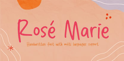 Rose Marie is a beautiful handwritten font, support with multi-languages. This font has a cute modern style that is perfect for your branding design, and will also be very beautiful in your wedding invitations, diary quotes, youtube text, movie titles, Instagram, and business cards. Rose Marie should make your designs instantly look beautiful, original, and amazingly! So enjoy this font and make some cool stuff!
 - VVDS London Oatmeal by Vintage Voyage Design Supply,
$15.00 London Oatmeal - a new stylish font duo, an elegant modern art-deco inspired sans with a lot of ligatures with retro look stylish brush script. It's nice font pair for use it in blogs, posters, magazines, logo’s or greeting/wedding cards. The sans has caps lowercase, so you can combine them in many ways. More than 100 OpenType features as Alternates, Swashes and Ligatures.
 - Daniels Signature by madeDeduk,
$15.00 Introducing Daniels Signature, Oblique and Extras. It includes more than 170 ligatures to make everything look natural handmade signature. This font perfect for poster design, book covers, merchandise, fashion campaigns, newsletters, branding, advertising, magazines, greeting cards, album covers, and quote designs and more. Features: - Uppercase - Lowercase - Numbers & Symbols - International Glyphs - Ligature - Extra If you have any questions please shoot my by email : dedukvic@gmail.com Cheers
 - Roicamonta by Aga Silva,
$24.99 Roicamonta font looks very feminine and delicate. Perfect fit for invitations, greeting cards and other printing where soft and elegant writitng is required. The design stems from Copperplate calligraphy and comes in two styles - upright and italic. This family consists of six font files overall, each file contains over 1200 glyphs. Complete with variety of swashes and fancy ligatures. All engineered and included in handy otf format.
 - Louisville Script by Ascender,
$50.99 Louisville Script is an informal script font based loosely on the handwriting of its designer, Steve Matteson. It was named for the town of Louisville, Colorado (pronounced "Lewis-ville"). Louisville Script is a youthful, casual handwriting script font. It is ideal for casual correspondence including cards, scrapbooks, menus and flyers. Louisville Script is also great for educational materials including the school newsletter or yearbook!
 - Dora Fonna by Ws Studio,
$15.00 Dora Fonna is a new modern script font with an irregular baseline. Trendy and feminine style. Dora Fonna looks beautiful for branding, logo, wedding supplies, greeting cards, fashion, lookbooks, marketing promotions. Includes initial and terminal letters, alternatives, ligatures and multiple language support. Dora Fonna also has a strong neoclassical serif typeface with high contrast, cool style and look, unique with alternative fonts, Ligatures, and multilingual support.
 - Stenblak by Ascender,
$29.99Stenblak is a rough, stencil blackletter design created by Terrance Weinzierl. There is just the right amount of grunge and texture to make Stenblak stand out from other formal blackletter designs. Stenblak would be great for any printed Halloween materials as well as posters, flyers and greeting cards. Stenblak is available in OpenType and TrueType font formats and is best used in medium to large headline sizes. - Ramllast by Thanoestd,
$15.00 INtroduction, Ramllast, This font is natural handwriting style, so if you need digital signature or natural hand writing for quotes, this is the perfect typeface for you! This font perfectly made to be applied especially in logo, and the other various formal forms such as invitations, labels, logos, magazines, books, greeting / wedding cards, packaging, fashion, make up, stationery, novels, labels or any type of advertising purpose.
 - Estravaganza by Scholtz Fonts,
$19.95 Estravaganza is an elegant, finely crafted script, with an uneven, drizzled paint line. It has the delicacy of gossamer while boasting the extravagance of bold swashes and loops. Think "ballet-like femininity offset by the distressed paint drizzle of a jackson Pollock canvas." Use Estravaganza to brand perfume, clothing, jewelry, and to enhance wedding invitations, greeting cards and book covers. Language support includes all European character sets.