10,000 search results
(0.036 seconds)
- Xmas Bubbles by Mvmet,
$18.00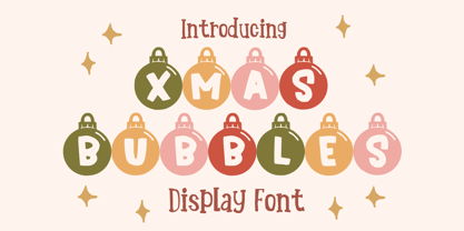 Xmas Bubbles is a cool ornamental Christmas display font. You can use it for anything ranging from t-shirts, kids’ book designs, and greeting cards to stickers and posters, or anything that needs a casual touch. Fall in love with its incredibly versatile style, and use it to create lovely designs!
 - Christmas Kringle by Mvmet,
$16.00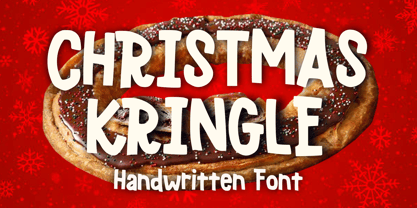 Christmas Kringle is a fun and festive Christmas display font. You can use it for anything ranging from t-shirts, book designs, and greeting cards to stickers and posters, or anything that needs a casual touch. Fall in love with its incredibly versatile style, and use it to create lovely designs!
 - Blushing Woman by Balpirick,
$15.00 Blushing Woman is a Modern Handwritten Font. Whether you’re using it for crafts, digital design, presentations, or making greeting cards, this font has the potential to become your favorite go-to font, no matter the occasion! - also multilingual support Enjoy the font! Feel free to comment or feedback! Thank you!
 - Qomarun by Wildan Type,
$14.00 Introducing new typeface. Qomarun- A modern, luxury, fashionable display serif font. It has unic construction for future style. Qomarun perfectly used for product presentation, elegant logo design, packaging or invitation cards or heading text. it is allcap with symbol and multilingual support Features Two style/ Numbers & Punctuation / Extensive Language Support/ligature
 - Roselyn by Calamar,
$20.00 Roselyn Script is an elegant calligraphic font that will look awesome on wedding and event stationery, logos and branding materials, cards and so on. Roselyn Script includes Uppercase and Lowercase Latin Basic Characters, Numbers and Punctuation. Also the font contains ligatures and stylistic alternates to perfectly re-create natural calligraphy.
 - Bownjax by BonjourType,
$15.00 Bownjax is a modern, handwritten, brush script font that is both versatile and unique! This font is perfect for modern projects, headings, blogs, logos, branding, business cards, websites, invitations, shirts, mugs, and more. This font is PUA encoded which means you can access the available glyphs and swashes with ease!
 - Merry Snowmen by Greater Albion Typefounders,
$5.00 Merry Snowmen is a piece of winter fun-is a set of hand-drawn snowwmen figures, ideal for Christmas or any other time when cold and snow are about. It complements our Merry Fleurons and Christmas Fleurons faces, and is ideal for all your cards, gift labels, invitations, posters and banners.
 - Lisa by Doffdog,
$14.00 Lisa is an all caps display font perfect for Branding, Logo Design, Greeting Cards, Stationery Design, Invitations, T-shirts, Apparel, Packaging designs, Posters, Typographic Design, and so much more. Multilingual support for various languages including: French, German, Spanish, Portuguese, Italian, Dutch, Finnish, Swedish, and more. Happy creating with Lisa font!
 - Faceless by Gassstype,
$29.00 Hello Everyone, introduce our new product Font Faceless it is lack metal Typeface, Rooted, but still readable.This is a Textured Natural Style and classy style with a clear style and dramatic movement. This font Faceless is great for your next creative project such as logos, printed quotes, invitations, cards, product .
 - Alishba by Nandatype Studio,
$19.00 Alishba is a handcrafted font with a regular and bold vibe. It was handmade with an irregular baseline and is equipped with alternatives and ligatures. It can be used to add a natural touch to your stationery designs, quotes, branding, logos, greeting cards, t-shirts, packaging designs, posters and more.
 - Dreamy Night by Fidan Fonts,
$18.40 Dreamy Night is an uppercase decorative font. We've tried to create a cute and simple hand-lettered bubbly sans serif font. This font would be perfect for party invitations, baby showers, birthday cards and more. It includes uppercase basic characters, multilingual symbols, numerals and punctuation. Latin-based Language Support. Happy creating!
 - Retail Price JNL by Jeff Levine,
$29.00 Redrawn from lettering found on a British publication circa the 1930s, Retail Price JNL is an extra bold display inline sans that’s great for catchy headlines, price cards, banners or any other attention-getters. Retail Price JNL is offered in regular, oblique, solid and solid oblique versions. Caps only Fonts.
 - Vishenka by Supfonts,
$9.00 Vishenka Cyrillic will be perfect for wedding lettering, beautiful frame for your home, book covers, greeting cards, logos, marketing, magazines or anything that requires cute handwritten lettering :) What's inside: Vishenka Script Multilingual support Cyrillic support Cricut support If you have any questions, please contact me directly or in instagram @superdizigner
 - Dripping Drops by Prioritype,
$25.00 Inspired by paint dripping and combined with the graffiti artist culture, this font is both eye-catching and character. You can use them in your designs such as posters, skateboard boards, merchandise, music covers, t-shirts, music events etc. Features: -Uppercase -Lowercase -Numeral -Punctuation -Multilingual -PUA Encoded -Opentype Features Thanks.
 - Monday Today by Sensatype Studio,
$15.00 Monday Today is a fun and playful cute typeface. It is perfect for logotype, flyer, greeting cards, packaging, book cover, printed quotes, headings, etc. What will you get: All Characters (from A to Z) Numbers and Punctuation Works on PC & Mac Simple installations PUA Encoded Thanks and have a wonderful day. :)
 - Caniago by Wildan Type,
$10.00 Introducing new typeface. Caniago- A modern, luxury, fashionable display serif font. Embargo perfectly used for product presentation, elegant logo design, packaging or invitation cards or heading text. it is allcap with symbol and multilingual support Two style, Caniago Italic Caniago Regular Features Two style/ Numbers & Punctuation / Extensive Language Support/ligature/Alternate
 - Waston by Burnoth Design Co.,
$19.00 Waston is a beautiful and inspiring set of classical typography glyphs based on a minimal and simplistic approach to elegance Waston is a classic serif font made for headlines, titles, and is well-suited for advertising, fashion mood board, branding, logotypes, packaging, titles, editorial design and modern and social media.
 - Insigne Display by Gian Studio,
$15.00 Insigne Display A bold, modern and fun display font that lives up to its name. The way you can uniquely combine the different parts of this font makes it a lot of fun to use! Perfect for all purposes. , Suitable for magazine design, logo design, headlines, posters, packaging, cards etc. Enjoy!
 - "Just Me Again Down Here" by Kimberly Geswein stands out as a beautifully crafted font that embodies a casual and personal touch. At its heart, this font feels like a handwritten note from a friend, ...
- As of my last update in April 2023, there's no widely recognized or standard font specifically named "Signboard" that's known across major font repositories or among typographic tools; however, the i...
- Leather by Canada Type,
$24.95 Over the past few years, every designer has seen the surprising outbreak of blackletter types in marketing campaigns for major sports clothing manufacturers, a few phone companies, soft drink makers, and more recently on entertainment and music products. In such campaigns, blackletter type combined with photos of usual daily activity simply adds a level of strength and mystique to things we see and do on a regular basis. But we couldn't help noticing that the typography was very odd in such campaigns, where the type overpowers all the other design elements. This is because almost all blackletter fonts ever made express too much strength and time-stamp themselves in a definite manner, thereby eliminating themselves as possible type choices for a variety of common contemporary design approaches, such as minimal, geometric, modular, etc. So extending the idea of using blackletter in modern design was a bit of a wild goose chase for us. But we finally found the face that completes the equation no other blackletter could fit into: Leather is a digitization and major expansion of Imre Reiner's forgotten but excellent 1933 Gotika design, which was very much ahead of its time. In its own time this design saw very little use because it caused problems to printers, where the thin serifs and inner bars were too fragile and broke off too easily when used in metal. But now, more than seventy years later, it seems like it was made for current technologies, and it is nothing short of being the perfect candidate for using blackletter in grid-based settings. Leather has three features usually not found in other blackletter fonts: - Grid-based geometric strokes and curves: In the early 1930s, blackletter design had already begun interacting back with the modern sans serif it birthed at the turn of the century. This design is one of the very few manifestations of such interaction. - Fragile, Boboni-like serifs, sprout from mostly expected places in the minuscules, but are sprinkled very aesthetically on some of the majuscules. The overall result is magnificently modern. - The usual complexity of blackletter uppercase's inner bars is rendered simple, geometric and very visually appealing. The contrast between the inner bars and thick outer strokes creates a surprising circuitry-like effect on some of the letters (D, O, Q), wonderfully plays with the idea of fragile balances on some others (M, N and P), and boldly introduces new concepts on others (B, F, K, L, R). Our research seems to suggest that the original numerals used with this design in the 1930s were adopted from a previous Imre Reiner typeface. They didn't really fit with the idea of this font, so we created brand new numerals for Leather. We also expanded the character set to cover all Western Latin-based languages, and scattered plenty of alternates and ligatures throughout the map. The name, Leather, was derived from a humorous attempt at naming a font. Initially we wanted to call it Black Leather (blackletter...blackleather), but the closer we came to finishing it, the more respect we developed for its attempt to introduce a plausible convergence between two entirely different type categories. Sadly for the art, this idea of convergence didn't go much further back then, due to technological limitations and the eventual war a few years later. We're hoping this revival would encourage people to look at blackletter under a new light in these modern times of multiple design influences.
 - Euroscript by profonts,
$41.99 Euroscript Pro is the handwriting of Ralph M. Unger, a very talented and hard-working German type designer. Unger has redesigned a large number of beautiful ancient typefaces during the last few years. Peter Rosenfeld of profonts persuaded him to try and produce his own very beautiful handwriting. Kind of hesitant at the beginning of the design process, Unger's joy and excitement about the project was continuously growing during the design process. He designed not only the standard character complement West, but added all of the Eastern European Latin glyphs and, on top of that, even the complete Cyrillic characters. Born and grown up in Th�ringen, former East Germany, Unger has a fair knowledge of Polish and also Russian (Cyrillic). Euroscript Pro is a very beautiful, casual, informal and modern handwriting of a contemporary type designer. Even though a digitized handwriting, it keeps a very natural and pleasant look, at the same time being generous and well-readable. The individual characters combine quite easily and perfectly with no need for extra variants.Euroscript Pro is well-suited for plenty of applications, e.g. personal correspondence, invitations, greeting cards, headlines etc.Euroscript Pro is supplied in the complete Latin character set (West + East) plus Cyrillic.
 - Helsa Display by ParaType,
$39.00 Helsa is a slim and eccentric serif for headings and short texts. It’s a modern interpretation of the narrow Elseviers of the early 20th century. The letterforms are based on Dutch samples, and in the details there are references to both American type catalogs and letters from the foundries of Wolf and Herbeck. Due to the compact proportions of characters and the high contrast of strokes, Helsa doesn’t take up much space in the line and allows you to increase the type size freely, drawing the viewer's attention to the text. The typeface is suitable for branding museums and exhibitions, alternative music bands, independent clothing and perfume brands, and for any topic related to design or history. Helsa’s character set has more than 1600 characters. It supports hundreds of languages, including extended Cyrillic, Greek, and Vietnamese, as well as many OpenType features: fractions, ligatures, old style and tabular numerals, titular letter alternates, and more. There are variants of dashes and other punctuation marks specifically for uppercase typing. In addition to letters, the typeface contains arrows, numbers in circles (in fact, in ovals), symbols of various types of plastic, card suits and much more. Helsa typeface was made at Paratype in 2020-2022.
 - Declaration Of Independence by Celebrity Fontz,
$17.99The Signers of the Declaration of Independence font is a collection of all 56 signatures that appeared on America's Declaration of Independence. A must-have for autograph collectors, desktop publishers, lovers of history, or anyone who has ever dreamed of sending a letter, card, or e-mail to a friend or family member "signed" as if by one of the signers of America's Declaration of Independence. This unique font puts every signature on that history-altering document at your fingertips in the form of a high-quality Open Type font. Our fonts behave exactly like any other font on your system and are installed and selected the same way. No special software is needed. Each signature contained in our fonts is mapped to a regular character on your keyboard. Just as with any True Type or Open Type font, you can resize the signature, change its color, etc. Open any Windows application, select the installed font, and type a letter, and you will see the President's signature appear right there on your page where you placed your cursor. Painstaking craftsmanship and an incredible collection of hard-to-find signatures go into this one-of-a-kind font. We're confident you will enjoy it. Please note that this font is intended for entertainment purposes only. - Poppy Spoor by Yumna Type,
$15.00 Would you like a legible, professional, prominent font? Well, if that is what you want, you will probably have trouble finding one as it is a time-wasting process and is a hard challenge. Let us introduce you to a perfect font for any project, the Poppy Spoor. Poppy Spoor, unlike the other display fonts, is a display font with rather square letters to show you fun, soft, modern impressions due to the thin line designs in low contrasts. This font type, giving you a clipart as a bonus, is legible and is better applied for big text sizes. You can maximize your designs with Poppy Spoor’s features to remain the best in every design at any time. Features: Alternates Ligatures Multilingual Supports PUA Encoded Numerals and Punctuations Poopy Spoor fits best for various design projects, such as brandings, posters, banners, headings, magazine covers, quotes, invitations, name cards, printed products, merchandise, social media, etc. Find out more ways to use this font by taking a look at the font preview. Thanks for purchasing our fonts. Hopefully, you have a great time using our font. Feel free to contact us anytime for further information or when you have trouble with the font. Thanks a lot and happy designing.
 - American Presidents by Celebrity Fontz,
$19.99The American Presidents font is a collection of the signatures of all 44 U.S. Presidents. A must-have for autograph collectors, desktop publishers, lovers of history, or anyone who has ever dreamed of sending a letter, card, or e-mail to a friend or family member “signed” as if by one of America’s Presidents. This unique font puts the signatures of America’s Presidents at your fingertips in the form of a high-quality Open Type font. Our fonts behave exactly like any other font on your system and are installed and selected the same way. No special software is needed. Just as with any True Type or Open Type font, you can resize the signature, change its color, etc. Each signature contained in our fonts is mapped to a regular character on your keyboard. Open any Windows application, select the installed font, and type a letter, and you will see the President’s signature appear right there on your page where you placed your cursor. Painstaking craftsmanship and an incredible collection of hard-to-find signatures go into this one-of-a-kind font. We're confident you will enjoy it. Please note that this font is intended for entertainment purposes only. - Floras Display by Putracetol,
$22.00 Floras is a display typeface font inspired by vintage albums and posters from 1960s music bands. This unique font features a classic typeface with a fun and groovy impression, making it perfect for any display purpose, including album covers, posters, labels, t-shirts, apparel, signage, quotes, logos, greeting cards, and more. Floras also supports multiple languages, making it a versatile font for any project. In addition to its classic typeface, Floras also features several variations such as ligatures, adding to its uniqueness and versatility. The font comes with several Open Type features, including swashes, stylistic sets, stylistic alternates, contextual alternates, and ligatures, which can be accessed using Open Type savvy programs such as Adobe Illustrator, Adobe InDesign, Adobe Photoshop, Corel Draw X version, and Microsoft Word. The Floras font package includes three file formats - otf, ttf, and woff - providing compatibility across various platforms. It also comes with several features, including uppercase and lowercase letters, alternates, ligatures, and support for numbers, punctuation, and symbols. If you're looking for a font with a classic yet unique vibe, Floras is an excellent choice. This display typeface is perfect for any project that requires a touch of vintage charm and a groovy impression. With its multiple language support and versatile features, Floras is sure to impress.
 - JT Collect by OGJ Type Design,
$35.00 JT Collect is a hybrid sans-serif typeface for the 21st century that takes a playful approach to the type design heritages of Germany and Switzerland. Confidently built on a geometric structure and infused with elements from traditional grotesque typefaces, it hits the sweet spot between geo and grot. I developed JT Collect purely digitally, drawing from years of experience with analog type design. The letters aren’t based on one particular source but seek to merge different type genres from the first half of the 20th century and lift them to a contemporary quality level. JT Collect is less reserved than strictly geometric designs and brings some industrial workmanship and honesty into the game. The six weights plus three optical sizes of JT Collect offer what you need to make an impact. While cool and elegant in the Light weight, the fonts show more presence on the page as they grow bolder. To this end, I drew the letterforms with a slightly unrefined, brawny air in the bolder weights. This sets them apart from the perceived purity of more geometric designs. The Book weight is ideal for short texts and medium-length copy, and the forceful Bold makes wordmarks look crisp and lets headlines radiate cosmopolitan self-confidence. JT Collect is suitable as a primary typeface for branding, advertising, packaging, stationery, posters, documents, and websites from trades and industries as diverse as food & fashion, media & makers, culture & creators, games & gems, sports & startups. Use JT Collect for film titles or watch faces, for leaflets or store signs, for business cards or billboards: this font family is as adaptable as a chameleon (and like a chameleon, it’s never boring). Try it in different contexts. You won’t be disappointed. Its adaptability also makes JT Collect a great starting point for poised and persuasive font combinations. Even a sans/sans pairing is possible due to hybrid nature of JT Collect—something that’d be hard to achieve with most other sans-serif typefaces on the market. You can add to it a heavy slab from the OGJ library, like Temper Wide. You might go for a geometric or a grotesque typeface as secondary (text) typeface. Or you could set your body copy in a classic serif typeface such as Caslon, Sabon, or Plantin. That’s right: JT Collect is a true team player. Whether you need a grotesque or a geometric sans: try JT Collect. You can get the best of both worlds.
 - Martini at Joe's by steve mehallo,
$19.56 Googie Architecture, also known as "Midcentury Coffee Shop Modern," was born in California during the Atomic Age. Martini at Joe's is based on lettering from several historic Googie sources - many of which no longer exist. The futuristic Martini at Joe's collection was named for Northern California's famous Italian-themed "Joe's" restaurants, some of which are still serving up large portions of charbroiled beef steak, canned buttered veggies and pretty decent martinis. Martini at Joe's contains many fabulous typographic extras – and is available in single font packages or as a 15 font interchangeable Megaset (with "italic-esque" obliques and "retro obliques"). Martini at Joe's is perfect for use as commercial signage, on the menu for your coffee shop, supper club, tiki bar, fish grotto, smorgy, space port or destination casino. It also holds its own in any vintage store, on greeting cards, t-shirts, hi-brow gallery announcements, product skins, your 'zine masthead, on the faceplate of your futuristic microwave oven, tv dinner packaging, at millionaire's conferences or even embellishing the fuselage of your latest jet airline venture. Martini at Joe's: there's no better way to say, "Hold the olive, I'm having a moment."
 - Apolline Std by Typofonderie,
$59.00 A Venetian serif in 6 styles The Apolline typeface family was created by Jean François Porchez as a means to study the transition from Renaissance writing into the first printing types. Rather than sticking to the method commonly used these days for the creation of revivals of Jenson or Bembo types, it seemed more interesting to try and get in the same mindset as those exceptional designers during this pivotal period in the history of typography. Thus Apolline is an exploration of the design methods used by people like Nicolas Jenson and his contemporaries for adapting handwriting with its multiple occurrences (a, a, a, b, b, b…) into single, unique signs (a, b…). Initially Jean François made drawings modelled after his own calligraphy. They were done at a very small size on tracing paper (2 cm high for the capitals) to preserve the irregularity of human handwriting. Besides emphasising the horizontal parts of the letter forms, the serifs were designed asymmetrically to reinforce the rhythm of the writing. The final drawings were produced at a large size (10 cm high for the capitals) to allow for subtle optimisation of specific details. The very narrow and fluid Apolline italic Influenced by various concepts for an ideal italic by Van Krimpen, Gill, etc. Apolline italic was designed at 8° degrees. Although the structure of the letterforms were informed by chancery scripts, the italic has full serifs like the roman. Very narrow and fluid, its unique design creates a good contrast when used in combination with its upright counterparts. Thanks to the presence of the serifs similar to roman typefaces it sets very neatly in large sizes. The next step was digitising the drawings with Ikarus (the pre-Bézier-curves era) to create the final roman and italic fonts. Two years later, when the family was expanded to six series the same method was used, this time with Fontographer. This was necessary for correcting a few problems caused by the conversion to Bézier outlines, and to add intermediate weights. Before the advent of feature-rich OpenType, quality type families consisted of several separate fonts for each weight to provide users with various sets of numerals, an extended ligature set and alternates, ornaments, and so on. Introducing Apolline Morisawa Awards 1993
 - Madriz by SilverStag,
$14.00 Introducing Madriz, a slab serif font with a retro feel that's perfect for any project that needs a touch of old-school charm. With over 32 fonts in one font family, Madriz offers a wide range of styles to suit any need. You can choose from Thin to Black weights and Regular to Extra Expanded widths to create your perfect look. Madriz is inspired by the old-school signage of Madrid, Spain. The name "Madriz" is actually the affectionate nickname that Madrileños, the people of Madrid, gave to their city. The font's bold, blocky letters capture the essence of Madrid's vibrant and historic streets. Madriz's versatile nature makes it a great choice for a wide range of projects. Its bold, retro style is perfect for showcasing heritage brands or giving a modern touch to classic designs. Madriz can also be used to create a sense of nostalgia, making it ideal for retro-themed projects or campaigns. Here are some of the ways you can use Madriz: Titles and headings: Madriz's bold, eye-catching style is perfect for titles and headings. Text blocks: Madriz's wide range of weights and widths makes it suitable for text blocks, from body copy to large paragraphs. Logos and branding: Madriz's retro charm makes it a great choice for logos and branding. With its 32 font styles and support for over 90 languages, Madriz is an incredibly powerful tool for any designer. It can be used to create a variety of looks, from classic and elegant to modern and edgy. Whether you're working on a print project, a web design, or an app, Madriz has the potential to make a lasting impression. Madriz is the perfect font for anyone who wants to add a touch of old-school charm to their designs. With its wide range of styles and features, Madriz is sure to make a statement in any project. Would you like to get 5 completely free fonts worth over $75? No tricks, no hidden words, terms or anything. Just subscribe to my newsletter, make sure to check your email to approve the subscription, add me to your contacts so that the emails don't end up in spam folder and you will get 5 fonts for free. The fonts are packed with alternates, ligatures and some even come with extra goodies. Happy creating everyone!
 - Analogue Pro by Ingo,
$42.00 very traditional forms strongly slanted italic consistant proportions extraordinary ligatures swashes alternate letters alternate figures lower case l with a hooked “foot” Believe it or not, there are hardly any sans serif fonts in which the lower case letter l also has the hooked form of an l. Instead, we readers have to constantly distinguish whether we are seeing an uppercase I or a lower case l — just take a look at the word “Illinois”... The ingoFont Analogue was developed for exactly this reason. The intent: To create a pretty much »ordinary«, even classical font with its most striking characteristic being the inclusion of the “crooked l.” As a model, I used the »mother of all sans serifs«, Akzidenz Grotesk from Berthold, with its beginnings going back to the 19th century. Analogue is so to say a new interpretation of Akzidenz Grotesk from ingoFonts. All characters — following the model — have been newly designed. And if you want to emphasize the shape of the hooked foot even more, you can also activate the alternate styles for d, h, m, n (Style Set 1). Conversely, the alternate a somewhat softens the “hooked” impression (Style Set 2). The slanted versions — it isn’t truly a real cursive font — are noticeably stronger with 13° than the italics in comparable fonts, and were given a round e with a mind of its own which distinguishes itself considerably compared to the upright characters in the overall appearance of the font. More modern and formal solutions in detail were chosen for some of the characters, for example the M was given lightly slanted sides; the a reflects the curves of the s; the “feet” of a, l and t match; the flared legs of K and R became a “foot”, too. General proportions were carried over almost completely with no changes from Akzidenz Grotesk as well as the slanted trimming on the open forms of a, c, e, s; in comparison, C, G and S were given straight endings. Analogue contains many ligatures, even discretional ligatures, plus proportional, old style as well as tabular figures. All in all, at first sight Analogue brings back memories of the charm of its well-known predecessor; and yet, many small differences give Analogue an unmistakable certain something...
 - Blue Goblet Drawn by insigne,
$5.00 This best selling series has now been extended to include a new member, Blue Goblet Drawn. Blue Goblet is hand-drawn by the artist, Cory Godbey, and is organic, charming and exuberant. Characters bounce and dance above and below the baseline and x-height, making this a whimsical and fun script. Not only is Blue Goblet Drawn a excellent choice, it also is also a versatile member of a wide family of different fonts. You can use it side by side with the original Blue Goblet fonts, and there are a wide range of ornaments available in the supplemental ornament sets--over 370 illustrations! These illustrations include doodley frames, lovely florals and other text ornaments that can be inserted into your text and resized at will. This makes the Blue Goblet series a great pick when you want a type system for a very unique and consistent look. The Blue Goblet series also continues to expand, making any of these family members a valuable investment for the future. Blue Goblet Drawn comes in three weights and three widths in each weight, with complementary italics for maximum impact for a total of eighteen pro fonts. The compact thin weights are delicate and tall, while the Regular has just enough heft for those situations where subtlety doesn't work. If you don't need the professional features, there are three stripped down fonts that include only the basic character set! Blue Goblet Drawn also includes auto-replacing ligatures that make it appear that the script was drawn by the artistís own hand--just for you! Blue Goblet Drawn also includes a wide variety of alternates that can be accessed in any OpenType enabled application. Blue Goblet includes over 190 additional glyphs and is loaded with features including an even more unique alternate alphabet. Included are swash alternates, style sets, old style figures and small caps. Please see the informative PDF brochure to see these features in action. OpenType enabled applications such as the Adobe suite or Quark can take full advantage of the automatic replacing ligatures and alternates. This family also includes the glyphs to support a wide range of languages. Blue Goblet Drawn is a great choice for friendly display type in children's books, packaging, organic packaging or other unique applications. Use Blue Goblet whenever you want to inject a handmade sense of fun and whimsy to your designs. Give the Blue Goblet series a whirl today!
 - Basilia by Linotype,
$29.99 Among the countless typefaces available today, the Modern Face style is relatively underrepresented. During the 19th century and then later with the competition from the mechanized hot metal types and film setting, a number of attractive headline types appeared in this style. For text, however, the available types were limited to those based on tried and true classics like Walbaum, Didot and Bodoni, which were created between 1780 and 1830, as well as a few variations from the end of the 19th and beginning of the 20th centuries. The demand for new Modern text types remained nonexistant until the 1960s. Such was the situation when the Haas'sche Schriftgiesserei (Haas Type Foundry) commissioned me to come up with a concept and sketches of a new hot metal type. I was able to convince the director of the foundry that there was a niche to be filled with contemporary Modern typography. Another reason for the production of a new type was of a technical nature: the introduction of a new setting technique should not be limited to existing typefaces, but instead should lead to innovative text types suited to the demands of the new applications. André Gürtler, Basilia's designer: I began to work on the concept and initial designs of the new text type in 1968. I wanted to give the type a classical look, expressed above all in the strong stroke contrast between the robust verticals and fine horizontal strokes and serifs. This is one of the main characteristics of Modern typography.""This new typeface, Basilia, is distinguished by its soft, open appearance as well as a number of details which together mark a departure from historical models. For example, it has nothing of Bodoni's round letters and their angular, narrow spacing, and displays instead round forms with a much softer stroke in the curves. It was very important to me to avoid the Modern characteristic of stiff, vertical, grid-like strokes and to create instead a lighter, more transparent type. I retained the Modern style by using straight horizontal serifs at right angles to the strokes to still give the type its sense of rigidity." Three sketches for Basilia (normal, italic, and bold) were finished in 1973. Only the 9-point size was produced at first. In the following years, basic weights were made and adapted to filmsetting."
 - Neon Love by Schriftlabor,
$29.99 Neon Love was designed originally for a circle coaster design with a quote by the Beatles’ “All you need is Love, Love is all you need”. The inspiration of the lettering was a neon sign style where a cursive script is kind of bended from those glass wires. The idea was to get the overall look and feel of neon signs into a font, as well as creating a good raw material to use for some further photoshop effects to enhance the visual presentation. Neon Love has many OpenType features that allow for choices that can make the lettering unique. Neon Love has two versions of the font a Smooth one which is connected and the Cutout version which can be used to create neons and for this it is in parts. Design by Roland Hüse and Schriftlabor team.
 - Amstrong Script by Lucky Type,
$14.00 Introducing Amstrong Signature Script font. Hi Designers, come again to complete your script font collection! This is a classic thin font with an italic style. This font comes with several modern swirly alternates that can make your work look elegant, sweet and perfect. With this style, this font will be suitable for logos, branding projects, product packaging, mugs, quotes, posters, shopping bags, logos, t-shirts, book covers, business cards, invitation cards, greeting cards, and all your other beautiful projects. Amstrong Signature Script font, includes various language support. You can use this font for your work very easily because it contains many features. Contains a complete set of upper and lowercase letters, punctuation, numbers and multilingual support. This font also includes several ligatures and alternative styles Set Stylistic For those of you who have software that is able to work OpenType (Corel Draw / Photoshop / Illustrator / InDesign). Files include: Amstrong Signature Script.OTF If you don't have a program that supports OpenType features such as Adobe Illustrator and CorelDraw X Version, you can access all alternative glyphs using Font Book (Mac) or Character Map (Windows): How to access all alternative characters using Adobe Illustrator: https://www.youtube.com/watch?v=XzwjMkbB-wQ How to access all alternative characters, using Windows Character Map with Photoshop: https://www.youtube.com/watch?v=Go9vacoYmBw
 - Athan Script by Max.co Studio,
$14.00 Athan Script is a classic calligraphy font. This is a classic thin font with an italic style. This font is available in several modern swirls that can make your work look elegant, sweet and perfect. This font is suitable for logos, branding projects, design of household appliances, product packaging, mugs, quotes, posters, shopping bags, logos, t-shirts, book covers, business cards, invitation cards, greeting cards, and all your other beautiful projects. Athan Script has 620+ glyphs and 400 alternative characters, including various language support. You can use this font for your work very easily. Because there are many features in it. Contains a complete set of upper and lowercase letters, punctuation, numbers and multilingual support. This font also includes several ligatures and alternative styles Set Stylistic For those of you who have software that is able to work OpenType (Corel Draw / Photoshop / Illustrator / InDesign). If you don't have a program that supports OpenType features such as Adobe Illustrator and CorelDraw X Version, you can access all alternative glyphs using Font Book (Mac) or Character Map (Windows). How to access all alternative characters using Adobe Illustrator: https://www.youtube.com/watch?v=XzwjMkbB-wQ How to access all alternative characters, using Windows Character Map with Photoshop: https://www.youtube.com/watch?v=Go9vacoYmBw Mail support: maximal.fonts@gmail.com
 - Amorra Script by Zane Studio,
$15.00 Amorra Script is a classic thin font with italics style. Here you will get a beautiful classic font. This font is available in several modern rounds that can make your work look elegant, sweet and perfect. With this style, this font will be suitable for logos, branding projects, household designs equipment, product packaging, mugs, quotes, posters, shopping bags, logos, t-shirts, book covers, business cards, invitation cards, greetings card, and all the other beautiful projects. Amorra Script, including various language support. You can use this font for your work easily. Because there are many features in it. Contains complete set upper and lower case letters, punctuation, numbers, and multilingual support. This font also includes several ligaments and alternatives Style Set Style For those of you who have good software OpenType function (Corel Draw / Photoshop / Illustrator / InDesign). If you don't have a program that supports the OpenType feature like Adobe Illustrator and the CorelDraw X version, you can access all alternatives glyphs use Font Book (Mac) or Character Map (Windows): How to access all alternative characters using Adobe Illustrator: https://www.youtube.com/watch?v=XzwjMkbB-wQ How to access all alternative characters, using Windows Character Map with Photoshop: https://www.youtube.com/watch?v=Go9vacoYmBw Thank you & Congratulations on the Design
 - Atrament by Suitcase Type Foundry,
$75.00The Atrament font family was originally conceived in 2003 as the corporate display type family for Suitcase Type Foundry. Its original source of inspiration is the front cover of the Devetsil - Revolucni slovn’k almanac (1922), designed by Karel Teige. The lettering on this cover is a condensed sans serif with rounded stroke terminals. Atrament is significantly broader than the model and its characters are better balanced, reflecting the evolution of semi-condensed sans serifs throughout the 1960s. The horizontal strokes of both lower and upper case are less stressed than the vertical stems. Noteworthy are the unusual tiny gaps in the apex and vertex of letters with diagonal strokes, designed to prevent ink from spreading and smudging the letter shapes. This detail is one of the main features of the font's character. The general feel of the italics closely matches the strictly vertical, parallel character of the regular cut. When converting the family to OpenType the alternate character shapes from the Alternator weights were incorporated in the regular cut, which allows the user to switch selected characters from one shape to another within the same font. A number of glyphs and accents were corrected, and all the glyphs missing in the Suitcase Standard character set were added, along with the relevant kerning pairs. The individual weights of Atrament Std thus contain accented upper and lower case, small caps, alternate glyphs for most European languages, nine types of numerals, superscript characters, caps glyph versions, and much more. Its narrow proportions make Atrament the perfect choice whenever economy of space is a must. It is however not very well suited for setting long texts. Ideal for headlines and display use, it is perfect for situations where the text needs to make a great impact in a little space. - Univers Next by Linotype,
$53.99 Linotype Univers is a completely reworked version of the original Univers typeface family designed by Adrian Frutiger in 1957. After a long process of painstakingly detailed revision, Frutiger and the design staff at Linotype completed this large joint project in 1997. The result: a brilliant and cohesive font family of 63 weights and styles including the 4 monospaced typewriter weights. All the existing weights were completely redrawn, with careful attention paid to making the proportions more consistent with each other and improving fine details such as curves and thick-to-thin stroke ratios. The family was expanded from 27 to 63 weights, providing a much larger framework to graphic designers for choosing just the right style. The bold and condensed weights were reworked for improved legibility and on-screen application. The stroke weights were revised for consistency within each face as well as in relationship to the other weights. By following Frutiger's original designs, the humanist character of the sans serif Univers now comes through more distinctly. T he systemized numbering system has also been updated. With its sturdy, clean forms Univers can facilitate an expression of cool elegance and rational competence. In fact, the strong familial relationships between all the styles and weights make it a serviceable choice for large graphic design projects that require versatility with consistency. Frutiger was successful in staying true to his initial aims; the new Linotype Univers does indeed work in longer texts as well as for display settings. In 2010 the typeface family was extended and renamed into a more logical naming of "Univers Next" to fit better in the Platinum Collection naming. Univers Next Variable are font files which are featuring two axis and have a preset instance from Light to Heavy and Condensed to Extended. Univers® Next font field guide including best practices, font pairings and alternatives.