10,000 search results
(0.022 seconds)
- Quoi Chou NF by Nick's Fonts,
$10.00The letterforms of Lucien Bernhard's stylish, if somewhat anorexic, Bernhard Fashion were beefed up and complemented with thick-and-thin stroke variation to create this elegant family, available in normal and bold weights. Additionally, Bernhard's variant forms have replaced several of the letters which commonly appear in other revivals. The Postscript and Truetype versions contain a complete Latin language character set (Unicode 1252); in addition, the Opentype version supports Unicode 1250 (Central European) languages as well. - Neva by ParaType,
$30.00 Neva Regular with Italic was created by Moscow book and type designer Pavel Kuzanyan (1901-1992) at Polygrafmash in 1970 for slugcasting and display composition. Based on simple strict letterforms of Russian classical typefaces. Neva typeface was rewarded on the Gutenberg international type design contest in 1971 (Leipzig). The typeface is useful in text and display composition, in fiction and art books. The digital version and bold styles were designed for ParaType in 2002 by Lyubov Kuznetsova.
 - ITC Connectivities by ITC,
$29.99Some words from the designer... West coast artist Teri Kahan developed a "design font" of 68 pictographs capturing the sentiments of relationship, connection and synchronicity. Many of the characters were created with phrases in mind like, "handing you the world on a platter", "howling at the moon", and "message in a bottle". Others represent life experiences. The clean, simple illustration style originates from the look of hand-carved rubber stamps, and lends itself beautifully to logos and graphics. - Isabella by Monotype,
$29.99Isabella was designed by Hermann Ihlenburg in 1892 for MacKellar, Smiths and Jordan, one of many type houses that were later amalgamated into American Type Founders. As testimony to its long-lived appeal, Isabella was one of the first PostScript® language typeface releases (in 1988) of Agfa Compugraphic. With its unmistakable 19th-century characteristics - swirls, loops, and surprising letter shapes - Isabella is a natural for display situations that demand high drama or, dare we say, melodrama. - Eolia A by Eurotypo,
$24.00 In ancient Greece, the inhabitants of the Aegean islands and the northwest coast of Asia Minor were called "Eolia". Eolia is a family of sans serif fonts that combine grotesque style with certain geometric characteristics. This family composed of six weights harmonically controlled, has blunt strokes, perfectly defined with subtle modulations as a result of careful optical corrections. The control of the counterforms and accurate kerning gives it great readability, personality, aesthetic value and visual impact.
 - Manufactory JNL by Jeff Levine,
$29.00 Manufactory JNL and its oblique counterpart were re-drawn from examples of a now-antique typeface used within many advertisements found throughout the pages of The American Stationer magazine, circa 1879. The term ‘manufactory’ was popular during this era; the word being a more archaic form of ‘factory’. There is a bit of Western flavor to this type design, as the spurred serifs and the top and bottom strokes are heavier than the vertical and mid-point stroke weights.
 - LTC Goudy Extras by Lanston Type Co.,
$24.95 A set of over 50 ornaments, connecting borders, flourishes and decorative motifs originally designed by Frederic Goudy throughout his career. Many of these designs were used by Goudy at his Village Press and offered by his Village Foundry in the 1920s. The styles range from complex title page illustrations to simple linking borders, but all have the unique Goudy style. This set is completely different from the Goudy Ornaments found in the P22 Goudy Aries Set.
 - Chartha by Amarlettering,
$30.00 Chartha come with 250+ glyphs. The alternative characters were divided into several Open Type features such as Swash, Stylistic Sets, Stylistic Alternates, Contextual Alternates. The Open Type features can be accessed by using Open Type savvy programs such as Adobe Illustrator, Adobe InDesign, Adobe Photoshop Corel Draw X version, And Microsoft Word. And this font has given PUA unicode so that all the alternate characters can easily be accessed in full by a craftsman or designer. Email : amarlettering@gmail.com
 - Ellabette by Bombus Hollow,
$24.00 Ellabette™ is a script font that was created by a wedding stationery designer after working in the industry for over a decade and getting request after request for script fonts that were formal but legible. Ellabette is warm and inviting, playful but elegant. Perfect for all things weddings, branding, editorial, social media, and websites. Designed with weddings in mind with fun special ligatures like "RSVP" "and" and "to" and works beautifully for legible address lists and envelope printing.
 - Badlands JNL by Jeff Levine,
$29.00 A vintage piece of sheet music for "Waitin' at the Gate for Katy" (from the 1934 movie "Bottoms Up") provided the hand-lettered, Western-influenced lettering which is now available as Badlands JNL. Some of the characters originally had overly-thick vertical strokes which stood out from the rest of the letters, so they were "standardized" in order to provide a more aesthetically pleasing overall design. Available in both regular and oblique versions to fit your design needs.
 - Bryson by Valentino Vergan,
$16.00 Introducing Bryson, A bold sans serif ligature typeface. The Bryson typeface is characterized by simple but distinctive shapes. The typeface is very eye catching, its tight kerning and bold shapes makes it great for retro designs. You can use it for a wide range of projects, including print and web. If you are looking for something bold and retro for you next project, Bryson is the typeface for you. I hope you enjoy using the Bryson typeface.
 - Kraken Ink by Fat Hamster,
$20.00 Kraken Ink & Kraken Script fonts were inspired by mystery of ocean and sea, their secrets and creatures. As unique, rustic, frivolous and fun as a wind! With Kraken Ink font you can give your project it's own trendy and stylish feel. Kraken Ink typeface is perfect for your label and packaging design, social media quotes, logo and branding design, t-shirt design, heading, scrapbooking, calendars, book covers. Enjoy using the illustrations and elements in your design projects.
 - Oilvare by Adam Ladd,
$25.00 Oilvare is a hand-drawn, layered typeface inspired by vintage painted signs and oil cans. While sturdy, it also has a softer side—wide proportions, oval-inspired forms, curled angle strokes, and a medium contrast all help give it a little bit of distinction from the typical sans serif. Mix, match, and layer the styles to your liking. Carefully drawn, when you enlarge the typefaces, the subtle irregularities become more apparent and harken to hand lettering of the past.
 - 1479 Caxton Initials by GLC,
$20.00 This family was created inspired from the two sets of rough initials fonts used by the famous William Caxton in Westminster (GB) in the late 1400’s. As it was normal for the time, there were not any differences between I and J, U and V. It is not a mistake. We have reconstructed the few other missing characters. This font was conceived as a supplement for our 1479 Caxton but may be used with all our Blackletters fonts.
 - Maisee by AVP,
$29.00Maisee is a smiling sans serif face for many occasions and has proved itself in art catalogues, wine lists, websites and many other situations. Full of retro influences, it sits elegantly on today's page or screen. A useful modern font which doesn't sacrifice form and charm for space, Maisee is characterised by a generous x-height and a roundness of form based on gentle spirals. Numerals and math characters are tabular from ExtraLight through to SemiBold. - HV Auckland by Harmonais Visual,
$12.00 Auckland Variable Serif is a highly versatile and elegant serif font that exudes a timeless charm. With its beautifully crafted curves and exquisite details, Auckland is the perfect choice for a wide range of design projects. Whether you need a font for display purposes, web design, or social media, Auckland will effortlessly elevate your creations to the next level. Its fancy curves add a touch of sophistication and uniqueness, making it a standout choice among other fonts.
 - White Capel by Putracetol,
$24.00 White Capel - Modern Display Font is a bold, distinctive, and thoroughly contemporary typeface that exudes a trendy and up-to-the-minute vibe. Its soft, rounded letterforms lend it a unique and easily recognizable appearance, ensuring it stands out in any design. This font is perfectly suited for a wide range of applications, including logos, quotes, posters, branding, business names, and more. With its modern, sleek aesthetics, White Capel brings a touch of current style to your creative projects.
 - Onyon by Ingrimayne Type,
$9.00 Onyon is a bizarre typeface with vertical stems that thicken in the middle and narrow at the ends. It was created as an experiment to see what a typeface would look like if the vertical stems were diamond or rhombus shaped. The letters are angular with unusual triangular serifs and they have no curves. It is a harsh, cruel typeface that will make your eyes water if you use it at small point sizes for text.
 - MC Blothe Display Font by Maulana Creative,
$13.00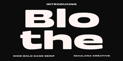 Blothe is a wide sans serif basic font. With bold extended stroke, fun character with a bit of ligatures and alternates. To give you an extra creative work. Blothe font support multilingual more than 100+ language. This font is good for logo design, Social media, Movie Titles, Books Titles, a short text even a long text letter and good for your secondary text font with handwritten or script. Make a stunning work with Blothe font. Cheers, Maulana Creative
 - Bauen by Tipo Pèpel,
$22.00 Bauen (worker in German) is a tribute to the Bauhaus school that has just completed its first centenary and whose ideas are still relevant. It is a geometric typeface inspired by the sans serif typefaces prevailing in those years, and whose cradle resides in the Bauhaus school. It has a wide language coverage, and a generous range of OpenType functionalities, to make it an all-rounder for our day to day, and especially for corporate use.
 - Quietism High by Michael Rafailyk,
$20.00 Quietism High is an experimental subfamily that received a high contrast from Quietism Display and a high x-height from Quietism Text. It's still a Display typeface, albeit more graceful, wide and open. Other subfamilies: https://www.myfonts.com/collections/quietism-font-michael-rafailyk Scripts: Latin, Greek, Cyrillic. Languages: 480+ The promo images used “Sleeping Venus” painting by Giorgione, “The Creation of Adam” painting by Michelangelo, and “The Piazza and Church of Santa Maria Maggiore” painting by Giovanni Paolo Pannini.
 - KhaoSans by TypeK,
$35.00 KhaoSans is a Rounded typeface. The latin was inspired from Thai woodtype used as headline in old day Thai newspaper. The refined curve with some sharp end add uniquely beautiful touch to the typeface. In Thai language, ‘Khao’ (ข่าว) means ‘news’ and ‘Sans’ (สาร) means ‘message’. The font comes in 8 weights, ranging from a delicate ExtraLight to Black, with 3 widths (Normal, Wide, and Expanded). Matching italics are provided, resulting in a total of 48 styles family.
 - Big Caslon CC by Carter & Cone Type Inc.,
$35.00 The three largest sizes of type made by the Caslon foundry are strangely unlike the famously consistent text faces cut by William Caslon. Perhaps they were the work of other hands—or of the master in a funky mood. Caslon’s text types have often been revived, but the display sizes, forceful and a touch eccentric, had no digital version until Matthew Carter’s Big Caslon. With striking Italics and rich design features , this typeface shines at BIG sizes.
 - DEATHE MAACH by The Fontry,
$15.00 There's a war starting; you just didn't notice because you were too busy fighting to realize what was happening. Take your sides. Pick your battles. Choose a face that stands ready to defend, enforce and police. All who are ready to serve, please step forward. Deathe Maach is a six-font family of descending weights with the strength and stamina to face all comers in the approaching conflict. Armor on. Pistols out. Barrels forward. Enforce and serve.
 - Deconstructed JNL by Jeff Levine,
$29.00 Deconstructed JNL is another set of rubber stamp alphabet letters and numbers from a 1930s toy printing set. The original typeface of this set is Cheltenham Open. The stamps were printed out and scanned, creating this limited-character font with dual characteristics. At small point sizes it replicates inked rubber stamp impressions, but in larger format it shows angular lines and erratic character shapes as if made from cut paper or lettering that was intentionally made to look damaged.
 - Devil Kalligraphy by Lián Types,
$17.00Devil Kalligraphy was performed by Argentina Lián Types in 2007. The shapes of each caracter have a strong personality. It was based on antique writings. Devil Kalligraphy was inspirated in calligraphy styles. Gothic and Uncial themselves. A mix with lots of personal qualities. Devil Kalligraphy has ligatures which look evil. Ascendents and descendents were designed to look that way too. Kerning was designed taking into account the way calligraphers used (and still use) to write: Pattern looking. - Devina Rodent by UICreative,
$23.00 Introducing of our new product the name is Devina Rodent Sans Serif Font Family comes with 9 different weights. Modern Sans Serif font that feels beautiful classy, elegant, and modern .This font is perfect suited for a wide variety of projects, as to signature, stationery, logo, wedding, typography quotes, magazine or book cover, website header, clothing, branding, packaging design and more. Also for fashion related branding or editorial design and displays both masculine and feminine qualities.
 - Sheko by Valentino Vergan,
$14.00 Sheko is a creative headline pixel font that looks great on any retro design. Sheko is designed to be very eye catching, it’s tight kerning and bold letters makes it great for bold headline vintage designs. You can use Sheko for a wide range of projects, including print and web. If you are looking for something bold and retro for you next project, Sheko is the font for you. I hope you enjoy using the Sheko font.
 - Zodchiy by Chvyalev,
$15.00 Cyrillic (and Latin) poster font is limited in composition by uppercase. Monumental, dry, ascetic. Designed for the design of posters, title pages of projects, signage, book covers, building facades. It is formed based on architectural and drawing fonts. It combines Russian traditions and modern trends. The shape of the letters varies from round wide to oblong narrow, in this contrast lies the idea of the font. At first glance, this contradictory decision finds harmony with closer acquaintance.
 - Foda Sans by Fo Da,
$25.00 FodaSans typeface is a Multi-language font family for a wide range of uses, comes with 126 weights with 463 glyph for each weight, supports Latin and Arabic language and covers OpenType features like Glyph Composition / Decomposition, Kerning, Standard Ligatures, Mark Positioning .. and more. The Typeface Have 6 Styles (Normal, Curved, Rounded, Solid, Solid Curved, Solid Rounded) with their obliques and italics ranging from Extra light to Black. Thank you for choosing FodaSans fonts from Fo Da Foundry.
 - Gaufre de Bruxelles by TypeAddiction,
$10.80 TypeAddiction presents “Gaufre de Bruxelles”, a playful handmade uppercase font. Lowercase letters have filled letters (A, B, D, O etc) and the uppercase letters have unfilled letters. "Gaufre de Bruxelles" means a Brussels waffle in English. The Brussels waffle is a rectangular-shaped waffle and is a Belgian culinary speciality. The characters of the font were inspired by the waffle dough and more specifically the shape that the dough takes when it is poured into the waffle iron.
 - Pausefisk by Bogstav,
$18.00 I wanted to mix the handmade look with both comic and grafitti, but leaving an organic laid back feeling. The result is this: Pausefisk. A font with smooth, handdrawn curves and a total of 6 different versions of each letter. Pausefisk is actually something from my childhood: when the TV-programs where finished (yes, there were no TV after midnight!) the only thing to see was a camera pointed at a fishtank...and that went on for hours!
 - Greenwich Village JNL by Jeff Levine,
$29.00 For decades, the Greenwich Village area of New York was a home for artists, poets, writers and free-thinkers of their time who were labeled "Bohemians" because of their non-conformist approach to life and the arts. Greenwich Village JNL is an Art Nouveau-influenced typeface with a Bohemian approach in its double crossbars on the A and H; all the while being a nice example of hand lettering found on a vintage piece of sheet music.
 - LTC Forum Title by Lanston Type Co.,
$24.95 Forum Title was originally designed by Frederic Goudy in 1911. It was intended to be the heading font used for a book set in Kennerley. Based on inscriptional Roman stone cut capitals, this face is true to the early Roman forms which did not have a lower case. Forum exemplifies the classic Roman letterform at its finest. If a lower case were desired, Forum Title can be paired with Goudy Oldstyle for a harmonious hybrid font.
 - Matogrosso Script by Sudtipos,
$59.00 Matogrosso is another rough script from Argentine calligraphy team Koziupa and Paul. With its expressive urge at the importance of discovery, it is ideal to use on wine labels or organic food packaging, stationery and old maps. It also makes a great choice for designs relating to outdoor activities and rugged travel, where the concept of the wild is to be accentuated. Matogrosso's OpenType programming combines several alternate lowercase characters to generate perfectly fit and more natural textures.
 - Salda Soft by Hurufatfont,
$19.00 Salda Soft; It is a modern sans serif family that blends old and new generation sans serif fonts in the same body. It has a wide usage area with its light narrow structure, soft and clean lines, humanist touches. It provides clean and smooth visuals in vertical screens, mobile applications and block texts. It consists of a total of 20 styles. Ideal for all kinds of editorial design, packaging, corporate identity, brand, application, web and desktop.
 - Sunfleur by Valley Type,
$17.00 Sunfleur is a high dose of peace and love. With flared edges and rounded terminals, its playful forms were inspired by the flower child style of the 1960s. The waxing and waning curves of the letters complement each other for optimal readability and flow. Sunfleur also features a series of happy flower icons. Bring positive energy to logos, headlines, packaging, editorial, and posters. Includes all uppercase characters with punctuation, glyphs, diacritics, numerals, icons, and multilingual support.
 - Mulidey by Amarlettering,
$15.00 Mulidey come with 200+ glyphs. The alternative characters were divided into several Open Type features such as Swash, Stylistic Sets, Stylistic Alternates, Contextual Alternates. The Open Type features can be accessed by using Open Type savvy programs such as Adobe Illustrator, Adobe InDesign, Adobe Photoshop Corel Draw X version, And Microsoft Word. And this Font has given PUA unicode (specially coded fonts). so that all the alternate characters can easily be accessed in full by a craftsman or designer.
 - Old Times American by Baseline Fonts,
$29.00The Old Times American Family is derived from several letterpress books from the 1880s in the midwest. The fonts were painstakingly compiled from over 100 pages of text and optically balanced for optimum results. Old Times American is part of the Grit History Series A font set. The set encompasses serif and sans-serif fonts in varying weights to meet the needs of designers. The less-than-perfect letterforms evoke a sense of the non-digital. - Mellnik by ParaType,
$25.00Mellnik is a sans serif of humanist style (in a way) that was developed by Oleg Karpinsky for ParaType in 2006. The type family contains nine styles with a number of alternate characters in each ones. For use as a text font in long text passages of advertising booklets, catalogues or magazines, as well as for accident setting. Mellnik may be also applied as a corporate typeface. Five condensed styles were added in 2007 by the same designer.