10,000 search results
(0.024 seconds)
- Share-Regular - Unknown license

- FS Split Sans by Fontsmith,
$80.00 Quirky and irregular FS Split is no ordinary typeface. Its irregular proportions make it unique, with round letters appearing wide, and straight letters narrow. Other quirks include its eclectic crossbars – the uppercase ‘A’ has an unusually low bar, while the bar on ‘G’ is particularly long. The uppercase has many interesting features in fact, including large counters, closed terminals on certain letters like ‘J’, and a cap-height that lines up with ascenders. The lowercase also holds surprises – the dots on ‘i’ and ‘j’ are unusually large, and some characters, such as ‘g’, feature double-storey counters. An extreme but stylish italic The italic versions of FS Split Sans and Serif are particularly striking. While similar in style to their upright, Roman versions, they take on a larger-than-usual 18-degree angle, making the forward-slant more dramatic. Although the main purpose of any italic is to help words and phrases stand out, this unique execution helps to make the italic variants of FS Split stylish fonts in their own right – they would work brilliantly on magazine covers, in titles and headlines, pull quotes, and even used commercially in logos and corporate branding. Serif and sans: a split personality FS Split Sans and Serif have their differences but also their similarities, contrasting and complementing each other perfectly. This ‘love hate’ relationship inspired the name of the typeface family, and means the two variants provide a versatile, typographic palette for use in graphics and branding. While its proportions are similar to the sans, the serif has a bigger contrast between its weights of bold, regular and light, bracketed serifs, and different styles of terminals, some being straight and others ball-shaped. FS Split Sans has more subtlety and simplicity, with a smaller weight contrast, less flamboyant terminals, and more consistent counter sizes. The two variants are distinct yet alike, so can be used successfully either in isolation or together.
 - FS Split Serif by Fontsmith,
$80.00 Quirky and irregular FS Split is no ordinary typeface. Its irregular proportions make it unique, with round letters appearing wide, and straight letters narrow. Other quirks include its eclectic crossbars – the uppercase ‘A’ has an unusually low bar, while the bar on ‘G’ is particularly long. The uppercase has many interesting features in fact, including large counters, closed terminals on certain letters like ‘J’, and a cap-height that lines up with ascenders. The lowercase also holds surprises – the dots on ‘i’ and ‘j’ are unusually large, and some characters, such as ‘g’, feature double-storey counters. An extreme but stylish italic The italic versions of FS Split Sans and Serif are particularly striking. While similar in style to their upright, Roman versions, they take on a larger-than-usual 18-degree angle, making the forward-slant more dramatic. Although the main purpose of any italic is to help words and phrases stand out, this unique execution helps to make the italic variants of FS Split stylish fonts in their own right – they would work brilliantly on magazine covers, in titles and headlines, pull quotes, and even used commercially in logos and corporate branding. Serif and sans: a split personality FS Split Sans and Serif have their differences but also their similarities, contrasting and complementing each other perfectly. This ‘love hate’ relationship inspired the name of the typeface family, and means the two variants provide a versatile, typographic palette for use in graphics and branding. While its proportions are similar to the sans, the serif has a bigger contrast between its weights of bold, regular and light, bracketed serifs, and different styles of terminals, some being straight and others ball-shaped. FS Split Sans has more subtlety and simplicity, with a smaller weight contrast, less flamboyant terminals, and more consistent counter sizes. The two variants are distinct yet alike, so can be used successfully either in isolation or together.
 - Investigator JNL by Jeff Levine,
$29.00Investigator JNL gives a serif treatment to Cold Case JNL, which was modeled from some old lettering stencils manufactured in the 1950s. - Jugendstil Initials by HiH,
$16.00 Jugendstil Initials were designed by Heinrich Vogeler around 1905, based on the German blackletter tradition. A similar set of initials by Vogeler, but based on roman letters was released by Rudhardsche Geisserei of Offenbach at about this time. I believe the originals were woodcuts. The backgrounds to the letterforms may be seen as examples of Heimatkunst, an art movement within Germany that drew deliberate inspiration from the rural countryside. Like the Arts and Crafts Movement in England a little earlier, Heimatkunst may be seen, in part, as a romantic rejection of urban industrialization, while at the same time representing a back-to-roots nationalism. Like any river, it was fed by many streams. Jugendstil Initials is an experiment with which I am most pleased. It is far and away the most complex font HiH has produced and I was uncertain whether or not it could be done successfully. To oversimplify, a font is produced by creating outlines of each character, using points along the outline to define the contour. A simple sans-serif letter A with crossbar can be created using as few as 10 points. We decided to make a comparison of the number of points we used to define the uppercase A in various fonts. Cori, Gaiety Girl and Page No 508 all use 12 points. Patent Reclame uses 39 and Publicity Headline uses 43. All the rest of the A’s, except the decorative initials, fall somewhere in between. The initial letters run from 48 points for Schnorr Initials to 255 for Morris Initials Two, with 150 being about average. Then there is a jump to 418 points for Morris Initials One and, finally, to 1626 points for Jugendstil Initials. And this was only after we selectively simplified the designs so our font creation software (Fontographer) could render them. The average was 1678, not including X and Y. There was no X and Y in the original design and we have provided simple stand-ins to fill out the alphabet, without trying to imitate the style of the orginal design. We did a lot of looking to find a compatible lower case. We decided that Morris Gothic from the same period was the best match in color, design and historical context. We felt so strongly about the choice that we decided to produce our Morris Gothic font for the purpose of providing a lower case for Jugendstil Initials. The long s, as well as the ligatures ch and ck are provided. at 181, 123 (leftbrace) and 125 (rightbrace) respectively. This font was a lot of work, but I think it was worth it. I hope you agree.
 - La Flama y La Espina - Personal use only

- Sign And Design JNL by Jeff Levine,
$29.00Sign and Design JNL is a casual brush alphabet modeled after an Alf R. Becker design that appeared in Signs of the Times Magazine. Thanks to Tod Swormstedt of ST Media and the American Sign Museum for providing the reference material to make this font. - Materia Pro by Elsner+Flake,
$79.00 Minimal, modular, modern—at first glance, Materia shows a contemporary flair, combining pure, strong geometrical form with a subtle, distinct appearance. Actually, the design was inspired by lettering from the turn of the 19th to the 20th century that still can be found in the East of France. While its formal origins date back as far as this, revived e. g. by the constructivists into the nineteen twenties and later on by Dutch information designer Wim Crouwel in the nineteen-sixties, the visual language of Materia still speaks of the »future«. Following a minimalistic concept the font is formally built on a grid. Wherever optical curves are needed for a smoother, more comfortable shape of letters than a simple rectangular block, diagonals cut off the egdes – like a diamond is cut to achieve more beauty. Thus headlines and texts set in Materia are given a certain »egdy« feeling, whereas their tonality is still kept well-balanced, keeping concentation all on information in a nonconfomist way. Materia comes in eight styles, from elegant Thin to attention-forcing Ultra. Even a regular Italic is available, following the classic type-set-principle. Two of the styles are explicitly designed for display use, Shadow and Code. Both are ready for combinations with Bold or each other respectively, the layering of Shadow and Code e. g. allows astonishing effects or highlighting within the letters. For OpenType-users Materia is a real Pro, containing accented Latin letters for over 70 languages, small caps, old style, tabular and lining figures and special condensed titling all caps for cases in which space is all that counts. How useful all of the above mentioned is may be seen in the book David Lynch – Lithos, designed by Koma Amok, published in 2010 by item éditions, Paris, and Hatje Cantz, Germany, which was typeset completely in Materia.
 - Alone Forever by BBA Key,
$15.00 Alone Forever script is a new and fresh modern font built with handmade calligraphy, decorative characters and dancing lineage! Great for invitations like greeting cards, branding material, business cards, quotes, posters, and more! Alone forever Script comes with 612 glyphs. Alternate characters are divided into several Open Type features such as Swash, Stylistic Sets, Stylistic Alternate, Contextual Alternate. Open Type features are accessible by using Open Type savvy programs such as Adobe Illustrator, Adobe InDesign, Adobe Photoshop Corel Draw X versions, and Microsoft Word. And this font has code PUA unicode (font with special code). So that all alternative characters can be easily accessed by craftsmen or designers. Features: - Uppercase & lowercase - International signature & symbol - Punctuation - PUA Unicode - Alternative Style Range 1-15 - Contextual Character Variation
 - The Black Box - Personal use only

- Two Race by Alit Design,
$10.00 Introducing Two Race Typeface 🏁The Two Race font 🏁 is inspired by the sporty racing display font. This bold, italic and strong font with an impression of speed is perfect for making sports racing themed designs. Can be used for making logo designs, car stickers, racing event titles and so on with sport race themes. In addition to the regular Two Race, there is also an italic version which makes it look faster and cooler. Apart from that this font is very easy to use in both design and non-design programs because all alternates and glyphs are supported by Unicode (PUA).
 - Killer Garbage by PizzaDude.dk,
$19.00 Killer Garbage is a grunge version of my Spitzenklasse font. It's worn and torn real bad - but not more than the font is still legible even at very small sizes. I don't fancy grunge fonts that only has one or two versions of each letter available. The text usually gets very static and predictable, because the same letters are repeated again and again. That's why I have included 6 different versions of each letter in this font! And the great thing about this is that the letters automatically cycles as you type! Forget everything about repeating the same letters all the time!!!
 - Blau by Wilton Foundry,
$19.00 Designed with a hand-chiseled feel, Blau’s sculpted characters add a refined personality to a wide range of brand, corporate, product and service applications. Highlighting the sculpted theme, inkwell treatment variations are prevalent throughout Blau, with several key glyphs that are stenciled for increased legibility. This sturdy, typographic workhorse shines when a slightly unorthodox typographic approach is required — a prime choice for distinctive and dynamic logotype use. The Blau family is available in Light, Light Italic, Regular, Italic, Bold and Bold Italic. The name Blau was chosen to celebrate the color Blue (or Blau in German, Blaauw in Dutch, Bleu French, Blå in Norwegian, Swedish & Danish, Blua in Esperanto, Blár in Icelandic) Blue is nature’s color for water, sky, mountains and glaciers. Blue is embraced as the color of heaven and authority, denim jeans and corporate logos. Surveys in the US and Europe show that blue is the color most commonly associated with harmony, faithfulness, confidence, distance, infinity, the imagination, and cold. In US and European public opinion polls, it is the most popular color, chosen by both men and women as their favorite color. Another very popular Wilton Foundry font in the “blue” family is “Cyan” and “Cyan Neue”.
 - Pritude Radiance by Sohel Studio,
$16.00 Pritude Radiance is a Modern elegant branding serif typeface with Unique alternative , multilingual support with perfect kerning. This typeface is perfect for an elegant & luxury logo , classy editorial design, women's magazine, fashion brand , cosmetic brand, fashion promotion , modern advertising design, invitation card, art quote, home decoration , book/cover titles, special events, Tote bag, T-shirt, Advertising and much more.
 - Giliant by Sohel Studio,
$16.00 Giliant is a Modern elegant serif typeface with Unique alternative , multilingual support with perfect kerning. This typeface is perfect for an elegant & luxury logo , classy editorial design, women's magazine, fashion brand , cosmetic brand, fashion promotion , modern advertising design, invitation card, art quote, home decoration , book/cover titles, special events, Tote bag, T-shirt, Advertising and much more.
 - Dex Gothic by Linotype,
$29.99Dex Gothic is another sort of stencil type. Instead of the "normal" routine of blocked-out horizontal or vertical areas, Dex Gothic creates its stencil appearance through the unique placement of diagonals. The result is a technical-like appearance, which bears some resemblance to 1980s technology products. Dex Gothic should be used large in headlines or logos. - Modern Negra by Sohel Studio,
$14.00 Modern Negra is a Modern elegant serif typeface with Unique alternative , multilingual support with perfect kerning. This typeface is perfect for an elegant & luxury logo , classy editorial design, women's magazine, fashion brand , cosmetic brand, fashion promotion , modern advertising design, invitation card, art quote, home decoration , book/cover titles, special events, Tote bag, T-shirt, Advertising and much more.
 - Sasparillo Fizz by Greater Albion Typefounders,
$16.00 Sasparillo is an "extreme" Tuscan face, with reversed emphasis, by which we mean the horizontals are far heavier than the verticals. Saspirillo Fizz has been put through our (not quite) patented "fizzing" process, in order to give it that weathered look of heavily used type. Recreate the spirit of the "Wild West" with a sense of fun!
 - Boho Breeze by Sohel Studio,
$16.00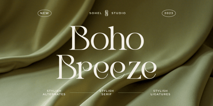 Boho Breeze is a Modern elegant serif typeface with Unique alternative , multilingual support with perfect kerning. This typeface is perfect for an elegant & luxury logo , classy editorial design, women's magazine, fashion brand , cosmetic brand, fashion promotion , modern advertising design, invitation card, art quote, home decoration , book/cover titles, special events, Tote bag, T-shirt, Advertising and much more.
 - Roughly Begather by Sohel Studio,
$16.00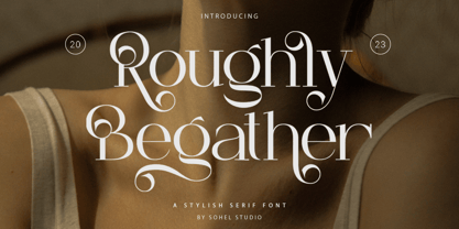 Roughly Begather is a Modern elegant serif typeface with Unique alternative , multilingual support with perfect kerning. This typeface is perfect for an elegant & luxury logo , classy editorial design, women's magazine, fashion brand , cosmetic brand, fashion promotion , modern advertising design, invitation card, art quote, home decoration , book/cover titles, special events, Tote bag, T-shirt, Advertising and much more.
 - Pyrocraft by Sohel Studio,
$16.00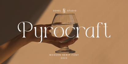 Pyrocraft is a Modern elegant serif typeface with Unique alternative , multilingual support with perfect kerning. This typeface is perfect for an elegant & luxury logo , classy editorial design, women's magazine, fashion brand , cosmetic brand, fashion promotion , modern advertising design, invitation card, art quote, home decoration , book/cover titles, special events, Tote bag, T-shirt, Advertising and much more.
 - Scinara by Sohel Studio,
$16.00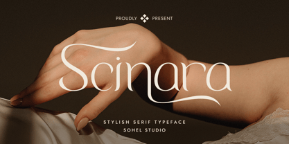 Scinara - is a Modern Elegant Serif typeface with Unique alternative , multilingual support with perfect kerning. This typeface is perfect for an elegant & luxury logo , classy editorial design, women's magazine, fashion brand , cosmetic brand, fashion promotion , modern advertising design, invitation card, art quote, home decoration , book/cover titles, special events, Tote bag, T-shirt, Advertising and much more.
 - Kitchen Disaster by PizzaDude.dk,
$18.00 Kitchen Disaster is a wordplay, and not really a disaster! I deliberately made the lines a bit off here and there, to mimic bad poster design. In order to make your text even more natural, I added 5 different versions of each letter - and they automatically cycle as you type! Besides that, Kitchen Disaster comes with multilingual support!
 - Bareback by Solotype,
$19.95The devil does indeed find work for idle hands. This was designed by Dan X. Solo about with no excuse whatsoever. The name comes from the fact that a circus that we regularly did work for used it in one of their programs, the only time it was ever used as far as we can recall. - Glow Bloom by RagamKata,
$16.00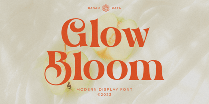 Glow Bloom is a Modern elegant serif typeface with Unique alternative , multilingual support with perfect kerning. This typeface is perfect for an elegant & luxury logo , classy editorial design, women's magazine, fashion brand , cosmetic brand, fashion promotion , modern advertising design, invitation card, art quote, home decoration , book/cover titles, special events, Tote bag, T-shirt, Advertising and much more.
 - Roxon by Fo Da,
$7.00 Roxon is a sans serif typeface of 4 weights from Extra Light to Bold and can be used as both a headline and text face. Roxon is recommended for using in long-form writing and articles, since a serif is far more readable for longer passages of text. The typeface has a carefully crafted weight range, with ligatures.
 - Anegra by Sohel Studio,
$16.00 Anegra - is a Modern elegant Sans-serif typeface with Unique alternative , multilingual support with perfect kerning. This typeface is perfect for an elegant & luxury logo , classy editorial design, women's magazine, fashion brand , cosmetic brand, fashion promotion , modern advertising design, invitation card, art quote, home decoration , book/cover titles, special events, Tote bag, T-shirt, Advertising and much more.
 - Relisha by Sohel Studio,
$16.00 Relisha - is a Modern Elegant Serif typeface with Unique alternative , multilingual support with perfect kerning. This typeface is perfect for an elegant & luxury logo , classy editorial design, women's magazine, fashion brand , cosmetic brand, fashion promotion , modern advertising design, invitation card, art quote, home decoration , book/cover titles, special events, Tote bag, T-shirt, Advertising and much more.
 - Yorklyn Stencil by House Industries,
$33.00 Yorklyn Stencil includes three fonts, each optimized for use at different size ranges. Grande has greater contrast and more delicate breaks designed to be used at larger sizes where finer details are more conspicuous. Medium and Petite are intended for smaller sizes where the breaks and contours must be more resilient. We embedded several OpenType layout features, including traditional fractions and nut fractions. We extensively tested Yorklyn Stencil in what might be the broadest range of media and conditions in the annals of Northwestern Delaware typefounding history. From the ceramic kilns of Heath Ceramics to our studio’s stucco facade, Yorklyn Stencil’s robust curves and deceptively delicate breaks will withstand a wide variety of harsh conditions with unprecedented aplomb. Whether you’re hand cutting a stencil to buzz your bespoke restaurant bar stools or simply looking for a practical yet illustrative display font, Yorklyn Stencil’s elegant efficacy will enhance any creative composition. Like all good subversives, House Industries hides in plain sight while amplifying the look, feel and style of the world’s most interesting brands, products and people. Based in Delaware, visually influencing the world.
 - ITC Simran by ITC,
$29.99ITC Simran was created by the London designer Satwinder Sehmi in 1998. The Indian influence is recognizable at first glance and lends the font an exotic feel - at least to the western eye. Sehmi borrowed forms and feelings from northern Indian writing systems for this typeface. Both the upper and lowercase letters make use of the same lowercase forms, but the upperacse letters have the addition of a horizontal bar running over them at the ascender height. This feature is directly reminiscent of writing systems in northern India, and is ITC Simran's most distinguishing characteristic. But there were other influences as well: Sehmi was also inspired by uncial forms when designing this typeface. ITC Simran exhibits the typical look of writing with a broad-tipped pen, with its strong strokes, as well as characteristic letter forms, for example, the a or h. ITC Simran is a fascinating and harmonious symbiosis of a variety of influences from different cultures. This font is best used for headlines and short texts in point sizes of 12 and larger. - Pivnaya-Latin by Roman Type,
$28.99 ‘Пивная’ (Pivnaya) means ‘bar’ or ‘brewhouse’ in Russian. Pivnaya Latin is a display font published by Roman Type. Initially designed for a poster, the family quickly turned multi-script. In 2019, the global design community is busy celebrating the centennial of Bauhaus, silently triggering the question as to if or how the phenomenon matters in the lives we lead today, or whether it could rather be reduced to mere historic purposes. At that point, I found myself falling into the Bauhaus trap myself, preparing a typeface design workshop for a group of Lithuanian and Russian students. But by a typing error, I accidently made Google translate ‘Brauhaus’ (brewhouse) instead of ‘Bauhaus’. That is why I called this family ‘Pivnaya’ in the end. Pivnaya Latin works for: Afrikaans, Albanian, Catalan, Croatian, Czech, Danish, Dutch, English, Estonian, Finnish, French, German, Hungarian, Icelandic, Italian, Latvian, Lithuanian, Maltese, Norwegian, Polish, Portugese, Romanian, Slovak, Slovenian, Spanisch, Swedish, Turkish, Vietnamese, Zulu. Though being a decorative font, the International Phonetic Alphabet (IPA) increases usability for all kinds of purposes.
 - Vanilla Twilight by Bluestudio,
$15.00 Vanilla Twilight is a collection of handwritten fonts for every design project that requires a light, cute and charming feel. Use it to make any design project stand out! Vanilla Twilight includes Multilingual support - spread your message globally AÀÁÂÃÄÅCÇDÐEÈÉÌÍÎÏIÌÍÎÏNÑOØÒÓÔÕÖUÙÜÚÛWYÝŸÆßÞþ Coded PUA Characters Fonts are fully accessible without additional design software. Happy designing ...! Thanks.
 - Heaster by Letterara,
$14.00 Heaster is a cute and casual handwritten font with an incredibly friendly feel. It features gorgeous swashes and ligatures that make this script incredibly versatile. Whether you’re looking for fonts for Instagram or calligraphy scripts for DIY projects, Heaster will turn any creative idea into a true piece of art! God bless you!
 - Clincher by ParaType,
$20.00 Clincher is a set of monospaced and duospaced fonts designed specifically for program coding and user interface design. Distinctive font design and multiple alternates allow to use it in advertising, wayfinding and signage as well as in short texts when regularity and monospacing is important. The font was designed by Alexander Lubovenko and released by Paratype in 2018.
 - Polaroid 22 - Unknown license

- Paralucent by Device,
$39.00 Paralucent is versatile all-purpose modern sans. Available in seven weights, from Thin to Heavy, and in two widths each with corresponding italics, it avoids some of the more eccentric calligraphic quirks of Akzidenz or Helvetica or the cool precision of Univers for an elegant, functional, yet warm design. There are two additions to the core 28-weight family: a three-weight stencil set, and a four weight text family. The text weights have been adjusted for use at small point sizes, and feature more open character shapes, looser inter-letter spacing for improved readability, and lining numerals for use in listings and tables. Several core ideas inform Paralucent’s design. Prime attention has given to the negative space between characters, giving a more even “colour”, especially in text. For example, the J, L and T have shorter arms than comparable sans typefaces, while the M and W are wider. The A has a lower bar, opening up the interior counter. An unusually high lower-case x-height again helps to give a more even colour and improve legibility. Care has been taken to rationalise repeated elements like the tails on lower-case letters, or the Q and the “ear” of the g. Typographic design solutions that are consistent across all these features add more stylistic cohesion. ‘Ink traps’ are exaggerated incisions used to open up a letter's narrower internal angles, which can become clogged with ink, especially in small point sizes. Now largely redundant due to the high quality of modern print, they are still sometimes used as a stylistic quirk or design feature. Now that digital fonts are often reversed or outlined, or enlarged to enormous sizes, these can also lead to unexpected or obtrusive results. Paralucent takes these inevitable digital manipulations into account, and adds optical corrections without resort to ink traps. The family has been picked up by many UK and US publishers, featuring heavily in magazines like Loaded, Heat and TV Quick, as well as high-end coffee-table photography books and gallery websites. A perennial Device bestseller.
 - ITC Motter Sparta by ITC,
$29.99ITC Motter Sparta is the work of Austrian designer Othmar Motter and for its inspiration, he turned to car design. As we all know, trends in car design affect many other fields of design in a way that shapes tastes." At the end of the 1990s, Motter saw the trend moving away from soft lines and toward a tighter, tenser look: "In this latest trend, sharp clearly-defined edges meet broadly-drawn, dynamic curves and cut them off sharply." And so too is ITC Motter Sparta, with each character form distinct, which also creates a typeface instantly recognizable from a single character. "The sharp straight strokes, cut off almost at right angles, and the strong cross-stroke curves, ending in points, form a charged contrast to the vertical and horizontal straight strokes that give Motter sparta its taut framework."" - Nurhalifa Script by BBA Key,
$11.00 Nurhalifa Script is a new fresh & modern script font, with decorative characters and dancing lineage! So wonderful for greeting cards, branding material, business cards, quotes, posters and more. Nurhalifa Script comes with 564 glyphs. Alternate characters are divided into several OpenType features such as Swash, Stylistic Sets, Stylistic Alternate, Contextual Alternate. Open Type features are accessible by using Open Type savvy programs such as Adobe Illustrator, Adobe InDesign, Adobe Photoshop Corel Draw X versions, and Microsoft Word. And this font has code PUA unicode (font with special code). So that all alternative characters can be easily accessed by craftsmen or designers. If you do not have programs that support OpenType features like Adobe Illustrator and CorelDraw X Versions, you can access all alternative flying machines using Font Book (Mac) or Character Map (Windows).
 - ALS Dereza by Art. Lebedev Studio,
$63.00 Dereza is a grotesque typeface designed specially for display use in children’s books and magazines. Books for little ones are usually set in grotesques, and a vigorous font would make a nice addition to the main face. Playful and lively, Dereza is great for any non-grown-up design such as games and toy boxes, cookie jars and cereal packs, clothing labels and other things meant for kids. It looks super in speech bubbles. The Dereza family includes four fonts, from light to bold, with ligatures, lowercase figures and accented characters.
 - Bewilderment by SavoringSurprises,
$10.00 Bewilderment is a hand lettered sans-serif font. The perfectly simple font could be used for a variety of projects, such as a design on a t-shirt, car decal, or tumbler! - Contains over 200 accented characters for language support. Some of the languages supported are: English, Spanish, Portuguese, German, Italian, French, Polish, Catalan, Irish, Norwegian, Croatian, Gaelic, and more! If you would like to know if a certain language is supported, please contact me with the language and/or any special characters you wanted to know about.


