8,287 search results
(0.024 seconds)
- Playing Fake by Gassstype,
$23.00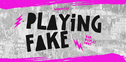 Hello Everyone, Introduce our new collection,Playing Fake is Bad Display Font.this is a Strong Style and classy style, inspired by famous logos of Technology and brands that have very strong characteristics, this font is great for your creative projects such as watermark on photography, and perfect for logos & branding, invitation,advertisements,product designs, stationery, wedding designs,label ,product packaging, special events or anything that need handwritting taste. Playing Fake has charming, authentic and relaxed characteristic more natural look to your text with a more natural look to your text.
 - Tangelo by Laura Worthington,
$25.00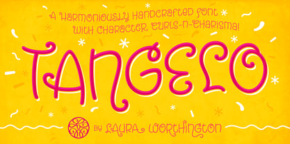 Tangelo is a fun, casual display script that could be more accurately termed a unicase – it borrows characters liberally from the lower case, but scales them up to cap-size. Tangelo is ideal for kid-friendly products like candy packaging, game boards or apps, and clothing labels. It includes 115 alternates and swash characters for a convincingly hand-lettered look. See what’s included! http://bit.ly/2lW33tt These fonts have been specially coded for access of all the swashes, alternates and ornaments without the need for professional design software! Info and instructions here: http://lauraworthingtontype.com/faqs/
 - Black Ravens by Arterfak Project,
$26.00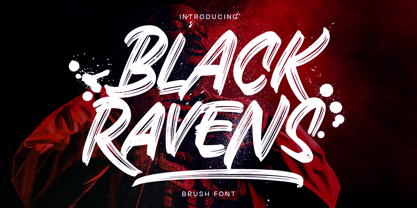 Introducing Black Ravens, a freestyle dry-brush font with a natural single brush. Black Raven's is a street urban font, youth theme, sporty, and masculine looks that visualize smooth strokes, and rough texture at the same time. This font is an all-caps font that perfects for displays, title, logos, packaging, craft, labels, T-shirt, hoodie, tote bag, posters, hats, stickers, quotes, and any advertising which needs energetic typography. Black Ravens equipped with 31 stylish ligatures, swashes, multilingual, and alternates characters that you can mix and match to get your own typographic design!
 - Ponder by TypeUnion,
$20.00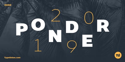 This is Ponder. A modern sans carefully crafted to be a versatile typeface for the modern world. Featuring over 650 glyphs, Ponder includes stylistic alternates for the a, l, y and & characters to provide two uniquely styled design approaches. From contrasting strokes on the heavier weights to the angled bars on the P & R, Ponder has a unique feel that will give your brand or project that stand out quality. Ponder features extensive language support for Latin & Cyrillic as well as many opentype features such as stylistic alternates, ligatures and numbers (Tabular, Oldstyle & Circled).
 - Nelson by Laura Worthington,
$25.00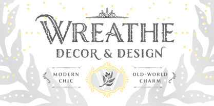 Evocative of paint on weathered wood, Nelson’s engraved capital letters are as rustic and confident as the Old West. Combine the engraved face with bold and rough versions to create handsome wordmarks, or use Nelson to captivate customers of food packaging, restaurant menus, and roadside attractions. See what’s included! Engraved • Ornaments • Rugged • Bold *NOTE* Basic versions DO NOT include swashes, alternates or ornaments These fonts have been specially coded for access of all the swashes, alternates and ornaments without the need for professional design software! Info and instructions here: http://lauraworthingtontype.com/faqs/
 - Peaknose by FadeLine Studio,
$15.00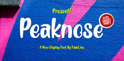 Peaknose is a fancy comic typeface, cute and beautiful. Although It is also suitable for other purposes such as posters, shopping bags, headline, insignia, badge, t-shirt, logo, branding, cover book, badge, birthday invitation, greeting cards, etc. Peaknose is also suitable for use in the design style as retro, vintage, minimalist, flat, cartoon, modern design, etc. With the combination and some color, you can easily create a compelling message and look beautiful for your design Peaknose comes with a complete set of standard characters, punctuation & international glyphs, are also available web fonts.
 - Bayoneta Pro by Sudtipos,
$39.00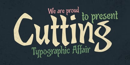 Bayoneta is not your usual handcut alphabet, though it can seem so. It can also seem like carefully constructed lettering inspired by Polynesian cultures. By bridging that gap between knife-wielding kitsch and studied display lettering, Bayoneta offers quite a various range of theme possibilities. Its clear and attractive shapes can provide the eye-catching spontaneity on a book cover, the expressive shout on a skateboard or a muscle shirt, the mouth-watering brand on a protein bar package, or the main notice on a theme park ride sign.
 - Frozenflare by Balpirick,
$15.00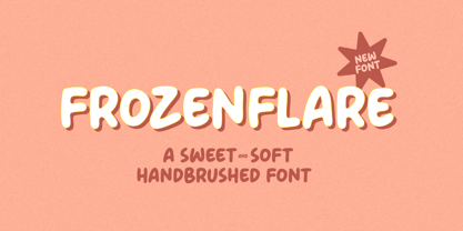 FROZENFLARE is a Sweet and Soft Handbrushed Font. It is suitable for svg designs, mug decorations, pottery, shirts, hats, tote bags, card making, wall art, interior prints, and various other creations. Whatever the topic, this font will be a wonderful asset to your font library, as it has the potential to enhance any creation. This font only has all uppercase letters, but if accessed with lowercase letters it will automatically become uppercase. also multilingual support Enjoy the font, feel free to comment or feedback, send me PM or email. Thank you!
 - Saxo Grammaticus by Jonas Stensgaard,
$8.00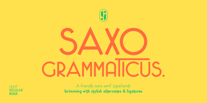 Saxo Grammaticus is a beautiful and friendly family that works great with family themes, elegant & classy material and professional settings. It's so versatile you'll find yourself coming back to it over and over for your projects, and that's whether you're looking to create logos, quotes, poster designs, brochures, packaging, anything with big letters like headlines, wedding invitations, holiday cards, advertisements, signs and on and on and on... There is a total of 107 ligatures and 76 alternates! That's plenty of options for any designer wanting to give those big letters a little extra wham bam!
 - Adorn Garland Smooth by Laura Worthington,
$29.00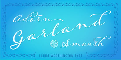 Adorn Garland is a script face that runs along a somewhat “vintage” direction. Rather than deriving its strength from a heavy skeleton or structure, it uses its sense of contrast, its light touch upon the page, and its elongation to provide a visual break – it can function as a long string, rule, or dividing line. With 166 swashes. See what's included! http://bit.ly/1rYDcmQ This font has been specially coded for access of all the swashes, alternates and ornaments without the need for professional design software! Info and instructions here: http://lauraworthingtontype.com/faqs/
 - PAG Trust by Prop-a-ganda,
$19.99Prop-a-ganda offers retro-flavored fonts inspired by lettering on retro propaganda posters, retro advertising posters, retro packages all the world over. This is perfect font for your retrospective project. Almost all the letters of PAG Trust are drawn by bold line, but some bars are very thin line and counters are extremely small. With this font, regular typed text transformed into unique typography. We can’t decide the impression of PAG Trust, depending on how to use it, it can be cute package, retro book cover or propaganda poster of Cuba. - Edison by HiH,
$12.00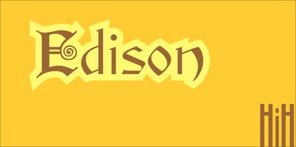 Edison, is it Victorian or is it Art Nouveau? While this typeface may be found in Petzendorfer’s Treasury of Art Nouveau Alphabets, I believe the decorative spirals are more Victorian than “New Art.” To me, they looked tacked on, rather than organic -- with the industrial mechanics of a coiled spring, rather than the tendrils of a growing plant as the philosophical wellspring. Originally released by ATF in 1894 as Houghton, this typeface was re-released shortly thereafter by Bauer and Berthold in Germany as EDISON. Please do not make the mistake of thinking the font we offer here is no better than freeware fonts in cheap rip-off collections. This font has a set 218 characters and represents many hours manipulating the bezier curves to produce acceptable results. Available freeware fonts are often little more than raw scans with little accuracy of letterform. The muddy line intersections are a dead give-away. Frequently all you get is the alphabet itself. No numbers, no punctuation and don't even think about diacriticals. The font we offer represents a tremendous value. Considering the hours of work involved, I have no business charging so little. I could make better money cooking hamburgers or bagging groceries. But we want very much to encourage you to purchase and enjoy these fascinating historical typefaces and are making it as easy as possible for you to do so. So please encourage us and order Edison today.
 - Zira by Artcity,
$10.00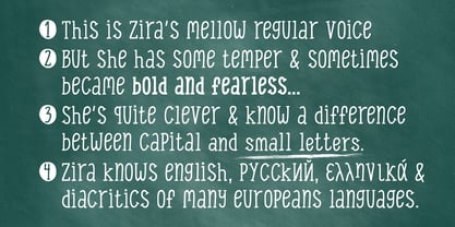 Zira is a playful hand-drawn font family designed by Daniel Bak (Artcity). It is available in three handy weights: regular, bold and screaming. It contains international language accent marks and diacriticals, including Greek and Cyrillic. Zira can be considered as smoothed serif version of Cornelius font. Zira as Cornelius as well is a chimpanzee character in the novel and movie series Planet of the Apes. Dr. Zira is a chimpanzee psychologist and veterinarian, who specializes in the study of humans, in the novel and subsequent movie series Planet of the Apes. Zira was played in the first three Apes movies by actress Kim Hunter. Unique among the Apes characters, Zira has blue eyes. Zira is the fiancée (later wife) of Cornelius, and both are ultimately responsible to the Minister of Science, Dr. Zaius. Zira's character and role are essentially the same in both the novel and the movies, though some story details differ. Her work in each involves both working with humans under laboratory conditions (e.g. learning and behavioural experiments), and working on them physically (lobotomy and other brain surgeries, vivisection, physical endurance and tolerance experiments, and subsequent autopsies). Zira is an outspoken liberal by nature, deploring war and militancy (and despising the gorillas, who seem to make both a way of life), and eager to seek and develop intelligence anywhere it can be found. Zira literally stands for her principles - or refuses to stand, as the case may be.
 - Storyville by Canada Type,
$29.95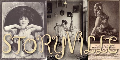 This is the redrawn and expanded version of an alphabet Rebecca Alaccari made back in 2009 as a bespoke font for a tourism agency looking to recapture the appeal of New Orleans after the hurricane Katrina disaster robbed it of its core industries. The brief back then was to "revive the unique spirit of what always made Nola great for new adults, which is the excellent combination of history, romance, food and music." No word of a lie, the brief actually contained "new adults." Storyville contains two interchangeable sets of forms drawn in the doodly, loose and organic way now conspicuously popular with today's young designers, almost every one of whom thinks they will get to design something for a boutique coffee bar somewhere. Well, this whole thing perhaps means freedom, youth, fun, happiness, good stuff like that. But just in case, a little caution doesn't hurt: Use this font only if you know what you're doing. We don't want to go back to the 1990s. Please. We were nearly done for by that exposure the first time around. The ligatures feature in this font does some pseudo-randomization, so the forms in doubled letters don't repeat. Serious fun can be had by also applying the stylistic alternates feature, or picking a letter in the middle of a setting and disabling the ligatures feature. Or various sequences of all that. If you don't like any of that stuff, just forget about it. Uh, wutever.
 - Marble by URW Type Foundry,
$59.99 Marble is part of Asterisk Type Collection by URW Type Foundry. Marble is a modern sans serif with a distinct character and comes in 108 styles plus Variable Fonts. It grew from the desire to create full bodied letters in contrast to the economy of most sans serif faces. Designed for corporate and publishing use it is rounded and approachable, its three styles (Condensed, Normal and Wide) range from slender elegance to warmth and playfulness without ever being informal. Designed by Alessia Mazzarella and Vaibhav Singh, Marble derives its character from the generous roundness of the x-heights which is balanced by the striking horizontal or vertical cuts to the terminals. The result is a readable font that encourages the eye to move from one shape to the next and that offers a range of possibilities for digital and print. The Marble family has nine weights in Latin for each variant. Eminently versatile, it’s ideal for establishing hierarchies of information with a wealth of choices for headlines, subheadings, captions and body copy styles that are all in harmony with each other. The Wide style allows headlines to be set with width and presence.
 - Blackduck by Eurotypo,
$60.00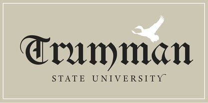 “Blackduck” font is a typical Gothic, usually named “Blackletter” . This typeface was born with the name of “Textur” and developed from Carolingian cursive. It was used in the middle age as sacred script, became increasingly narrower, his vertical lines were emphasized and his strokes very compacted to save space. Along the time the early German print typefaces derived in others styles that were more readable such as Schwabacher and Fraktur, very popular in Germany and sometimes associated to the identity of the country. The font "Blackduck" was inspired mixing carefully the last two “Blackletters”. We try to joine some characteristics of both to reach good legibility without loosing the strong impact and powerfulness of the shapes. Some minuscules like the “o” “c” “e” “d” are rounded on both sides, while both strokes join in an angle at the top and at the bottom. Some other lower cases are formed by an angular and rounded stroke. This font contains a full set of OpenType features; swashes, stylistics alternates, old style figures (Arabic numeral were carefully shape integrated), ligatures and some extras ornaments were added to help in your design. "Blackduck" includes diacritic signs for Central European languages.
 - Tailgates by Ditatype,
$29.00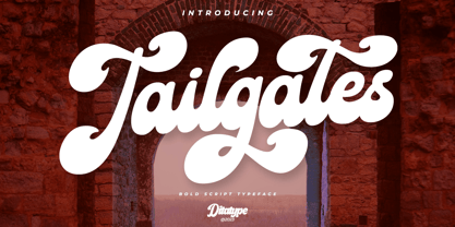 Introducing Tailgates, a script font that exudes a robust and inviting charm. This typeface showcases a substantial weight, offering your text a bold and captivating presence. Tailgates is characterized by its rounded letterforms, contributing to a friendly and approachable aesthetic. With consistent proportions and a relatively high contrast, it achieves a dynamic and eye-catching design. What sets Tailgates apart are the captivating swinging ends that adorn select letters. These elegant flourishes add a sense of whimsy and grace to your text, creating a visual experience that is both lively and engaging. The combination of round shapes and these decorative elements adds a unique touch to your designs. In addition, enjoy the features here. Features: Ligatures Stylistic Sets Swashes Multilingual Supports PUA Encoded Numerals and Punctuations Tailgates fits in headlines, logos, posters, flyers, branding materials, print media, editorial layouts, and many more designs. Find out more ways to use this font by taking a look at the font preview. Thanks for purchasing our fonts. Hopefully, you have a great time using our font. Feel free to contact us anytime for further information or when you have trouble with the font. Thanks a lot and happy designing.
 - Elkoga by Prioritype,
$15.00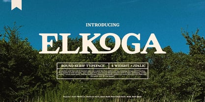 Introducing Elkoga - Round Serif Typeface A modern serif font with a rounded style that makes this font stylish and eye-catching. Comes with 8 families, from regular to bold and italic. You can apply it to your various design projects such as logos, packaging, covers, posters, social media posts, youtube thumbnails, wedding invitations, quotes and much more you can make with this great item for any design! Features: -Uppercase -Lowercase -Numeral -Punctuation -Multilingual -Opentype Features & PUA Encoded Multilingual contained: Afrikaans, Albanian, Asu, Basque, Bemba, Bena, Breton, Catalan, Chiga, Cornish, Danish, Dutch, English, Estonian, Faroese, Filipino, Finnish, French, Friulian, Galician, German, Gusii, Indonesian, Irish,Italian, Kabuverdianu, Kalenjin, Kinyarwanda, Luo, Luxembourgish, Luyia, Machame, Makhuwa-Meetto, Makonde, Malagasy, Manx, Morisyen, North Ndebele, Norwegian Bokmål, Norwegian Nynorsk, Nyankole, Oromo, Portuguese, Quechua, Romansh, Rombo, Rundi, Rwa, Samburu, Sango, Sangu, Scottish Gaelic, Sena, Shambala, Shona, Soga, Somali, Spanish, Swahili, Swedish, Swiss German, Taita, Teso, Uzbek (Latin), Volapük, Vunjo, Zulu. Note: Use a program that supports the Opentype features and the glyph panel is available, so you can see the various alternative characters available. Examples of programs such as Adobe Illustrator, Corel Draw or Affinity Designer. Thanks.
 - Mellow Sans by ParaType,
$30.00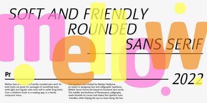 Mellow Sans is a soft and friendly rounded sans serif. Its bold styles are great for packages of something tasty, while light and regular ones work well in rather long texts, from a children's book to a reading app, or a family restaurant menu. The typeface was created by Natalya Vasilyeva, an expert in designing text and calligraphic typefaces. Mellow Sans’s forms are based on humanist sans serifs. The nobility and liveliness of Renaissance calligraphy reads beneath its curves and makes the typeface even friendlier, while helping the eye to move along the line. The typeface supports extended Latin, extended Cyrillic (all major languages of the Russia’s peoples) and Greek. It also has old style figures, arrows and non-alphabetic signs. With Mellow Sans as a heading typeface (in that case bold styles fit the best), calm open sans serifs, f.e. Vast or Fact, are its optimal text companions on the screen. Calm serifs, f. e., Octava, Scientia or Aelita, will work as its companions on paper. And to create expressive typography, for example, in packaging, you can match Mellow Sans with quirky rounded serifs — Cooper or Epice.
 - HU Life Style by Heummdesign,
$15.00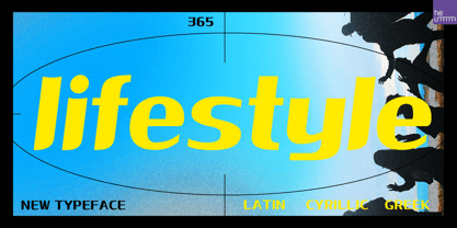 English HU Life Style is a headline font designed by using curves and straight lines in harmony. The end of the stroke is designed with a rounded diagonal line, and the horizontal stroke is relatively thin, giving a sense of rhythm. It is a font that is thick and large, so it is a good font to be recognized at a glance. There are 1 weights of HU Basic Round : ExtraBold & Italic Cyrillic HU Life Style - это шрифт заголовка, в котором гармонично сочетаются кривые и прямые линии. Конец мазка представляет собой закругленную диагональную линию, а горизонтальный штрих относительно тонкий, что дает ощущение ритма. Это толстый и большой шрифт, поэтому его легко узнать с первого взгляда. HU Life Style имеет 1 толщины: Экстра жирный и курсив Greek Το HU Life Style είναι μια επικεφαλίδα γραμματοσειρά σχεδιασμένη χρησιμοποιώντας αρμονικές καμπύλες και ευθείες γραμμές. Το τέλος της διαδρομής έχει σχεδιαστεί με στρογγυλεμένη διαγώνια γραμμή και η οριζόντια διαδρομή είναι σχετικά λεπτή, δίνοντας μια αίσθηση ρυθμού. Είναι μια γραμματοσειρά που είναι παχιά και μεγάλη, οπότε είναι μια καλή γραμματοσειρά που αναγνωρίζεται με μια ματιά. Υπάρχουν 1 βάρη του HU Life Style : ExtraBold & πλάγια
 - Core Sans M by S-Core,
$25.00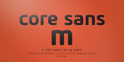 The Core Sans M Family is a part of the Core Sans Series, such as Core Sans N, Core Sans N Rounded, Core Sans N SC, and Core Sans G. This font family has open and square letter shapes, and overall rounded finishes provide a soft and friendly appearance. Simple and modern shapes with a tall x-height make the text legible and the spaces between individual letter forms are precisely adjusted to create the perfect typesetting. The Core Sans M Family consists of 2 widths (Condensed, Normal), 7 weights (ExtraLight, Light, Regular, Medium, Bold, ExtraBold, Heavy), and Italics for each format. Small Caps versions are also available. It supports WGL4, which provides a wide range of character sets (CE, Greek, Cyrillic and Eastern European characters). Each font includes support for Tabular numbers, Arrows, Box drawings, Geometric shapes, Block elements, Mathematical operators, Miscellaneous symbols and Opentype Features such as Proportional Figures, Numerators, Denominators, Superscript, Scientific Inferiors, Subscript, Fractions and Standard Ligatures. The Core Sans M Family provides both OpenType (.OTF) and TrueType (.TTF) versions in the same package. We highly recommend it for use in books, web pages, screen displays, and so on.
 - Neue Comic by Unio Creative Solutions,
$4.00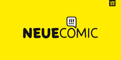 Meet "Neue Comic," a rounded typeface making a bold entrance into the design scene, aiming to redefine the delicate balance between playfulness and practicality in typography. Crafted with the recognition that rounded aesthetics enhance information retention and legibility, Neue Comic delivers a distinct, rhythmic design that breaks through traditional design boundaries. Reflecting on the divisive legacy of Comic Sans, we pondered: Is it really deserving of all the hate? Comic Sans entered the typography scene in 1994 with the noble goal of injecting fun into casual contexts. However, it fell victim to misuse and eventually succumbed to an undeserved sense of imposter syndrome. This prompted us to create a typeface that transcends these limitations. Inspired by the non-connecting script of comic book lettering, Neue Comic seeks to recapture the charm of the '90s while acknowledging the genuine intention behind Comic Sans—offering accessibility and friendliness. Avoiding the pitfalls of overuse, Neue Comic presents itself with seven weights and corresponding obliques, showcasing the flexibility of a variable version. Specifications: - Files included: Neue Comic, including obliques - Multi-language support (Central, Eastern, Western European languages) - OpenType Features (Superscript and Subscript Numerals, Fractions, Oldstyle figures) Thanks for viewing, Unio.
 - Abraham by Sabrcreative,
$15.00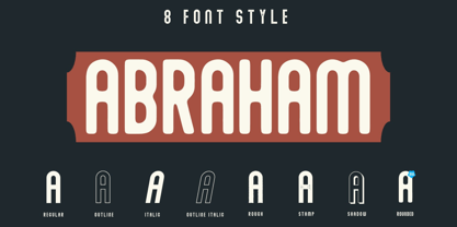 Discover the versatile and stylish Abraham Font Family at MyFont. With 8 unique styles, including Regular, Italic, Rough, Stamp, Shadow, Outline, and Rounded, this modern sans-serif modular family offers endless creative possibilities. Perfect for a wide range of design projects, Abraham is suitable for logos, greeting cards, quotes, posters, branding, business cards, stationary, blog headers, and more. Each style of the Abraham Font Family features both uppercase and lowercase letters, ensuring flexibility in your designs. Additionally, it includes stylistic alternates, standard ligatures, and numerals & punctuations in OpenType format for seamless typography. Enhance your artwork with the multilingual support of the Abraham Font Family, which includes a wide range of accents and characters to accommodate various languages. The font family is PUA encoded, allowing for easy access and usage across different platforms and software. With the Abraham Font Family, you'll receive the following fonts: Abraham Regular, Abraham Regular Italic, Abraham Outline, Abraham Outline Italic, Abraham Rough, Abraham Stamp, Abraham Shadow, and Abraham Rounded. Whether you're designing greeting cards, package designs, brand identities, or art projects, Abraham Font Family will add a touch of sophistication and creativity to your work.
 - Monthly Calendar JNL by Jeff Levine,
$29.00Monthly Calendar JNL is a companion font to Calendar Blocks JNL, and features classic wood type lettering and numerals from the 1800s. A set of large numbers are on their own keys, while the numbers 1-31 reside on the A-Z and a-e keys respectively. The days of the week are on the lower case “f” through “l” keys, while the names of the months are found on the “m” through “x” positions. An open rectangle is on the lower case “y” key, and a solid black rectangle is on the “z”. For those who wish to use the 23/30 and 24/31 configurations, they can be found on the left and right parenthesis. - Up Up And Away by Comicraft,
$19.00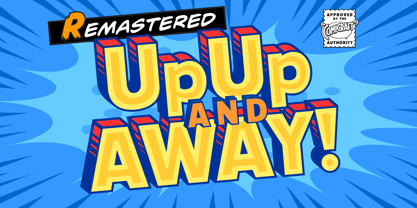 Is it a Bird? Is it a Plane? Is it a Rocket? No it’s another Super Font from those awfully nice chaps at Comicraft. Faster than a speeding Option 8, Up, Up and Away can see through 'O’s, jump Capital T in a single bound, and rescue caps dropped from the tallest descenders. There isn't a more heroic or x-heighting font in our catalog and it’s as wholesome as truth, justice and mom’s apple pie. Brought to you in cut out form in association with our friends at Howtoons! Be sure to also check out Up Up And Away's clever sidekick Single Bound! Comicraft fonts are created BY comic book letterers FOR lettering comic books. Accept no substitutes!
 - P22 FLW Midway by P22 Type Foundry,
$29.95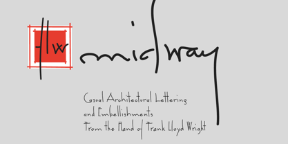 This font set is based on Frank Lloyd Wright's hand-lettering found on the Chicago Midway Gardens working drawings from 1913. This type of architectural lettering is a bit more casual than standard lettering found on most blueprints. It evokes the personality of Frank Lloyd Wright and complements the other fonts in the P22 FLW font series. Midway One and Midway Two can be used interchangeably to give a more naturalistic feeling of hand lettering. Midway Ornaments features over 100 decorative border elements that can be combined is many ways for surprising and effective decorative motifs. Midway One and Midway Two have been remastered and now contain over 400 characters including support for Western and Central European languages.
 - Fontana ND by Neufville Digital,
$45.25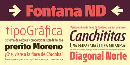 Designed for the printing of a magazine, the Fontana Sistema was based fundamentally on the Spanish language as its natural and cultural context. Due to the spanish colonization of America, the spanish language has been influenced by native american terms that enriched it and caused significant changes in both the sound and form of words. These sounds and forms had a strong influence on the identity of text, substantially modifying the nature and the characteristics of the composition. The Fontana Sistema we present is the fruit of our desire to design a font that, based on the spanish language, would endow the publication with identity and at the same time offer a framework for typographic research.
 - Rolling Pen by Sudtipos,
$79.00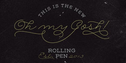 After doing this for so many years, one would think my fascination with the old history of writing would have mellowed out by now. The truth is that alongside being a calligraphy history buff, I'm a pop technology freak. Maybe even keener on the tech thing, since I just can't seem to get enough new gadgets. And after working with type technologies for so many years, I'm starting to think that writing and design technologies as we now know them, being about 2.5 post-computer generations, keep becoming more and more detached from what the very old humanity arts/tasks they essentially want to facilitate. In a world where command-z is a frequently used key combination, it’s difficult to justify expecting a Morris-made book or a Zaner-drawn sentence, but accidental artistic “mutations” become welcome, marketable features. When fluid pens were introduced, their liquid saturation influenced type design to a great extent almost overnight an influence professional designers tend to play down. Now round stroke endings are a common sight, and the saturation is so clean and measured, unlike any liquid-paper relationship possible in reality. Some designers even illustrate their work by overlaying perfect circles at stroke ends, in order to illustrate how “geometric” their work was. Because if it’s measured with precise geometry, it’s got to be meaningful design. And once in a while, by a total freak accident, the now-cherished mutations prove to have existed long before the technology that caused them. Rolling Pen was cued by just such a thing: A rounded, circular, roll-flowing calligraphy from the late nineteenth century seemingly one of those experimental takes on what inspired Business Penmanship, another font of mine. Looking at it now it certainly seems to be friendlier, more legible, and maybe even more practical and easier to execute than the standard business penmanship of those days, but I guess friendliness and simplicity were at odds with the stiff manner business liked to present itself back then, so that kind of thing remained buried in the professional penman’s oddities drawer. It would be quite a few years before all this curviness and rounding were thought of as symbolic of graceful movement, which brought such a flow closer to the idea of fine art. Even though in this case the accidental mutation just happens to not be a mutation after all, the whole technology-transforms-application argument still applies here. I'm almost sure “business” will be the last thing on people’s minds when they use this font today. One extreme example of that level of disconnect between origin and current application is shown here, with the so-called business penmanship strutting around in gloss and neon. Rolling Pen is another cup of mine that runneth over with alternates, swashes, ligatures, and other techy perks. To explore its full potential, please use it in a program that supports OpenType features for advanced typography. Enjoy the new Rolling Pen designed by Ale Paul with Neon’s visual poetry by Tomás García.
 - Praitor by Scriptorium,
$18.00Praitor is based on a devotional inscription to the goddess Diana found a short distance from Rome in 1887. It is an early style from before 100 BC and has some characteristics of Etruscan lettering. It's a rough, strong font which works very well for distinctive titles. - Wood Condensed Grotesk JNL by Jeff Levine,
$29.00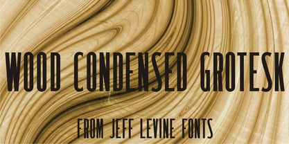 Wood Condensed Grotesk JNL is a more condensed version of the type style found in Wood Type Grotesk JNL. The font was a popular sans used for large posters or broadsheets as well as newspaper titles where more copy needed to be fit into limited space.
 - Pelin by Koray Özbey,
$9.00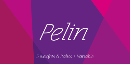 The design of Pelin, which began as an experiment, inspired by the harmony created by the contrast between the soft, flowing movements and sharp movements found in Circassian dances. To capture this harmony, both curved and sharp lines were used along with stems that contrasting angles.
 - Eccentric by Solotype,
$19.95Here's another old-timer that needed a lowercase, so we drew one. Originally issued as a caps-only type by The American Type Founders Company about 1898, this font found its way into Craftsman period design. It was the inspiration for Galadriel, a dry transfer sheet alphabet. - Cat Blvck by The Design Speak,
$100.00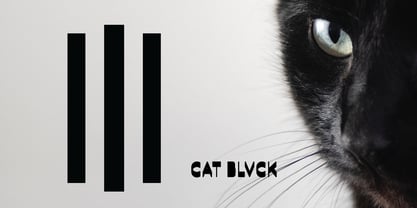 Another experimental typeface by Marshall. This typeface is almost difficult to read but that is almost the point. It features words or almost enclosed circles as well as thick strokes around the letter forms. The font has an mysterious edge while providing shock to whomever views it.
 - Talking Picture JNL by Jeff Levine,
$29.00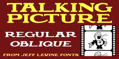 In a vintage photograph, promotional signage outside an old theater for the 1929 early sound film “The Doctor’s Secret” had lettering in a wide, bold Art Nouveau slab serif design. This was the model for Talking Picture JNL, which is available in both regular and oblique versions.
 - RM Opensans by Ray Meadows,
$19.00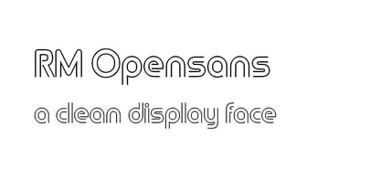 This delightful new design has a friendly, open face and will be useful for many display purposes. Due to the modular nature of this design there may be a very slight lack of smoothness to the curves at extremely large point sizes (around 200 pt and above).
 - RM Slabb by Ray Meadows,
$19.00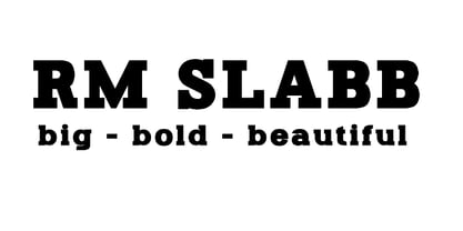 This bold display font has considerable strength and will grace any design that requires extra impact. Due to the modular nature of this design there may be a very slight lack of smoothness to the curves at extremely large point sizes (around 100 pt and above).
 - Pomponianus by Scriptorium,
$18.00Pomponianus comes from a 4th century inscription found in North Africa. It is an attractive example of early uncial lettering. Uncial inscriptions are quite uncommon, because although the style was well suited for writing on vellum, the curved letters made it more difficult to carve in stone. - Pigalle Swing by Autographis,
$39.50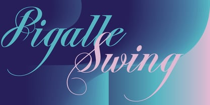 Pigalle Swing is a very elegant script from the 1950s which I found some time ago in a similar but not so elegant version on Place Pigalle in Paris. I designed lots of alternate capitals and lowercase letters to make the font more usable and interesting. Enjoy!
 - Raw by Device,
$29.00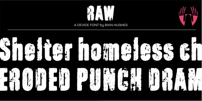 Raw was designed in 2006 for Shelter, the UK homeless charity. It was originally called “Cathy”, after the film “Cathy Come Home”, which was instrumental in inspiring the founding of the charity. Now reworked with more “inkiness”, it is released as part of the Device range.
 - HT Motel by Dharma Type,
$19.99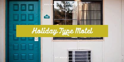 A handsome font, perhaps a little classical. Regularly-connected script, so it’s legible but also memorable font. Holiday Type Project offers retro hand drawing scripts. Inspired by retro script on shopfront lettering, wall paint advertisements in Italy around 1950s. Check out the script fonts from Holiday Type!