8,849 search results
(0.023 seconds)
- TOMO Nara by TOMO Fonts,
$20.00 TOMO Nara adds plenty of joy to any logo, layout or UI. Geometric shapes and a funny look come together in this font – thus, Nara might be the perfect choice for toys, books, packaging, posters or even webapps! Let’s have some fun!
 - Giarek by Nirmana Visual,
$24.00 Inspired by the elegance of classic typography and the beauty of calligraphy, this font exudes a sense of refined aesthetics. Its graceful strokes and balanced proportions make it an excellent choice for luxury branding, high-end invitations, editorial design, and formal occasions.
 - Gersang by Linecreative,
$16.00 Gersang is a retro groovy font with rounded corners that is perfect for designing with a retro style. With bold style and unique shapes, Gersang is the perfect choice for those seeking a retro font that will create eye-catching and memorable designs.
 - Sulky Adolescent by Ali Hamidi,
$12.00 Sulky Adolescent is a cute handwritten font that has a rather neat and simple vibe. It will add an incredibly joyful touch to your designs. Add this beautiful typeface to each of your creative ideas and notice how it makes them stand out!
 - Linotype Pegathlon by Linotype,
$29.99Linotype Pegathlon is an unusual, eye-catching typeface, perfect for headlines and short texts. The bold strokes have a mystical, Asian touch and allow a large range of applications. Whether a text should look exotic or esoteric, Linotype Pegathlon is an excellent choice. - Zombie Mummy by Letterara,
$14.00 Zombie Mummy is a bold, quirky, and incredibly spooky display font. Add this font to your favorite Halloween-themed ideas and notice how it makes them come alive! This font is PUA encoded which means you can access all of the glyphs.
 - Linea Nera NF by Nick's Fonts,
$10.00Here's another Disco-era darling, based on Wolf Magin's contemporary offering, originally called Black Line. It's a natural choice for sassy headlines with a cool Retro vibe. Both versions contain the complete Latin 1252, Central European 1250 and Turkish 1254 character sets. - Jattestor by Sabrcreative,
$25.00 Elevate your creative projects with the enchanting allure of the Jattestor Script Font. This typeface seamlessly melds the fluidity of handwritten script with a touch of artistic charm, making it an excellent choice for designs seeking a blend of authenticity and creativity.
 - Stark Brush by Carpiola Studio,
$12.00 Stark Brush is a rough brushed handwritten font. It is the best choice for creating attractive logos, branding, clothing designs, quotes and more. Each letter adds a unique and beautiful touch to your design, bringing it to life with a street art vibe.
 - Printers Parts JNL by Jeff Levine,
$29.00 The thirty images contained in Printers Parts JNL are another assortment of wonderful dingbats from various vintage sources. Brackets, ornaments, end caps, arrows, pointing hands and advertising phrases are part of the wide and various choices and styles found within this font.
 - Pale by Hiekka Graphics,
$29.00 Pale is an experimental geometric monoline sans font. Pale will look great in the headings and will be a functional addition to the design work. Pale is a bold choice for logo designs, posters, identity and packaging, headlines, editorial design and album covers.
 - Wolf Fangs Graffiti by Sipanji21,
$15.00 Wolf Fangs is an incredibly unique and chunky lettered display font with graffiti basic feel, its suitable for logotype, design grafics, e-sport, apparel, wall art, etc. Add this font to your favorite creative ideas and notice how it makes them come alive!
 - Caramelia by Stringlabs Creative Studio,
$25.00 Caramelia is a playful kid’s font with a unique and modern look. Get inspired by its wonderfully light appeal. The Caramelia font is a great choice to increase the prominence in your project. Although the typography is traditional, the basic elements are great.
 - Cikal by Beary,
$14.00 Cikal is an elegant serif font with captivating alternate characters. With a total of 245 glyphs, this font offers a wide range of design possibilities. Its timeless elegance makes it a perfect choice for various design needs. Don't wait, get it now!
 - Hirondelle by JBFoundry,
$18.00 With over 900 characters and with the contextual alternates, Hirondelle offers you a perfectly connected writing. By activating swashes, your texts will take a more remarkable expression. With its four weights, you will have a wide choice for your invitations, advertisements, packaging …
 - Absolute Adventure by Seemly Fonts,
$14.00 Absolute Adventure is a unique handwritten font. This font is a great choice for a wide variety of contexts! It looks amazing on greeting cards, business cards, logos, thank-you cards, quotes, greeting cards, and any other design that needs a creative spark.
 - Deltany Signature by Typebae,
$15.00 Deltany Signature Font is a mesmerizing handwritten signature script font that exudes elegance and charm. Each letter is meticulously crafted, showcasing the seamless flow and impeccable balance, making it a perfect choice for adding a touch of class to any design project.
 - Omnia by Linotype,
$29.00Omnia is a single alphabet font based on the uncial hand. The humanist letterforms of the Omnia font make it a good choice to use for personal messages. Omnia™ is a trademark of Linotype GmbH and may be registered in certain jurisdictions. - October Nightmare by AEN Creative Studio,
$15.00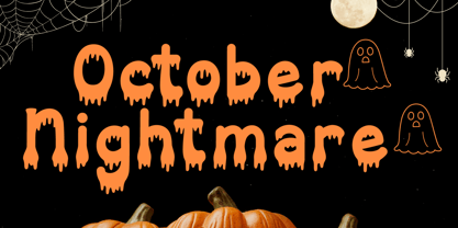 October Nightmare Font is a captivating and spooky display font designed to perfectly encapsulate the spirit of Halloween. This display font is an ideal choice for creating chilling and eye-catching designs for Halloween-themed posters, apparel, embroidery, crafts, and other festive applications.
 - Flower Park by AEN Creative Studio,
$15.00 Flower Park is a sweet and playful display font. This font is perfect for the autumn theme, floral design, and nature theme, fitting a wide range of contexts. Add it to your creative ideas and notice how it makes them stand out!
 - West Yard by Typefactory,
$14.00 West Yard is a bold, western looking display font. Whether you are using it for cartoon-related designs, children’s games, quotes, titles, brand names, book covers, posters, or just any creation that requires a touch of beauty, this font is a great choice.
 - Farmer by SparkyType,
$19.00The OpenType version of Farmer contains two sets of slightly different upper-case letters. The alternate version is accessible as Titling Caps in OpenType feature enabled software. Mixed and matched they create a strong and persuasive headline, logo or For Sale notice. - Hallo Witch by Sakha Design,
$12.00 Hallo Witch is a cool and spooky decorative font. Add it to each of your Halloween related designs and notice how easily they stand out. This font is PUA encoded which means you can access all of the glyphs and swashes with ease!
 - Esenka by Differentialtype,
$10.00 Esenka is a family sans that comes with 9 weights, 9 italics and 2 outlines. Esenka has an expanded uppercase alternate, with a choice of 2x and 3x width options. Esenka is PUA encoded which mean you can access alternate with ease.
 - Journey of Night by Carpiola Studio,
$12.00 Journey of Night is a lovely and timeless handwritten font. It is the best choice for creating eye catching logos, branding and quotes. This font is PUA encoded which means you can access all of the amazing glyphs and ligatures with ease!
 - Superstar by ITC,
$40.99Superstar was designed by Colin Brignall, who was inspired by American sportswear graphics during the process. The font is an inline sans serif that incorporates wedge-like cutouts instead of curves. Superstar is an excellent choice for design work related to sports activities. - Rational TW by René Bieder,
$39.00 Rational TW is the typewriter addition to the Rational family. It is a monospaced font building on the same principles as its proportional, neogrotesque brother, such as maximum legibility and flexibility while combining Swiss and American gothic elements with a modern aesthetic. Due to the monospaced environment, some of its letter shapes like “r”, “m”,“f”, “i” and “w” have been slightly adapted but kept the same in appearance. Rational TW comes in two version: Rational TW Display and Rational TW Text. As indicated by its name, Rational TW Text is not limited to, but works best in small font sizes because it features distinctive letter shapes like a double storey “a” or “g” in order to help differentiate similar glyphs in small sizes. Rational TW Display, on the other hand, creates a geometric uniformity by implementing round shapes in “a” and “g”, giving it a subtle friendly and open character. Unlike many other monospaced fonts, Rational TW has a large amount of opentype features like small caps, alternative glyphs, case sensitive shapes, and many more making it the perfect choice for countless scenarios. With more than 700 glpyhs per font, it performs excellently in any project from print to digital.
 - Cotton Club by Vincenzo Crisafulli,
$30.00 Cotton Club remembers the fonts of the thirties of the last century and the Bodoni, but it does not present graces: it is a sans serif. It has 360 glyphs and is composed of two regular and italic styles. Cotton Club is characterized by a high contrast between thick and thin strokes. The emphasized signs give the font an essential, sharp and elegant look. The Italic style of the Cotton Club refers to handwriting and this is noticeable in the ligatures obtained with kerning. The name of the font, “Cotton Club,” refers to the famous Jazz Club in New York, in Harlem, active in the twenties and thirties, during and after Prohibition. At that time the Bodoni, in its many derivations, was widely used not only in lead composition, but also in neon signs, plaques, posters, as well as in many other applications. Redesigning a new font that brings back to those years wants to be, therefore, a tribute and a reinterpretation of the graphics of that period as well as, it is understood, to the glorious Bodoni. Supported Languages Bulgaro, Bosnian, Catalan, Czech, Danish, German, English, Spanish, Estonian, Finnish, French, Irish, Croatian, Hungarian, Icelandic, Italian, Lithuanian, Latvian, Maltese, Dutch, Norwegian, Polish, Portuguese, Romanian, Slovak, Slovenian, Albanian, Serbian, Swedish, Turkish. Vincenzo Crisafulli font designer Vincenzo Crisafulli graduated from the Faculty of Architecture in Palermo and works as a graphic designer. He has been designing fonts since 1996 and has published with T26 (Type-Foundry, digital foundry in Chicago-California USA): Crisafulli, Chocolat, LST, Luminaria, and Stitching; with MyFonts: Rétrospectif, Bella Copy, Jasmin and Noahs Ark.
 - Carnival by House Industries,
$33.00 Unlike the modest fonts in your menu content with discreetly imparting information, Carnival is conspicuous by design. Deliberately engineered to attract eyeballs, the typeface’s unmistakable silhouette produces a dramatic visual texture that stands out in print, on screen, or in any environment where your message demands to be noticed. The steady yet vibrant rhythm created by its letterforms also makes Carnival ideal for fashioning alphabet patterns and graphic devices. Flaunting a lean slender body anchored by stout stroke endings, Carnival turns conventional typographic thinking on its head by inverting the relative thickness of its stems and serifs. This reverse-contrast approach stretches all the way back to the roots of modern advertising, when similar types became the favorite for posters, packaging, and loads of consumer products during the 1800s. The striking style prevailed well into the next century, as Harold Horman, co-founder of New York City-based Photo-Lettering. Inc., modernized a version for the company’s popular film-typesetting service in the early 1940s. Digitized and expanded by Dan Reynolds in 2013, Carnival had previously been used exclusively for House Industries projects. Now you can get in on the action, and use this stunning slice of type history anytime you want your work to turn heads. SUGGESTED USES Carnival’s unique character commands attention, making it the perfect voice for promotional pieces, editorial design, labels, packaging, posters, and any other application that needs to strike the right tone. Like all good subversives, House Industries hides in plain sight while amplifying the look, feel and style of the world’s most interesting brands, products and people. Based in Delaware, visually influencing the world.
 - Waba by Lewis McGuffie Type,
$40.00 Waba Pronounced ‘Vah-bah’, is a font family that I designed. The name comes from a historical variation on the Estonian word ‘vaba’ – meaning ‘free’, or 'at liberty'. Back in 2017 I visited the Estonian Print & Paper Museum in Tartu to see its great collection of type (well worth a visit!). While I was there I saw some big woodcut blocks of Reklameschrift Herold - a super Art Nouveau/Jugendstil style display font. The Print & Paper Museum's collection covers both Latin and Cyrillic faces and as a foreigner in these parts I'm kind of fascinated by the exoticism of Cyrillic. How it is different but the same to the Latin letters I take for granted (as a humble Englander – no excuses). Not to mention, Jugendstil with its imitation of natural form, reverse-weights and looping-delicious curves (like you've left the window open all summer and the garden plants are climbing in). This mix of Jugendstil, Cyrillic letters and the beautiful historical border town of Tartu inspired me to start drawing Waba. Trimming the serifs from Herold, simplifying those angles and expanding the category of weights, then taking look at the magical logic of Berthold Block and doing a few things that just seemed right at the time – Waba is a bit of love letter to Estonia, the Baltics and the visual history of Eastern Europe. Waba Monogram Waba also contains a monogram face, which allows you to create any monogramming latin and cyrillic. Simply type out your 2-3-4 characters in Waba Monogram, making sure Contextual Alternates is turned on them voila! Monograms can be customised manually using the OpenType select-pop-up in Adobe. Also included are a few Discretionary Ligatures for Mc, De, Von etc. Monograms work best when Contextual Alternates is turned on.
 - Lady Rene by Sudtipos,
$59.00 Looking back on my production to date, neither so little nor so large, it does not come as a surprise to find myself now introducing Lady René. A brief review of my career would read as follows: graphic designer graduated from Buenos Aires University, a 10-year professorship in Typography in the same institution, an illustrator in the making. For almost 15 years now my work has focused on the design of editorial pieces, predominantly books and CD sleeves. Typography proper has always been central to my research projects. All my obsessions eventually embodied as much the search for a perfect, spotless text as for a daring and provoking one. In my view, "how-to-say-something" ranks highest amongst a graphic designer’s responsibilities. It was in this vein that I called in the written word to illustrate, to draw, to narrate. Why not reverse the saying and proclaim that “a word is worth a thousand images”? If so, one single word could trigger endless meanings, associations, ideas, and memories in every reader’s mind. Language, we know, has a strong power and is a living expression of a culture. In my illustrations, letters and drawings reunite in one synergy said and unsaid, the finiteness of the message and the freedom of the free reading. And this is how and when, Lady René, my first born type font sees the light of day conceived out of a love of illustration and a reverence for the written word, recalling the whimsicality of the handmade drawing and reflecting its sensitive, warmth and spontaneity. Enabled by the characteristics of Open Type and the hard, outstanding work of designer Ale Paul, Lady René succeeds in composing texts in a simple, organic way by means of its contextual and stylistic alternates, swash characters, ligatures and connecting words. A bundle of decorative miscellanea completes the set of signs, enabling the user considerable freedom to create new typographic landscapes. Lady René is then prepared, very much like a character in a short story, to come to life in the reader’s mind. I expect you will enjoy her as much as I did creating her. Laura Varsky
 - Steak by Sudtipos,
$59.00 Here I am, once again digging up 60-year sign lettering and trying to reconcile it with the typography of my own time. The truth is I've had this particular Alf Becker alphabet in my sights for a few years now. But in the typical way chaos shuffles the days, Buffet Script and Whomp won the battle for my attentions way back when, then Storefront beat the odds by a nose a couple of years ago. Nevertheless, revisiting Alf Becker’s work is always a breath of fresh air for me, not to mention the ego boost I get from confirming that I can still hack my way through the challenges, which is something I think people ask themselves about more often as they get older. You can never tell what may influence your work, or in this case remind you to dig it out of dust drawers and finally mould it into one of your own experiences. On my recent visits to the States and Canada, I noticed that quite a few high-end steak houses try their best to recreate an urban American 1930s atmosphere. This is quite evident in their menus, wall art, lighting, music, and so on. The ambience says your money is well spent here, because your food was originally choice-cut by a butcher who wears a suit, cooked by a chef who may be your neighbour 20 minutes from downtown, and delivered by a waitress who can do the Charleston when the lights dim and who just wouldn't mind laughing with you over drinks at the bar later. So Steak is just that, a face for menus and wall art in those places that see themselves in the kind of jazzy, noirish world where one-liners rule and exclamation points are part of a foreign language. As is usual with my lettering-inspired faces, there is very little left of the original Alf Becker alphabet. Of course, the challenges present in bringing typographic functionality to what is essentially pure hand lettering gives the spirit of the original art a hell of a rollercoaster ride. But I think that spirit survived the adventure, and may in fact be even somewhat magnified here. This font is over 850 glyphs. It’s loaded with ligatures, swashes, ending forms, alternates, ascender and descender variations, and extended Latin language support. Steak comes in 3 versions. According to your taste you can choose Barbecue, Braised or Smoked. It’s up to you!
 - JAF Lapture by Just Another Foundry,
$59.00 Lapture is based on the Leipziger Antiqua by Albert Kapr, released in 1971 by the East German foundry Typoart. It has been extended and carefully redesigned by Tim Ahrens in 2002-05. The strong calligraphic characteristics are a result of the design process: "The size of the counters and the width of individual characters at small optical sizes were analysed with a steel pen while the letter shapes were designed in larger size with a specially trimmed reed pen. Sometimes the hand is more innovative than the head alone," says Kapr. A unique feature of this font is the introduction of gothic shapes into a latin typeface. "The basic concept is to string together narrow white hexagons as counters and inter-letter spaces, defined by vertical stems and triangular serifs. The interior spaces are at least as important as the strokes that make up the characters." Lapture is an ideal choice if a reference to gothic style is desired, as true black letter types are often too eye-catching and not as legible as latin fonts for unfamiliar readers. "The last few years have seen a number of very elegant typefaces based on the mellow and feminine renaissance model. However, sometimes we require a font that is strong and robust, harmonic yet rigid," says designer Tim Ahrens. JAF Lapture is provided in OpenType format. Each font contains more than 600 glyphs, including true small caps, nine sorts of figures, contextual and stylistic alternates and accented characters. This means that you only need to purchase one font whereas in other families you would have to buy two or three fonts in order to get the same. Technically, they follow the Adobe Pro fonts and provide the same glyph set and OpenType functionality. JAF Lapture Basic is provided in OpenType format. Each font contains the standard sets of both MacOS and Windows. In contrast to JAF Lapture they do not provide any advanced OpenType features and no extended glyph set.
 - Quad Light - 100% free

- Quad Ultra - 100% free

- fancyPens - Unknown license

- Quad Black - 100% free

- Crunchy Taco - Unknown license

- Susanna - Unknown license

- Mayestica by Stringlabs Creative Studio,
$29.00 Mayestica is a luxurious script font with a sophisticated style. Use it to turn any design project into a true standout! The Mayestica font is a great choice to increase the prominence in your project. Although the typography is traditional, the basic elements are great.


