10,000 search results
(0.068 seconds)
- Hello Balgetia by Mega Type,
$14.00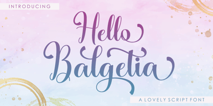 INTRODUCING Hello Balgetia Script is a lovely script font, including Regular. This font is casual and pretty with swashes. Can used for various purposes. such as logo, product packaging, wedding invitations, branding, headlines, signage, labels, signature, book covers, posters, quotes and more. Hello Balgetia Script features OpenType stylistic alternates, ligatures and International support for most Western Languages is included. To enable the OpenType Stylistic alternates, you need a program that supports OpenType features such as Adobe Illustrator CS, Adobe Indesign & CorelDraw X6-X7, Microsoft Word 2010 or later versions.How to access all alternative characters using Adobe Illustrator: https://www.youtube.com/watch?v=XzwjMkbB-wQ Hello Balgetia Script is coded with PUA Unicode, which allows full access to all the extra characters without having special designing software. Mac users can use Font Book , and Windows users can use Character Map to view and copy any of the extra characters to paste into your favourite text editor/app.How to access all alternative characters, using Windows Character Map with Photoshop: https://www.youtube.com/watch?v=Go9vacoYmBw If you need help or have any questions, please let me know. I'm happy to help :) Thanks & Happy Designing!
 - Hello Molydia by Mega Type,
$14.00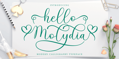 Hello Molydia is a sweet modern calligraphy font. This font is casual and elegant with swashes. Hello Molydia can be used for various purposes such as logos, product packaging, wedding invitations, branding, headlines, signage, labels, signatures, book covers, posters, quotes and more. Hello Molydia Script features OpenType stylistic alternates, and ligatures. International support for most Western Languages is included. To enable the OpenType Stylistic alternates, you need a program that supports OpenType features such as Adobe Illustrator CS, Adobe Indesign & CorelDraw X6-X7, Microsoft Word 2010 or later versions. How to access all alternative characters using Adobe Illustrator: https://www.youtube.com/watch?v=XzwjMkbB-wQ Hello Molydia Script is coded with PUA Unicode, which allows full access to all the extra characters without having special designing software. Mac users can use Font Book , and Windows users can use Character Map to view and copy any of the extra characters to paste into your favourite text editor/app. How to access all alternative characters, using Windows Character Map with Photoshop: https://www.youtube.com/watch?v=Go9vacoYmBw If you need help or have any questions, please let me know. I'm happy to help. Thanks and Happy Designing!
 - Christofer by Straight.Co,
$12.00 Christofer Script is elegant calligraphy font, including Regular and Slant. This font is casual and pretty with swashes. Can used for various purposes. such as logo, product packaging, wedding invitations, branding, headlines, signage, labels, signature, book covers, posters, quotes and more. Christofer Script features OpenType stylistic alternates, ligatures and International support for most Western Languages is included. To enable the OpenType Stylistic alternates, you need a program that supports OpenType features such as Adobe Illustrator CS, Adobe Indesign & CorelDraw X6-X7, Microsoft Word 2010 or later versions.How to access all alternative characters using Adobe Illustrator: https://www.youtube.com/watch?v=XzwjMkbB-wQ Christofer Script is coded with PUA Unicode, which allows full access to all the extra characters without having special designing software. Mac users can use Font Book , and Windows users can use Character Map to view and copy any of the extra characters to paste into your favourite text editor/app.How to access all alternative characters, using Windows Character Map with Photoshop: https://www.youtube.com/watch?v=Go9vacoYmBw If you have any question, don't hesitate to contact me by email. Thanks so much for looking and Enjoy it!
 - Blussafir by Great Studio,
$15.00 Blussafir is modern calligraphy design, including Regular. This font is casual and pretty with swashes. Can used for various purposes. such as logo, product packaging, wedding invitations, branding, headlines, signage, labels, signature, book covers, posters, quotes and more. Blussafir features OpenType stylistic alternates, ligatures and International support for most Western Languages is included. To enable the OpenType Stylistic alternates, you need a program that supports OpenType features such as Adobe Illustrator CS, Adobe Indesign & CorelDraw X6-X7, Microsoft Word 2010 or later versions. How to access all alternative characters using Adobe Illustrator: https://www.youtube.com/watch?v=XzwjMkbB-wQ Blussafir is coded with PUA Unicode, which allows full access to all the extra characters without having special designing software. Mac users can use Font Book , and Windows users can use Character Map to view and copy any of the extra characters to paste into your favourite text editor/app. How to access all alternative characters, using Windows Character Map with Photoshop: https://www.youtube.com/watch?v=Go9vacoYmBw If you need help or have any questions, please let me know. I'm happy to help :) Thanks & Happy Designing!
 - Nathalia by Romie Creative,
$15.00 Nathalia Script is calligraphy formal design, including Regular. This font is casual and pretty with swashes. Can used for various purposes. such as logo, product packaging, wedding invitations, branding, headlines, signage, labels, signature, book covers, posters, quotes and more. Nathalia Script features OpenType stylistic alternates, ligatures and International support for most Western Languages is included. To enable the OpenType Stylistic alternates, you need a program that supports OpenType features such as Adobe Illustrator CS, Adobe Indesign & CorelDraw X6-X7, Microsoft Word 2010 or later versions. How to access all alternative characters using Adobe Illustrator: *https://www.youtube.com/watch?v=XzwjMkbB-wQ Nathalia Script is coded with PUA Unicode, which allows full access to all the extra characters without having special designing software. Mac users can use Font Book , and Windows users can use Character Map to view and copy any of the extra characters to paste into your favourite text editor/app.How to access all alternative characters, using Windows Character Map with Photoshop: *https://www.youtube.com/watch?v=Go9vacoYmBw If you need help or have any questions, please let me know. I'm happy to help :) Thanks & Happy Designing!
 - Anindira by Straight.Co,
$15.00 Anindira Script is elegant calligraphy font. This font is casual and pretty with swashes. It can used for various purposes, such as logo, product packaging, wedding invitations, branding, headlines, signage, labels, signature, book covers, posters, quotes and more. Anindira Script features OpenType stylistic alternates, ligatures and International support for most Western Languages is included. To enable the OpenType Stylistic alternates, you need a program that supports OpenType features such as Adobe Illustrator CS, Adobe Indesign & CorelDraw X6-X7, Microsoft Word 2010 or later versions. How to access all alternative characters using Adobe Illustrator: https://www.youtube.com/watch?v=XzwjMkbB-wQ Anindira Script is coded with PUA Unicode, which allows full access to all the extra characters without having special designing software. Mac users can use Font Book, and Windows users can use Character Map to view and copy any of the extra characters to paste into your favourite text editor/app. How to access all alternative characters, using Windows Character Map with Photoshop: https://www.youtube.com/watch?v=Go9vacoYmBw If you have any question, don't hesitate to contact me by email. Thanks so much for looking and Enjoy it!
 - Montine by Gatype,
$8.00 Montine Script is elegant calligraphy font. This font is casual and pretty with swashes. Can used for various purposes such as logos, product packaging, wedding invitations, branding, headlines, signage, labels, signatures, book covers, posters, quotes and more. Montine Script features OpenType stylistic alternates, ligatures and International support for most Western Languages is included. To enable the OpenType Stylistic alternates, you need a program that supports OpenType features such as Adobe Illustrator CS, Adobe Indesign & CorelDraw X6-X7, Microsoft Word 2010 or later versions.How to access all alternative characters using Adobe Illustrator: https://www.youtube.com/watch?v=XzwjMkbB-wQ Montine Script is coded with PUA Unicode, which allows full access to all the extra characters without having special designing software. Mac users can use Font Book , and Windows users can use Character Map to view and copy any of the extra characters to paste into your favourite text editor/app.How to access all alternative characters, using Windows Character Map with Photoshop: https://www.youtube.com/watch?v=Go9vacoYmBw If you have any question, don't hesitate to contact me by email : chaidirgata@gmail.com Thanks so much for looking and Enjoy it!
 - Sundaris Script by Great Studio,
$15.00 Sundaris Script is modern calligraphy design. This font is casual and pretty with swashes. Can be used for various purposes. such as logos, product packaging, wedding invitations, branding, headlines, signage, labels, signature, book covers, posters, quotes and more. Sundaris Script features OpenType stylistic alternates, ligatures and International support for most Western Languages is included. To enable the OpenType Stylistic alternates, you need a program that supports OpenType features such as Adobe Illustrator CS, Adobe Indesign & CorelDraw X6-X7, Microsoft Word 2010 or later versions. How to access all alternative characters using Adobe Illustrator: https://www.youtube.com/watch?v=XzwjMkbB-wQ Sundaris Script is coded with PUA Unicode, which allows full access to all the extra characters without having special designing software. Mac users can use Font Book , and Windows users can use Character Map to view and copy any of the extra characters to paste into your favorite text editor/app. How to access all alternative characters, using Windows Character Map with Photoshop: https://www.youtube.com/watch?v=Go9vacoYmBw If you need help or have any questions, please let me know. I'm happy to help :) Thanks & Happy Designing!
 - Nigthwel by Picatype,
$14.00 Nigthwel Script is inspired by retro style and combination with Hand Lettering style. Nigthwel has many OpenType features like a stylistic alternatives, stylistic sets, ligatures and swash so you can mix and match like a you want. Nigthwel Script is good for logotype, poster, badge, book cover, t-shirt design, handwritten quotes, product packaging, header, poster, merchandise, social media & greeting cards. To enable the OpenType Stylistic alternates, you need a program that supports OpenType features such as Adobe Illustrator CS, Adobe Indesign & CorelDraw X6-X7, Microsoft Word 2010 or later versions. How to access all alternative characters, using Windows Character Map with Photoshop: https://www.youtube.com/watch?v=Go9vacoYmBw How to access all alternative characters using Adobe Illustrator: https://www.youtube.com/watch?v=XzwjMkbB-wQ Nigthwel Script is coded with PUA Unicode, which allows full access to all the extra characters without having special designing software. Mac users can use Font Book , and Windows users can use Character Map to view and copy any of the extra characters to paste into your favourite text editor/app. Thanks so much for looking and please let me know if you have any questions.
 - Angel Heart by Great Studio,
$15.00 Angel Heart Script is a modern script with handwriting, decorative characters, and dancing baselines! It's very suitable in use like blog headers, t-shirts, and for weddings, social media, product design, stationery, advertising, clothing, book covers, business cards, greeting cards, branding, merchandise, invitations and handmade quotes and more. Angel Heart Script features OpenType stylistic alternates, ligatures and International support for most Western Languages is included. To enable the OpenType Stylistic alternates, you need a program that supports OpenType features such as Adobe Illustrator CS, Adobe Indesign & CorelDraw X6-X7, Microsoft Word 2010 or later versions. How to access all alternative characters using Adobe Illustrator: https://www.youtube.com/watch?v=XzwjMkbB-wQ Angel Heart Script is coded with PUA Unicode, which allows full access to all the extra characters without having special designing software. Mac users can use Font Book , and Windows users can use Character Map to view and copy any of the extra characters to paste into your favourite text editor/app. How to access all alternative characters, using Windows Character Map with Photoshop: https://www.youtube.com/watch?v=Go9vacoYmBw If you have any question, don't hesitate to contact me by email : greatstudio92@gmail.com Thank you!
 - Shirelda Script by Picatype,
$12.00 Say hello to Shirelda Script - A contemporary calligraphy, with a vintage feel, style calligraphy with moving baseline and elegant touch. That makes the font look fabulous! Can be used for various purposes.such as headings, signature, logos, wedding invitation, t-shirt, letterhead, signage, lable, news, posters, badges etc. Shirelda Script features OpenType stylistic alternates, ligatures and International support for most Western Languages is included. To enable the OpenType Stylistic alternates, you need a program that supports OpenType features such as Adobe Illustrator CS, Adobe Indesign & CorelDraw X6-X7, Microsoft Word 2010 or later versions. How to access all alternative characters using Adobe Illustrator: https://www.youtube.com/watch?v=XzwjMkbB-wQ Shirelda Script is coded with PUA Unicode, which allows full access to all the extra characters without having special designing software. Mac users can use Font Book , and Windows users can use Character Map to view and copy any of the extra characters to paste into your favourite text editor/app. How to access all alternative characters, using Windows Character Map with Photoshop: https://www.youtube.com/watch?v=Go9vacoYmBw If you need help or have any questions, please let me know. I'm happy to help :) Thanks & Happy Designing!
 - Betrycia by Rastype Studio,
$16.00 Betrycia Script is modern calligraphy font. This font is casual and pretty and includes swashes. It can be used for various purposes, such as logos, product packaging, wedding invitations, branding, headlines, signage, labels, signature, book covers, posters, quotes and more. Betrycia Script features OpenType stylistic alternates, ligatures and support for most Western Languages. To enable the OpenType Stylistic alternates, you need a program that supports OpenType features such as Adobe Illustrator CS, Adobe Indesign & CorelDraw X6-X7, Microsoft Word 2010 or later versions. How to access all alternative characters using Adobe Illustrator: https://www.youtube.com/watch?v=XzwjMkbB-wQ Betrycia Script is coded with PUA Unicode, which allows full access to all the extra characters without having special designing software. Mac users can use Font Book , and Windows users can use Character Map to view and copy any of the extra characters to paste into your favourite text editor/app. How to access all alternative characters, using Windows Character Map with Photoshop: https://www.youtube.com/watch?v=Go9vacoYmBw If you need help or have any questions, please let me know. I'm happy to help :) Thanks & Happy Designing!
 - Gothic Birthday Cake, a creation by the remarkably talented Bill Roach, encapsulates the essence of celebration intertwined with an intriguing gothic aesthetic. This font stands out due to its distin...
- The DIST Inking Bold font is a robust and captivating typeface that effortlessly captures the essence of hand-drawn creativity with the precision and clarity of digital design. Designed to emulate th...
- Hand Scribble Sketch Times by TypoGraphicDesign,
$19.00 CHARACTERISTICS A state-of-the-art OpenType-Feature (like Contextual Alternates (calt) and Stylistic Alternates (salt)) of “Hand Scribble Sketch Times” is, that each uppercase and each lowercase letter has automatically alternated two variations to bring humanly-random characteristics of handwriting to life. The character of the rough, ruggend and raw handwritten classic serif typeface is a very unique warmly atmosphere. An pro-version of the font “Hand TIMES”. APPLICATION AREA warmth, love, handmade. For support of human warmth. Of cooking recipes, menus in the restaurant across party flyer, music cover Art to logo (word marks), headings in magazines and websites. TECHNICAL SPECIFICATIONS ? Font Name: Hand Scribble Sketch Times ? Font Weights: Regular, Rough, Invert ? Font Category: Grunge Serif Display for Headline Size ? Font Format: OTF (OpenType Font for Mac + Win) ? Glyph coverage: 601 ? Language Support: Basic Latin/English letters, Central Europe, West European diacritics, Baltic, Romanian, Turkish ? Specials: Alternative letters, Standard & Discretionary Ligatures, extras like symbols, dingbats, Old-style Digits, Lining Figures, accents & €, incl. OpenType-Features like Contextual Alternates (calt), Glyph Composition/Decomposition (ccmp), Discretionary Ligatures (dlig), Kerning (kern), Standard Ligatures (liga), Numerators (onum), Ordinals (ordn), Stylistic Alternates (salt), Stylistic Set 01 (ss01), Stylistic Set 02 (ss02), Stylistic Set 03 (ss03), Slashed Zero (zero), Lining Figures (lnum), Tabular Figures (tnum), Old Style Figures (onum), Proportional Figures (pnum) ? Design Date: 2013 ? Type Designer: Manuel Viergutz
 - Jackalope LP by LetterPerfect,
$39.00 Jackalope is a new original script font from LetterPerfect Fonts. The design is a hybrid of pressure-pen calligraphy infused with whimsy and curlicue terminals. Letterforms are free-spirited and edges are rough, simulating spontaneous writing on rough paper. In addition to the full ANSI western character set, Jackalope includes a full set of small capitals, both lining and old-style numbers, and swash lowercase alternate characters that can be used as terminal letters at the ends of words for additional flourish. The genesis and realization of Jackalope was also a hybrid process. In 1996, LetterPerfect commissioned type designer Kathy Schinhofen to provide pen-written source material based on her commercial handwriting style and specifically on a logo she had designed for its "Viva la Fonts" line of script fonts. This work was digitized by LetterPerfect’s Garrett Boge and later fonticized by former Hallmark Cards type maven Myron McVay who unified the design and contributed additional characters. The design sat unfinished for over 12 years until Garrett Boge revived the project in 2010 filling out the extended character set. Jackalope is released in two versions: Jackalope LP Regular, which is the base font for continuous text setting; and Jackalope LP Expert, which includes swash variants, small capitals, and old-style numerals which can be swapped into text for extra flourish and effect.
 - Stone Dense by Putracetol,
$20.00 Stone Dense is a playful display font. Stone Dense has a large number of ligatures, 160 ligatures. So that makes this display font more playful and unique. And Stone Dense has a bold body, with unequal widths for the characters. Stone Dense can suitable for your projects that require fonts with bold and strong characteristics. Such as branding, logos, titles, headlines, printing, magazines, quotes, posters, fashion, t-shirts, apparel and others. Stone Dense is also support multi language.
 - Tape Up by Ingrimayne Type,
$9.00 The letters in TapedUp are constructed from straight pieces of what could be masking tape. The letters have a unsophisticated or unpolished quality to them. The typeface is caps-only but many of the shapes on the lower-case keys differ from those on the upper-case keys. It was formed with a template used for several letterbat fonts and also typefaces Rumpled and Tinkerer. The family has six styles: regular, bold, shadowed, oblique. bold oblique, and shadowed oblique.
 - Ballsye by Putracetol,
$28.00 Say Hello to Ballsye, a Superb bold display font. This font is a very bold font so it has a strong impression. But other than that, this font can also be a fun and playful font. Ballsye is perfect for branding design, posters, apparel, for logotype, website header, fashion design and any more. Come with Opentype feature with a lot of alternates, its help you to make great lettering. This font is also support multi language.
 - Charles Wright by K-Type,
$20.00 Charles Wright is a full typeface in the style used for British vehicle license plates. The standard Bold weight is based on the condensed bold ‘2001’ style with an uppercase which conforms to UK registration plate specifications for character heights of 79mm and widths of 50mm. The 9 font family also includes previously unavailable Medium and Regular weights, Obliques , and a newly designed lowercase. For platemakers, the wider '1935' and lighter 'Motorcycle' fonts are also included.
 - Typewriter Revo by Matthias Luh,
$29.99 Typewriter Revo is based on Typewriter BasiX but it is completely redesigned: While Typewriter BasiX has dapples and grunge (which looks more realistic), the contours of Typewriter Revo crisp and clear. Typewriter Revo is more suitable for continuous text while Typewriter BasiX and Typewriter DirtY are suitable for large Pictures, logos or headings. In contrast to Typewriter BasiX, Typewriter Revo includes 11 more characters and is also available in a bold, italic and bold + italic version.
 - Forbes by Linotype,
$29.99 Forbes consists of one bold weight and is an alphabet in the style of the bold English slab serifs, as made evident by its flexed serifs. This style first made its appearance in the 19th century. It was used at first only on posters but later became available in smaller point sizes and was then be used for titling and headlines. With its robust figures, Forbes should be used exclusively for these applications in middle and large point sizes.
 - Aremic by Graptail,
$15.00 Aremic is a bold display font created to be used for bold headings coming in 2 shapes Regular and Rounded including Oblique. This font is inspired by the shape of the letters on sports posters. This type of font perfectly made to be applied especially in logo, headline, signage and the other various formal forms such as invitations, labels, logos, magazines, books, greeting / wedding cards, packaging, fashion, make up, stationery, novels, labels or any type of advertising purpose.
 - Romanica by K-Type,
$20.00 ROMANICA is a relaxed humanist sans with subtly curved corners and slightly flared glyphic terminals that are expressively angled where appropriate. Romanica has the authority of the ages without the harshness of many classically inspired typefaces. All eight fonts include a full complement of Latin Extended-A characters, Welsh diacritics, Irish dotted consonants, and additional oldstyle numerals. ROMANICA is available in three packages - • Basic Family (Regular, Italic, Bold & Bold Italic) • Light (Light & Light Italic) • Medium (Medium & Medium Italic)
 - Guthenberg by Creatype Studio,
$15.00 Guthenberg Bold Script is a bold calligraphy script with dramatic movement and strong style for your latest project that needs a handlettering look. It's perfect for branding projects, logo, wedding designs, social media posts, advertisements, product packaging, product designs, labels, photography, watermarks, invitations, stationery and any projects that need handwriting style. Guthenberg comes with uppercase, lowercase, numerals, punctuations and many variations of each character, including OpenType alternates and common ligatures to let you customize your designs.
 - Badr by Linotype,
$187.99Badr is a traditional-style Arabic text typeface with two weights: Badr Light and Badr Bold, and include Latin glyphs (Cochin Roman and Bold), allowing a single font to set text in both most Western European and Arabic languages. The two Badr fonts incorporate the Basic Latin and the Arabic character sets, which support Arabic, Persian, and Urdu. They include tabular and proportional Arabic, Persian, and Urdu numerals, as well as a set of tabular European (Latin) numerals. - Right Potions by Sarid Ezra,
$19.00 Introducing, Right Potions, handwritten script family! Right Potions is a handwritten script family contains three weight from light to bold. With ligatures and underline, this fonts will make your design more naturally handwritten. You can use this fonts to make logo and branding, magazine, aesthetic post, and also handwritten quote. Right Potions also support multilingual! Foreign Languages Support: ÀÁÂÃÄÅÇÈÉÊËÌÍÎÏÐÑÒÓÔÕÖØÙÚÛÜÝßàáâãäåæçèéêëìíîïðñòóôõöøùúûüýÿ What Will You Get: Right Potions Light (TTF/OTF) Right Potions Regular (TTF/OTF) Right Potionsn Bold (TTF/OTF)
 - Landslide by Ana's Fonts,
$12.00 Landslide is a cute handwritten font family with: 4 fonts: regular, bold, italic and bold italic, each hand-drawn separately for a true handwritten feel a bonus set of ornaments (A-Z, a-z and 0-9) to help decorate your text Each font includes: A-Z, a-z, 0-9, accents punctuation and symbols Ligatures Landslide is perfect for any design that needs a handwritten feel, such as signatures, notes and quotes, logos and branding.
 - Conseration by Letterhend,
$17.00 Conseration is a condensed font family. This family has 5 styles: Light, Regular, Medium, Semi Bold, and Bold. You can use it according to your needs. Luxury, classy yet still looks fun and playful in the same time. This font is perfectly made to be applied especially in logos and the other various formal forms such as invitations, labels, magazines, books, greeting / wedding cards, packaging, fashion, make up, stationery, novels or any type of advertising purpose.
 - Happy Boy by Niznaztype,
$15.00 Happy Boy is a handwritten sans typeface that has a rounded corner in each glyph. Inspired from speech bubble for comics, illustrations and kid writing. Happy Boy is perfect for comics, illustrations, cartoons and very suitable for speech bubble text. It is fun, easy communication and an eye catching style. You can use it for cover book, tagline, poster, branding, advertising, wallpainting letter, graphic design, and more. Happy Boy comes in 4 styles, regular, italic, bold and bold italic.
 - Atnew by Outerend,
$18.00 "Atnew" is a modern typeface that includes six individual fonts (ExtraLight, Light, Regular, Medium, SemiBold, Bold) and a variable font ranging between Light (50pt) and Bold (200pt). Keeping geometric shapes but with soft curves gives fonts a playful feel. They can be used in interfaces, websites, posters, stationery, tv show credits, and many other purposes. It could be for your everyday activities like journaling. The variable font version provides more flexibility for your needs by fine-tuning weight points.
 - Crossfit Core by TypeThis!Studio,
$50.00 Crossfit is a new headline font for great sizes, such as big movie posters, advertising or editorials. Matching topics might be adventures, sports, strong nature and all kind of challenging life events. Its bold stability transforms your creation into a non questionable design. It is bold, clear and also friendly thanks to its rounded corners. www.typethis.studio Thank you for checking out Crossfit font family. If you have any questions, please send us an email: hello@typethis.studio
 - Enjoying Typeface by Putracetol,
$24.00 The Enjoying Typeface - Modern Display Font is a bold and contemporary font with a unique twist, offering two distinctive versions for added versatility. Its bold and playful characters make it an excellent choice for logos, quotes, posters, titles, headlines, magazines, business branding, product names, stickers, and invitation cards. With its thick, distinctive design, this font is sure to stand out and leave a lasting impression, making it quickly recognizable and perfect for a wide range of creative projects.
 - Pontiff Wide by Jehoo Creative,
$19.00 Designed to stand out is perfect for giving bold impressions, Pontiff Wide is a display typeface with sharp edges and has a wide shape referring to the neo vintage trend. Equipped with italic style and outline increasingly make this font striking and prominent in all its shapes and styles, bold format provides a great personality type in the title. Characters that are well-suited for a wide variety of applications from editorial design to branding, advertising, publicity and digital.
 - Leira by WildOnes,
$10.00 Leira hand drawn typeface is drawn by hand with a thick brush, resulting in really bold characters with some shakiness in line to get that personal touch feel. This typeface will suit for headlines, logo, titles, identities, packaging, posters, cards, quotes, etc. With the uniqueness of the shapes, Leira can definitely attract attention of anyone and be an eye catching font. The bold letters and playfulness of this font makes it stand out from the crowd.
 - Riot Funky by Beary,
$10.00 Get ready to make a bold statement with our revolutionary font that combines various styles into one. This eclectic, rebellious font is perfect for anyone looking to add an unpredictable touch to their designs. Whether you're creating posters, templates, or any other type of design, this font will help your work stand out and leave a lasting impression. Don't settle for ordinary, upgrade to this bold and daring font today and let your designs do the talking.
 - Girona by Narrow Type,
$35.00 Girona is a contrasting sans serif typeface which comes in 5 weights from light to bold. Large inktraps and many playful details create a modern typeface with a distinctive look. Girona offers many discretionary and standard ligatures. With different stylistic sets you can change the feel of your design from more delicate to more bold. It’s a perfect typeface for branding, editorial design, logo design and many others. Girona works best in larger sizes or headlines.
 - Phonk by Slava Antipov,
$39.00 Phonk is a bold and wide sans serif. It's great for logos, packaging, posters, advertising and other tasks requiring strong and bold typography. The font family contains the following 4 styles: Regular, Regular Italic, Contrast, Contrast Italic. Contrast styles are characterized by increased readability in small font sizes. Phonk has very wide language support (80+ languages). The font includes Latin and Cyrillic scripts. I recommend you check out the new and improved version of this font! Phonk Sans
 - Belle Jardin by Greater Albion Typefounders,
$18.00 Belle Jardin is an Art Deco inspired display family of three typefaces, offered in in-line engraved regular and demi bold forms as well as a solid bold form. It offers upper and lower case solid slab-built forms that create an immediate atmosphere of the streamline era of the thirties and are also at home in post-war revival inspired design work. The letterforms are solidly legible and ideal for cover and poster inspired design work.
 - Boulevard Sans by takoliko,
$16.00 Boulevard Sans typeface designed by Takoliko Studio. This Sans Serif font inspired by retro geometric style especially the radio and vhs era.The simplicity and geometric style is a timeless choice for your design. It comes with reguler and Bold, also oblique style for a different feel. Its bold characteristics makes it suitable for attention grabbing design projects such as headlines, posters, social media displays and editorials. And You can combine the family to make a larger design concept.