10,000 search results
(0.036 seconds)
- Red Bells by Maulana Creative,
$14.00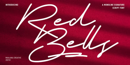 Red Bells is a unique casual signature script font. With regular mono-line stroke, fun character with some of ligatures and extra swash. To give you an extra creative work. Red Bells font support multilingual more than 100+ language. This font is good for logo design, Social media, Movie Titles, Books Titles, a short text even a long text letter and good for your secondary text font with sans or serif. Make a stunning work with Red Bells font. Cheers, MaulanaCreative
 - Lovatine by Arterfak Project,
$18.00 Feel the love with Lovatine, a brand new lovely font that is created with smooth, soft, and lovely feels. Designed with extra alternates characters, Lovatine is the perfect choice for decoration, branding, children's needs, books, quotes, and more! Lovatine is complete with extra dingbats containing some symbols, ornaments, and doodles which you can apply to beautify your design and make it more attractive! Featured : Uppercase Lowercase Numbers Symbols Stylistic Alternates Swashes Ligatures Multilingual Characters. Thank you for watching and stay safe!
 - Surfers South by Maulana Creative,
$13.00 Surfers South is an expressive signature font combine with extra sans display. With light mono-line stroke, fun character with a bit of ligatures. To give you an extra creative work. Surfers South font support multilingual more than 100+ language. This font is good for logo design, Social media, Movie Titles, Books Titles, a short text even a long text letter and good for your secondary text font with sans or serif. Make a stunning work with Surfers South font. Cheers, Maulana Creative
 - Liner Notes by AdultHumanMale,
$20.00 Liner Notes is a fun scrawly, marker felt, ALL CAPS display font. I wanted it to look fun, loud, and to have hints of School graffiti, so it can wail from Posters and Headlines. It has over 260 glyphs and several variations on the standard alphabet and all those extra pésk¥ foreign features. It also has various letters with extra ligatures and flourishes available through OpenType or your Glyphs palette. OMG, LOL I also added some web slang to the glyphs.
 - DejaVu Serif - Unknown license

- Offroad by Grype,
$16.00 Geometric typefaces can harken back and visually tie themselves to so many genres, from constructivist posters, to techno club flyers, to raw industrial era power. The Offroad family finds its origin of inspiration in the O’Neal MX logo for their motocross division, represented in its truest form in the MX styles of this family, and expanded to a type megafamily. Offroad grabs hold of that unique pseudo-unicase style and runs with it to create a range of widths and weights that are perfect for historical through modern use. It embodies the hardcore motocross rigidity from the limited inspiration of the original logotype and expands to include a full and expansive glyphset, and a comprehensive range of widths and weights, creating a straightforward, uncompromising collection of typefaces that lend a solid foundation and a broad range of expression for designers. Here's what's included with the Offroad Collection bundle: 382 glyphs per style - including Capitals, Lowercase (Unicase Style), Numerals, Punctuation and an extensive character set that covers multilingual support of latin based languages. (see the 6th graphic for a preview of the characters included) 45 fonts in 6 width subfamilies: Extra Condensed, Condensed, Standard, Expanded, & Wide. 5 weights per subfamily with obliques: Light, Book, Regular, Bold, & Black. Fonts are provided in TTF & OTF formats. The TTF format is the standard go to for most users, although the OTF and TTF function exactly the same. Here's why the Offroad Collection is for you: You're in need of a geometric pseudo-unicase family with a big range of weights and widths You're a die-hard motocross fan, and want to design anything within that genre You're a club flyer designer, and need a kick-ass techno style font family You're totally into constructivist design, and want to create designs within that genre You just like to collect quality fonts to add to your design arsenal
 - HS Sondos by Hiba Studio,
$40.00 HS Sondos is an Arabic display typeface designed specifically for titles and graphic projects. Drawing inspiration from Modern Kufi calligraphy, the font features a harmonious fusion of sharp and curved lines, resulting in a visually captivating and innovative take on square shapes and geometric structures. The distinctive sharp endings at the bottom of each character add an extra touch of aesthetic appeal. With three available weights -regular, bold, and black- HS Sondos offers versatility and variety. The black weight introduces a novel concept by maintaining the same horizontal dimensions as the regular weight but expanding the vertical dimensions, creating a uniquely bold appearance. Supporting Arabic, Persian, and English languages, HS Sondos opens up a world of possibilities for designers looking to enhance their Arabic typography. Its visually striking and flexible nature makes it an excellent choice for projects that demand attention and creativity. Overall, HS Sondos stands as a testament to the beauty and adaptability of Arabic typography, empowering designers to bring their visions to life with a captivating and versatile typeface.
 - Naghashian by Naghi Naghachian,
$78.00 Naghashian is designed by Naghi Naghashian. It is a Font family, in 5 weights, Light, Regular, Bold, Extra Bold and Heavy This font is a contribution to modernisation of Arabic typography, gives the font design of Arabic letters real typographic arrangement und provides more typographic flexibility. Naghashian supports Arabic, Persian and Urdu. It also includes proportional and tabular numerals for the supported languages. Naghashian design fulfills the following needs: A Explicitly crafted for use in electronic media fulfills the demands of electronic communication. B Suitability for multiple applications. Gives the widest potential acceptability. C Extreme legibility not only in small sizes, but also when the type is filtered or skewed, e.g., in Photoshop or Illustrator. Nima’s simplified forms may be artificial obliqued in InDesign or Illustrator, without any loss in quality for the effected text. D An attractive typographic image. Naghashian was developed for multiple languages and writing conventions. Naghashian supports Arabic, Persian and Urdu. It also includes proportional and tabular numerals for the supported languages. E The highest degree of calligraphic grace and the clarity of geometric typography.
 - Chopper by Canada Type,
$24.95 In 1972, VGC released two typefaces by designer friends Dick Jensen and Harry Villhardt. Jensen’s was called Serpentine, and Villhardt’s was called Venture. Even though both faces had the same elements and a somewhat similar construct, one of them became very popular and chased the other away from the spotlight. Serpentine went on to become the James Bond font, the Pepsi and every other soda pop font, the everything font, all the way through the glories of digital lala-land where it was hacked, imitated and overused by hundreds of designers. But the only advantage it really had over Venture was being a 4-style family, including the bold italic that made it all the rage, as opposed to Venture’s lone upright style. One must wonder how differently things would have played if a Venture Italic was around back then. Chopper is Canada Type’s revival of Venture, that underdog of 1972. This time around it comes with a roman, an italic, and corresponding biform styles to make it a much more attractive and refreshing alternative to Serpentine. Chopper comes in all popular formats, boasts extended language support, and contains a ton of alternate characters sprinkled throughout the character map.
 - Lexia - Unknown license

- Biondi by Typodermic,
$11.95 Introducing Biondi—a timeless typeface that exudes sophistication and refinement. Inspired by the beloved Copperplate Gothic, Biondi boasts a set of small caps slab-serif characters that stay true to the classic wide and squarish shape of its predecessor. But what sets Biondi apart is the beefed-up wedge serifs that replace delicate hairline serifs, making it perfect for today’s display environment. Every character in Biondi is thoughtfully crafted, with strategically placed serifs that create a cleaner-flowing line of text without sacrificing understated gravitas. Whether you’re designing a logo, a book cover, or a poster, Biondi’s elegant lines and bold presence will instantly elevate your project to the next level. Available in five weights and italics, Biondi offers unparalleled versatility and flexibility. Whether you need a bold statement or a subtle accent, this timeless typeface will deliver every time. Why settle for ordinary when you can elevate your work with Biondi? Try it today and experience the classic beauty of Copperplate Gothic reimagined for the modern world. Most Latin-based European, Vietnamese, Greek, and most Cyrillic-based writing systems are supported, including the following languages. Afaan Oromo, Afar, Afrikaans, Albanian, Alsatian, Aromanian, Aymara, Azerbaijani, Bashkir, Bashkir (Latin), Basque, Belarusian, Belarusian (Latin), Bemba, Bikol, Bosnian, Breton, Bulgarian, Buryat, Cape Verdean, Creole, Catalan, Cebuano, Chamorro, Chavacano, Chichewa, Crimean Tatar (Latin), Croatian, Czech, Danish, Dawan, Dholuo, Dungan, Dutch, English, Estonian, Faroese, Fijian, Filipino, Finnish, French, Frisian, Friulian, Gagauz (Latin), Galician, Ganda, Genoese, German, Gikuyu, Greenlandic, Guadeloupean Creole, Haitian Creole, Hawaiian, Hiligaynon, Hungarian, Icelandic, Igbo, Ilocano, Indonesian, Irish, Italian, Jamaican, Kaingang, Khalkha, Kalmyk, Kanuri, Kaqchikel, Karakalpak (Latin), Kashubian, Kazakh, Kikongo, Kinyarwanda, Kirundi, Komi-Permyak, Kurdish, Kurdish (Latin), Kyrgyz, Latvian, Lithuanian, Lombard, Low Saxon, Luxembourgish, Maasai, Macedonian, Makhuwa, Malay, Maltese, Māori, Moldovan, Montenegrin, Nahuatl, Ndebele, Neapolitan, Norwegian, Novial, Occitan, Ossetian, Ossetian (Latin), Papiamento, Piedmontese, Polish, Portuguese, Quechua, Rarotongan, Romanian, Romansh, Russian, Rusyn, Sami, Sango, Saramaccan, Sardinian, Scottish Gaelic, Serbian, Serbian (Latin), Shona, Sicilian, Silesian, Slovak, Slovenian, Somali, Sorbian, Sotho, Spanish, Swahili, Swazi, Swedish, Tagalog, Tahitian, Tajik, Tatar, Tetum, Tongan, Tshiluba, Tsonga, Tswana, Tumbuka, Turkish, Turkmen (Latin), Tuvaluan, Ukrainian, Uzbek, Uzbek (Latin), Venda, Venetian, Vepsian, Vietnamese, Võro, Walloon, Waray-Waray, Wayuu, Welsh, Wolof, Xavante, Xhosa, Yapese, Zapotec, Zarma, Zazaki, Zulu and Zuni.
 - Good Selection by Mega Type,
$10.00 Good Selection Font Duo and Extras is a modern scripts with handwriting, decorative characters, designed to perfectly combine informal, sassy, romantic, sweet scripts. Hand-drawn design elements allow you to create many beautiful typographic designs in an instant like branding, logos, web design and editorial, prints, invitations, crafts, quotes, and more. Good Selection Font Duo and Extras features OpenType stylistic alternates, ligatures and International support for most Western Languages. To enable the OpenType Stylistic alternates, you need a program that supports OpenType features such as Adobe Illustrator CS, Adobe Indesign & CorelDraw X6-X7, Microsoft Word 2010 or later versions. How to access all alternative characters using Adobe Illustrator: https://www.youtube.com/watch?v=XzwjMkbB-wQ Good Selection is coded with PUA Unicode, which allows full access to all the extra characters without having special designing software. Mac users can use Font Book , and Windows users can use Character Map to view and copy any of the extra characters to paste into your favorite text editor/app. How to access all alternative characters, using Windows Character Map with Photoshop: https://www.youtube.com/watch?v=Go9vacoYmBw If you have any question, don't hesitate to contact me by email : megatype04@gmail.com
 - Dealers by Gumpita Rahayu,
$20.00 Back to the past when the old building and the beauty of a old store decorated by distinctive signage. With a clear feels of authentic historical value and the today's needs must be balanced in order to create the nostalgic feels. Introducing an authentic touch based on old fashioned signage developed into the wood type feels, and it's called Dealers. Dealers is a development of the classic taste wood type to form a solid blocked shapes, modern serifs, and with all caps based characters and slightly condensed. With specific characteristics, dealers font is intended for coffee shops, stores, restaurant menu that you want to create the impression of a classic and harmonious. With the addition of catchwords in the OpenType features, allowing you to be more creative to meet the requirements on the design you create.
 - VLNL Bleek by VetteLetters,
$35.00 Bleek started its life as a logo for a rock band with the same name. This makes sense as it has distinct roots in classic rock logo design. Any rock band name set in VLNL Bleek looks instantly cool – profi logo quality! Of coarse Bleek will serve an awesome purpose as a headline font as well. Or gig flyers and posters. Or band backdrops. Just turn it up to 11! DBXL expanded the original logo into the full Heavy weight and added Light and Medium cuts. VLNL Bleek is an all caps font with uppercase and lowercase variations for maximum effect. It has a number of Open type features, like and alternate F, mirrored A and O and a TT ligature to spice up your designs. VetteLetters says: Rock on!
 - Kolesom by Frantic Disorder,
$12.00 Kolesom is bold display font that inspired from classic rusty stuff like old signage and poster. This typeface has various styles of font that includes Clean, Alt, Texture, and Western. I found it perfect for poster design, t-shirt design, and other display design needs. Works best in 100pt and above.
 - RM Signwriter by Ray Meadows,
$19.00 Inspired by the signwriting on traditional old canal boats in the UK, this bold, block serif design has many potential uses. Due to the modular nature of this design there may be a slight lack of smoothness to the curves at very large point sizes (around 100 pt and above).
 - AZ Script by Artist of Design,
$25.00 AZ Script font was inspired from a need to have a "worn look" on bold headline script of letters This font utilizes an "old look" to the line work which is designed to have a "worn feel" to it. Ideal for use as headline or sub-head text in you design.
 - Table Wood JNL by Jeff Levine,
$29.00 Concave Tuscan Extra Condensed is a classic wood type sans serif design that is the basis for Table Wood JNL, which is available in both regular and oblique versions.
 - Newshawk JNL by Jeff Levine,
$29.00Jeff Levine's Newshawk JNL emulates the tall, condensed headline fonts often used years ago when an urgent story broke and a newspaper rushed an "Extra" edition to the streets. - Weisshorn Brush by Bal Studio,
$12.00 Weisshorn Brush is a new brushed textured font which includes extra swashes. Perfect for brand projects, logos, product packaging, posters, invitations, greeting cards, news, blogs, everything including personal charm.
 - TOMO Catcher by TOMO Fonts,
$15.00 TOMO Catcher is a sweet and friendly handwritten font. The extra narrow style makes it incredibly fitting to a large pool of designs. The only limit is your imagination!
 - Cabrito Contrast by insigne,
$29.99 The Cabrito family is back again to make a statement. Released as a complement to the children's book, The Clothes Letters Wear, the original Cabrito is light-hearted, fun, and easy to read. Now, balancing this friendliness with a new elegance, Cabrito Contrast steps forward--a handsome typeface with an extra-sophisticated sensibility injected into the design. Still bright and playful in its Cabrito ancestry, this new Cabrito member approaches the field with a cleaner, more reductionist form, ensuring that its polished look retains the readability. Regular features and Italic forms of the 54 fonts include upright alternates, ligatures, and old figures. A range of weights include extended and condensed variants. To preview any of these interactive features, see the PDF manual. The family also includes language support for 72 Latin-based languages, and there are over 600 glyphs for further refining your work. Cabrito Contrast is best used for logos and packaging as well as flyers and websites, though its readability makes it a great option across a wide variety of works. In short, it’s well-designed just for you. Take a stroll with Cabrito Contrast, and see how much fun refinement can be. Along the way, take a look at a few other members of Cabrito, too and see how well the likes of Original, Inverto or Didone can pair with the new Contrast.
 - Cocogoose Classic by Zetafonts,
$39.00 Download PDF Specimen Created as a display typeface in 2012 by Cosimo Lorenzo Pancini, Cocogoose is one of Zetafonts most loved typefaces. A sans serif typeface of geometric proportions, with very low contrast and slightly rounded corners, it was the first typeface to be produced in the Coco series, an ongoing research on the design variation in gothic typefaces through the ages. Cocogoose extreme x-height and ultrabold weight (with regular being comparable to heavy weights of other typefaces), have since then made it very popular for effective display and logo use, also thanks to decorative versions like Cocogoose Letterpress. Since 2016, Andrea Tartarelli has been improving the typeface expanding the original glyph set to include cyrillic and greek and adding extra weights, widths, and italics to the original family range, and bringing Cocogoose to an impressive count of 52 variants. In 2019, Francesco Canovaro has teamed with Andrea Tartarelli and Cosimo Lorenzo Pancini to create a new variant subfamily: Cocogoose Classic, featuring 8 weights and matching italics. Cocogoose Classic keeps the original design for uppercase characters while developing a new design for lowercase, with a smaller x-height, round dots and expanded open-type features, including positional numerals, alternate forms, and extended ligatures and bringing the glyph count to over 1000 characters.
 - Aviel - 100% free

- TOY_SOLDIERS - Personal use only

- FLUID - Personal use only

- Letterpress Studio by Fenotype,
$15.00 Letterpress Studio -Crafted Vintage Goods Letterpress Studio includes following • 7 fonts - a textured and clean version of each • Ornaments • Catchwords • 25 Logo Templates Letterpress Studios core is seven fonts - textured and clean version of each. Fonts are designed in same proportions and work great together. Here’s a short introduction to the fonts: • Letterpress Script -A connected script with lot’s of OpenType features • Letterpress Script Bold -Bold version of Letterpress Script • Letterpress Condensed -A condensed sans-serif typeface with swash uppercase characters on • Letterpress Gothic -A sans-serif typeface with swash uppercase characters • Letterpress Sans -An extended sans-serif typeface with swash uppercase characters • Letterpress Wood -A woodcut style serif typeface with swash uppercase characters • Letterpress Black -A black woodcut style serif typeface with swash uppercase characters • Letterpress Ornaments -A set of pictograms, ornaments, borders and badges (OTF, AI & PDF) • Letterpress Catchwords -A set of over 100 woodcut-style catchwords (OTF, AI & PDF) All fonts have West European, Central European, Baltic, Turkish and Romanian character sets. Fonts come in OTF format. TTF are also available but OpenType features won’t work with them. Letterpress Templates -25 templates (AI) Letterpress Templates is a set of 25 ready made compositions with font pairings, shapes, ornaments and ready made 2-4 color schemes for each. Templates can be used as such or as a starting point for your own project. Download Letterpress Templates here.
 - Octava by ParaType,
$30.00 PT Octava™ was designed at ParaType in 2001 by Vladimir Yefimov. The first (Cyrillic only) version named Scriptura Russica (1996) consisting of three styles (book, italic, bold) was commissioned by the Russian Bible Society. Lately the Latin letters and bold italic were added. Inspired by Lectura, 1969, by Dick Dooijes and Stone Print, 1991, by Sumner Stone. In spite of large x-height the typeface is both space saving and quite legible at small sizes. Expert fonts including small caps (book) and old style figures are available.
 - Nelson by Laura Worthington,
$25.00 Evocative of paint on weathered wood, Nelson’s engraved capital letters are as rustic and confident as the Old West. Combine the engraved face with bold and rough versions to create handsome wordmarks, or use Nelson to captivate customers of food packaging, restaurant menus, and roadside attractions. See what’s included! Engraved • Ornaments • Rugged • Bold *NOTE* Basic versions DO NOT include swashes, alternates or ornaments These fonts have been specially coded for access of all the swashes, alternates and ornaments without the need for professional design software! Info and instructions here: http://lauraworthingtontype.com/faqs/
 - Cautions Brush by Fargun Studio,
$12.00 Thanks for checking out Cautions Brush! A fabulously fun yet elegant script font with tons of energy, allowing you to create beautiful hand-made typography in an instant. With extra bouncy curves & loops, Cautions Brush is guaranteed to make your text stand out - perfect for logos, printed quotes, invitations, cards, product packaging, headers and whatever your imagination holds. What's really awesome is that Cautions Brush comes with a complete set of lowercase alternates, which allows you to create even more authentic custom-feel text. Another great feature is the bonus ornaments font, which allows you to add some really unique and elegant finishing touches to your script text. Cautions Family includes 2 font files; Cautions Brush• A handwritten script font containing upper & lowercase characters, numerals and a large range of punctuation. Cautions extras • A set of hand-drawn swashes & doodles, the perfect finishing touch to underline your Cautions Brush text & doodles for perfect lettering logos. Simply install this as a separate font, select it from your font menu and type any A-Z, a-z & 0-9 character to create a swash & Doodles.
 - onakite - Unknown license

- Scriptuale by Linotype,
$29.00The Scriptuale family, which contains eight styles, is a contemporary upright calligraphic face. Designed by German designer Renate Weise in 2003, this family of typefaces speaks to the present, while at the same time reflecting on a lyrical past. The letterforms of the Scriptuale family are romanticized, they reference German calligraphic styles from the 19th and early 20th Centuries. For instance the design of Scriptuale's uppercase strays from the canon of classical proportion into romantic idealism. While the C and O are drawn according to the ancient quadratic proportions - almost twice as wide, optically, as the E or the L - the letter A is wider than would be expected, and the D narrower. These subtle differences introduce a different rhythm into text set in Scriptuale than Italic styles of calligraphy may offer. Scriptuale's Gs merit special notice: both the upper and lower case G lunge slightly forward, further enhancing the dynamic quality of the text. Also unique in Scriptuale's design is the lowercase width: the letterforms appear slightly condensed; they have large x-heights to compensate for this. In a delightful twist, the number 2's beak has been closed by drawing it full-circle, back into the stem: this references a style of letter design that was practiced, among other places, by artists from the old Klingspor foundry in Offenbach Germany. Typefaces constructed there easily captured the zeitgeist of the romantic period, but are less calligraphic than Scriptuale (e.g., Rudolf Koch's Koch Antiqua). A semi-serif face (like Prof. Hermann Zapf's Optima or Otl Aicher's Rotis Semi), some of Scriptuale's letters have serifs (D), and some do not (A). And although both the B and the E normally have the same "structure" on their left side, Weise has drawn them differently in Scriptuale. These strengthen the calligraphic-like quality of the family. Traces of the pen are easy to see in Scriptuale's design; it is a thoroughly calligraphic face. The eight typefaces in the Scriptuale family include Light, Regular, Semi Bold, and Bold weights. Each weight has a companion italic. Scriptuale is similar to one other contemporary calligraphic family in the Linotype portfolio, Anasdair , from British designer - Jukebox Hero by Grype,
$19.00 As one of the most popular rock bands of the world, Foreigner has rocked the charts with 10 multi-platinum albums and sixteen top 30 hits in the last 40 years. But one might ask what a band this successful has been missing all these years? No head games here...a consistent typeface based on their logo is the answer. As fans of Foreigner, we've taken the essence of their iconic logotype and expanded it out into a full typeface in regular and bold weights to celebrate their 40th anniversary tour. The Jukebox Hero Family celebrates the typographic stylings of Foreigner, with the soft rounded terminals and an open geometric feel, including the unique stencil flavor of the original logo. It inherited the friendly stylings of the all Capitals logo that inspired it, and goes on to include a full standard character set with expansive international support of latin based languages, and two weights jumping from regular to a beefy bold. This family is ready to rock the charts for your designs towards that of a modern, comfortable appeal. Here's what's included with Jukebox Hero Family bundle: 413 glyphs - including Capitals, Lowercase, Numerals, Punctuation and an extensive character set that covers multilingual support of latin based languages. (see the 3rd graphic for a preview of the characters included) 2 weights: Regular & Bold. Fonts are provided in TTF & OTF formats. The TTF format is the standard go to for most users, although the OTF and TTF function exactly the same. Here's why Jukebox Hero Family bundle is for you: You're a die-hard Foreigner fan, and have a case of "Double Vision" and need both font weights. You're looking for a stylish and sophisticated soft sans-serif stencil typeface family. You've been waiting for fonts like these. You're looking for a Sci-fi vibe typeface that has a look that feels familiar. You just like to collect quality fonts to add to your design arsenal
 - CoolKids by SevenType,
$29.99 CoolKids was inspired by the song “Signs of Life” by Arcade Fire. Since the lyrics talk about some cool kids we wondered what a typeface with the name cool kids would look like. We immediately knew it had to be laid back yet bold and to stand out from the crowd. After designing the bold script we decided to include a light, regular and medium weight to offer you more options for your designs. It comes with initial and final alternates, that show up automatically, to make it feel more natural and similar to handwriting. Every character was carefully drawn and connections are real smooth. This casual font-family speaks most Latin languages, both in their basic and alternate forms. CoolKids is great for creating logos, packaging, posters and much more. More important than to create a font is to use it… so now it’s up to you to create something awesome with it. Feel free to share your designs with us via email to hi@seventype.com We would love to see and share them with the world!
 - Treatise by Zephyris,
$- Treatise was born in a notebook at the back of a boring lecture on immunology with the simple thought of “How can I make a serif more fun?” When writing a scientific treatise, there are not many options for making it enjoyable. However, some little quirks and fun features in the font can take the serious edge off the writing.... Treatise is a light and open serif with some design quirks, which give it a slightly calligraphic feel; a single -storey “a” and “g,” a visible stroke mark on the “o,” and a curved arm on the “k.” These features are subtle enough to fit into a paragraph of text but bold enough to give a title some character. The Treatise family includes a true italic and a heavy-struck style bold, and several OpenType features; standard and discretional ligatures, contextual alternatives, and different figure styles. The character coverage includes Basic Latin, Latin-1 Supplement, and Latin Extended-A and will support most Latin-alphabet languages, including languages with more exotic characters such as Icelandic and Maltese.
 - BPmono - Unknown license

- Bargain Shopping by Jeff Levine,
$29.00 F.W. Woolworth was once one of the giants of the variety store chains, along with the likes of Kress, S.S. Kresge, McCrory’s, Neisner Brothers, Ben Franklin and others. In 1960, the company brought out a new corporate logo with a type design harking back to the Art Deco style of the 1930s and 1940s. A photo of one of their old store fronts (despite having only eight letters to work with) inspired the digital interpretation of the signage as Bargain Shopping JNL, which is available in both regular and oblique versions.
 - Al Mangsi by Aluyeah Studio,
$120.00 Mangsi in Javanese means ink. We want to create a modern display typeface with an inked-like feel by combining clean modern serif strokes, brush strokes and the curved line made by the ink tank. Mangsi is a modern inked display typeface that unites the beauty of the old lines with the clean modern lines. A simple, yet distinctive, elegant font that can be applied to many areas of design. Coming with 170+ stunning and super easy to use alternates and ligatures. To get results like the preview just type M.3A.NGS.3I
 - Chunk by Fenotype,
$25.00 Inspired by the more than hundred years old classic Cooper Black, Chunk Black features a hefty character with rounded serifs and a soft yet sturdy overall appearance. Chunk Black provides a timeless and friendly feel and it’s very suitable for product and packaging design and any kind of display purposes from music business to restaurant menus and from t-shirts to band logos. Both Chunk Black and Chunk Black Italic are equipped with several OpenType -features and a total number of 87 alternate characters, set in Swash, Stylistic and Titling Alternates and Discretionary Ligatures.
 - Cubenzis by Illuminaut Designs,
$12.00 Attempting to marry the warm friendliness of the Cubano typeface with the versatility, functionality, and geometry of Eurostile has resulted in Cubenzis. After finishing the regular weight, I realized that it reminded me of old Soviet military hardware, something you might see on the outside of a tank or rocket, so i made the decision to include a full Cyrillic alphabet as well. It feels very sci-fi to me and i can imagine it being used as signage on a ship or as a warning label on machinery.


