10,000 search results
(0.033 seconds)
- Mockgent by pentagonistudio,
$19.00 Mockgent Is A Blackletter Font Inspired By Sleek and Gothic Style. SOFTWARE REQUIREMENTS : Fonts and alternate: No special software is required they may be used in any basic program /website apps that allows standard fonts That's it folks! You can go ahead and get cracking :) Follow My Shop For Upcoming Updates Including Additional Glyphs And Language Support. And Please Message Me If You Want Your Language Included or If There Are Any Features or Glyph Requests, Feel Free to Send me A Message. Have a Good Day!
 - Petit Oiseau by Hanoded,
$15.00 Petit Oiseau (Little Bird in French) is a very nice and very legible 'back-to-school' kind of typeface. It is thin, elegant and stylish, yet retains a certain youthfulness. Petit Oiseau comes with Babylonian language support!
 - Floralissimo by Wiescher Design,
$39.50 Floralissimo are flowery embellishments that I found in several old publishing books dating back over a hundred years. I thought they might be useful for some of you, so I digitized them. Your digitizing typedesigner, Gert Wiescher
 - Christmas Shadow by Yoga Letter,
$18.00 "Christmas Shadow" is a beautiful handwritten font with a love shape. This font is equipped with uppercase, lowercase, numerals, punctuation, and multilingual support. It is suitable for weddings, engagements, invitations, back to school, autumn, Christmas, and others.
 - Roquette by ITC,
$29.00Roquette is the work of British designer Martin Wait, a casual all capital wedge serif typeface which brings the 1950s back to life. The undulating baseline and lively spot illustrations of Roquette will pep up any headline. - Scalar Biform NF by Nick's Fonts,
$10.00 Here's a trip back to the Disco Age, based on a font called Gemini Biform from Fotostar. Big, bold, brassy and sassy. Both versions support the Latin 1252, Central European 1250, Turkish 1254 and Baltic 1257 codepages.
 - Just Fall Holidays by Outside the Line,
$19.00 Lots of Fall fun, many Halloween icons... black cat, haunted house, witch hat, ghost, scary masks, pumpkins, bat, BOO! and more. Plus back to school icons... bus, pencil, flashcards, paste, leaves and an apple for the teacher.
 - Debunk by Matt Grey Design,
$19.00 Debunk is made to look (mis)printed, like a faulty, worn out and mixed up letterpress or typewriter. The typeface is ideal for stationary branding, labels, band artwork or album covers as well as endless other uses.
 - Midiet - 100% free

- Ezekiel by MYSTERIAN,
$9.00 Ezekiel Script is the font become flesh—mythic gesture imposed upon forms of mechanical medium. Typography has changed the internet; our phasing mimetic desires tend toward posture rather than rationale, and the face is a concept that explores that concept. Obviously some reading of McLuhan has infliunced this concept of analysis. The script has ample diacritic extensions, as well as an alternative for the ampersand (characteristic of MYSTERIAN type) and the eszette: an upper and lower case. The upper and lower case alphabets are diverse in that the majuscules do not have linking strokes while the miniscules do. This was the first script that I've made, and great attentiveness was taken to ensure that links were set accurately, and spacing harmonious throughout.
 - DNNR - Personal use only

- AgitProp - Unknown license

- Omellons - Unknown license

- Coffeehouse - Unknown license

- grotto Med - Personal use only

- Tallula SelbyWillis aged 4 - Personal use only

- Joshua Dawson aged 4 - Personal use only

- Peachboys Handwritten Font by Maulana Creative,
$13.00 Peachboys is a modern handwritten display font. With slanted medium contrast stroke, fun character. To give you an extra creative work. Peachboys font support multilingual more than 100+ language. This font is good for logo design, Social media, Movie Titles, Books Titles, a short text even a long text letter and good for your secondary text font with sans or serif. Make a stunning work with Peachboys font. Cheers, Maulana Creative
 - Manforest by Maulana Creative,
$12.00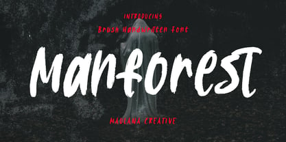 Manforest is a brush handwritten display font. With medium brush stroke, fun character. To give you an extra creative work. Manforest font support multilingual more than 100+ language. This font is good for logo design, Social media, Movie Titles, Books Titles, a short text even a long text letter and good for your secondary text font with sans or serif. Make a stunning work with Manforest font. Cheers, Maulana Creative
 - Raceway - Unknown license

- Cauldron - Unknown license

- Vagabond by Studio K,
$45.00 Vagabond is a vintage font family whose natural home is on the back porch, ranch or railroad. A rugged slab serif with a lived-in look, it’s lends a note of earthy authenticity to any graphic design project.
 - Groovy Summer JNL by Jeff Levine,
$29.00 Peace, love, togetherness and a fun font from Jeff Levine called Groovy Summer JNL harkens back to the long summer days of the 60's or 70's when life was just a little bit slower and happier...
 - King George by Chank,
$59.00King George is a chaotic, bouncy, flyer display font that harkens back to Chank's roots as a grunge alphabetician. It also has a ransom note feel that reflects the stresses and randomness of this American life. Pure rebellion! - Mixed Messages JNL by Jeff Levine,
$29.00Mixed Messages JNL brings back a favorite old theme... mixing up various letters and numbers from different fonts to create a printed message that resembles a ransom note or a collage of type with many styles of lettering. - Spring Display by Yoga Letter,
$14.00 "Spring Display" is a cute and unique display font. This font is equipped with uppercase, lowercase, numerals, punctuations, and multilingual support. This font is perfect for Easter, summer, winter, holidays, spring, back to school, mother's day, and more.
 - Akhilona by Yoga Letter,
$16.00 "Akhilona" is a very elegant and aesthetic handwritten brush font. This font is equipped with uppercase, lowercase, numerals, punctuation, and multilingual support. It is suitable for weddings, engagements, birthdays, photography, back to school, Christmas, parties, invitations, and others.
 - Shipping Carton JNL by Jeff Levine,
$29.00 Shipping Carton JNL was modeled from vintage bands of rubber type used on a special rotary marking stamp (similar to an office date stamp); generally used for identifying cartons and boxes of merchandise for shipment or product identification.
 - Tschicholina by Type-Ø-Tones,
$40.00 Tschicholina is inspired by a project by Jan Tschichold dating back to 1929. It is a unicase "universal" font which has always been considered to have very little future; this is why we have it in our catalogue.
 - Militaria JNL by Jeff Levine,
$29.00 Militaria JNL is a collection of various military insignias modeled from vintage printer's blocks. While this in no way represents all ranks, specialties and branches of the military, it is still a nice little package for themed projects.
 - Sterling Script by Canada Type,
$54.95 Sterling Script was initially meant to a be digitization/reinterpretation of a copperplate script widely used during what effectively became the last decade of metal type: Stephenson Blake's Youthline, from 1952. The years from 1945 to 1960 saw a heightened demand for copperplate faces, due to post-war market optimism, as well as the banking and insurance industries booming like never before, which triggered the need for design elements that express formal elegance and luxury. The name Sterling Script is a tip of our hat to England, the Stephenson Blake foundry's country of origin. It is also a historical hint about copperplate scripts having been used mainly for banking and bonds in the 19th century. Originally we just wanted to resurrect a gorgeous metal type from the ashes of forgotten history. But after the main font was done we saw that the original s really needed an alternate. We made one. But we felt sorry for the original s and didn't want to see it dropped from use altogether, so we saved it by building a set of ligatures that solve the minor connection problem with the s at large sizes. Before the completion of the ligatures, a few different alternates were also drawn, and we were faced by the fact that the single font we set out to do was now a much larger set than we anticipated. While thinking about how to split up our unexpected bundle of large characters, we drew a few more alternates and some swashes. This abundance "problem" reached a certain point where there was no looking back, so we just decided to go all the way with this font. We added many more alternates, swashes, ligatures, and two full sets of each beginning and ending lowercase letter. The result is over 750 characters of sheer elegance. Sterling Script has many features that set it above and beyond other copperplate scripts: - It has 2 beginning and 2 ending alternates for every single lowercase character. The beginning and ending variants on the vowels are also available in accented form in the appropriate cells of the character map. - Sterling Script is the ultimate elegant font choice for luxury design. Very elegant, but not too soft. Its strong and confident shapes convey a message that is real, comforting and assuring. - One of the eventual purposes of expanding Sterling Script this extensively was to create a script that finds the middle ground between formal and informal without compromising either trait, a script where the degree of formality can be gauged, tweaked, cranked up or toned down depending on the layout's needs. Aside from beginnings and endings, there are multiple variations for the majority of the basic characters. This is a formal script on steroids, where twirls and swashes can be set to come out unexpectedly from any place in the word, which is great for reducing the inherent rigidity of words set in copperplate scripts and "humanizing" them whenever needed. This is especially useful for wedding, postcard and invitation design, where not every viewer of the collateral material has something to do with banking or insurance. - With such an extensive character set, a designer can easily set a word or a sentence in 10 or more different ways, and choose the perfect one for the task at hand. This is particularly useful for work where details are of utmost importance, like logos, slogans, or elegant engravings that consist of one to three words. Let those swashes and twirls intertwine for maximum elegance. The Sterling Script complete package consists of 7 fonts: Sterling Script, Alternates, Beginnings, Endings, Swashes, Swash Alternates, and Ligatures. Sterling Script is available in five different purchase options and price ranges. But with such a massive offering of variation, the Sterling Script complete package is definitely the most value-laden set in its class. Once you use Sterling Script, you will never want to go back to other copperplates.
 - Vandiana Platin - Personal use only

- Telephone Extended by K-Type,
$20.00 Telephone Extended is a geometric semi-slab family with block serifs positioned to assist wordflow. The typeface evolved from an italic wordmark designed in 1966 for the British GPO by the Banks & Miles agency to publicize all-figure telephone dialling (all-number calling), and the new fonts retain that italic spirit, even in the upright romans. The squarish glyphs, with a mix of rounded and angular corners, have a post-modern feel suggesting technological advance, innovation and vitality. A normal width family, Telephone, is also available.
 - Telephone by K-Type,
$20.00 Telephone is a geometric semi-slab family with block serifs positioned to assist wordflow. The typeface evolved from an italic wordmark designed in 1966 for the British GPO by the Banks & Miles agency to publicize all-figure telephone dialling (all-number calling), and the new fonts retain that italic spirit, even in the upright romans. The squarish glyphs, with a mix of rounded and angular corners, have a post-modern feel suggesting technological advance, innovation and vitality. A wide version, Telephone Extended, is also available.
 - Anselm Sans by Storm Type Foundry,
$63.00One of the good practices of today’s type foundries is that they release their type families as systems including both serif and sans serif type. Usually, the sources of inspiration need to be well tried with time and practice, since production of a type family is such a laborious and complex process. From the beginning, it needs to be clear that the result will be suited for universal use. Such systems, complete with the broad, multi-lingual variations permitted by the OpenType format, have become the elementary, default instrument of visual communication. Non-Latin scripts are useful for a wide scope of academic publications, for packaging and corporate systems alike. And what about outdoor advertisement designated for markets in developing countries? Cyrillics and Greek have become an integral part of our OpenType font systems. Maybe you noticed that the sans serif cuts have richer variety of the light – black scale. This is due to the fact that sans serif families tend to be less susceptible to deformities in form, and thus they are able to retain their original character throughout the full range of weights. On the other hand, the nature of serifed, contrasted cuts does not permit such extremes without sacrificing their characteristic features. Both weights were drawn by hand, only the Medium cut has been interpolated. Anselm Ten is a unique family of four cuts, slightly strengthened and adjusted for the setting in sizes around 10 pt and smaller, as its name indicates. The ancestry of Anselm goes back to Jannon, a slightly modified Old Style Roman. I drew Serapion back in 1997, so its spirit is youthful, a bit frisky, and it is charmed by romantic, playful details. Anselm succeeds it after ten years of evolution, it is a sober, reliable laborer, immune to all eccentricities. The most significant difference between Sebastian/Serapion and Anselm is the raised x-height of lowercase, which makes it ideal for applications in extensive texts. Our goal was to create an all-round type family, equally suitable for poetry, magazines, books, posters, and information systems. - Anselm Serif by Storm Type Foundry,
$63.00 One of the good practices of today’s type foundries is that they release their type families as systems including both serif and sans serif type. Usually, the sources of inspiration need to be well tried with time and practice, since production of a type family is such a laborious and complex process. From the beginning, it needs to be clear that the result will be suited for universal use. Such systems, complete with the broad, multi-lingual variations permitted by the OpenType format, have become the elementary, default instrument of visual communication. Non-Latin scripts are useful for a wide scope of academic publications, for packaging and corporate systems alike. And what about outdoor advertisement designated for markets in developing countries? Cyrillics and Greek have become an integral part of our OpenType font systems. Maybe you noticed that the sans serif cuts have richer variety of the light – black scale. This is due to the fact that sans serif families tend to be less susceptible to deformities in form, and thus they are able to retain their original character throughout the full range of weights. On the other hand, the nature of serifed, contrasted cuts does not permit such extremes without sacrificing their characteristic features. Both weights were drawn by hand, only the Medium cut has been interpolated. Anselm Ten is a unique family of four cuts, slightly strengthened and adjusted for the setting in sizes around 10 pt and smaller, as its name indicates. The ancestry of Anselm goes back to Jannon , a slightly modified Old Style Roman. I drew Serapion back in 1997, so its spirit is youthful, a bit frisky, and it is charmed by romantic, playful details. Anselm succeeds it after ten years of evolution, it is a sober, reliable laborer, immune to all eccentricities. The most significant difference between Sebastian/Serapion and Anselm is the raised x-height of lowercase, which makes it ideal for applications in extensive texts. Our goal was to create an all-round type family, equally suitable for poetry, magazines, books, posters, and information systems.
 - Jetlab by Swell Type,
$15.00 Jetlab is a typographic time machine that drops you squarely into the techno-futuristic optimism of the 1960s, 1970s and 1980s! While certain weights may conjure familiar space race-era logos from the sci-fi movies, board games, sports teams, new wave bands and sneaker brands of the late 20th century, the complete 45-weight Jetlab font family is loaded with modern features to power your retro-futuristic designs with near-infinite versatility. Features: 45 weights provide widths from squeezed to stretched and weights from light to heavy, plus reverse-stress (that's thick horizontal strokes with thin verticals) high, medium and low crossbar options upper and lowercase letters provide two distinct styles a four-axis variable font provides precise control of width, vertical & horizontal weight, and crossbar height 500 glyphs support 223 languages, including Western & Central Europe and Vietnamese
 - DustHome - Unknown license

- XPFourTwoContour - Unknown license

- Feedbag NF by Nick's Fonts,
$10.00 Horse Tank, an admittedly wacky offering from Fotostar, provided the pattern for this friendly little face, full of retro charm. Both flavors of this font feature the 1252 Latin, 1250 Central European, 1254 Turkish and 1257 Baltic character sets.


