6,134 search results
(0.024 seconds)
- End Crawl by Wing's Art Studio,
$10.00 End Crawl - A Halloween Brush Font Introducing a new creeping terror this Halloween, End Crawl is a hand-drawn brush font inspired by the gore-soaked horror movies and comic books of the 1970s and 80s. This textured all-caps design evokes a nervous energy that will leave your readers frozen in suspense! With a bold painted look surrounded by an anxious outline, it offers the tools to leave your readers stomach in knots! The End Crawl font family includes all-caps uppercase and lowercase characters, along with numerals, punctuation, symbols and language support. Also included are a complete set of alternative characters and additional paint marks, drips and splashes. Wingsart Studio Design Tip! The uppercase and lowercase characters work great when mixed in an alternating fashion, with shapes that combine to create a dynamic, trembling look that's perfect for the Halloween season. Add the alternatives and paint marks into the mix and you'll have yourself a title or header design that looks truly custom-made. I've even included the base font and outlines separately, allowing to overlay your own colour combinations!
 - ITC Caslon No. 224 by ITC,
$40.99 The Englishman William Caslon (1672-1766) first cut his typeface Caslon in 1725. His major influences were the Dutch designers Christoffel van Dijcks and Dirck Voskens. The Caslon font was long known as the script of kings, although on the other side of the political spectrum, the Americans used it as well for their Declaration of Independence. The characteristics of the earlier Renaissance typefaces are only barely detectable. The serifs are finer and the axis of the curvature is almost or completely vertical. The overall impression which Caslon makes is serious, elegant and linear. Next to Baskerville, Caslon font is known as the embodiment of the English Baroque-Antiqua and has gone through numerous new interpretations, meaning that every Caslon is slightly different. ITC Caslon 224 was designed by Edward Benguiat and appeared with ITC in 1982. It is the text font which expanded upon the title font ITC Caslon 223. The alterations in the proportions of the letters make this Caslon 224 a noticeable departure from the original, but make the font overall more legible.
 - Christmas Bubble by Blankids,
$24.00 Hello, Are you looking for a Christmas font? Do you want of creating something that stand out and inspire creativity, imagination, and endless fun? Wait no more, we will give you the best choice. Christmas Bubble a Bouncy Playful Font Christmas Bubble a Bouncy Playful Font, Inspiring from playful stone style typography. This font is perfect for a design that makes it more attractive and playful. made with a very good level of aesthetics making this font suitable for book cover, children book, comic, poster, packging, merchandise, logotype and much more. Christmas Bubble font includes Multilingual Support, among others : Afrikaans, Albanian, Asu, Basque, Bemba, Bena, Breton, Catalan, Chiga, Cornish, Danish, Dutch, English, Estonian, Faroese, Filipino, Finnish, French, Friulian, Galician, German, Gusii, Indonesian, Irish, Italian, Kabuverdianu, Kalenjin, Kinyarwanda, Luo, Luxembourgish, Luyia, Machame, Makhuwa, Meetto, Makonde, Malagasy, Manx, Morisyen, North Ndebele, Norwegian Bokmål, Norwegian Nynorsk, Nyankole, Oromo, Portuguese, Quechua, Romansh, Rombo, Rundi, Rwa, Samburu, Sango, Sangu, Scottish Gaelic, Sena, Shambala, Shona, Soga, Somali, Spanish, Swahili, Swedish, Swiss German, Taita, Teso, Uzbek (Latin), Volapük, Vunjo, Zulu FEATURES : Uppercase Lowercase Number Punctuation Multilingual PUA Encode Opentype
 - Another Grotesk by Aleksandrs Golubovs,
$32.00 Another Grotesk is a contemporary typeface that was inspired by the early grotesques. Upon closer inspection you will notice the terminals of some of the characters are slightly turned inwards, this detail gives Another Grotesk its distinctive and friendly personality. Another Grotesk is functional and has been crafted with a great attention to detail. It is available in 9 weights and two optical sizes with matching italics which adds up to 36 styles. Another Grotesk Text family has been carefully redesigned some of the details were removed and simplified, x-height increased, and ink traps added, but preserved the overall look and feel of the display version, to ensure a greater legibility and clarity in running text. The extensive language support allows type setting in more than 200 languages across Latin, Cyrillic and Greek scripts. Another Grotesk also includes small caps and punctuation, tabular and old-style figures, as well as case sensitive feature and offers stylistic alternates for K, a, g, and y to fulfil any creative need of a designer.
 - Loyalty Chicano by Blankids,
$24.00 Hello, Are you looking for a tattoo font? Do you want of creating Something that stand out and inspire creativity, imagination, and endless fun? Wait no more, we will give you the best choice. Loyalty Chicano a Script Tattoo Font Loyalty Chicano a Script Tattoo Font, Inspiring from Ornamental Tattoo style typography. This font is perfect for a design that makes it more attractive and playful. made with a very good level of aesthetics making this font suitable for book cover, children book, comic, poster, packging, merchandise, logotype and much more. Loyalty Chicano font includes Multilingual Support, among others : Afrikaans, Albanian, Asu, Basque, Bemba, Bena, Breton, Catalan, Chiga, Cornish, Danish, Dutch, English, Estonian, Faroese, Filipino, Finnish, French, Friulian, Galician, German, Gusii, Indonesian, Irish, Italian, Kabuverdianu, Kalenjin, Kinyarwanda, Luo, Luxembourgish, Luyia, Machame, Makhuwa, Meetto, Makonde, Malagasy, Manx, Morisyen, North Ndebele, Norwegian Bokmål, Norwegian Nynorsk, Nyankole, Oromo, Portuguese, Quechua, Romansh, Rombo, Rundi, Rwa, Samburu, Sango, Sangu, Scottish Gaelic, Sena, Shambala, Shona, Soga, Somali, Spanish, Swahili, Swedish, Swiss German, Taita, Teso, Uzbek (Latin), Volapük, Vunjo, Zulu FEATURES : Uppercase Lowercase Number Punctuation Multilingual PUA Encode Opentype
 - Mad Scientist by Comicraft,
$19.00 Working on The Lab late one night, evil comic book genius Scott Christian Sava realized there was something missing from his graphic experiment! No, not slugs and snails or puppydogs' tails, nor sugar, spice, everything nice and formula 'X'....No, what his nefarious scheme was missing were the actual numbers and letters with which he could complete his equation! BRILLIANT! What he needed was something antiseptically clean and readable, even at small sizes for megalomanical rambling as well as the 5 point type under the Bio-Hazard logo that nobody really reads, and yet also bouncy and energetic enough for the inevitable sound effects that might follow exclamations such as: "IT'S ALIVE!" or "IT JUST-MIGHT-WORK!" Thanks to those awfully nice chaps at Comicraft, MadScientist is now available to evil geniuses everywhere, and guaranteed Laboratory tested.* *On reanimated human beings reconstituted from bones and organic body parts and organs from local charnal houses. No animals or small children were hurt during the creation and use of this font. Well, not yet, anyway. Artwork by Lew Stringer
 - Between by Monotype,
$40.99 Akira Kobayashi’s Between™ typeface comes in three main states. While different from each other, they all offer human-centered design to ensure that copy set in them is affable and approachable. An added benefit is the ability to transition “between” font designs, choosing different styles – or even individual characters – to create hierarchy, contrast or emphasis. Kobayashi designed the Between typeface in response to the current popularity of rounded, humanist sans serif designs over the cool grotesques of the 20th century. Between 1 melds industrial and humanist sans ethics. Between 2 represents a sans version of Kobayashi’s Cosmiqua® typeface, striking a balance between crisp and legible, organic and friendly. Between 3 is a freestyle sans with an uplifting sprightly mien. Between has 48 styles; each has eight weights of roman with its own italic counterpart. The family offers a large set of alternative glyphs and OpenType® features. A full interactive type specimen can be viewed here: http://www.monotype.com/fonts/between/ Featured in: Best Fonts for Logos
 - Dialogist by Nathatype,
$29.00 Dialogist is a display serif font animated in balanced beauty with curvy lines on each letters’ edges to make it look elegant and classic. Due to its bigger size than any other serif fonts, it becomes a noticeable and eye-catching font design. Proportions among letters equal to low contrasts, but it is still legible due to the font’s wide spaces. As a result, you may apply this font for any text sizes. Additionally, you can enjoy various features available here. Features: Stylistic Sets Ligatures Multilingual Supports PUA Encoded Numerals and Punctuations Dialogist fits best for various design projects, such as posters, banners, logos, magazine covers, quotes, headings, printed products, invitations, name cards, merchandise, social media, etc. Find out more ways to use this font by taking a look at the font preview. Thanks for purchasing our fonts. Hopefully, you have a great time using our font. Feel free to contact us anytime for further information or when you have trouble with the font. Thanks a lot and happy designing.
 - Urban Melted by Blankids,
$20.00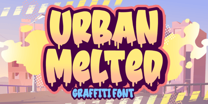 Hello, Are you looking for a Graffiti/Urban font? Do you want of creating Something that stand out and inspire creativity, imagination, and endless fun? Wait no more, we will give you the best choice. Urban Melted a Graffiti Font Urban Melted a Graffiti Font, Inspiring from playful graffiti style typography. This font is perfect for a design that makes it more attractive and playful. made with a very good level of aesthetics making this font suitable for book cover, children book, comic, poster, packging, merchandise, logotype and much more. Urban Melted font includes Multilingual Support, among others : Afrikaans, Albanian, Asu, Basque, Bemba, Bena, Breton, Catalan, Chiga, Cornish, Danish, Dutch, English, Estonian, Faroese, Filipino, Finnish, French, Friulian, Galician, German, Gusii, Indonesian, Irish, Italian, Kabuverdianu, Kalenjin, Kinyarwanda, Luo, Luxembourgish, Luyia, Machame, Makhuwa, Meetto, Makonde, Malagasy, Manx, Morisyen, North Ndebele, Norwegian Bokmål, Norwegian Nynorsk, Nyankole, Oromo, Portuguese, Quechua, Romansh, Rombo, Rundi, Rwa, Samburu, Sango, Sangu, Scottish Gaelic, Sena, Shambala, Shona, Soga, Somali, Spanish, Swahili, Swedish, Swiss German, Taita, Teso, Uzbek (Latin), Volapük, Vunjo, Zulu FEATURES : Uppercase Lowercase Number Punctuation Multilingual PUA Encode Opentype
 - Slatz by CozyFonts,
$20.00 The Slatz Font Family is Vertical. It has a slender, consistent weight that is best used in limited, left to Right, space limitations as to maximize font height. Slatz font variations all have extremely clean edges and even the serif versions are crisply defined with a flat-pointed serif for an added unique character. The designed intent was for a tight kern, however evenly letterspacing these family members give a distinct personality and continues to command the negative space just as in tight kerned examples. The compatible relationship of these font family members, serif to sans serif, and regular to italic is seamless and the overall design coloring of words as sentences is well balanced and extremely legible. The Slatz Family fonts are matching members glyph to glyph yet there is a noticeable difference between the serif and sans serif members. The sans serif works in contemporary and vintage settings. The serif members work particularly well in vintage, period applications. The Bold and Drop versions of Slatz also fit the above descriptions and also work on their own.
 - Kitchen Knife by Putracetol,
$22.00 Kitchen Knife - Display Font a bold, quirky display font with a fun, trendy street style vibe. From posters designs to t-shirts and packaging, Kitchen Knife will give your designs that alternative minimal look and make your creative work look supercharged. Kitchen Knife was hand-drawn, making its outlines somewhat irregular and quirky. It has an almost hand-lettered look; the characters jump around the baseline giving it a charming but urban look and feel. With a Kitchen Knife , it will be very suitable for your project, which is related to fun, trendy street style vibe. Such as story books, illustrations, comic books, t-shirts, posters, greeting cards, logos, branding, stickers, svg, crafting. The alternative characters were divided into several Open Type features such as Swash, Stylistic Sets, Stylistic Alternates, Contextual Alternates, and Ligature. The Open Type features can be accessed by using Open Type savvy programs such as Adobe Illustrator, Adobe InDesign, Adobe Photoshop Corel Draw X version, And Microsoft Word. This font is also support multi language.
 - Mr. Jenkins by Lindstrom Design,
$13.00 Mr. Jenkins is designed to fill the void between the crazy, wacky and reckless comic style fonts, and the standard boring but very readable sans-serif typefaces. It makes for a distinctive bold headline, but is also quite legible at small sizes. It’s just off kilter enough to not take itself too seriously. A deceptively care-free font, each character was carefully drawn. The spacing and kerning of each letter and letter combination were painstakingly considered. Particular attention was paid to maintaining consistent optical weights and a spontaneous appearance. Mr. Jenkins is inspired heavily by humanist sans-serif faces such as Myriad and Lucida Sans, with its open apertures, and low contrast but almost calligraphic line weights. The lowercase a is single story in the italic face, but two story in the regular face. It contains uncommon features amongst many “quirky” fonts, including a full set of latin accented characters, lining and proportional figures, math symbols, standard fractions, foreign currency marks, contextual alternates, and even a few ligatures.
 - Nuqat by Arabetics,
$39.00 An isolated letters typeface design with a comic feel. All letters start with a prominent circular dot. All final shape letters end with a smaller dot, in addition. The Nuqat (Arabic for dots) font family has four members which include two weights, normal and bold, and comes in regular and left-slanted italic styles. This font family design follows the guidelines of Mutamathil Taqlidi type style with one glyph for every basic Arabic Unicode character or letter, as defined in the latest Unicode Standards, and one additional final form glyph, for the freely-connecting letters in traditional Arabic cursive text. The Nuqat font family employs variable x-height values. Nuqat includes only Lam-Alif ligatures. Soft-vowel diacritic marks, harakat, are selectively positioned. Most of them appear by default on the same level, following a letter, to ensure that they would not interfere visually with letters. Tatweel is a zero-width glyph. Keying the tatweel key before Alif-Lam-Lam-Ha will display the Allah ligature. Nuqat includes both Arabic and Arabic-Indic numerals, in addition to standard punctuations.
 - Horror World by Blankids,
$25.00 Hello, Are you looking for a Horror and Halloween font? Do you want of creating Something that stand out and inspire creativity, imagination, and endless fun? Wait no more, we will give you the best choice. Horror World a Bouncy Horror Font, Inspiring from playful horror style typography. This font is perfect for a design that makes it more attractive and playful. made with a very good level of aesthetics making this font suitable for book cover, children book, comic, poster, packing, merchandise, logotype and much more. Horror World font includes Multilingual Support, among others : Afrikaans, Albanian, Asu, Basque, Bemba, Bena, Breton, Catalan, Chiga, Cornish, Danish, Dutch, English, Estonian, Faroese, Filipino, Finnish, French, Friulian, Galician, German, Gusii, Indonesian, Irish, Italian, Kabuverdianu, Kalenjin, Kinyarwanda, Luo, Luxembourgish, Luyia, Machame, Makhuwa, Meetto, Makonde, Malagasy, Manx, Morisyen, North Ndebele, Norwegian Bokmål, Norwegian Nynorsk, Nyankole, Oromo, Portuguese, Quechua, Romansh, Rombo, Rundi, Rwa, Samburu, Sango, Sangu, Scottish Gaelic, Sena, Shambala, Shona, Soga, Somali, Spanish, Swahili, Swedish, Swiss German, Taita, Teso, Uzbek (Latin), Volapük, Vunjo, Zulu FEATURES : Uppercase Lowercase Number Punctuation Multilingual PUA Encode Opentype
 - Slate by Monotype,
$34.99 A typeface of grace, power and exceptional versatility, the Slate collection is a truly beautiful design that achieves stellar levels of readability, both in print and on screen. Created by the award winning type designer Rod McDonald, this six-weight sans serif family is a rare example of sublime aesthetics meeting world-class functionality. The typeface’s legible letterforms embody an amalgam of the best traits of both humanistic and grotesque letterforms. “I didn’t want a face with an ‘engineered’ look, or with any noticeable design gimmicks or devices,” admits designer McDonald. “I wanted a pure design. I confess that I was ruthless with any character that wanted to stand out from the rest.” The Slate collection is available in six weights with complementary italics, with slight changes in structure from the light to the black weights. Its light weight is reminiscent of early American sans. Whether for use in display work or in longer-form settings, few typefaces possess the beauty and power of this design, leaving the Slate family an excellent addition to any designer’s typographic quiver.
 - Hatchet Job by Wing's Art Studio,
$10.00 Hatchet Job - A Halloween Brush Font Unleashed onto an unsuspecting public this Halloween, Hatchet Job is a brush font inspired by the slasher and cabin-in-the-woods horror movies and comics typical of the 1970s and 80s. This textured all-caps design takes its visual style from old cabins, ghost ships and axe-splintered wood that can only spell danger! With a bold brush strokes and frayed edges, it offers the tools to leave your readers nerves in tatters! The Hatchet Job font family includes all-caps uppercase and lowercase characters, along with numerals, punctuation, symbols and language support. Also included are a complete set of alternative characters and additional paint marks, drips and splashes. Wingsart Studio Design Tip! The uppercase and lowercase characters work great when mixed in an alternating fashion, with shapes that combine to create a dynamic, un-hinged look that's perfect for the Halloween season. Add the alternatives and paint marks into the mix and you'll have yourself a title or header design that looks truly custom-made.
 - Mairy by Typesketchbook,
$39.00 Mairy font family is a modern sans serif font family. Featuring 9 separate weights each followed by own true italics Mairy is positioned somewhere between rounded sans with humanist touch. In fact the humanist presence in Mairy is a little bit more than the usual doze adding more calligraphic elements mostly noticeable in italic weights but also very important in regulars. This symbiosis of Grotesk geometry with handwriting is well balanced regarding contrast and legibility so that at the end we have a highly usable font family. Light weights are very tender and elegant while the old and blacks are soft, friendly and full of vitality. The mid weights are just perfect with their medium contrast and excellent legibility. Mairy is very fresh font family and is surprisingly flexible when it comes to screen or print use – it is optimized for both even if the conditions are poor. Use it with OpenType compatible software and explore its true potential by accessing additional set of ligatures, alternates and multilingual support.
 - ZT Yaglo by Khaiuns,
$16.00 ZT Yaglo is a dynamic and expressive display font, from the first impression you may have noticed that this font is a fishing rod-like concept, with a consistent rhythmic curve that gets sharper at the ends. The ZT Yaglo typeface is framed in a sans theme and added a serif feel to produce a bold, geometric typeface in all thicknesses. ZT Yaglo mixes a simple sans style for extra bold serif energy with the feel of calligraphic shapes. The thicker your choice of style, the more striking the flow of changes in shape becomes spiky. ZT Yaglo is a cool alternative for you to create branding projects, Logo designs, Apparel Branding, product packaging, magazine headers or just as a stylish text overlay onto any background image. ZT Yaglo has 9 Styles, 1 Free for Commercial, and one Variable font. each face has 457 glyphs. Includes Standard Ligature, and the "&" character has an alternate letter in each Weight. I hope you have fun using ZT Yaglo. Thanks for using this font ~ Khaiuns X zelowtype
 - Stacked Letter by Putracetol,
$20.00 Stacked Letter – Display Font a bold, quirky display font with a fun, trendy street style vibe. Stacked Letter was hand-drawn, making its outlines somewhat irregular and quirky. It has an almost hand-lettered look; the characters jump around the baseline giving it a charming but urban look and feel. Stacked Letter suitables from posters designs to t-shirts and packaging, Stacked Letter will give your designs that alternative look and make your creative work look amazing. With a Stacked Letter , it will be very suitable for your project, which is related to fun, trendy street style vibe. Such as story books, illustrations, comic books, t-shirts, posters, greeting cards, logos, branding, stickers, svg, crafting. The alternative characters were divided into several Open Type features such as Swash, Stylistic Sets, Stylistic Alternates, Contextual Alternates, and Ligature. The Open Type features can be accessed by using Open Type savvy programs such as Adobe Illustrator, Adobe InDesign, Adobe Photoshop Corel Draw X version, And Microsoft Word. This font is also support multi language.
 - ITC Merss by ITC,
$29.99ITC Merss proves that sometimes accidents work out just fine. Late one evening Eduardo Manso, an Argentinean graphic and type designer, spilled coffee on his desk. When he began to wipe up the mess, he noticed that one of the splashes looked like a roman letter 'l' - complete with serifs. This triggered his imagination. “What if a complete alphabet was created with this same irregular flow to the character designs?” ITC Merss was the result of Manso's experiments with “fluid” letter shapes. The oddly handsome design looks aged and spontaneous at the same time. Its irregular texture is striking-the result of careful modeling of character shapes. While Manso wanted to maintain the free-form character of spilled liquid, he also knew the individual letters had to work together with an underlying harmony. When not experimenting with typefaces - or spilled coffee - Manso creates award-winning graphic and publication designs. A contributor to the design magazine el Huevo (the Egg), he also writes articles on type and typography and is part of the publication's design team. - Night Visions by Wing's Art Studio,
$14.00 Night Visions: An Unsettling Hand-Drawn Brush Script Font Night Visions is a hand-drawn script font with a loose style typical of late night horror and thriller movie posters. It’s designed to look as though ink has been laid with the nervous flick of the artists brush, giving a random, imperfect, but elegant result. This font comes with the flowing script of the regular version or a complete set of non-script alternatives. Added to which there are additional character alternatives and special ligatures to experiment with for a truly hand-made look. Each version comes with a full set of uppercase and lowercase characters along with numerals, punctuation and language support. I recommend this font for anyone about to design a header or title that needs an authentically hand-made look. It’s the perfect choice for movie titles or posters, album covers, comic books, t-shirts or editorials. It’s a font that rewards experimentation and offers many options for your designs. Check out the visuals for usage ideas.
 - TessieStandingBirds by Ingrimayne Type,
$13.95 A tessellation is a shape that can be used to completely fill the plane—simple examples are isosceles triangles, squares, and hexagons. Tessellation patterns are eye-catching and visually appealing, which is the reason that they have long been popular in a variety of decorative situations. These Tessie fonts have two family members, a solid style that must have different colors when used and an outline style. They can be used separately or they can be used in layers with the outline style on top of the solid style. For rows to align properly, leading must be the same as point size. Shapes that tessellate and also resemble real-world objects are often called Escher-like tessellations. This typeface contains Escher-like tessellations of birds. A number of years ago I decided to see how many of the 28 Heesch types of tessellations I could use to make birds standing on the backs of other birds. I found standing bird patterns for all 17 of the types that had either translated or glided edges. The TessieStandingBirds typefaces contain the standing-bird shapes that I discovered. At first glance they seem to be quite similar, but small differences matter in how they fit together. Most of the patterns require more than one character. The sample file here shows how pieces fit together to give tessellating patterns. (Earlier tessellation fonts from IngrimayneType, the TessieDingies fonts, lack a black or filled version so cannot do colored patterns.)
 - Gearing by Heyfonts,
$15.00 Gearing is a typeface that is widely associated with the extreme music genre of death metal. It is characterized by its dark and aggressive appearance, evoking a sense of brutality and chaos. The font is typically designed with sharp edges, bold and angular letterforms, and intricate or distorted shapes. The death metal font typically features strong upper and lowercase letter variations, often with sharp, exaggerated serifs or thorn-like spikes. These embellishments contribute to its menacing and threatening aesthetic. The letters may also have broken or damaged elements, giving them a weathered or decayed look. Though death metal fonts come in various styles and variations, they often prioritize legibility and impact over ease of reading. This means that certain parts of the letters may be missing or disconnected, making them appear jagged or incomplete. Ligatures, which are unique letter combinations, are sometimes included in the font to add a sense of continuity or artwork to the overall design. In terms of color, death metal fonts are commonly depicted in monochromatic shades such as black, grey, or dark red to maintain their sinister appearance. The color contrast often enhances the sharpness and intensity of the font, making it more visually striking. Due to its association with the underground music scene, the death metal font has become an essential element in album covers, band logos, posters, and merchandise. It effectively conveys the aggressive and rebellious spirit of the genre, becoming instantly recognizable to fans and enthusiasts.
 - Plathorn by insigne,
$24.00 Vast and untamed, the American West once stretched as free and wild as imagination itself. Still beautiful, the Wild West of long ago and the new West of today is now to be found in insigne’s new face, Plathorn. That’s right, folks. When the West called, Jeremy Dooley reached up like Pecos Bill, grabbed it by the reins and pulled it in, then using its wide, roaming elements to design this functional font that still has an unbroken spirit burning deep inside. This down right, no-nonsense, orthodox face leaves off any of that extra fancy stuff that doesn't belong on a ride. Plathorn comes with a family of cowhands as wide as the Rockies, bringing specifically tailored condensed and extended sub-families along with it too. By design, it’s not very obtrusive like its unorthodox reversed tension brethren. Leave those for the next font rodeo. This mount features barely a hint of a serif that hearkens back a hundred years or so to sign painters and package lettering artists of early twentieth century. They're sure to put the sharpness, gumption and grit you need into your copy. So grab a tall glass of Plathorn and drink in the deep taste of America’s big country. Put it in your next magazine. Put it in your brand. This typeface’s offbeat appeal is bound to bring a bit of wild U.S. to your free-spirited work.
 - Tequendama by JVB Fonts,
$30.00 A display fontface for titles inspired on Latin America, Ethnic, Native, Tribal, Mysthical, Handmade, Aboriginal, Pre-Hispanic, Pre-Columbian, Textured. By mid-1997 I was developed the early type edition was called «Muisca Sans» as my work for the degree in Graphic Design (Universidad Nacional de Colombia), based on the concept of pre-Columbian figures characteristics within some of the very few visual elements recovered from the Muisca culture, ancient pre-Columbian tribe disappeared before the arrival of the Spaniards in what is now central Colombia. In fact, the name of the capital Bogotá (the capital of Colombia) goes back to Bacatá as primary or village downtown of what was once the imperial capital of tribe Muisca. Although this unfinished early typographic project has not yet been published, Tequendama is the evolution of the first one. Tequendama reminds the myth of Muisca culture and religion of this tribe. The god Bochica, a wise old man with a white beard heard the cries of his tribe suffered against flooding of their land losing harvests before the divine punishment resulted by the offended god Chibchacun. However Bochica appeared wearing a white robe sitting on a huge rainbow and he broken the mountain towards the southwest wise old man with a golden staff broke the mountain to drain the flooded savanna. This emblematic and iconic place would later be called as «Salto de Tequendama». Tequendama name also been adopted to a nearby province to Bogotá.
 - Allerlei Zierat by Intellecta Design,
$14.90 Ornaments family with four different sets plus a decorative capitals font from the rare, valuable and amazing Allerlei Zierat book from Schelter & Gieseck (1902). A research and free interpretation by Intellecta Design. This encyclopedic specimen book of the Leipzig, Germany type foundry and printing supply house J.G. Schelter & Giesecke features, as the title indicates, all kinds of decoration for supplying printing of every type. On the title page, the firm boasts winning grand prize in 1900 in Paris (presumably at the Exposition Universelle). It is hard to do justice in a short description to the variety of styles (traditional, Jugenstil, etc.) and categories (certificates, letterheads, borders, ornaments, exotic motifs, flowers, animals, silhouettes, menus, greeting cards, vignettes humorous and otherwise, images of bicyclists, occupational symbols, portraits, Classical figures, religious art, heraldry, ships, trains, athletes, etc., etc.) offered in this volume. Some of the examples are printed in color, most are in black-and-white. The Jugenstil cover of this copy shows minor wear and soiling. The plate of “Gust. Carlsson & Co., Stockholm” is attached to the front pastedown. A small fraction of pages show minor soiling, a pencil notation or a short closed tear. Two of the fold-outs at the back have a little more damage-one is missing a 1x2 inch piece along the margin, the other has a 3-inch closed tear and an edge which is crumpled. A rare specimen from the Intellecta rare books library.
 - Boldiva by Graphicfresh,
$9.00 Looking for a way to add a touch of bold, retro charm to your designs that evoke the fun and creativity of the 70s, 80s, and 90s? Look no further than our collection of classic and modern fonts that are perfect for logos, posters, and all kinds of design projects, whether you're going for an old-school vibe or a fresh new twist on retro design. With our carefully curated selection of fonts, you'll have everything you need to create eye-catching and memorable designs that capture the essence of classic design from the past. Whether you're looking to add some vintage flair to a modern design, or you want to create a throwback look that's right at home in the 90s, our fonts are the perfect tool for the job. From bold, geometric designs that harken back to the 80s, to playful, colorful fonts that embody the fun-loving spirit of the 70s, our collection has something for everyone. And with our easy-to-use design tools and resources, you'll have everything you need to bring your creative vision to life in no time. So why wait? Start exploring our collection of classic and modern fonts today, and discover how easy it can be to create stunning logos, posters, and designs that are truly one-of-a-kind. Whether you're a seasoned designer or just starting out, our fonts are the perfect way to add a touch of old-school charm to any project.
 - ITC Don't Panic by ITC,
$29.99ITC Don't Panic's distressed shapes and craggy outlines evoke the feeling you get when you're just barely in control of a situation. This is type design on the edge. ITC Panic is further down the emotional track, when you've actually lost control and there is no hope in sight. Thompson says the inspiration for these faces arrived one day in the mail. I received an envelope that looked like it had a rough trip; the type that was stamped on it had a tired, ragged appearance. Ironically, the haggard envelope woke me up. I got excited and wanted to replicate the look as a font of type." Thompson designed ITC Don't Panic, then stood back and looked at it and decided it cried out for a more agitated companion. ITC Don't Panic gave birth to the positively psychotic offspring, ITC Panic. Both are all-cap designs with alternate characters in the unshift position. Creating an authentically disturbed appearance proved to be a challenge for Thompson. "I tried to design agitated characters, but they looked staged. So I tried multiple photocopies, but that didn't work. Eventually, I laser-printed the basic characters, wadded up the lasers, then flattened them out and stomped on them with heavy boots. The end result was scanned and used as the basis for the rest of the design." Thompson's work on web sites and multimedia has influenced his interest in type and typography that transcends the cool, unemotional nature of the computer." - Radona by insigne,
$29.00 Radona is a blast from the 80’s that's rader than rad. Radona is the typeface version of Synthwave, an electronic music subgenre that takes influence from the 1980s but builds on it, resulting in a construct that lives in the minds of both those who have experienced it and those who haven't. Radona expresses a nostalgia for 1980s culture, attempting to replicate and appreciate the era's vibe, but extends it further with something new. This sans family has plenty of 80's flavor, but with some fresh twists to push it to the limit. Radona is a geometric sans-serif typeface. Radona has a few quirky characteristics, but it has a generally neutral tone and structure that makes it ideal for usage in print, especially when a contemporary look is desired. It looks amazing in both body text and headlines. The geometric grotesques that were popular in the 1980s served as inspiration. It's a typeface that's been crafted for usage in a range of design fields, from branding to packaging, and it can be used in anything from interfaces to apps. Radona is an excellent typeface for use on websites and other digital applications. Radona comes with a wide variety of styles and a large selection of stylistic alternatives, ligatures, small caps and other special features. Along with parachute pants, synthesized guitar riffs, and VHS scanlines, Radona brings back the 1980’s.
 - Nimbus Sans by URW Type Foundry,
$35.00 The first versions of Nimbus Sans have been designed and digitized in the 1980s for the URW SIGNUS sign-making system. Highest precision of all characters (1/100 mm accuracy) as well as spacing and kerning were required because the fonts should be cut in any size in vinyl or other material used for sign-making. During this period three size ranges were created for text (T), the display (D) and poster (P) for small, medium and very large font sizes. In addition, we produced a so-called L-version that was compatible to Adobe’s PostScript version of Helvetica. Nimbus was also the product name of a URW-proprietary renderer for high quality and fast rasterization of outline fonts, a software provided to the developers of PostScript clone RIPs (Hyphen, Harlequin, etc.) back then. Also in the 80s, a new, improved version of the Nimbus Sans, namely Nimbus Sans Novus was designed. Nimbus Sans Novus was conceptually developed entirely with URW’s IKARUS system, i.e. all styles harmonize perfectly with each other in terms of line width, weight, proportions, etc. On top of that, Nimbus Sans Novus contains more styles than Nimbus Sans. Now, Nimbus Sans is also available as Round (like the popular URW fonts Futura Round and Eurostile Round). The Round versions are intended to facilitate the work of designers and typographers. The fonts can be used directly, without further preparatory work in graphic programs as finished, high-quality Rounds.
 - Chiq by Ingo,
$36.00 The name suggests it: the Chiq is based on a well-known system font from Apple's classic Mac OS operating system. By revamping and expanding good old “Chicago“, I want to make that 90s tech charm available for the future. The model consisted of just a single style and inspired me to create “Chiq Bold,” which later became the starting point for the entire font family. The shapes of the Chiq are constructed according to a very simple principle. The contrast of stems and hairlines becomes more pronounced towards the bolder cuts. A few basic shapes form the framework for all characters. The shapes are very regular and sometimes form somewhat unusual figures, which has a negative effect on readability and makes the font rather unsuitable for long passages of text, but results in a very even typeface. This is particularly true for the extra-wide “UltraExpanded,” which is so wide that you can no longer recognize word images but literally have to spell them out. In this way, words are turned into letter bands with a great decorative effect. With variants from “Light” to “Black”, from “Normal” to “Ultra Expanded” and the italics, Chiq reaches beyond its archetype. This opens up a wide range of uses. It is even clearer, even more sober, and to a certain extent speaks an even more modern formal language. Chiq is also a variable font!
 - Magent by Craft Supply Co,
$20.00 Introducing Magent – Display Typeface A Fusion of Style Magent sets itself apart as a striking Display Typeface that seamlessly merges the timeless elegance of serifs with the contemporary allure of sans serifs. This extraordinary fusion not only shatters monotony but also injects a vibrant energy into your designs. Fun and Playful Typography Magent exudes an unmistakable aura of fun and playfulness. It’s the font to choose when you want to infuse your projects with a touch of whimsy and character. The result is content that not only stands out but also leaves a lasting and memorable impression. Endless Creative Versatility An outstanding attribute of Magent is its sheer versatility. This font effortlessly adapts to a multitude of design contexts, spanning from posters to branding and beyond. Its adaptability makes it a true chameleon in the world of creativity. Memorable and Engaging Magent’s dynamic blend of serif and sans serif elements guarantees that your content remains not only memorable but also engaging. It captivates your audience and leaves them with a vivid and enduring impression, ensuring they keep coming back for more. In Conclusion In summary, Magent – Display Typeface is a font that defies conventions. It’s a design masterpiece that harmoniously combines aesthetics with a playful spirit. Whether it’s branding, posters, or an array of creative projects, Magent is a one-of-a-kind font that captivates your audience and infuses your content with vibrancy and charm.
 - Ambroise Std by Typofonderie,
$59.00 An exquisite Didot font in 18 series Ambroise is a contemporary interpretation of various typefaces belonging to Didot’s late style, conceived circa 1830, including the original forms of g, y, &; and to a lesser extent, k. These unique glyphs are found in Gras Vibert, cut by Michel Vibert. Vibert was the appointed punchcutter of the Didot family during this period. It is the Heavy, whom sources were surest that Jean François Porchez has been used as the basis for the design of the typeface family. In the second half of the 19th century, it was usual to find fat Didots in several widths in the catalogs of French type foundries. These same typefaces continued to be offered until the demise of the big French foundries in the 1960s. Ambroise attempts to reproduce more of what we see printed on paper in the 19th century; a more accurate representation of Didot punches. So, the unbracketed serifs are not truly square straight-line forms but use tiny transitional curves instead. The result on the page appears softer and less straight, particularly in larger sizes. The illustrious Didot family of type founders and printers Every variation of the typeface carries a name in homage to a member of the illustrious Didot family of type founders and printers. The condensed variant is called Ambroise Firmin. The extra-condensed is called Ambroise François. Ambroise Pro brought back to life: fifteen years in the making! Club des directeurs artistiques, 48e palmarès Bukva:raz 2001
 - Ongunkan South Picene by Runic World Tamgacı,
$50.00 South Picene (also known as Paleo-Sabellic, Mid-Adriatic or Eastern Italic) is an extinct Italic language belonging to the Sabellic subfamily. It is apparently unrelated to the North Picene language, which is not understood and therefore unclassified. South Picene texts were at first relatively inscrutable even though some words were clearly Indo-European. The discovery in 1983 that two of the apparently redundant punctuation marks were in reality simplified letters led to an incremental improvement in their understanding and a first translation in 1985. Difficulties remain. It may represent a third branch of Sabellic, along with Oscan and Umbrian (and their dialects), or the whole Sabellic linguistic area may be best regarded as a linguistic continuum. The paucity of evidence from most of the 'minor dialects' contributes to these difficulties. The corpus of South Picene inscriptions consists of 23 inscriptions on stone or bronze dating from as early as the 6th century BC to as late as the 4th century BC. The dating is estimated according to the features of the letters and in some cases the archaeological context. As the known history of the Picentes does not begin until their subjugation by Rome in the 3rd century, the inscriptions open an earlier window onto their culture as far back as the late Roman Kingdom. Most are stelai or cippi of sandstone or limestone in whole or fragmentary condition sculpted for funerary contexts, but some are monumental statues.
 - ITC Panic by ITC,
$29.99ITC Don't Panic 's distressed shapes and craggy outlines evoke the feeling you get when you're just barely in control of a situation. This is type design on the edge. ITC Panic is further down the emotional track, when you've actually lost control and there is no hope in sight. Thompson says the inspiration for these faces arrived one day in the mail. I received an envelope that looked like it had a rough trip; the type that was stamped on it had a tired, ragged appearance. Ironically, the haggard envelope woke me up. I got excited and wanted to replicate the look as a font of type." Thompson designed ITC Don't Panic, then stood back and looked at it and decided it cried out for a more agitated companion. ITC Don't Panic gave birth to the positively psychotic offspring, ITC Panic. Both are all-cap designs with alternate characters in the unshift position. Creating an authentically disturbed appearance proved to be a challenge for Thompson. "I tried to design agitated characters, but they looked staged. So I tried multiple photocopies, but that didn't work. Eventually, I laser-printed the basic characters, wadded up the lasers, then flattened them out and stomped on them with heavy boots. The end result was scanned and used as the basis for the rest of the design." Thompson's work on web sites and multimedia has influenced his interest in type and typography that transcends the cool, unemotional nature of the computer." - Celari Titling by insigne,
$- Need for speed? Satisfy it with insigne’s Celari. Take it for a drive and watch how its simple curves, easy lines, and sturdy shapes handle the edges and corners of your projects with smooth and rapid execution. The negative space cuts through the rounded sans serif letterforms of Celari, giving this all-caps typeface a strong impression of dimension and speed. Celari’s organic stroke direction allows you to ease through its gentle turns, too, causing the font to hum around the lines of your project like a V8 engine on an open Nevada highway. The speed and agility of Celari is built for nothing less than a headline. Use the larger-than-life power of this face for any number of oversized applications--mastheads, posters, web headlines, flyers. It provides excellent performance for service-oriented ads where efficiency and quick buyer service are priorities. Customize your ride, too. The OpenType version of Celari includes some serious add-ons to make it your design. The font incorporates discretionary ligatures for some funky combinations and adds in stylistic and contextual alternates for virtually endless possibilities with the characters, ligatures, and composites. Make sure your setup allows for OpenType fonts (Adobe CS suite or Quark) before unleashing the fun of Celari, though. Be confident with your design. Be quick with your message. Again, take Celari for a drive and unleash the strength and velocity of its character in your design. You've been holding back long enough.
 - DynaGrotesk by Storm Type Foundry,
$55.00 The most exciting new feature of DynaGotesk is the Vintage Italics stylistic set, which activates the decorative forms. It includes the looped "w", curved ascenders and descenders of many lowercase letters. These can significantly change the feel of a poster or invitation. DynaGrotesk may look like a revival of an old typeface, but it is not. It uses only some historical reminiscences, sharp edges and curved shapes, but it’s completely original design aimed at ease of use. The bigger the size, the more evident and pronounced are the spicy details. In smaller and even smallest sizes it’s appearance is qieter, very well suited even for long portions of text. DynaGrotesk was created in 1995 with the use of Multiple Master interpolation. But the MM fonts never achieved the desired application in industry, so designers returned back to single fonts. Over the following decades, the font was modified several times as an old house, and the present re-animation includes the Variable font format. Since its first release in the mid-nineties, it is widely used in all areas of graphic industry from small publishing to international corporate identity. The warm character of DynaGrotesk derives from early sans-serif typefaces, those which appeared before Helvetica. All 60 styles contain common OTF features like Small Caps, various sorts of figures, ligatures, Cyrillics, Greek, and full Latin diacritics. Perfect for branding systems and corporate identities, lettering, as well as cultural posters and catalogs.
 - Hassan by Linotype,
$187.99Hassan is a traditional-style Arabic text face designed by Hassan Sobhi Mourad, an experienced calligrapher and teacher of the art and first produced by the Linotype Design Studio (U.K.) as a PostScript font in 1993. An individual Naskh style, Hassan cleverly combines elegant proportions, echoing an inscriptional Thuluth in its tall vertical stems and deeply rounded final jim and ain. The effect of verticality is enhanced by the tense, reined-in kerning strokes of ra and waw, the well-poised lam-alif, and the compactly drawn ligatures. The broad-band strokes of Hassan Bold smooth some of the angularity and relax the tension apparent in the Light. The traditional-style ligatures are rendered with an easy flow. Because of the economical character count, Hassan Light and Bold text may be headed by the compact titling styles (Hisham, Mariam) as well as designs like Ahmed or Kufi which answer to the inscriptional qualities of Hassan. In addition to other uses, Hassan would be particularly suited to document text-setting. Hassan’s two OpenType weights include Latin glyphs from Janson Text Roman, and Janson Text Bold, respectively, inside the font files, allowing a single font to set text in both most Western European and Arabic languages. The OpenType glyph ranges incorporate Basic Latin and the Arabic character set, which supports Arabic, Persian, and Urdu. The fonts include tabular and proportional Arabic, Persian, and Urdu numerals, as well as a set of tabular European (Latin) numerals. - Nimbus Sans Round by URW Type Foundry,
$35.99 The first versions of Nimbus Sans have been designed and digitized in the 1980s for the URW SIGNUS sign-making system. Highest precision of all characters (1/100 mm accuracy) as well as spacing and kerning were required because the fonts should be cut in any size in vinyl or other material used for sign-making. During this period three size ranges were created for text (T), the display (D) and poster (P) for small, medium and very large font sizes. In addition, we produced a so-called L-version that was compatible to Adobe’s PostScript version of Helvetica. Nimbus was also the product name of a URW-proprietary renderer for high quality and fast rasterization of outline fonts, a software provided to the developers of PostScript clone RIPs (Hyphen, Harlequin, etc.) back then. Also in the 80s, a new, improved version of the Nimbus Sans, namely Nimbus Sans Novus was designed. Nimbus Sans Novus was conceptually developed entirely with URW’s IKARUS system, i.e. all styles harmonize perfectly with each other in terms of line width, weight, proportions, etc. On top of that, Nimbus Sans Novus contains more styles than Nimbus Sans. Now, Nimbus Sans is also available as Round (like the popular URW fonts Futura Round and Eurostile Round). The Round versions are intended to facilitate the work of designers and typographers. The fonts can be used directly, without further preparatory work in graphic programs as finished, high-quality Rounds.
 - Bellissima Script Pro by Sudtipos,
$79.00 While in the same vein and spirit as Burgues and Compendium, Bellissima began from an entirely different thread from those fonts. It started with Alex Trochut generously showing me a gorgeous lettering book from his grandfather’s library: Bellezas de la Caligrafía, by Ramón Stirling, 1844. Stirling was one of the Latin calligraphy pioneers who introduced a refined version of English calligraphy in Spain and made it popular in the nineteenth century. Some scans from that book served as initial basis for the caps in my Poem Script. But it was always in the back of my mind that I should do a copperplate, and the Stirling model was the perfect source. My intention was to veer away from Stirling’s exuberant ornamentation, and work within simplified forms of his ideas. As it usually is with most of my projects, Bellissima became its own bird and shaped its own flying patterns. Suddenly there were many ligatures, multiple endings and swashed connections, hundreds of alternates for both uppercase and lowercase. Bellissima has an effusive energy that appeals much beyond its sourcing. It’s intended for these modern times of appreciation for old crafty things like stationery and letterpress, where its origins help it shine brightly. Bellissima Script Pro is a complete font with almost 2000 characters full of alternates, swashes, ligatures & ornaments covering a wide palette of latin languages and Bellissima Script Redux is a random sample of glyphs totally usable with a reduced price.