10,000 search results
(0.068 seconds)
- Besley Clarendon by HiH,
$12.00 Besley Clarendon ML is our version of the Clarendon registered by Robert Besley and the Fann Street Foundry in 1845. Besley Clarendon ML represents a significant change from the slab-serif Antiques & Egyptians that had become so popular in the prior three decades. Like Caslon’s Ionic of 1844, it brackets the serifs and strongly differentiates between the thick and thin strokes. Besley Clarendon is also what today is considered a condensed face, as a comparison to the various contemporary Clarendons will show. Robert Besley’s Clarendon was so popular that many foundries quickly copied it, a fact that caused him to complain vigorously. The reason it was so widely copied is simple ó it was extremely useful. It provided the attention-getting boldness to highlight a word or phrase, yet at the same time was compact and easier to read than the fat faces and antiques of the period. It wasn't until sixty years later that the concept of a typeface family of different weights was developed with DeVinne and Cheltenham. Until then, Clarendon served as everyone’s all-purpose bold face. It can be used for ads, flyers, headers or even short text. Don't leave home without it. Besley Clarendon ML includes the following features: 1. Glyphs for the 1250 Central Europe, the 1252 Turkish and the 1257 Baltic Code Pages. Added glyphs to complete standard 1252 Western Europe Code Page. Special glyphs relocated and assigned Unicode codepoints, some in Private Use area. Total of 353 glyphs. 158 kerning pairs. 2. OpenType GSUB layout features: pnum, salt, liga, dlig, hist and ornm. 3. Inclusion of tabular (std) and proportional (opt) numbers. 4. Kreska-accented letters.
 - Atjeh Night by BlackLotus,
$12.00 Atjeh Night is a twisted and extravagant display font that will add an extraordinary feel to any design project! What's included in this font pack : -- LARGE GLYPH SETS : There are 435 total glyphs in this font pack. Atjeh Night comes with a large range of glyphs including punctuation, numerals, international language support, ligatures & additional extra glyphs for stylistic sets. It includes 209 Glyphs of Stylistic Sets to make your text looks natural and beautiful. -- INTERNATIONAL LANGUAGE SUPPORT : This font supports English, French, Italian, Spanish, Portuguese, German, Swedish, Norweigen, Danish, Dutch, Finnish, Indonesian, Malay.
 - Braga by DSType,
$40.00 DSType proudly introduces BRAGA, an exuberant baroque typeface, named after a portuguese city, also known as the baroque capital of Portugal. Our latest typographic extravaganza comes with a multitude of fonts designed to work like layers, allowing to insert color, lines, gradients, patterns, baroque, floral swashes, and many other graphic elements. Starting with Braga Base, you can add any of the twenty-three available styles, to create colorful typographic designs. Be sure you check our detailed specimen, showing all the features and how to use this type system.
 - Cristopher Shake by Violatype,
$14.00 Introducing “Cristopher Shake” Font, a unique creation born from the elegance of handcrafted strokes. With an artful touch, each character exhibits a natural and distinctive quality that adds a truly authentic charm to your design projects. “Cristopher Shake” Font is the perfect choice for those who seek a blend of individuality and style. Whether it’s for branding, logo design, magazine layouts, quotes, or any other creative endeavor, this font brings a touch of genuine craftsmanship to your work, Christopher Shake Supports more than 90 languages If you have any questions, don’t hesitate to contact us
 - ITC Musclehead by ITC,
$29.99ITC Musclehead is the work of type designer Timothy Donaldson, a robust, densely packed handwriting typeface. It almost looks like brushwork but was in fact made with a ruling pen which Donaldson had bought from a company in Salem, Massachusetts. He says, The world's gone ruling-pen mad at the moment [late 1990s] and I was beginning to tire of all the skinny splashiness of the letters that most people were making with them. I wanted to do something heavy and robust with the tool, so that's what I did."" - Pain de Mie by PintassilgoPrints,
$24.00 Pain de Mie is a soft font, friendly and sweet, kinda creamy, kinda bubbly. It's an all caps font with 2 different glyphs for each letter: easily access these through the keyboard upper or lower cases keys. Make them cycle with OpenType Contextual Alternates. There's also a handful of drawings to add an extra charm here and there. Reach these via OpenType Ornaments or pick your choices through a glyphs palette. Like a fresh loaf of bread, Pain de Mie goes well in so many ways. Give it a try!
 - WL Rasteroids by Writ Large,
$5.00 Rasteroids is a typographic flashback to computing of the mid 1980s, when 9-pin dot-matrix printers were the state of the art, and most home computer displays were TVs hooked up to RF modulators. Rasteroids not only captures the dot-matrix printer look, but recreates the rasterized appearance of text on those lower-resolution monitors. Unlike that dot matrix type of yore, Rasteroids does have some variation in character width, and is legible in small blocks of copy. Still, it is best used sparingly, or as a special effect.
 - Yngreena by Ingrimayne Type,
$12.95 Yngreena is a serifed typeface with calligraphic origins. In updating it in 2011, I began to add alternative letters and reached the point where it made sense to create an alternative family of faces rather than include all the alternatives as part of an OpenType font. The letters K, R, V, W, Y, f, g, k, t, v, and w are tamer in Yngreena Alt. As a result, though it is still a decorative text face, Yngreena Alt is better suited for lengthier blocks of text than is the original Yngreena face.
 - Squoosh Gothic by Thinkdust,
$10.00 Squoosh Gothic is a serious new contender in the arena of headline fonts. Upright and condensed, Squoosh’s whimsical name belies its true nature. Though, that’s not to say it’s totally devoid of a sense of merriment – it just values a more orderly, regulated kind of tomfoolery. Mad-libs for instance, or The Times cryptic crossword. Its mature but unmistakably witty attitude can go a great distance to lending a sense of culture and an air of scintillation to your designs. Don’t miss out on this sanguine new font, Squoosh Gothic from Thinkdust, available now.
 - Geroska by Keristyper Studio,
$14.00 Geroska Is a serif contemporary inspired by combining Mid-Century, Modern & Aesthetics styles. This font is good for logo design, Social media, Movie Titles, Books Titles, short text even long text letters, and good for your secondary text font with sans or serif. **Featured:** * Standard Uppercase & Lowercase * Numeral & Punctuation * Multilingual : ä ö ü Ä Ö Ü ß ¿ ¡ * Alternate & Ligature * PUA encoded We recommend programs that support the OpenType feature and the Glyphs panel such as Adobe applications or Corel Draw. so you can use all the variations of the glyphs. Hope you enjoy our fonts!
 - Devil Scream by Yoga Letter,
$15.00 "Devil Scream" is a very unique horror font, as it is equipped with ghost decorations and a witch's hat on each letter. This font is very easy to use because the letters and decorations will automatically appear when typing letters. "Devil Scream" is a display font with a horror theme that will add a horror atmosphere to your Halloween party celebration. In addition, this font can also help your work. This font can be used as logos, branding, banners, posters, prints, stickers, horror movie titles, book titles, comics, or others.
 - Astogria Bejha by Figuree Studio,
$18.00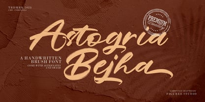 Introducing Astogria Bejha! Astogria Bejha is modern hand-drawn brush font that combines attractive curves with a fresh urban edge; delivering a stylish brush font that is guaranteed to add an eye-catching appeal to your logo designs, brand imagery, handwritten quotes, product packaging, merchandise, social media post, or website font. Features: Uppercase and Lowercase Number and Punctuation Ligature Stylistic Alternate Swash Versatile for branding, headline, or printing product Detailed dry brush markers I hope you enjoy this font. If you have questions, don't hesitate to give me a message Thank You!
 - Birthday Wish PB by Pink Broccoli,
$16.00 Birthday Wish is a totally off-kilter sans-serif font inspired by a late 70's birthday greeting card. Much like a typographic drunken stumble, this font wonderfully and awkwardly fumbles across designs, surprising with each letter typed. With a pseudo unicase character set, and offbeat letter weighting, Birthday Wish is fun to typeset with, with a cluster of ligature combinations that add to the quirky playfulness. You’ll find this Birthday Wish is a typesetting ride of a font. Try typing standard, all caps, or all lowercase for even more visual variety.
 - Gedhibold by Sesa Grafika,
$15.00 Gedhibold font is a retro groovy display font. Use this display font to add that special retro touch to any design idea you can think of! Masterfully designed to become a true favorite, this font has the potential to bring each of your creative ideas to the highest level! It will look great on headlines, magazines, logos, branding and so much more! Gedhibold latest style letters are perfect for wall displays, wedding invitations, social media post logos, advertisements, product packaging, product designs, labels, photography, watermarks, invitations, stationery, and any project that requires handwritten taste.
 - Foundry Old Style by The Foundry,
$90.00 Foundry Old Style was the first typeface to be released by The Foundry. Inspired by the incunabula typefaces of Nicolas Jensen, the letterforms were first created as calligraphy, with the aim of retaining the structure and free form of the pen stroke in the final drawing development. The resulting face is a contemporary translation that retains the classical tradition of the transitional roman style. Originally conceived as a text face, with a small weight range for good book work, Foundry Old Style is a versatile design that contrasts and compliments Foundry Sans.
 - Deco Eccentrique JNL by Jeff Levine,
$29.00 The inspiration for Deco Eccentrique JNL was initially hand drawn contoured lettering from a mid-1920s piece of sheet music; the style of the letters showing influences of the upcoming Art Deco movement. This was made into a digital font entitled Poster Contoured JNL. Once all of the excess parts of the previous design were stripped away to only the inner letters, the pre-Art Deco influences remained along with characters of varying stroke widths and shapes. This non-conformist type face is available in both regular and oblique versions.
 - Bodoni Classic Stencil by Wiescher Design,
$39.50 Bodoni Classic Stencil is another of my personal additions to the Bodoni Classic Family that Giambattista would have never made. In his days people had enough skill and the neccessary time to put beautiful handlettering on parcels and cases. No need for stencils! Today we do not need them either since shipping has gone barcode crazy, but for some reason stencil-letters are very much in fashion. Bodoni letters lend themselves perfectly to be stenciled so I just did the whole alphabet; not just the capitals. Yours, Gert Wiescher
 - Childfolk by Good Java Studio,
$23.00 Childfolk is the perfect font for all your fun designs. The main font file is equipped with ordinary characters, as well as more than 350 glyphs to support most Latin-based languages. Everything is made with the same brush, and everything is the same size as Letter Kids, so you can be sure they will work well together! It is suitable for you to use in making t-shirt design, quote, label, packaging, logo type, or long writing. Because we have compiled kerning and matrices that are tailored to your needs.
 - Hysterian by Gassstype,
$23.00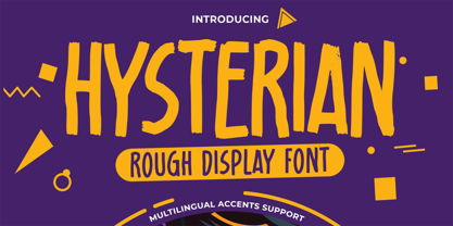 Hello Everyone, introduce our new product Hysterian is a Rough Display Font.This Playful Kids with a natural feel. This handmade font will make your design has a beautiful natural touch for each details. It is perfect for any design project as Invitation,logo, Kids,book cover, craft or any design purposes. This font is PUA encoded which means you can access all of the magical glyphs. That is Hysterian has charming unique,authentic and relaxed characteristic more natural look to your text. It also features a wealth of special features including Alternates glyphs.
 - Rise by Greentrik6789,
$14.00 Are you looking for an eye-catching display font? This fonts will do it for you! Rise is a strong display font with reverse contrast so it grabs a lot of attention in the crowd. Rise will be very suitable for marketing design needs such as posters, flyers, advertisements, labels, book covers, film titles and various design needs with retro vintage style. Comes in Regular, hollow, shadow, extruded, and bold styles. Also come with several alternatives for lowercase characters that you can use to add aesthetics to your designs.
 - Bastro by HansCo,
$15.00 Bastro is a bold retro serif fonts that feels casual and clean an incredible modern retro aesthetic. Use this Bastro serif font to add that special modern retro touch to any design idea you can think of! Masterfully designed to become a true favorite, this font has the potential to bring each of your creative ideas to the highest level! This font is PUA encoded which means you can access all of the glyphs and swashes with ease! Tutorial how to Install & use Alternate / Special Character : https://hanscostudio.com/tutorial/ Enjoy!
 - Guilty Pleasure by Hanoded,
$15.00 Some time ago, my kids asked me what kind of sweets I really liked. To be honest, I don’t actually like sweets at all - never have, never will. BUT… you can wake me up for chocolate and ice cream! Those are my guilty pleasures! Guilty Pleasure is a handmade font. I used China Ink and a brush to create all the glyphs. Guilty Pleasure is a very distinct display font. I recommend you use it for your ice cream or chocolate packaging… but that, of course, is entirely up to you!
 - Academy by ParaType,
$30.00 Academy was designed circa 1910 at the Berthold type foundry (St.-Petersburg). It was based on Sorbonne (H. Berthold, Berlin, 1905), which represented the American Type Founders rework Cheltenham of 1896 (designers Bertram G. Goodhue, Morris F. Benton) and Russian typefaces of the mid-18th century. A low-contrast text typeface with historical flavor. The modern digital version was designed at Poligrafmash type design bureau in 1989 by Lyubov Kuznetsova. Corrections and additions were done later in ParaType in early 2000th. Reworked version with Bold Italic style was released in 2009.
 - Magnify PRO by XdCreative,
$32.00 About Magnify Pro Magnify Pro Geometric sans 2 Style in 1. Magnify PRO Geometric sans is the latest version of "Magnify" by. Faldykudo. Comes up with more complete language support and features, including ink-trap and reverse contrast will add more different taste & style to the art of modern typography. Magnify PRO has two style in one font, normal & inverse contrast. If you are like normal: just type with regular letters, if you are like reverse contrast: just access your opentype features to find the alternate letters. Thank You.
 - Trained Monkey by Hanoded,
$15.00 Trained Monkey is a happy serif cartoon font. Use it for your book cover designs, posters, product packaging (may I suggest peanut butter?) and whatever else you may fancy. This monkey was made by hand, so the glyph edges are a bit rough and uneven - giving it ‘ye olde handmade look’. The name? Well, I was watching a movie (can’t remember which one) in which two guys were having a discussion. One of them said to the other: ‘a trained monkey could have done this job!’ That’s all folks.
 - Twinkle Magic by Balpirick,
$15.00 Twinkle Magic is a Lovely Modern Script Font. Twinkle Magic is an enchanting handwritten font. This versatile script font has a wide spectrum of applications ranging from greeting cards to headlines and is guaranteed to add a romantic feel to your next project. This font is PUA encoded which means you can access all of the beautiful glyphs and swashes with ease! Twinkle Magic also multilingual support. Uppercase & Lowercase font Stylistic Alternates Ligatures Symbols & Punctuation OpenType Features. Enjoy the font, feel free to comment or feedback, send me PM or email.
 - Cat Burglar PB by Pink Broccoli,
$16.00 Cat Burglar is another off-kilter sans-serif font by Pink Broccoli, this time inspired by the titling of a 1961 Looney Tunes cartoon called "The Pied Piper of Guadalupe". As with some of my previous type designs, it is a typographic drunken stumble, wonderfully and awkwardly stumbling across designs, surprising with each letter typed. With an extensive character set, and offbeat letter weighting, Cat Burglar is fun to typeset with, with a collection of double letter ligatures, as well as discretionary ligature combinations that add to the quirky playfulness.
 - Decode by Little Fonts,
$15.00 Decode is a retro styled font, referencing the art deco typography from the 1920's and 30's. The font is designed to be in keeping with the art deco style but with a contemporary and modern finish making it a stylish font for all kinds of work. The typeface is available in 3 complimentary styles. Use one on its own as a headline font or combine all three to create eye catching typographic displays. Each version comes with deco styled caps with an alternate uppercase to add extra variation to your work.
 - The Brother Hoops by Figuree Studio,
$24.00 Introducing The Brother Hoops! The Brother Hoops is strong hand-drawn brush font that combines attractive curves with a fresh urban edge; delivering a stylish brush font that is guaranteed to add an eye-catching appeal to your logo designs, brand imagery, handwritten quotes, product packaging, merchandise, social media post, or website font. Features: Uppercase and Lowercase Number and Punctuation Ligature Extra Swash Versatile for branding, headline, or printing product Detailed dry brush markers I hope you enjoy this font. If you have questions, don't hesitate to give me a message
 - Calcite by Adobe,
$35.00Calcite Pro is a contemporary sans serif italic typeface designed by Japanese type designer Akira Kobayashi. Although it derives its basic character from the italic scripts of the Italian Renaissance, Kobayashi has utilized a highly stylized and rational approach to create an inspired modern Adobe Originals adaptation. Calcite Pro's geometric form and almost crystalline texture evoke images of its mineral namesake. The dynamic appearance of this retro chancery script adds a strong graphic presence to modern typesetting, whether it is used on its own or in conjunction with more traditional typefaces. - Chelistine by Abo Daniel,
$13.00 introducing CHELISTINE - Beauty Handwritten Font - CHELISTINE is a natural font, that is made using a real brush pen. It is great for Signature, logos, branding, advertising, titling, quotes, and more. It came in 2 styles: Regular Slant Features: Uppercase Lowercase Number & Puncturation Multilingual Support Swash PUA encoded The ending swashes make this product so complete and perfect. Very easy to access. You only need to add an underscore twice after the lowercase character. example: a_ _ it will become a with swash So, don't hesitate to purchase this product. It is fantastic. Regards, Abo Daniel
 - Drama Queen by melifonts,
$5.00 Drama Queen is a remake of the very first font I ever made. At the time, I was thirteen years old, and this was my handwriting. This font fully supports the following languages: Bulgarian, Czech, Danish, Dutch, English, Estonian, Finnish, French, German, Icelandic, Italian, Norwegian, Polish, Portuguese, Romanian, Russian, Serbian, Slovak, Spanish, Swedish, Ukrainian. If your language is not listed, or if I've missed a character in a language I claim to support, please contact me! I will be happy to add characters as needed, and will consider supporting more languages if there is interest.
 - Charlonka by PleasureFonts,
$22.00 I‘d like to introduce “Charlonka“ to you. When my daughter finished high school, she wanted to get rid of her entire school stuff. So I saved a few sheets of her beautiful handwriting and promised her to create a typeface out of it. That‘s how the idea of Charlonka was born, a typeface family out of Charlotte‘s handwriting (by the way: that‘s her name). Some characters of Charlonka have extended crossbars, like in upper case A or H, and reduced descenders, like in lower case g or y.
 - Misspiece by Yahya Type,
$22.00 Meet Misspiece, a luxury ligature serif font with italic. Misspiece combines a vintage look with a modern flair to add more elegance to your project. This font can be used in high-end branding, logo designs, magazines, product packaging & invitations, wedding designs, social media posts, advertisements, labels, photography, and watermark... WHAT’S INCLUDED? Misspiece Regular (uppercase & lowercase) Misspiece Italic (uppercase & lowercase) Misspiece Condensed (uppercase & lowercase) Misspiece Condensed Italic (uppercase & lowercase) Numbers & punctuation Ligature & Huge Stylistic alternate Multilingual support. Still have a question? Send me a message and I’ll be happy to answer! qura.yahya@gmail.
 - Smashing by PintassilgoPrints,
$26.00 Smashing is a stout typeface, with a twist. It’s a massive all-caps font with bouncing glyphs, positively bold yet quite good-humored. Its upper and lower case slots stores different lettershapes, providing handy options to choose from. When working with OpenType savvy applications you can turn on the contextual alternates feature to instantly get alternating glyphs, which add spontaneity to your artwork and prevent neighbor double letters from using the same glyph. Also try the discretionary ligatures feature to get some cool interlocking pairs. A smashing font for truly smashing designs!
 - HU Mois by Heummdesign,
$15.00 English It is a font made based on the handwriting written by a designer who said it was HUMois, and it is a font with a speedy and natural tilt as if taking notes. Cyrillic Это шрифт, сделанный на основе почерка, написанного дизайнером, который сказал, что это HUMOIS, и это шрифт с быстрым и естественным наклоном, как если бы принимал заметки. Greek Είναι μια γραμματοσειρά φτιαγμένη με βάση το χειρόγραφο που έγραψε ένας σχεδιαστής που είπε ότι ήταν HUMois, και είναι μια γραμματοσειρά με γρήγορη και φυσική κλίση σαν να κρατά σημειώσεις.
 - FF Real Text by FontFont,
$50.99 FF Real is a convincing re-interpretation of the German grotesque style from between 1998 and 1908, but with much more warmth and improved legibility as well as a hint towards the warmer American grotesques. Later on, not just slanted styles, but a “proper” italic version was added inspired by the way Roman and Italic are distinguished in traditional serif faces. NEW: a specially created set of obliques were added in 2018 to give designers more design flexibility, for those looking for a less calligraphic look. In 2020 the family was extended with matching condensed weights. FF Real was originally conceived by Erik Spiekermann as one text weight and one headline weight to be used as the only faces in his biography ‘Hello I am Erik’, edited by Johannes Erler, published in 2014. While Spiekermann drew the alphabets, he passed on the font data to Ralph du Carrois and Anja Meiners who cleaned it up and completed it. In the meantime, FF Real has been extended to a family of two styles and 65 weights each. The design of FF Real is rooted in early static grotesques from the turn of the century. Several German type foundries – among them the Berlin-based foundries Theinhardt and H. Berthold AG – released such designs between 1898 and 1908. The semi-bold weight of a poster-size typeface that was lighter than most of the according semi-bolds in metal type at the time, gave the impetus to FF Real’s regular weight. In the words of Spiekermann, the historical example is “the real, non-fake version, as it were, the royal sans serif face“, thus giving his new typeface the name “Real” (which is also in keeping with his four-letter names, i.e. FF Meta, FF Unit). FF Real is a convincing re-interpretation of the German grotesque style, but with much more warmth and improved legibility. With a hint towards the warmer American grotesques, Spiekermann added those typical Anglo-American features such as a three-story ‘g’ and an ‘8’ with a more defined loop. To better distinguish characters in small text sizes, FF Real Text comes in old style figures, ‘f’ and ‘t’ are wider, the capital ‘I’ is equipped with serifs, as is the lowercase ‘l’. What’s more, i-dots and all punctuation are round.
 - FF Real Head by FontFont,
$50.99 FF Real is a convincing re-interpretation of the German grotesque style from between 1998 and 1908, but with much more warmth and improved legibility as well as a hint towards the warmer American grotesques. Later on, not just slanted styles, but a “proper” italic version was added inspired by the way Roman and Italic are distinguished in traditional serif faces. NEW: a specially created set of obliques were added in 2018 to give designers more design flexibility, for those looking for a less calligraphic look. In 2020 the family was extended with matching condensed weights. FF Real was originally conceived by Erik Spiekermann as one text weight and one headline weight to be used as the only faces in his biography ‘Hello I am Erik’, edited by Johannes Erler, published in 2014. While Spiekermann drew the alphabets, he passed on the font data to Ralph du Carrois and Anja Meiners who cleaned it up and completed it. In the meantime, FF Real has been extended to a family of two styles and 65 weights each. The design of FF Real is rooted in early static grotesques from the turn of the century. Several German type foundries – among them the Berlin-based foundries Theinhardt and H. Berthold AG – released such designs between 1898 and 1908. The semi-bold weight of a poster-size typeface that was lighter than most of the according semi-bolds in metal type at the time, gave the impetus to FF Real’s regular weight. In the words of Spiekermann, the historical example is “the real, non-fake version, as it were, the royal sans serif face“, thus giving his new typeface the name “Real” (which is also in keeping with his four-letter names, i.e. FF Meta, FF Unit). FF Real is a convincing re-interpretation of the German grotesque style, but with much more warmth and improved legibility. With a hint towards the warmer American grotesques, Spiekermann added those typical Anglo-American features such as a three-story ‘g’ and an ‘8’ with a more defined loop. To better distinguish characters in small text sizes, FF Real Text comes in old style figures, ‘f’ and ‘t’ are wider, the capital ‘I’ is equipped with serifs, as is the lowercase ‘l’. What’s more, i-dots and all punctuation are round.
 - San Remo - Personal use only

- Aphrodite Slim by Typesenses,
$57.00 Aphrodite Slim Pro is not just a lighter version of its sister Aphrodite Pro. Aphrodite Slim Pro has duplicated the quantity of characters of its partner, and that means more than 500 new glyphs, reaching a total of more than 1000. More delicate and meticulous, Aphrodite Slim Pro is once more a new typography with deep calligraphic ideals: We immersed ourselves into the world of each calligraphy ductus and each calligraphy masters by studying from decoration to lettering books. This was the key for the logic of Aphrodite Slim’s behavior. The new concept of Aphrodite Slim Pro was to join diverse styles of calligraphy in one in order to achieve an autonomous expressiveness, in fact, this is what calligraphy aims to, and we agreed to bring those ideals to the world of typography: It is justifiable to be inspired in hundred-year-old calligraphies, but it is even better if the results you obtain have a plus. A personal plus. During the creation process we were wondering whether it was possible to mix certain strokes of such rigid styles as uncial, (Li·n’s favourite style), with strokes of the copperplate, (Sav’s favourite style), and also to take and mix cualities of cancelleresca cursiva, formata and moderna; finally giving our creation a roman-transition italic look. So Aphrodite Slim takes ideals and aspects from those formal styles, following its own logic though, and emphasizing the fact of being a decorative typography. Calligraphy masters of our past are who we are in debt with. They are the cause we have lovely letters now. They have been spontaneous at the moment of creation, what differs from the type-designers of nowadays, whose spontaneity is more limited. Digital faces that we are used to see these days are a result of long hours of optical adjustments, grids, macros and inspirations of other existing typography, but without personal contributions. Aphrodite Slim wants to refute this. Its mission is to rescue de spontaneity of the artesanal lettering in order to obtain unique words; those which only calligraphy masters of our past or lettering artists of our present could give us. We have worked hard to achieve this, making Aphrodite the most universal font we could: It was necessary to study the most common words, focalizing more in the ones referring to “sensitivity”, of four of the most spoken languages in the world. Aphrodite Slim has an enormous quantity of decorative characters and special ligatures for phrases and words in English, French, Spanish and German. (See English, Français, Español, Deutsch PDF in the gallery section). We promise there is no existing type that decorates/ligates glyphs and words like Aphrodite Slim does: It is the first time a font like this really considers its purpose. -The way glyphs are ligated is insane- : Aphrodite Slim rescues some ideals of persons like Jan van den Velde (Italian cancilleresca writing of XVI Century) who understands ascenders and descenders as possibilities to beautify the lines of writing with curved strokes that seem to be dancing above and below of the words. This master also creates ascenders and descenders even where they are not necessary, on letters that do not actually need them: Aphrodite Slim takes this ideal. The font counts with a wide range of glyphs that seem not to be satisfied with its more primitive form and prefer to extreme their parts to be decorative. It also existed masters of calligraphy like José de Casanova of XVII Century, who, with a magnificant skill and a really personal mark, had the particularity of ligating words that were actually separated with spaces. This is another innovative feature in Aphrodite Slim. An investigation of the most common beginnings and endings words of the English language was done. Having that feature activated (discretionary ligatures), common words will start to ligate or to be decorated even when they are separated by spaces. Impossible to forget Francesco Periccioli of XVII Century and our experience us designers to face with works of him: His letters, that today are included in the group of cancellerescas modernas, have been a direct inspiration to the oldstyle figures and historical forms variables in Aphrodite Slim. Giovanni Antonio Tagliente (XVI Century) and his particular way of making tails and diagonals longer than usual, qualities that our creation reflects too. Finally, our adventures in Biblioteca Nacional and Barrio San Telmo, Buenos Aires, were essential for us to make Aphrodite Slim more complete and interesting: Sav did an excellent work when studying how the decorative miscellanea and swirls of early XX century were. She also investigated what particularities made those roman titling characters look antique so she could rescue some ideals for the oldstyle figures and historical forms variables. This also leaded her to create the ornaments variable in Aphrodite Slim. We are really proud of presenting Aphrodite Slim Pro, a typography that was the result of days and nights of working hard, because we do love what we do; and we are glad we are living in a present that gives us the possibility to spread this kind of art, because that is the way we consider our job: Aphrodite Slim Pro is Art. Hope you can appreciate the enormous work this type has. Features. Aphrodite Slim Pro is the most complete variable. It includes more than 1000 glyphs. Thanks to the Open-Type programming, it counts with a easy way to change/alternate glyphs if the application in which the font is used supports this. The variables contained in Aphrodite Slim Pro are also offered separately. Aphrodite Slim Text: It is the variable for lines and paragraphs. Thus it is the least ornamental and the most accurate to achieve a satisfying legibility. It has the Standard Ligatures feature in order to improve the possible conflicts some glyphs could have by others. Aphrodite Slim Contextual: It is the one that makes emphasis in decorating. It has the particularity of ligating/decorating words of common use in English, French, Spanish and German. It also has the quality of ligating common beginnings and endings of the common words in English. Aphrodite Slim Stylistic: With similar features of Slim Contextual. It includes a set of decorative numbers for a display use. Aphrodite Slim Swash: This one has special beginnings and endings to decorate words. Aphrodite Slim Endings: It makes words look as a signature. Aphrodite Slim Historical: It adds an antique look to the written word. It also has the special historical ligature function. Aphrodite Slim Titling: This one is the most decorative. Its copperplate inspired ornaments give words a special color, in order to handle the quantity of decoration, it comes with the standard ligature feature, which has the most common ligatures plus others that make decorative swirls not to be conflictive. Aphrodite Slim Ornaments: A set of 52 ornaments. Aphrodite Slim Pro includes all this features plus the Stylistic Set 1; Stylistic Set 2 and the possibility of Slashed Zero. We recommend you to check out the gallery in order to see all these features in action.
