10,000 search results
(0.147 seconds)
- Neonoir by phospho,
$25.00 Neonoir is an homage to neon lettering craftsmanship of the mid 20th century. The beautiful futuristic grace of wall-sized bent-glass hand-writing is distilled into a three-weight connected script that’s on the button for headlines, logotype and branding designs. Its Slim and Bold weights are formal monoline scripts, while the medium weight mimics the rough edges of ink on paper. Neonoir is available as an Open Type font that features alternate endings and lots of ligatures.
 - Hadsai by Jipatype,
$25.00 ฟอนต์ หาดทราย ลักษณะกลมมน เส้น Stem มีความหนาแตกต่างกันสองขนาด หนา-บาง ไม่เท่ากัน การเดินเส้นเลียนแบบลายมือ มาพร้อมกับฟีเจอร์ dlig ที่เปิดใช้งานแล้วจะยกตัวอักษรลำดับที่สองให้สูงขึ้นเล็กน้อยสลับกันเป็นฟันปลา เหมือนคลื่นเล็ก ๆ บนผิวน้ำ ให้ความรู้สึกเป็นมิตร น่ารักใสๆ มีไดนามิค สนุกสนาน ไม่เป็นทางการ เหมาะสำหรับการผาดหัว โปรยประโยคข้อความสั่น ๆ มีให้เลือกใช้ 9 น้ำหนัก ทั้งตัวตรงและตัวเอียงรวมเป็น 18 สไตล์ - Hadsai, rounded shape, stem lines are of two different thicknesses, look like handwriting. It comes with a dlig feature that is enabled to raise the letter to zigzag. Like a wave on the surface of the sea water, it feels friendly, cute, clear, dynamic, fun, casual. Suitable for headline and sub-headline. Available in 9 weights, both upright and italic, total of 18 styles.
 - Algarabia Display by Macizo.com.mx,
$55.00 Algarabía Display was created for titles or to highlight a particular text. It includes a set of accented capitals and accented lowercases, almost one hundred ligatures, entry and exit capitals, symbols, punctuation and numerals, and almost 50 different kinds of dingbats. It is a typeface to have fun.
 - Lolapeluza by RodrigoTypo,
$45.00 Inspired by the logo from “Lollapalooza”. The intention was to design a cheerful, entertaining typeface. Lolapeluza works perfectly for designs for children and youth. 4 variants are also included: -Regular: Basic set -Black: Heavy -line. Lolapeluza can run over or behind a text -Shadow. A Cyrillic alphabet is also included to enhance but the typography is more a set of alternatives.
 - Puffy Slushy by Fauzistudio,
$9.00 Here it is! the most cheerful font on the market, besides being cheerful font, on the other hand, this font can also make your project even more attractive to look at, this font is suitable for those of you who want to make stickers, logos, quotes, or something else, what are you waiting for, choose Puffy Slushy so that your project will be even better and more pleasant.
 - Rae's Monogram Family by Outside the Line,
$19.00 Rae's Monogram Family is a contemporary take on monograms. Rae's Monogram One letters are best used as the right and left letters. You can add Rae's Monogram Two for the middle letter. Rae's Monogram Doodles One are 50 small illustrations to use with the monogram. If you don't see the one you want take a look at over 1,000 others in Outside the Line's Doodle font library. Of course just because it was planned this way doesn't mean you have use them this way. Use your imagination! You can use just one font, or two or all three. Commercial Licensing: Rae's Monogram Doodles One uses Outside the Line's normal licensing if you are using an illustration alone or not in a monogram on commercial goods. Plz read the http://www.outside-the-line.com/license/ Rae's Monogram One and Two offers Impression Licensing. If you don't intend to sell any items made from these fonts you don't need an additional license. But if you do, to make it easier Outside the Line offers the added ability to buy this license upgrade at the time you place your order. Plz contact Rae directly to do that. By default, you're allowed to sell 250 items in total without any additional licensing required and should you intend to sell more items, additional levels of licensing can be purchased now or at any time in the future. To be clear, 250 items doesn't refer to how many different items you may create but rather refers to the number of total sales of any item or items created with these fonts. If you have any questions or need additional commercial licensing feel free to contact Rae at hello@outside-the-line.com She is always happy to hear from you.
 - ShakeiTup - Personal use only

- Wild Sewerage - Unknown license

- Dot Your Eyes - Personal use only

- Gumtuckey - Unknown license

- KR Snowman - Unknown license

- Touchdown - Unknown license

- Fat Legs - Unknown license

- Spat Crumb - Unknown license

- Tiffy - Unknown license

- Bleeding Cowboys Pro by CheapProFonts,
$10.00 A very popular grungy font, now made even more useful! With this Pro version you have the possibility to tone it down a bit - I have made alternate letters without swashes (use the OpenType Swash feature to switch them) and without so much bleed (use the OpenType Stylistic Alternates/ss01 feature). And then you can turn it up again by adding six different swashes to any letter! Write { or after a letter to add a swash to the right side, _ will add one below. Added fun and language support! ALL fonts from CheapProFonts have very extensive language support: They contain some unusual diacritic letters (some of which are contained in the Latin Extended-B Unicode block) supporting: Cornish, Filipino (Tagalog), Guarani, Luxembourgian, Malagasy, Romanian, Ulithian and Welsh. They also contain all glyphs in the Latin Extended-A Unicode block (which among others cover the Central European and Baltic areas) supporting: Afrikaans, Belarusian (Lacinka), Bosnian, Catalan, Chichewa, Croatian, Czech, Dutch, Esperanto, Greenlandic, Hungarian, Kashubian, Kurdish (Kurmanji), Latvian, Lithuanian, Maltese, Maori, Polish, Saami (Inari), Saami (North), Serbian (latin), Slovak(ian), Slovene, Sorbian (Lower), Sorbian (Upper), Turkish and Turkmen. And they of course contain all the usual “western” glyphs supporting: Albanian, Basque, Breton, Chamorro, Danish, Estonian, Faroese, Finnish, French, Frisian, Galican, German, Icelandic, Indonesian, Irish (Gaelic), Italian, Northern Sotho, Norwegian, Occitan, Portuguese, Rhaeto-Romance, Sami (Lule), Sami (South), Scots (Gaelic), Spanish, Swedish, Tswana, Walloon and Yapese.
 - Malikon by Alcode,
$20.00 Malikon is a classic script, with each letter having been carefully made to make your text look beautiful. This font is perfect for logos, badges, shirts, labels, clothing designs, etc. Try Malikon and enjoy the richness of OpenType features and let the fun and elegant fun make you happy and increase your creativity! You can use this font very easily. If you do not have programs that support OpenType features like Adobe Illustrator and CorelDraw X Versions, you can access all alternative flying machines using Font Book (Mac) or Character Map (Windows).
 - Centennial Script by Canada Type,
$24.95 Centennial Script was designed and cut by Hermann Ihlenburg in 1876 (the centennial of American independence, hence the typeface's name) for the MacKellar, Smiths & Jordan foundry in Philadelphia. Ihlenburg was then only 33 years old, and these beautiful forms put him on his way to become the most prolific and innovative deco, ornamental and script typeface designer and punch cutter of the nineteenth century. In trying to be a true homage to the history of the new world, Centennial Script transcends its then-contemporary deco fashion to embrace script elements historically similar to lettering found on maps or political documents of the 18th century. Letters like the p and s extend themselves high and mighty to accentuate words and lines of text in a fancy hand-drawn manner. The dots on the i and j are those of a careful scribe who acknowledges the importance of the document being lettered. The lowercase letters connect with two slight angular motions of the hand, also very carefully and elegantly. Even the ligatures and ending swashes Ihlenburg made for this face were reminiscent of a mapmaker's patient hand, though Ihlenburg's elegant touch in them cannot be mistaken. Although Centennial Script was one of the few Ihlenburg faces to make it to film type technology, the transition was neither credited nor faultless. The film type version was a bit sloppy in the way the connectors were made, so the lowercase needed a lot of manual work to typeset properly. To alleviate such waste of time for the user of this digital version, the connectors were redrawn according to the original metal ones made by Ihlenburg himself, and tested thoroughly in print to ensure the quality of the typeface's flowing cursive nature. This wasn't an easy task, and very time-consuming, since the changing angles on both ends of the connection made it impossible to escape from having to build every lowercase letter with both left and right connectors that would fit with the rest of the letters. This is one typeface that couldn't be revived in any other manner than the way it was originally made, regardless of more than 130 years of technological advances since the face was designed. Centennial Script comes in all popular font formats, and supports most Latin-based languages. Also included is an Alts fonts that contains alternates, ligatures, snap-on swash endings, some ornaments, as well as a complete set of the lowercase without left side connectors, for a more natural combination when following a majuscule, or just in case the user finds it fit to set the copy in a non-connecting script instead of the face's original connected flow. Centennial Script Pro, the OpenType version, combines the main font with the Alts font in a feature-packed single font. Use the ligature feature to set wordmarks like Mr, Ms, Mrs, Dr, and &Co, the stylistic alternates feature to replace some letters with their alternative forms, the contextual alternates feature for better uppercase-lowercase sequences, and the titling feature to set your text in a disconnected script. Centennial Script is the only script we currently know of that can be set connected or disconnected simultaneously, either using the titling feature in the OpenType Pro version, or manually in the other formats.
 - Cirkus Fantastiko by PizzaDude.dk,
$17.00 The other day I was at a market with my kids and they had this really retro kind of circus thing. The signs and posters there, were designed in a really sloppy and poor manner - but they all had a lot of naive charm! I was really fascinated by all these uneven letters and I was immediately inspired to do a font like that! And out of the magic hat comes...ta-da-da-da...Cirkus Fantastiko! Planning on throwing a party with a circus theme? Then Cirkus Fantastiko is ready to play the juggling clown while riding the elephant! Play around with the 3 different layers to create that low budget hand painted cirkus posters! :)
 - Acceptable JNL by Jeff Levine,
$29.00 Acceptable JNL is a typeface modeled from hand lettering on a piece of 1940s sheet music, and has a distinctly casual, yet Art Deco flair. It's name can also be mischievous, for when you're asked "which font should I use for the job" you can answer "the Acceptable font". This may well start a dialogue reminiscent of Abbott and Costello's "Who's On First?"
 - HT Cafe by Dharma Type,
$19.99 This connected and brush script is very impressive, but is also legible, so it is the best for package of sweets or breads, shop card, shop front and so on. Holiday Type Project offers retro hand drawing scripts. Inspired by retro script on shopfront lettering, wall paint advertisements in Italy around 1950s. Check out the script fonts from Holiday Type!
 - Ouachita Way NF by Nick's Fonts,
$10.00One in the series of fonts called Whiz-Bang Wood Type, intended to be set large and tight. Ouachita Way is an ultrabold and boxy caps and small caps font, especially well-suited for commadning headlines. Based on nineteenth-century “Grecian” fonts, the name comes from a forest and a river in Arkansas. Both versions of this font contain the Unicode 1252 Latin and Unicode 1250 Central European character sets, with localization for Romanian and Moldovan. - Whomp by Sudtipos,
$59.00 Whomp takes its inspiration from the work of an American master in sign painting and alphabet manipulation: Alf Becker . In 1932, Becker began designing a series of alphabets to be published in Signs of the Times magazine at the rate of one alphabet per month. Nine years later, 100 of those alphabets were compiled in one book that became an enormous success among sign painters. In the late 1990s and early 2000s, many Alf Becker alphabets were digitized with blurbs that falsely credit an “Alf Becker typeface”. Alf Becker was not really a typeface kind of guy. He was more of a calligrapher and sign painter. His alphabets were either incomplete or full of variations on different letters, and didn't become typefaces until the digital era. This particular Becker alphabet was quite incomplete. In fact, it wasn't a showing of an alphabet, but words on a poster. Alejandro Paul took the challenge of drawing, digitizing, restructuring, and finally building a complete usable typeface from that partial alphabet. He then extended his pleasure by once again playing with the wonderful possibilities of OpenType. Whomp comes with more than 100 alternates, tons of swashy endings and ligatures, all built into the font and accessible through OpenType palettes in programs that support such features. This is the in-your-face kind of font that stands among other Becker-based alphabets as paying most homage to the vision of this great American artist who saw letters as live ever-changing beings. Whomp is right at home when used on packaging, signage, posters, and entertainment related products.
 - Xander by Monotype,
$29.99Based on the handwriting of the eminent Dutch typographer Alexander Verberne, Julius de Goede's Xander typeface manages to be both sophisticated and whimsical. This monoline connecting script dances across the page with the grace of a ballerina. An accomplished graphic designer and writer of more than 20 books on calligraphy, de Goede's lettering skills are evident in this careful translation of casual handwriting into a lighthearted, affable typeface family. Like a warm breeze on a spring day, Xander is fresh and welcome. - Inlet JNL by Jeff Levine,
$29.00 An interesting bit of Art Deco influenced serif hand lettering was found on the cover of the sheet music for 1938's "Boatman's Serenade". This became the model for the digital font Inlet JNL; available in both regular and oblique versions.
 - Sweet Darkness by Gassstype,
$23.00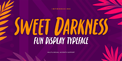 Hello Everyone, introduce our new product Font Sweet Darkness is a Fun Display Typeface .This is a Textured Natural Style and classy style with a clear style and dramatic movement. This font Sweet Darkness is great for your next creative project such as logos, printed quotes, invitations, cards, product packaging, headers, Logotype, Letterhead, Poster, Design this font is great for your creative projects such as watermark on photography, and perfect for logos & branding, invitation,advertisements,product designs, stationery, wedding designs,label ,product packaging, special events or anything that need handwritting taste. You can activate Ligatures glyphs and Alternates glyphs OpenType panel.
 - Nice Postman by Gassstype,
$23.00 Hello Everyone, introduce our new product Font Nice Postman is a Fun Brush Font .This is a Textured Natural Style and classy style with a clear style and dramatic movement. This font Nice Postman is great for your next creative project such as logos, printed quotes, invitations, cards, product packaging, headers, Logotype, Letterhead, Poster, Design this font is great for your creative projects such as watermark on photography, and perfect for logos & branding, invitation,advertisements,product designs, stationery, wedding designs,label ,product packaging, special events or anything that need handwritting taste. You can activate 19 Ligatures glyphs and Alternates glyphs OpenType panel.
 - Rotten Banquet by Subqi Studio,
$35.00 Introducing Rotten Banquet, our first victorian display font. This font inspired by 1800s typography design with some modern touch at it. We made this font without too much swashy efefct on the letterform. Just gave it two bold ripple floral effect at the tail is enough. So this font will more readable and not too complicated thus you could make any kind of projects with this font. In the preview we give you a sample ideas. We made it with one style design for the continuity but of course you could make your own style display for your own project purposes. This font contained with 370+ total glyphs. Each uppercase and lowercase have their own stylistic alternate at least one.
 - Amanila by RahagitaType,
$16.00 Amanila simplifies elegance into one truly outstanding handwritten font. This font is the perfect fit for all of your logos, branding, social media, and crafty DIY projects.
 - Hidup Tenang by Aldedesign,
$25.00 Hidup Tenang is a whimsical, laid-back, and fun display font. No matter the topic, this font will be an incredible asset to your fonts’ library, as it has the potential to elevate any creation.
 - Quiet Backyard by Invasi Studio,
$13.00 Quiet Backyard is a super playful combo pairing font. Combination with the concept rounded sans serif and hand-lettered font. From Fun, Playful handwriting and casual rounded san serif. This attractive combination with playful vibes special for your Display Design; is guaranteed to add an eye-catching suitable for your logo designs, brand imagery, quotes, product packaging, merchandise & social media posts. ?Features: Alternates Punctuation Ligature Multi-language
 - Summer Program JNL by Jeff Levine,
$29.00 The WPA (Works Progress Administration) posters on file at the Library of Congress have been a treasure trove of classic hand-lettered type designs. Summer Program JNL is based on one such poster offering free arts and crafts classes in New York City sponsored by the Federal Art Project.
 - PMN Caecilia eText by Monotype,
$29.99PMN Caecilia™ is the premiere work of the Dutch designer Peter Matthias Noordzij. He made the first sketches for this slab serif design in 1983 during his third year of study in The Hague, and the full font family was released by Linotype in 1990. The PMN prefix represents the designer's initials, and Caecilia is his wife's name. This font has subtle variations of stroke thickness, a tall x-height, open counters, and vivacious true italics. Noordzij combined classical ductus with his own contemporary expression to create a friendly and versatile slab serif family. With numerous weights from light to heavy, and styles including small caps, Old style figures, and Central European characters, PMN Caecilia has all the elements necessary for rich typographic expression. eText fonts - the optimum of on-screen text quality With our new eText fonts that have been optimised for on-screen use, you can ensure that your texts remain readily legible when displayed on smartphones, tablets or e-readers. The poor resolution of many digital display systems represents a major challenge when it comes to presenting text. It is necessary to make considerable compromises, particularly in the case of text in smaller point sizes, in order to adapt characters designed in detail using vector graphics to the relatively crude pixel grid. So-called 'font hinting' can help with this process. This, for example, provides the system with information on which lines are to be displayed in a particular thickness, i.e. using a specific number of pixels. As font hinting is a largely manual and thus very complex technique, many typefaces come with only the most necessary information. What is unimportant for a text printed in high resolution can result in a poor quality image when the same text is displayed on a screen, so that reading it rapidly becomes a demanding activity. Specially optimised eText fonts can help overcome this problem. An extremely refined and elaborate font hinting system makes sure that these fonts are optimally displayed on screens. Monotype has not only adopted font hinting for this purpose but has also thoroughly reworked the fonts to hone them for display in low resolution environments. For example, the open counters present in the letters C, c, e, S, s, g etc. have been slightly expanded so that these retain their character even in small point sizes. Also with a view to enhancing appearance in smaller point sizes, line thickness has been discreetly increased and x-height carefully adjusted. Kerning has also been modified. Don't leave the on-screen appearance of your creations to chance. Play it safe and use eText fonts to achieve perfect results on modern display devices. Many typefaces, including many popular classics, are already available as eText fonts and new ones are continually being published. The eText font you can purchase here are available for use as Desktop Fonts or Web Fonts. Should they be used in Mobile Devices such as smartphones, tablets or eReaders, please contact our OEM specialists at sales-eu@monotype.com. - Meow Zilla by Putracetol,
$22.00 Introducing “Meow Zilla” - a Display Cat Theme Font that is as playful and fun as a kitten! This unique font, inspired by the whimsical world of cats and kittens, is designed to add a touch of charm to any project. With 10 distinct variations, each reflecting the delightful themes of paws, playful kittens, and more, Meow Zilla is versatile and adorable. Crafted with care and precision, it’s perfect for children’s themes, crafting projects, logos, branding initiatives or any design enriched by a touch of feline grace. Whether you’re creating invitations, packaging or personalized stickers – Meow Zilla shines in its versatility. Every stroke embodies the essence of fun making it an excellent choice for titles in children’s books or playful branding.
 - Lemonado by Melvastype,
$29.00 Lemonado is a type family drawn with a dry brush pen. It includes upright and italic scripts and all caps fonts with brush texture or with smooth edges. Lemonado Script is playful and slightly bouncing connecting script. It includes two sets of lower cases to increase the hand writing effect. By enabling Contextual Alternates from OpenType panel you can cycle these two sets and achieve variation. Lemonado Script also includes set of lowercases without connecting stroke, you can use those in the middle of words or automatically add them at the end of words by enabling Stylistic Set 1 at the OpenType panel. There are also set of lower cases with end swashes, you can automatically add these swashes to end of words by enabling Stylistic Set 2 at the OpenType panel. Also other alternate characters and underlines are included to give you even more possibilities to play with. Lemonado Caps has two sets of upper case letters, high and low ones. You can achieve this fun looking bouncing effect by varying them. Just enable Contextual Alternates from OpenType panel and those two sets will cycle.
 - Ellida by Wiescher Design,
$49.50 Ellida is a very elaborate and elegant script in the tradition of the 18th-century English calligrapher George Bickham and the 19th-century American calligrapher Platt Rogers Spencer. I really enjoyed designing this script and maybe one day I will add starting and ending letters. Doing this script was extremely time- and brain-consuming, it is a huge challenge to make calligraphic letters work on computers so that they join perfectly. That's also the reason that this has become my most expensive font so far, but I think the price is fair for the incredible amount of work I put into the script. I really need a break from scripts now! Yours very exhausted Gert Wiescher.
 - Cosmic Venus by Ironbird Creative,
$15.00 Cosmic Venus - Brush Typeface Cosmic Venus is a handmade brush typeface with bold and strong feel. This type of font perfectly made to be applied especially in headlines which is need a standout font, and the other various formal forms such as labels, logos, magazines, books, packaging, fashion, stationery, novels, labels or any type of advertising purpose. Features : Uppercase & lowercase (alternates) PUA encoded ADDITIONAL INFORMATION Feel free to convert the fonts to web fonts for your personal/business website. You may not use the fonts in templates or for sale/free or on template websites. ( web/print/app ) For upgrading license please contact me. Upgraded licenses are required for apps, books, television, commercial exhibition, film, gaming, print on demand products, etc. Simply email me to : ironbirdcreative@gmail.com Hope you enjoy the font, please feel free to comment if you have any thoughts or feedback. Thanks for purchasing and have fun! Regards, Ironbird Creative
 - Polyspring by PintassilgoPrints,
$29.00 Polyspring is a handcrafted serif display font, with a cool flowery flair. It was hand-drawn based on Italia Condensed typeface from Keystone Foundry from circa 1906. Loaded with stylish ornaments and flourishing alternates for all its letters and numbers, this font is a terrific toolbox for display purposes. Yet, it has the superpower of changing the first and last letters in words to its germinated alternates at the click of a button, thanks to the smart OpenType programming. Please note that this feature will only work in OpenType savvy applications. Check it performing live on the sample text below: just click on the Advanced Typography option, located next to the sample colors options (look for an icon showing “ff”), and check the option “swash”. Very cool, isn't it? Happy blooming!
 - Beskill by CBRTEXT Studio,
$15.00 Beskill is a modern handwritten script font. Every hand stroke, we keep it simple. The ligature is also available which gives a beautiful impression on this font. This font is perfect for your project or branding such as quotes, weddings, headings, designs, logos, invitations, and more! Thank you!
 - Annotate by Ignace De Keyser,
$9.95 Annotate is a handwritten, monospace blockletter font complete with letters, numbers, & extended punctuation. The font is based on the handwritten annotation architects and engineer make on plans and sketches. By using a gridbased spacing and blocklettering, engineers can rely on an easily-readable and copy 'n print friendly annotations on techninical drawings to prevent any possible mistakes in the production process that are a consequence of misreading text. The clarity and uniformity allow to add a hand-written touch to any project without having to make concessions on the readability. Annotate will distinguish your text from the rest, ideal in logos, printed quotes, product packaging design, headers and many more usecases. Designer: Ignace De Keyser


