10,000 search results
(0.045 seconds)
- Obcecada Sans & Serif by deFharo,
$15.00 Obcecada Sans & Serif are two geometric digital typefaces in regular and bold versions, very condensed and thin with a rounded finish on the horns and joints with a modern style. They include the Cyrillic and Greek alphabet. These fonts are the result of my obstinacy for very condensed fonts, in this case I have inclined to a very fine proportion with short ascending and descending that gives them elegance decó.
 - Leipziger Antiqua by profonts,
$41.99 The original typeface was designed by Albert Kapr between 1971 and 1973 for Typoart in Dresden. Kapr was the font designer and teacher as well as book author on type design of former East Germany. He also was an expert on this kind of type design, and thus, it is no surprise that he created Leipziger Antiqua, a design combining features of both Latin and broken scripts. The result is a stunning and unique gem from earlier times although it does not come along too distinguished or artsy. The digital version of Leipziger Antiqua was developed by Ralph M. Unger exclusively for profonts in 2005. During the work, Unger fell so deeply in love with this typeface that he couldn't help but add an expert font with small caps etc.
 - Textus Receptus by Lascaris,
$60.00 Textus Receptus is a historical revival based on the Roman and Greek types used by Johann Bebel (and later also Michael Isengrin) in Basel in the 1520s. The Roman is a low-contrast medium-to-heavy Venetian reminiscent of Jenson or Golden Type. The unusual polytonic Greek, not previously digitized, is lighter in weight and supplied with all the ligatures and variants of the original. Yet when used without historial forms the Greek has a surprisingly contemporary feel: it’s quirky and playful as a display face, but still easily legible in running text. Bebel’s Greek extended and refined the one used for the first printed Greek New Testament, Desiderius Erasmus’ Novum Instrumentum Omne, published in Basel in 1516 by Johann Froben. The name of the font was chosen in honor of this edition, which was so influential that it was later called the Textus Receptus (the “received text”), serving as the basis for Luther’s German Bible in 1522 and much subsequent scholarship for over 300 years. Following 16th century practice, Textus Receptus contains 130 ligatures and stylistic alternates for Greek, accessible either with OpenType features or with five stylistic sets. The Greek capitals, often printed bare in early editions, have been equipped with accents and breathings for proper polytonic or monotonic typesetting. The Roman includes both standard and historical ligatures along with the abbreviations and diacritics typically employed in early printed Latin. For expanded language coverage it has the entire unicode Latin Extended‑A range and part of Latin Extended-B. The capital A is surmounted by a horizontal stroke, as in some 16th century Italian designs, and the hyphen and question mark have both modern and historical form variants. Mark-to-base positioning correctly renders fifty combining diacritics, and with mark-to-mark positioning the most common diacritics may be stacked, permitting, for example, accents and breathings on top of length-marked vowels. Numerals include old-style, proportional lining and tabular lining. For further details, please download the 31-page Textus Receptus User Guide.
 - Thirdlone by Letterhend,
$14.00 Thirdlone is a handmade typeface with monoline script and sans. This font is perfect to be used as t-shirt designs, logo/brands, signatures, headlines, lettering quotes, and more. It also comes in uppercase, lowercase, punctuation, symbols, numerals, stylistic set alternate, ligatures, and multi-lingual support. Thirdlone Script includes 3 different styles: Regular, Stamp, and Ink. Thirdlone Sans includes 4 different styles: Regular, Stamp, Ink, and Edge. Regular styles are a regular style that have clean look on it. Stamp styles give you aged texture on the font that will push out the vintage feel. Ink styles will give the font a little bit of an ink feel. The Edge style give this font a rough feel on its edge. You can choose one of the styles mentioned above that match perfectly for your style, or just mix and match it.
 - Kidyba by Twinletter,
$13.00 Introducing “Kidyba Font” – Where Playful Typography Takes Center Stage! Unleash your creativity with Kidyba Font, a whimsical display typeface that injects fun and energy into your designs. Kidyba Font is the perfect choice for projects that require a playful touch. Its charming and lively characters make it ideal for children’s books, eye-catching posters, and playful branding that stands out. With Kidyba Font, your designs will instantly capture the essence of playfulness, drawing your audience in. Whether you’re designing a cheerful invitation or a vibrant logo, this font adds a joyful and spirited element to your work. Elevate your creative projects and let your imagination soar with Kidyba Font. Infuse your designs with a sense of fun and wonder, and watch as they come to life with this delightful typeface. Embrace the playful spirit of Kidyba Font today! – PUA Encoded Characters – Fully accessible without additional design software.
 - Rabsy by D&K Project,
$15.00 Rabsy is a unique cartoon font with a doodles concept. The included dingbat doodles pattern makes it easy for you to make unique patterns, and make fun display tittle. A mixed-case font (Rabsy and Rabsy Pattern) with lots of combination possibilities, makes for great fun! It is good for logotype, stickers, fun kids signs, and other lettering projects. This fun is perfect combination uppercase and lowercase. Rabsy File Downloaded: - UPPERCASE and lowercase - Lots of doodles Rabsy Pattern 1-9, A-Z and a-z (more fun with lots of combination possibilities) - Punctuation and numeral - Extended Latin characters for language support. Please let me know in the comments what you think or if you have any issues or queries, If you have any questions about licensing, need help with a typeface, or would like to request a new feature, drop me a message. Thank you, D&K Project
 - Eurobia by Greater Albion Typefounders,
$24.00 Eurobia is a family of two typefaces - Regular and Plain. They are display faces with a strongly European feel and a strong flavour of the 1920s. My suggestion would be to use them for poster or banner work, or packaging or cover design, with the heading text set in Eurasia Regular and subsidiary text set in Eurobia plain. Why not give that European flavour to your next project? We see Eurobia as a fun typeface, for advertising products like confectionery or concerts. We had a lot of fun designing it and hope you'll like it too!
 - Composer JNL by Jeff Levine,
$29.00 There are thousands of pieces of vintage sheet music available for collectors and curiosity seekers. Prior to the 1930s, a large percentage of them had wonderfully hand-lettered titles on the covers, but gradually there was a shift by music publishers to utilizing metal type for the bulk of their output. Normally set in an all-caps format, certain type faces reappeared in growing frequency and familiarity. Composer JNL is one such example of a “workhorse” font, and has been re-drawn and reinterpreted by Jeff Levine Fonts in both regular and oblique versions. It is based on the design "Glamour", released by Lanston Monotype in 1948; which in turn was based on "Corvinus", designed by Imre Reiner.
 - Glaw by Flavortype,
$15.00 Meets Glaw, A new carefully crafted Fonts from Ilham Herry to bring a new heavy look of Psychedelic Theme. The Ideas of this fonts are from 70s, Psychedelic, Funk, Hippie, Party, Music and Etc. Even though it’s a specific theme for this fonts. It doesn’t ruled out the possibility of creating a new style or themes. Glaw Created with a 3 Weight on the traditional OTF, Condensed, Regular and Expanded. Not Just that, If your software are support for Variable Fonts like Adobe Illustrator or Photoshop, The Weight are going to 100 Weight!. Glaw Best used for a Large Text such as Headline, Poster, Branding, Logos, Concert, Branding and Any other use that needs a Heavy looks for the Title. Our creation on the display to give you a reference what it looks like on your project. It shows that how Glaw will look on your design style.
 - Ciribiribin JNL by Jeff Levine,
$29.00 Ciribiribin is an Italian ballad composed by Alberto Pestalozza in 1898. Many versions with different sets of lyrics have been recorded over the years. The hand lettering on the sheet music for one such popular version of the song was comprised of bold characters with a "semi-serif" treatment; that is, characters with partial or no serifs on certain strokes of the letters. Ciribiribin JNL extends this unique design into a complete digital typeface. Available in both regular and oblique versions.
 - Braver Grave by Multype Studio,
$99.00 Braver Grave is a death metal font. This font perfect for logotype death metal band, logotype death metal brand, product, merchandise death metal band, death metal band covers, rock events, rock posters, rock magazine covers, branding, product design, labels and other creative project. What’s Included : Standard glyphs Works on PC / Mac Simple installations Accessible in the Adobe Illustrator, Adobe Photoshop, Adobe InDesign, even work on Microsoft Word PUA Encoded Characters, Fully accessible without additional design software. Multilingual support Thank you for your purchase! Hope you enjoy with our font!
 - Retro Disco by Ahmad Jamaludin,
$15.00 Get ready to groove with our latest creation, RETRO DISCO font! RETRO DISCO brings the perfect blend of quirky boldness and unique letterforms, adding a dash of playfulness to your designs. With RETRO DISCO, the fun doesn't stop! You can easily play around with its uppercase and lowercase modes to find the perfect fit for any form you desire. But that's not all – we've taken it up a notch by offering 3 widths for each type: Narrow, Regular, and Wide! So no matter the project, this font is here to serve your creative needs. Features: Retro Disco Main File Has 3 Variable: Narrow - Regular - Wide Instructions (Access special characters, even in Cricut Design) Unique Letterforms Works on PC & Mac Simple Installations Accessible in Adobe Illustrator, Adobe Photoshop, Microsoft Word even work on Canva! PUA Encoded Characters Fully accessible without additional design software. Join the party and let RETRO DISCO be the life of your design projects. Embrace the groovy vibes and create something truly unforgettable! Enjoy Designing! Dharmas Studio
 - Cassandra Plus by Wiescher Design,
$49.50 Cassandra Plus is my revised version of Cassandra, it can now be used all over Europe except Greece and Russia. I changed the weights a bit to make them more distinct. The Font has two widths of letters, wide Capitals on the (shift) uppercase-keys and narrow ones on the (no shift) lowercase-keys. You can match them as you like, but you should avoid having the same letter in one word in two different widths. But if yoyu are really daring you can use one narrow S and a wide one, it might still look good. It will almost always look good! Cassandra is my “bow” to Adolphe Mouron Cassandre. Yours sincerely mixing things up for you again Gert Wiescher
 - Girasol by Lián Types,
$35.00 This is a cute story about a mother and her son. :) About a decade ago my own mother got very interested in my work. She used to say my letters had so many swirls and dazzling swashes, and suggested my job seemed to be very fun. She wondered if she could ever try to make her own alphabet... Well, she is a civil engineer and a maths teacher, and appeared to be a little tired of exact sciences... I remember answering this, while she was listening with her typical tender look: -"Mamá... While type-design may be a really enjoyable thing to do, it also involves having a great eye and knowledge about the history of letters: nice curves and shapes require a meticulous study and, like it happens in many fields, practice makes perfect"-. Well, she raised her eyebrows at me. -"and so what?"- She didn't have any experience neither in the field of art nor in the field of graphic design so, I told her that if she really wanted to get into this she should borrow some of my calligraphic books from my beloved shelves in my office. So... she did. Some weeks after that, she came to me with many sketches made with pencils and markers: some letters where very nice and unique while others naturally needed some work. I remember she added ball terminals to all of her letters (even if they didn't need them) because that was one of the rules she imposed. After some back and forth, we had the basis for what would be today, ten years later, the seed of this lovely font Girasol. Her proposal was nice, something I was not accustomed to do, that’s why many years later I decided to watch it with fresh new eyes and finished it. While she was in charge of making the lowercase letters, I helped with the uppercase and also added my hallmark in the alternates, already seen in others of my expressive fonts. The result is an upright decorative font that follows the behavior of the copperplate nib with a naive touch that makes it really cute and useful for a wide range of products. Many alternates per glyph make Girasol a very fun to use font which will delight you. Above posters are a proof of that! This font is a gift for my mother, Susana, who, in spite of her exacts academic background, taught me that beauty can also be found in the imperfect. 1 NOTES (1) In my fonts I'm always in seek of the perfect curve. When I designed Erotica and Dream Script, I read about Fibonacci’s spirals!
 - Grayfel by insigne,
$- As designers, we seek perfection and originality. The more we step back and look at our work, the more changes we tend to find necessary. Drastic modifications are inevitable. The same is true of Grayfel. Grayfel began as an exercise at insigne to explore the crowded space of neutral sans. While the world of sans serifs is admittedly crowded, I still managed to find something new and different. The final Grayfel consists of 42 full-featured OpenType fonts containing three widths: Regular, Condensed, and Extended. Every width consists of 14 fonts--seven weights with matching italics, making it a good companion for setting clear text and headlines for print and screen. OpenType features are also available. There’s figure choices, such as proportional and old style figures. Additionally, Greyfel includes sophisticated typographic attributes: ligatures, fractions, alternate characters, small caps, superscripts and subscripts. Its extended character set supports Central, Western and Eastern European languages. Optical compensations also mean the outcome of this family is a hybrid of humanistic proportions. It’s a well-finished design with optimized kerning gives it a friendly look. If you like sans serifs within the tradition of Futura, Helvetica, Avant Garde and Avenir, then you’ll love Greyfel, too. Grayfel works well in a variety of applications. Subtly neutral yet fun, it’s suitable for headlines of all sizes as well as for text. Put it to the task for marketing, packaging, editorial work, branding and even on-screen projects. Try it out: it’s not just fun and playful; it’s Grayfel.
 - Milano Traffic by Roland Hüse Design,
$13.00 This is a hand drawn quick-sketch font. I wanted to create a high contrast serif in a cartoonish, kid style. It contains basic latin western and central european language extensions and accents. Looks natural and playful, and really nice on chalkboard texture as you can see on the example above. It comes with the classic default ligatures of fi, fl, ffi and ffl.
 - Milgran by Kulokale,
$25.00 Milgran is a modern and elegant sans-serif font. Milgran is well-suited for advertising, branding, logotypes, packaging, titles, headlines and editorial design. We highly recommend using a program that supports OpenType features and Glyphs panels such as Adobe Illustrator, Adobe Photoshop CC, Adobe InDesign, or CorelDraw, so you can see and access all Glyph variations. This font is encoded with Unicode PUA, which allows full access to all additional characters without having special design software. Mac users can use Font Book, and Windows users can use Character Map to view and copy one of the extra characters to paste into your favorite text editor / application. Thanks for purchasing and have fun!
 - Mailbox Letters JNL by Jeff Levine,
$29.00Many items we use in our day-to-day lives offer wonderful source material for font designs. Mailbox Letters JNL was inspired by a set of self-stick adhesive letters used on mailboxes, doors and other areas of identification at home or in business. Each letter, number and punctuation mark is centered on a black rectangle - just as the actual model for this font. Use it as spaced, or hand set it tighter to form a ribbon with white-on-black text. To provide continuity for the ribbon effect, a blank rectangle is provided on the vertical bar key (the shift position of the backslash key). Limited character set. - Bright by Ahmad Jamaludin,
$19.00 Start good day for new font! present to you, Bright! Bright is a stylish font It has both modern and retro look - clear, modern and fun. Helps to create layout design in 60s or 70s design projects. This font have more than 50 unique alternate and ligature that to give your logo,business card and another project to a unique vintage look. It has Italic version too so what a perfect vintage font! What's you get? Unique letterforms Works on PC & Mac Simple Installations Accessible in the Adobe Illustrator, Adobe Photoshop, Microsoft Word even work on Canva! PUA Encoded Characters Fully accessible without additional design software. I really hope you'll get pleasure using Bright font and it will be perfect addition to your font collection! If you have some questions, please write me a letter! Come and say hello over on Instagram! https://www.instagram.com/dharmas.studio/
 - Icebold by Balpirick,
$15.00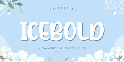 ICEBOLD is a Fun and Bold Hand brushed Font. ICEBOLD is perfect for product packaging, branding project, magazine, social media, wedding, or just used to express words above the background. It support multilingual. Enjoy the font, feel free to comment or feedback, send me PM or email. Thank you!
 - Funny Toys by Letterafandi Studio,
$14.00 Funny Toys is a fun and bubble display font. No matter the topic, this font will be an incredible asset to your fonts’ library, as it has the potential to elevate any creation.
 - Rich Monster by Letterafandi Studio,
$14.00 Rich Monster is a fun and casual display font. No matter the topic, this font will be an incredible asset to your fonts’ library, as it has the potential to elevate any creation.
 - Red Hot Mama NF by Nick's Fonts,
$10.00The Zanerian Manual of Alphabets and Engrossing, published in numerous editions since 1895, featured many elegant and elaborate script typefaces. However, it seems that, from time to time, calligraphers just want to have fun, and this little number is definitely fun. Light, lively and just a little loopy, Red Hot Mama is sure to add just the right amount of spice to your special project. Both versions contain the complete Unicode 1252 (Latin) and Unicode 1250 (Central European) character sets, with localization for Romanian and Moldovan. - Avendica by Mokatype Studio,
$24.00 Avendica is an experimental typeface inspired by Celtic Roman font. It’s developed with a modern serif style design so it looks elegant and luxurious. This font is only used in Uppercase form with some different styles between the uppercase and the lowercase. This font is suitable for short-text designs like headlines, logos, brands, and more. Works on PC & Mac, simple installations, accessible in Adobe Illustrator, Adobe Photoshop, Adobe InDesign, and even works on Microsoft Word. PUA Encoded Characters - Fully accessible without additional design software. Fonts include multilingual support Image used: All photographs/pictures/vectors used in the preview are not included, they are intended for illustration only. Thank You
 - Vena Amoris by Delve Fonts,
$49.00 New Orleans, June 25, 1895 My dear Edmond, I found upon my return home to dinner yesterday, your letter informing me of your affection for Annie and asking that we confide her future happiness to your keeping... This excerpt was taken from a letter written by designer Kathryn Podorsky’s great-great-grandfather, Lucien Doize, in response to Edmond’s request to marry his daughter, Annie. The letter was not only beautiful contextually, but exquisitely penned and epitomized the delightful charm of the New Orleans people of the time. Vena Amoris, or “Vein of Love” refers to a phrase coined by Henry Swinburne in his A Treatise of Espousal published in 1686. Vena Amoris also refers to the fourth finger on the left hand which was traditionally believed to contain a vein running directly to the heart, hence “the ring finger.” As a digital font, Vena Amoris boasts an extensive Latin-based character set that supports 51 languages. Also included are stylistic and contextual alternates, ligatures, swash variants, oldstyle figures, and roman numerals and calligraphic words that will undoubtedly bring a dynamic quality to any setting. All of those extras are driven by cleverly applied OpenType features allowing you to add harmony and calligraphic beauty to your layout.
 - Lina sans Arabic by Zaza type,
$24.00 Lina sans is an Arabic typeface from Lina type family, it expresses modern vigor based on simplicity and clarity. It's Strong, Bold, legible, clear, simple, Modern. With a handful set of OpenType features and alternatives. Lina type family consists of Lina soft, Lina sans, Lina round. the design is inspired by the Kufic calligraphic style and influenced by the Naskh style. Lina sans was highly crafted in order to perform well both on screen and in print. The large x-height and open counters make it function well even on small font sizes. It has a wide range of use possibilities headlines, logotypes, branding, books, magazines, motion graphics, and use on the web and Tv. Lina sans consists of 7-weight versions from thin to bold.
 - Crisis by SIAS,
$29.90 Crisis is a child of the dictatorship of economics. Since time is money the time budget of its production has been rigidly limited. Crisis was designed and generated completely on one single day. The target was to make a useful font while investing nothing more than absolutely indispensable. The component-based glyph construction scheme of another font has been utilized, further detailing work has been strictly limited. Due to those restrictions some letters have rather unusual shapes. This straightforward and contemporary sans (320 glyphs) is of compact proportions and very legible even when set in small sizes. In printing you get more text on one page and thus save up to 30% of paper.
 - Cabrito Semi by insigne,
$24.00 Relax. Deep breath. And step away to font nirvana with Cabrito Semi. Like its Cabrito relatives, Semi’s handwriting-inspired feel is mellow and care-free. But don’t misunderstand us. Even with its fun-loving peculiarities, this free spirit will command whatever party you invite it to. It’s a perfect blend of unique and functional. So what’s the secret of this little one’s strength? It’s pure balance. Cabrito Semi’s energy surges from deep within the relaxed, balanced tones of its humanist structure and calligraphic crafting. The 36 fonts of this well-crafted semi serif originate from the popular Cabrito, an insigne design slab serif developed for the kid’s book, The Clothes Letters Wear. Along with its other amigos, Inverto and Sans, Cabrito Semi rounds out this easy-going household of fonts. The four fonts play well together on anything from meals and candy to toys and cars. With the support of the other three, Semi makes a great choice for titles and moderately long text like you would use for websites, flyers, and packaging. Semi’s complete pack of alternates is accessible in any OpenType-enabled system. This kiddo has loads of alternates, swashes, and alternate titling caps to add a bit of sweetener to the balance. Also bundled are swash alternates, old style figures, and compact caps. Preview any and all of these features in the interactive PDF brochure. This font members of the family also consists of your glyphs for 72 languages. So who says you can’t love quirky? Take a look at Cabrito Semi--and any of the other members of the Cabrito family. You’re bound to find yourself loving fun all over again.
 - Patent Reclame by HiH,
$10.00 Patent Reclame manages to be light-hearted, while clearly showing its blackletter roots both in the shape of the individual letters and the rhythm of text on a page. The designer is unknown. Schriftgeisserei Flinsch of Frankfurt a.M. cast the face around 1895. Nicolete Gray shows a quite similar face called “Graphic,” from Stephenson Blake in 1896. Personally, I don't think that Patent Reclame looks like an English design, but I do not have any proof one way or the other. The numbers are proportional, intended for posters, not spreadsheets. Two ornaments are included, an art nouveau rose at #172 and a lilypad with long tendril at #177. Great for invitations, posters and flyers announcing fun events. Do not use for obituaries. Quite readable in smaller sizes for short blocks of text. I really like the buoyant quality -- a nice combination of discipline and enthusiasm.
 - Jobber Wacky NF by Nick's Fonts,
$10.00This bouncy little number is based on handlettering often found on greeting cards in the 1950s and 1960s, and often the work of Alan Denney. Wild and wacky (and maybe a little bit tacky), this monocase font is a sure attention-getter. This font contains the complete Latin language character set (Unicode 1252) plus support for Central European (Unicode 1250) languages as well. - Therhoernen by Proportional Lime,
$9.99 Arnold Therhoernen. (Arnoldus ther Hornen, Drucker des Dictys , Arnold ter Hoernen, Arnold ther Hoernen, Arnoldus TherHornen.) Who was this guy? He was a printer active in the city of Cologne, having graduating from the university there. He learned his craft under Ulrich Zell. He printed books from 1470 to 1482 when the plague carried him off. Was he just another printer of the era? No, he brought out the first edition of the "Fasciculus temporum'' (The most popular work by a living author at that time.) And he was the first to use both a title page and page numbers. His page numbers, an idea probably suggested to him by Werner Rolevinck, were interesting in that they were centered half way down the page on the outer margin and were set in Roman Numerals.
 - Alta California by steve mehallo,
$18.80 Alta California became designer steve mehallo's "vector-based artist's response" to the early Apple Macintosh bitmapped font San Francisco. Alta California was developed using "sampled" wood type and letters from numerous historical sources. The name comes from the Alta California newspaper, the first daily published in California, one of a dubious Barbary Coast nature, a sheet that shaped the bias of San Franciscans and attracted its own grade of reporters, including a printing specialist who went under the nom de plume Mark Twain. Alta California's edges were meticulously redrafted by hand, with letterpress-inspired fallout and 19th century pointing hands. The final collection of rough hewn letters jump, dive, fall, zag and zig. Alta California looks great on greeting cards, food packaging, as retail signage for boutiques, vintage stores or at D.I.Y. sales, on band posters or club cards, in and around historical quarters, or for use on any ransom note that needs to evoke a wild west look and feel.
 - ITC Galliard eText by ITC,
$29.00A clear and enjoyable reading experience hinges on the legibility of text copy, especially when reading on screen. This is why Monotype has developed the eText collection of fonts specifically tailored for the text-heavy display environments of e-readers, tablets, mobile devices, and the Web. Matthew Carter designed the original ITC Galliard. Carl Crossgrove created this eText version. - FF Dingbats 2.0 by FontFont,
$51.99 German type designers Johannes Erler and Henning Skibbe created this pi and symbols FontFont in 2009. The family has 12 weights and was one of the first symbol typeface for a new generation.It has one of the largest collections of contemporary symbols and icons for office communication.
 - Skypilot by Ferry Ardana Putra,
$19.00 Hello there! We are introducing my new font - Skypilot! This font is carefully selected from hundreds of letters. We manually created this font using a flat pen and make it as close as possible to street graffiti style. Not only that, we also make another typeface that is perfectly suited for this theme, Skypilot extruded! With those fonts, you can combine them as a pair to make them a layered style! You will make exquisite real street graffiti art just like on the wall that you saw in the city! Besides all this, the Skypilot Swashes and ornaments are designed to make your designs more fun! You can apply this font to t-shirt designs, posters, covers, video thumbnails, merchandise, wall, and so on to make it look special. ——— Skypilot features: A full set of uppercase and lowercase Numbers and punctuation Multilingual language support PUA Encoded Characters OpenType Features Layered Style +379 Total Glyphs +100 Graffiti Swashes and Ornaments included! ——— ⚠️To enable the OpenType Stylistic alternates, you need a program that supports OpenType features such as Adobe Illustrator CS, Adobe InDesign & CorelDraw X6-X7, Microsoft Word 2010 or later versions. There are additional ways to access alternates/swashes, using Character Map (Windows), Nexus Font (Windows), Font Book (Mac) or a software program such as Pop Char (for Windows and Mac). ⚠️For more information about accessing alternative, you can see this link: http://adobe.ly/1m1fn4Y
 - Carolyna by Emily Lime,
$59.00 Carolyna is an elegant, yet whimsically handwritten calligraphy font that was created with readability in mind. It uses open-type features to assist with letter flow and to give each creation that modern, hand-lettered touch. With over 1000 characters, there are many stylistic alternates to choose from, tons of foreign characters so you can write in other languages, and fun swashes to give headings a little something extra. Note: The Pro version contains ALL characters - but if you can't use open-type, I highly recommend opting for one of the other options where what you see is exactly what you get!
 - Fluffenhaus by astroluxtype,
$20.00 Fluffenhaus is a vintage bold retro-font, the glyphs are soft serve ice cream, sorta Cooper Black after to much party. A fun playful look that suggests the 1960's and 1970s rock posters and cereal box art as well. Fluffenhaus is a fat bold font, apply to projects that need an attention grabbing headline that expresses the fun of the information being convened. Tightly spaced in the metric, suggested uses would be for it to be used BIG and then bigger. Fluffenhaus is a groovy beautiful and tuned into the psycho-fab of the now!
 - Patched by Mans Greback,
$39.00 Patches is a multi-faceted, victorian-era serif typeface for when you need something more than plain text. Get that extra attention while adding a genuine, original appearance to your message. Patches was designed from scratch to give a sense quality and depth. Its designer Mans Greback has created a typeface with a complex structure, yet one that will be easy to master. This work will suit every style, taste and skill level. It is a decorative and completely hand-drawn design in vintage lettering, with the perks and flexibility of present-day technology, which is exactly what you'd expect from a modern typeface. Whether you are making a decorative floral headline, drawing a cowboy logo, or creating a unique design based on this ornamental font, the hopes are that Patches can give you a set of tools and inspiration to bring out the best of your artistry. Standing on the shoulders of giants, it was inspired by a wide range of works, and will hopefully be able to continue to teach and inspire future artists. Or at least help you become a better designer when you're designing an elegant and classic headline. Set the coloring of Patches to light gold and cream tones to apply a luxurious look, or in dark tones for a more rugged impression. Bold, bright colors will make it appear In the mid-1800s, decorative design flourished in the Western major cities. Victorian style thrived and encouraged techniques such as enamelling, embroidery and calligraphy. From the 1880s onwards, there were a series of reactions to higher Victorian tastes, with Art Deco reaching the heights of the 20th century. However, the Victorian art persisted popularity, as it changed to more sophisticated designs which made it more attractive to specific professions and groups. The evolution of the Victorian style in the mid-20th century was a key factor in the succession of the movement. Classic shops and salons, sport designs and traditional festivals, and later Rock'n'Roll and Harley Davidson-themed graphics inspired the continued development of the art. Aspiring to carry on this tradition, this typeface family consists twelve different high-quality variations. The main ones are Patched and Patched In – an outlined variation – and each one provided in five weights: Thin, Light, Medium, Bold and Black. Additionally, the two rough fonts Hangaround and Prospects, that tries to grasp the rough, earthy atmosphere of a shady motorcycle club. The font is built with advanced OpenType functionality and has a guaranteed top-notch quality, containing stylistic and contextual alternates, ligatures and more features; all to give you full control and customizability. It has extensive lingual support, covering all Latin-based languages, from North Europa to South Africa, from America to South-East Asia. It contains all characters and symbols you'll ever need, including all punctuation and numbers.
 - Capitolium 2 by TypeTogether,
$58.00 Capitolium was designed in 1998 at the request of the Agenzia romana per la preparatione del Giubileo for the Jubilee of the Roman Catholic Church in 2000. This type design was the central part of the project for a wayfinding and information system to guide pilgrims and tourists through Rome. Capitolium also continues Rome’s almost uninterrupted two-thousand-year-old tradition of public lettering . It is a modern typeface for the twenty-first century and strongly related to the traditions of Rome. Soon after the completion of this project Unger began contemplating the possibility of bringing the atmosphere of this design to newspapers. Though Capitolium works well in most modern production processes and also on screens, it is too fragile for newsprint. For newspapers sturdier shapes were required as well as more characters to a line of text, and Capitolium News has a bigger x-height than Capitolium. Capitolium News is a thoroughly modern newsface, with classic letterforms linked to a strong tradition. Capitolium News for running text comes in the variations regular, italic, semibold, semibold italic, bold and bold italic. As is possible with most of Unger’s type designs, Capitolium News can be condensed and expanded without any harm to the letterforms. The update to this beautiful font family, Capitolium News, includes the addition of over 250 glyphs featuring full Latin A language support, new ligatures, 4 sets of numerals, arbitrary fractions and superiors/inferiors. Furthermore, kerning was added and fine tuned for better performance.
 - Fake Fury by Bogstav,
$14.00 Actually there is nothing furious about this font. There are no sharp edges and absolutely nothing harmful at all. The name plays tricks on you, because it's a cool laid back font with ounces of possibilities. I'd say you can use the Fake Fury font for posters, flyers, comics, invitations, commercials, toys, candy, clothing, packaging ... ahhh, the list goes on and on! Each letter was carefully handdrawn and soften a bit with rounded edges. And each letter has a total of 6 different versions: upper- and lowercase, and then 4 alternate versions. And the magic happens AS you type, because the font is programmed to automatically cycle through all the different letter variations!