10,000 search results
(0.058 seconds)
- Bonlivet by Greater Albion Typefounders,
$12.00 Bonlivet is an all capitals display face, which starts from Roman letter forms and pushes them into wild decorative extravagance. There is a somewhat early 20th century feel to this, but really it’s just a bit of good fun, with a hint of elegance thrown in.
 - OBO Classic by Juri Zaech,
$19.00 OBO Classic is the second installment of the OBO series, a type collection based on a square. Every character is mapped on a 1x1 ratio which allows for horizontal and vertical settings alike. Or mixed, like crosswords. OBO Classic is a display interpretation of a traditional Old-style Serif. The “distortion” which maps each character to a square creates unusual proportions to what we are used to from classic serif typefaces. The result is a monospaced font. While each individual letter feels conventional on its own, when brought together in words the result feels contemporary. Thanks to the square base vertical and horizontal – and mixed – settings are possible and easy to apply. There are a few exceptions for certain punctuation and special characters that are half the width for better spacing; and the word space’s width can easily be adjusted through OpenType stylistic sets. Talking about spacing, for strictly horizontal typesetting there is the option to turn on kerning for a number of characters to create a cleaner texture across words and phrases. OBO Classic is best set in large sizes and is most comfortable in editorial and display settings. A series of icons complete the character set. A selection comes as pixel graphics which adds further contrast to the traditional legacy of the typeface.
 - Normandia by Canada Type,
$30.00 Designed over three years after the second World War, and published in 1949 by the Nebiolo foundry, Normandia was Alessandro Butti’s take on the fat face. As it usually was with Butti’s designs, this face effectively injected a catchy yet expertly calculated calligraphic spin into its source of inspiration — which was the essentially geometric/deco, thicker model of Bodoni’s very popular aesthetic. The metal Normandia saw some widespread use for a handful of years after its publication, not least because of the multitude of sizes in which it was available. It stepped out of the limelight by the mid-1950s, due to a combination of the popularity of cold type and Nebiolo’s refusal to retool its faces for new technologies. It was copied by a few small film typesetting outfits on both sides of the Atlantic, but never really found its way back to the mainstream. By the time computer type became the norm, Normandia was pretty much relegated to a type historian’s collection of anecdotes. This digital update of the classic series revives and refines the three original metal designs (Tonda/Regular, Corsiva/Italic, and Contornata/Outline) and expands the character set to more than 600 glyphs per font, including small caps, six types of figures, fractions and nut fractions, a full set of f-ligatures, some stylistic alternates, and other fine typography niceties.
 - Fuel by VersusTwin,
$39.00 The Fuel typefaces are a modern update on the techno sans, complete with soft rounded corners as well as decorative inktraps. Stylistic Alternates included within all styles are alternates for the capital B, E, G, and R characters, as well as all of their accented siblings. The Fuel Complete package bundles all of the dynamic styles of the Fuel, Fuel Extended, Fuel Uni, Fuel Uni Extended, and Fuel Script typefaces into one powerhouse of a collection.
 - Siabella Script by Dora Typefoundry,
$15.00 Introducing the charming Modern Siabella Script type of calligraphy inspired by love and joy! Siabella Script with various start and end swash, I hope you are interested in beautiful and aesthetic fonts to perfect your extraordinary project. This font can be used easily and simply because there are many features on in it to contain a complete set of lowercase and uppercase letters, various kinds punctuation marks, numbers, and multilingual support. The font also contains several binders and Stylistic Sets alternative styles for those of you who have software which is able to work OpenType (Photoshop / Illustrator / InDesign). Siabella Script is suitable for the market design developed today, this font has a model trendy, natural and soft, with this font you can use opportunities at every moment from one extraordinary way to highlight the celebration your best party, because this font will be a support for the purposes such as wedding invitations, parties, graduations, birthdays, meetings, and more Please send a message if you have questions. Thank you !
 - Kelso by Talbot Type,
$19.50 Kelso is a highly original, outline display font. Each character is represented by a single continuous line to create a fluid and rhythmic look. This technique seems somehow to bring out the individual characteristics of each letter, resulting in a harmonious typeface that’s both easy to read and easy on the eye.
 - Kleukens Kursiv NF by Nick's Fonts,
$10.00This classic face is based on Kleukens Scriptura, designed by Friedrich Wilhelm Kleukens in 1926 for D Stempel AG. It served as an alternative to Lucien Bernhard's Cursive and an inspiration for Oswald Cooper's Pompeian Script. Both versions of the font contain the complete Unicode Latin 1252 and Central European 1250 character sets. - Office Space JNL by Jeff Levine,
$29.00 Office Space JNL is based on “Condensed Edina” from the 1921 Miller & Richard type specimen book and is available in both regular and oblique versions. This spurred serif Art Nouveau monoline font is a milestone – marking the 1900th font design released by Jeff Levine Fonts since its inception in January of 2006.
 - Half Full NF by Nick's Fonts,
$10.00This cheerful charmer is based on Glass-Antiqua, designed by Franz Paul Glass for the Genzsch & Heyse foundry of Hamburg in 1912. Great for engaging headlines with a playful twist. Both versions feature the complete Latin 1252, Central European 1250 and Turskish 1254 character sets, with localization for Lithuanian, Moldovan and Romanian. - Rolla Cossta by Gassstype,
$25.00 Rolla Cossta - Handwritten Brush Font . Introducing of designs look modern, unique and fun. It’s perfect for labels, quotes, posters, DIY projects, branding, packaging, greeting cards, websites, photos, photography overlays, signs, window art, scrapbooking, tags and so much more!our new product that inspired by Street Tagging, graffiti style with a fun theme very good for graffity poster, flyer, childrenbook, cartoon, comic etc
 - Chilidog PB by Pink Broccoli,
$16.00 Looking for a real fun whack-a-doodle typestyle? You may have just found your match with the Chilidog PB typeface. Chilidog PB began as a digitization of the film typeface called Nectar by LetterGraphics. This font is filled with irregular shapes, shifting weights, and a collection of ligatures that give it real personality. It's a real eyecatcher, but don't take my word for it, give it a spin for yourself.
 - Compasso by Plau,
$30.00 The idea that mathematical precision and the supposed "purity" of geometric forms are part of the discourse of us graphic designers is not new. Studying typography for some time now and learning about all the small alterations and adjustments that this geometry undergoes to better adapt to the imperfect human eye, I found myself with a new way of seeing things. Compasso is, in a way, a result of my growth as a designer. Established and recognized fonts like Futura, Avenir, and their predecessors (including Tempo - published by the Ludlow foundry in the early 20th century) informed the result of Compasso at some level. Others opened my mind to possibilities. Mallory, Azo Sans, the font designed for Audi by Bold Monday, and many other contemporary sans-serif fonts that left me speechless are also responsible for details present in this font. From the first sketch, the family grew on both sides, gaining condensed and extended counterparts. From there - and from a brilliant insight from designer Nicole Rauen - I learned that Compasso was not about geometry. Compasso is about rhythm. It's about the rhythmic movement that provides a foundation, supports, and also makes you dance and swing. My musical taste is too eclectic, I can go from classical to funk in less than two songs on Spotify. Compasso is also eclectic. It's a font to take your project anywhere, a record to listen to on any occasion.
 - Kappa by W Type Foundry,
$25.00 Kappa is a modern sans serif with humanistic and geometric features. Its structure is slightly narrow to fit in a greater range of platforms (moreover if you print it, you may save a lot of paper), and its height is higher allowing a great legibility in small sizes. This family is composed with the display version and the text version providing a broad spectrum of solutions, making this family easier and friendlier to use. Designed with powerful OpenType features in mind. Each weight includes alternate characters, ligatures, fractions, special numbers, arrows, extended language support, small caps and many more… Perfectly suited for graphic design and any display / text use. The 36 fonts are part of the larger Kappa super family. Learn about upcoming releases, work in progress and get to know us better! On Instagram W Foundry On facebook W Foundry wtypefoundry.com
 - Novusa by Taznix Creative,
$18.00 Novusa is a bold and dramatic display font. This original look will appeal to a wide range of crafty ideas, from letterheads and titles, to stationery. Novusa Perfect for for many creative products such as logos, tattoo design, t-shirt prints, street wear, headlines, tattoo lettering, calligraphy, clothing brands, music, sports, labels and much more. What's Included : Web Fonts Standard glyphs Ligature Works on PC & Mac Simple installations Accessible in the Adobe Illustrator, Adobe Photoshop, Adobe InDesign, even work on Microsoft Word. PUA Encoded Characters - Fully accessible without additional design software. Fonts include multilingual support for; ä ö ü Ä Ö Ü ß ¿ ¡
 - Herbit by Lafontype,
$25.00 Herbit is a handwritten sans serif font designed with the principle "Irregularity in regularity" so that herbit produces different shapes on each side of the character but looks in harmony and still maintain readability. The family contains 7 weights from Light to black with multilingual support and is ideally suited for branding, logo, advertising and packaging needs, editorial and publishing, as well as web and screen design.
 - Without Sans by W Type Foundry,
$30.00 Without Sans is a new geometric sans serif of 10 weights plus matching italics and alt family. It was designed by Felipe Sanzana and Diego Aravena, the founders of “Without Foundry”, in 2014/15. It is inspired by the geometric-style sans serif typefaces that were famous during the 50s. The fonts are based on the geometric forms with a mix of grotesque typefaces. The opentype fonts have an extended character set to support Central and Eastern European as well as Western European languages. It is perfectly suited for highlighting lettering, magazines, web, interaction design, advertising, logotypes, etc. Learn about upcoming releases, work in progress and get to know us better! On Instagram W Foundry On facebook W Foundry wtypefoundry.com
 - Broadletter JNL by Jeff Levine,
$29.00Modern digital typography pushes many designers to try and achieve visual perfection with their lettering. In the days of wooden type, the premise was more in creating a font that "sold" the message (possibly, in part due to the lack of advanced tooling to achieve uniformity). In many styles of wood type (such as the one used as a model for Broadletter JNL), there are vast differences within the character design, weight and symmetry from letter to letter. This is now looked upon as "old fashioned" and "charming" - part of the appeal of this typeface. - Whipsmart - Personal use only

- Algha by Youthlabs,
$17.00 Introducing Algha Beauty Sans Serif Font. Algha inspired from cottagecore which prioritizes beauty and elegance. Algha has an obtuse angle which means that beauty is not confined to the point of view. Algha is suitable for your needs that require beauty. Algha can be worn simply or with ornaments. What's The Feature ? - 3 Stylistic Alternate Set - Stylistic Ligature - Smooth Corner - Multilingual Support - Separate Alternate Files - Opentype Support Need to test words in this font? Just type the box below, and see what it looks like - For more information on accessing alternative flying machines, you can see this link (http://adobe.ly/1m1fn4Y) - If you want to use this font on canva, you can see the tutorial in this link (https://www.youtube.com/watch?v=Rwhf1O3Dv78&ab_channel=tomcunningham) Feel free to message me if you have any question. Thanks, stay safe and healthy, and have a nice day.
 - Super Drift by Mevstory Studio,
$15.00 Super Drift consists of a racing style with sharp lines with a verified tilt angle that will emphasize a modern and sporty style. Super Drift very suitable for automotive magazine covers, racing game covers, logos & branding, product design, labels and so on. What’s Included Super Drift 3D Super Drift Ragular Super Drift Line Standard glyphs Works on PC / Mac Simple installations Accessible in the Adobe Illustrator, Adobe Photoshop, Adobe InDesign, even work on Microsoft Word. Thank you for your purchase! Hope you enjoy with our font!
 - NaNa Arabic by Naghi Naghachian,
$75.00 NaNa Arabic is a new creation of Naghi Naghashian. It was developed in 2012/2013 on the basis of specific research and analysis of Arabic characters and definition of their structure. This innovation is a contribution to the modernisation of Arabic typography, giving the font design of Arabic letters real typographic arrangement and providing greater typographic flexibility. This step was necessary after more than two hundred years of relative stagnation in Arabic font design. NaNa Arabic supports Arabic, Persian and Urdu. It also includes proportional and tabular numerals for the supported languages. The NaNa Arabic Font Family is available in four weights: Thin, Light, Regular and Bold. The design of this font family is inspired by two classic scripts: Kufic and Naskh. The quasi-geometric character of Kofic melds with the calligraphic grace of Naskh, which was invented by Iben Moghleh, an Iranian savant of the ninth century. He lived in Baghdad and was assassinated at the instigation of an Abbasid caliph. He was a polymath and a renowned scholar. I dedicate the design of this font family to the memory of this great man.
 - Nebulae by LucasFonts,
$19.00 Almost every type designer feels the need, from time to time, to interrupt his or her serious work on complex text type systems for something more playful. In Luc(as)'s case this has often meant designing more typefaces. In the early 1990s, while working on Thesis, Luc(as) drew several display faces which were based on the shapes of TheSans but were either de(con)structive versions or experimental variations. Probably the most innovative of these was Nebulae, in which the lettershapes have been dissolved into clouds of bubbles; the three versions can be layered to obtain a denser (and more legible) structure which can also be multi-coloured. A fourth version called ThreeDee (3D) offers a convincing simulation of three-dimensional bubble-like type floating in space.
 - Padar Island by ErlosDesign,
$19.00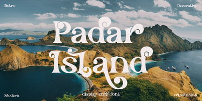 Padar Island - Display Serif Font by erlosDESIGN Padar Island is a stylish and fun display font. Use it for any design project that require a charming appearance. Made with many alternative characters and ligatures. It is perfect for book covers, social media post, logos, business card, quotes and so much more. This font is PUA encoded which means you can access all of the amazing glyphs and ligatures with ease!
 - Gweneth embassy by Stringlabs Creative Studio,
$25.00 Gweneth celebrates all things comics. This gorgeous cartoonish display font will look simply magical in a wide range of design projects. It’s great for comics, cartoons, birthday invitations, and any creative project that needs a fun look! Gweneth is a flowing and elegant handwritten font, created with the help of a brush pen. Get inspired by its unique and beautiful style and add it to your favorite designs!
 - Laugh Together by Invasi Studio,
$19.00 Laugh Together is a dynamic display font inspired by urban streetwear culture and the vibrant world of brush paint tagging graffiti. With its bold and expressive style, Laugh Together makes a fun and bold statement in any design. This all-caps font features a complete set of A-Z alternates, allowing you to experiment and create unique combinations. Additionally, Laugh Together supports multilingual characters, making it versatile for various language requirements.
 - Cross Stitch Carefree by Gerald Gallo,
$20.00 Cross Stitch Carefree is based on upper case characters 10 stitches tall and contains the characters A-Z and period. Several characters extend above the capital line or below the base line.
 - Morro by Great Scott,
$16.00 Morro is based on simple geometric shapes – circles, triangles and rectangles. Imagine cutting circles, triangels and rectangles from paper and arranging them into letters where the outer edges form a filled figure. Arranging figures like this to form letters is nothing unique. You can find several beautiful examples of alphabets that inspired the creation of Morro. Everywhere from a 1936 booklet by Draughtsman called ”Modern lettering for all branches of commercial arts” to obvious examples is from the paragon of the design industry - Milton Glaser - with his typeface Baby Teeth. What sets Morro apart from other digitized versions of Glasers' ”Baby teeth”, or other similar designed fonts, is that Morro is expanded into lower case and also supports Basic latin, Western European, Central European, south Eastern European and Pinyin. There are also stylistic alternatives to some of the glyphs. Morro Regular works like a stencil and is accompanied by a block shadow style and an outline. The Morro family of fonts are layered and can be superimposed on each other to create several types of text effects.
 - Minigap by Gravitype,
$19.90 Minigap is a geometric sans serif family that has a minimal height difference between upper and lower case. In other words for those who are into typography, it has a very high x-height. The choice was made to finally have a typeface that could appear very neat, reducing ascending and descending parts of the glyphs (b, d, g, j, l, ...) that could interfere with the lines above and below. All of that without going to extremes in a unicase style but also without renouncing to a great legibility. This aesthetic, in fact, translates into a pleasant visual effect that creates well-defined lines and enhances the layout, looking excellent also on small screens. The pointed corners of capital letters and numbers have been kept even in the heavier styles, to give consistency to the family. Stylistic alternates are included: “i” and “j” can be set to the x-height, to have a more common aesthetic; by default they are set in the lower version, fitting better the purpose of this typeface. the two-story “a” is also available, to give you one more customizable option and extend the range of use. Minigap is available in 14 styles (7 uprights + matching italics), has OpenType features and supports multiple languages. The Regular weight is offered for free, try it!
 - Mellow Sans by ParaType,
$30.00 Mellow Sans is a soft and friendly rounded sans serif. Its bold styles are great for packages of something tasty, while light and regular ones work well in rather long texts, from a children's book to a reading app, or a family restaurant menu. The typeface was created by Natalya Vasilyeva, an expert in designing text and calligraphic typefaces. Mellow Sans’s forms are based on humanist sans serifs. The nobility and liveliness of Renaissance calligraphy reads beneath its curves and makes the typeface even friendlier, while helping the eye to move along the line. The typeface supports extended Latin, extended Cyrillic (all major languages of the Russia’s peoples) and Greek. It also has old style figures, arrows and non-alphabetic signs. With Mellow Sans as a heading typeface (in that case bold styles fit the best), calm open sans serifs, f.e. Vast or Fact, are its optimal text companions on the screen. Calm serifs, f. e., Octava, Scientia or Aelita, will work as its companions on paper. And to create expressive typography, for example, in packaging, you can match Mellow Sans with quirky rounded serifs — Cooper or Epice.
 - Lakony by Khoir,
$9.00 Lakony Regular, italic and display serif lacony are combined into one into a modern serif, lacony pays attention to high readability and a soft font model so that readers feel comfortable. lakony font also has unique alternates, making it easier for you to design as unique a text as possible. However, this does not leave behind the function of the font itself, namely readability, so this font is suitable for titles, posters, branding, invitation cards and much more. Lakony Regular Lakony Italic Lakony Display Uppercase Lowercase 75+ Language Alternates Font
 - Hefeweizen by David Thometz Design,
$24.95 As seen on Typophile.com, DTD Hefeweizen is a contemporary take on the textura blackletter style. Comprised of straight lines and angles sloped at ratios of 1/2 or 2/1, Hefeweizen is a highly geometric design with extensive alternates and ligatures.
 - Seriatim by David Thometz Design,
$24.95 As seen on Typophile.com, DTD Seriatim is a new and innovative take on the geometric sans-serif, with a wide variety of alternate characters and elegant ornaments to make it a highly versatile type for display or more discreet text use.
 - Bfrika by Holland Fonts,
$30.00Bfrika is an 'Africa inspired' typeface and a contribution for the typographic issue 'National Typographica' of I-Juici Magazine, in South Africa. This geometrical decorative design represents bold simplicity, directness and rythm. The name evolved from text for the spread in the magazine. The B replaces the A. Africa be free. Bfrika. The concept behind Bfrika is to generate an unpredictable visual rhythm in an attractive decorative presentation. Filling up the white space around the letters accentuates form over function, thus creating an interference of visual impressions with its legibility. This visual rhythm is amplified by its redundancy in a text, only pausing at a break or a word space. Based on the concept of separate printing forms in letterpress, Bfrika Two Tone and Bfribat Two Tone separate the letter from the outside form in two fonts. Placing two text frames exactly on top of each other and assigning each part of these font to a frame in a different color, offers a quick way to add color. Originally Bfrika was designed for I-Jusi magazine #17, National Typografika, South Afrika 2001. Bfribat and both two tone fonts were created for Building Letters, a fund raiser for orphanages in Kenya and Uganda (www.buildingletters.org) and are also available for Mac and PC at www.hollandfonts.com and will be distributed in 2004 through associated foundries. - PGF Orqquidea by PeGGO Fonts,
$29.00 For usage details feel free to download the technical Specimen document https://peggofonts.com/pdf/PGF-Orqquidea-Manuscrita_Specimen.pdf PGF Orqquidea Manuscrita is a font mainly based on the calligraphy hand- made by the Chilean designer, calligra- pher and teacher Marcela Aguilera (Lanascribe) complemented by the il- lustration and type design work made by Pedro González (Peggo FontsTM). As part of the creation of the “Orqquidea family”, which contains a Sans, a Script, complemented with an ornaments and decorations sets, in addition to a huge set of typographic resources de- signed to enrichyour layouts in the cre- ation of graphic pieces such as labels , packaging, editorial work, retail graph- ics and branding design.
 - Maree by Ashton,
$5.00 If you want to write something sincere and genuine but not too formal then this is the font for you. It is based on real handwriting, not some artificial calligraphy made to be either too haphazard or spiky or have loads of elegant flourishes but an ordinary person's writing, and designed to look as natural and as close to the original lettering as possible. Like any person's writing it is individual and distinctive, but so easy going on the eye those differences sit comfortably with you. It is friendly and open with easy to read glyphs both as lowercase and uppercase. The letters are relatively wide with clearly shaped distinct outlines. This font may be ideal for projects where you expect a wide readership with different reading abilities from young to old. When you are using this font a slightly bigger point size usually gives a better result so for a standard letter or similar you should size up to 15 points or more. Maree has been individually crafted to the smallest detail. To create a realistic handwriting font that looks relatively simple but works in a wide variety of languages requires a complexity and attention to detail most fonts will never require. This font in any ordinary business environment would never have been made, the effort required to make it too great, the length of time too long. There have been no shortcuts in this font, no automatic scanning or tracing, no automatic generation, no class kerning. Not only is each glyph individual but the width of letters, the height, the accents and the positions of the accents are all different. Even the line weight of the letters is designed to have natural variation but yet similar enough that the font appears as though it were written effortlessly in the same pen. And in order to keep the spacing consistent even though the letters have different widths, heights, lengths of descenders and so on, there are a vast number of kerning pairs, letter to letter, number to number, letter to number... All kerning has been individually assessed with an eye to proportionality taking in character shape, size and weight. For instance if you write a telephone number the numbers all sit close together but if you write a number before a letter such as in a UK post code or before a unit of measurement an extra little bit of space has been added which makes the number more distinct and therefore readable. That space is so natural to the eye that you don’t even know it is there. However even in the spacing allowance has been made for the fact it can’t be too perfect because when you write by hand the spacing is inconsistent. There have to be some letters which are too close or far apart otherwise the font would look artificial. For similar reasons if you are going to print out this font for a letter, etc, check the print version before you make any letter spacing changes because with the zoom functions in modern applications that uneven spacing and lettering can seem more pronounced than it actually is. When this font is printed out you will find it is surprisingly neat. This font is what it is, simple clear handwriting. You will not go wow. But if you want something unique and different and looks good on the page you won’t be disappointed. This font is not a work of art but it is a work of love. This font has a soul. How many fonts can you say that about?
 - Argo Nova by Eliezer Grawe,
$- In Greek mythology, Argo was the ship on which Jason and the Argonauts sailed from Iolcos to Colchis to retrieve the Golden Fleece. The Argo Nova font is an adventure though geometric sans universe with a touch of humanistic feel, bringing a different look with curved vertical strokes and high contrast on thicker weights. Designed with OpenType features, it includes extended Latin support, fractions, tabular and old-style figures, ligatures and more. With no excess in mind, it came in 10 styles (5 uprights and is matching italics) and it is a font family ideal for text, branding, signage, editorial, print and web design creations. 5 weights: Thin, Light, Regular, Bold and Black Matching italics Lining and old-style figures with proportional and tabular spacing Ligatures on “f” Alternate characters for a, æ, g and ß Fractions Ordinals Extended language support, designed following the Underware Latin Plus character set, with 534 glyphs, supporting 219 Latin based languages (see https://underware.nl/latin_plus/languages/). * Some features require an application with OpenType support.
 - Coffee Morning by me55enjah,
$10.00 Handmade sans serif with rugged and imperfect edges shapes. Coffee Morning with Milk has rounded edges bring a vintage look and alternate character make it more stylish. And Coffee Morning Sans has rough stroke, imperfect shapes, make this typeface has its own taste, like coffee in the morning, raw and strong. * COFFEE MORNING WITH MILK features: All Caps, small caps, numeral, punctuation, alternate characters & ligatures. * COFFEE MORNING SANS features: All Caps, numeral, and punctuation. Have a wonderful day with a cup of coffee in the morning :)
 - Abril by TypeTogether,
$39.00 Conceived specifically for intensive editorial use, whether it is in newspapers, magazines or digital media, Abril is a font family of two worlds. The titling weights, based on a contemporary revamp of classic Didone styles, display both neutrality and strong presence on the page, attracting the reader’s attention with measured tension in its curves, good color and high contrast. It also features typographic niceties such as ornaments, borders, special dingbats and alternate letters and numbers that propose a broad palette of tools to the designer. The text weights are more closely inspired by both, 19th century slab serifs and scotch roman types. They maintain consistency with the headline styles, and at first glance may appear to have the same shapes only with lower contrast. However, in reality the letter forms of Abril Text were engineered from scratch to achieve a color, texture and overall width that allow using the font comfortably in the most challenging environments for continuous reading, such as newspapers. This also makes it a great font family for pocketbooks and magazines. Abril competes, in terms of economy of space, head to head with some newspaper classics such as Utopia or Nimrod, but featuring a more contemporary look and feel; and unlike them, includes a full set of small caps with numbers and punctuation. The four main text weights of Abril Text were also manually hinted which grants the possibility of a smooth transition from printed media to web platform. Abril consists of 8 text styles and 12 display styles, all of them containing the standard TypeTogether character set that supports over 50 languages including those from Central and Northern Europe.
 - Relix by Intellecta Design,
$11.25 Relix, emulating the old videogame's screen fonts, that's a good font to non-formam small texts, names, logotypes, titles, headers, topics etc., developed from the original Reliant's Intellecta typeface. Big sizes of this font can be used for texts on posters, t-shirts and other surfaces.
 - Show Card Brush JNL by Jeff Levine,
$29.00 A movie poster for the 1952 Dean Martin & Jerry Lewis comedy “Sailor Beware” had the text rendered in a casual style of brush lettering similar to that found on store show cards. This inspired Show Card Brush JNL, which is available in both regular and oblique versions.
