10,000 search results
(0.083 seconds)
- Sunbursts JNL by Jeff Levine,
$29.00 Sunbursts JNL is a simple little collection of sun dingbats for all types of creative embellishment. Make sure to use them with the recommended SPF-rated sunblock!
 - Maximum by Device,
$39.00 Bold, punchy and attention-grabbing, Maximum is an extended sans serif with obround curves that fills the space on the page due to its tight spacing and short ascenders and descenders. Recommended for posters, packaging, headlines and branding.
 - LDJ Tickled Tourist by Illustration Ink,
$3.00This font is a lot of fun and will definitely tickle your funny bone! - Cream Shoes by Aisyah,
$12.00 Cream Shoes Handwritten is a charming and playful script font that mimics the appearance of casual handwriting. This font features smooth and rounded strokes with a consistent weight, giving it a relaxed and easygoing feel. The letters are slightly slanted to the right, adding a personal touch and a sense of movement. Cream Shoes Handwritten is perfect for creating fun and friendly designs such as greeting cards, social media posts, blog headers, and more. This font includes uppercase and lowercase letters, numerals, and punctuation.
 - Trasandina by TipoType,
$24.00 Trasandina is a very unique font-family: a modern, versatile, workhorse typeface with a special personality, given by the mix of humanist and geometric models, remaining far from both extremes. This typeface has 9 styles plus their matching italics, it has an incredible wide range of weights, from very thin to an ultra thick stem. This was made following the Luc(as) de Groot’s Interpolation Theory. Trasandina’s versatility also resides in the +800 characters that each weight includes, having several open type features and language support for more than 200 languages. This font has been specially designed for web (using hinting instructions), making it work in small and large sizes on different types of screen resolutions. Trasandina’s most interesting feature is its flexibility: On one hand, is easy to read thanks to its humanistic letterforms which allow this typeface to be legible in small sizes while remaining neutral (specially around its middle weights). And, at the same time, it’s perfect for logos and posters that need a lot more personality, this is mainly due to its more geometric nature in light and bold weights. Thank you for your support! It’s people like you that allow our team to keep enjoying creating new fonts. That’s why we’d like to hear from you! Send us your work using our fonts: info@tipotype.com, and you'll have a special 50% OFF on Tipotype at Myfonts
 - Buckley by Laura Worthington,
$23.00 Buckley is a condensed, hand-lettered font based on characters created with my favorite vintage fountain pen: a Waterman Ideal #2. Its textured strokes reveal its ink-on-paper origins, while randomized contextual alternates cycle through letterforms as you type, for a convincing and handwritten look. Buckley’s friendly, happy, and casual appearance helps make packaging, greetings, and storybooks charming and approachable. See what’s included! http://bit.ly/2c98p0L This font has been specially coded for access of all the swashes, alternates and ornaments without the need for professional design software! Info and instructions here: http://lauraworthingtontype.com/faqs/
 - Grotica by Runsell Type,
$24.99 Grotica is a versatile geometric sans serif contains 7 weights from Thin to Bold. IIt's inspired by the beautiful logotype on old labels and by exploring the Retroica font we've created in 2020. This font is suitable for movies, TV, advertising, packaging, logos, posters, music, branding, posters and so on with a modern design style. With over 600 glyphs per style, Grotica supports around 150 languages in Latin and Cyrillic script. Grotica OpenType Features including alternate glyphs, fractions, contextual alternates, oldstyle and lining (proportional and tabular) numerals, numerators/denominators, superiors/inferiors, and a variety of symbols.
 - Argonautica by URW Type Foundry,
$39.99 Argonautica is based on a relict of the future that was left on earth by time-travelling extra-terrestrials. In 1947, an UFO crashed in the New Mexico desert. There were unknown glyphs found on the spaceship which couldn�t be deciphered to date. Based on one of the unknown glyphs, Gabriele Lindemann developed a complete alphabet readable for human beings. Argonautica is particularly suited for colored typography and can be read much better with growing distance.
 - Aurore Grotesque by Device,
$39.00 Aurore Grotesque is an elegant, robust geometric sans for both text and headline. It has a classic European heritage that references the posters of Cassandre and the modern sans of Paul Renner or Karl Gustav Möhring, but is entirely new and does not slavishly follow any historical reference. The low lower-case x-height gives it character and definition in running text, while the capitals-only Titling variant lends weight and punch to headlines. The full range of weights, each with matching italics, make it perfect for brochures, magazines, advertising, web, app and corporate uses. Includes lining, old-style and tabular numerals, arrows, stylised geometric alternates, and a full international character set.
 - Paper Tiger by Fenotype,
$35.00 Paper Tiger is a splendid display font package by Fenotype. It’s a Victorian Script accompanied by a condensed flared serif in two weights and a chunky sans serif. Together they make a powerful set for creating logotypes, posters, packaging design, headlines or any display use online or offline. Paper Tiger fonts are available as normal clean versions, as well as “Print” versions that have rugged outlines and eroded texture inside. Paper Tiger suits great for book covers, restaurant menus, food products, craft ale labels, organic teas, sport teams logos and any such. Paper Tiger Script is equipped with Contextual Alternates and Standard Ligatures that keep the connections smooth. Both features are automatically on. In addition it has Swash, Stylistic and Titling Alternates for some extra flair.
 - Pukupuku by yamayama,
$20.00 Pukupuku is a cute round font. This font is designed based on the shape of clouds and beans, which looks somewhat like handwritten letters.
 - Laughin by GroupType,
$19.00 Designed by Andrew Smith this bouncy and playful headline font does not take itself seriously. Perfect for headlines, children's books or on the web.
 - Subytro by Subtitude,
$39.00 Subytro! Use this font for sweet bold titles. It adds personality and an handmade feeling. Old Style font based on posters of the fifties.
 - MultiType Pixel by Cyanotype,
$- MultiType Pixel, an all caps typeface focused in display purposes. 27 styles to be mixed with retro gaming and computing vibes in a fresh way. This is the first release of an upcoming multiverse of mixable fonts. The whole family of typefaces has been designed to work at big sizes and display purposes such as branding, headlines, thumbnails, posters and animations. You can swap between the three additional alternate sets through all the styles to add diversity to your composition, even in Cyrillic. This version features small caps in a independent font file. MultiType Pixel is inspired by bitmap fonts, fonts from video games, arcades and variable fonts. Have fun mixing all the styles in your projects.
 - 3 Prong Tree - Unknown license

- Jakosta by Twinletter,
$15.00 We introduce Jakosta, a one-of-a-kind Japanese-themed display font. This font was created by paying close attention to each letter shape to make it as natural as possible, similar to a Japanese font, while still prioritizing letterforms that are easy to read and understand by the audience so that all of your projects will become projects that are easy to remember and understand by anyone from anywhere in the world. anywhere Logotypes, food banners, branding, brochure, posters, movie titles, book titles, quotes, and more may all benefit from this font. Of course, using this font in your various design projects will make them excellent and outstanding; many viewers are drawn to the striking and unusual graphic display. Start utilizing this typeface in your projects to make them stand out.
 - Kickshaw by PizzaDude.dk,
$17.00Kickshaw is definately a hardcore tagfont. Its rough edges and hard lines makes it perfect for imitating writing on the walls! Switch between caps and lowercase to keep the original bad look! - 1715 Jonathan Swift by GLC,
$42.00 The famous Irish poet and novelist Jonathan Swift (Dublin 1667-1745) has a large personal library of which he noticed carefully the book list by himself. We have used a facsimile from this catalogue to reconstruct this present font, as one example of the poet’s personal hands but also as a typical example of the British quill pen handwriting from about mid 1600’s to the beginning of 1700’s . It is a “Pro” font containing Western (including Celtic) and Northern European, Icelandic, Baltic, Eastern, Central European and Turquish diacritics. The numerous alternates and ligatures allow to made the font looking as closely as possible to the real hand. Using an OTF software, the features allow to vary automatically almost each character of a word without anything to do but to select contextual alternates and standard ligatures and/or stylistic alternates options.
 - Smooth Sailing JNL by Jeff Levine,
$29.00 Songs of the early 1900s were anything but the status quo in topic or style. Excessively long titles, novelty tunes and "foreign themes" permeated the piles of sheet music in the local music shops. 1916's "Oh How She Could Yacki Hacki Wicki Wacki Woo (That's Love in Honolu)" covered a number of these quirks within one publication. This Hawaiian-tinged song evoked the mysterious ways of the South Seas islands, despite the abridging of Honolulu to "Honolu". Nonetheless, the hand lettered title of this particular piece of sheet music featured an Art Nouveau-influenced bold block letter with rounded corners. It's now available digitally as Smooth Sailing JNL, in both regular and oblique versions.
 - Synthica by Volcano Type,
$35.00 Synthica is the advanced version of a geometrically constructed typeface – designed for a thesis project in summer 2010 in Pforzheim. In the context of electronic music and the profound analysis of its parameters, this typeface is primarly based on a strict modular grid. Additionally, the ascender, descender and the x height had slightly been increased in order to even out a visual difference in size between the glyphs. The name „Synthica“ dervives from a basic principle in electronic sound synthesis. Sinus, triangle and square are some of the basic waveforms in the synthesizers’ oscillator section and were thus used as geometric modules for the grid. The modularity and geometry also derive from different structures of electronic music. The strong emphasis on diagonal lines creates a rhythmic typeface that connotates electronic music patterns with highly recognisable glyphs. The contrast between digital and analog is another basic idea of this typeface: while Synthica Outline has a more synthetic and fragile character, the filled version Synthica Black serves as the analog counterpart.
 - Little Knight by Almarkha Type,
$22.00 Little Knight is a Fun Slab font that will make your designs look unique and fun. It’s perfect for labels, quotes, posters, DIY projects, branding, packaging, greeting cards, websites, photos, photography overlays, signs, window art, scrapbooking, tags and so much more!
 - Sweet Purple by Almarkha Type,
$29.00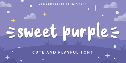 Sweet Purple – fun font that will make your design looks modern, unique and fun. Perfect for labels, quotes, posters, DIY projects, branding, packaging, greeting cards, websites, photos, photography, signs, window art, scrap booking, tags and so much more! Thank You
 - ITC Bailey Sans by ITC,
$39.00ITC Bailey Sans is the first typeface family created by Kevin Bailey, a graphic designer in Dallas, Texas. He was once looking for an understated block serif for a design project and could find nothing suitable. Bailey began working on his own serif face but then found that the basics of his new design worked well as a sans serif and continued on that track. ITC Bailey Sans font is available in four weights: book, book italic, bold and bold italic and even has a companion serif display font, ITC Baily Quad Bold. - FF DIN Round by FontFont,
$93.99 This welcome addition to FontFont’s most popular family brings a softness to FF DIN’s simplicity and industrial sterility. FF DIN Round is more than a “search-and-replace” rounded version of its predecessor. Albert-Jan Pool and his team redrew each letterform to maintain the structure of the original. This ensures FF DIN and FF DIN Round will work well together in logos, slogans, price tags, etc. as compatible parts of advertising campaigns and corporate identities. FF DIN Round is not only a good companion to FF DIN, its smooth and friendly curves make it work on its own for branding strategies for family cars, bikes, household appliances, sportswear, shoes, or medical products. It’s also very legible on screen. This FontFont is a member of the FF DIN super family, which also includes FF DIN.
 - St Croce Pro by Storm Type Foundry,
$29.00 Our eye is able to join missing parts of worn letters back into undisturbed shapes. We tend to see things better than they really are. Thanks to this ability we ignore faults of those close to us as we can’t accept the fact that every once in a while we convene with an impaired entity. Typography is merely a man’s invention, hence imperfection and transience, albeit overlooked, are its key features. This typeface is based on worn-out letterings on tombstones in the St. Croce basilica in Florence. For hundreds of years, microscopic particles of marble are being taken away on the soles of visitors: the embossed figures become fossilised white clouds, fragments of inscriptions are nearing the limits of legibility. First missing are thin joins and serifs, then the main strokes finally slowly diminish into nothingness over time. Unlike an archaeologist, for whom even completely featureless stele is valuable, the typographer must capture the proper moment of wear, when the type is not too “new” but also not too much decimated. Such typeface is usable for catalogue jackets, invitations and posters. Calligraphy is a natural human trait. To write is to create characters of reasonable beauty and content, according to the nature of the writer. A natural characteristic of architecture is to create an aesthetic message very similar to the alphabet. A doric column, the gabled roof, the circle of the well plan: these are the basic shapes from which all text typeface is derived.
 - Glance Slab by Identity Letters,
$29.00 Dynamic and sportive. A well-balanced experiment for sparkling headlines. Glance Slab is an experimental design that plays on the tension between connection and detachment. In this typeface, serifs may be detached and some strokes may not connect to their stems. This creates a dynamic impression of balance and movement. The elegance of an ice skater and the determination of a quarterback: Glance Sans has it all. Where a curve meets a stem and where serifs seem to “hover” near their respective letters, the nonjoining elements create an impression similar to a stencil typeface. But here, the function of the gaps differs from strictly stencil designs: while the gaps provide a “sparkling” effect in Glance Slab that’s clearly visible in large sizes, they take on the role of ink traps when set smaller, making for surprisingly legible body copy. With its strong visual character, this font family is quickly recognizable, making it perfectly suitable for branding and any large-scale application, such as posters, billboards, and event signage. Glance Slab consists of seven weights from Thin to Black. Each style has a character set of about 570 glyphs, which includes circled numbers and arrows (positive and negative versions), ligatures, extended language support, and many other features.
 - Areplos by Storm Type Foundry,
$53.00To design a text typeface "at the top with, at the bottom without" serifs was an idea which crossed my mind at the end of the sixties. I started from the fact that what one reads in the Latin alphabet is mainly the upper half of the letters, where good distinguishableness of the individual signs, and therefore, also good legibility, is aided by serifs. The first tests of the design, by which I checked up whether the basic principle could be used also for the then current technology of setting - for double-sign matrices -, were carried out in 1970. During the first half of the seventies I created first the basic design, then also the slanted Roman and the medium types. These drawings were not very successful. My greatest concern during this initial phase was the upper case A. I had to design it in such a way that the basic principle should be adhered to and the new alphabet, at the same time, should not look too complicated. The necessary prerequisite for a design of a new alphabet for double-sign matrices, i.e. to draw each letter of all the three fonts to the same width, did not agree with this typeface. What came to the greatest harm were the two styles used for emphasis: the italics even more than the medium type. That is why I fundamentally remodelled the basic design in 1980. In the course of this work I tried to forget about the previous technological limitations and to respect only the requirements then placed on typefaces intended for photosetting. As a matter of fact, this was not very difficult; this typeface was from the very beginning conceived in such a way as to have a large x-height of lower-case letters and upper serifs that could be joined without any problems in condensed setting. I gave much more thought to the proportional relations of the individual letters, the continuity of their outer and inner silhouettes, than to the requirements of their production. The greatest number of problems arose in the colour balancing of the individual signs, as it was necessary to achieve that the upper half of each letter should have a visual counterbalance in its lower, simpler half. Specifically, this meant to find the correct shape and degree of thickening of the lower parts of the letters. These had to counterbalance the upper parts of the letters emphasized by serifs, yet they should not look too romantic or decorative, for otherwise the typeface might lose its sober character. Also the shape, length and thickness of the upper serifs had to be resolved differently than in the previous design. In the seventies and at the beginning of the eighties a typeface conceived in this way, let alone one intended for setting of common texts in magazines and books, was to all intents and purposes an experiment with an uncertain end. At this time, before typographic postmodernism, it was not the custom to abandon in such typefaces the clear-cut formal categories, let alone to attempt to combine the serif and sans serif principles in a single design. I had already designed the basic, starting, alphabets of lower case and upper case letters with the intention to derive further styles from them, differing in colour and proportions. These fonts were not to serve merely for emphasis in the context of the basic design, but were to function, especially the bold versions, also as independent display alphabets. At this stage of my work it was, for a change, the upper case L that presented the greatest problem. Its lower left part had to counterbalance the symmetrical two-sided serif in the upper half of the letter. The ITC Company submitted this design to text tests, which, in their view, were successful. The director of this company Aaron Burns then invited me to add further styles, in order to create an entire, extensive typeface family. At that time, without the possibility to use a computer and given my other considerable workload, this was a task I could not manage. I tried to come back to this, by then already very large project, several times, but every time some other, at the moment very urgent, work diverted me from it. At the beginning of the nineties several alphabets appeared which were based on the same principle. It seemed to me that to continue working on my semi-finished designs was pointless. They were, therefore, abandoned until the spring of 2005, when František Štorm digitalized the basic design. František gave the typeface the working title Areplos and this name stuck. Then he made me add small capitals and the entire bold type, inducing me at the same time to consider what to do with the italics in order that they might be at least a little italic in character, and not merely slanted Roman alphabets, as was my original intention. In the course of the subsequent summer holidays, when the weather was bad, we met in his little cottage in South Bohemia, between two ponds, and resuscitated this more than twenty-five-years-old typeface. It was like this: We were drinking good tea, František worked on the computer, added accents and some remaining signs, inclined and interpolated, while I was looking over his shoulder. There is hardly any typeface that originated in a more harmonious setting. Solpera, summer 2005 I first encountered this typeface at the exhibition of Contemporary Czech Type Design in 1982. It was there, in the Portheim Summer Palace in Prague, that I, at the age of sixteen, decided to become a typographer. Having no knowledge about the technologies, the rules of construction of an alphabet or about cultural connections, I perceived Jan Solpera's typeface as the acme of excellence. Now, many years after, replete with experience of revitalization of typefaces of both living and deceased Czech type designers, I am able to compare their differing approaches. Jan Solpera put up a fight against the digital technology and exerted creative pressure to counteract my rather loose approach. Jan prepared dozens of fresh pencil drawings on thin sketching paper in which he elaborated in detail all the style-creating elements of the alphabet. I can say with full responsibility that I have never worked on anything as meticulous as the design of the Areplos typeface. I did not invent this name; it is the name of Jan Solpera's miniature publishing house, in which he issued for example an enchanting series of memoirs of a certain shopkeeper of Jindrichuv Hradec. The idea that the publishing house and the typeface might have the same name crossed my mind instinctively as a symbol of the original designation of Areplos - to serve for text setting. What you can see here originated in Trebon and in a cottage outside the village of Domanín - I even wanted to rename my firm to The Trebon Type Foundry. When mists enfold the pond and gloom pervades one's soul, the so-called typographic weather sets in - the time to sit, peer at the monitor and click the mouse, as also our students who were present would attest. Areplos is reminiscent of the essential inspirational period of a whole generation of Czech type designers - of the seventies and eighties, which were, however, at the same time the incubation period of my generation. I believe that this typeface will be received favourably, for it represents the better aspect of the eighties. Today, at the time when the infection by ITC typefaces has not been quite cured yet, it does absolutely no harm to remind ourselves of the high quality and timeless typefaces designed then in this country.In technical terms, this family consists of two times four OpenType designs, with five types of figures, ligatures and small capitals as well as an extensive assortment of both eastern and western diacritics. I can see as a basic text typeface of smaller periodicals and informative job-prints, a typeface usable for posters and programmes of various events, but also for corporate identity. Štorm, summer 2005 - Monday Routines by Walkeren,
$21.00 Say hello to Monday! The day when your spirit is reborn. Monday Routines Font comes to complement your warm spirit to start all your fun activities. Monday Routines Font is a simple and bold signature font style designed with decisive and strong lines, provides an authoritative impression. You can use Monday Routines Font for any purposes such as branding, signatures, product packaging, titles of books or novels, or just on social media posts. Monday Routines Font includes some alternates, ligatures, and a complete set of uppercase and lowercase letters, as well as multi-language support, numbers, punctuation and comes with various swashes. Thanks so much for looking and please let me know if you have any questions. Just contact us
 - Breite Kanzlei by URW Type Foundry,
$39.99 Ralph M. Unger, known for his preference for blackletter designs, brought this beautiful blackletter variant back to life. Based on artwork from old catalogues, he redesigned, digitally remastered and completed the character set for this typeface. Breite Kanzlei cannot be avoided by blackletter lovers!
 - Satin by Lizzy Hartley Design,
$32.00 This simple design keeps its elegance through slight curves like satin draped over skin. Satin is tall and sleek. The curves are not completely symmetrical. The curves are perfectly balanced with long curves on the bottom half and shorter more dramatic curves in the ascenders.
 - Cool Cat by Fox7,
$10.00 Cool Cat is a fun and comfortable handwritten font that is easy to read. You can use it for various projects, such as blog posts, logos, branding, ads, invitations, greeting cards, planners, photo albums, decorations, and much more. Add it to any of your designs, and enjoy the results!
 - Caesar Dressing Pro by Open Window,
$19.95 Caesar Dressing is a 'Markers' take on a Greek alphabet. Open Window fonts gravitate towards more experimental or spontaneous renderings and this one doesn't look out of place next to the most experimental of those. It also maintains the geometric balance of a classic Greek-font quite effectively. Designed by Dathan Boardman of Open Window.
 - Cal Beneventan Minuscule by Posterizer KG,
$16.00 Calligrapher Beneventan Minuscule Font, is one of the calligraphic group of fonts called “21 alphabets for Calligraphers“. All graphemes are taken from calligraphic pages written on traditional Beneventan Minuscule calligraphic stile. This font is ideal for calligraphic sketches or for imitation of ancient manuscripts. Font contains all the Latin glyphs and plenty of ligatures.
 - Denedo by Andinistas,
$19.95Just like the M.C. Escher impossible figures and optical illusions, "Denedo" is a font that is impossible to construct in three dimensions because it only exists as a drawing. This font is based on the "0, 1, 2, 3, 4, 5, 6, 7, 8, 9" characters of one of the alphabets published by Nedo Mion Ferrario in the "Letromaquia" exhibition that was shown in Caracas, Venezuela in the 70's. The reason why I chose to restore and complete this font is that unique and exceptional personality that each word acquires when it is written with this alphabet. Denedo is a typographic family in three styles: Denedo 1A, 1B and 1C. When mixing them in big sizes you will emphasize the balance and incongruity of its shapes, providing originality and a unique identity to every word. All of the 3 variations include a complete character set with the lower and upper case letters, numbers, accents, diacritic signs, punctuation and monetary signs. All the fonts included in this family are available in Open Type format and are perfectly compatible with Mac and PC. I want to express my sincere gratitude to all my friends at Typophile who supported and motivated me during the final stages in the development of this font. - Brahma by Tall Chai,
$15.00 Brahma V2 is here. The new version has been three years in the making. It has multiple new updates and improvements based on user feedback. The focus for this version has been improved readability while maintaining the unique, modern identity of Brahma type family that has received so much love since V1 was launched in Dec 2020. Brahma is a modern geometric sans-serif font family with weights ranging from Thin (100) to Black (900). Features: Available in 9 weights Over 550 glyphs supporting extended Latin Ideal for display texts: Titles, Logos and Headlines etc. Perfect for branding and rebranding Supports OpenTypes features like Ligatures and Stylistic Alternates Tabular Numerals included Symbols for 10 major currencies including Bitcoin provided in all weights Description: The name comes from Brahmā who is known as the god of creation. And manifesting the same spirit, the Brahma font family focuses on modern creativity. Every character effortlessly integrates with current design standards and interfaces. The fonts are professional yet have a hint of informal personality in them. This makes Brahma perfect for use in modern apps and websites. Brahma is built for the designing and marketing squads. It has a trendy geometric characteristic which is ideal for any branding and rebranding. Brahma has lot of OpenType features (like ligatures and tabular numerals) and the Extended Latin character set supports over a hundred languages. Start Creating!
 - Hernandez Bros by Latinotype,
$29.00 Hernández Bros, is a typeface designed by Daniel and Eli Hernández. Born in the year 2021, in the midst of the Covid pandemic, from a collaborative spirit where everything called them to work together as family, in order to obtain better results in such trying times. The Hernández siblings, started a ping pong of drawings based on Bulfinch found in the 1912 ATF catalogue. From this exercise, Hernández Bros was designed, a modern Sans Serif, with 8 weights ranging from Extralight to Black. This is an elegant font, with beautiful and harmonious contrasts, which makes it ideal for titles, brands, editorial design, magazines among others.
 - Ribbonetter by Ingrimayne Type,
$5.00 Ribbonetter is an experimental font playing with the calt or contextual alternatives feature of OpenType. This feature alternates letters in ovals with letters in hourglass shapes to create a banner. The letters in the ovals will be determined by the start of the line, whether it starts by typing an upper-case or lower-case letter. Using layers, background color can be added (dot accent and ring characters) or the outline color can be changed (sterling and yen characters). The font may also be useful with the contextual alternatives turned off. Different amounts of character spacing may give interesting results. With default character spacing, ovals with will overlap. If you are typing numbers and want the start to be an oval, switch on OpenType style set 2. In at least one word processor (Pages 5 for Macintosh) the carriage return adds the shape assigned to the space character. If you encounter this, try adding a nonbreaking space (option-space on the Macintosh) before the carriage return.
 - Linotype Feltpen by Linotype,
$29.99Linotype Feltpen is part of the Take Type Library, chosen from the contestants of Linotype’s International Digital Type Design Contests of 1994 and 1997. This fun font was designed by the Swedish artist Lutz Baar with clear, light forms. The spontaneous, even letters seem to have been written with the felt pen from which the font takes its name. Linotype Feltpen is available in two weights, regular and medium, both suitable for short and middle length texts and medium for headlines as well. - HS Alhoson by Hiba Studio,
$50.00 HS Alhoson is based on the font HS Alnasma font that is an Arabic display typeface, under “titles” category. It is useful for book titles, creative designs and modern logos. Also, it is used when a contemporary and simple look is desired that can fit with the characteristics of Latin fonts where horizontal parts are thinner than vertical ones for use in technical and engineering company. The font is based on some modern lines of Kufi calligraphy along with some derived ideas of Latin fonts, maintaining the beauty of the Arabic font and its fixed rates. This font supports Arabic, Persian, Urdu, Kurdish and Pashto and also includes Basic Latin and consisting of two weights (regular and bold) which can add to the library of Arabic and Latin fonts contemporary models that meet with the purposes of various designs for all tastes.
 - Taku by Thinkdust,
$10.00 Taku comes in two styles, Taku regular and Taku Solid. As one of the most creative faces to date, this is a beautiful piece aimed at a whole range of markets for print and digital work. Super creative, extremely eye catching, and almost obsessively accurate. Taku is a typographers dream, over 300 hours of work on aesthetics and technical details, so you can expect the most high quality typeface around.
