10,000 search results
(0.083 seconds)
- Chanson De Paris JNL by Jeff Levine,
$29.00 A couple of pieces of sheet music from France [circa 1925] offered the inspiration for Chanson De Paris JNL (Song of Paris), which is available in both regular and oblique versions. This hand lettered Art Nouveau style features a unique take on thick-and-thin lettering which foreshadows the Art Deco typefaces to come during the 1930s.
 - Art Magazine JNL by Jeff Levine,
$29.00 A 1920 art magazine from Great Britain entitled “Pan” had its three letter name hand lettered on the cover in a style that had elements of Art Nouveau, Art Deco and what would eventually be called Techno in the 1980s. This inspired the typeface Art Magazine JNL, which is available in both regular and oblique versions.
 - Halliday JNL by Jeff Levine,
$29.00 Halliday JNL was redrawn from impressions made by a rubber stamp sign printing set, thus providing the slight imperfection of line widths that gives a hand-made approach to the typeface. The lettering style is based on Beton Open Condensed, a clean and popular slab serif used for decades in print display titling and rubber stamp manufacture.
 - Atlantica by Jonahfonts,
$35.00 My pet peeve for many years has been with the 'rn' in small texts, especially with my smart phone. I felt that perhaps others may have the same peeve. I decided to try and fix that with Atlantica. As you can see in poster No. 4. "With the combination of 'rn' in small text it tends to appear as 'm'. Therefore it may be read as 's t e m' instead of 's t e r n'. Altalntica has an alternate 'rn'. By invoking the < Contextual-Alternate > feature. Atlantica will replace each 'rn' - or you may individually change them if you desire". Also note the deep cuts to help legibility for smaller texts. This combination apparently does not appear in many words, but when it does it can suggest a different word as in; eastern, stern, tarnish, Tornado, Turn and in some names as well.
 - Halloween School by Jehansyah,
$9.00 Halloween School is a font family with various types in it, you can choose according to your needs, with several characters to suit the latest design trends experience, make this your choice and have fun with each character.
 - Tuxedo Stencil JNL by Jeff Levine,
$29.00 The sheet music for the 1934 tune "Two in A Dream" had the title hand lettered in a bold type style that utilized some stencil and some solid lettering. Following through on the stencil portion of the design, Tuxedo Stencil JNL was created in both regular and oblique versions. The 1930s were the era of elegant supper clubs and night spots, and it was not unusual to find gentlemen all decked out in formal wear for an evening on the town, hence the font's name.
 - Clarendon 617 by Wooden Type Fonts,
$20.00 One of the classic display types of the 19th century, an Egyptian with bracketed serifs. There are many variants of this face and its uses are many.
 - Archee by KaryAmo Studio,
$4.99 Introducing Archee™ - Display Sans Serif Font Archee™ is a typeface that inspired by modern architecture. Designed for screen and medium sizes. It has 3 different weights and this font also featured with ligatures. Archee cover more than 20 languages including russian and greek. **FEATURES** - Uppercase & Lowercase letters - Numbering and Punctuations - Ligatures - Multilingual Support - Works on PC or Mac - Simple Installation - Support Adobe Illustrator, Adobe Photoshop, Adobe InDesign, also works on Microsoft Word. **All images on the demo is just for preview purpose only and not actually included on the files** Hope you Like it. Thanks.
 - Rondawe by Luhop Creative,
$18.00 If you've got style and love all the luxuries in life, you're Rondawe! Add a touch of luxury and style to your projects too, with the new Rondawe Font Collection. It's highly recommended to turn your Opentype features on while using the Rondawe font, to make use of it's best features - the multitude of OpenType ligatures and alternates. This font is designed to pair harmoniously, and lend themselves to high end branding, logo designs, product packaging & invitation designs.Creates a perfect pairing contrast with combining Rondawe Serif and all Script font. and one more font recommendation that you should apply in your work,(Kelimajaroe Display) Get Discont 45% Use Code [ KLMJR45 ]
 - Just Realize by Kimberly Geswein,
$5.00 This messy, natural handwriting font is a mix of cursive and print. It seems that the busier my life is, the messier my handwriting gets- and this is based on my real-life scribbled notes to myself and shopping lists.
 - Eurostile Unicase by Linotype,
$29.99 Akira Kobayashi modified his Eurostile Next design into a fun unicase version. Ascenders and descenders have been traded in for alternates of letters that all share the same height. The effect is similar to using all caps, although this is quite a bit more quirky. For example, letters like the lowercase a and e are now the same height as their capital versions and the lowercase y has been raised to fit between the baseline and top height. Odd relationships such as these give Eurostile Unicase a fresh and funky feeling. Try using it for headlines and titles, then use Eurostile Next for the body text!
 - Deco Days JNL by Jeff Levine,
$29.00 The hand lettered pre-Deco style title and songwriters' credits on the cover of the sheet music for 1929s "The Love Parade" were the models for Deco Days JNL, which is available in both regular and oblique versions.
 - Sportivo by muccaTypo,
$33.00 Sportivo is a 5-speed font that runs blazing fast. With a choice of 5 slants and a wealth of OpenType features, Sportivo is the ideal display font for titles that ask for a modernist-retro flair. With multiple alternates and special ligatures, Sportivo will take your headlines straight to the winners’ podium. The unique back-slanted design translates to Italic with three intermediate styles to electrify your layouts. Fast and furious, Sportivo is also equipped for victory at any Grand Prix thanks to its high-octane language support and turbo-charged OpenType features.
 - Letter Sketch by Motokiwo,
$15.00 This fun typeface is great for quote, tagline, or headline. Letter Sketch is all caps hand drawn font with two style, rough sketch and filled version. It's have natural drawing feels in each characters and give personal touch to your projects. Letter Sketch Regular : a funky rough pencil sketch font Letter Sketch Bold : the filled version of Letter Sketch Regular
 - Bandoliers by PintassilgoPrints,
$19.90 Dusty and charmingly rustic, Bandoliers is a hand-drawn family of eight loud speaking fonts. Not quite sure which one to pick? Ask the dust... Or just take them all! (Be sure to put your earplugs in!)
 - CemeteryWalk by Ingrimayne Type,
$5.00 I created CemeteryWalk in 2018 to illustrate a program for a local cemetery walk. CemeteryWalk places letters on pictures of gravestones. In 2022 I expanded the family by placing three different sets of letters on the gravestones. Each of the four different sets of letters on gravestones has two styles, one with black letters on white gravestones and the other with white letters on black markers (the bold style). The bold style can be placed beneath the plain style to add color or texture. All eight styles are caps only, with the lower-case letters having different shapes for the tombstones but the same letters as in the upper case. There is only one set of accented characters and it is where the upper-case letters are found. Each also has an alternate set of characters that are somewhat similar in appearance and it can be accessed using the OpenType feature of stylistic sets. A final typeface in the family is a picture font of items that may be found on old tombstones.
 - Rackham by Scriptorium,
$18.00Rackham Italic is based on the hand lettered titles of Arthur Rackham from the book English Fairytales. The Rackham font is based on his more familiar title lettering style. - Broadside by Device,
$39.00 Broadside is a versatile, authoritative and functional family inspired by the sans serifs seen on ’40s and ’50s patriotic posters and period advertising. It is available in seven weights across condensed, normal and extended widths, each with reweighed italics. The type from this period was very often hand-drawn, and so differs considerably from poster to poster. Many American examples of this period use a Photo-Lettering style called Murray Hill and its derivatives, although their UK counterparts, designed by such luminaries as Abram Games or Tom Eckersley, are more stylistically diverse. Even though no single model is available to base a digitisation on, there are certain recurring stylistic quirks that give the type its unique flavour, and so the most interesting examples from several sources were be combined for the final family. Alternate short descenders, allowing for tighter line spacing, can be toggled on or off in the Opentype panel of Indesign or Illustrator. Tabular and lining numerals and a single-story ‘a’ are also available in all weights and styles.
 - Mango Swifter by Olivetype,
$18.00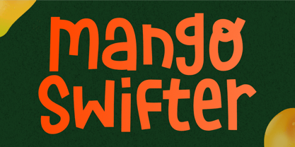 Mango Swifter is a fun and playful display font that's perfect for logotypes, headlines, and product packaging. It's bold and eye-catching, and it will add a touch of personality to any design. So what’s included : Basic Latin Uppercase and Lowercase Numbers, symbols, and punctuations Multilingual Support. PUA Encoded and fully accessible without additional design software Simple Installations Works on PC & Mac Thank You.
 - Smiling Animal by Tlatous Type,
$19.00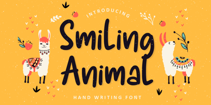 Introducing SMILING ANIMAL Font by Tlatoustype Smiling Animal is a Fun Modern Handdrawn Font. Smiling Animal is perfect for product packaging, branding project, magazine, social media, wedding, or just used to express words above the background. This font includes multilingual support.
 - Heller Sans JNL by Jeff Levine,
$29.00 Heller Sans JNL is based on the main letterforms of an experimental alphabet designed by Steven Heller; noted author of over 170 books on design and visual culture. Some modifications were made in turning his design into a digital font. In his own words, here is the background to this typeface: “I recently recovered this from the junk heap. It is a yellowing photostat of my first and only typeface design (1969-70). Total folly! At the time I was smitten by Art Moderne lettering. I called it “Klaus Boobala Bold” because I liked the K and B. I’ve lost the letters S through Z, which were made. The letters were drawn with compass, Techno pen (that frequently clogged). as well as a triangle and T-square. The inline and outline made no real logical sense. I based the design, in part, on Kabel, Avant Garde and it was a product of whatever I could accomplish with those tools. The caps-only alphabet was photographed and produced as a film negative that was cut in foot-long strips and spliced to fit on a Typositor reel. Sadly, the negatives made for the font were too brittle and the splice snapped apart in the Typositor. I worked on it for well over a month and used the face only once. I realized with this attempt, like so many other times I attempted different challenges, that type design — indeed mechanical drawing — was not my strong suit.” Heller Sans JNL is available in both regular and oblique versions.
 - Klip Klop by Samuelstype,
$24.00 Designed by Hans Samuelson in 2023. With two weights and many variations Klip Klop offers a large set of characters for playful lettering. The flavouring is strong avant garde and the build is strict geometrical with even stroke thickness throughout. One unusual feature is that the bottom and top horizontal strokes are centered on the baseline and capital height. This renders the same optical size between the thin and the medium but different actual heights and baselines. Use it for Headlines or signage in any medium! Klip Klop!
 - Boola Boola NF by Nick's Fonts,
$10.00This typeface is a new and improved (really!) version of one of my most popular freeware fonts, Team Spirit, which has made appearances in the Tank McNamara comic strip and on Blue Collar TV. Add the “nose” at the front with an open parenthesis -(- and add the tail with a close parenthesis -). To continue the bar beneath between words, use the _underscore in place of a space. No math operators and limited punctuation, but complete accented characters for the Unicode 1252 (Latin) and Unicode 1250 (Central European) character sets, with localization for Romanian and Moldovan. - Odaiba Soul by Megami Studios,
$12.50 The second in our Cool Japan series, Odaiba Soul echoes back to some of the futuristic amusement centers and entertainments found on Odaiba Island in Tokyo Bay. Tailored for sci-fi lettering, anime awesomeness or even just making flyers for a day trip across the Rainbow Bridge, this is one to keep in mind!
 - Maximillian CT by CastleType,
$19.00 Another one of those faces that caught my eye in one of my art deco type books, and I wanted it. After I finished the face, I noticed that there is a more clean-cut version of this face in digital format, but my version retains more of the funkiness of the original drawings.
 - Titular by Latinotype,
$26.00 Titular is a condensed Sans Serif typeface that works well with headings, subheadings, newspapers, magazines as well as with logotypes, brands and posters. This typeface revives the spirit of old Woodtypes, but adding a contemporary flavour and Latin American seasoning. The family comes with 2 subfamilies: one regular and one alternative. Just like many of our faces, every subfamily includes 7 weights plus italics. Titular is a Latinotype’s typeface designed by Bruno Jara, and produced and supervised by Latinotype Team. Latinotype Team comprises: Luciano Vergara, Daniel Hernández, Bruno Jara, César Araya and Rodrigo Fuenzalida.
 - Bubble Guts by RVM Creative,
$9.00 Bubble Guts is a whimsical typeface with four fonts. It is one of the few of its kind that has both uppercase and lowercase options, allowing the user versatility and legibility at the same time. Its four styles, Normal, Italic, Shadow, and Extrude, allow for the user to create a bevy of visual effects. It has a retro feel that makes it great for animations, invites, branding, and social media! What you get Bubble Guts Regular Bubble Guts Italic Bubble Guts Shadow Bubble Guts Extrude This typeface supports 438 characters, and it supports most western languages! Layer these fonts to get all types of cool effects! Extrude is perfect for this; it allows for the user to fit the "Bubble Guts Regular" characters on top and create layers.
 - Truly Happy by Olivetype,
$18.00 Truly Happy is an ideal font choice for anyone looking to add a bit of fun and playfulness to their projects. This handwritten font has a light and airy feel, making it ideal for any creative project. With its cute and whimsical details, Truly Happy will surely bring a smile to everyone who sees it. So what’s included : Basic Latin Uppercase and Lowercase Numbers, symbols, and punctuations Multilingual Support. PUA Encoded and fully accessible without additional design software Simple Installations Works on PC & Mac Cheers.
 - Very Frank by Up Up Creative,
$16.00 Meet Very Frank, a font that won’t feed you any lines or tell you any lies. Straight and tall and lacking in all but the subtlest softening details (look at the leg on that uppercase K, though…). Very Frank is a condensed sans serif display font (in regular and italic) with tall, straightforward lines and subtle curves to soften things up. It includes a ton of standard and discretionary ligatures and two stylistic sets to spice things up and add some fun. It's perfect for headlines, editorial design, monograms, branding, logos, poster design, and more. Very Frank includes approximately 540 glyphs and more than 75 standard and discretionary ligatures. Additional OpenType features include character variants, stylistic sets, and multilingual support (including multiple currency symbols). The OpenType features can be very easily accessed by using OpenType-savvy programs such as Adobe Illustrator and Adobe InDesign. (To access these awesome features in Microsoft Word, you'll need to get comfortable with the advanced tab of Word's font menu.)
 - Spellcaster by Comicraft,
$19.00 Raven hair and ruby lips, it may have been a trick of the light but I'm sure sparks flew from her fingertips. I definitely heard echoed voices in the night, of a restless spirit on an endless flight. If I remember correctly she held me spellbound in the night, with dancing shadows and firelight. Yes, I think I did see a crystal ball on the table, showing the future, the past and I did drink the potion she offered me, when I really should have gotten out of there fast. And that's my story and I'm sticking to it, your honor. It was that girl with the white hair, I'm telling you. She has my wallet too.
 - Raisin Muffin by Gassstype,
$23.00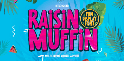 Hello Everyone, introduce our new product Raisin Muffin is a Fun Display Font .This is Cute & Lovely Craft font with a natural handwritten feel. This handmade font will make your design has a beautiful natural touch for each details. It is perfect for any design project as Invitation,logo, book cover, craft or any design purposes. Raisin Muffin is font with Creative Display Fun and challenging nuances. very suitable for the title, typography, Poster, magazines, brochures, packaging,Websites and much more for your design needs, making your designs more modern and professional.
 - PAG Novembris by Prop-a-ganda,
$19.99Prop-a-ganda offers retro-flavored fonts inspired by lettering on retro propaganda posters, retro advertising posters, retro packages all the world over. This is perfect font for your retrospective project. PAG Novembris is narrow and serif font with art deco look. “A”, “G”, “H” and “M” have different letter form in uppercase and lowercase, and they give decorative accents on your typography. PAG Novembris is perfect font for your retrospective project. - Hypercreepos by Bisou,
$15.00 Hypercreepos is a sweet and creepy hyper-bold font inspired by the horror comic books of the 60s. Handmade in La Chaux-de-Fonds (Switzerland) on lined A4 papers, the letter's shape is conscientiously designed to give a punchos impact on the reader. The unique and vibrant contours are drawn on an improvised backlit table inherited from Bisou's mother. Definitely contemporary, the overall feeling given off by Hypercreepos is profound and human, evoking the graphite smell of the comic's workshops. Exclusively made for titles, this impactos font will suite with delight the text of posters, signs of comics bookstore, gaming bar, horror movie theater or film festival. That said, the designer is not responsible for the use of Hypercreepos and wish it will serve beyond all expectation.
 - Authority by Juncreative,
$15.00 Authority i a script elegant font, handwrittien perfect for your projects. It has lots of alternate characters that you can find in the glyphs panel. This font is suited for branding projects, as well as packaging. FEATURES Alternate Characters Uppercase and Lowercase letters Numbering and Punctuations Multilingual Support Works on PC or Mac Simple Installation Support Adobe Illustrator, Adobe Photoshop, Adobe InDesign, also works on Microsoft Word
 - Blazer by Liartgraphic,
$22.00 Hi guys! How are you guys? I bet it's great! Introducing our latest product, we call this product the Blazer display font Blazer is a monoline display type font With a unique and firm touch Blazer font is great to use on: fashion magazines, logos, photography, landing pages, flyers, social media and so on What's included - multilingual support - alternatives - ligatures Thank you, best regards Liarttyype
 - Ranuka by Liartgraphic,
$22.00 Hi guys! How are you guys? I bet it's great! Introducing our latest product, we call this product the Ranuka font Ranuka hight is a retro type font With a unique and firm touch Ranuka font is great to use on: fashion magazines, logos, photography, landing pages, flyers, social media and so on What's included - multilingual support - alternatives - ligatures Thank you, best regards Liarttyype
 - Ringlings by Yanky Goldman,
$29.00 Ringlings stems from Yanky Goldman’s quest for a fresh and innovative display font that subtly attracts. Thus, this lively, dancing-in-the-sun typeface was created. Ringlings is ideal for logo design, package design, headlines and more. This single-stroke, semi-serif font family includes over 1,100 glyphs including uppercase, lowercase, stylistic sets, titling, petite caps, deco caps, ligatures, borders & ornaments and more. It supports most Latin and European languages. Ringlings is airy, light and quite versatile.
 - Cleveden by Greater Albion Typefounders,
$9.50 Cleveden was inspired by some lettering sighted on a neglected and somewhat tarnished brass plaque, affixed to an elderly office building. The elegance and character (somehow playful and formal at the same time) of the letterforms shone through the tarnished state of the plaque. As an aside the brass plaque in question was on the former business premises of a long established firm of accountants. We suspect the ethics of that profession would preclude us identifying which one. Our efforts to identify their engraver have proven unavailing. Cleveden is a family of four typefaces, Regular, Bold, Capitals and Capitals Bold. They are ideal for designs that call for distinctive formality and especially lend themselves to signage, certificates, and -dare it be said- engraved plaques!
 - Battista by preussTYPE,
$29.00 The BATTISTA typeface stands in the long tradition of the designs developed by Giambattista Bodoni, who made his famous typefaces in the end of the eighteenth century. Similar designs can be found on various specimen books e.g. Alexander Wilson, John Bell, Edmund Fry and Alexander Thibaudeau. One of the best italics was available by Stephenson Blake & Co. foundry form Sheffield, England. In the end of the nineteenth century an unknown punch cutter at the German type foundry Schelter & Giesecke made an very bold cut of this Bodoni design. He brought both designs, the regular and the italic to an new level of harmony. Compared to the original Bodoni designs the new typeface was a lot bolder, which was well taken by the audience in this time. The BATTISTA typeface is an remarkable design, assembled of ultra bold and very fine shapes, but in all, the spirit of Bodonis design was well preserved. BATTISTA is a classic display design. The fine details are best shown on larger text sizes.
 - Brilors by Zane Studio,
$15.00 Start a good day for a new font! present to you, Sunny! Brilors is a stylish font. It has a modern and retro look - clear, modern and fun. Help create layout designs in 60's or 70's design projects. This font has over 50 unique alternatives and binders that give your logo, business cards and other projects a unique vintage look. Unique fonts Works on PC & Mac Simple installation Accessible in Adobe Illustrator, Adobe Photoshop, Microsoft Word even works in Canva! PUA Coded Characters Fully accessible without any additional design software. I really hope you will enjoy using the Brilors font and that it will be the perfect addition to your font collection! If you have some questions, please write me a letter! Please try! Zane Studio