10,000 search results
(0.05 seconds)
- Butternut by Ryan Keightley,
$19.00 Butternut’s origins can be traced back to handwriting in felt-tipped marker. Because of this, you’ll find a slight degree of roughness to the edges, yet a fluid softness to the letterforms themselves. As well as some weird, fun details here and there.
 - Fansy by Jörg Schmitt,
$9.90 This font should be used with all three formats. It is recommended to use it in big font sizes due to the thin hairline of Fansy A. Have fun playing with the new modern and fancy display font designed by Jörg Schmitt.
 - Codswallop by Hanoded,
$20.00 The origin of the word Codswallop is uncertain, but it might have something to do with a 19th century English soft drink brewer named Hiram Codd. Codswallop is a beautiful hand drawn font. A little weird, a tad grotesque and a wee bit over the top, but fun and useful nonetheless.
 - Retroxoid by PizzaDude.dk,
$20.00 You may recognize the looks of Retroxoid - if not, then let me help you out: Retroxoid is actually a font I made back in 2007. I ran prints of the font, through a very bad copymachine, used a wet cloth to make the print look worn, scanned the prints and voila! Retrozoid, my very first Open Type font, was born! Now in 2010, Retroxoid has risen from the past, and is ready to burst your designs with clean, round and futuristic shapes!
 - Monday Tuesday by IKIIKOWRK,
$17.00 Proudly present Monday Tuesday - Retro Type, created by ikiiko. Monday Tuesday is an thick slab font with a touch of retro style. This type has a character bold, sturdy and also short. Tight font spacing makes this font has a retro impression and is more fun to explore. This type is very suitable for making a poster, magazine layout, brand logo, packaging, food & beverages, cartoon style, quotes, or simply as a stylish text overlay to any background image. What's Included? Uppercase & Lowercase Numbers & Punctuation Multilingual Support Works on PC & Mac Enjoy our font and if you have any questions, you can contact us by email : ikiikowrk@gmail.com
 - Geminian by Sudtipos,
$49.00 Geminian is a set of fonts that started as a simple idea based on a theoretical level and developed during a long time, to be able to take shape under a creative impulse inspired by the need to communicate, today more than ever. From an astrological point of view, it celebrates and contributes to this practice, the study of stars position and movement and their influence on people's destiny. As a good Gemini, this set revives the main features of the opposite twins sign. Gemini is associated with thoughts, creativity, and communication. Its ruler Mercury (Hermes for the ancient Greeks), messenger of the Gods, and spokesman of the divine word, gives the natives of this sign intelligence, wit, eloquence and poetry. Geminian aims to be a medium to carry different messages from one end to the other. And this is because when using words, Geminis always surprise. Thanks to this gitf (and language and communication), they are able to bring up the most ingenious ideas, to solve any problem and to contribute new perspectives. These qualities may be the secret of its magnetism. The Geminian set comes in 5 styles including a script with multiple ligatures and alternates, 3 sets of caps and dingbats. In addition the complete font family supports a wide variety of Latin alphabet-based languages.
 - Simah Zaza Arabic by Zaza type,
$24.00 Simah zaza typeface - خط سمة ظاظا Simah Zaza is an Arabic typeface that has luxury yet warm and humane feelings. It's legible, soft, clear, flexible, simple, and contemporary. The design is inspired by the Kufic calligraphic style and influenced by the Naskh style. Simah Zaza is highly crafted in order to perform well both on screen and in print. it functions well even on small font sizes. It has a wide range of use possibilities headlines, logotypes, branding, books, magazines, motion graphics, and use on the web and Tv. Simah Zaza consists of five weights.
 - LiebeKlara by LiebeFonts,
$29.90 LiebeKlara is LiebeFonts’ most delicious gourmet creation yet. The mouth-watering look of savory swashes and the fine aroma of masterfully sprinkled contextual alternates will make everyone happy—your spouse, family, and friends. LiebeKlara is festive enough to sit on wedding menus, but still warm enough to give everyday dinner invitations the personal flavor they deserve. LiebeKlara likes company—for example when her girlfriend LiebeErika comes over and they have some LiebeOrnaments with their LiebeMenu. LiebeKlara also likes travelling! She speaks most Western languages fluently and with a cute accent. Try it for yourself—LiebeKlara is calorie-free but (or because) she is very delicate. We hope you like her as much as we do! Bon appétit! LiebeKlara comes with a tasty variety of ligatures and alternative forms available through OpenType features. (Please make sure your software supports OpenType if you wish to use the advanced features.) The font contains over 580 carefully hand-crafted glyphs—so it’s more like two or three fonts in one.
 - Kansas Casual by Kyle Wayne Benson,
$10.00 Kansas Casual offers a more upright, gothic, and modern alternative to the conventional sign painter's one stroke. Kansas provides a completely unique take on a overdone classic with proportions and crossbar heights inspired by the more friendly Chicago style. This all-caps set provides six weights so that you can adjust size with weight to maintain that authentic single brush weighted look. The proofing process included projecting, tracing, and then painting the letters out to see how true the small details were to the medium. The set also includes wide language support, opentype fractions, and arrows. You can learn more about its development here.
 - Tertius by Scholtz Fonts,
$21.00 Tertius, with its high ascenders and clubbed serifs, is a modern interpretation of the classic Carolingian style (7th - 9th centuries AD). There was no capital form in the Carolinian hand and Roman square capitals were originally used with it. The Carolingian hand began, after a while, to develop more cursive tendencies as people looked for a way to speed up the writing process. I have “capitalized” on this trend and have devised an appropriate and dramatic set of flowing capitals for this family. With its elegant swashes and bold letter shapes, Tertius embodies the romance of medieval life, of knights, castles, and chivalry. Tertius comes in four styles:- -- Regular: with elegant, smoothly penned characters; -- Crenellated: written with a scratchy pen over rough parchment -- many drops of ink and blotches have been left on the parchment (“Crenellated” means battlements -- the rough protrusions on the top of castle walls); and -- Romantic: the capitals have been loosely overwritten generating a contemporary version of illuminated capitals. -- Illuminated: richly decorated illuminated capitals for use with Tertius Regular (28 characters) All fonts have been carefully crafted, letterspaced and kerned and contain full character sets of 237 characters.
 - Spiraltwists by Aah Yes,
$0.75Spiraltwists is a family of 2 fonts giving assorted spiral shapes. In each font they're grouped in fours - the same basic spiral in 4 different orientations (N S E W almost), and Spiraltwists has solid lines making up the spirals, Spiraltwists Antique has dotted lines making up the spirals, giving them an antique or rustic appearance. Spiraltwists has heavier spirals on Upper Case, lighter spirals on lower case; plus a group of spirals with a straightened outer end and connecting lines so you get two spiral scrolls joined together by a long line at the top or bottom. (inputting UVWXYZ into the text-box on this webpage will show it). The big example on the webpage shows it all more clearly than any explanation. A fuller description, plus the above example, are included in the zipfile. Please note: for the avoidance of doubt, the font does not contain any letters, the text in these 2 examples is not Spiraltwists but Luzaine. - ALS Pobeda by Art. Lebedev Studio,
$20.00 Pobeda is a bright jobbing typeface inspired by the Moscow Victory Day Parade commemorating the 70th anniversary of the end of the Second World War. At the heart of the typeface is the recognizable rapid silhouette of the famous MiG-29. This cool typeface looks great on souvenir objects, in print and on the web, adding some technical flair to any material.
 - Tradewinds JNL by Jeff Levine,
$29.00Tradewinds JNL is based on one of many innovative alphabets designed by the late Alf R. Becker for Signs of the Times magazine between the 1930s and 1950s. Thanks go to Tod Swormstedt of ST Media (who is also the curator of the American Sign Museum in Cincinnati, Ohio) for supplying the reference material used to make this font. - Chuck by Parkinson,
$20.00 Chuck. Designed in 2004 by Jim Parkinson. Originally released as a Type 1 font, Chuck was refreshed (version2) and re-released as simple Open Type in 2012. The models for this massive Deco typeface appear on a bronze plaque on the South Tower of the Golden Gate Bridge. The plaque commemorates the builders of the bridge.
 - Enforcer by Tour De Force,
$25.00 Modern simple typeface expressing sharp and bright words without need for writing something really smart. Made by Dusan Jelesijevic one day when he left without anything smart to say or write, so he just grabbed a pencil and forced the paper to be cooperative. Someone said that this typeface looks like the ancient Greeks went in present future and used contemporary equipment for writing those letters. It is ideal for branding and avantgarde identities.
 - Fox Wizard by Fox7,
$12.00 Fox Wizard is a vintage and cool slab serif font. this font is perfect for publications, logos, business cards, or printed on t-shirts, this font will look outstanding on everything, no matter the topic. This font will be an incredible asset to your fonts’ library, as it has the potential to elevate any creation.
 - Ghimli by Anonymous Typedesigners,
$40.00 Ghimli Antique was created using the ping-pong method, based on the graphic idea of Artem Rulev and the participation of Vladimir Anosov in the future. Then we sent the font file to each other, adding something of our own and making corrections, and so on many times. Ghimli Antique has already managed to get 2nd place in the Granshan competition in the Cyrillic section. The name was obtained by combining the name of the dwarf Gimli and Studio Ghibli. The font is quite evil, incredibly dense, bold. It looks like when the dwarves closed ranks and go to defend their lands from the invasion of the orcs. Suitable for short word design, logo creation, menu layout and use in movies about gnomes and anything fantastic.
 - ITC Astro by ITC,
$29.99ITC Astro is the typeface that proves you can get your work done while watching cartoons. “It all started as a series of doodles while I was watching The Jetsons,” recalls Sasa Petricic. “The show's impossibly simplistic vision of the twenty-first century cried out for a font that fit into that world -- a world where everyday objects can carry far more fun and personality than they should.” ITC Astro is the first commercial typeface design from Petricic, whose “day job” is working as a reporter for the Canadian Broadcasting Corporation. Petricic has filed stories from across Canada and around the world for CBC's flagship evening newscast, The National. His reports have also appeared on CNN and BBC Television. Petricic's work as a correspondent and video journalist have taken him to six continents, covering everything from famine and genocide in Africa to the war in Iraq. With such serious matters filling the hours of Petricic's day as a journalist, it's not hard to see why he conceived Astro as a welcome blast of whimsy. “As I began to draw the design,” he says, “I decided that every part of Astro should be a cartoon character unto itself.” Each character has its own baseline shadow (or coaster, or circular antigravity generator, depending on how you look at things). The angular caps dance jauntily, rocking from left to right, while a suite of companion small caps provide backup. The end result is a design quite unlike any other, with surprising charm and versatility. ITC Astro comes in a two-weight family of White and Black. - JT Collect by OGJ Type Design,
$35.00 JT Collect is a hybrid sans-serif typeface for the 21st century that takes a playful approach to the type design heritages of Germany and Switzerland. Confidently built on a geometric structure and infused with elements from traditional grotesque typefaces, it hits the sweet spot between geo and grot. I developed JT Collect purely digitally, drawing from years of experience with analog type design. The letters aren’t based on one particular source but seek to merge different type genres from the first half of the 20th century and lift them to a contemporary quality level. JT Collect is less reserved than strictly geometric designs and brings some industrial workmanship and honesty into the game. The six weights plus three optical sizes of JT Collect offer what you need to make an impact. While cool and elegant in the Light weight, the fonts show more presence on the page as they grow bolder. To this end, I drew the letterforms with a slightly unrefined, brawny air in the bolder weights. This sets them apart from the perceived purity of more geometric designs. The Book weight is ideal for short texts and medium-length copy, and the forceful Bold makes wordmarks look crisp and lets headlines radiate cosmopolitan self-confidence. JT Collect is suitable as a primary typeface for branding, advertising, packaging, stationery, posters, documents, and websites from trades and industries as diverse as food & fashion, media & makers, culture & creators, games & gems, sports & startups. Use JT Collect for film titles or watch faces, for leaflets or store signs, for business cards or billboards: this font family is as adaptable as a chameleon (and like a chameleon, it’s never boring). Try it in different contexts. You won’t be disappointed. Its adaptability also makes JT Collect a great starting point for poised and persuasive font combinations. Even a sans/sans pairing is possible due to hybrid nature of JT Collect—something that’d be hard to achieve with most other sans-serif typefaces on the market. You can add to it a heavy slab from the OGJ library, like Temper Wide. You might go for a geometric or a grotesque typeface as secondary (text) typeface. Or you could set your body copy in a classic serif typeface such as Caslon, Sabon, or Plantin. That’s right: JT Collect is a true team player. Whether you need a grotesque or a geometric sans: try JT Collect. You can get the best of both worlds.
 - Sterling Script by Canada Type,
$54.95 Sterling Script was initially meant to a be digitization/reinterpretation of a copperplate script widely used during what effectively became the last decade of metal type: Stephenson Blake's Youthline, from 1952. The years from 1945 to 1960 saw a heightened demand for copperplate faces, due to post-war market optimism, as well as the banking and insurance industries booming like never before, which triggered the need for design elements that express formal elegance and luxury. The name Sterling Script is a tip of our hat to England, the Stephenson Blake foundry's country of origin. It is also a historical hint about copperplate scripts having been used mainly for banking and bonds in the 19th century. Originally we just wanted to resurrect a gorgeous metal type from the ashes of forgotten history. But after the main font was done we saw that the original s really needed an alternate. We made one. But we felt sorry for the original s and didn't want to see it dropped from use altogether, so we saved it by building a set of ligatures that solve the minor connection problem with the s at large sizes. Before the completion of the ligatures, a few different alternates were also drawn, and we were faced by the fact that the single font we set out to do was now a much larger set than we anticipated. While thinking about how to split up our unexpected bundle of large characters, we drew a few more alternates and some swashes. This abundance "problem" reached a certain point where there was no looking back, so we just decided to go all the way with this font. We added many more alternates, swashes, ligatures, and two full sets of each beginning and ending lowercase letter. The result is over 750 characters of sheer elegance. Sterling Script has many features that set it above and beyond other copperplate scripts: - It has 2 beginning and 2 ending alternates for every single lowercase character. The beginning and ending variants on the vowels are also available in accented form in the appropriate cells of the character map. - Sterling Script is the ultimate elegant font choice for luxury design. Very elegant, but not too soft. Its strong and confident shapes convey a message that is real, comforting and assuring. - One of the eventual purposes of expanding Sterling Script this extensively was to create a script that finds the middle ground between formal and informal without compromising either trait, a script where the degree of formality can be gauged, tweaked, cranked up or toned down depending on the layout's needs. Aside from beginnings and endings, there are multiple variations for the majority of the basic characters. This is a formal script on steroids, where twirls and swashes can be set to come out unexpectedly from any place in the word, which is great for reducing the inherent rigidity of words set in copperplate scripts and "humanizing" them whenever needed. This is especially useful for wedding, postcard and invitation design, where not every viewer of the collateral material has something to do with banking or insurance. - With such an extensive character set, a designer can easily set a word or a sentence in 10 or more different ways, and choose the perfect one for the task at hand. This is particularly useful for work where details are of utmost importance, like logos, slogans, or elegant engravings that consist of one to three words. Let those swashes and twirls intertwine for maximum elegance. The Sterling Script complete package consists of 7 fonts: Sterling Script, Alternates, Beginnings, Endings, Swashes, Swash Alternates, and Ligatures. Sterling Script is available in five different purchase options and price ranges. But with such a massive offering of variation, the Sterling Script complete package is definitely the most value-laden set in its class. Once you use Sterling Script, you will never want to go back to other copperplates.
 - Absurdies by Typephases,
$25.00 Absurdies is a trilogy of pictorial typefaces with lots of mischief, fun, weirdness, black humour and amusement. It includes 143 digitized illustrations. You will find many inexplicable behaviours, madmen, strange occupations, absurd and chaos-loving characters, and general whimsy. This little crowd can be used in many ways, from spot illustration to big illustration work or graphic designs, taking advantage of the vectorial format of the font file. The characters in Absurdies (together with their kin, the Illustries, Whimsies, Ombres, Bizarries and Genteta dingbats) are drawings from the sketchpad of Joan M. Mas, drawn from imagination and with no reference, except in a handful of cases pulled from historical photography. He wanted an easy-to-use format to collect his hundreds of imaginary ink drawings and he realized a digital typeface was an ideal solution. Having the illustrations gathered in a font file means you can use them instantly in any program you like. You may choose to use the images out of the box, or further customize them with colours and textures. The possibilities are endless.
 - Suomi Script by Suomi,
$80.00Suomi Script is a typeface with a twist (pun intended): it has more than 1600 ligatures with two or more glyphs connected to make it look like an odd hand-written script polished by ITC. With Open Type savvy programs this font automatically replaces single characters with the ligatures. Some hand kerning is needed here and there. - Nsai by AukimVisuel,
$15.00 Nsai is a modern sans serif font family with a geometric twist, created in 2021 by a Congolese type designer, Audry Kitoko Makelele. It is available in two versions (normal and extended) making a total of 36 fonts. There are 9 weights with their true italics. Over 600 glyphs per font provide a wide range of language support, from Latin to Cyrillic, as well as powerful Opentype features such as professional kerning, stylistic variations, very special ligatures, old-fashioned tabular figures, Fractions, denominators, exponents, unlimited indices, arrows and more to satisfy the most demanding professionals. On the one hand, it features rounded curves with very open terminals that make this font family elegant, user-friendly and contemporary and on the other hand very useful for writing titles on any medium. Perfectly suited for graphic design and any display use. It could easily work for web, signage, corporate as well as editorial design. It’s a wonderful, bold and elegant font. This font is guaranteed to make your design stand out from the crowd and leave a lasting impression, as it has the potential to enhance any creation.
 - Brown Holmes by Letterhend,
$19.00 Introducing, Brown Holmes - A fun and playful bold display font. The bulky shape make this font looks appealing, especially when it comes to casual fun theme design. This font also perfectly made to be applied especially in logo, and the other various formal forms such as invitations, labels, logos, magazines, books, greeting / wedding cards, packaging, fashion, make up, stationery, novels, labels or any type of advertising purpose. Features : numbers and punctuation multilingual alternate (uppercase & lowercase) & ligature PUA encoded We highly recommend using a program that supports OpenType features and Glyphs panels like many of Adobe apps and Corel Draw, so you can see and access all Glyph variations.
 - Agent by Canada Type,
$24.95 Agent was inspired by the classic fun lettering of 1930s Dutch alphabetician Martin Meijer. Casual and playful, Agent is a carefully considered amalgam of the art brush's organic forms and the easily read, ironic forms of the comic book. Ideal for signs as well as packaging of products aiming to be memorable and fun. Agent ships in all common formats, and contains plenty of alternates, as we all as support for a wide range of Latin-based languages.
 - Beer Joint JNL by Jeff Levine,
$29.00 A vintage photograph of the Man at the Wheel Saloon in San Pedro, CA [circa 1895] provided an excellent type design source with the unusual lettering on the bar’s sign. Basically a spurred serif design, the unusual characteristic of the type style is the ‘bumps’ or ‘dots’ on the tops of each letter. This has been redrawn digitally as Beer Joint JNL, and is available in both regular and oblique versions.
 - ITC Luna by ITC,
$40.99 ITC Luna is the work of Japanese designer Akira Kobayashi. He turned to the designs of the 1930s for his inspiration for both ITC Luna and ITC Silvermoon. Luna is designed to fill the gap between a pure Art Deco display face and an ordinary text face," says Kobayashi. "It has an Art Deco style but is still fairly easy to read. It can be used in short passages of text. As for individual characters, I especially liked the distinctive O, shaded only on one side. Lowercase a and g are also unusual, but they are somehow legible enough in text matter." And for a finishing touch on his Luna, Kobayashi added the charming moon face as an extra character.
 - Delightful by Jessie Makes Stuff,
$12.00 Delightful is a whimsical and cheerful handwritten font family of varying weights and widths. This typeface is like if Comic Sans had a cousin who studied abroad one summer and now wears scarves to look more grown up, even though inside she's still the same, sweet marshmallow she always was. The letters were inspired by my handwriting on a good day - slowed down, legible, and intentionally drawn. I even threw in some of my favorite doodles as alt characters because the set wouldn't be complete without them. And the name was inspired purely by how it feels when I see it - and by my word of the year, delight. Delightful is ideal for anyone who wants to include a bit more warmth and a personal touch with their messaging. It's friendly and non-threatening, and will enhance personal projects or professional ones alike - whether you're a designer, an Instagram influencer, or you need to create some flyers for the local Mom 'n Pop Shop. There are two versions of this font. The original style is slightly more rounded and gets chubbier as you increase its boldness, and the stretched style is like a condensed version, except it's been stretched taller rather than squished narrower. I hope you delight in it as much as I do!
 - Inkster by Typadelic,
$19.00Inkster breaks all the rules. The serifs vary from letter to letter, if they have any serifs at all. The upper and lower case letters intermingle and the contrasting characters bounce all over the baseline. Loosely based on the character shapes of Frisco, I developed a tightly spaced calligraphic version and called it Inkster. Use this artistic font when youre looking for a distinctive style! - Drugstore by Coffee Bin Fonts,
$20.00This font was inspired by lettering found on old tradecards and drugstore ads from the 19th century. - Quickflio by Brenners Template,
$19.00 A font family with excellent visibility and aesthetic originality was developed after years of troubleshooting. It will be the best choice for designers as it contains a variable font with two axes. A variety of styles, including stem widths from 10pt to 220pt, will be an exciting attempt for unique typography. And, 44 beautiful and amazing ligatures will make your imagination deeper and richer. On the Typographic Foundation, it makes sense to break most of the ligatures used here into discretionary ligatures. However, in view of the trend of modern typography, in which the essential boundary between function and decoration is increasingly blurred, it may be meaningful to use them together. All ligatures of this font family are included in Standard Ligatures. Your choices become easier and clearer. Its name is Quickflio. OpenType Features 44 Ligatures : Am, An, Br, Cr, Gr, Le, Lo, Op, ad, am, an, at, ba, ck, ct, da, de, do, er, es, ff, fo, fi, fl, gh, ha, hn, hs, in, le, ll, lo, ma, ns, oe, om, on, re, sh, st, um, un, ve, wa Ordinals Oldstyle Figures Tabular Figures Fractions Scientific Inferiors Superscrpt
 - New Car Tag JNL by Jeff Levine,
$29.00 Around 2018 or 2019, the State of Florida introduced new letter and number characters on its auto plates. Inspired by this change, Jeff Levine Fonts offers up a digital version of this lettering named New Car Tag JNL, which is available in both regular and oblique versions (for those who want a more sporty look). Some people prefer a rounded 'zero' to differentiate between the regular zero and the letter 'O'. You can find this alternate character located on both the solid bar and broken bar glyphs.
 - LeDrôle Lettering Pro by Ingo,
$40.00 The Comic-Script by ingoFonts In the past cartoons used to be lettered by hand. Hardly anyone does this today. The reason is, because hardly anyone has nice handwriting these days, so there are practical advantages in having a special font. However the font should still look like it’s been written by hand. Well, most script fonts don’t meet this requirement. The LeDrôle Lettering is a computer font, but closely resembles genuine handwriting. The model for the LeDrôle Lettering is my personal handwriting, as can be seen on the example of the Biró Script, which is also an ingoFont. The habit of capitalization comes from the Romanic and Anglo-Saxon countries. Depending on the purpose they are designed in three significantly bolder weights. In order for the typeface to actually look handwritten, it needs to have clearly visible irregularities. These are not found only in the shapes of the individual letters. Even though LeDrôle Lettering is all in capital letters, the characters of uppercase and lowercase letters are clearly different. Additionally, many alternative shapes are used, which are automatically applied when the OpenType “Ligatures” feature is activated. Thus, there are no identical double letters or numerals, and many character combinations are defined as ligatures with alternative forms.
 - Royce by Jehoo Creative,
$18.00 Royce is a cute and minimalist designed font family with rounded edges on each character to make a fun and modern impression on your designs. It is very easy to combine this font with other types because it comes with 10 complete weights ranging from thin to extrablack, with a modern impression Royce has many useful features for example Alternate which is more formal in feel and Discretionary Ligature which is very eye-catching so it is ready to be used for various kinds design types such as displays, titles, body text, magazines, cover art, social media, logos, web Ui, clothing, posters, and others. Royce also has multilingual support.
 - Partitura1941 by Idoia de Luxan,
$37.50 Tipograf�a caligr�fica inspirada nos t�tulos das canci�ns dun caderno familiar de partituras de 1941. � unha fonte creada da maneira m�is fidel posible a como se debuxar�a cunha pluma estilogr�fica do momento. Axeitada para t�tulos ou letras capitais. Non se recomenda empregar para textos longos, de non ser que se pretenda simular un arquivo antigo dun estilo manuscrito semellante. Tipograf�a caligr�fica inspirada en los t�tulos de las canciones de un cuaderno familiar de partituras de 1941. Es una fuente creada de la manera m�s fiel posible a como se dibujar�a con una pluma estilogr�fica del momento. Adecuada para t�tulos o letras capitales. No se recomienda utilizar pata textos largos, a no ser que se pretenda simular un archivo antiguo de un estilo manuscrito semejante. Calligraphic typography inspired by the titles of the songs of a family notebook of 1941. It is a source created in the most faithful way possible to how it would be drawn with a stylus pen of that moment. Suitable for titles or capital letters. It is not recommended to use for long text, unless you pretend to simulate an old archive with a similar manuscript style.
 - Hipweee by Storictype,
$9.00 Introducing Hipweee Layered Font Hipweee, A new carefully crafted layered rounded Typeface. The Ideas of this fonts are from wide range of reference, baby, kids, school, cafe, food desert & beverages are our main focus for this fonts. So the looks of this fonts must be in the wide range of the reference above. It’s Versatile, Fun, Cute and Beauty feel that you get in Hipweee Typeface Hipweee Created with 7 Layer : Base, Extrude, Shadow, Dot, Flower, Hatch & Inline. Perfect fitted layer to give you a more contrast, more bold look of the title. Our creation on the display to give you a reference what it looks like on your project. such as Branding, Header, Logotype, Poster, and etc. It shows that Gemoy clearly can accommodate various design style. Language Support : Afrikaans, Albanian, AsuBasque, Bemba, Bena, Breton, Catalan, Chiga, Colognian, Cornish, Croatian, Czech, Danish, Dutch, English, Estonian, Faroese, Filipino, Finnish, French, Friulian, Galician, German, Gusii, Hungarian, Indonesian, IrishItalian, Kabuverdianu, Kalenjin, Kinyarwanda, Latvian, Lithuanian, Lower Sorbian, Luo, Luxembourgish, Luyia, Machame, Makhuwa, Meetto, Makonde, Malagasy, Maltese, Manx, Morisyen, North Ndebele, Norwegian , Bokmål, Norwegian Nynorsk, Nyankole, Oromo, Polish, Portuguese, Quechua, Romanian, Romansh, Rombo, Rundi, Rwa, Samburu, Sango, Sangu, Scottish Gaelic, Sena, Serbian, Shambala, Shona, Slovak, Soga, Somali, Spanish, Swahili, Swedish, Swiss, German, Taita, Teso, Turkish, Upper Sorbian, Uzbek (Latin), Volapük, Vunjo, Western, Frisian, Zulu
 - Blossomy by kapitza,
$99.00 Blossomy is a pictographic font consisting of 72 plant and flower illustrations, designed by kapitza. The font explores the beauty of shapes and structures in nature. The illustrations are based on photographs which have been traced by hand and are the result of a long term interest in the organic and erratic lines of naturally growing plants. The idea for Blossomy originated several years ago via a series of paintings exploring forms and structures in nature. The outlines for those paintings were traced in Illustrator and then transferred onto canvas. The outcome was so simple and beautiful that the designers decided to keep working on new illustrations and combine them in a font. Blossomy can be used as individual illustrations or to create patterns. The font covers a wide variety of flora and fauna, including pot flowers, a bonsai trees, leaves, blooms and grasses, and gives creatives a wide variety of shapes to get inspired by and use in their work.
 - Yel Yeah by Allouse Studio,
$16.00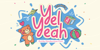 Yel Yeah a Quirky Handwritten Font tha will bring an fun and playful impression. Yel Yeah is perfect for any tittles, logo, product packaging, branding project, megazine, social media, wedding, or just used to express words above the background. Yel Yeah also come with Multi-Lingual support. Enjoy the font, feel free to comment or feedback, send me PM or email. Thank You!
 - Roseglow by Timurtype,
$14.00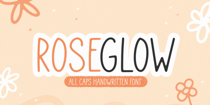 Introducing by Timur type Proudly Present, Roseglow Roseglow A fun Handwritten Font Roseglow is perfect for product packaging, branding project, megazine, social media, wedding, or just used to express words above the background. This Roseglow font includes: -Full Set of standard alphabet and punctuation & symbol -Extra set doodles -multilingual support. Embelish your designs with our original fonts.Enjoy the font,Thank you!
 - Old Tijuana JNL by Jeff Levine,
$29.00 Old Tijuana JNL was modeled from the hand lettered title on the cover of the 1939 sheet music for "Class Will Tell" and is available in both regular and oblique versions. Casual, playful and reminiscent of the "serape" style of pseudo-Mexican lettering found on ad designs of the 1930s and 1940s, the type face isn't just for South of the Border themes. Use it for any festive occasion and the design will blend in well.