10,000 search results
(0.046 seconds)
- Revla Slab by Eclectotype,
$40.00 The Revla family just keeps expanding! This is Revla Slab. It has the same exuberant charm as its siblings ( Revla Sans and Revla Serif ) with a touch more chunk. OpenType contextual alternates make for text that is lively and bouncy, without the monotony of obviously repeating letterforms. It’s shamelessly fun, but pretty serious at the same time. The range of weights can be used to maintain an even colour across different sizes - use lighter weights for bigger sizes and vice versa. OpenType features include automatic fractions, ordinals, contextual alternates (which along with the pseudo-randomness, help maintain a nice tight fit with minimal glyph collisions), standard and discretionary ligatures (OK, only one discretionary ligature, but it’s a belter!), and case-sensitve forms. Obviously, in sharing a common skeleton, it will work well with other members of the Revla Superfamily, particularly Revla Sans.
 - Note by Little Fonts,
$15.00 Note is a fresh and dynamic hand writing font. Inspired by graffitti and street style writing, executed using a flat tip calligraphy pen. The typeface is hand drawn on paper, then the resulting alphabets and punctuation scanned in and rendered to create the font. The resulting characters are bold yet energetic with an obvious human touch creating an interesting and original hand drawn typeface.
 - Janda Silly Monkey by Kimberly Geswein,
$5.00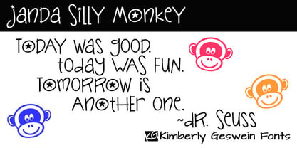 Cute and fun handwriting inspired by the playful antics of a child.
 - Tattoo Master by Vozzy,
$10.00 Introducing a vintage look label font named "Tattoo Master". This family includes five styles - Regular, Texture, Shadow, Full and Aged. You can see samples on the posters. This font will be great on any retro design on poster, t-shirt, label, logo etc.
 - Turban Hey NF by Nick's Fonts,
$10.00The “Moorish arch” treatment of certain letters on a 2001 book on Dutch design, executed by René Knip, provided the inspiration for this exotic unicase typeface. The font also includes arabesque designs in the brace, florin and section mark positions. Both versions of the font include 1252 Latin and 1250 CE (with localization for Romanian and Moldovan) character sets. - Fieasto by Dora Typefoundry,
$23.00 Fieasto is a modern serif typeface with many styles. High contrast version of the famous Didot display that has been synonymous with fashion for decades. This font has more than 378 glyphs with multilingual letters included. Based on modern serif fonts but by rethinking the height of lowercase letters to make this font look more fun, this font is modern and nostalgic and works great for logos, mastheads, and quotations. It's a beautiful pair with minimal serifs or lightweight script fonts. Includes: - Uppercase and lowercase letters are full - Numbers, Punctuation, Multilingual Accents - Alternates Glyphs We really hope you enjoy and are interested in our offer. If you want to upgrade or need a license or ask questions, you can send me a message and you can immediately start your service doratypefoundry@gmail.com. Thank You
 - Boosters by Nathatype,
$29.00 Looking for a vintage and bold font to captivate your audience or clients,? If you need to create have a t-shirt branding company, or need to create a new menu - then this is the perfect font for you. Boosters-A Vintage Font Boldy Vintage is a bold, fun, and vintage typeface that is made in uppercase and lowercase. This font is the best to maximize the amount of street vibe and vintage vibes. Ideal to create amazing headings, logos, menus, and social media graphics. Our font always includes Multilingual Support to make your branding reach a global audience. Features: Ligatures Alternates Bonus Oranament PUA Encoded Numerals and Punctuation Thank you for downloading premium fonts from Nathatype
 - Inscription by ITC,
$29.99Inscription is the work of Alan Meeks, a bold copperplate script with a fine open line running throughout. The relatively restrained initial capitals are complemented by a lowercase which joins together in the style of true handwriting. Inscription will give any text a look of refined elegance. - Memorial by Solotype,
$19.95The Fredrick Ullmer Co. in London acted as agent for many typefoundries, and this was one of their offerings. Some of the letters were rather outlandish, so we fearlessly decided to improve them. The result is this dated but pleasant font. The original didn't have a lowercase, so we added it. - Babushka by Resistenza,
$39.00 This font, is dedicated to all the Russian and non-Russian Babushkas around the world. This font was created using a flat brush and Chinese ink. After that I scanned all the letters and numbers and created the real font. Designed by Giuseppe Salerno, in the 2011. You can even watch a video on YouTube showing how Babushka was hand-drawn by the artist.
 - Easter Sweet by AEN Creative Studio,
$15.00 Easter Sweet is a fun, quirky, and sweet serif font. No matter the topic, this font will be an incredible asset to your fonts’ library, as it has the potential to elevate any creation. This font is PUA encoded, which means you can access all of the glyphs and swashes with ease!
 - Summer Letter by AEN Creative Studio,
$15.00 Summer Letter is a fun, quirky, and sweet outline display font. No matter the topic, this font will be an incredible asset to your fonts’ library, as it has the potential to elevate any creation. This font is PUA encoded, which means you can access all of the glyphs and swashes with ease!
 - Bali Script by Eclectotype,
$40.00 Inspired by the Indonesian island’s laid back feel and easy going culture, Bali Script is a tribute to the hand-lettered signage on beach bars, surf shacks and cafes. The swell of the stroke endings and the bolder-than-your-average gooey look convey a cool, contemporary take on baseball scripts. Overlay Bali Script Highlight for a cartoonish, glossy finish. Perfect for logos. This font is jam-packed with OpenType features that make smooth flowing text a doddle. Contextual alternates and ligatures are best left on by default. The alternates especially work a subtle magic that helps letters connect with an even rhythm, and automatically substitutes letters with the best fit alternatives based on their context, such as at the end of words, or adjacent to certain other letters. There are four stylistic sets (or all grouped together in the stylistic alternates feature for those without easy access to them) which do the following: SS01 - changes the r to a script form SS02 - makes certain caps more ‘scripty’ SS03 - capital I (and accented versions of it) get serifs SS04 - underline function. typing two or more underscores extends on underline beneath the previous word. Also included for your pleasure - oldstyle figures, automatic fractions, superior and inferior numbers, ordinals, some discretionary ligatures, swash alternates and extended language support.
 - Marseillette NB by No Bodoni,
$39.00 These four typefaces, Berlinette NB, Lyonette NB, Marseillette NB and Parisette NB, were designed from the same basic shape, a fanciful geometric form that avoids strict horizontals and uses more offbeat triangular shapes. Marseillette is the nasty one, with sharp hook terminations that require careful use. Don�t slip and accidentally stick one in your hand � it will hurt pretty bad and make you blubber like a baby. It�s good for surreal warning signs on dark, forbidding docks where gooey monsters live.
 - Hexanova by Jetsmax Studio,
$15.00 Hexanova is a handmade display font that is text friendly but will give an elegant touch in its alternative characters. With its free style, this font specifically design to elevate your project and make it stand out even more. Hexanova Font best uses for poster, logotype, branding, cover, events, advertisements, animation, social media post, advertisements, and many more. Let your imagination run free!
 - Go To Town JNL by Jeff Levine,
$29.00 Vintage sheet music for a song from the 1941 animated feature "Mr. Bug Goes to Town" featured a casual, hand-lettered inline type style on its cover page. Recreated as the digital font Go to Town JNL, this design is presented in all the imperfect glory of pen and ink lettering. Go to Town JNL is available in the regular inline version as well as a solid version. A bit about the cartoon: The project was created by the legendary Fleischer Studios in Miami, Florida (they had relocated from New York City), after they could not obtain the rights to adapt Maurice Maeterlinck's "The Life of the Bee". Beset by the expenses of relocating to Florida, growing production costs on the full-length feature cartoon and other problems; mid-way through the making of "Mr. Bug Goes to Town" the Fleischer brothers were forced to sell their studio to their distributor (Paramount Pictures) in order to continue in operation. It was released on Dec. 5, 1941 - just two days before the Japanese attack on Pearl Harbor. The release [and subsequent re-release by Paramount as "Hoppity Goes to Town"] was a disappointing failure, earning [as late as 1946] only $241,000 of the initial cost of $713,511 it took to make the film.
 - Geographica by Three Islands Press,
$29.00 Thomas Jefferys (ca. 1710–1771) was the best-known map maker in 18th-century England, chiefly because he won (and hyped) the title “Geographer to King George III.” Jefferys was really more an engraver/publisher than a geographer, since he mostly relied on the cartographic materials of others. Still, his maps of the North American colonies were well known. Geographica is a legible, four-style serif family modeled after the neat hand-lettered place names and peripheral text on Jefferys’s maps. With its long serifs, tall x-height, and robust curves, Geographica somehow combines classic elegance with a whiff of coastline and sea. The italic styles have the slant and warmth of the hand-drawn source materials. And the typeface comes with a slew of distinctive map-based ornaments—including compass wheels and sailing ships. This evocative serif works well in both display situations and long blocks of text, whether on paper or screen. OpenType features include small capitals, numerous ligatures, and two stylistic sets of titling caps. Geographica offers full support for Central and Eastern European languages—more than 1,200 glyphs in all.
 - Evil Ways JNL by Jeff Levine,
$29.00 The April 8, 1932 issue of The Film Daily ran an ad for a film entitled "The Sin of Lena Rivers". Hand lettered in a block style of chamfered characters, it is reminiscent of the 1920s, but still carries a touch of Art Deco influences with the thinner and extended horizontal strokes of the E, F and H. This retro sans serif design is now available digitally as Evil Ways JNL in both regular and oblique versions.
 - Funky Retrovy by IbraCreative,
$17.00 Funky Retrovy is a groovy and energetic font that perfectly captures the essence of retro nostalgia. With its funky and whimsical letterforms, this typeface exudes a vibrant and carefree spirit reminiscent of the colorful era it celebrates. Each letter boasts bold and playful curves, inspired by the iconic designs of the past. Funky Retrovy adds a touch of fun and funkiness to any project, making it ideal for eye-catching posters, vibrant branding, and retro-themed party invitations.
 - Diediedie - Unknown license

- Newfangle NF by Nick's Fonts,
$10.00 The 1892 MacKellar, Smiths & Jordan specimen book featured this jaunty little face, designed by profilic in-house designer Herman Ihlenburg. Happy, hoppy fun. Both flavors of this font feature the 1252 Latin, 1250 Central European, 1254 Turkish and 1257 Baltic character sets.
 - AT Move Quipo by André Toet Design,
$39.95 QUIPO is a typeface based on my recent survey (Freeflow) on hand drawn logotypes used by American and English pop groups in the 60-70s. We thought it an interesting project and a free flow exercise to design this particular font just in capitals and well... yes it’s rather ‘bulky’. Needless to say it comes with numbers and the normal punctuations ! Concept/Art Direction/Design: André Toet © 2017
 - Inventory JNL by Jeff Levine,
$29.00Inventory JNL is based on a "solid letter" stencil where you trace the body of the letter and fill in the top and bottom connecting lines to each character. This is another font in Jeff Levine's series of digital designs based on classic lettering stencil guides. - Early Hours by Epiclinez,
$18.00 Early Hours is a fun crafty font. A little bit quirky, this font looks incredibly adept in a wide variety of contexts, such as children's craft, teaching material, quotes, apparel, or any other design that needs a touch of fun and playfulness. The font Early Hours contains 203 glyphs, supporting 66 languages from Africa, Albanian to English, and Zulu. The font Early Hours contains 8 ligatures in 1 OpenType feature. Thank You
 - PAG Karogs by Prop-a-ganda,
$19.99Prop-a-ganda offers retro-flavored fonts inspired by lettering on retro propaganda posters, retro advertising posters, retro packages all the world over. This is perfect font for your retrospective project. PAG Karogs is geometric, art-deco font that had been used for a match box. The bowls of this font is based on a positive circle. The contrast of a circle and straight line effective in producing brisk structural rhythms. This is great for branding, packaging and posters or any other kind of display use. - Tropical Jungle by Colllab Studio,
$19.00 "Hi there, thank you for passing by. Colllab Studio is here. We crafted best collection of typefaces in a variety of styles to keep you covered for any project that comes your way! Tropical Jungle is a fun wild font, inspired by the wild life of the jungle. Inspired by the tropical rainforests of South America, Africa, and Asia, this font will inspire you to get out there and explore! Tropical Jungle is a bold, quirky typeface that captures the joyous spirit of life on earth or at least, of the parts we’re most familiar with: monkeys swinging through trees, tigers stalking their prey through the jungle, butterflies flitting from flower to flower. You can tell just from looking at it that this is going to be a fun-loving font that will bring a smile to your face and a bounce to your step. With over 500 glyphs, this stack of jungle animals will be a joy to use! We made sure our font was easy to read in any application so you don’t have to worry about your documents cluttering up. We know you can’t wait to get started using it in your next project. So go ahead! Grab Tropical Jungle now! A Million Thanks Colllab Studio www.colllabstudio.com
 - Deluta by Dharma Type,
$14.99 You can not find such a lovely, unique and funny blackletter. Enjoy and have fun with this font. There are two other fonts designed by in the same concept. -Xesy -Ekistra -Deluta Black
 - LD Wanted by Illustration Ink,
$3.00Bring an old west flavor to your lettering projects. The block letters of this "Wanted" font are reminiscent of western posters and signs. It's a fun choice for cowboy scrapbook pages and cards. - Chipen by 38-lineart,
$14.00 I am pleased to present you an excellent futuristic font "Chipen" in unique graphic style! This font consists of regular, expanded, regular italic and expanded italic, these 4 fonts are encapsulated in one variable. With one font variable, this will cover 4 styles and cover all the weights between regular and expanded. If you are used to working with variable fonts it will give you more weight options, if you have never tried this variable font it will be an amazing new experience for you, take a look at this video snippet: https://youtu.be/jgqNPGeoVjc Chipen comes in bold and with a “RoundCube” cut, this is perfect for modern, Sci-Fi, and technology themes. Coupled with the stripe in the middle of the makes it appear more sporty. Not only that, this stripe can also display "Eighties" if you package it in a retro concept. Another strength of this font is the lowercase ligature, we present a lot of ligatures and one of them might be suitable for your logo brand. Finally, this font is a dynamic font with a variable concept capable of covering more 'weight', unique to appearing in various eras, exploring the world of retro and even science and fiction.
 - Paris Metro by Studio K,
$45.00 Nothing is more iconic of Paris than its antique Metro signs, which are the inspiration for this typeface. The signs vary from station to station, some featuring plain block capitals, others the most exquisite Art Nouveau. This example falls somewhere in between. and should inject a strong gallic flavour into any design or publishing project. To recreate the Metro effect in Photoshop, set your text white on red, then go to Layer Style> Inner Shadow. Or with Paris Metro Reverse set your text red on white, then go to Layer Style> Drop Shadow.
 - ITC Ballerino by ITC,
$29.99Vienna designer Viktor Solt has a love affair with handwriting. “Usually” he says “when I start with a specific calligraphic style I take some historic specimens and try to integrate their main features into my own handwriting.” Although there are hints of various 18th-century calligraphic styles in Ballerino it was not based on any historical model. The swash ascenders and descenders on the lowercase are all slightly different; this and the rough texture of the edges gives Ballerino a distinctly hand-written feel. The swash caps are meant to be used only in conjunction with the lowercase not to be combined with each other. - Cranach by profonts,
$41.99 This picturesque, beautiful German Blackletter typeface was originally released by Benjamin Becker Succ, Frankfurt am Main, then named ?K�nstlergotisch?. Ralph M. Unger redesigned, digitally remastered and completed the font based on old catalogues/specimen. In honor of the famous Cranach family, German artists in medieval times, we renamed the font after them. The shadowed version was added for even more eye-catching purposes, e.g. in headlines.
 - Ingeo by Blancoletters,
$40.00 Between the most rigid geometric letterforms and the most expressive calligraphy works there are, undoubtedly, countless combinatory possibilities. Ingeo is just one of them. Located very close to a geometric approach it shows, however, a clear willingness to accommodate in its structure the calligraphic traits of our alphabet. In Ingeo geometry grows from the inside, meaning that all its counters are based on geometric shapes. Around them, contours are later defined. The solid mass resulting from that interaction is modulated in specific areas in a way that evokes the way a writing hand finishes a letter and starts the following one. Ingeo seeks to accommodate calligraphic features in its geometric structure without any complexes, in the same way a computer engineer writes a song or a poet admires the orbits of planets and satellites. In this vast and unmapped realm between seemingly opposing concepts is where Ingeo finds its playground. There, that interaction is pushed to its limits and the resulting letterforms are later confronted with typographical conventions to assess whether they survive. Ingeo comes with 695 glyphs in its character set with support for more than 270 languages. Among these glyphs you can find 5 stylistic sets, 19 useful science-related icons as well as 7 different designs for ampersands.
 - Slim Nouveau JNL by Jeff Levine,
$29.00 At times, one source of inspiration can generate more than one idea. This was the case with the 1918 sheet music for the song "You're Still an Old Sweetheart of Mine". The cover displays the title in a hand lettered narrow Art Nouveau Sans serif style. A number of characters were revised and the overall font was compressed by 25% to create a whole new look and feel. The end result became Slim Nouveau JNL. This was the same material used to originally model Easy Money JNL, which is truer to the original lettering design. The font is available in both regular and oblique versions.
 - Linotype Syntax Lapidar Serif Text by Linotype,
$29.99Modeled on the writings chiseled in stone in the second century B.C., Syntax™ Lapidar is an energetic, spirited typeface designed by Hans Eduard Meier in 2000. Linotype Syntax Lapidar Text and Linotype Syntax Lapidar Serif Text have five weights each, with both cap and lowercase letterforms. Lapidar Display and Lapidar Serif Display also have five weights each, with mostly all cap letterforms and many alternates. It's a terrifically fun and inventive family, and if you look closely, you can see the resemblance to the more modern and restrained Syntax™ relatives. Great for menus, artist books, travelogues, or advertising - and if used very sparingly, it could add just the right element of lapidary significance to corporate documents. - Linotype Syntax Lapidar Serif Display by Linotype,
$29.99Modeled on the writings chiseled in stone in the second century B.C., Syntax™ Lapidar is an energetic, spirited typeface designed by Hans Eduard Meier in 2000. Linotype Syntax Lapidar Text and Linotype Syntax Lapidar Serif Text have five weights each, with both cap and lowercase letterforms. Lapidar Display and Lapidar Serif Display also have five weights each, with mostly all cap letterforms and many alternates. It's a terrifically fun and inventive family, and if you look closely, you can see the resemblance to the more modern and restrained Syntax™ relatives. Great for menus, artist books, travelogues, or advertising - and if used very sparingly, it could add just the right element of lapidary significance to corporate documents. - Linotype Syntax Lapidar Display by Linotype,
$29.99Modeled on the writings chiseled in stone in the second century B.C., Syntax™ Lapidar is an energetic, spirited typeface designed by Hans Eduard Meier in 2000. Linotype Syntax Lapidar Text and Linotype Syntax Lapidar Serif Text have five weights each, with both cap and lowercase letterforms. Lapidar Display and Lapidar Serif Display also have five weights each, with mostly all cap letterforms and many alternates. It's a terrifically fun and inventive family, and if you look closely, you can see the resemblance to the more modern and restrained Syntax™ relatives. Great for menus, artist books, travelogues, or advertising - and if used very sparingly, it could add just the right element of lapidary significance to corporate documents. - Linotype Syntax Lapidar Text by Linotype,
$29.99Modeled on the writings chiseled in stone in the second century B.C., Syntax™ Lapidar is an energetic, spirited typeface designed by Hans Eduard Meier in 2000. Linotype Syntax Lapidar Text and Linotype Syntax Lapidar Serif Text have five weights each, with both cap and lowercase letterforms. Lapidar Display and Lapidar Serif Display also have five weights each, with mostly all cap letterforms and many alternates. It's a terrifically fun and inventive family, and if you look closely, you can see the resemblance to the more modern and restrained Syntax™ relatives. Great for menus, artist books, travelogues, or advertising - and if used very sparingly, it could add just the right element of lapidary significance to corporate documents. - Poster Casual JNL by Jeff Levine,
$29.00 Poster Casual JNL is based on the hand lettered title on the cover of the 1929 sheet music for the song "Give Yourself a Pat on the Back"; touted at the time as being "the cheer-up song of England". Available in both regular and oblique versions, the font is perfect for applications where a less-formal look is desired in headlines or brief text.
 - Kachelofen by Proportional Lime,
$9.99 Konrad Kachelhofen was a printer in the city of Leipzig beginning around 1483. He printed many works by contemporary authors and also many of the classics. He acquired an unusually large amount of typefaces for his shop, a place that included a wine bar and book store. This particular face is based on the Typ.8:170G GfT101 Gesamtkatalog der Wiegendrucke. He probably died in 1529 after passing his business on to his son-in-law Melchior Lotter.
