10,000 search results
(0.197 seconds)
- Kaczun Oldstyle Bold by Type Innovations,
$39.00 There are many subtle and dramatic differences incorporated into this classic beauty. Many shapes have undergone a bold transformation, while others lines remain faithful to that classic period of time that we all know and love. Kaczun Oldstyle works great in headlines, but it works equally well in text at a wide range of point sizes. Use it instead of the old times because, after all, we live in new times.
 - CHILLOUTTE by Fontysia,
$12.00 Chilloutte is a cute, cool, and friendly display font. A playful all-caps Display font that includes five versions of each letter which can be used separately or on top of each other to achieve a different look. This font is PUA encoded which means you can access all of the glyphs and alternates with ease! (please type the preview to see if I have what you need!)
 - Arzachel by CAST,
$45.00 Arzachel is a humanistic sanserif with a big x-height and a specific organic look. Its design is scientifically sharp and efficient in small type sizes as well as rugged and dramatic in headlines. Arzachel’s essential feeling comes from several features: all the letters are slightly sloped, stem terminations are flared at the top, and the terminals in letters a, c, e, f… are widening with the inside parts completely flat. The stroke contrast is low in the regular weight while it increases in the black; finally the capitals have an inscriptional flavor. Despite being a sanserif (thus a product of recent typography) Arzachel’s roots stretch back to the Renaissance tradition: Olocco took inspiration from some of the early and rather weird types cut in Venice in the 15th century. Arzachel was conceived during Olocco’s MA in Reading to provide a companion for his Zenon for use in small type sizes. But instead of expanding the Zenon family with optical sizes, the designer decided on a sans with its own personality rather than a sanserif version of Zenon with chopped-off serifs.
 - Corbert Compact by The Northern Block,
$- A compact geometric sans serif typeface influenced by Bauhaus and the early modernist era. Precise shapes are optically adjusted to create a clear, natural typeface with excellent legibility across various applications. Corbert compact is part of the popular Corbert type system; other widths include Normal, Condensed and Wide. Details include over 590 characters; OpenType features consist of five variations of numerals, including inferiors, superiors, fractions, alternative lowercase a, e and g, and language support covering Western, South, and Central Europe.
 - Bebopalula by Studio K,
$45.00 No prizes for guessing this font family was inspired by the 1950s - the sounds (Buddy, Eddie, Elvis), the styles (polka dots, petticoats and Dior's New Look), and the kitsch, from furry dice above the dashboard to plaster ducks over the mantlepiece! A particular point of reference is the furnishings and fabrics of the Fifties (with their distinctive kidney shapes and angular curves) as showcased in the Festival of Britain 1951. See also my other fun fonts Barrowboy, Calypso and Pier Arcade.
 - Mauro Poggi Ornamental Caps by Celebrity Fontz,
$19.99Ornamental caps with scrolls and flourishes inhabited by satyrs, mermaids, Medusa heads, birds, cats, dogs, snakes, and other creatures, inspired by designs from Italian Renaissance artists dating back to 1730-1750. Beautifully ornate and perfect for the beginning of paragraphs in publications and texts conveying the feel of the Italian Renaissance, your own fairy tale stories, or religious texts to grab the reader's attention. Includes one set of A-Z ornamental caps conveniently assigned to both the upper and lower case alphabet characters. - Aquinas by ITC,
$29.00Aquinas is distinguished by the contrast between its upright, generous capitals and its narrow, slanted lower case letters which look almost like italics. The combination of these so different alphabets creates an opportunity to give texts an unusual yet elegant look. Aquinas is suitable for both running text and headlines and should be used in point sizes of 10 or larger. The lyrical and sophisticated feel of Aquinas makes it a particularly good typeface for poems, songs and other artistic texts. - Gv Time by Bejeletter,
$18.00 Inspired from 60's and 70's script lettering, bringing a smile and a dose of nostalgia to the daily lives. Where you get to relive the far out culture of the 60’s and 70’s! The era of groovy was all about music, festivals, where icons were created, epic stories were told, and culture was changed forever. The Gv. time came with opentype features such stylistic alternates and others, its help you to make great lettering, also support multilanguage.
 - Ardentia by Asritype,
$19.00 Ardentia is a serif typeface, supporting a wide range of Latin based languages and Greek (see TechSpecs). Ardentia was created inspired by most serif text font used in book printing. Smooth curves help the flow for long text reading. Ardentia is designed with medium contrast in order to have all parts of the letter’s shape well printable in book size printing, for high or low resolution printers, high or low paper quality. Other than book printing, the medium contrast also gives good visibility in display thanks to its clearness. Thus, Ardentia will work well for both printing and display, webpage or electronic/digital display. Ardentia consist of 4 weights: Light, Regular, Semi-bold and Bold, plus matching italics. The thickness of the lowercases (vertical stem) of the regular font is drawn at about the middle of the thickness of similar kind (serif) and similar size fonts. So Ardentia is the right choice for both textbook and display altogether. Being a normal serif typeface, Ardentia is applicable to a wide range of usage. From book typing, news, magazines notes, cards, sticker texts, banners, to logos and the others design mean. Enjoy using Ardentia for your projects.
 - Pixwar by FSdesign-Salmina,
$39.00 An epochal battle in form of font. Calligraphic characters and pixel fight against each other in this experimental font. Two historical epochs collude. You decide the destiny of the battle using the shift button. The font is based on OpenType technology. Ligatures are required for its correct functionality and must be switched on (both on professional and office applications). May the best win, with Pixwar.
 - Eugenia by Phoenix Group,
$8.00 Eugenia is a font for display and poster needs. Each stroke reflects the strong nature of a woman who hates what she loves. This font is suitable for posters with the theme of art and enthusiasm. The name Eugenia reflects the glory and the figure who likes to do good, we hope that people who use this font can make something that is good for others.
 - Nimbus Sans Novus by URW Type Foundry,
$89.99 The first versions of Nimbus Sans have been designed and digitized in the 1980s for the URW SIGNUS sign-making system. Highest precision of all characters (1/100 mm accuracy) as well as spacing and kerning were required because the fonts should be cut in any size in vinyl or other material used for sign-making. During this period three size ranges were created for text (T), the display (D) and poster (P) for small, medium and very large font sizes. In addition, we produced a so-called L-version that was compatible to Adobe’s PostScript version of Helvetica. Nimbus was also the product name of a URW-proprietary renderer for high quality and fast rasterization of outline fonts, a software provided to the developers of PostScript clone RIPs (Hyphen, Harlequin, etc.) back then. Also in the 80s, a new, improved version of the Nimbus Sans, namely Nimbus Sans Novus was designed. Nimbus Sans Novus was conceptually developed entirely with URW’s IKARUS system, i.e. all styles harmonize perfectly with each other in terms of line width, weight, proportions, etc. On top of that, Nimbus Sans Novus contains more styles than Nimbus Sans.
 - Verse Serif by Hubert Jocham Type,
$39.00 In 2006 the art director of Emotion, a women’s psychology magazine, asked me to design a copy typeface for them. Before I actually got the job I started to work on a serif. I wanted it to be feminine but still clear and modern. On one hand there are the floral round elements and on the other hand the angular serifs. In the composition I wanted the two extremes to work together. All the other elements had to be harmonized. The proportions needed to match the magazine’s requirements. The ascenders and descenders are short enough to work in narrow columns but long enough to work in small sizes. As you can imagine, the emotion-job never happened. Verse is now a serif and a san-serif with 7 weights with italics and smallcaps. In copy you should not get heavier than Heavy. Extrabold and Ultrabold work best in display.
 - Ruthen Back by Java Pep,
$13.00 Ruthen Back - a Stylish Font, offering a different feel than my other fonts. A script font with a taste like signature fonts because all characters are based on the stylish signature, always catchy and elegant if you use it for personal name branding or logotype in your business. This font also looks outstanding in other projects such as greeting cards, tittle book/magazine, poster, neon light logo and etc. What's featured? - Uppercase and lowercase - numeral and punctuations - Multilingual support - PUA encoded Thanks for using this font. For other questions about this font please contact me at java.indonesian@yahoo.com. Have a nice day!
 - China Market by Pelavin Fonts,
$20.00 The initial characters in China Market were created in 1996 for a logo featuring the Temple of Heaven in Beijing where emperors from the Ming and Qing dynasties worshiped heaven and prayed for abundant harvests. The font was completed in 2010. It is composed of a regularly positioned curved and straight components as if part of a decorative grillwork or other architectural detail. While its influences and origins are clear, its appearance is relies more upon the geometry of its basic elements and the modular structure than a specific stylistic idiom.
 - Rolphie by Aah Yes,
$9.95 Rolphie can be your go-to sans-serif, with 16 easy-to-read weights and 10 versions for each weight, and the subtlety of choice that represents. The versions contained in each weight are: Regular; Condensed; Half-Condensed; Expanded; Small Capitals: and their italic counterparts. (At heavier weights particularly it seemed to be justified to have two Condensed versions). Plus there's 20 funky versions with the letters all shook up (that would make a good title for a song), or jumbled around, plus some Shadow, Doubled-Up, College, and other FX versions. In total there's 180 variations, giving a comprehensive selection of both standard and funky fonts, and that subtle degree of choice of weight. To make things easier, the weights are put in ascending numerical order from 01 to 16, and the FX versions have been stuck in the 80s and 90s, (like two musicians I know). There are grouped packages available for certain weights (which have 10 fonts in them) and the complete family package (180 fonts) which represent better value than the individual fonts, and there's a basic package containing the Normal and Italic versions of all 16 weights (32 fonts). A limit of 5 sub-family packages has been imposed, unfortunately, which precludes a more comprehensive selection. To let you know what's in the font that you might otherwise never know about . . . With Discretionary Ligatures on, you get special characters if you type Mc St. Rd. Bd. Ave. c/o No. (p) (P) - include the full-stop/period. With Stylistic Alternates switched on, you get plenty of extra characters - including a WiFi symbol (type Wifi or WiFi) / bullet numbers instead of ordinary numbers / that different U-dieresis / special characters for c/o No. Mc / an upside down ~ / a huge bullet, and different forms for cent, dollar, percent, per-thousand. As you'd expect, there's all the accented characters for all Western European scripts using Latin letters, and standard ligatures, plus other Open Type features including Class Kerning, Slashed-Zero, Historical Forms, Sub- and Superscript numbers, fractions for halves, thirds and quarters, Ornamental forms giving bullet numbers, etc. There's also the main mathematical operators, symbols like card-suits and male/female signs and so on, and some more obscure stuff like schwa and O-horn, U-horn - and there's lots more if you can Access All Alternates. Much will depend on what your software recognises. The Small Caps versions have (intentionally) lost the ligatures for lower case ff, fi, fj, fl, fr, fu, ffi, ffj, ffl, ffr, ffu. The names for the weights are not absolute - we had to make up some names to make them stretch out to sixteen - so rather - see them as relative to each other, being in ascending numerical order by weight.
 - Punch Tape JNL by Jeff Levine,
$29.00 Punch Tape JNL emulates the old-style pin-punched paper tapes that were used in everything from ticker tapes to moving electronic signage to early digital typesetting equipment. Pin punch characters were also used in the early days of banking as a secure way of canceling a check so that it was rendered useless if re-submitted. In this version, the "dots" are square rather than round.
 - Antique Vignette by Putracetol,
$32.00 Antique Vignette is a quirky vintage script font. I call this font quirky font because the concept of this font uses a very visible difference in the thickness of the font. Because of its thickness, it makes this font look more unique and has a more vintage feel. The perfect combination of vintage/groovy style with classic lettering. So this font is suitable for your projects with vintage/retro/groovy themes. In addition, this font is also suitable for logos, branding, lettering, badges / emblems, quotes, posters, svg, book titles, packaging, t-shirts / apparel and others. Come with Opentype feature with a lot of alternates, its help you to make great lettering. This font is also support multi language.
 - Bluestar by Melvastype,
$29.00 Bluestar is a roundhand script with modern touch. It has round terminals and quite low stroke contrast. It has five weights in upright and italic styles. Bluestar has two sets of capital letters; one is more basic and subtle and the other (Stylistic Set 1) is bigger and fancier. Bluestar has also lots of alternates for ascender, descenders, end swashes etc. to give a good amount of possibilities to play with and make some unique designs. It also has few options for tails and underlines.
 - Agatized Formal by ULGA Type,
$25.00 Agatized Formal is a chunky stencil typeface with slightly condensed letterforms and tight spacing. Designed primarily for display use, it’s ideal for posters, logos, advertising, book cover designs or small chunks of text such as pull-out quotes. It exudes authority without taking itself seriously, like a plump jolly uncle in charge of a brass band. Agatized Formal is a big, bold typeface with a charismatic presence that commands attention – in a friendly way, of course. But what really makes this typeface come alive is its arsenal of alternative characters and ligatures. There is a saying: Use sparingly. Whoa! Not here, no, no, no. Make your Glyphs palette earn its money. Flex your OpenType muscles: get stylized, contextualized, indulge in some ligaddiction. This typeface is a peacock that likes to put on a show, spread its plumage and strut around in all its blazing glory. Agatized, according to Wiktionary, means: A living thing converted into the form of agate; fossilized. I felt the name suited the solid, almost rock-like letterforms, but most of all I just wanted a typeface name that began with the letter A. Although Agatized Formal is a single-weight typeface it has a sibling, Agatized Informal, an older, more casual brother, rougher round the edges with craggy good looks and an altogether more jaunty style.
 - Mundo Sans by Monotype,
$50.99 Mundo Sans, by Carl Crossgrove for the Monotype Studio, is distinctive, approachable – and ready to tackle jobs both big and small. Its open counters and large x-height, which give the design a straight-forward no-nonsense mien, are softened by inviting calligraphic undertones. With 10 weights and a complementary suite of cursive italics, there is little outside the range of the Mundo Sans family. The light weights are elegant in packaging and brochure design, the medium are easy readers in digital blogs and print periodicals and the bold command attention in banners and headlines. Mundo Sans is at home in a wide range of sizes, and comfortable in everything from wayfinding to mobile apps. Mundo Sans takes on complicated branding projects with efficient grace. The family enables companies and products to express their brand seamlessly in websites, advertising, corporate messaging, packaging – virtually everywhere visible engagement is possible. A large international character set, that includes support for most Central European and many Eastern European languages, ensures ease of localization. Mundo Sans was originally released with seven weights. The family was updated with three new roman weights and their italics in 2019 that extend and diversify its range of use: a fine hairline weight, a book weight, slightly lighter than regular, and a demi that is subtly lighter than the medium. The design is also is a good mixer. It easily pairs with everything from refined Didones to stalwart slab serif designs. And if you need a more harmonious palette, look no further than Mundo Sans’ relative, Mundo Serif. The two designs harmonize with each other perfectly in weight, typographic color and proportion. Mundo Sans’ italics are true cursive designs, with fluid strokes and obvious calligraphic overtones. The flick of the down-stroke in the ‘a,’ the descending stroke of the ‘f’ and baseline curve of the ‘z’ add grace to the design and distinguish it from more mechanistic styles. Mundo Sans is a design with deep roots. It was originally drawn to pair with classic Renaissance book typefaces like Bembo® and ITC Galliard®. With a hint of diagonal stroke contrast and gentle flaring of strokes, Mundo Sans complements these designs with warmth and grace. Crossgrove says that Mundo isn’t meant to be showy or distinctive. It is intended to follow the tradition of sans serif designs that have a wide range of uses, enabling comfortable reading and clear expression. Crossgrove has designed a variety of typefaces ranging from the futuristic and organic Biome™ to the text designs of Monotype’s elegant Walbaum™ revival. His work for Monotype also often takes Crossgrove into the realm of custom fronts for branding and non-Latin scripts.
 - Sadlyne Cyrillic by Ira Dvilyuk,
$19.00 Amazing lightness of modern calligraphic writing is reproduced in handwritten script font Sadlyne. This font consists of a pair of handwritten script font and additional font with hand-drawn flourishes and decorative elements. An outstanding feature of them is the fanciful swirls of the initial and final tails of the letters, which will add a playful elegance to your typography designs. The handwritten font itself includes all abundance of modern calligraphic font capabilities. The font pair Sadlyne is the best option for your wedding stationery and wedding monograms. Also it will be perfect for branding, logos, social media, packaging, and other projects. Sadlyne script contains a full set of uppercase letters and 5 full sets of lowercase letters, (standard, alternative, and initial, final form and flourish form). To make a needed form just type a letter with a number (such as a1, b1, c1...) and 27 ligatures - which can be used to create a handwritten calligraphy look. Sadlyne script font contains the Cyrillic glyphs too. The Cyrillic part of the font contains the uppercase letters and 3 full sets of lowercase letters, (standard, initial and final form). To make a needed form just type a letter with a number such as a1, б1, в1... After that select the word and apply the Open Type Features in programmes such as Adobe Illustrator, Photoshop, and others) Also Cyrillic part of the font contains 12 Cyrillic ligatures. To use all features of the font you need to have an access to all Opentype Features in software you work with. Sadlyne Symbols is a font with over 36 hand-drawn elements, illustrations and swashes that can help you to make your design unique and matchless. Combine and merge swashes and illustrations to create your own designs and make borders, frames, dividers, logos, and more (just use A-Z and a-z keys in the included Sadlyne Symbols font). A different symbol is assigned to each uppercase or lowercase standard character, so you do not need graphics software, just type the letter you need. Multilingual Support for 31 languages: Latin glyphs for Afrikaans, Albanian, Basque, Bosnian, Catalan, Danish, Dutch, English, Estonian, Faroese, Filipino, Finnish, French, Galician, Indonesian, Irish, Italian, Malay, Norwegian Bokmål, Portuguese, Slovenian, Spanish, Swahili, Swedish, Turkish, Welsh, Zulu. And Cyrillic glyphs support for Russian, Belorussian, Bulgarian, and Ukrainian languages.
 - Sanatha by Pen Culture,
$19.00 Proudly Present "Sanatha - A Stylish Calligraphy Font" Sanatha is a stylish calligraphy font with natural handwritten that perfect for any kind of design project like wedding invitation, branding, poster and others. This font come with lovely swashes and ton of ligature which make this font stylish and elegant. What inside and what will you get: Uppercase and lowercase letter Number and punctuation Ligature Lovely swashes I really hope you enjoy it – please do let me know what you think, comments & likes are always hugely welcomed and appreciated. More importantly, please don’t hesitate to drop me a message if you have any issues or queries. Thank you
 - Baille Simpson by Letterhend,
$18.00 Baille Simpson is a dry brush typeface with natural hand writing feel and feminine look. This font is perfectly made to be applied especially in logos, and the other various formal forms such as invitations, labels, magazines, books, greeting / wedding cards, packaging, fashion, make up, stationery, novels, labels or any type of advertising purpose. Features : uppercase & lowercase numbers and punctuation Ligatures and alternates multilingual support PUA encoded We highly recommend using a program that supports OpenType features and Glyphs panels like many of Adobe apps and Corel Draw, so you can see and access all Glyph variations. Email us to letterhend@gmail.com if you need something! Happy Designing!
 - Julianti by Sulthan Studio,
$12.00 Julianti script new elegant font! This font was created specifically for those of you who need a touch of elegance, cute, fresh, to design your next project with perfect and amazing results. Julianti Script that is very beautiful and attractive, and is equipped with lines that are perfect for use for various purposes. Such as titles, signatures, logos, correspondence, wedding invitations, letterhead, sign boards, labels, bulletins, posters, badges, Branding, Greeting Cards, etc. Julianti Script is built with OpenType features and includes a beginning and an end. It comes with OpenType Stylistice, Initial, swash, ligatures and everything to add touches to your design and also support other languages :)
 - WL Rasteroids Monospace by Writ Large,
$5.00 Rasteroids Monospace is a typographic flashback to computing of the mid 1980s, when 9-pin dot-matrix printers were the state of the art, and most home computer displays were TVs hooked up to RF modulators. Rasteroids not only captures the dot-matrix printer look, but recreates the rasterized appearance of text on those lower-resolution monitors. Because of its fixed character width, Rasteroids Monospace is intended for use in accents or small areas of copy rather than long documents.
 - Gustatory Delight by Ali Hamidi,
$12.00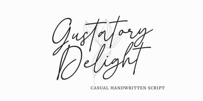 Gustatory Delight is a perfect handwritten script font that has a modern and authentic look, this font has a simple and unique character in both lowercase and uppercase, this font is perfect for branding, signature, logo, packaging, presentations, planners, resumes, business card, brochures, fashion, t-shirt, wedding invitations, yard signs and more.
 - Scrapyard Script by Mans Greback,
$69.00 Scrapyard Script is a bold, heavy font with a cool and funky vibe that captures the essence of street style and urban culture. Ideal for streetwear branding, concert posters, funky album covers, and other projects that require a cool, contemporary vibe, Scrapyard Script is a display font that adds an energetic, dynamic touch to your designs. Its unique style makes it a great choice for projects that need to stand out and make an impact. Use multiple _ ¤ # to make swashes of different lengths. Example: Rockstar____ (Download required.) The Scrapyard Script font family includes four high-quality styles to suit various design needs: Regular: A bold, paintbrush-inspired style with a youthful edge Italic: Adds a touch of movement and expressiveness to the regular style Bold: An even bolder and heavier presence for more impactful designs Bold Italic: Combines the assertiveness of bold with the energy of italic Built with advanced OpenType functionality, Scrapyard Script ensures top-notch quality and provides you with full control and customizability. It includes stylistic alternates, ligatures, and other features to make your designs truly unique. It has extensive lingual support, covering all Latin-based languages, from Northern Europe to South Africa, from America to South-East Asia. It contains all characters and symbols you'll ever need, including all punctuation and numbers.
 - Bizarries by Typephases,
$25.00 This series, with 104 illustrations in three files, collects original ink drawings with absurdities, bizarre people, whimsical personalities and risky behaviors! There is a very peculiar sense of narrative in the sucession of characters, even if they came out rather spontaneously and their order is random.With a vintage look and feel, these people seem to come out of a time capsule from Victorian times. Almost everything in the Bizarries (and also in their close relatives, our Illustries, Whimsies, Ombres, Absurdies and Genteta dingbats) is invented and drawn with no references —just a handful of images were sketched from historical photography. These illustrations can be very useful for a variety of projects, either in black and white, or colored in a paint or drawing application. You can use them at any size, from a small spot illustration to a huge poster, depending on your needs. The outlines remain crisp and clear no matter how much you enlarge, reduce, distort or tweak their shapes.
 - EraMax Radial by Our House Graphics,
$16.00 EraMax Radial is a geometric sans serif meant to be set BIG, for big statements. It's the perfect face for signage, packaging posters, branding and so on and on, where a strong voice is needed. It has a modern look that will work in a retro setting. Or, should that be a vintage look that will work in a modern setting. This is the first of what is to be a series to typefaces inspired by the original hand painted signage found in the TH&B train station in Hamilton Ontario. This classic Art Deco, Or, more precisely, Art Moderne building designed by the New York architectural firm of Fellheimer and Wagner and completed in 1933. The original lettering included about 75% of the uppercase letters only, so the balance of the uppercase and the lowercase plus all the other glyphs were extrapolated from the look and feel of the existing uppercase letters. Figures are based on the numerals on the station clock, with adjustments made to harmonised with the letters.
 - Snatched by Cititype,
$16.00 'Snatched' is a spontaneous handwriting. This name is taken from the slang term in the 2022 era to describe someone or something in a positive manner. This font consists of the same uppercase and lowercase, often referred to as 'all capital letterform', complete with numerals and punctuation. Composed in tends to widen form which is more like the typical handwriting of architects. This font looks like it was written with a marker or technical pen, very bold stylish and legible. For designers this is an interesting thing, the design looks very natural and rhythmic to beautify presentations and blue prints. Can be installed for CAD programs, Sekthup and other applications. This font is very suitable for various media related to handmade, craft businesses, logos, quotes, prints, social media posts, indie business, outdoor sports and other applications to strengthen the impression of handwriting and demand attention.
 - Pfennig - 100% free

- LT Beverage - 100% free

- Simple Home by Goodigital13,
$20.00 This font perfectly made to be applied especially in logo, and the other various formal forms such as invitations, labels, logos, magazines, books, greeting / wedding cards, packaging, fashion, make up, stationery, novels, labels or any type of advertising purpose.
 - Withered Leaves by Rvandtype,
$12.00 Withered Leaves is Handwritten font. It has a elegant, and modern look which can be used for logos, branding, invitations, stationary, wedding designs, social media posts, and every other design.
 - Full English by Hanoded,
$15.00 I have always been fascinated by the ‘Full English Breakfast’. A Full English usually consists of toast, baked beans, sausages, fried eggs, fried tomatoes, fried mushrooms and sometimes blackpudding (a kind of sausage made from pig’s blood). When I lived in England, my friends were always quite happy to stow away a big full breakfast, but I, on the other hand, could not really set myself to eating one. Full English is a hand made stencil font. If you own a pub and you serve breakfast, you could use it for your signs, but I guess this font looks good on anything that needs a bit of attention. For attention, it will get!
 - Hyperspit by PizzaDude.dk,
$20.00Hyperspit is really the CAPS of my other font Family Cat. They are just messed up pretty good! - Dreamline by Wiescher Design,
$19.50 Dreamline is a set of elegant monoline scripts in three variations that can be mixed with each other.
 - Bahnhof by Storm Type Foundry,
$29.00Poster type faces from the twenties and thirties are enjoying a new wave of popularity. The summary, even rather hard principle of the sign is required for a view from a distance. The information appearing on the poster must be readable even from the opposite pavement. And, as is often the case with monumental type faces, these type faces are legible even in small sizes. The name Bahnhof suggests the hypothetical use of the type face on railway station buildings. - Cover Letter JNL by Jeff Levine,
$29.00 The handmade title on the cover for the 1939 edition of “A Wand’ring Minstrel” [from Gilbert and Sullivan’s “The Mikado”] was rendered with a round nib lettering pen in an Art Deco style. This type design is now available as Cover Letter JNL in both regular and oblique versions. However, the font’s name is a bit of a pun, as it has nothing to do with cover letters, but rather the lettering found on the cover of the sheet music.

