10,000 search results
(0.039 seconds)
- Celdum by The Northern Block,
$39.00 Celdum, a modern geometric type family, constructed from a rectangular grid. Smooth, precise curves meet horizontal and vertical lines to create a monoline design with no apparent contrast. Each letter shape has unique subtleties creating a purposeful type family suited to text and branding scenarios within mobile applications, video games and other interactive software. Details include six weights with italics, 460 characters, five variations of numerals, manually edited kerning and Opentype features.
 - Dominica Calligraphy by Ride Studio,
$10.00 Dominica Calligraphy is a balanced, subtle, elegant and stylish handwritten font. It has beautiful character. This font comes with a matching Outline/Monoline version. Perfectly match the design of invitation cards, company logos, movie titles, movie names, business cards, book titles, brand names and various other designs. Dominica Calligraphy is a chic, refined script font that emanates sophistication and elegance. Its stylish alternates and ligatures make this font the perfect match for any project.
 - Sunnylise by Mevstory Studio,
$10.00 Sunnylise, from Mhdafifersya, is a handwritten script font with a simple and classy style. It includes a set of lowercase characters without connecting strokes. Be sure to turn on your OpenType features when using Sunnylise - it’s packed with ligatures and alternate characters for both upper and lower case glyphs. This font is great for your next creative projects such as headlines, quotes, album cover, bold branding, business cards, and many other design project. Thanks
 - Yuanita by Putracetol,
$12.00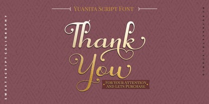 Yuanita is a beautiful modern calligraphy font. A modern script with a handmade calligraphy style. This font is feminime, elegant, messy and modern. Yuanita perfect for wedding event, anniversary, birthday, greeting cards, logotype, branding, wedding invite and card, elegant logo, poster, packaging, stationery, website, and any other projects requiring a handwritten and luxurious touch. Includes OpenType feature with a lot of alternates to help you to make great lettering. This font also supports multiple languages.
 - Bigtown by Letterhend,
$16.00 Bigtown - A Slab Serif Typeface. Bigtown is a display font that have a strong and bold looks. This font is made by hand lettering so it looks natural and very suitable for vintage and rustic theme. Perfectly made to be applied especially in logo, and the other various formal forms such as invitations, labels, logos, magazines, books, greeting / wedding cards, packaging, fashion, make up, stationery, novels, labels or any type of advertising purpose.
 - Joss Rilex by Rotterlab Studio,
$15.00 Introducing a new beautiful calligraphy font, Joos Rilex! Joos Rilex is perfect for elegant logos, high-end packaging, wedding stationery, websites and other projects that require a handwritten and luxurious touch. A wide variety of doodles and alternatives are included so you can give your logo or name a hand-drawn calligraphic look. Features: Joss Rilex (OTF) Thank you for visiting my shop, and feel free to contact if you have any questions!
 - Full Sans by Bülent Yüksel,
$19.00 Full Sans is a geometric sans in the tradition of Futura, Avant Garde and the like. It has a modern streak which is the result of a harmonization of width and height especially in the lowercase letters to support legibility. Full Sans is the younger brother of original Full Neue, Full Slab and Full Tools. Ideally suited for advertising and packaging, editorial and publishing, logo, branding and creative industries, poster and billboards, small text, wayfinding and signage as well as web and screen design. Full Sans provides advanced typographical support for Latin-based languages. An extended character set, supporting Central, Western and Eastern European languages, rounds up the family. The designation “Full Sans LC 50 Book” forms the central point. The first figure of the number describes the stroke thickness: 10 Thin to 90 Bold. Full Sans LC comes 5 weights and italics also Full Sans SC comes 5 weights and italics total 20 types. The family contains a set of 485 characters. Case-Sensitive Forms, Classes and Features, Small Caps from Letter Cases, Fractions, Superior, Inferior, Denominator, Numerator, Old Style Figures just one touch easy In all graphic programs. Full Sans is the perfect font for web use. You can enjoy using it. UPDATE: 08 March 2019 - Fixed extension of glyhps "y" and "g". - "LineGap" error has been fixed. - Fixed bug in "onum", "pnum", "tnum" and "tnum" software in OpenType feature.
 - FS Split Sans by Fontsmith,
$80.00 Quirky and irregular FS Split is no ordinary typeface. Its irregular proportions make it unique, with round letters appearing wide, and straight letters narrow. Other quirks include its eclectic crossbars – the uppercase ‘A’ has an unusually low bar, while the bar on ‘G’ is particularly long. The uppercase has many interesting features in fact, including large counters, closed terminals on certain letters like ‘J’, and a cap-height that lines up with ascenders. The lowercase also holds surprises – the dots on ‘i’ and ‘j’ are unusually large, and some characters, such as ‘g’, feature double-storey counters. An extreme but stylish italic The italic versions of FS Split Sans and Serif are particularly striking. While similar in style to their upright, Roman versions, they take on a larger-than-usual 18-degree angle, making the forward-slant more dramatic. Although the main purpose of any italic is to help words and phrases stand out, this unique execution helps to make the italic variants of FS Split stylish fonts in their own right – they would work brilliantly on magazine covers, in titles and headlines, pull quotes, and even used commercially in logos and corporate branding. Serif and sans: a split personality FS Split Sans and Serif have their differences but also their similarities, contrasting and complementing each other perfectly. This ‘love hate’ relationship inspired the name of the typeface family, and means the two variants provide a versatile, typographic palette for use in graphics and branding. While its proportions are similar to the sans, the serif has a bigger contrast between its weights of bold, regular and light, bracketed serifs, and different styles of terminals, some being straight and others ball-shaped. FS Split Sans has more subtlety and simplicity, with a smaller weight contrast, less flamboyant terminals, and more consistent counter sizes. The two variants are distinct yet alike, so can be used successfully either in isolation or together.
 - FS Split Serif by Fontsmith,
$80.00 Quirky and irregular FS Split is no ordinary typeface. Its irregular proportions make it unique, with round letters appearing wide, and straight letters narrow. Other quirks include its eclectic crossbars – the uppercase ‘A’ has an unusually low bar, while the bar on ‘G’ is particularly long. The uppercase has many interesting features in fact, including large counters, closed terminals on certain letters like ‘J’, and a cap-height that lines up with ascenders. The lowercase also holds surprises – the dots on ‘i’ and ‘j’ are unusually large, and some characters, such as ‘g’, feature double-storey counters. An extreme but stylish italic The italic versions of FS Split Sans and Serif are particularly striking. While similar in style to their upright, Roman versions, they take on a larger-than-usual 18-degree angle, making the forward-slant more dramatic. Although the main purpose of any italic is to help words and phrases stand out, this unique execution helps to make the italic variants of FS Split stylish fonts in their own right – they would work brilliantly on magazine covers, in titles and headlines, pull quotes, and even used commercially in logos and corporate branding. Serif and sans: a split personality FS Split Sans and Serif have their differences but also their similarities, contrasting and complementing each other perfectly. This ‘love hate’ relationship inspired the name of the typeface family, and means the two variants provide a versatile, typographic palette for use in graphics and branding. While its proportions are similar to the sans, the serif has a bigger contrast between its weights of bold, regular and light, bracketed serifs, and different styles of terminals, some being straight and others ball-shaped. FS Split Sans has more subtlety and simplicity, with a smaller weight contrast, less flamboyant terminals, and more consistent counter sizes. The two variants are distinct yet alike, so can be used successfully either in isolation or together.
 - Cadina by Sulthan Studio,
$12.00 Introducing Cadina, an elegant new font! This font is especially created for those of you who need a touch of elegance to design your projects next with perfect results and amazing. Cadina is a very beautiful and interesting script and comes with a perfect line for use for various purposes. Like titles, signatures, logos, correspondence, wedding invitations, letterheads, nameplate, labels, bulletins, posters, badges, Branding, Greeting Cards, etc. Cadina is built with OpenType features and includes start and end. It comes with OpenType Stylistic set, Initial, swashes, ligatures and everything to add a touch to your design and also supports other languages :)
 - Fedorro by Leeza Chepugova,
$13.00 We are proud to present to you our new Latin+Cyrillic font Fedorro! Fedorro typeface is a classy example of a modern Ukrainian style of type design. It is inspired by traditional fonts of the past, but with a strong modern twist to its appearance. The main feature of this font are round and playful letters combined with a relatively tiny negative space, making it unique like no other: many typeface elements were borrowed from historical exemplars of Ukrainian handwritten letters and redesigned with modern trends in mind. Fedorro is perfect for all the situations when you need the text to pop and catch the viewer's eye: posters, books and magazine covers, headlines, banners and ads, logotypes, corporate branding, lables, ads etc.
 - D.I.Y. Time by Latinotype,
$19.00 D.I.Y. Time is a hand drawn type system designed by Luciano and Coto inspired by the DIY philosophy which has been transformed into a whole global counterculture movement, identifying the new generations that reprice the handwork, paying attention to quality, processes and materials used in the manufacture of goods and objects, food, clothing, furniture etc. This beautiful philosophy inspires us every day. Is present in our homes, in our lifestyle and this time we have given him way through a typeface family that mixes different styles but integrates them through language handmade. The result is a typeface based on hand lettering drawing with different brushes and pens on paper. With versions ranging from organic proposals as DIY time hand to other based on the classic proportions of Gill as DIY time sans. To accompany a set of compound words designed on the needs of small farmers and a set of ornaments illustrated, everything you need to begin to make your own.
 - Acaraje by Latinotype,
$39.00 Acarajé is a grotesque font that stands out thanks to its versatility. Its personality blossoms through its particular modulation, which grows with weights; making it a rather jovial typeface that does not abandon the characteristics of more classic grotesques. With two styles available: normal and italic, and a variety of 7 weights that range from "Black" to "Regular", this font offers incredible flexibility for your designs.
 - Jayden Collins by Letterhend,
$14.00 Jayden Collins is the signature font that perfectly captures the beauty of a handwritten signature. With its natural feel and casual, chic style, it's the perfect choice for branding, logos, and the other various formal forms such as invitations, labels, logos, magazines, books, greeting / wedding cards, packaging, fashion, make up, stationery, novels, labels or any type of advertising purpose where a personal touch is needed. And with its two different style versions, you can create a variety of unique and eye-catching designs. Features : Uppercase & lowercase Numbers and punctuation Alternates & Ligatures Multilingual PUA encoded We highly recommend using a program that supports OpenType features and Glyphs panels like many of Adobe apps and Corel Draw, so you can see and access all Glyph variations.
 - Univers Next Variable by Linotype,
$259.99 Univers Next Variable Set is a single font file that features three axes: Weight, Width and Italic. The Weight axis has a range from Light to Extra Black. The Width axis provides a range of condensed and extended values. The Italic axis is a switch between upright and italic. Variable fonts act as a complete family of fonts in a single file. The new Variation font feature is supported by a growing number of desktop design applications, and more importantly by all the major web browsers. Variable fonts provide a variety of benefits to web and print designers and developers including flexible, responsive typography.
 - Posterizer KG Sketch by Posterizer KG,
$30.00 Posterizer KG Sketch is basically a drawn version of Egyptian Slab Serif font Posterizer KG. Posterizer KG Sketch, is useful for some themes like music, painting, party, food, nature, kids... and many other funny and creative things. Contains all the Latin and Cyrillic glyphs.
 - Mannish by Tacikworks,
$14.00 Tacikworks Studio presents Mannish Retro Display Font, an all caps font which is inspired by retro designs. Make the classic impression of this font stand out more. This font has approximately 400+ glyphs characters including uppercase, lowercase, discretionary ligatures and standard ligatures alternatives. It is suitable for creating vintage designs such as logo posters, merchandise, clothing, brochures, business cards and others. It can be accessed by using Open Type savvy programs like Adobe Illustrator and Adobe InDesign. features can be accessed by using Open Type save programs such as Adobe Illustrator, Adobe InDesign, Adobe Photoshop. So that all the alternate and ligature characters Easily can be accessed in full by a Craftsman or designer. Features: Uppercase Lowercase Numbers Punctuations Stylistic Alternates & Ligatures Multilingual Languages Supported HOW TO ACCESS ALTERNATE CHARACTERS Open Glyphs Panel: In Adobe Photoshop go to Window – glyphs In Adobe Illustrator go to Type – glyphs Not included: Product mockup, design template and textured background.
 - Phone Pro Hebrew by Tamar Fonts,
$30.00 Note: the 'Phone Pro Hebrew' typeface, includes just the Hebrew characters of the comprehensive "Phone Pro" family font, sold separately [on this MyFonts site], so they are economical for those interested just in the Hebrew Characters. And regarding the “Phone Pro” project in general, this is what I wrote: 'PRISTINE'; this font is—neither beautiful nor ugly, neither vigorous nor weak, neither traditional nor modern, neither serif nor sans serif, neither script nor printable, neither a text font nor a display font—it is rather all of the above, which makes it a more versatile typographic tool—[handwritten] characters that are well-suited for a wide variety of applications—from editorial design, [friendly] greeting cards... to branding, advertising, publicity and digital. Each glyph design combines its unique shapes and stylish ink-traps with parabolic curves. Each glyph design has been treated as an 'individual character'—the way I would treat a breathing, living, vulnerable and courteous human being; looking after each and every character as if it was my only child — bringing to light the authenticity and uniqueness of each individual, as well as my objective to bring about peace and harmony between them all as a whole. Designed with the intention of harmonizing between four scripts — Latin, Cyrillic, Greek and Hebrew; the whole family has a comprehensive set of characters—in addition to the Latin letters, the Phone typeface also has a full set of characters for Vietnamese, partially extended Cyrillic, Greek and Hebrew (sold separately). The t_t ligature is something unique to Phone, as well as the t_z ligature, among others and extras. A distinctive trait of the Phone typeface, is a high x-height combined with relatively short ascenders. The Phone typeface is in a way evoking the feeling of some Gaelic font and of the [Egyptian] Papyrus font (by Chris Costello, though, not being based on neither of those), having an exotic and an exquisite look, under the category of "Soft Fonts & Friendly Faces".
 - MVB Verdigris Pro by MVB,
$79.00 Garalde: the word itself sounds antique and arcane to anyone who isn’t fresh out of design school, but the sort of typeface it describes is actually quite familiar to all of us. Despite its age—born fairly early in printing’s history—the style has fared well; Garaldes are still the typefaces of choice for books and other long reading. And so we continue to see text set in old favorites—Garamond, Sabon®, and their Venetian predecessor, Bembo®. Yet many new books don’t feel as handsome and readable as older books printed in the original, metal type. The problem is that digital type revivals are typically facsimiles of their metal predecessors, merely duplicating the letterforms rather than capturing the impression—both physical and emotional—that the typefaces once left on the page. MVB Verdigris is a Garalde text face for the digital age. Inspired by the work of 16th-century punchcutters Robert Granjon (roman) and Pierre Haultin (italic), Verdigris celebrates tradition but is not beholden to it. Created specifically to deliver good typographic color as text, Mark van Bronkhorst’s design meets the needs of today’s designer using today’s paper and press. And now, as a full-featured OpenType release, it’s optimized for the latest typesetting technologies too. With MVB Verdigris Pro Text, Van Bronkhorst has revisited the family, adding small caps to all weights and styles, extensive language support, and other typographic refinements. Among the features: • Support for most Latin-based languages, including those of Central and Eastern Europe. • Precision spacing and kerning by type editor Linnea Lundquist. The fonts practically set beautiful text by themselves. • Proportional and tabular figure sets, each with oldstyle and lining forms with currency symbols to match. • Ligatures to maintain even spacing while accommodating Verdigris’ elegant, sweeping glyphs. • Numerators and denominators for automatic fractions of any denomination. • Useful, straightforward dingbats including arrows, checkboxes, and square and round bullets in three sizes. • Alternative ‘zero’ and ‘one’ oldstyle figures for those who prefer more contemporary versions over the traditional forms. • An alternative uppercase Q with a more reserved tail. • An optional, roman “Caps” font providing mid-caps, useful for titling settings, and for those situations when caps seem too big and small caps seem too small. __________ Sabon is a trademark of Linotype Corp. Bembo is a trademark of the Monotype Corporation.
 - Nadah by Nantia.co,
$12.00 Nadah Grunge Handwritten Greek font is a decorative font. Of course, the font supports Greek character set and a full extended Latin character set with diacritics. The raw, organic feeling of the font it makes it ideal for the food industry. Also, it’s ideal for creating social media content, for branding, poster design, wedding invitations, or any other packaging. So with your purchase, what is included? Extended Latin Characters Greek Characters Numerals
 - Picaro NF by Nick's Fonts,
$10.00A rather quaint but charming typeface, originally named Harlequin, provide the inspiration for this typeface. Its mild eccentricities will add an inviting warmth to your next project. Both versions of this font contain the Unicode 1252 (Latin) and Unicode 1250 (Central European) character sets, with localization for Romanian and Moldovan. - Medieval Gunslinger by Ingrimayne Type,
$14.95 What would happen if one took a rather crude, squared-serifed typeface of the type popular in the 19th century and added medieval and calligraphic ornamentation? Maybe the result would be Medieval Gunslinger. The MedievalGunslingerShadOverlay font is spaced so that it can be layered with MedievalGunslingerShadow to produce bicolored lettering.
 - Griezelig by Hanoded,
$15.00 I love creating fairytale fonts, but for some reason I haven’t made one for quite a while. So, without further ado, I present Griezelig! Griezelig in Dutch means ‘scary’ or ‘creepy’. The word itself even looks kind of creepy! Griezelig was loosely based on two of my favourite (but unfortunately rather inconspicuous) fonts called Hexenhammer and Bronwen.
 - Linotype Tapeside by Linotype,
$29.99Linotype Tapeside is part of the Take Type Library, chosen from the entries of the Linotype-sponsored International Digital Type Design Contests of 1994 and 1997. British designer Stephan B. Murphy created this typeface with light, regular and bold weights, each with its matching italic. Consciously awkward, the characters line themselves up and produce a young, lively image. Linotype Tapeside is best for headlines and shorter texts in point sizes of 12 and larger and its varying stroke strengths allow this font to be set more universally than others of its kind. - HS Almaha by Hiba Studio,
$50.00 HS Almaha is a modern OpenType Arabic Typeface. It combines the features of linear Naskh and modern Kufi. Segments of its letters are curvy and sharp. They are refinement more readable and present in extended texts in magazines, newspapers, books and other publications. This typeface supports Arabic, Persian, Urdu and Kurdish languages and it contains four weights; light, regular, medium and bold which can add to the library of Arabic fonts contemporary models that meet with the purposes of various designs for all tastes.
 - Bully Pulpit Plain NF by Nick's Fonts,
$10.00 This engaging headline face is based on a rather pudgy typeface named “Bullion Shadow”, which was originally released somewhere on the cusp between the hippie and disco eras, and was equally at home in both. Now available in shaded and plain. Both versions of this font support the Latin 1252, Central European 1250, Turkish 1254 and Baltic 1257 codepages.
 - Valenteena by Ingrimayne Type,
$9.95 Valenteena is in the spirit of the 19th century, but there are no other typefaces quite like it. It is geometric, using distorted hearts to form the letters. The lower-case letters are smaller versions of the upper-case letters. The overlay variant is derived by breaking ValentinaContour into its parts: the inner letter, the white inner border, and the black outer border. To use them one must have a program that allows layers of letters. Type in and format the inside variant to get the message you want. Also select the color you want this layer to have. Copy this layer twice, formatting one to the medium and and the other to outside. Color each of them in the colors you want and them combine the three layers, placing them so the letters exactly align. You will get letters with three colors.
 - Text by Alias Collection,
$60.00 Whereas blackletter types were hand written, Text letterforms are drawn using a series of graphic shapes that slot together in a series of permutations, one set for lower case and another for the upper case. As the link between the method of construction of the letterforms has been removed from the appearance (the quill pen with which they were written resulting in the angle and sharp stresses) there is no logic for these stylistic elements to work in any set way. As this fundamental rule of the blackletter style has been removed the typeface has become something other than a typical or derivative blackletter font.
 - Bruna by Antonio Lechuga,
$35.00 Its open counters and large x height give it excellent performance in small sizes. On the other hand, its curved diagonals, generous width and soft shapes give it a friendly but functional personality for a wide range of messages and voices. We recommend the four most extreme weights (Thin, ExtraLight, Black, and Heavy) for large sizes starting at 18 points, and the five intermediate weights (Light, Book, Regular, Medium, and Bold) for small sizes starting at 7 points.
 - Riky by Eurotypo,
$28.00 Riky is a heavy sans typeface carefully hand-drawn made, with different letter shapes, full of ligatures, and stylistic alternates that will provide great flexibility for your designs. Ricky's typeface is lively, dynamic and energetic. This font has an informal and decorative style. Riky fonts come in 2 versions: Shadow and solid. These fonts are quite perfect for packaging design, posters, children books and many other purposes. Play with them, be creative with them and enjoy them.
 - Photomark Signature by MJB Letters,
$17.00 Photomark Signature is a Casual and Stylish Signature font, it has unique style in uppercase and lowercase character and very perfect for branding, signature, card designs, wedding designs, watermarks, logos and other. Photomark Signature includes full set of uppercase and lowercase letters, numeral, punctuations and ligatures. Included in this set: Works on PC & Mac Simple installations Accessible in the Adobe Illustrator, Adobe Photoshop, Adobe InDesign, even work on Microsoft Word. PUA Encoded Characters – Fully accessible without additional design software
 - Sivana by Muflihin Nurhabib,
$18.00 Introducing Sivana: An elegant and modern serif typeface. With its modern and minimalist appearance, CAKELAN brings a luxurious and clean style to your projects such as websites, modern logos, branding identities, social media quotes, wedding stationery, and various other needs! Sivana displays the capital letters A to Z which are unique and classy, of course because they are made with great care so that they become beautiful fonts and can be adapted to various large projects that you want.
 - Millesa by Muflihin Nurhabib,
$18.00 Introducing Millesa: An elegant and modern serif typeface. With its modern and elegant appearance, Millesa brings a luxurious and clean style to your projects such as websites, modern logos, branding identities, social media quotes, wedding stationery and various other needs! Millesa displays capital letters A to Z which are unique and classy, of course because they are made with great care so that they become beautiful fonts and can be adapted to various large projects that you want.
 - Waldorfschrift by Joachim Frank,
$23.00 The Waldorfschrift family was created in digital form in the years 1993-1994 by Joachim Frank, inspired by the naturally organic letters from the anthroposophical movement of the 20th century of Rudolf Steiner . In nature there are no right angles, straight lines or complete uniformity, but instead round corners, varying thicknesses and all kinds of variability. This is what the anthroposophical movement created in their buildings, their art, in their music – and also in their lettering. And this Font is like the plants in nature: it grows upwards, branches out, letters hugs to some letters, with others they keeps more distance, some letters proudly stretch their belly, others crouch in the corner - a completely natural font. Take a look at the brand of Weleda (the natural cosmetics company), Demeter (one of the biggest organic foods companies), Filderklinik (a great anthroposophical hospital in Germany) and you will see these great companies work with different but organic letter styles. More recently, Joachim revisited the Waldorf fonts with modern type design software and added extra characters such as the euro sign, and extra weights to make the fonts useable for a wide variety of design tasks. Dez 21: A big update: All fonts have been digitized again and given a complete character set, new kerning, minor bugs removed.
 - GemFont One - Personal use only

- RePublic by Suitcase Type Foundry,
$75.00In 1955 the Czech State Department of Culture, which was then in charge of all the publishing houses, organised a competition amongst printing houses and generally all book businesses for the design of a newspaper typeface. The motivation for this contest was obvious: the situation in the printing presses was appalling, with very little quality fonts existing and financial resources being too scarce to permit the purchase of type abroad. The conditions to be met by the typeface were strictly defined, and far more constrained than the ones applied to regular typefaces designed for books. A number of parameters needed to be considered, including the pressure of the printing presses and the quality of the thin newspaper ink that would have smothered any delicate strokes. Rough drafts of type designs for the competition were submitted by Vratislav Hejzl, Stanislav Marso, Frantisek Novak, Frantisek Panek, Jiri Petr, Jindrich Posekany, and the team of Stanislav Duda, Karel Misek and Josef Tyfa. The committee published its comments and corrections of the designs, and asked the designers to draw the final drafts. The winner was unambiguous — the members of the committee unanimously agreed to award Stanislav Marso’s design the first prize. His typeface was cast by Grafotechna (a state-owned enterprise) for setting with line-composing machines and also in larger sizes for hand-setting. Regular, bold, and bold condensed cuts were produced, and the face was named Public. In 2003 we decided to digitise the typeface. Drawings of the regular and italic cuts at the size of approximatively 3,5 cicero (43 pt) were used as templates for scanning. Those originals covered the complete set of caps except for the U, the lowercase, numerals, and sloped ampersand. The bold and condensed bold cuts were found in an original specimen book of the Rude Pravo newspaper printing press. These specimens included a dot, acute, colon, semicolon, hyphens, exclamation and question marks, asterisk, parentheses, square brackets, cross, section sign, and ampersand. After the regular cut was drafted, we began to modify it. All the uppercase letters were fine-tuned, the crossbar of the A was raised, E, F, and H were narrowed, L and R were significantly broadened, and the angle of the leg and arm of the K were adjusted. The vertex of the M now rests on the baseline, making the glyph broader. The apex of the N is narrower, resulting in a more regular glyph. The tail of Q was made more decorative; the uppercase S lost its implied serifs. The lowercase ascenders and descenders were slightly extended. Corrections on the lower case a were more significant, its waist being lowered in order to improve its colour and light. The top of the f was redrawn, the loop of lowercase g now has a squarer character. The diagonals of the lowercase k were harmonised with the uppercase K. The t has a more open and longer terminal, and the tail of the y matches its overall construction. Numerals are generally better proportioned. Italics have been thoroughly redrawn, and in general their slope is lessened by approximatively 2–3 degrees. The italic upper case is more consistent with the regular cut. Unlike the original, the tail of the K is not curved, and the Z is not calligraphic. The italic lower case is even further removed from the original. This concerns specifically the bottom finials of the c and e, the top of the f, the descender of the j, the serif of the k, a heavier ear on the r, a more open t, a broader v and w, a different x, and, again, a non-calligraphic z. Originally the bold cut conformed even more to the superellipse shape than the regular one, since all the glyphs had to be fitted to the same width. We have redrawn the bold cut to provide a better match with the regular. This means its shapes have become generally broader, also noticeably darker. Medium and Semibold weights were also interpolated, with a colour similar to the original bold cut. The condensed variants’ width is 85 percent of the original. The design of the Bold Condensed weights was optimised for the setting of headlines, while the lighter ones are suited for normal condensed settings. All the OpenType fonts include small caps, numerals, fractions, ligatures, and expert glyphs, conforming to the Suitcase Standard set. Over half a century of consistent quality ensures perfect legibility even in adverse printing conditions and on poor quality paper. RePublic is an exquisite newspaper and magazine type, which is equally well suited as a contemporary book face. - Gorod.Volgograd by FontCity,
$15.00The general idea: Can You imagine to yourself, what the hydroelectric power station is? The building of this electricity production foundry is half hidden under the water, but the visible above-water part astonishes your sense. It is a construction almost 1,5 km length dammed out the powerful river stream. Besides thousand of electricity conduction lines supports it bears also the highway and the railroad. From a faraway distance the train seems like a caterpillar that has climbed up the stout tree. There are also the navigable sluices, the flood channels and other erections. The idea of this typeface outlines arrived to the authors exactly on the viewing platform, under the impression of the waterfalls, which are escaping from the dam womb, falling from almost 50 meters altitude and becoming white-haired during this flight. Release: in the form of "gorod.Volgograd" font with the one style. We work with other styles now and sometime we will be very glad to introduce the Bold and Italic styles to You. We should explain the font name meaning. "Gorod" is "city of" in Russian and Volgograd is the old, big and famous Russian city. The Volga hydroelectric power station of a name of XXII congress of the CPSU caused the Volgograd sea formation. It expands of 14 km width and more than 600 km along the Volga river-bed. But HEPS isn't the sole Volgograd sight. There are many interesting places here. The most known tourist sight, the visit card of Volgograd is the Mamaev Hill. Being here You can see almost all 100 kilometers of city length. Due to its geographical position, Mamaev Hill has got a great importance during the Great Patriotic War (1941-1945). It became and still is the Main Height of Russia. Soviet people have built the huge stately memorial ensemble here. There are many other witnesses of the heroic past of Volgograd: the Alley of Heroes, the Perished Fighters Square, the Soldiers Field and others. The line of tank turrets is stretched out along all town not far from Volga bank. It marks the line, where fascist troops was stopped in 1943. It is very amazingly when You dive under the ground on a usual tram. Volgograders have built a few underground station for the high-speed tramway. The river tram need a quarter of an hour to get an island in the Volga. And You need the same time to walk across the river station. The Volga-Don navigable channel starts from Volgograd. There are planetarium, circus, some theatres, many museums in Volgograd. One of football matches of Euro-2004 qualifying round took a place in the "Rotor" stadium in Volgograd. Volgograd holds the longest - above 50 km - park in the world. Its avenues, squares, embankments are beautiful, Volgograd central districts are built in unique architecture style called the Stalin Empire. You can enjoy fountains, parks, attractions, water-pools and other Volgograd sights. If You visit Volgograd once You'll never forget it. You can read about the ancient history of Volgograd city on the Tsaritsyn font page. Also we plan to create the Stalingrad font and give You a short story about another period in Tsaritsyn-Stalingrad-Volgograd history. - Ammurapi by Proportional Lime,
$5.99 Ammurapi was the last king of Ugarit, which was destroyed circa 1200 B.C. Back then all writing was done by hand and all that has been preserved is on clay tablets many of which were fired in the very destruction of the cities that enabled these documents to withstand the rvages of time. Ugarit unlike the other cuneiform scripts has a very limited number of glyphs. It is somehow exotically attractive. This font has been encoded in the appropriate unicode block to permit ease of use for scholarly purposes, but would also make a fine use as a decorative element.
 - Submarine by Holland Fonts,
$30.00The Submarine family is based on a custom designed typeface for website navigation and headlining purposes, hence its geometric structure. In contrast to most other typefaces, where increase of boldness of the lighter weights expands externally in the width, the Submarine heavier weights expand internally, leaving the length of words and texts pretty much the same. The open structure of the lighter weights make it reasonable text face as well. - Bumbershoot by Ingrimayne Type,
$9.00 Bumbershoot is a typeface for a rainy day. A letterbat font constructed of umbrellas, it does not have true lower-case letters. Rather it has two mostly different sets of upper-case characters.
