10,000 search results
(0.038 seconds)
- Pagram by 4RM Font,
$15.00 Pagram fonts are fonts that have neutral and authentic values, are made without reducing the value of functionality, these fonts are easily adaptable to the use of text and displays such as logos, body text, and others.
 - Bamble Hearts by Awan Senja,
$14.00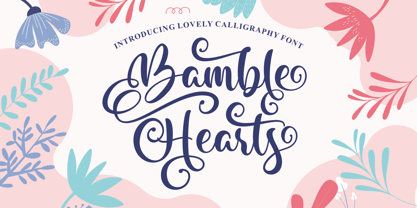 Bamble Hearts is a lovely calligraphy font. It has a modern and elegant look and is perfect for logos, branding, invitations, photography, wedding stationary, labels, and every other design which needs an unique and luxurious touch. This font is PUA encoded which means you can access all of the cute glyphs and swashes with ease! It also features a wealth of special features including alternate glyphs and ligatures.
 - Carlottena by Stefani Letter,
$12.00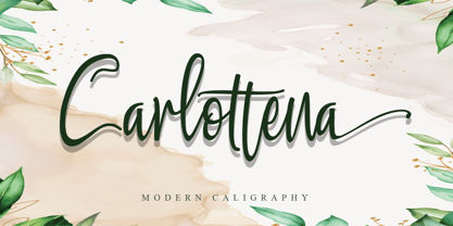 Carlottena is a beautiful and elegant script font. Its modern and classy look is perfect for logos, branding, invitations, social media posts and every other design that needs a handwritten touch and can be used for almost every design. This font is PUA encoded which means you can access all of the amazing glyphs and swashes with ease! It also features a wealth of special features including alternate glyphs and ligatures.
 - Vintage Stencil Motifs JNL by Jeff Levine,
$29.00 Vintage Stencil Motifs JNL is a collection of charming and decorative designs re-drawn (as the name indicates) from vintage source material. For decades, home decorators and do-it-yourself hobbyists embellished furniture, chests, walls and other areas with thematic stencils in both borders and topical vignettes. Today's digital designers can use these stencil patterns to embellish text set in other stencil alphabets or by themselves to evoke the feeling of rustic Americana.
 - Vladimir Script by ITC,
$40.99Vladimir Script is a brush-style font, similar to the kind of lettering found on old hand-painted department store signs during the 1950s. The letters have a steep slant, and the uppercase letters and the numbers are rather informal. Many of the letters' strokes end in looped terminals, some with dynamic amounts of contrast. Vladimir Script is best used in larger point sizes, where its subtle details can dance across the page. The typeface looks fabulous on signs and cards. - Banner by URW Type Foundry,
$39.99 Jan Koller designed the Banner typeface family especially for the creation of animated web banners. Banner is best used at 80p without antialiasing. The family comes in 24 styles which, in combination, create great, unusual screen effects. Three different animation modells provide the basis: extrusion, cutting in/out by ‘pixelation’, outline pixel rotation. The available flash clip listed in the Related Links below demonstrates some of the effects. Take a look! The swf clip runs in any web browser (drag & drop) but you need the flash player plugin. Apart from animation use, Banner also works well in print. Since all 24 styles are identical in width and kerning, you can set several styles on top of each other, maybe using different colours for each style. Look at the nice effects yourself!
 - Whichit by Ingrimayne Type,
$5.00 Whichit contains typefaces designed with a hexagonal motif. The opposite sides of the hexagon are parallel but two of them are longer than the other four. It does not have reflective symmetry so flipping it over a vertical line returns a different appearance. One of these appearances is the basis for WhichIt and the other for WhichItTwo. Each has three weights and each weight has an italic style. The result is a quirky sans-serif family of a dozen faces.
 - Automatic AOE by Astigmatic,
$19.95A retro seventies idea of the Futuristic typeface, Automatic is a reflection on the simple and innocent ideas of the future from our past. To reach to moon, to colonize other planets, feed and clothe the earth, and spread peace throughout the universe and our own planet. Those ideals of the future are now changed forever by genetics, and the progression towards automation, amongst others. Will the future still be an innocent place for our children, or something out of a Terminator or Matrix like film...? Put the retro techno edge into your designs, and bring the dreams of yesteryears future back into our future! - Tabwa by Scholtz Fonts,
$19.00The design of the Tabwa font was inspired by the font Neuland designed by Rudolf Koch in 1923. Rather than attempting to re-create his font in a digital form as so many others have done, I have tried to capture the "spirit" of his font and merge this with the spirit of Africa. As a result the characters differ markedly from Koch's original styles and have much less of an "Art Deco" look to them. To further modernize the font I have included all the characters missing in Koch's original (a full lower case, as well as all punctuation, diacritics, special characters etc). The result is a thoroughly modern re-interpretation of the original "Neuland". The numbers (0 to 9) bear no relation to Koch's originals but, I believe, are far more in keeping with the alphabetic characters in the font. The triangles that decorate the characters of this African font are typical of the patterns found in the Tabwa culture of central and west Africa (in the Congo region). - Morro by Great Scott,
$16.00 Morro is based on simple geometric shapes – circles, triangles and rectangles. Imagine cutting circles, triangels and rectangles from paper and arranging them into letters where the outer edges form a filled figure. Arranging figures like this to form letters is nothing unique. You can find several beautiful examples of alphabets that inspired the creation of Morro. Everywhere from a 1936 booklet by Draughtsman called ”Modern lettering for all branches of commercial arts” to obvious examples is from the paragon of the design industry - Milton Glaser - with his typeface Baby Teeth. What sets Morro apart from other digitized versions of Glasers' ”Baby teeth”, or other similar designed fonts, is that Morro is expanded into lower case and also supports Basic latin, Western European, Central European, south Eastern European and Pinyin. There are also stylistic alternatives to some of the glyphs. Morro Regular works like a stencil and is accompanied by a block shadow style and an outline. The Morro family of fonts are layered and can be superimposed on each other to create several types of text effects.
 - The Humorous by Create Big Supply,
$17.00 The Humorous is the perfect choice for adding a playful and energetic touch to your creative projects. With its combination of uppercase and lowercase letterforms, The Humorous offers versatility and allows you to create captivating typography that stands out. Whether you're designing greeting cards, posters, children's books, or any other cheerful project, this font will infuse your work with a sense of fun and happiness. The font includes a comprehensive range of characters, including numbers and punctuation marks, ensuring versatility and compatibility across various design applications. It also supports multiple languages, allowing you to express your message effectively to a global audience. One of the standout features of The Humorous is its collection of ligatures, which adds a touch of uniqueness and enhances the visual appeal of your designs. Additionally, the font is equipped with PUA Encoding, enabling easy access to special characters and glyphs. Embrace the joyful spirit of The Humorous and let your creativity soar. Whether you're designing for personal projects, branding, or any other creative endeavor, this font will bring a smile to your audience's faces.
 - Mrs Lollipop by Hipopotam Studio,
$20.00 Mrs Lollipop is a hand drawn narrow typeface designed for one of our books. You can layer different styles over the background style to achieve lots of colorful effects. Check out the manual for details. Mrs Lollipop has upper and lowercase characters with up to three alternate glyphs. Build in OpenType Contextual Alternates feature will automatically set alternate glyphs depending on frequency of appearance of the same character (even in web font but only in HTML5 browsers). The script doesn’t throw random glyphs. It has lines, frames, hearts, stars, ladybird and two rabbits.
 - Belco by Tour De Force,
$25.00 Belco, designed by Slobodan Jelesijevic, was the first font family released by Tour De Force Font Foundry. Belco is elegant and useful for all kinds of publications such as books, magazines, catalogs and brochures. With a wide range of possibility and smooth personal touch, the Belco font family is ideal for longer texts, titles and typography exercises.
 - Sirba by TypeTogether,
$49.00 Sirba, a serif typeface family with a friendly personality, was conceived especially for the demands in complex text environments like dictionaries, academic texts, annual reports, novels and magazines. It has many design features that were particularly designed with Sirba’s purpose in mind. Because of its open counters, the large x-height and its short ascenders and descenders, this typeface conveys a pleasant reading experience and high legibility even in small sizes. Sirba is a low-contrast typeface, contemporary but with a classical touch, revealing its beauty in design details, such as the asymmetrical bottom serifs, curved bracketing and calligraphically reminiscent terminals. Furthermore, the capitals appear integrated into the text, thanks to the low cap height, and the constant width of all tabular numbers between the weights make this typeface very usable in annual reports and tables. Sirba is available in the four classic styles plus a special heavy (Black) version, which is particular in that its proportions are designed so the counters remain big enough when set in very small text sizes. This means that Sirba Black’s spacing and letter width are rather generous in comparison to other typefaces of that colour. This ensures excellent legibility. During the design of the typeface family, much attention was given to the italic and regular as counterparts of each other. The italic distinguishes itself just enough while reading without creating strange spots within the text when looking at the text as a whole.
 - PaperCutAlmond by PineStreet,
$25.00 PaperCutAlmond breathes just the hands-on self-made authentic happy feeling you may be looking for. Each and every glyph is based on a paper letter cut by hand with a pair of scissors by me in my studio. Ideal for packaging for organic products, illustrated goods, book covers, editorial illustrations and other freestyle projects.
 - Seddon Penmans Paradise Capitals by Intellecta Design,
$29.50 John Seddon (1644-1700), was a famous English writing master, the leading calligrapher of his time, and master of Sir John Johnson’s Free Writing School in Priest’s Court, Foster Lane. His portrait was drawn by William Faithorne and was engraved by John Sturt as the frontispiece for his copy-books, such as ‘The Ingenious youth’s companion’ of c.1690 and 'The pen-man’s paradise' of c.1695. These were engraved after his work by others. Your extra-rare book - "The Pen-mans Paradise Both pleasent & Profitable OR Examples of all ye usuall hands of this Kingdome. Adorn'd with variety of ffigures an Flourishes done by Command of hand. Each ffigure being one continued & entire Track of the pen most where of may be struck as well Reverse (or to answer bothwayes) as Forward", London (1965). - (YES, that is the title of the book!) was the starting point to these new extra accurated works of Iza W, a series of revivals of the penmanship Seddon’s artworks, like this highly ornamented animal kingdom inspired capitals and alphabets: the Seddon Penmans Paradise Capitals typeface. And, on the other hand, you can get the animal and human kingdon inspired penmanship forms in the Bestiario font. The “SeddonsFleurons” will complete the collection. Fantastic choice to elaborated barocque/renaissance inspired and historical accurated layouts.
 - Pushkin by ParaType,
$25.00 Designed for ParaType in 1999-2004 by Gennady Fridman. The Pushkin type family is based on the autographs of Alexander Pushkin, the eminent Russian poet (1799-1837). Alternative letters typical for Pushkin's hand are included. There are several variants of Pushkin's hand. Pushkin Script in 2 styles was based on the manuscripts of 1815 and covers Western and Russian character sets. Pushkin One was developed on the basis of thoroughly written documents. Pushkin Two imitates small but nevertheless rather legible hand. Pushkin Three in 2 weights was created on the basis of the autographs distinguished by sprawling hand. Pushkin One, Two and Three series covers just the Russian character set. This set of Russian fonts was amended by Pushkin French font that is based on French writings and covers Western character set.
 - FebDrei by Ingrimayne Type,
$9.95 FebDei is neat, meticulous hand printing in two weights, plain and bold, each with italics. It has little contrast and appears as if it was written with a pencil or ball-point pen. Unlike many other hand-printing fonts, it has tiny serifs. FebDrei was created in the process of making the fonts AllSmiles and BringInTheFrowns and can be used with them.
 - VakaDi by Tadiar,
$15.00 vakaDi is stylish futuristic tech font designed for such areas as hi-tech, future, sport, space, army, games and many others. In the process of creating the font, we faced the choice of which letters are better - this or that... Each of them was beautiful in its own way and so we decided to include them all!:) Some you will find in upper case, others in lower case. Multilingual support (Latin extended). It is designed for header and text both.
 - Lil' Punk by Celebrity Fontz,
$19.99Youthfully energetic, this unique typeface looks like it came straight from the hand of a skateboarding teenager. The quirky strokes and unrestrained characters convey the essence of early adolescence like no other font you will find. Perfect for children's books or publications appealing to an adolescent audience or for texts portraying unbridled youth. - Agmena by Linotype,
$40.99 Created by Jovica Veljović, the Agmena typeface family is a fine melding of digital technology and beautifully crafted Renaissance fonts. This typeface makes skillful use of proportion, form and spacing rather in the way that a practiced storyteller varies the timbre of his voice and deftly inserts longer pauses to bring his tale alive.
 - Old Chisholm JNL by Jeff Levine,
$29.00 An old brass stencil of the word 'large' was spotted for sale in an online auction. What set it apart from many other vintage stencil items was the beautiful, hand-punched Western letters with a diamond-shape center. Those five letters served as the basis for Old Chisholm JNL, which retains the look and hand-made charm of the original metal stencil.
 - Toby Font by Ingo,
$19.00 A playful handwriting of a child Twelve-year old Tobias Düsel designed the characters of this font in 2002 during his family’s furlough in the USA. He drew the alphabet freehand in pencil on a piece of stationery, and clearly had examples of the well-known college and military fonts in mind. The characters in their basic form are geometrically thought out, as well as the construction of the shadows. But remarkably, while drawing, Tobias Düsel did not reach for the obvious aid of a ruler. In fact, the strokes of the letters are not linear, rather are recognizably well-balanced with declining and increasing straights as can be seen in polished classical fonts. Originally this font consists only of upper case letters — all other characters (punctuation marks, figures and similar) have been modified from the components of the capital letters. Complementary to the original Outline-Shadow-Version TobyFont Empty, the variations TobyFont Inside and TobyFont Full are also available. ”Empty“ is, so to speak, the frame of the typeface as “Inside” is the filling, and “Full” is the sum of both. All three versions have the exact same body size so that they can be placed over one another congruently. In this way the effect of a font in two or three colors can be attained. TobyFont is excellently suitable for designing “picturesque” or “hand-carved” contents; large weights are especially charming and striking.
 - Helga by Corradine Fonts,
$14.95 Based in the handwriting of Helga Mora, Manuel Corradine's mother.
 - Thataway JNL by Jeff Levine,
$29.00 Thataway JNL is an assortment of arrows in many different sizes, shapes and directions that were collected from antique letterpress blocks and other vintage sources.
 - Albemarle by Scriptorium,
$18.00Albemarle is a distinctive text font based on hand lettered text from the turn of the century. It's designed to work well at text sizes, but to have some of the flair and personality of a calligraphic font. The result is both attractive and readable and doesn't look much like any other text font. We've been working on expanding the Albemarle family so that it now includes not just Albemarle, but also three swash variations and a new italic version of the font. - G&G by Woodside Graphics,
$19.95G&G is the only authorized digitized version of the original handlettering of early 20th Century architects Charles and Henry Greene. This font is both accurate and authentic -- it was adapted directly from the Greenes' original plans for The Gamble House in Pasadena, California, and others. G&G contains both Upper and Lower-case characters, consistent with the Greenes' use of lower-case to explain fine construction details on their plans. G&G is very successful in creating the illusion of hand lettering. - Baturet by Hazztype,
$16.00 Baturet is a whimsical and playful display font that adds a touch of casual charm to any project. The fluid and organic shapes of the letters give this font a unique, handcrafted feel, making it an excellent choice for creative designs, branding, and projects that require a touch of personality. Whether you're working on invitations, posters, or any other design where a playful vibe is desired, Baturet is sure to bring joy and a sense of fun to your typography. **Uppercase
 - Bleak by Andinistas,
$34.00 @andinistas presents Bleak , an experimental font designed by #carlosfabiancg. Bleak is based on the imaginative use of contrast applied in the empty space and on the dramatic distributions of the wide and compressed horizontal of more than 400 textured symmetric capitals inspired by compositions of the Lissitzky, Theo van Doesburg, among others. In the Europe of the 20s, scarce resources prevailed, which gave these great artists the firm determination and dedication to create a visual vocabulary, characteristic of the composition with movable types of wood and metal. As they did not readily dispose of the forms of the letters they required, they did not hesitate to construct them with metal rulers, ornaments and other improvised pieces and remains and obtained in the forgotten corners of the typographic composition workshop.
 - AW Conqueror Std Carved by Typofonderie,
$59.00 Engraving inspired typeface The AW Conqueror Carved encapsulates perfectly the lettering styles in fashion during the 19th century quite often in the frontispieces of books. It wasn’t rare to see these kinds of typefaces, with their variations in depth and relief effects, adorning boxes and other forms of packaging of the time. AW Conqueror superfamily AW Conqueror Didot is part of a larger family, who include 4 others subfamilies with great potential: They’re but based on same structure, with some connection between them (width for example), to offer a great & easy titling toolbox to any designers, from skilful to beginner. Each of the members try their best to be different from the others because of their features. They should work harmoniously in contrast. Club des directeurs artistiques Prix 2010 European Design Awards 2011
 - Blonde Fraktur by ParaType,
$30.00 Blonde Fraktur is a free interpretation of the Gothic theme in Cyrillic. The font is neither Fraktur nor any other Gothic script from the formal point of view, but it makes text look like Gothic script, no matter which language is used. Blonde Fraktur was written with a quill by Alexandra Korolkova and prepared in digital form by Alexandra Pushkova. The font contains a set of alternatives and swashed variations. It suits well for advertising of beer, sausages, pubs and other places where Gothic scripts are commonly used.
 - Bricked by Cristian Mielu,
$9.00 Bricked is a font family, containing 3 weights: Bolt, Regular and Light, plus their Italic versions, results in a total of 6 styles, 375 glyphs each one of them. The shapes of Bricked font, are borowed from the straight lines of the bricks, as the name says. Bricked is created to suit perfectly as a logo font for a construction company, ingineering company, auto garage, and many other activities with a relative profile, but not only, Bricked can be versatile and can be a perfect choice for other type of businesses to. Bricked supports a wide variety of Latin from Latin0 to Latin10, Windows Latin and Macintosh Latin.
 - Ginga> - Personal use only

- Gretoon Highlight - Personal use only

- DIST Inking Bold - Unknown license

- Janda Spring Doodles - Personal use only

- Yerbaluisa - Personal use only

- Glider Girls - Unknown license

- Sketchica - Personal use only

- ILL oCtoBer - Unknown license


