10,000 search results
(0.072 seconds)
- Bustani by Monotype,
$103.99 The Bustani™ typeface is a typographic interpretation of Naskh, a principal calligraphic style of Arabic script. Designed by Patrick Giasson and Kamal Mansour, Bustani is the first OpenType® font to offer full classical Naskh contextual shaping, while supporting all the numerous languages that use the Arabic writing system without the need for auxiliary plugins (an OpenType compliant application is required). Through the use of OpenType® stylistic sets, Bustani features intelligence to choose the appropriate letterforms for faithful interpretation of Naskh calligraphy. Bustani supports Arabic, Farsi, and Urdu – in addition to many other languages. While primarily intended for setting literary text, the Bustani typeface can also be used in a broader variety of projects that require classic, graceful shapes. “The face shines in environments where the text is given breathing space,” says Giasson. “This includes poetry, literature and artistic publications – perhaps even adding a bit of flair to parking tickets,” he quipped.
 - Linotype European Pi by Monotype,
$29.00These series of fonts contain numbers in circles and other characters that are useful for tabular setting and annotations. - Belisha by Nissa Nana,
$20.00 Belisha is a beautiful script with a modern vibe. It has a classy, elegant, and modern look which can be used for logos, branding, invitations, stationary, wedding designs, social media posts, and any other design in need of a handwritten touch.
 - French Stencil Sans JNL by Jeff Levine,
$29.00 French Stencil Sans JNL is another typeface based on vintage French tin/zinc stencils. Slightly rounded corners and a "hand-cut" look add an interesting and charming variation that breaks away from the "standard" design of other metal stencil sets.
 - Makota by Yukita Creative,
$14.00 The modern font Makota is perfect for use in luxury-related design projects. Its tall elegant typeface makes it ideal for branding and advertising, while its high legibility makes it perfect for use on websites, advertisements and other types of communication.
 - Adelaide Sky by Omaikraf Studio,
$14.00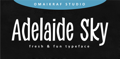 Adelaide Sky is a fun and relaxed display font. Casual and versatile, this font fits a wide range of designs, such as branding, product packaging, invitation, quote, t-shirt, label, poster, logo or any other idea that you wish to develop.
 - Tyrumate by Differentialtype,
$12.00 Tyrumate is an elegant serif font with a vintage touch and classic. Comes in two styles, regular and italic. Its clean lines and meticulous attention to detail embody the essence of classic typography, making it a chic serif font. Tyrumate is suitable for template design, brochures, videos, advertising branding, logos, invitations, layout designs, elegant crafts, beauty designs, and much more. It will add a splash of luxury to any design project you want to create!
 - Simply Grotesk JNL by Jeff Levine,
$29.00 Up until the advent of vinyl plotters, computers and a myriad of other typesetting and printing changes the world has experienced over the past few decades, the art of hand lettering flourished. An early 1900s book on show card writing displayed a nice example of a Grotesk typeface (a popular style of sans serif of the time). This has been redrawn digitally as Simply Grotesk JNL and is available in four varieties - regular, oblique, condensed and condensed oblique.
 - Freak by HiH,
$10.00 Freak was originally released by The Great Western Type Foundry in 1889. According to Maurice Annenberg, Great Western became Barnhart Brothers & Spindler when the Barnhart brothers bought out the Toepfer family in 1868.The plant superintendent, Charles Spindler, became Secretary of the new firm. Specimen books as late as 1899 show the name Great Western alongside the BB&S name. At some point, prior to 1925, Freak was renamed “Bamboo” by BB&S. It was delisted when BB&S was absorbed by ATF in 1929. Listed in McGrew under “Bamboo”.
 - Nomad by Coniglio Type,
$20.02 NOMAD —Regular is a stand alone font. Nomad -Regular is a clean, interesting revival font. It is a Display font. Nomad, now exclusively in OpenType .oft by Joseph V Coniglio of Coniglio Type. It is a narrow boldfaced font. Its analog source was comprised of an extremely limited die cut, truly generic, craft, peel-and-stick vinyl set of capital letters of ascenders and numbers. It was purchased at a five & dime stores, hardware department from the 1970's. My father owned an original set of characters: Nomad-Regular is nicely expanded to meet the needs of OpenType. The original adhesive labels adhered to the bows of that small boats so fisherman wouldn't get turned away at the Canadian border for not having their vessels tagged and listed with the appropriate license name and numbers, recorded by customs. It was a required serialization of letters and numbers marked on the side of their vessels. On the other hand, most beer and whisky drinking fishers, card players and bait casters would rather not deal with it, but the boat could not cross over the border without them. (Once part of Market LTD from the 1990's, a collection of limited faces, mostly alpha-numeric and some just plain numeric, used primarily in retail and display situations and titling.) Designer: Joseph V Coniglio Author: Coniglio Type
 - Bulgari by Slex Studio,
$15.00 Bulgari is an organic handwritten font suitable for branding, wedding invitations, promotions, product packaging and other necessities. This font is modern, simple, but still authentic. You'll get a full set of lowercase and uppercase letters, numbers and punctuation, multilingual symbols, lowercase start and end swashes, and ligatures.
 - Outside by PintassilgoPrints,
$24.00 Alternates, ornaments, ligatures and two casual stylish faces. This is Outside. Where we'd absolutely rather be. * Released during the inside times of 2020 *
 - Dudley Castle by Putracetol,
$28.00 Dudley Castle - Hand Written Script Font is a beautifully crafted font with a hand-drawn script style that exudes elegance and luxury. Designed to resemble handwritten text, this font adds a personal touch and a sense of authenticity to your designs. With its abundance of alternative characters and flourishes, Dudley Castle offers versatility and allows for creative exploration. It is a perfect choice for titles, names, branding, headlines, logos, and various other design applications. The hand-written script style of Dudley Castle brings a unique and personalized feel to your projects. It captures the essence of beautiful handwriting, giving your designs a human touch and an intimate connection. The font's elegant and luxurious appearance elevates the visual appeal and adds a touch of sophistication to any text it is applied to. Whether you're creating a title for a magazine, a name for a product, or a logo for a high-end brand, Dudley Castle will help you achieve a refined and stylish look
 - The Black Shapes by Intellecta Design,
$15.90 The Black Shapes" are a collection of decorative single forms good to use as background of graphic design projects, like covers of books, headpieces at books and magazines, cd-covers, and many others.
 - 1751 GLC Copperplate by GLC,
$38.00 This family was inspired by an engraved plate from Diderot & Dalembert's Encyclopedia (publication beginning in 1751), illustrating the chapter devoted to letter engraving techniques. The plate bears two engravers names : "Aubin" (may be one of the four St Aubin brothers ?)and "Benard" ( which name is present below all plates of the Encyclopedia printed in Geneva ). It seems to be a transitional type, but different from Fournier or Grandjean. Small caps are included in fonts for TTF and OTF version, separate files are included in the family sets of the Mac TT version.
 - Kenosha Antique NF by Nick's Fonts,
$10.00 The inspiration for this elegant, willowy typeface was found in the 1903 type specimen catalog of Barnhard Brothers & Spindler. The original version was named "Racine"; this version takes its name from another town in Wisconsin. The Postscript and Truetype versions contain a complete Latin language character set (Unicode 1252); in addition, the Opentype version supports Unicode 1250 (Central European) languages as well.
 - Pelegotic by T4 Foundry,
$21.00Pelegotic makes you think of Scandinavian pioneer design, with its functional letterforms and architectural look. It is also a very versatile typeface, and fits easily as headline type for a magazine, or as part of a graphic profile for a company. It looks simple, but that impression is deceptive; the letters are drawn with a flair and individuality that shows the hand of a master typographer. Pelegotic Regular is rather thin, and is useful for big type like signs. Veteran designer Bo Berndal has created Pelegotic: "Pelegotic is a sansserif inspired by the Art Deco of the 20's and the Swedish functional style of the 30's. The slightly condensed design is an attempt to find a somewhat more elegant lettershape than the usually rather technical expression of monoline typefaces", says Bo Berndal. Pelegotic comes in three weights, with roman and italic in each weight. It is an OpenType creation, for both PC and Mac. - Glogalex by ZultypeFonter,
$21.00 We designed this Glogalex font inspired by today's rapid digital technology, where the art of typography is very much needed to support various digital needs, both for software and for other print media needs. Glogalex is a display font designed with the main focus aimed at the needs of various brands of digital products or other technology products, but not limited to the use of various kinds of printing, both mass media or for the needs of various titles of books, magazines, newspapers, and various other kinds of tabloids, the wealth of Glyph Alternate and Ligature can add to the creation of typography art, you can be creative in using various letters that we have designed by combining ordinary letters with alternative letters and also ligatures, we have combined several ligatures to make it easier for you to use, but if If you have difficulty using Alternate letters and ligatures, we recommend you to manually combine each Alternate and ligature you want to use. We highly recommend the use of this Glogalex font for the needs of displaying company brands, trademarks, logo designs, use in digital media, such as movie titles, online game names, and for various vehicle brands, if you can maximize its use it will be very interesting. for each display that has been designed, pleasing to the eye and easy to read. we are very happy if you are satisfied in using our products, and if there are problems in using our products you can tell us via email zulfikarzul80@yahoo.co.id, we will respond as soon as possible, thank you.
 - Harbour Light by Cititype,
$19.00 Harbourligh is a monoline script font. designed for those of you who are needing a touch of clean monoline handwritten Font. Resembling the typical line of a casual rollerpen and equipped with a lot of stunning ligature make it more naturals, assertive and appear more stand out for modern brands. The swas line is a straight line at the beginning and end to emphasize a strong decision in the signature. this font is a great choice for digital signature, logo, book cover, web site, brand identity, wedding invitation, photography, movie title and other modern brand.
 - Brazzaville NF by Nick's Fonts,
$10.00Barnhard Brothers and Spindler called this typeface Congo when it appeared in their circa-1910 type catalog. The design is characterized by strong Art Nouveau influences, tight spacing and a large x-height. - Georgie by Jonahfonts,
$29.00 Georgie— A script font. The designers choice for greeting cards and a host of other applications.
 - XStarsAndStripes by Ingrimayne Type,
$14.95 These two typefaces contain elaborate star patterns. XSarsAndStripesOne and XStarsAndStripesTwo are mirror images of each other.
 - Chartu Poo by Enfeeltype,
$15.00 Chartu Poo is a stunning modern sans serif font that exudes a sense of luxury and sophistication. Its futuristic concept is truly unique, and makes it stand out from other fonts in its class. The sleek lines and bold curves of Chartu Poo give it a sense of elegance and refinement, while also conveying a sense of modernity and innovation. One of the things that sets Chartu Poo apart is its versatility. It can be used in a wide range of design projects, from logos and branding materials to website designs and advertising campaigns. Whether you're looking to create a bold and impactful headline, or a subtle and understated body copy, Chartu Poo is the perfect font for the job. Another great feature of Chartu Poo is its readability. Despite its bold and unique design, this font is incredibly easy to read, making it a great choice for both print and digital media. Whether you're designing a brochure or a website, Chartu Poo will ensure that your message is conveyed clearly and effectively. In short, if you're looking for a modern sans serif font that combines luxury, sophistication, and innovation, look no further than Chartu Poo. Its unique and futuristic concept, combined with its versatility and readability, make it the perfect choice for any design project.
 - Bandleader JNL by Jeff Levine,
$29.00 How does one arrive at a font name? With the thousands of digital typefaces available, it's not an easy process. Bandleader JNL was modeled from the hand-lettered title on a piece of sheet music called "Largo", which means "slow tempo". Since the names "Largo" and "Tempo" were already taken, what other musical theme would fit? The lettering is in an Art Deco style, and Big Band was all the rage of the Art Deco period; therefore "Bandleader". Sometimes the road to naming a font takes on many twists and turns but the end result is always gratifying.
 - Kingthings Spikeless - 100% free

- Multistrokes - Unknown license

- odstemplik - 100% free

- Peanuts - Unknown license

- Fleurs de Liane - Unknown license

- Pacifico - 100% free

- JICAMA - Unknown license

- peach sundress ~ - 100% free

- Child's Play - Unknown license

- Squeeze Me Baby! - 100% free

- Dr.Enoksen - Unknown license

- Quintus LeadedGlass - Unknown license

- Simple Melody - Unknown license

- La Rosa Muerta - Unknown license

- WALLRIDER - Personal use only

- Keawneta by Almarkha Type,
$25.00 Hello Everyone, Introduce our new collection, Keawneta - Authentic Display - Bold Display With 15 Ligatures, Inspired from Modern logos of brands that have very strong characteristics, very suitable for posters, t-shirt, packaging, branding, logotype and more. Keawneta font with strong and challenging nuances. very suitable for the title, typography, Poster, magazines, brochures, packaging,Websites and much more for your design needs, making your designs more modern and professional.


